Last week I had the opportunity to see (and touch!) some first edition copies of Adam Smith’s books, including The Wealth of Nations and The Theory of Moral Sentiments.
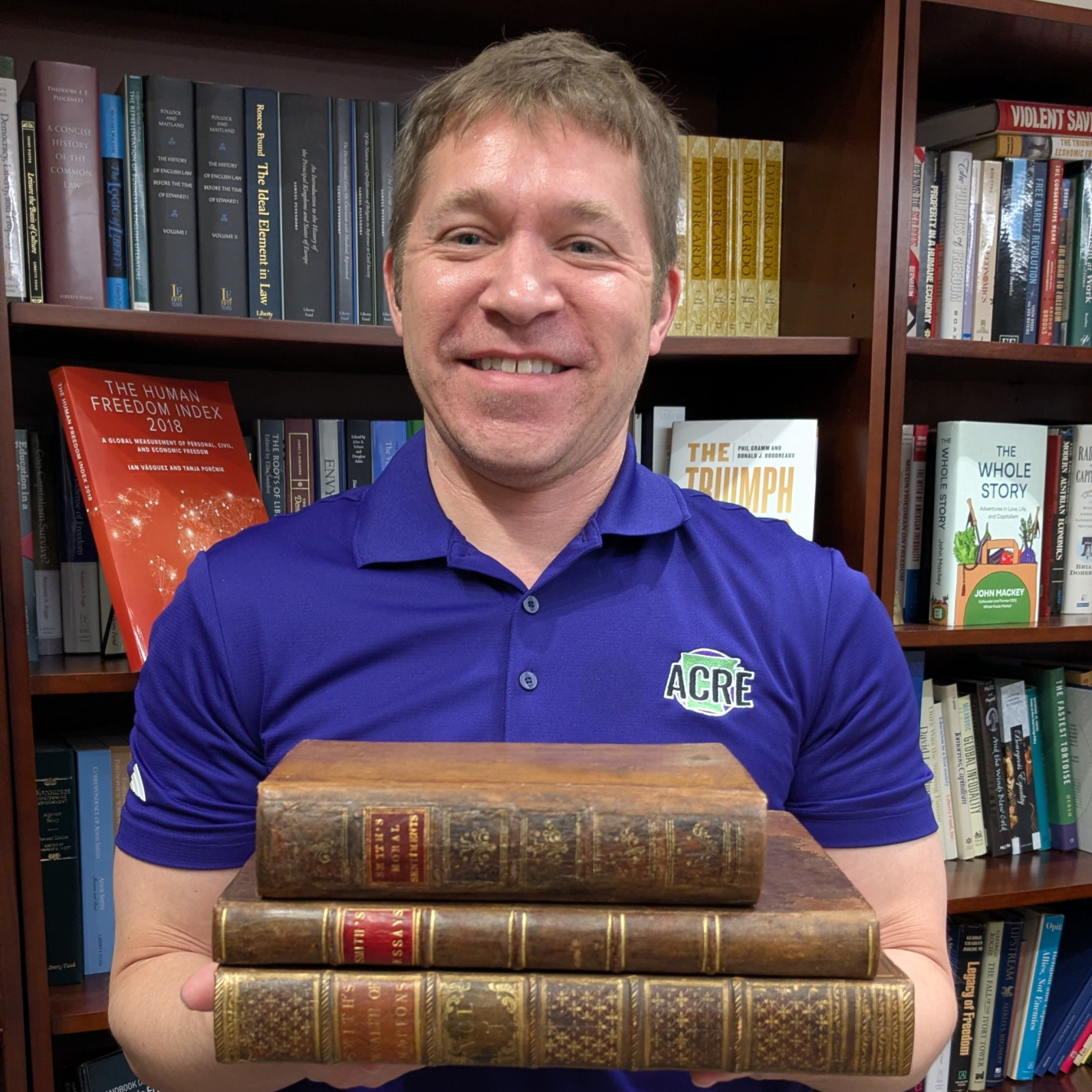
For an economist, of course this was a very cool experience. The books from the Remnant Trust were still in great condition, despite people like me handling these copies from time-to-time. The books were also beautiful editions, which got me thinking: how much did these cost to purchase when originally published?
According to John Rae’s Life of Adam Smith, the original price for The Wealth of Nations was 1 pound, 16 shillings. Average wages per day in England were somewhere around 15 pence per day (1 pence is 1/12 of a shilling), it would take close to 30 days of labor to purchase the book. But that’s assuming you spent all of your wage on books, which of course would have been impossible: a common laborer would have been spending 80-90% of their wages on food, beer, and rent. And that’s assuming no unexpected expenses or sickness. In reality, it might take a common laborer months, years, or maybe his entire life to save up for that book.
Today, of course we can read this book online for free, but what if you want a nice hardcover version? Amazon has several nice hardback versions available for just under $30. These are not quite as beautiful as the 1776 edition, but they would look nice in any library. Given that the average wage in the US today is close to $32, it would take less than one hour of labor to purchase the book. And thankfully the cost of necessities today is much lower than 1776, indeed much lower than 1900, so it would be much easier to set aside that one hour of wages relative to the past, and purchase yourself a little treat like a book written 250 years ago.