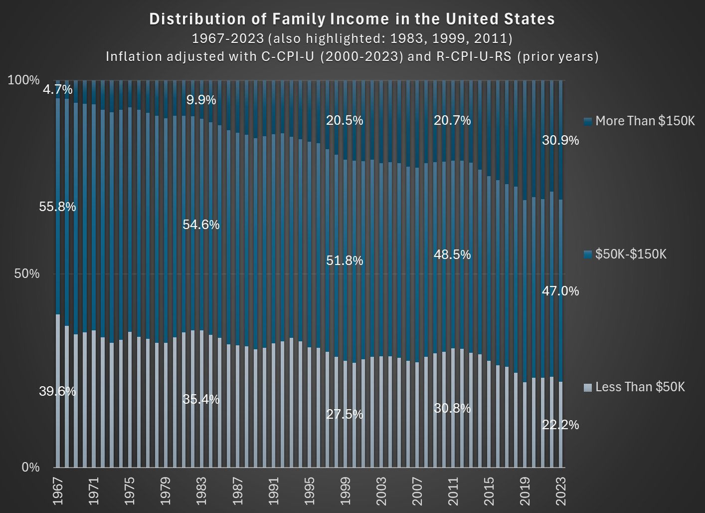
In 1967, about 56 percent of families in the US had incomes between $50,000 and $150,000, stated in 2023 inflation-adjusted dollars. In 2023, that number was down to 47 percent. So the American middle class shrunk, but why? (Note: you can do this analysis with different income thresholds for middle class, but the trends don’t change much.)
As you can see in the chart, the proportion of families that are in the high-income section, those with over $150,000 of annual income in 2023 dollars, grew from about 5 percent in 1967 to well over 30 percent in the most recent years. And the proportion that were lower income shrunk dramatically, almost being cut in half as a proportion, and perhaps surprisingly there are now more high-income families than low-income families (using these thresholds, which has been true since 2017). The number is even more striking when stated in absolute terms: in 1967 there were only about 2.4 million high-income households, while in 2023 there were 11 times as many — over 26 million.
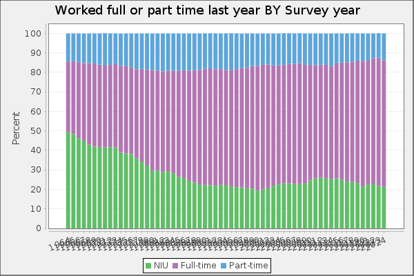
Is this increase in family income caused by the rise of two-income households? To some extent, yes. Women have been gradually shifting their working hours from home production to market work, which will increase measured family income. However, this can’t fully explain the changes. For example, the female employment-population ratio peaked around 1999, then dropped, and now is back to about 1999 levels. Similarly, the proportion of women ages 25-54 working full-time was about 64 percent in 1999, almost exactly the same as 2023 (this chart uses the CPS ASEC, and the years are 1963-2023).
But since the late 1990s, the “moving up” trend has continued, with the proportion of high-income families rising by another 10 percentage points. Both the low-income and middle-income groups fell by about 5 percentage points. Certainly some of the trend in rising family income from the 1960s to the 1990s is due to increasing family participation in the paid workforce, but it can’t explain much since then. Instead, it is rising real incomes and wages for a large part of the workforce.
I had planned to write about the Trump-BLS fight today. But considering that two of my co-bloggers have already written about this (Mike on Monday and Scott on Tuesday) and that I have written about supposedly “fake” jobs numbers before several times (see January 2024 and August 2024), I will hold off on that topic until all of the dust settles. But this is a very important topic, and I believe Trump is clearly in the wrong (as is Kevin Hassett, see my tweets from this week), so please do continue to follow this topic and sane voices on it (see a Tweet from Ernie Tedeschi and from me for a long-run perspective on data accuracy).
But now, on to something a little more light-hearted: is everyone traveling to Europe these days?
Judging by my Facebook feed, it seems that Yes, lots of people are traveling to Europe. But this could be a result of selection bias in at least two ways: the people I am friends with on Facebook, and what people choose to post about on Facebook.
So what does the hard data say? We actually have pretty good long-run data on this question. In short: yes, lots more Americans are traveling to Europe (and overseas generally). Though don’t worry: not everyone went to Europe this summer, despite what social media might have you believe.
For starters, here’s a chart showing three decades of US overseas travel:
In macroeconomics we have basic tools to help us talk about economic growth, which is simply the percent change in RGDP per capita. What causes growth? Lot’s of things. All else constant, if more people are employed, then more will be produced. But the productivity of those workers matters too. That’s why we calculate average labor productivity (ALP), which is the GDP per worker. This tells us how much each worker produces. All else constant, more ALP means more GDP.*
What affects ALP? Nearly everything: Technology, demographics, health, culture, and public policy. Most of these have long-term effects. So, it’s better to think in terms of regimes. After all, incurring debt now can result in a lot of investment and production, but there’s no guarantee that it can be sustained year after year. This is why I don’t get terribly excited about individual good or bad policies at any moment. There’s a lot of ruin in a nation. I care more about the long-run policy regime that is fostered over time.
Given the variety of inputs to economic growth, there’s always plenty of room for complaint about policy – even if the economy is doing well. In this post, I’m inspired by a Youtube video that a student shared with me. The OP laments poor policy in Massachusetts. But compared to some other nearby states, MA is doing just fine economically. This is not the same as saying that the OP is wrong about poor policies. Rather, a regime of policy, technology, interests, etc. is built over time and there can be a lot wrong in growing economies.
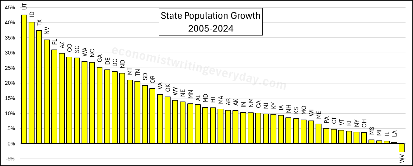
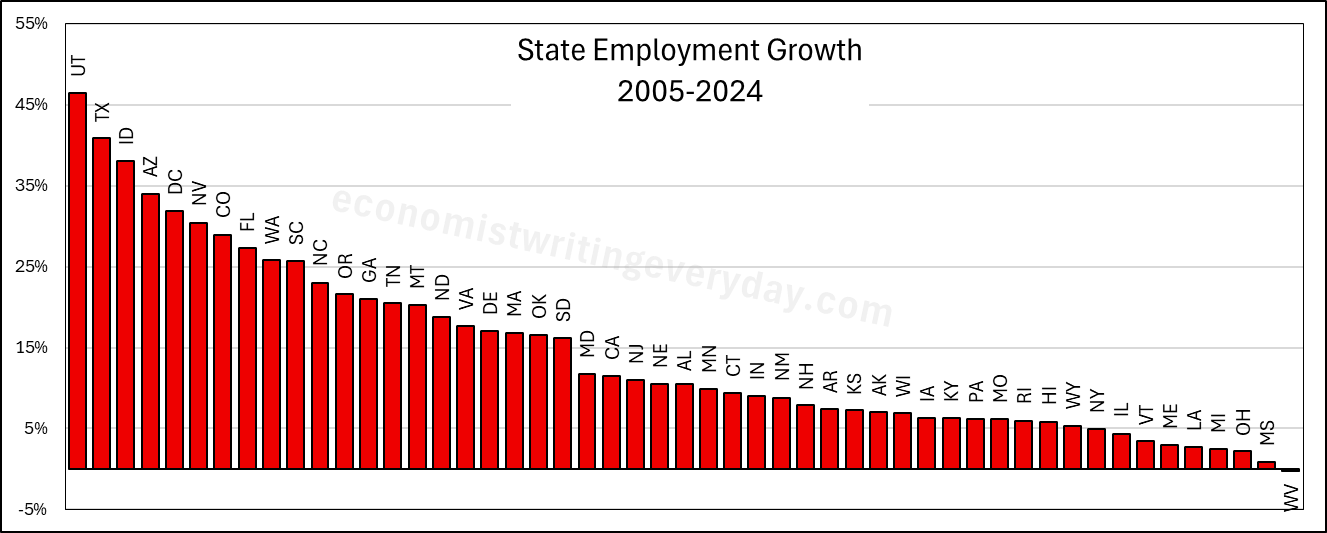
In the interest of being comprehensive, this post includes basic growth stats for all states from 2005 through 2024 (the years of FRED-state GDP).** First, let’s start with the basic building blocks of population, employment, and RGDP. Institutions matter. Policy affects whether people migrate to/from the state, fertility, how many people are employed, and what they can produce.
People like to talk about migration and the flocking to Texas & Florida. But that fails to catch the people who choose to stay in their state. Utah is 43% more populous than it was 20 years ago. But you don’t hear much clamoring for their state policies. Idaho and Nevada also beat Florida in terms of percent change. Where are the calls to be like Idaho? Employment largely tracks population, though not perfectly. The RGDP numbers can change quickly with commodity prices, reflected in the performance of North Dakota. But remember, these numbers cover a 20 year span. So, any one blockbuster or dower year won’t move the rankings much.
Of course, these figures just set the stage. What about the employment-population ratio, ALP, and RGDP per capita? Read on.
The Tax Cuts and Jobs Act was passed in late 2017 and went into effect in 2018. For academic research to analyze the effects, that’s still a very recent change, which can make analyzing the effects challenging. In this case the challenge is especially important because major portions of the Act will expire at the end of next year, and there will be a major political debate about renewing portions of it in 2025.
Despite these challenges, a recent Journal of Economic Perspectives article does an excellent job of summarizing what we know about the effects so far. In “Sweeping Changes and an Uncertain Legacy: The Tax Cuts and Jobs Act of 2017,” the authors Gale, Hoopes, and Pomerleau first point out some of the obvious effects:
TCJA increased budget deficits (i.e., it did not “pay for itself”)
Most Americans got a tax cut (around 80%), which explains #1 — and only about 5% of Americans saw a tax increase (~15% weren’t affected either way)
Following from #2, every quintile of income saw their after-tax income increase, though the benefits were heavily skewed towards the top of the distribution ($1,600 average increase, but $7,600 for the top quintile, and almost $200,000 for the top 0.1%)
Beyond these headline effects, it seems that most of the other effects were modest or difficult to estimate — especially given the economic disruptions of 2020 related to the pandemic.
For example, what about business investment? Through both lowering tax rates for corporations and changing some rules about deductions of expenses, we might have expected a boom in business investment (it was also stated goal of some proponents of the law). Many studies have tried to examine the potential impact, and the authors group these studies into three buckets: macro-simulations, comparisons of aggregate data, and using micro-data across industries (to better get at causation).
In general, the authors of this paper don’t find much convincing evidence that there was a boom in business investment. The investment share of GDP didn’t grow much compared to before the law, and other countries saw more growth in investment as a share of GDP. Could that be because GDP is larger, even though the share of investment hasn’t grown? Probably not, as GDP in the US is perhaps 1 percent larger than without the law — that’s not nothing, but it’s not a huge boom (and that’s not 1 percent per year higher growth, it’s just 1 percent).
Ultimately though, it is hard to say what the correct counterfactual would be for business investment, even with synthetic control analyses (the authors discuss a few synthetic control studies on pages 21-22, but they aren’t convinced).
What’s important about some of the main effects is that these were largely predictable, at least by economists. The authors point to a 2017 Clark Center poll of leading economists. Almost no economists thought GDP would be “substantially higher” from the tax changes, and economists were extremely certain that it would increase the level of federal debt (no one disagreed and only a few were uncertain).
Are you better off than you were four years ago? That question was asked at the Presidential debate last night. But more importantly, we also got a massive amount of new data on income and poverty from Census yesterday. That data allows us to make that just that comparison, although somewhat imperfectly.
The Census data is excellent and detailed, but it’s annual data, meaning that the release yesterday only goes through 2023. We won’t have 2024 data for another year. Such is the nature of good data. (Note: I’ve tried to address this same question with more real-time data, such as average wages). Still, it’s a useful comparison to make. It’s especially useful right now because the new 2023 data on income are (for most categories) the highest ever with one exception: 4 years ago, in 2019.
A reasonable read of the data on income (whether we use households, families, or persons) is that in 2023 the median American was no better off than in 2019, after adjusting for inflation. In fact, they were probably slightly worse off. I fully expect this will no longer be true when we have 2024 data: it will certainly be above 4 years prior (2020) and likely above 2019 too (more on this below). But we can’t say that for sure right now.
So let’s do a comparison of “are you better off than 4 years ago” for recent Presidents that were up for reelection (treating 2024 as a reelection year for Biden-Harris too), using the 4-year comparison that would have been available at the time using real median family income. Notice that this data would be off by one year, but it’s what would have been known at the time of the election.
A recent post from the blogger (Substacker?) Cremieux called Rich Country, Poor Country showed how small differences in economic growth add up over time. Because he used nominal GDP growth rates, I don’t think that post is exactly the right way to analyze the question, but I still think it’s a very important one. So in this post I will offer, not necessarily a critique of that post, but perhaps a better way of looking at the data.
For the data, I will use the Maddison Project Database, which attempts to create comparable GDP per capita estimates for countries going back as far as possible… for some, back thousands of years, but for most countries at least the last 100 years. And the estimates are stated in modern, purchasing power adjusted dollars, so they should be roughly comparable over time (if you think these estimates are a bit ambitious, please note that they are scaled back significantly from Angus Maddison’s original data, which had an estimate for every country going back to the year 1 AD). The most recent year in the data is currently 2022, so if I slip up in this post and say “today,” I mean 2022, or roughly today in the long sweep of history.
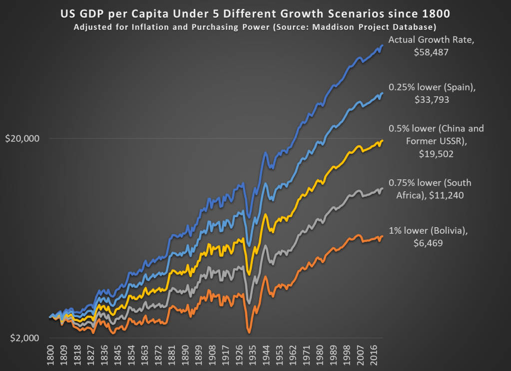
Like Cremieux’s post, I am interested in how much slightly lower economic growth rates can add up over time. Or even not so slightly lower growth rates, like 1 percentage point less per year — this is a huge number, because the compound annual average growth rate for the US from 1800 to 2022 is 1.42%. So let’s look at the data way back to 1800 (the first year the MPD gives us continuous annual estimates for the US) to see how changes in growth rates affect long-term growth.
It probably won’t surprise you that if our 1.42% growth rate had been 1 percentage point lower, the US would be much poorer today, but to put a precise number on it, we would be about where Bolivia is today (that is, ranked 116th out of the 169 countries in the MP Database). Note: I’m using a logarithmic scale, both so it’s easier to see the differences and because this is standard for showing long-run growth rates.
What is very interesting, I think, is that if our growth rate had been just 0.25 percentage points lower per year since 1800, we would be about where Spain is. Now, Spain is certainly a fine, modern developed country (they rank 34th of the 169 MPD countries). But Spain’s growth has not been spectacular lately. Average income in Spain is almost half of the US today (purchasing power adjusted!), which is another way to say that just 0.25 percentage points lower over 222 years reduces your growth rate by half.
That’s the power of economic growth.
And if our growth rate had been 0.5 percentage points lower, we’d be about where the big former Communist countries are today (both China and the former countries of the USSR are about equal today — about 1/3 of the income of the US).
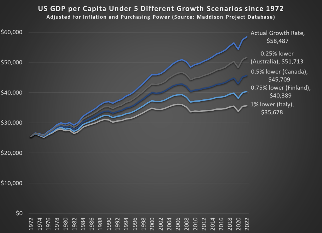
What if we perform the same analysis for a shorter time horizon? If we go back 50 years to 1972, the effects are not quite as dramatic, but still visible.
Our cumulative annual growth rate since 1972 has been a bit higher than the long-run average, around 1.68%. Under these four alternative growth scenarios since 1972, the comparable countries don’t sound so bad. It probably wouldn’t be a huge deal if we were only at Australia’s level, losing just about a decade of economic growth. But it would be a huge failure if we were only at Italy’s current level of development. Under that 1 percentage point lower growth scenario, we would have had no net growth since about year 2000, which has roughly been the case for Italy.
All of these alternative scenarios show the power of economic growth to add up over time, but they do so in pessimistic way: what if growth had been slower. What if we look at the opposite: what if growth had been faster over some time horizon. Sticking with the 1972 medium-run example, if real growth rates had been 1 percentage point higher, our income today would be almost double what it actually is, about $95,000 compared with the current $58,000 (the MPD data is stated in 2011 dollars, so that sounds lower than it actually is now: over $80,000).
What if we went back even further? If our economic growth rate since 1800 had been 1 percentage point higher every year, our average income in 2022 would be an astonishing $517,000 — almost 10 times what it actually was in 2022. That’s a dizzying number to think about, and maybe that’s not a realistic alternative scenario.
But what if it had only been 0.25 percentage points higher since 1800 — that probably is a world that was possible. In that case, GDP per capita would be about double what it actually was in 2022, at over $100,000 (again, stated in 2011 dollars).
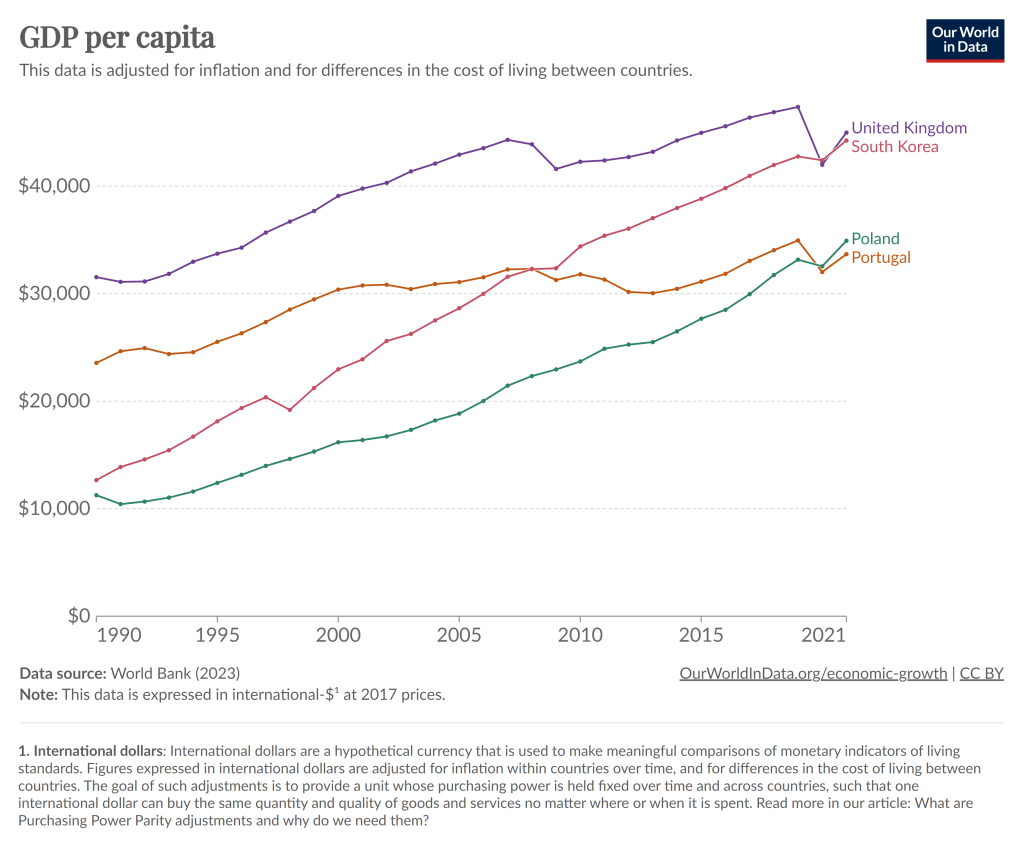
To kick off 2024, I’m just going to give you a chart to think about:
Notice that in 1990, Poland had about half the average income of Portugal, as did South Korea compared to the UK. By about 2021, those gaps had been completely closed. And while the 2021 data is a bit uncertain given the pandemic, IMF estimates for 2024 suggest that both Poland and South Korea have now pulled slightly ahead of Portugal and the UK.
You can find many other examples like this. Why have some countries grown rapidly while others have slowed or stagnated? In some sense, this is an age-old question in economics, and at least as far back as Adam Smith economists have been trying to answer that question.
But it’s actually a bit different now. In Smith’s day, the big question was why some countries had started on their path of economic growth, while others hadn’t started at all. Today, nearly all countries have started economic growth, but some of the early leaders in growth seem to have slowed down. But there isn’t some global reason for this that affects all countries: Poland and South Korea will likely keep growing for a while, and eventually there will be a big gap between them and Portugal and the UK.
The answer to this question is not, of course, just One Big Thing. But for countries like Portugal and the UK (and Japan and Spain and Italy and etc. etc.), the key to their economic future is figuring out what Many Little Things these economic miracles are doing right so that they can return to a path of high economic growth. And this isn’t just a race to see who wins: all countries can be winners! But without continued growth, solving economic, political, and social problems will be a huge challenge.
Maybe 2024 is when they will start to figure it out.
Lately many journalists and folks on X/Twitter have pointed out a seeming disconnect: by almost any normal indicator, the US economy is doing just fine (possibly good or great). But Americans still seem dissatisfied with the economy. I wanted to put all the data showing this disconnect into one post.
In particular, let’s make a comparison between November 2019 and November 2023 economic data (in some cases 2019q3 and 2023q3) to see how much things have changed. Or haven’t changed. For many indicators, it’s remarkable how similar things are to probably the last month before anyone most normal people ever heard the word “coronavirus.”
First, let’s start with “how people think the economy is doing.” Here’s two surveys that go back far enough:
The University of Michigan survey of Consumer Sentiment is a very long running survey, going back to the 1950s. In November 2019 it was at roughly the highest it had ever been, with the exception of the late 1990s. The reading for 2023 is much, much lower. A reading close to 60 is something you almost never see outside of recessions.
The Civiqs survey doesn’t go back as far as the Michigan survey, but it does provide very detailed, real-time assessments of what Americans are thinking about the economy. And they think it’s much worse than November 2019. More Americans rate the economy as “very bad” (about 40%) than the sum of “fairly good” and “very good” (33%). The two surveys are very much in alignment, and others show the same thing.
Last week I wrote about median income in the US, and how it had declined since 2019 and 2021 through 2022 (inflation adjusted, of course). The big story is that median income (both for households and families) has been falling in recent years. While there are some silver linings when looking at subgroups, such as Black families, the overall data isn’t good.
But while that is true for the US overall, it’s not true for every state. In fact, it’s not even true for most states! From 2019 to 2022, there were 29 states that saw their median family incomes rise! That’s adjusted for inflation (I’m using the C-CPI-U, which is Census’s preferred inflation measure for this data). The income data in this post all comes from the Census ACS 1-year estimates.
Here’s a map showing the states that had increases in median family income (green) and those that had decreases (in red). (This is my first time experimenting with Datawrapper maps, feedback appreciated!)
Some states had pretty robust growth, with New Mexico and Arizona leading the way with around 5 percent growth. There is substantial variation across US states, including with big declines like Wyoming at -5 percent, and Oklahoma and Illinois are -3 percent.
A few weeks ago I also wrote about the richest and poorest MSAs in the US. But what about the richest and poorest states in the US? The following map shows that data.
The immediate fact which will jump out at you is that the lowest income US states are almost all located in the South. This will probably not surprise most of us, although it probably is a bit surprising since the data is adjusted for differences in the cost of living (using the BEA RPP data). Even after making these adjustments, the South is still clearly the poorest region (and it definitely was the poorest without the adjustments).
Among the higher income states, they are distributed pretty well across the rest of the non-South. There are 16 states (plus DC) that have median family incomes over $100,000 (again, cost of living adjusted), and while many of these are in New England and the Mid-Atlantic, there area still a few in the Midwest, Great Plains, and the West. Utah and New Jersey have similar incomes, as do Virginia and Rhode Island.
The highest income states are Massachusetts and Connecticut, with over $112,000 in median family income, while the lowest are Mississippi and West Virginia, both under $78,000. Median family income in Massachusetts is 46 percent higher than Mississippi. And that’s after adjusting for differences in the cost of living.
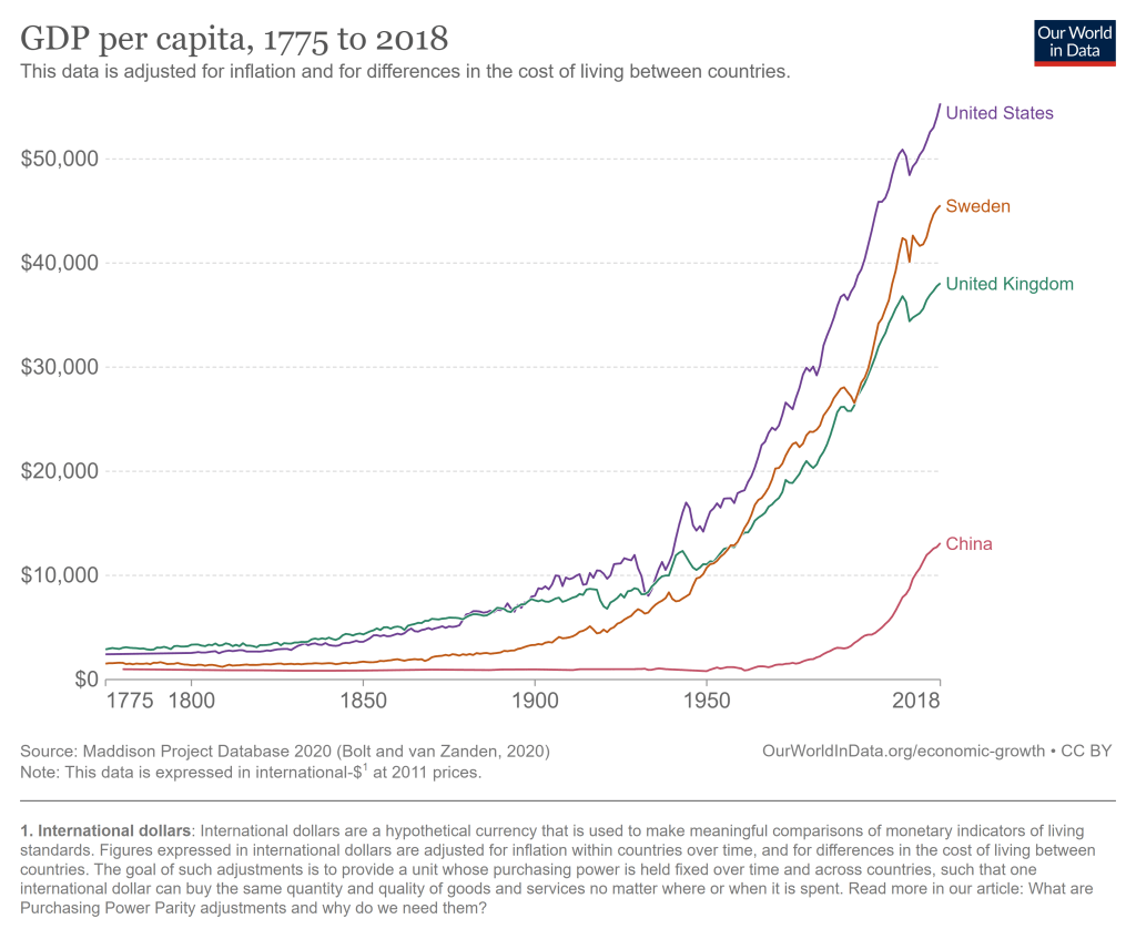
The United States has problems and always had. But the historical record of the United States as an economic powerhouse is unrivaled. The US had a bit of a head start on economic growth, being a direct descendant of the country that really kicked of the Industrial Revolution. But we took that head start and really ran with it, now being by far the highest income large country, and the highest income country that does not derive a significant part of its GDP from fossil fuels or being a tax haven.
The average American has, as best as we are able to measure it, a standard of living that is at least 20 times greater than Americans when this country began.