The Fraser Institute released their latest report on the Economic Freedom of the World today, measuring economic policy in all countries as of 2023. They made this excellent Rosling-style graphic that sums up their data along with why it matters:
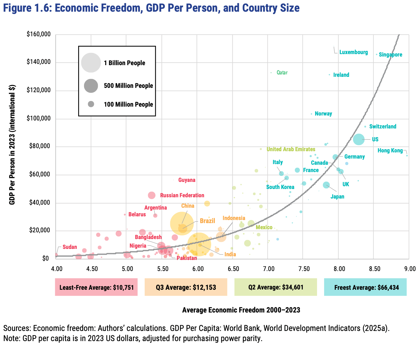
In short: almost every country with high economic freedom gets rich, and every country that gets rich either has high economic freedom or tons of oil. This rising tide of prosperity lifts all boats:
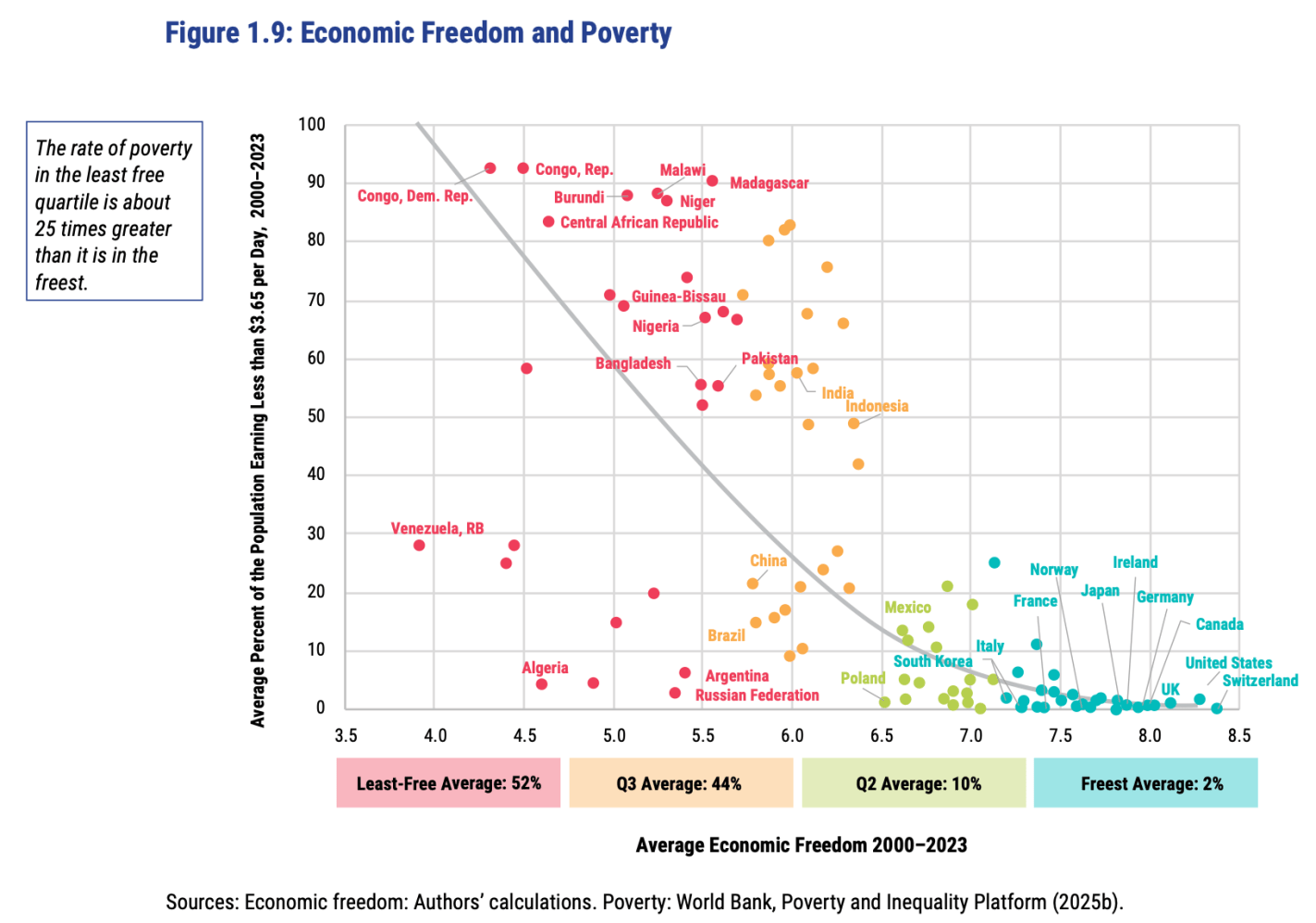
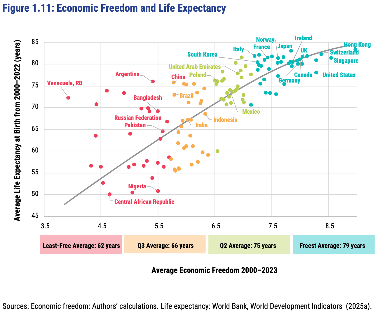
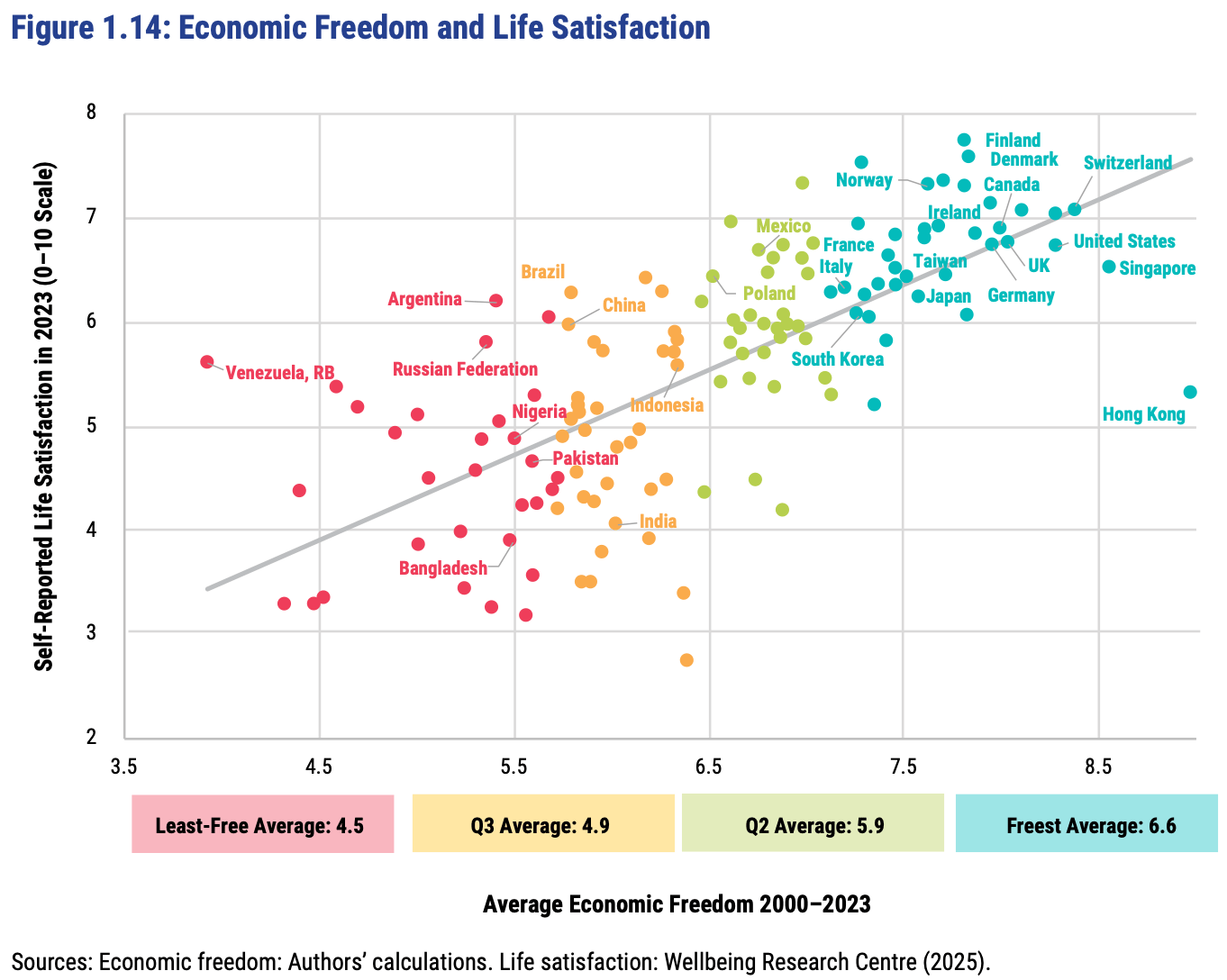
This greater prosperity that comes with economic freedom goes well beyond “just having more stuff”:
The full report, along with the underlying data going back to 1970, is here. The authors are doing great work and releasing it for free, so no complaints, but two additional things I’d like to see from them are a graphic showing which countries had the biggest changes in economic freedom since last year, and links to the underlying program used to create the above graphs so that readers could hover over each dot to identify the country (I suppose an independent blogger could do the first thing as easily as they could…).
FRDM is an ETF that invests in emerging markets with high economic freedom (I hold some), I imagine they will be rebalancing following the new report.
