From a new working paper “The Price of Housing in the United States, 1890-2006” by Ronan C. Lyons, Allison Shertzer, Rowena Gray & David N. Agorastos (emphasis added):
“Zoning was adopted by almost every city in our sample during the 1920s. We see a slightly steeper gradient over the next two periods (coefficients of .48 and .29, respectively). In these periods it is possible both that the existing zoning regimes were causing higher price growth and that home price appreciation was incentivizing cities to adopt even more restrictive measures, particularly by the 1970s (Fischel, 2015; Molloy et al., 2020). The gradient in the final period (1980-2006) is even steeper, however (coefficient of .67), suggesting a closer relationship between zoning and home price appreciation towards the end of the 20th century.”
A few months ago I looked at the richest and poorest MSAs in the US, including adjusting for the cost of living in each MSA. One big thing I found was that the list doesn’t change that much when you adjust for the cost of living: San Jose, San Francisco, Bridgeport (CT), Boston, and Seattle are still the highest income MSAs even after accounting for the fact that they are also high-cost-of-living places to live. The gap shrinks, but they are still in the lead.
But that was adjusting for all the factors in the cost of living. But what if we just looked at one important aspect of the cost of living: housing. And since the cost-of-living adjustments (BEA’s RPP) that I was using are from 2021, what if we tried to bring the data up as close to the present as possible? We know that housing prices have increased a lot since 2021, but also that the cost of borrowing has risen dramatically too. What would this show us about the cost of living for different MSAs?
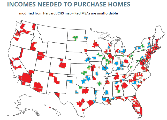
A tool from the Harvard Joint Center for Housing Studies allows us to make some pretty up-to-date comparisons. Their interactive map shows data for the 179 largest MSAs (about half of the total MSAs in the US) on the median price of each home for the second quarter of 2023 and uses interest rates from that quarter to show the rough principal and interest cost (assuming a 3.5% down payment). Taxes and insurance costs for each MSA are also estimated.
Based on those assumptions, their tool provides the minimum income you would need to purchase a home in that area, assuming a 31% debt-to-income ratio for the mortgage. And the income levels needed vary quite widely across MSAs, from a low of $44,000 in Cumberland, Maryland, to a high of over $500,000 in San Jose, CA. That’s a huge difference.
Of course, we know that incomes also vary across MSAs. But they don’t vary that much. The JCHS tool doesn’t provide this data (though a JCHS map from 2017 did compare house prices to incomes), but we can look up median family income for each MSA from Census. Doing so we see that San Jose is indeed unaffordable based on the current (2022) median income, which is “only” about $170,000. A nice income compared to the national median, but only about 1/3 of the $500,000 you would need to afford a home in San Jose. Cumberland looks much better though: median family income is over $77,000 there, about 76% more than you would need to buy a home!
What if we did a similar calculation for all MSAs in the JCHS data? The following map is my attempt to do so. Sorry, but my graphics skills are not the best, so this map isn’t as pretty as it could be (I started with the JCHS map, and just shaded in the colors I wanted to use). But I think it conveys the general idea.
Green-shaded MSAs are the most affordable: places like Cumberland, Maryland, where median family income is well above (at least 20% above, my arbitrary threshold) the amount JCHS says you need to buy a home. There are 27 Green-shaded MSAs. Blue-shaded MSAs are affordable too, and median income is between 100% and 120% of the amount needed to afford a home on the JCHS standard. There are 41 of these, making 68 total MSAs out of these 179 that are affordable. Red-shaded MSAs are less than 100%, and thus unaffordable (though as I will discuss below, some are much closer to affordable than others).
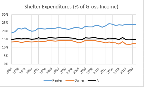
Kevin Erdmann has written a detailed and thoughtful response to my post from last week on housing spending as a percent of income. My goal in that post was to look at consumer spending as a percent of income for a variety of different sub-groups (my primary interest was by age group, but I tried to get into more detail for other sub-groups).
As Erdmann emphasizes in his post, I left out one set of sub-groups that the CEX data allows us to use: renters vs. homeowners. And these are very important groups to look at, since for homeowners (as he points out) many of the costs are implicit (such as the opportunity cost of those that don’t have a mortgage). Lumping all of these households together may obscure some of the different trends.
Be sure to read Erdmann’s post in full (he says many smart and correct things), but the key result is in his Figure 2 (reproduced here). Renters have seen the share of their income spent on shelter rise from 19% in 1984 to 24% in 2021. This is not a trivial increase. Owners, by contrast, have seen their share of spending fall, which is how it all gets washed out in the average.
I will concede that Erdmann is probably right on many of his many points. Still, I wanted to see this at a much finer level of detail, since national aggregates might be giving us confusing results. The micro-data in the CEX is probably not detailed enough to give us good breakdowns by MSA.