A periodically recurring conversation on social media is whether imports are bad for GDP. Everyone thinks they are clearly right, and then they lazily defer to brief dismissal of the opposing view. Some of this might be due to media format. Something just a tiny bit more thorough could help to resolve the painfully unproductive online interactions… And just maybe improve understanding.
It starts with the GDP expenditure identity:
The initial assertion is that imports reduce GDP. After all, M enters the equation negatively. So, all else constant, an increase in M reduces Y. It’s plain and simple.
Many economists reply that the equation is an accounting identity and not a theory about how the world works and that the above logic is simply confusing these two things. This reply 1) allows its employers to feel smart, 2) doesn’t address the assertion, & 3) doesn’t resolve anything. In fact, this reply erects a wall of academic distinction that prevents a resolution. What a missed opportunity to perform the literal job of “public intellectual”.
How are Imports Bad/Good/Irrelevant for GDP?
Let’s add a small but important detail to the above equation to distinguish between consumption of goods produced domestically and those produced elsewhere.
Did president Trump’s first term tariffs, enacted in 2018, increase manufacturing employment or even just manufacturing output? Let’s set the stage.
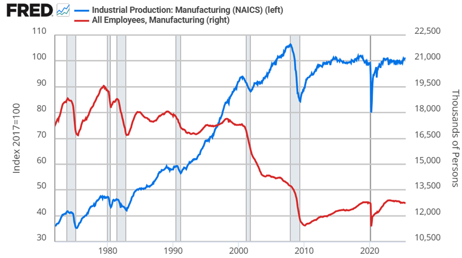
Manufacturing employment was at its peak in 1979 at 19.6 million. That number declined to 18m by the 1980s, 17.3m in the 1990s. By 2010, the statistics bottom out at 11.4m. Since then, there has been a rise and plateau to about 12.8m if we omit the pandemic.
Historically, economists weren’t too worried about the transition to services for a while. After all, despite falling employment in manufacturing, output continued to rise through 2007. But, after the financial crisis, output has been flat since 2014, again, if we omit the pandemic. Since manufacturing employment has since risen by 5% through 2025, that reflects falling productivity per worker. That’s not comforting to either economists or to people who want more things “Made in the USA”.
Looking at the graphs, there’s no long term bump from the 2018 tariffs in either employment or output. If you squint, then maybe you can argue that there was a year-long bump in both – but that’s really charitable. But let’s not commit the fallacy of composition. What about the categories of manufacturing? After all, the 2018 tariffs were targeted at solar panels, washing machines, and steel. Smaller or less exciting tariffs followed.
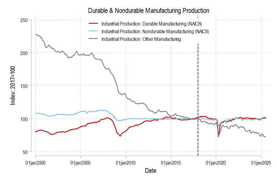
Breaking it down into the major manufacturing categories of durables, nondurables, and ‘other’ (which includes printed material and minimally processed wood products), only durable manufacturing output briefly got a bump in 2018. But we can break it down further.
This post is co-written with John Olis, History major at Ave Maria University.
There is a popular myth that manufacturing jobs of the past provided a leg-up to young people. The myth goes like this. Manufacturing jobs had low barriers to entry so anyone could join. Once there, the job paid well and provided opportunities for fostering skills and a path toward long-term economic success. There is more to the myth, but let’s stop there for the moment. Is the myth true?
One of my students, John Olis, did a case study on Connecticut in 1920-1930 using cross sectional IPUMS data of white working age individuals to evaluate the ‘Manufacturing Myth’. We are not talking causal inference here, but the weight of the evidence is non-zero. The story above has some predictions if not outright theoretical assertions.
Manufacturing jobs paid better than non-manufacturing jobs for people with less human capital.
Manufacturing jobs yielded faster income growth than non-manufacturing jobs.
Implicitly, manufacturing jobs provided faster income growth for people with less human capital.
Using only one state and two decades of data obviously makes the analysis highly specific. Expanding the breadth or the timescale could confirm or falsify the results. But historical Connecticut is a particularly useful population because 1) it had a large manufacturing sector, 2) existed prior to the post WWII boom in manufacturing that resulted from the destruction of European capacity, and 3) had large identifiable populations with different levels of human capital.
Who had less human capital on average? There are two groups who are easy to identify: 1) immigrants and 2) illiterate people. Immigrants at the time often couldn’t speak English with native proficiency or lacked the social norms that eased commercial transactions in their new country (on average, not always). Illiterate people couldn’t read or write. Therefore, having a comparative advantage in manual labor, we’d expect these two groups to be well served by manufacturing employment vs the alternative.
Being cross-sectional, the individuals are not linked over time, so we can’t say what happened to particular people. But we can say how people differed by their time and characteristics. Interaction variables help to drill-down to the relevant comparisons. There are two specifications for explaining income*, one that interacts manufacturing employment with immigrant status and one that interacts the status of illiteracy. The baseline case is a 1920 non-operative native or literate person. Let’s start with the below snapshot of 1920. The term used in the data is ‘operative’ rather than ‘manufacturer’, referring to people who operate machines of one sort or another. So, it’s often the same as manufacturing, but can also be manufacturing-adjacent. The below charts illustrate the effect of lower human capital in pink and the additional subpopulation impacts of manufacturing in blue.
In the left-hand specification, native operatives made 2.2% less than the baseline population. That is, being an operative was slightly harmful to individual earnings. Being an immigrant lowered earnings a substantial 16.8%, but being an operative recovered most of the gap so that immigrant operatives made only 6.1pp less than the baseline population and only 3.9pp less than native operatives. In the right-hand specification, unsurprisingly, being illiterate was terrible for one’s earnings to the tune of 23.4pp. And while being an operative resulted in a 1.2% earnings boost among natives, being an operative entirely eliminated the harm that illiteracy imposed on earnings.
Both graphs show that manufacturing had tiny effects for a typical native or literate individual. But manufacturing mattered hugely for people who had less human capital. So, prediction 1) above is borne out by the data: Manufacturing is great for people with less-than-average human capital.
Many regular Americans and policymakers say they want the US to manufacture more things domestically. But when they ask economists how to accomplish this, I find that our most common response is to question their premise- to say the US already manufactures plenty, or that there is nothing special about manufacturing. It’s easy for people to round off this answer to ‘your question is dumb and you are dumb’, then go ask someone else who will give them a real answer, even if that real answer is wrong.
Economists tell our students in intro classes that we focus on positive economics, not normative- that we won’t tell you what your goals should be, just how best to accomplish them. But then we seem to forget all that when it comes to manufacturing. Normally we would take even unreasonable questions seriously; but I think wondering how to increase manufacturing output is reasonable given the national defense externalities.
So if you had to increase the value of total US manufacturing output- if you were going to be paid based on a fraction of real US manufacturing output 10 years from now- how would you do it?
I haven’t made a deep study of this, but here are my thoughts. Better ideas at the top, ‘costly but would increase manufacturing output’ ideas at the bottom:
You may have heard that there is a new viral song which deals with a few economic issues. Noah Smith has a good analysis of “Rich Men North of Richmond,” which he mostly finds to be incorrect in its analysis (for example, of welfare policy). But Smith does say that the song has a point: manufacturing wages haven’t performed well in recent years. Not only has pay for factory workers “[lagged] the national average in recent years,” for those workers in Virginia, it’s lower in real terms than in 2010.
Well that all doesn’t sound good! Smith is only going back to about 2000 with the data he shows. What if we took a longer run perspective? What if we took a really long-run perspecitive?
Here’s wages for blue-collar factor workers that goes back to 1939 in the US:
The wage data (for manufacturing production workers) is from BLS and the PCE price index is from the BEA. What do you notice as you look at the data?
First, it is true that the last 20 years or so hasn’t been great. Only about 8% cumulative growth since 2002. That’s not great!
But as you look back further, you’ll notice that gains are substantial. Compared to what some might consider the “golden age” of manufacturing wages, the early 1950s, real wages have roughly doubled. It’s true, the growth rate from 1939-1973 is much, much better than the following 50 years. Wouldn’t it be nice if that growth rate had continued! But no doubt you’ve seen many memes saying something like “in the 1950s you could support a family on one high-school graduate income, but not today!” This data suggests that view of the 1950s is a little distorted by nostalgia.
One final thing to note: we might think that one big change in recent decades is that a lot more compensation goes to benefits, rather than wages. There’s actually a total compensation series for blue-collar workers going all the way back to 1790:
The total compensation data, as well as the CPI data that I used to inflation-adjust the figures (to 2022 dollars), comes from the fantastic resource Measuring Worth. This is a total compensation measurement, so it includes benefits, but the source data tells us that up until the late 1930s, it’s really just a wage measure. So potentially we could splice this together with the above chart, to get a “wage only” series covering the entire history of the US.
However, when we look at total compensation, we still see the post-1970s stagnation. Real compensation is roughly the same as about 1977. Yikes! Note here that we’re using the CPI, since the PCE index only goes back to 1929, and the CPI tends to overstate inflation (yes, that’s right, sorry CPI truthers). Still, it’s not the most optimistic picture.
Or isn’t it? With all of the automation and global competition in manufacturing coming on board in the past 50 years, perhaps our baseline is that things could have been much worse. In any case, if we look at total compensation, it’s currently about double what it was in the post-WW2 era. That’s even with the dip in 2022 due to high CPI inflation.
Wages and compensation of blue-collar productions workers have indeed been growing slowly for the past few decades. That much is true. On the other hand, they are still among the highest they have ever been in history, over 50 times (not 50%, 50 times!) higher than at the birth of this nation. This ranks them as probably the highest wages anywhere in world history for an occupation that doesn’t require an advanced degree. That history is worth knowing.