Poverty Lines Are Hard to Define, But Wherever You Set Them Americans Are Moving Up (And The “Valley of Death” is Less Important Than You Think)

Last week I wrote a fairly long post in response to an essay by Michael Green. His essay attempted to redefine the poverty line in the US, by his favored calculation up to $140,000 for a family of four. That $140,000 number caught fire, being covered across not only social media and blogs, but in prominent places such as CNN and the Washington Post. That $140,000 number was key to all of the headlines. It grabbed attention and it got attention. So it’s useful to devote another post this week to the topic.

And Mr. Green has written a follow-up post, so we have something new to respond to. Mr. Green has also said a lot of things on Twitter, but Twitter can be a place for testing out ideas, so I will mostly stick to what he posted on Substack as his complete thoughts. I am also called out by name in his Part 2 post, so that’s another reason to respond (even though he did not respond directly to anything I said).

Once again, I’ll have 3 areas of contention with Mr. Green:

  1. As with last week, I maintain that $140,000 is way too high for a poverty line representing the US as a whole (and Mr. Green seems to agree with this now, even though $140,000 was the headline in all of the major media coverage)
  2. There are already existing alternative measures of what he is trying to grasp (people above the official poverty line but still struggling), such as United Way’s ALICE, or using a higher threshold of the poverty rate (Census has a 200% multiple we can easily access)
  3. His idea of the “Valley of Death” is already well-covered by existing analyses of Effective Marginal Tax Rates, and tax and benefit cliffs. This isn’t to say that more attention is warranted, but Mr. Green doesn’t need to start his analysis from scratch. And this “Valley” is probably narrower than he thinks.
Continue reading

The Poverty Line is Not $140,000

UPDATE: Michael Green has written a follow-up post which essentially agrees that $140,000 is not a good national poverty line, but he still has concerns. I have written a new response to his post.

A recent essay by Michael W. Green makes a very bold claim that the poverty line should not be where it is currently set — about $31,200 for a family of four — but should be much higher. He suggests somewhere around $140,000. The essay was originally posted on his Substack, but has now gone somewhat viral and has been reposted at the Free Press. (Note: that actual poverty threshold for a family of four with two kids is $31,812 — a minor difference from Mr. Green’s figure, so not worth dwelling on much, but this is a constant frustration in his essay: he rarely tells us where his numbers come from.)

I think there are at least three major errors Mr. Green makes in the essay:

  1. He drastically underestimates how much income American families have.
  2. He drastically overstates how much spending is necessary to support a family, because he uses average spending figures and treats them as minimum amounts.
  3. He obsesses over the Official Poverty Measure, since it was originally based on the cost of food in the 1960s, and ignores that Census already has a new poverty measure which takes into account food, shelter, clothing, and utility costs: the Supplement Poverty Measure.

I won’t go into great detail about the Official Poverty Measure, as I would recommend you read Scott Winship on this topic. Needless to say, today the OPM (or some multiple of it) is primarily used today for anti-poverty program qualification, not to actually measure how well families are doing today. If we really bumped the Poverty Line about to $140,000, tons of Americans would now qualify for things like Medicaid, SNAP, and federal housing assistance. Does Mr. Green really want 2/3 of Americans to qualify for these programs? I doubt it. Instead, he seems to be interested in measuring how well-off American families are today. So am I.

Let’s dive into the numbers.

Continue reading

Economic Freedom of the World 2025

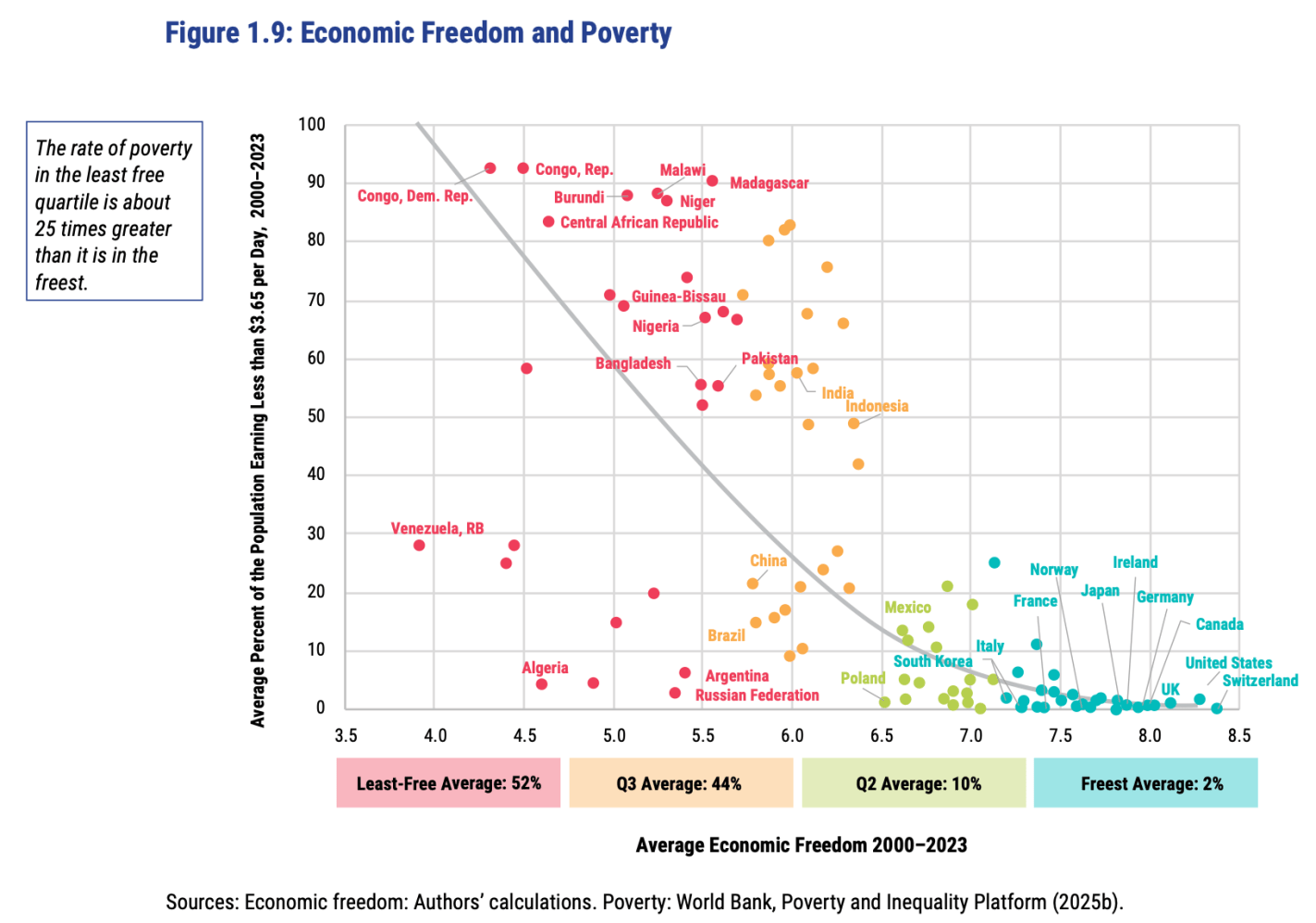
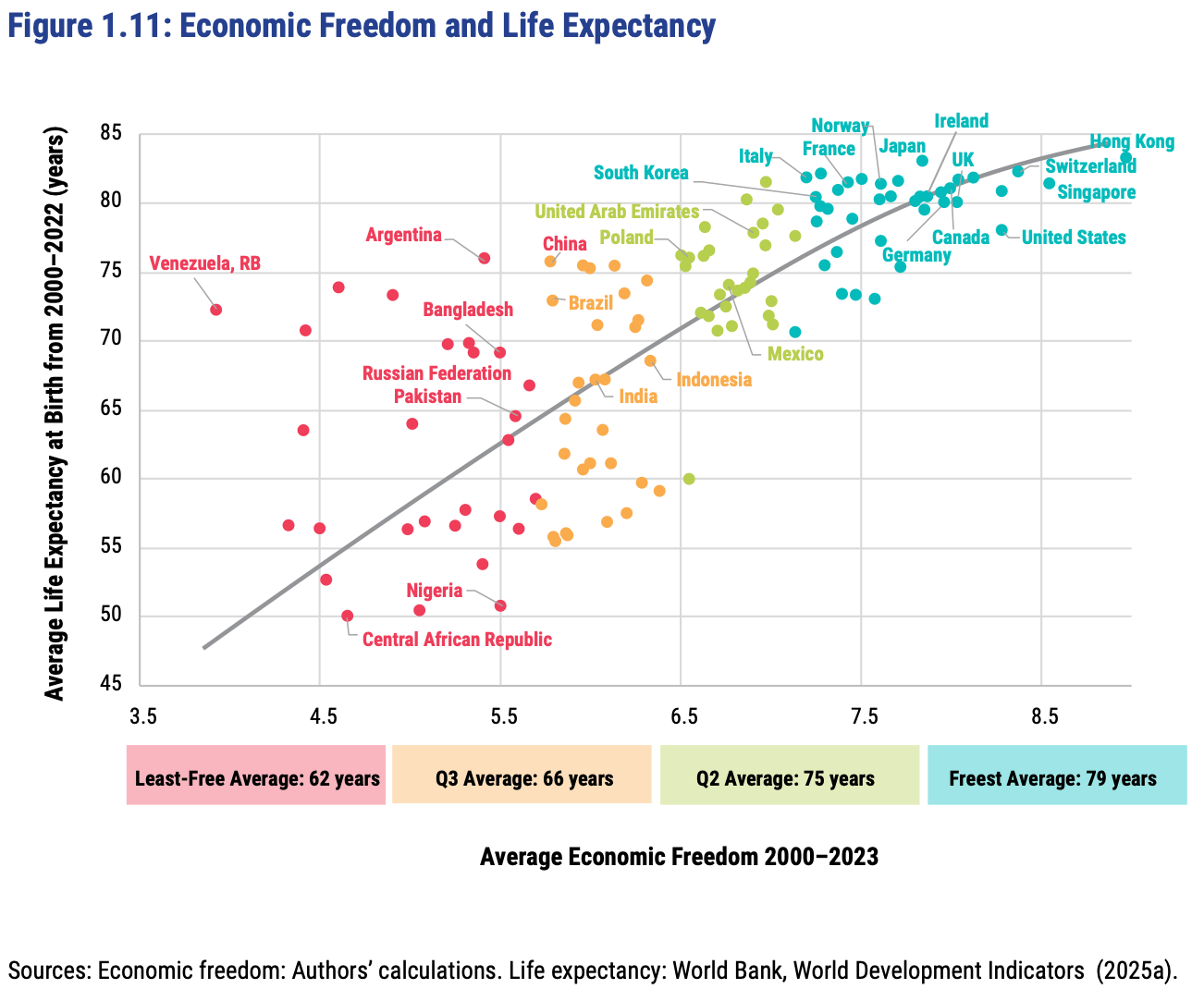
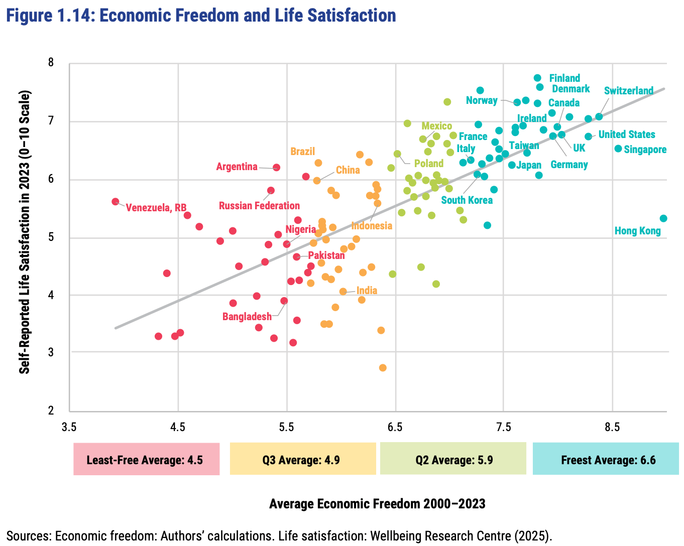
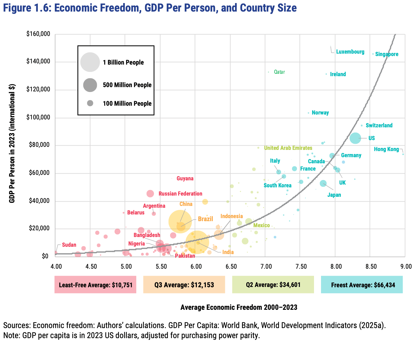
The Fraser Institute released their latest report on the Economic Freedom of the World today, measuring economic policy in all countries as of 2023. They made this excellent Rosling-style graphic that sums up their data along with why it matters:

In short: almost every country with high economic freedom gets rich, and every country that gets rich either has high economic freedom or tons of oil. This rising tide of prosperity lifts all boats:

This greater prosperity that comes with economic freedom goes well beyond “just having more stuff”:

The full report, along with the underlying data going back to 1970, is here. The authors are doing great work and releasing it for free, so no complaints, but two additional things I’d like to see from them are a graphic showing which countries had the biggest changes in economic freedom since last year, and links to the underlying program used to create the above graphs so that readers could hover over each dot to identify the country (I suppose an independent blogger could do the first thing as easily as they could…).

FRDM is an ETF that invests in emerging markets with high economic freedom (I hold some), I imagine they will be rebalancing following the new report.

Counting the missing poor in pre-industrial societies

There is a new paper available at Cliometrica. It is co-authored by Mathieu Lefebvre, Pierre Pestieau and Gregory Ponthiere and it deals with how the poor were counted in the past. More precisely, if the poor had “a survival disadvantage” they would die. As the authors make clear “poor individuals, facing worse survival conditions than non-poor ones, are under-represented in the studied populations, which
pushes poverty measures downwards.” However, any good economist would agree that people who died in a year X (say 1688) ought to have their living standards considered before they died in that same year (Amartya Sen made the same point about missing women). If not, you will undercount the poor and misestimate their actual material misery.

So what do Lefebvre et al. do deal with this? They adapt what looks like a population transition matrix (which is generally used to study in-,out-migration alongside natural changes in population — see example 10.15 in this favorite mathematical economics textbook of mine) to correctly estimate what the poor population would have been in a given years. Obviously, some assumptions have to be used regarding fertility and mortality differentials with the rich — but ranges can allow for differing estimates to get a “rough idea” of the problem’s size. What is particularly neat — and something I had never thought of — is that the author recognize that “it is not necessarily the case that a higher evolutionary advantage for the non-poor over the poor pushes measured poverty down”. Indeed, they point out that “when downward social mobility is high”, poverty measures can be artificially increased upward by “a stronger evolutionary advantage for the non-poor”. Indeed, if the rich can become poor, then the bias could work in the opposite direction (overstating rather than understating poverty). This is further added to their “transition matrix” (I do not have a better term and I am using the term I use in classes).

What is their results? Under assumptions of low downward mobility, pre-industrial poverty in England is understated by 10 to 50 percentage points (that is huge — as it means that 75% of England at worse was poor circa 1688 — I am very skeptical about this proportion at the high-end but I can buy a 35-40% figure without a sweat). What is interesting though is that they find that higher downward mobility would bring down the proportion by 5 percentage points. The authors do not speculate much as to how likely was downward mobility but I am going to assume that it was low and their results would be more relevant if the methodology was applied to 19th century America (which was highly mobile up and down — a fact that many fail to appreciate).

Is Global Capitalism Increasing Poverty?

A few days ago on Twitter, Nathan Robinson made the claim that global capitalism wasn’t reducing poverty. In fact, it appears that poverty, using the threshold of $10/day (rather than the usual lower numbers) has increased from 1981 to 2017:

While there were a lot of critical responses to him on Twitter, he’s not wrong about the data: in 2017, there were 1.3 billion more people living on less than $10 per day (we’re going to assume in this post that the underlying data is basically correct, and correctly adjusted for inflation and purchasing power). It’s also true that at lower thresholds, such as $1.90 and $3.20, the absolute number of poor people has declined. And as a proportion of the world population, fewer people are under $10 per day. But in absolute terms there are more people under $10 per day. And not just a few: over a billion! There are also a lot more people above $10/day in the world than in 1981 (1.7 billion more!), but I agree that we should be concerned if there are more poor people too.

So how should we think about these numbers? Here’s what I think is the fundamental problem with Robinson’s claim: he asserts that the entire world has experienced something called “global capitalism” during this time period. But there has been considerable variation in the extent to which countries have experienced something we would call “capitalism,” and the degree to which it has increased in the past 40 years (I wrote a series of Tweets on this too).

The easiest way to see this is to break down that 1.3 billion people into different countries. Where were the biggest increases? Also, did any countries experience decreases in poverty? (Spoiler alert: YES!)

Continue reading

Are Poor Americans Really as Rich as Average Canadians?

Have you seen this chart? I certainly have. It floats around on social media a lot. The chart seems to indicate that poor Americans are better off than the average person in most other rich countries. Roughly equal to Canada and France, and better off than Denmark or New Zealand.

When I’ve asked for sources in the past, people usually aren’t sure. They remember downloading it from somewhere, but they can’t recall where.

But I think I found the source: it’s this article from JustFacts. After seeing how they calculated it, I’m skeptical that it provides a good comparison of poor Americans to other countries.

Here’s what the chart does. For most countries, it uses a World Bank measure of consumption per capita. They then convert that to US dollars using PPP adjustments. For the poor in the US, they use a consumption estimate for the bottom 20% of households (Table 6), and then divide by the average number of people per household. For the poor in the US, the average consumption for 2010 was an amazing $57,049, more than double the poverty line! That’s about $21,000 per poor person.

How is this possible?

Continue reading