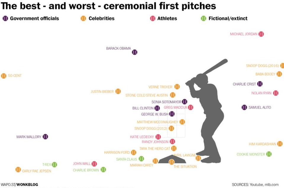
The Washington Post created a fun infographic of celebrity baseball pitches.

I use this graphic in my Data Analytics class. Students are tempted to draw inferences about individuals from this data set. John Wall and Michael Jordan are great athletes, but in this case they are underperforming Avril Lavigne and George W. Bush. Do we conclude that Sonia Sotomayor missed her calling as an MLB player?
The first lesson here is that we should not assume we can predict where Harrison Ford’s next pitch will go based on observing just one pitch. A single pitch should be considered a random draw from a distribution centered around Ford’s average ability. Any single pitch could be an outlier.
Snoop Dog features twice on this graph. In 2012 he got the ball in the strike zone. Had we only seen that, we would want to conclude that he is a great pitcher. However, in 2016 he was way off to the right. In either case, overconfidence that he is predictably near a single pitch would have been a mistake.
Lastly, I use this graph to illustrate the concept of overfitting (investopedia definition). I suggest a model that is obviously inappropriate. What if we conclude from these data that anyone with the last name of Bieber will not be able to throw the ball in the strike zone? That model surely will not generalize. The problem is that if we test that prediction on the same data we used to train the model, the misclassification rate will be zero. If possible, start with a large data set and set aside some portion of the data for validation, before training a model. Having validation data for assessment is a good way to check that you haven’t modeled the noise in your training set.