To tell me you need me? I see that you’re bleeding You don’t need to show me again But if you decide to, I’ll ride in this life with you I won’t let go ’til the end
So cry tonight But don’t you let go of my hand You can cry every last tear
These are the lyrics to the song sung by Lady Gaga in the closing credits of Top Gun: Maverick. This song has been on the Billboard Top 100 chart for 6 weeks. The film TG:M is on its way to breaking a billion dollars worldwide at the box office this year. People (millions of people in every demographic all over the world) want to see Tom Cruise, playing himself (j/k), save the day. At the end of the movie they expect you to want to cry, and then Lady Gaga tells you to just let it out.
The only bit of acting that was hard to believe in the movie was the guy who was trying to play the arrogant jerk. The writers were trying to inject some drama with his lines, but the whole cast was so good-hearted and earnest. These folks seemed about 2 meters from heaven, and I don’t just mean because of flying at high altitudes.
After seeing TG:M in theaters this weekend, I watched the original 1986 movie (free on Amazon Prime right now) for comparison. The locker room banter in TG1 seemed more genuinely mean-spirited. That was back when bullies were bullies and no one was afraid of getting canceled?
I love data, I love maps, and I love data visualizations.
While we tend not to remember entire data sets, we often remember some patterns related to rank. Speaking for myself anyway, I usually remember a handful of values that are pertinent to me. If I have a list of data by state, then I might take special note of the relative ranking of Florida (where I live), the populous states, Kentucky (where my parents’ families live), and Virginia (where my wife’s family lives). I might also take special note of the top rank and the bottom rank. See the below table of liquor taxes by State. You can easily find any state that you care about because the states are listed alphabetically.
A ranking is useful. It helps the reader to organize the data in their mind. But rankings are ordinal. It’s cool that Florida has a lower liquor tax than Virginia and Kentucky, but I really care about the actual tax rates. Is the difference big or small? Like, should I be buying my liquor in one of the other states in the southeast instead of Florida? Without knowing the tax rates, I can’t make the economic calculation of whether the extra stop in Georgia is worth the time and hassle. So, the most useful small data sets will have both the ranking and the raw data. Maybe we’re more interested in the rankings, such as in the below table.
But, tables take time to consume. A reader might immediately take note of the bottom and top values. And given that the data is not in alphabetical order, they might be able to quickly pick out the state that they’re accustomed to seeing in print. But otherwise, it will be difficult to scan the list for particular values of interest.
Back in May I mentioned that a study was recruiting participants to try a 4-week all-potato diet. What I didn’t say was that I was joining the study, and I finished this week.
I’m glad I did it; I lost 8 pounds and 2 inches of waistline, going from slightly overweight (BMI 26) to just barely not-overweight (BMI 24.9). Here are some of my notes:
Day 5: Energy boost kicked in today. Feel half my age
Day 6: Potato energy going strong. Feel like Irish Superman
Day 15: Almost too much energy, hard to sit down at a computer and work, took a break to play basketball
So like many people who previously tried this, I can add more anecdotal evidence of weight loss (despite eating all the potatoes you want) and energy. I’ll also echo people who said that “hunger feels different” and not as demanding, and that it “resets your tastebuds” so that previously bland foods taste good (I just had a turnip with zero seasoning and it was almost too intense). Now to answer your likely questions:
Q: Did you actually eat nothing but potatoes for 4 weeks?
A: No, but I got reasonably close. I cooked potatoes in avocado oil and added seasonings, I drank coffee and beer, I ate other vegetables, I had some snacks. Overall I estimate I got 75-80% of my calories from potatoes.
Q: Was it hard to stick to? didn’t you get bored?
A: Being hungry or even bored weren’t really issues, all 5 times I slipped up and ate a meal that wasn’t potatoes I’d say it was for social reasons (I was at a party with great food, at a restaurant with someone, et c)
Q: What kinds of meals did you cook?
A: Lots of home fries and roast potatoes using lots of varieties of potato (russet, gold, red, purple, sweet). Mashed potatoes a few times. McCain’s craft beer fries for my birthday.
Q: Aren’t potatoes bad for you?Why didn’t this make you fat?
A: Anything can be bad for you if you deep-fry it, or otherwise smother it with fats or process it to death. This is probably how most potatoes get consumed in America, but they start as nutritious root vegetables.
Q: What about protein? Doesn’t this kill your gains?
A: This was my biggest concern going into the study. Potatoes do have more protein than I thought, enough to live on but probably not enough to make you strong. My lifts did come down a bit, though it’s unclear if that was due to the lack of protein or just the lower calories and weight loss taking some muscle along with the fat. I was eating high-protein yogurt many days to try to mitigate this.
Q: If this is so great, are you going to keep doing it?
A: No, it was great for the first 14-16 days then just ok. Most of the weight loss and energy boost happened in the first half. If I ever do this again I’m going to plan on two weeks, which I think is also what Penn Jillette suggests. I do think I’ll do potatoes for lunch a lot more often than I used to, and pivot this to a “whole foods / not-ultra-processed” diet.
Q: Is there something special about potatoes? Would any single-food diet work as well?
I’m not sure. Some of the benefit likely comes from cutting out variety, so not eating a lot just because “I need to try everything”. Some likely comes from cutting out specific categories of food, like high fat / high sugar / hyper-palatable. I don’t think that just any food would work, probably most whole foods would, but potatoes are cheap and nutritious. The potato diet leading to weight loss is consistent with many, though not all theories of obesity.
Signups are now closed, but we plan to do more potato diet studies in the future. If you’re interested in participating in a future potato diet study, you can give us your email at this link and we’ll let you know when we run the next study.
We are going through some tough economic times right now: high rates of inflation (generally exceeding wage growth) with the strong possibility of a recession in the near future. In times like this, I think it is useful to also consider the historical perspective. The US economy has gone through challenging times in the past, but the long-run track record is impressive.
Here is one way to show the data. It comes from the Census Bureau, and shows the total money income of households in the US. The data is, of course, adjusted for inflation, and not just with the regular CPI-U: they use the superior CPI-U-RS, which attempts to maintain a consistent methodology for how prices are measured (BLS is constantly improving the CPI, but that sometimes makes historical comparisons challenging). I present the data both as a percent of the total number of households, and the absolute numbers.
I’ve shaded the chart to suggest that over $100,000 of annual income is high income, and under $35,000 is low income, with everything else considered “middle class.” By these definitions, the number of high-income households in the US increased dramatically from 6.6 million (10.9% of the total) in 1967 to 43.7 million (33.6% of the total) in 2020. The number of low-income households also rose, unfortunately, from 21.4 million in 1967 to 34 million in 2020, but the portion of the total fell (from 35.2% to 26.2%) since it increased slower than the overall growth of the number of households. Today, there are more high-income households (43.7 million) than low-income households (34 million) in the US.
But even if you don’t like those definitions, I’ve provided as much detail in the chart as Census makes available publicly. For example, let’s say you think $200,000 is what makes you high income. There were fewer than 1 million of these households in 1967 (1.3% of the total). Today, there are over 13 million of them (10.3% of the total). However we slice the data, there are a lot more high-income households in the US than in the past. (Remember remember, this is all adjusted for inflation.)
Many people found this data interesting when I posted it to Twitter, including the world’s richest person. But among the many objections raised is that this is driven by the rise of female employment and dual-income households. And indeed, that is a factor. But how much of a factor?
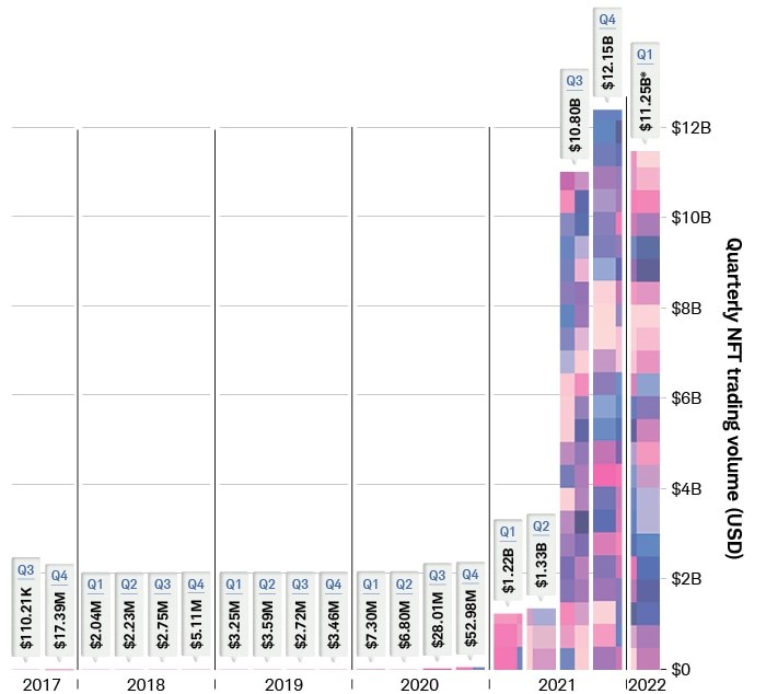
Saturday Night Live fans were introduced to Non-Fungible Tokens (NFTs) a year ago with this skit. Most people know that an NFT is a digital ownership certificate of some asset. That could be a physical asset, or a purely digital asset, like a crude graphic of an ape wearing a sailor’s hat which people are willing to pay hundreds of thousands or millions of dollars for.
The NFT market volume exploded in the second half of 2021:
On-line chain transactions as tracked by DappRadar. Source: Schwab.
The global NFT market is projected to grow from $1.9 billion in 2021 to $5.1 billion by 2028, an annual growth rate of some 18%.
But, why??? Why would people plunk down millions of dollars for just a certificate of ownership of something which may not be particularly beautiful or functional? It is just not something that would ever occur to me.
Part of the answer must be that there are a lot of people who have a lot of money that they don’t really need. This may be a function of the ever-increasing income inequality, but we will not go down that rabbit hole. But still, assuming some 30-something has 50 grand that he doesn’t need — why spend it on an NFT?
I did a real quick search on this topic. The most common reason appears to be the same reason many people buy rare coins or rare wines or other “collectibles” – they hope that someone else will pay them a higher price in the future. There also seems to be a sense of participating in some “community”, e.g., of Bored Ape Yacht Club aficionados. Much of it comes down to the psychology of what others will pay for something, which can be often explained in hindsight, but can be hard to predict if some asset class has not yet become “hot”.
It turns out that there are some other nuances to NFTs beside just hoping some “greater fool” will pay you more for the ownership of your ape drawing five years from now. I will conclude by pasting in some excerpts from an article on the Hyperglade blog, which frames the discussion partly in terms of the familiar economic concept of scarcity:
The key value proposition that NFTs often claim is scarcity. NFTs, as their name suggests, are each inherently unique on the blockchain, i.e. they can be attributed to a specific ‘hash’ or ID. But scarcity alone doesn’t drive value – it has to be a ‘scarcity’ that people want.
One of the first types of scarcity that people want is exclusivity. Exclusivity in this context means something that is very rare and has attributes of originality. Long before NFTs existed, collectibles took center stage in this arena. For example, trading cards, comic books, and antique toys were very valuable due to their scarcity and history associated with them. For example, the Captain America Comics No. 1, from 1941 sold for over $3 million! The NFT equivalent of this would be Jack Dorsey’s first tweet, which went for $2.9 million. Jack’s tweet illustrates the quintessential NFT qualities; distinct historical moment, a special creator, and only one of them.
Collectible NFTs come in many forms (in image, audio, or video formats), but the primary category is art (e.g. the Beeple NFT), followed by music, and sports moments (e.g. NBA top shot). Subsequently, given the depth of the cultural penetration of the content involved, collectibles are the most popular reason for investing in NFTs. According to Crypto.com’s NFT survey of ~30,000 polled users, 47% of those who own NFTs bought them for collectible value. Their primary motive – to be able to ‘flip’ (sell) at a higher price.
Access to a Network
More recently however, is the emergence of NFT collections that empower communities. These collections give holders access to special privileges, primarily access to special cryptocurrency related services and benefits (e.g. higher investment rates). For example, The famous Bored Ape Yacht club holders get to attend special events, E.g. in October 2021, members celebrated annual Ape Fest in New York City, Bright Moments Gallery.
Assets in virtual worlds and gaming
If you haven’t heard of them already, Virtual digital worlds are computer-simulated environments in which users roam around using their personal avatars. So NFTs neatly solve the problem of immutable land ownership. And depending on the demand, access and foot-traffic to certain places in these simulated world prices for virtual lands have skyrocketed. For example, even the cheapest land in decentraland exceeds $10,000. In a very similar way, web 3.0 games are expanding the use case by digitizing in-game assets so that they can be physically owned by players on the blockchain. In-game assets can include characters, cards, skins, etc. a list of which you can find here.
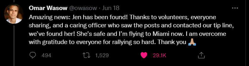
My mentality changed immediately. This was no longer a tragic event happening to an anonymous person in a context I had no capacity, nor obligation, to offer assistance. This was a problem and time was a factor. I started thinking about who I knew in Florida. Did I have any friends holding a position through which they could offer assistance? Was there a social cluster I was connected to I could reach out to through social media? Hospitals, law enforcement, travel. Who did I know? I became despondent when it became clear I had nothing to offer but a retweet.
After a few seconds I returned to reading what I realized was a thread of tweets only to be given the relief of wonderful news, a happy ending that was directly a product of sharing on twitter:
The arc of drama (from the privilege of my physical and personal distance from actual events) was over in less than 30 seconds. What I was left with was a simple truth: I was sympathetic, but comfortably detached from a tragic event actively unfolding. It wasn’t my problem nor was it something I could do anything about until I found out I knew someone involved.
Barely knew. I had exchanged a couple messages with Omar about a year ago. A handful of polite thoughts about something Omar tweeted that was of mutual interest. That’s it. That’s the totality of our interactions. But with it came a completely different framing, a level of connection that elevated an evocation of standard sympathy to a potential call to action.
Twitter, that engine of animosity and toothless rage, had made me care more about a stranger through the simplest of social connections.
Comedians and other entertainment professions often tell the same simple story about online trolls that goes something like this:
Someone writes something mean about the entertainer on twitter
The entertainer responds to the troll in a polite and controlled manner that invites them to more civil engagement or simply reveals that the trolls comments are hurtful.
The troll evaporates, replaced by a person excited to re-acknowledge the basic humanity and worth of their previous target.
A moment of direct interaction transforms, in the eyes of the troll, a previously two-dimensional narrative prop into a flesh and bone person worthy of dignity. We’re awash in the denigration of targeted individuals by detached opportunists seeking status and approbation through targeted cruelty. What is underappreciated is the opportunity in this moment for the target to reach back and give the troll what they actual want: to be seen.
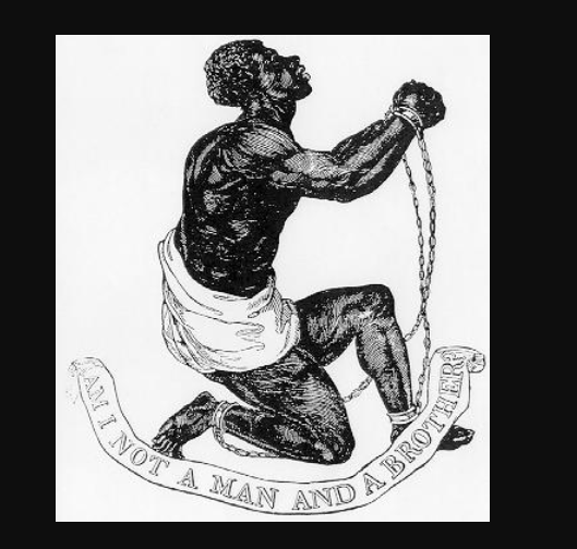
Not to be glib about such an important and horrifying part of our history, but this image blew people’s minds. In David Levy’s amazing history of how economics came to be referred to as “The Dismal Science”, he relates the efforts of Thomas Carlyle, Charles Dickens, John Ruskin, and other figures in English literature to deny the basic humanity of non-White men and women, particularly those from Africa and Ireland. Key to their efforts were stories, particularly those coupled with drawings, that explicitly portrayed the targets of their denigration as something far removed from humanity as a species. It was to their chagrin that the “Man and Brother?” image went the 18th century equivalent of viral.
It not only shocked households all over England to learn that the victims of the slave trade were clearly human in every sense of the word, it sparked an undeniable chain of logic. If these are men and women, then they can learn to read. If they can read, then they can come to know the Bible and their souls can be saved. If they can be saved then we have an obligation to teach them to read, offer them a Bible, and welcome them as brothers and sisters.
This image forced the reconsidered worth of others and with that reconsideration a calling for their liberation and salvation. This image, and others like it, changed who was human.
Social media is currently how many of us stay on the bleeding edge of news. It’s a way for us to promote ourselves and our work. It’s also a hellscape of acrimony, bad faith arguments, bullying mobs, and malicious propaganda. That’s what it is today. But that doesn’t mean that’s all it can ever be. Film and television changed the world as entirely passive, one-directional media. Most of the downsides of social media are born of interactions that, by little more than the inertia of the mob, often behave as if it were a one-directional media, carrying the masses along in the tidal wave of an irresistible narrative. There remains the possibility, the hope, that the capacity to interact meaningfully will eventually reclaim it as a multi-directional discourse, where the people we interact with become more real. More human. Where calls to serve can overwhelm and displace calls to destroy.
The story of social media isn’t over. There is still time for it to become something more. Where the people on the other side of claims and jokes and accusations become more human, not less. Where we broaden the ranks of who we offer our best to and shrink those whom we condemn with our worst.
In one sense, it seems like advice does not work. Advice is often ignored and sometimes even resented. People are going to just do what they want.
And yet, many people were in fact influenced by advice at some point in some situation. Many people can tell you about a mentor they spoke with or a book they read. Somehow, we do indeed need to learn about our environments and make choices about career and health and relationships. So, advice does work, sometimes.
A trivial example is why I stopped putting sugar in my coffee. A random anonymous message board post said that you should stop putting sugar in your coffee and your taste will adjust. “You won’t even miss it,” the anonymous poster told me. From that day forward, I stopped putting sugar in my coffee. I’m healthier and I don’t miss it. I was “nudged”. I was also predisposed to make this healthy decision, and I had sought out advice.
We might overestimate the effectiveness of advice because when people bother to talk about it, they mention the one time it affected them. First, they fail to mention the thousands of messages that had no effect (personally I still eat all kinds of junk food that contain sugar despite getting warnings to stop). And secondly, some decisions (perhaps including my coffee-sugar example) would have been made eventually without the advice event. Even recognizing those limitations, I still believe that messaging works sometimes.
It is tempting to think that, at almost zero cost, you could nudge people into making different decisions, just by sending them messages. There is a growing literature on this topic. Economists like myself are collecting data on whether it works.
One of these papers was just published:
Halim, Daniel, Elizabeth T. Powers, and Rebecca Thornton. 2022. “Gender Differences in Economics Course-Taking and Majoring: Findings from an RCT.” AEA Papers and Proceedings, 112: 597-602.
We implemented an RCT among undergraduate students enrolled in large introductory economics courses at the University of Illinois at Urbana Champaign. Two treatment arms provided encouragement to major in economics. A “prosocial” treatment provided information emphasizing the wide variety of career options and personal benefits associated with the major, while an “earnings” treatment provided information on financial returns. We evaluate the effects of the two treatments on subsequent choices to take another economics course and declaration of the economics major by the end of the student’s junior year using student-level matched administrative data. … Our primary aim is to evaluate whether women can be “nudged” into a major with low-cost, theoretically grounded, encouragement/information interventions.
Our primary sample consists of 1,976 students who were freshmen or sophomores during the focal course.
We find that the average male student receiving either treatment is more likely to take at least one more economics course after the focal course, but there is little evidence of increased majoring. The average woman appears unresponsive to either treatment.
Treated women with better than-expected focal-course performance are nudged to take an additional economics course. The likelihood that a woman takes another course in response to treatment increases by 5.6-5.9%-points with a favorable one-third- grade “surprise”. The hypothesis of treatment effects on women’s majoring, mediated or not, is rejected. Men’s susceptibility to treatment is invariant with respect to focal course performance.
Women did not demonstrate a bias towards a pro-social framing, and men did not demonstrate a bias towards a pro-earnings framing.
The pile of null results for messaging, when it is randomly assigned, is growing. It’s good to see null results get published though.
One of my current projects is related, but with a focus on computer programming instead of majoring in economics.
On May 6, 2022, the governor of Florida, Ron DeSantis, signed House Bill 7071. The bill was touted as a tax-relief package for Floridians in order to ease the pains caused by inflation. In total, the bill includes $1.2 billion in forgone tax revenues by temporarily suspending sales taxes that are levied on a variety of items that pull at one’s heartstrings. Below is the list of affected products.
A minor political point that I want to make first is that the children’s items are getting a lot of press, but they are only about 18.4% of the tax expenditures. The tax break on hurricane windows and doors received 37% of the funds and gasoline is receiving another 16.7%. There are ~$150 million in additional sales, corporate, and ad valorem tax exemptions. Looking at the table, it seems that producers of hurricane windows and doors might be the biggest beneficiary and that that the children’s items are there to make the bill politically palatable. Regardless, this is probably not the best use of $1.2 billion.
There are at least three economic points worth making.
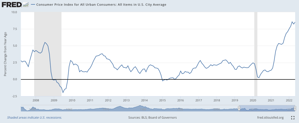
I think so, though the path back to 2% is a long one. Two months ago I wrote that “the Fed is still under-reacting to inflation“. We’ve had an eventful two months since; last Friday the BLS announced CPI prices rose 1% just in May, and that:
The all items index increased 8.6 percent for the 12 months ending May, the largest 12-month increase since the period ending December 1981
Then this Wednesday the Fed announced they were raising interest rates by 0.75%, the biggest increase since 1994, despite having said after their last meeting that they weren’t considering increases above 0.5%. I don’t like their communications strategy, but I do like their actions this month. This change in the Fed’s stance is one reason I think we’re at or near the peak.
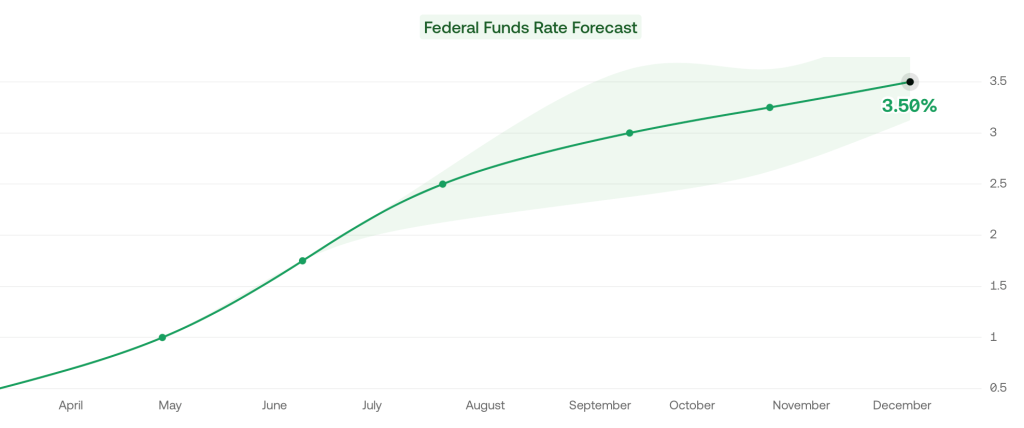
Its not just what the Fed did this week, its the change in their plans going forward. As of April, the Fed said the Fed Funds rate would be 1.75% in December, and markets thought it would be 2.5%. But now the Fed and markets both project 3.5% rates in December.
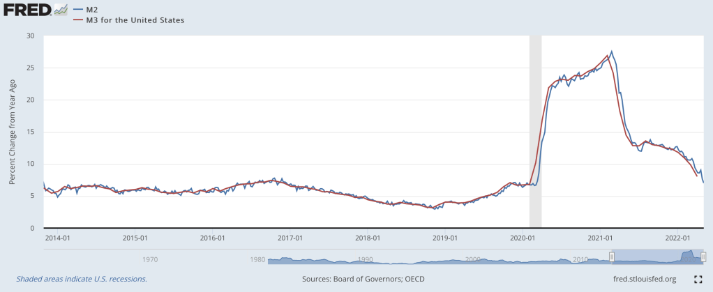
The other reason I’m optimistic is that the days of rapid money supply growth continue to get further behind us. From March to May 2020, the M2 and M3 supply exploded, growing at the fastest pace in at least 40 years:
Rapid inflation began about 12 months later. But the rate of money supply growth peaked in February 2021, then began a rapid decline. Based on the latest data from April 2022, money supply growth is down to 8%, a bit high but finally back to a normal range. Money supply changes famously influence prices with “long and variable lags”, so its hard to call the top precisely. But the fact that we’re now 15 months past the peak of money supply growth (and have stable monetary velocity) is encouraging. Old-fashioned money supply is the same indicator that led Lars Christiansen to predict this high inflation in April 2021 after successfully predicting low inflation post-2009 (many people got one of those calls right, but very few got both).
Stocks also entered an official bear market this week (down 20% from highs), which is both a sign of excess money no longer pumping up markets, and a cause of lower demand going forward.
Markets seem to agree with my update: 5-year breakevens have fallen from a high of 3.6% back in March down to 2.9% today, implying 2.9% average inflation over the next 5 years. Much improved, though as I said at the top the path to 2% will be a long one- think years, not months. Even the Fed expects inflation to be over 5% at the end of this year, and for it to fall only to 2.6% next year.
What am I still worried about? The Producer Price Index is still growing at 20%. The Fed is raising rates quickly now but their balance sheet is still over twice its pre-Covid level and is shrinking very slowly. The Russia-Ukraine war drags on, keeping oil and gas prices high, and we likely still have yet to see its full impact on food prices. Making good predictions is hard.
While I’m sticking my neck out, I’ll make one more prediction, though this one is easier- Dems are in for a bad time in November. A new president’s party generally does badly at his first midterm, as in 2018 and 2010. But this time the economy will be a huge drag on top of that. November is late enough that the real economy will be notably slowed by the Fed’s inflation-fighting effects, but not so late that inflation will be under control (I expect it to be lower than today but still above 5%). Markets currently predict a 75% chance that Republicans take the House and Senate in November, and if anything that seems low to me.
As you drive, walk, or bike around your city, what do you think about as you see the various buildings and other structures? Perhaps you think about the lives of the people in them, or the architecture of the buildings themselves, or the products and services that the businesses offer for sale. For me, lately I’ve been thinking about one thing as I make my way around town: zoning. It’s not something I had thought about before very much, but after reading Nolan Gray’s new book Arbitrary Lines: How Zoning Broke the American City and How to Fix It, I’ve been thinking about zoning a lot more.
(Disclosure: I know the author of the book, but I paid for my own copy and got it in advance through the luck of the Amazon-pre-order draw.)
The book does a wonderful job of explaining what zoning is (and importantly, also what it is not), where zoning comes from historically (it’s a development of the early 20th century), and how zoning affects our cities. I really like the way that the book encourages the reader to be a part of the story of zoning. In Chapter 2, Gray encourages you to put down the book and locate your city’s zoning map to learn more about how zoning impacts your life.
I immediately did so and had no trouble finding zoning maps for the city I live in, Conway, Arkansas. Conveniently, my city provides both a simple PDF map and an interactive map, which provides a lot more detail. The interactive map even has embedded links with historical information on different pieces of property. For example, I found the ordinance for when my college, the University of Central Arkansas (previously Arkansas State Teachers College), was annexed by the City in 1958. Pretty cool!
Looking over the map, it’s pretty clear that most of the city that I live in is covered by R-1 and R-2 zoning. But what exactly do these designations mean? You can probably guess that “R” designates residential, but what does it proscribe about land use?
For that, you must dig into the zoning ordinances. And as Gray cautions in the book (somewhat tongue-in-cheek), you might not want to get in too deep with your zoning ordinances, since they can run hundreds or thousands of pages. But I was brave enough to do so, and located my zoning code online (the PDF runs a modest 253 pages).
What did I learn about the zoning that covers my city?