I have a list of economics topics that I like to teach about because they conflict with the biases of my average student. The list includes fiat currency, inflation, deficits, net exports, and immigration. The list also includes the importance – or lack thereof – of the federal government’s debt. This post walks through a few graphs to do a gut-check of what we think is true and how it compares to reality. For example, do you have a sense of when the debt grew historically and when it was constant? Do you have a sense for when it shrank?
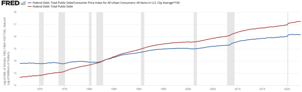
Below is a graph that includes both the logged nominal and real, inflation adjusted value of the debt. A few things stand out. First, the nominal debt (red line) tends to grow steadily, except when there are recessions. Then, the debt tends to level-up or even grow faster for a few years. We should also note that the only time that the nominal debt *fell* in the past 60 years was under President Clinton. Surprising to me is that the *real* value of the debt remained mostly constant in the 1960s and 1970s. Then, it slightly declined during the Clinton administration (nice!). Finally, inflation adjusted debt under President Biden has remained entirely constant or has slightly declined. Given the public discourse, these are not what I would have thought.
People also like to talk about the debt-GDP ratio. But, does that really matter? Arguably, every dollar of federal debt substitutes investment in some other endeavor. More likely than not, a healthy proportion of that investment would be for productive ends. But the debt-to-GDP ratio has relatively little to do with the severity or affordability of the federal debt. If the federal debt-to-GDP ratio is in excess of 100%, then that just means that we can’t pay off all of our debt all at once in one year. But, there is no reason to expect that to be applicable. Most individuals wouldn’t do that at the household level either.
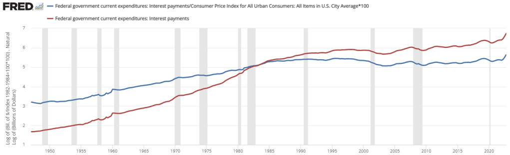
Rather, what matters for the affordability of our debt is the relative size of our debt payments. People and governments don’t default when they have high debt. They default when they can’t afford to service their debt. Below is a graph of both the logged nominal and the real value of our federal debt payments. Clearly, our nominal debt payment has grown (red), but more slowly since about 1985. In fact, the real value of our debt payment has been mostly *flat* for the past 35 years (blue). Only very recently has the value of our real debt exceeded the previous 1996 peak. The bottom line is that our debt payments have been more or less constant in purchasing power terms.
But even this is not the most important measure of the debt burden. People don’t default by having a high real value of debt. They default by having a high ratio of nominal debt payments-to-nominal income. Below is the size of our debt payments as a percentage of GDP. Prior to Covid, the national burden of our debt payments remained constant since about 2003. It’s true that recent interest payments compose a larger share of our income, but it’s nowhere near the historical highs. In the 1980s the federal debt payments topped-out at about 5% of GDP. Right now, we’re sitting at 3.25%. That’s higher than recent history, but it’s comfortably at about the 70-year average.


Hey Professor Bartsch, I’m doing a paper on the impact of government policies on healthcare costs in the United States. The healthcare marketplace seems to be a prime suspect of short-run inflation. During the period from 1960-2013, the price of medical care in the US dramatically increased by 1,806.43 %, approximately ten times higher than the growth of real GDP. The expansion of care is great yet the increase in price is not so much. The influence on price is related to government programs propping up healthcare costs. This is a long short-run situation, SO since we are in a healthcare bubble. When will it pop?
LikeLike