This is an update to a previous post that I did on per-capita real consumption in 1990 vs 2021. As of 2021, we still weren’t sure after the pandemic what was transitory vs structural, and it was unclear whether incomes would keep up with inflation. We now have three more years of data through 2024. News flash: We’re even richer.
I like to use the BEA real quantity indices. Those track what is actually consumed in volumes rather than by deflating total spending by price indices. Divided by population, we can calculate the real quantities of goods and services that people actually consumed per capita.
Even after the pandemic policies have settled down, we are still SO MUCH RICHER – and even richer than we were with all of the pandemic-related stimulus. The worst consumption category since the pandemic has been food and beverage for off-premise consumption, and that is *up* 4.6% since 2020, increasing 31% since 1990. So, while I understand that people can’t enjoy the the low prices of yesteryear, we are still better off in that category than pre-pandemic. In the other categories, everything is awesome.

Since 1990, our consumption of communication services has risen 332%, our houses are 254% better furnished, and we have 118% greater quality-adjusted clothing consumption. All of this is already adjusted for inflation and is per-capita. Since the pandemic, these numbers are still up by 20.4%, 9.8%, and 31.1% respectively. People didn’t like the post-pandemic inflation. I get that. But these improvements in average consumption are mind boggling.
Granted, total real per-capital consumption quantities are only up a measly 21% since 2020… Sorry, I really can’t say that in a dour tone. As Dave Chappelle says, ‘We’re rich!’. Since 1990, per capita consumption is up 86%. I remember the 1990s. They were good times given that I had my own room and didn’t pay rent. But we could also afford 46.2% less on average than we can today. How’s that for nostalgia?
Education services are the only area in which we consume less per capita than in 1990, by 12% (up 15% since 2020). All of the other categories in the above figure that I haven’t mentioned are up since 1990 between 31% & 88%. Again, those are *per capita* real, inflation adjusted quantities consumed**.
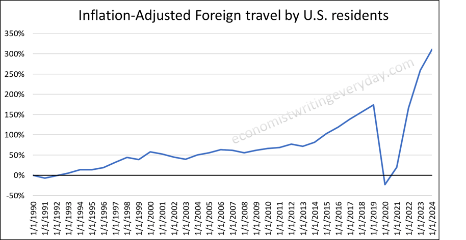
In my last post I separated Foreign travel by US residents because it had taken a heck of a beating in the wake of the pandemic. What does it look like now? It’s up 311% since 1990 and up 50% since pre-pandemic. Personally, my wife or I fly way more frequently and way more affordably now thanks to the big discount airlines. People like to belly-ache about the nickel-and-diming. All I can say is, ‘look at the graph’. We afford so much.
In summary, we were not richer in 1990, a popular demarcation of slower economic growth, than in 2024. We’re not a little bit richer now. We’re a crazy amount richer now. We’re a well-dressed, jet-setting, digitally-communicating-from-our-very-comfortable-house blessed country of people.
**I have to say both ‘real’ and ‘inflation adjusted’ because people are silly and will protest that it’s not the important one if I omit one.

One thought on “Per Capita Consumption: 1990 Vs 2024”