Henrik Karlsson read lots of biographies of geniuses and tried to sum up the things their childhoods had in common here. Some highlights:
At least two-thirds of my sample was home-educated (most commonly until about age 12), tutored by parents or governesses and tutors. The rest of my sample had been educated in schools (most commonly Jesuit schools).
As children, they were integrated with exceptional adults—and were taken seriously by them.
They had time to roam about and relied heavily on self-directed learning
A common theme in the biographies is that the area of study which would eventually give them fame came to them almost like a wild hallucination induced by overdosing on boredom. They would be overcome by an obsession arising from within.
They were heavily tutored 1-on-1
An important factor to acknowledge is that these children did not only receive an exceptional education; they were also exceptionally gifted.
There is lots of discussion of John Stuart Mill and John Von Neumann, who each had major contributions to economics:
When they were done, James Mill took his son’s notes and polished them into the book Elements of Political Economy. It was published the year John Stuart turned fifteen….
There is a moving scene in John Stuart Mill’s biography, when John Stuart is about to set out into the world and his father for the first time lets him know that his education had been . . . a bit particular. He would discover that others his age did not know as much as he did. But, his father said, he mustn’t feel proud about that. He’d just been lucky.
Let’s make more people lucky.
Other nice posts along similar lines are Erik Hoel’s “How Geniuses Used to Be Raised” (linked in Karlsson’s piece), and Scott Alexander’s review of Laszlo Polgar’s book “Raise a Genius” (about raising his 3 daughters to be chess grandmasters). Karlsson’s post, worth reading in full, is here.
I was writing up something for my graduating seniors about how to keep learning economics after school, and realized I might as well share it with everyone. This may not be the best way to do things, it is simply what I do, and I think it works reasonably well.
Blogs by Economists: There are many good ones, but besides ours Marginal Revolution is the only one where I aim to read every post
Podcasts on the Economy: NPR’s The Indicator (short, makes abstract concepts concrete), Bloomberg’s Odd Lots (deeper dives on subjects that move financial markets)
Podcasts by Economists: Conversations with Tyler and Econtalk (note that both often cover topics well outside of economics). Macro Musings goes the other way and stays super focused on monetary policy.
Twitter/X: This is a double-edged sword, or perhaps even a ring of power that grants the wearer great abilities even as it corrupts them. The fastest way to get informed or misinformed and angry, depending on who you follow and how you process information. Following the people I do gives you a fighting chance, but even this no guarantee; even assuming you totally trust my judgement, sometimes I follow people because they are a great source on one issue, even though I think they are wrong on lots of other things. Still, by revealed preference, I spend more time reading here than other single source.
Finance/Investing: Making this its own category because it isn’t exactly economics. Matt Levine has a column that somehow makes finance consistently interesting and often funny; unlike the rest of Bloomberg, you can subscribe for free. He also now has a podcast. If you’d like to run money yourself some day, try Meb Faber’s podcast. If you’d like things that touch on finance and economics but with more of a grounding in real-world business, try the Invest Like the Best podcast or The Diff newsletter.
Economics Papers: You can get a weekly e-mail of the new papers in each field you like from NBER. But most econ papers these days are tough to read even for someone with an undergrad econ degree (often even for PhDs). The big exception is the Journal of Economic Perspectives, which puts in a big effort to make its papers actually readable.
Books: This would have to be its own post, as there are too many specific ones to recommend, and I don’t know that I have any general principle of how to choose.
This is a lot and it would be crazy to just read all the same things I do, but I hope you will look into the things you haven’t heard of, and perhaps find one or two you think are worth sticking with. Also happy to hear your suggestions of what I’m missing.
We put my daughter on a waitlist for the daycare her siblings attended when she was one month old. Fourteen months later, she is still waiting, and we are looking around for other options. Almost every daycare I contact is full, with many saying their waitlists run into 2025.
This sounds like a classic shortage: demand exceeds supply at prevailing prices. But I am puzzled by such a shortage in the absence of price controls. Why don’t these daycares simply raise prices enough to eliminate their waitlists?
Theories:
The kind of person who runs a daycare is not inclined to act as a ruthlessly efficient profit maximizer. This probably explains some of it, but some of the daycares are literally publicly traded for-profit corporations, and they still have big waitlists.
Daycares deliberately underprice infant care as a loss leader to sell care to older kids. Sure, they could raise prices for infants and make more money today, but they want to make sure their preschool stays full down the road, and the easy way to do that is to keep infants as they age.
This is a temporary dislocation due to Covid. Demand fell off during Covid, some centers closed, then demand came back and the remaining centers are full. Perhaps opening a new center would be a good business, but regulation is slowing this down, or people just haven’t realized the opportunity yet.
I think there is something to each of these, but I still feel puzzled, especially since the most expensive locations seem to have the longest waits (at least here in Rhode Island). I can’t come up with a definite answer without lots more data on prices, waitlist sizes, entry, and exit. But I’d love to hear your theories.
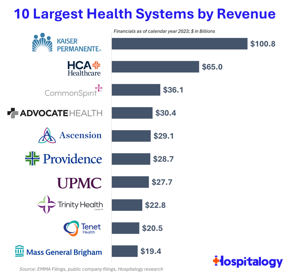
Health spending keeps rising, and hospitals keep consolidating, so the largest health systems in the US keep growing bigger. But getting exact data on how big is surprisingly difficult. So I appreciate that someone else did the work, in this case Blake Madden of Hospitalogy. Here are his top 10:
See his post for the full list of the largest 113 health systems, and details and caveats on the methodology. I have found that Hospitalogy generally has good coverage of the business of health care, and that following Blake on Twitter is a good way to keep up with it.
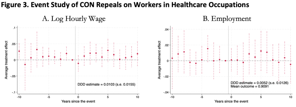
This was surprising to me, as I kind of expected CON laws to harm workers. Certificate of Need laws require many types of health care providers to obtain the permission of a state board before they are allowed to open or expand. This could lead to fewer health care facilities, and so less demand for health care workers, lowering wages and employment. It could also lead to less competition among health care employers, to similar effect.
On the other hand, less competition in the market for health services could raise profits, with room to share them in the form of higher wages. Or, CON being primarily targeted at capital expenditures like facilities and equipment could increase the demand for labor (to the extent that labor and capital are substitutes in health care). All these competing theories seem to cancel out to one big null when we look at the data.
We use 1979-2019 data from the Current Population Survey and a generalized triple-difference approach comparing CON-repealing to CON-maintaining states, and find a bunch of fairly precise zeroes. This holds for many different definitions of “health care worker”: those who work in the health industry, in health occupations, in hospitals, in health care outside hospitals, nurses, physicians, and more.
This is the first word on the topic, not the last; I wouldn’t be too surprised if someone down the road finds that CON does significantly affect health care workers. In this paper we pushed hard on the definition of “health care workers”, but not on “Certificate of Need” or “wages”. We simply classify states as “CON” or “non-CON” because that is what we have data for, but some states have much stricter programs than others, and some day someone will compile the data on this back to the 1970’s. The easier thread to pull on is “wages”. We use one good measure (the natural log of inflation-adjusted hourly real wages), but don’t do any robustness checks around it; considering “business income” could be especially important here. It is also possible that CON affects workers in other ways; we only checked wages and employment.
The full paper is here (ungated here) if you want to read more.
Last weekend brought me back to Temple University, ten years after graduating, for a conference of econ PhD alums. I had so many reactions:
Mixing a research conference with what is effectively a reunion or homecoming is a great idea for a PhD program, and more schools should do it. It brought together alumni from all different years, but it especially felt like a reunion to me since it’s been ten years since I graduated (not that I really know about reunions; I’ve never been to a high school or college one).
Philadelphia in general and Temple University in particular have gotten much nicer (though still gritty). Some of this I expected; the country is getting steadily richer, and it seems like every college is always on a building spree. But as with New Orleans, it is a city still well below its peak population that I first got to know in the aftermath of the great recession. Unemployment in Philly is now well under half what it was the whole time I lived there, and it shows.
Life is short. I was saddened, but not shocked, to hear that one of my professors had died. I was saddened and shocked to hear that one of my fellow students had.
As a kid, whenever I went back to one of my old schools, I usually felt nostalgia mixed with the feeling that everything seemed small. Then I thought this smallness was only about me having grown taller, but now I wonder. At Temple the economics department has changed buildings, but when I went back to the old building everything seemed small, despite me being the same size I was in grad school. But at the time the building loomed so large in my mind; I was so focused on the things that happened there, the classes and tests, the study sessions and writing in the computer lab, what the professors thought, and everything that it all represented. All that apparently made the rooms seem physically larger in a way they now don’t once I have graduated and the professors moved.
Temple PhDs are much more successful than I would have guessed at the time. It was hard for students attending what was then a bottom-ranked program during the Great Recession to be optimistic about our job prospects, especially when we worried we might fail out of the program (a valid concern when, afaik, only 4 of the 11 students in my year finished their PhDs). But things turned out great; just in the past 10 years from a small program there are many people who are tenured or tenure track at decent schools, who have research or important supervisory positions at the Fed, or who are making a name for themselves in the private sector (like Adam Ozimek).
Why have we so exceeded our low expectations? The improving economy helped. Economics PhDs from anywhere turned out to be a valuable degree. Perhaps our training was stronger than we gave it credit for at the time. I see two main tracks for success coming out of a lower-ranked program, where the school’s name alone might not open doors:
find some way to get your foot in the door of a major institution like the Fed system or a major bank, then work your way up. The initial way in could be something less competitive, like an internship or a job you don’t necessarily need a PhD for. But once you are in you will be judged mostly on your performance within the institution, not your credentials. In a panel on non-academic jobs, several alums emphasized that conditional on having enough technical skills to get hired, at the margin people/communication skills are much more important to advancement than further technical skills.
Temple’s economics PhD program paused admissions back in 2020, but is aiming to restart with a redesigned program in 2025.
The Federal Reserve Bank of Philadelphia just released the first report on a new survey they are conducting quarterly. Some highlights:
Respondents in January 2024 were more positive about their income prospects than respondents a year earlier; one-third believed their income will increase, compared with 29 percent in January 2023
Younger, more affluent, male, or non-White respondents report a more positive outlook, compared with one year prior. Those who are older than 55 or earn less than $40,000 report notably negative changes in their personal outlook, compared with respondents in the same demographic segments surveyed a year ago
When asked about their ability to pay all of their bills in full this month, 23.5 percent of respondents in January 2024 indicated that they could not pay some or any of their bills; this was 1.5 percentage points higher than in January 2023 (22.0 percent) and the highest rate in the last five quarters
Overall, I’d say it shows an economy with mixed performance, but leaning more positive than negative.
Source: My graph of LIFE Survey data
It will be interesting to see if this ends up taking a place in the set of Fed surveys that are always driving economic discussions, like the Survey of Consumer Finances and the Survey of Professional Forecasters. If they keep it up and start putting out some graphics to summarize it, I think it will. My quick impression (not yet having spoken to Fed people about it) is that it will be the “quick hit” version of the Survey of Consumer Finances. It asks a smaller set of questions on somewhat similar topics, but is released quickly after each quarter instead of slowly after each year. If they stick with the survey it will get more useful over time, as there is more of a baseline to compare to.
It seems like we finally have anti-obesity drugs that are effective and come without deal-breaking side effects: GLP-1 inhibitors like semaglutide (Wegovy). But they are currently priced over $10,000 per year for Americans. Should insurance cover them?
So far Medicare has decided to cover these drugs only to the extent that they treat diseases like diabetes (which these drugs were originally developed to treat) and heart disease (Wegovy reduces adverse cardiac events by 20% in overweight patients with heart disease). Just based on the diabetes coverage, Medicare was already spending $5 billion per year on these drugs in 2022, making semaglutide the 6th most expensive drug for Medicare with prescriptions still growing rapidly. The addition of other indications for specific diseases, like heart disease coverage added last month, is sure to expand this dramatically, especially if trials confirm other benefits.
But with almost 3/4 of Americans now officially overweight, weight loss makes for a bigger potential market than any specific disease. Medicare currently spends about 15k per beneficiary for all medical care; if they actually paid for an 11k/yr drug for 3/4 of their beneficiaries, their spending could rise to 23k per beneficiary per year. The effect on Medicare Part D, which covers prescription drugs and currently spends about 2.5k per beneficiary per year, would be even more dramatic, with spending quadrupling. This would blow a huge hole in the federal budget, where health insurance already accounts for about 1/4 of all spending (and Medicare 1/2 of that 1/4).
Of course, the reality would not be nearly that bad. Not all overweight people would want to take a weight loss drug, even if it were covered by insurance; the side effects are real. To the extent people do take the drugs, the reduction in obesity could lead to lower spending on treatments for things like heart attacks. Rebates can already reduce the cost of these drugs to be less than half of their list price, and Medicare may be able to negotiate even lower prices starting in 2027. Key patents will expire by 2033, after which generic competition should dramatically lower prices. Competition from other brand-name GLP-1 drugs could lower prices much sooner.
Patents always come with a tradeoff: they encourage innovation in the future, but mean high prices and under-use of patented goods today. The government does have one option for how to lower the marginal price of a drug without discouraging future innovation: just buy out the patent. This would likely cost hundreds of billions of dollars up front, but this could be recouped over time through lower spending, while bringing large health benefits because the drug would be much more widely used if it were sold at a price near its marginal cost of production.
Of course, for now supply of these medications is the bigger problem than the cost. Even with the current high prices and insurers tending not to cover drugs of weight loss alone, demand exceeds supply and shortages abound. The manufacturers are trying to ramp up production quickly to meet the large and growing demand, but this takes time. Insurers like Medicare covering weight loss drugs wouldn’t actually mean more people get the drugs in the short run, it would simply change who gets to use them.
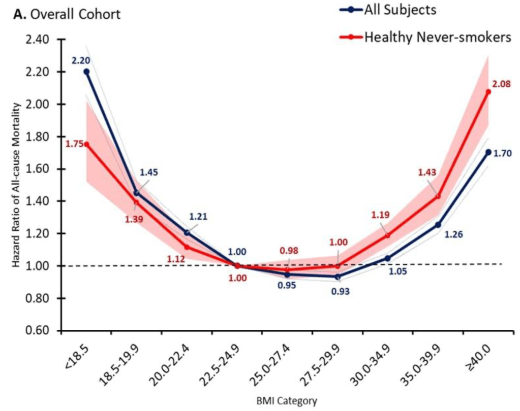
But once production ramps up, I do expect that it will make sense for Medicare to cover weight loss drugs. The health benefits appear to be so large that the drugs are cost effective even at current prices, and prices are likely to fall substantially over time. The big restriction I suspect will still make sense is to require that patients be obese, rather than merely overweight, since being “merely” overweight (BMI 25-29) probably isn’t that bad for you:
Update 4/18/24: I started thinking about this question because of an interview request from Janet Nguyen at Marketplace. She has now published an excellent article on the subject that also includes quotes from John Cawley of Cornell, who knows a lot more than I do on the subject.
Daniel Kahneman, the psychologist who won a Nobel prize in economics and wrote the best-selling book “Thinking Fast and Slow“, died yesterday at age 90. Others will summarize his biography and the substance of his work, but I wanted to highlight two aspects of his style that I think fueled his unusual success among both the public and economists.
Daniel Kahneman’s new book amazes me. Not so much due to the content, though I’m sure that will blow your mind if you haven’t previously heard about it through studying behavioral economics or psychology or reading Less Wrong. It is the writing style: Kahneman is able to convey his message succinctly while making it seem intuitive and fascinating. Some academics can write tolerably well, but Kahneman seems to be on a level with those who write popularly for a living- the style of a Jonah Lehrer or Malcolm Gladwell, but no one can accuse the Nobel-prize-winning Kahneman of lacking substance.
This made me wonder if it is simply an unfair coincidence that Kahneman is great at both writing and research, or causation is at work here. True, in more abstract and mathematical fields great researchers do not seem especially likely to be great writers (Feynman aside). But to design and carry out great psychology experiments may require understanding the subject intuitively and through introspection. This kind of understanding- an intuitive understanding of everyday decision-making- may be naturally easier to share than other kinds of scientific knowledge, which use processes (say, math) or examine territories (say, subatomic particles) which are unfamiliar to most people. Kahneman says that he developed the ideas for most of his papers by talking with Amos Tversky on long walks. I suspect that this strategy leads to both good idea generation and a good, conversational writing style.
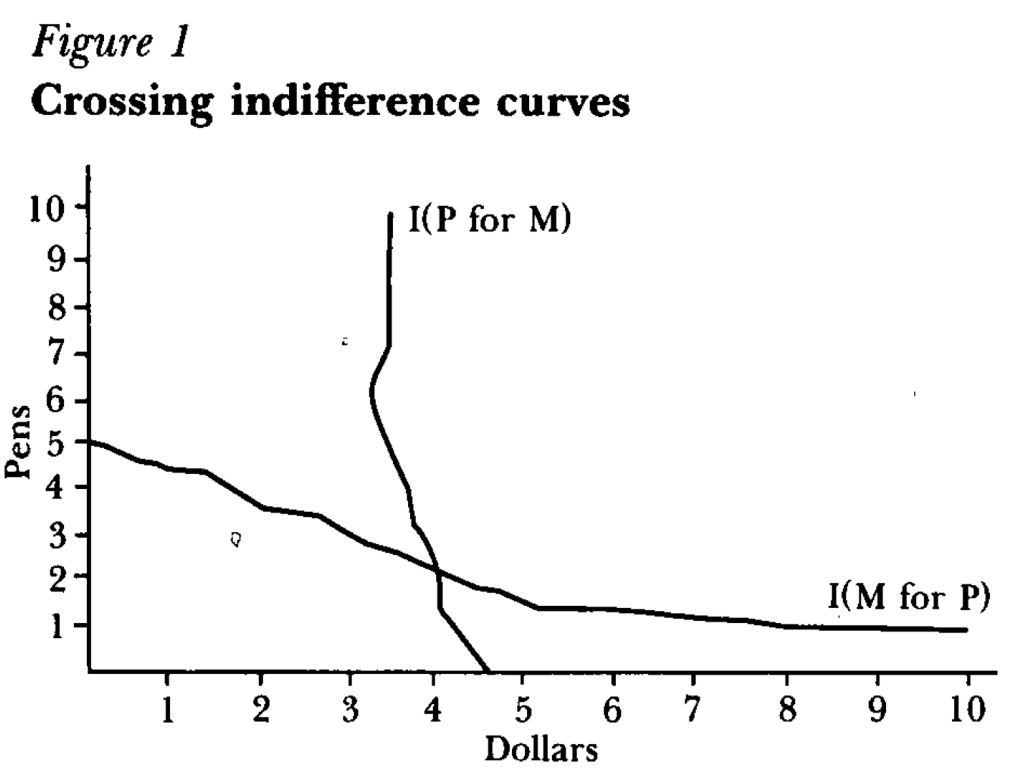
But how did a psychologist get economists to not just take his work seriously, but award him the top prize in our field? One key step was learning to speak the language of our field, or coauthor with people who do. For instance, summarizing the results of an experiment as showing indifference curves crossing where rationally they should not:
Finally, something that helped Kahneman appeal to all parties was that he avoided the potential trap of being the arrogant behavioral economist. Most economists have a natural tendency toward arrogance, kept somewhat in check by our belief that most people are fundamentally rational. Behavioral economists who think most people are irrational can be the most arrogant if they think they are the only sane one, and should therefore tell everyone else how to behave. But Kahneman avoided this by seeming to honestly believe he is just as subject to behavioral biases as everyone else.
I’ve always told my health economics students that Medicaid is both better and worse than all other insurance in the US for its enrollees.
Better, because its cost sharing is dramatically lower than typical private or Medicare plans. For instance, the maximum deductible for a Medicaid plan is $2.65. Not $2650 like you might see in a typical private plan, but two dollars and sixty five cents; and that is the maximum, many states simply set the deductible and copays to zero. Medicaid premiums are also typically set to zero. Medicaid is primarily taxpayer-financed insurance for those with low incomes, so it makes sense that it doesn’t charge its enrollees much.
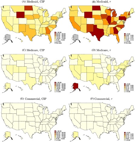
But Medicaid is the worst insurance for finding care, because many providers don’t accept it. One recent survey of physicians found that 74% accept Medicaid, compared to 88% accepting Medicare and 96% accepting private insurance. I always thought these low acceptance rates were due to the low prices that Medicaid pays to providers. These low reimbursement rates are indeed part of the problem, but a new paper in the Quarterly Journal of Economics, “A Denial a Day Keeps the Doctor Away”, shows that Medicaid is also just hard to work with:
24% of Medicaid claims have payment denied for at least one service on doctors’ initial claim submission. Denials are much less frequent for Medicare (6.7%) and commercial insurance (4.1%)
Identifying off of physician movers and practices that span state boundaries, we find that physicians respond to billing problems by refusing to accept Medicaid patients in states with more severe billing hurdles. These hurdles are quantitatively just as important as payment rates for explaining variation in physicians’ willingness to treat Medicaid patients.
Of course, Medicaid is probably doing this for a reason- trying to save money (they are also trying to prevent fraud, but I have no reason to expect fraud attempts are any more common in Medicaid than other insurance, so I don’t think this can explain the 4-6x higher denial rate). This certainly wouldn’t be the only case where states tried to save money on Medicaid by introducing crazy rules hassling providers. You can of course argue that the state should simply spend more to benefit patients and providers, or spend less to benefit taxpayers. But the honest way to spend less is to officially cut provider payment rates or patient eligibility, rather than refusing to pay providers as advertised. In addition to being less honest, these administrative hassles also appear to be less efficient as a way to save money, probably because they cost providers time and annoyance as well as money:
We find that decreasing prices by 10%, while simultaneously reducing the denial probability by 20%, could hold Medicaid acceptance constant while saving an average of 10 per visit.
Medicaid is a joint state-federal program with enormous differences across states, and administrative hassle is no exception. For administrative hassle of providers, the worst states include Texas, Illinois, Pennsylvania, Georgia, North Dakota, and Wyoming:
Source: Figure 5 of A Denial a Day Keeps the Doctor Away, which notes: “The left column shows the mean estimated costs of incomplete payments (CIP) by state and payer. The right column shows the mean CIP as a share of visit value by state and payer. “