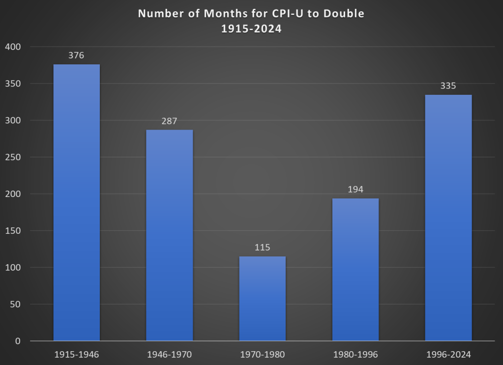
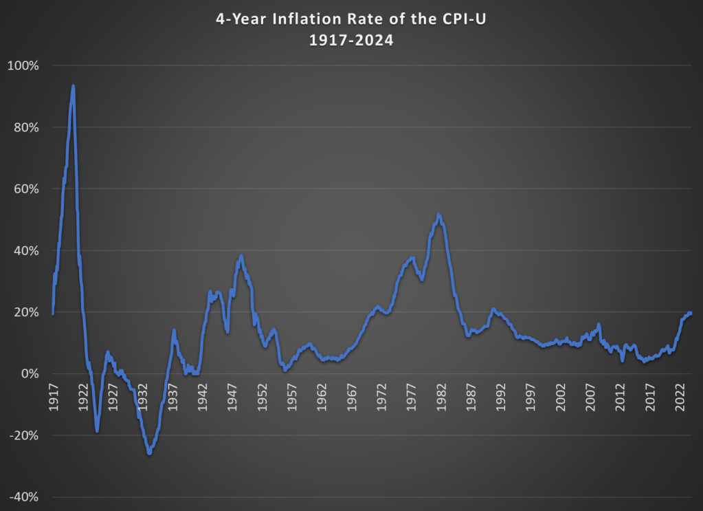
Lately on Twitter this chart has been going around:
The chart comes from Bloomberg journalist Justin Fox, who always puts together interesting economic data. You can read his interpretation of the data at Bloomberg, but the folks posting it on Twitter all seem to have the same shock and awe: Detroit was the richest big city in 1949. And of course we all know that today it isn’t. Still, the Detroit MSA has done OK since 1949, even though it is no longer anywhere near the top.
How well has Detroit done? Despite industrial decline and many other major problems, median household income of the Detroit MSA was around $71,000 in 2022 according to the Census Bureau. How does this compare to the $3,627 median income in 1949? It’s about double in real terms: you can multiply it by about 10 using the Census’ preferred inflation adjustment for household incomes since 1949 (the C-CPI-U since 2000, and the R-CPI-U-RS before that).
Let me start by saying high rates of inflation, especially unexpected inflation, is bad. Still, it is useful to have some historical context. We’ve experienced the highest inflation rates in a generation lately, especially in 2022, but past generations experienced inflation too. How to compare?
Here’s one approach. Using the latest CPI-U data, we can see that prices on average approximately doubled between March 1996 and February 2024. That’s 335 months to double, or just shy of 28 years. How long did it take prices to double if we keep moving backward in time from March 1996?
It only took 194 months for prices to double from January 1980 until March 1996, just a little over 16 years. Prior to January 1980, prices doubled even quicker, this time taking less than 10 years! Prior to that, it took 24 years for prices to double between WW2 and 1970, and before that you have to go back 31 years to 1915 for another doubling. Judged by this, our recent history doesn’t look so bad.
That doesn’t mean everything is OK. As I said above, unexpected inflation is the worst kind, since individuals and businesses aren’t planning for it. And we’ve had 20% inflation in the past 4 years — something not seen since 1991 over a 4-year time period. A 20%+ inflation rate is unusual to us today, but it certainly wasn’t in the past: basically all of the 1970s and 1980s had 20%+ inflation every 4 years, sometimes more than 40% or even 50%.
Finally, while unexpected inflation is bad, we also care about the relationship between wage increases and price increases. We can rightfully bemoan rapid, unexpected price inflation, but if wages are increasing faster than inflation, we are still better off (on average). The BLS average hourly wage series for production and non-supervisory workers only goes back to 1964, so we can’t do a full comparison with the CPI-U, but we can compare the three most recent doublings of prices.
Keep in mind with the chart above that prices (as measured by the CPI-U) increased by 100% for each of these time periods. So, for the 1970s and 1980-1996 periods, wages actually rose by less than rate of inflation — wage stagnation! If we used the PCE price index instead, those time periods still don’t look good: PCE prices increased by 88% for 1970-1980, 85% from 1980-1996, and 78% since 1996. With either price index, the 1996-2024 period is clearly the best of these three, and it’s not even really close.
Let me finish where I started: the recent inflation is bad. I don’t want to downplay that. But some historical perspective is also useful.
By now, hopefully we’ve all heard of shrinkflation. But if you haven’t, it’s when the unit price (e.g., the cost per pound) increases not because the price of the good went up, but because the product shrank in size.
Let’s be clear about a few things. First, this is nothing new. Here’s an Economist story from 2019 (pre-pandemic and pre-Bidenflation) talking about shrinkflation. You can find many such anecdotal stories back even further.
Second, the BLS is aware of this. They track it, and price it into the CPI. Take a look at the price data which underlies the CPI: it’s all stated in units. Price per pound, price per dozen, etc.
Moreover, the BLS also recently gave us some data on how frequently this happens. It’s pretty rare. Even among food items, which are a category the includes a fair amount of shrinkflation, only about 3 percent of products experienced any downsizing or upsizing from 2015-2021. That’s right, sometimes packages get larger, not smaller, which effectively lowers the unit price. “Shrinkdeflation” anyone?
Ignore the weird obsession with Biden’s ice cream habit. The Senator is concerned that NYC is not safe.
But what’s the reality? Here’s a map showing the homicide rate in each state, and its relative position to NYC (data is from the CDC for 2022, the most recent complete year available right now).
The light-colored states have a lower homicide rate than NYC (5.2 deaths per 100,000). There’s 18 of those states. But most states have higher homicide rates than NYC. Some are a lot higher, even triple NYC in a few states (colored purple). Alabama’s homicide rate of 13.9 deaths per 100,000 people is about 2.5 times as high as New York City.
But perhaps the homicide rates in these states are being driven by high homicide rates in cities in those states? Comparing a city to a state is perhaps a little strange to do, but I also often hear this retort: well, it’s those cities, especially “Democrat-controlled” cities, that are driving the high homicide rate in Alabama and elsewhere. And while this is true to a certain extent, comparing rural counties to New York City doesn’t make Alabama and the South look much better:
For this map I combined 2021 and 2022 data, because the CDC doesn’t report very small numbers (usually under 10 deaths), so grouping two years is needed to get more data. Even so, there are still a handful of states that don’t have enough homicides for CDC to report them over that two-year period, and they are shown in gray on the map (as well as states that have no rural counties: Delaware, Rhode Island, and New Jersey).
Notice that even focusing on just the rural counties, there are almost 20 states with higher murder rates than New York City. Again, some are double or even triple. Rural Alabama, at 11 deaths per 100,000 people, is exactly double NYC. Notably, the entirety of the rural South is higher than NYC.
If this is all true, why might New York City feel less safe? There are a number of possible explanations, but I’ll offer a few. First, homicide isn’t the only kind of crime. While it does correlate with other crimes, it’s not a 1:1 relationship, so it’s likely that some places with higher homicide rates than NYC have lower levels of assault, rape, or property crimes. These are even more challenging to compare across jurisdictions, but it’s a possible explanation. Related, NYC is a relatively safe big city! Other big cities wouldn’t compare as favorably to Alabama. But folks just seem to love NYC as a punching bag.
The other explanation is just the sheer number of people, and therefore homicides. According to the CDC, NYC had 434 homicides in 2022, that’s an average of more than one per day. You could literally turn on the news every single day and hear about a murder, and perhaps you had even been in the neighborhood where it happened recently. Contrast rural Alabama, which had 65 homicides in 2022. That’s only about one per week. And it might be happening in a completely different part of the state from you, so you either don’t hear about it or think “that’s somewhere else.”
But rural Alabama only has about 600,000 people. NYC has fourteen times as many people. So if we are trying to answer the question “What are the odds that a random person is murdered in a given year?”, we need to take population into account. That’s the logic of reporting homicide rates. Indeed it may feel like NYC is less safe, and that’s a natural human reaction. But that’s why the data is so important, to give us a sense of proportion.
Food prices are up a lot in the past few years. I’ve written about this several times in the past few months. In the US, we’ve seen grocery prices go up 20% on average in just 3 years. That’s much higher than we are used to: in the decade before the pandemic, the average 3-year increase was just 4%. In fact, the 3-year increase was negative for much of 2017 and 2018. To find increases this big, you have to go back to the late 1970s and early 1980s (when sometimes the 3-year grocery inflation rate was almost 50%).
But if it’s any consolation, this is not a problem that is unique to the US: food prices are up around the globe. That’s a relevant insight when we come to a recent viral video from Tucker Carlson’s visit to a Russian grocery store. Carlson says that the inflation and cost of groceries will “radicalize you against our leaders.”
So what has food price inflation looked like in Russia, the US, and the other G7 countries? (What used to be called the G8, until Russia invaded Crimea in 2014.) Here’s the chart:
Cumulatively since January 2021, when our current “leaders” came into power in the US, food prices are up 20% in the US, as I said above. But notice that this is on the low end for this group of countries. Japan, with consistently low inflation and occasionally deflation over the past few decades, has been the lowest over this timeframe (though even in Japan, food prices are up about 7 percent in the past year).
But notice who is the highest: Russia, where grocery prices are up 32% in the past 3 years. Certainly, their invasion of Ukraine and the resulting global sanctions plays a role in this, but even if we look at early 2022, the cumulative 15% food inflation was much higher than any G7 country.
So blaming our leaders for rampant inflation is probably not a good idea, especially if you are trying to portray Russia in a positive light.
Perhaps the more charitable interpretation of Tucker Carlson is that the nominal price of groceries is lower, rather than the rate of inflation (even though he does mention inflation in the video). The basket of food they purchase in the video comes out to the equivalent of about $100 at current exchange rates. Everyone on his crew guessed it would be around $400.
I can’t say whether their guess of $400 was accurate, but it would not be totally surprising if the prices of non-tradable goods were lower. This is what would expect in a country with lower wages. While we normally think of services as non-tradable, it’s also reasonable to assume that a lot of fresh food, such as produce, bread, and dairy, is also non-tradable (at least not without high transaction costs).
Carlson’s claim that people “literally can’t buy the groceries they want” is a much more apt statement of the state of affairs in Russia (and other poor countries) than it is in the US and Western Europe.
The average Russian allocates about 30% of their spending to groceries, similar to the Dominican Republic. And this data is from 2021, just before the massive spike in food prices in Russia. Meanwhile, the US is by far the lowest, at just under 7%. The UK, Canada, and Switzerland are the closest to the US, but they are in the 9-10% range. Food in the US is cheap.
The food inflation we’ve experienced in the US has been bad, the worst in a generation. But it’s not exactly clear that our “leaders” are to blame. And it’s also pretty clear that it’s much worse in the rest of the world, especially in Russia.
In a post from July 2021, I discussed housing affordability and “zoning taxes” — in other words, how land use restrictions such as zoning were driving up the cost of housing in some US cities. San Francisco, Los Angeles, Seattle, and New York stood out as the clear outliers, with “zoning taxes” adding several multiples of median household income to housing costs.
The paper I was summarizing used data from 2013-2018, and it’s a very well done paper. But so much has changed in the US housing market since that time. In my post, I pointed to a map from 2017 showing that a large swatch of the interior country still had affordable housing — loosely defined as median home prices being no more than 3 times median income.
To see how much has changed so quickly, consider these two maps for 2017 and 2022 generated from this interactive tool from the Joint Center for Housing Studies.
Regular readers know that I’ve written numerous times about the wealth levels of younger generations, such as this post from last month. Judged by average (and usually median too) wealth, younger generations are doing as well and often better than past generations. This is not too surprising, if you generally think that subsequent generations are better off than their parents, but many people today seem to think that progress has stopped. The data suggest it hasn’t stopped!
Now there’s a great new paper by Kevin Corinth and Jeff Larrimore which looks at not wealth but income levels by generation. The look at income in a variety of different ways, including both market income and post-tax/transfer income. But the result is pretty consistent: each generation has higher incomes (inflation adjusted) than the previous generation. Here’s a typical chart from the paper:
The year 2023 was a pretty good one for the economy, whether judged by the labor market or economic growth. Despite this good economic growth, total receipts of the federal government were down about 7 percent from 2022 (note: I’m using calendar years, rather than fiscal years). Here’s a chart (note: in NOMINAL dollars) of total federal revenue since 2009:
I want to stress that these are nominal dollars (there, I’ve said it three times, hopefully there is no confusion). Nominal dollars are usually not the best way to look at historical data, but for purposes of looking at recent government budgets, sometimes it is. Especially when revenue is declining: if I adjusted this for inflation, the decline in 2023 would be even larger!
You’ll notice also that the decline in 2023 is even larger than the decline in 2020, the height of the pandemic when many people were out of work due to government regulations and changes in consumer behavior. The 2023 decline is big!
So, what the heck in going on with federal revenue in 2023?
I’ve written numerous times about generational wealth on this blog. My biggest post was one comparing different generations using the Fed’s Distributional Financial Accounts back in September 2021. I’ve posted several updates to that post as new the quarterly data was released, but this post contains a major update. I’ll explain in great detail below about the updates, but first let me present the latest version of the chart (through 2023q3):
Regular readers will notice a few differences compared with past charts. The big one is that young people have a lot more wealth than it appeared in past versions of this chart! You’ll also notice that I have relabeled this line “Millennials & Gen Z (18+)” and shifted that line over to the left a few years to account for the fact that this isn’t just the wealth of Millennials, and therefore the median age of this group is lower than in my past charts. The two dollar figures I highlighted are at the median age of 30 for these age cohorts (unfortunately we don’t have data for Boomers at that age).
As we enter election season, I can sympathize with those that want to ignore it as much as possible. But if you do want to follow it closely, here is my advice: talk is cheap, so follow the money.
And by money, I am not referring to campaign contributions. I mean prediction markets, where people are putting their money where their mouth is, rather than just making predictions based on their own intuition (or their own “model,” which is just a fancy intuition).
There are a number of betting markets online today, but a good aggregator of them is Election Betting Odds.