Last night was a big win for Trump, but it was also a big win for prediction markets. In January 2024, I suggested that one of the best ways to follow the election was by following prediction markets. That prediction turned out to be correct!
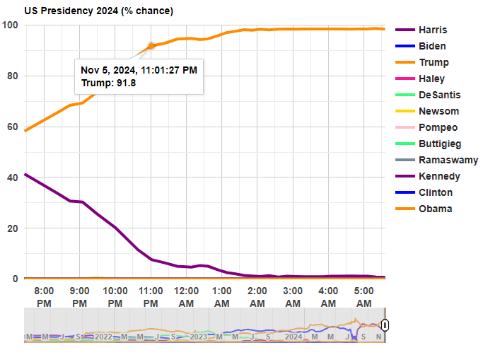
Before any polls had closed, prediction markets had Trump with about 60% odds of winning. That’s far from a sure thing, but it’s much better than many prediction models, which all had the race as basically a 50-50 toss-up with a very slight edge to Harris (though one simple model that I wrote about two weeks ago had Harris slightly losing the popular vote, a good call in hindsight). So going into the election results, you would have been more confident that a Trump win was a real possibility if you watched predictions markets
Last night after the results started coming in, the average over five different prediction markets from Election Betting Odds put Trump at over 90% odds by 11:00pm Eastern Time. By about 12:45am, he was already over 95%. These aren’t absolutely certain odds, but if you were watching the election night news coverage, they were still treating this as essentially a toss-up in the battleground states.
The Associated Press hadn’t even called Georgia, the second of the battleground states, by the time prediction markets were over 95% for the overall race! Decision Desk HQ, which is a very good source for calling races in real time, didn’t declare Trump the winner until 1:21am, when they called Pennsylvania (they also have a nice explanation of how they made the call). The AP didn’t declare Trump the winner until 5:34am, when they called Wisconsin.
Polymarket is the largest of the five markets in the Election Betting Odds average, and they are also a good source because they have markets for all of the battleground states (here’s the market for Michigan, which still hasn’t been called as of 11:30am on Wednesday by most news sources!). This table shows when the 90% and 95% thresholds were permanently crossed on Polymarket odds for each of the 5 early battleground states, in comparison with the DDHQ and the AP.
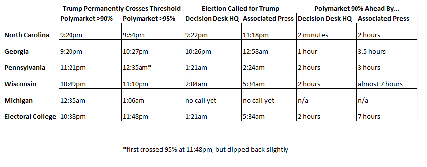
Notice that the 90% threshold consistently beats DDHQ by at least an hour (the one exception is North Carolina, where DDHQ called it very early — they are very good at what they do!). And the 90% threshold is consistently beating the AP by at least 3 hours.
None of this should be read as a criticism of the Associated Press. They should be cautious about predictions! But if you want to know things fast (or, before your bedtime in this case), prediction markets are clearly worth following.
How can prediction markets be so far ahead of media sources? Because there is a strong incentive to be right early: that’s how you make money in these markets! How exactly this is done is unclear, since the traders are all anonymous and we generally can’t ask them. But likely they are doing a similar analysis of counties results compared to the 2020 election, as DDHQ told us they did after the fact, just quicker (indeed, if you were watching news coverage, they were doing the same thing, just in an ad hoc way, and much more slowly).