Grocery prices are definitely up a lot in the past few years. I’ve wrote about thisseveral times before. But lately there has been a trend on social media to “post your receipts” and show how much your grocery prices have gone up. Unfortunately, very few people actually post the full receipts, often just showing the total, which leads to wild claims like prices being up 250% in just the past 2 years! That’s a huge contrast to BLS “food at home” category of the CPI, which shows an increase of 4.7% from July 2022 to July 2024 (it’s also unclear in the video what the exact date of the receipt is, he just says “2 years”). Depending on the exact base month, you’re going to be in the 20-25% compared with pre-pandemic or early pandemic using BLS data.
What if we actually looked at receipts? I tried such an exercise in November 2023, when there was another round of social media videos claiming prices had doubled in just a single year. My own personal receipt matched the corresponding BLS data pretty closely, but that was just one receipt with only eight items from Sam’s Club (which might not match grocery stores, for various reasons). At the time, I couldn’t find any good receipts from 2019 or 2020 (Kroger and Walmart drop old receipts in your account after about 2 years), but after scouring an old email account, I discovered two more receipts to compare. These are both from Walmart, in 2019 and 2020, and they contain a larger number of items than my Sam’s Club receipt (each with about a dozen and half items that are fairly typical grocery purchases, and I was able to find matching products today).
This morning the Bureau of Labor Statistics released the latest quarterly data for their Quarterly Census of Employment and Wages for the first quarter of 2024. Along with this release is the announcement of their preliminary “benchmark estimate” for March 2024, which will eventually (next year) be used to revise employment data for the Current Employment Statistics program. To keep all of the alphabet soup of programs clear in year head, CES is the more familiar “nonfarm jobs” data that is released each month, usually with some media fanfare.
Benchmarking is an important part of the process for many data releases, because the monthly CES data is based on a survey of employers, a subset of the total. But the QCEW data is the universe of employees — at least the universe of the those covered by Unemployment Insurance law, which is something like 97-98% of workers in the US. So the numbers will never match exactly (CES is supposed to be measuring all workers, not just the 97-98% covered by UI), but they should be pretty close. The media reports the CES monthly data more prominently, because it is more timely and usually pretty close to correct — but benchmarking is the process to see just how correct those initial surveys were.
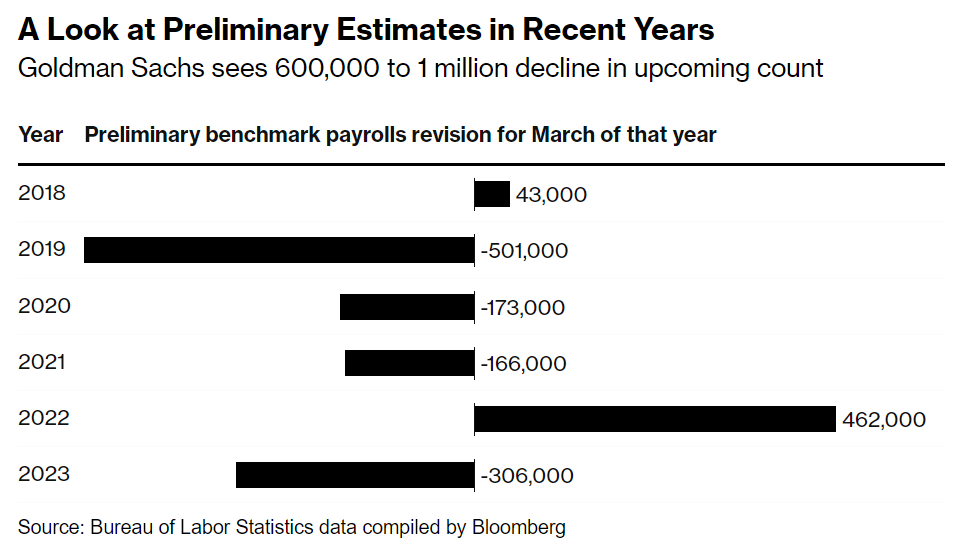
That brings us to the release today, which is the preliminary estimate of the benchmark adjustment for March 2024 (it will be finalized early in 2025). And that preliminary estimate was a big number, with a downward revision projected of 818,000 jobs. To put this in perspective, the current CES data shows 2.9 million jobs were added between March 2023 and March 2024, so this estimate suggest that the job growth was overstated by perhaps 40 percent. That’s a big revision, though large revisions are not unheard of: the same figure for March 2022 was an estimated 468,000 jobs higher, while March 2019 was 501,000 jobs lower. But this year is a big one (largest absolute number since 2009). Here’s a chart summarizing recent years revisions from Bloomberg:
I’ve covered this topic before, such as an April 2024 post where I noted that as of September 2023, there was an 880,000 gap in job growth between the CES and QCEW over the prior year. So this was not unexpected, and in the days leading up to the report, close followers of the data were forecasting that the revision could be up to 1 million jobs.
As I wrote last November, the question “are you better off than you were four years ago?” is a common benchmark for evaluating Presidential reelection prospects. And even though Biden is no longer running for reelection, voters will no doubt be considering the economic performance of his first term when thinking about their vote in November.
The good news for American wage earners (and possibly Harris’ election prospects) is that average wages have now outpaced average price inflation since January 2021. Despite some of that time period containing the worst price inflation in a generation, wages have continued to grow even as price growth has moderated. Key chart:
For most of Biden’s term, it was true that prices had outpaced wages. But no longer.
The real growth in wages, admittedly, is not very robust, despite being slightly positive. How does this compare to past performance under recent Presidents? Surprisingly, pretty well! (Lots of caveats here, but this is what the raw data shows.)
Recently there has been some discussion in the Presidential race about the taxation of parents vs. childless taxpayers. The discussion has been ongoing, but it was kicked up again when a 2021 video of J.D. Vance resurfaced where he said that taxpayers with children should be lower tax rates than those without children. There was some political back-and-forth about this idea, much of it tied up in the framing of the issue, with the usual bad faith on both sides about the fundamental issue (in short: most Democrats and a small but growing number of Republicans support increasing the size of the Child Tax Credit).
Let’s leave the politicking aside for a moment and focus on policy. As many pointed out in response to Vance’s idea, we already do this. In fact, we have almost always done this in the history of the US income tax — “this” meaning giving taxpayers at least some break for having kids. For most of the 20th century, this was done through personal exemptions which usually included some tax deduction for children, and later in the century the Child Tax Credit was added (after 2017, the exemptions were eliminated in favor of a large CTC). Other features of the tax code also make some accounting for the number of children, most notably the size of the Earned Income Credit.
The chart below is my attempt to show how the tax breaks for children have affected four sample taxpaying households. What I show here is sometimes called the “zero bracket” — that is, how much income you can earn without paying any federal income taxes. The four households are: a single person with no children, a married couple with no children, a single person with two children (“head of household”), and a married couple with two children. All dollar amounts are inflation-adjusted to current dollars
The concept of “fiscal illusion” has long existed in public finance, but it is difficult to test. The basic theory is that people will underestimate how much they pay in taxes, as well as underestimate government expenditures. A forthcoming paper in Public Choice by Kaetana Numa uses survey data from the United Kingdom to test the theory, and finds support. From the abstract of “Fiscal illusion at the individual level“:
“providing personalized fiscal information reduces support for higher taxes and spending and increases support for lower taxes and spending. These findings indicate that taxpayers underestimate both their tax liabilities and the costs of public services.”
The paper uses a “novel personalized fiscal calculator” to estimate how much tax an individual would actually owe. It then randomizes which taxpayers get this information, and finds that “the treated respondents… were less supportive of raising taxes and more supportive of cutting taxes than the respondents in the control condition.”
And the results are large. For all taxes, in the treated group that saw their personalized fiscal calculator, 61 percent support cutting taxes, versus just 50 percent in the control group. The differences show up across the major taxes that individuals pay in the UK, including the income tax, national insurance contributions (both employer and employee sides), and the VAT. There is no tax category where the treatment group is more likely to want to increase the tax, though the VAT and the smaller Fuel duty and Council tax are about equal on the percent wanting an increase (but the median response for these last two is to decrease the tax — in both the control and treatment groups).
Do these results from the UK hold up in other developed nations? Possibly. In a 2014 Eurobarometer survey, the percent of EU citizens that could correctly identify their nation’s VAT rate varied widely. The high was 89 percent in Germany correctly identifying the rate, down to 31 percent in Ireland. The average was 65 percent — though the UK was at the low end with only about 47 percent correctly identifying the VAT rate.
Fiscal illusion appears to be a real issue, and probably an important one in the UK.
Among the former G8 countries, Russia has by far the highest cumulative inflation rate since January 2020, almost double the amount of inflation we’ve seen in the US and in most G7 countries. No doubt the effects of the wartime economy are contributing to this, but even in February 2022 before they invaded Ukraine, their inflation still had clearly been worse.
The US is on the high end for this group, but pretty close to the median. Japan looks really good on inflation, but that’s probably not much comfort to them since their economy is still smaller than before the pandemic. By this measure, the US looks pretty good (chart from Joey Politano):
GDP estimates for Russia are a little tricky because of the war, but according to IMF estimates, Russia’s economy in 2023 was about 5.6% larger than 2019 in real terms.
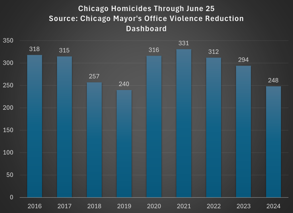
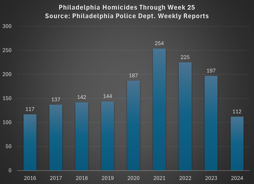
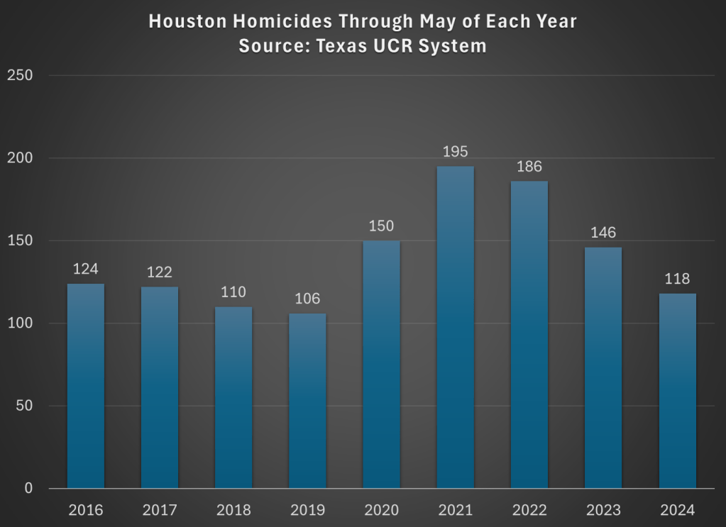
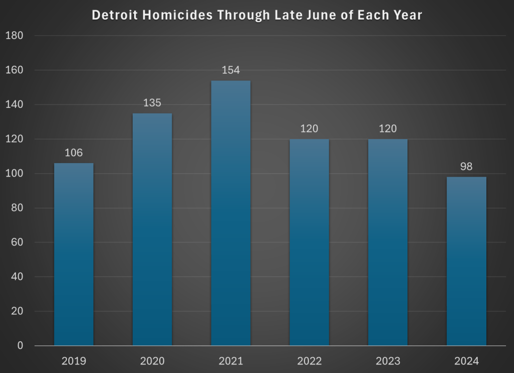
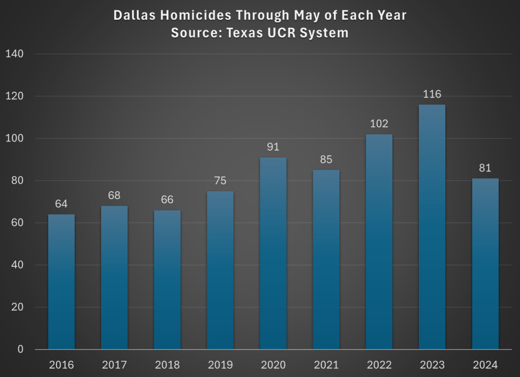
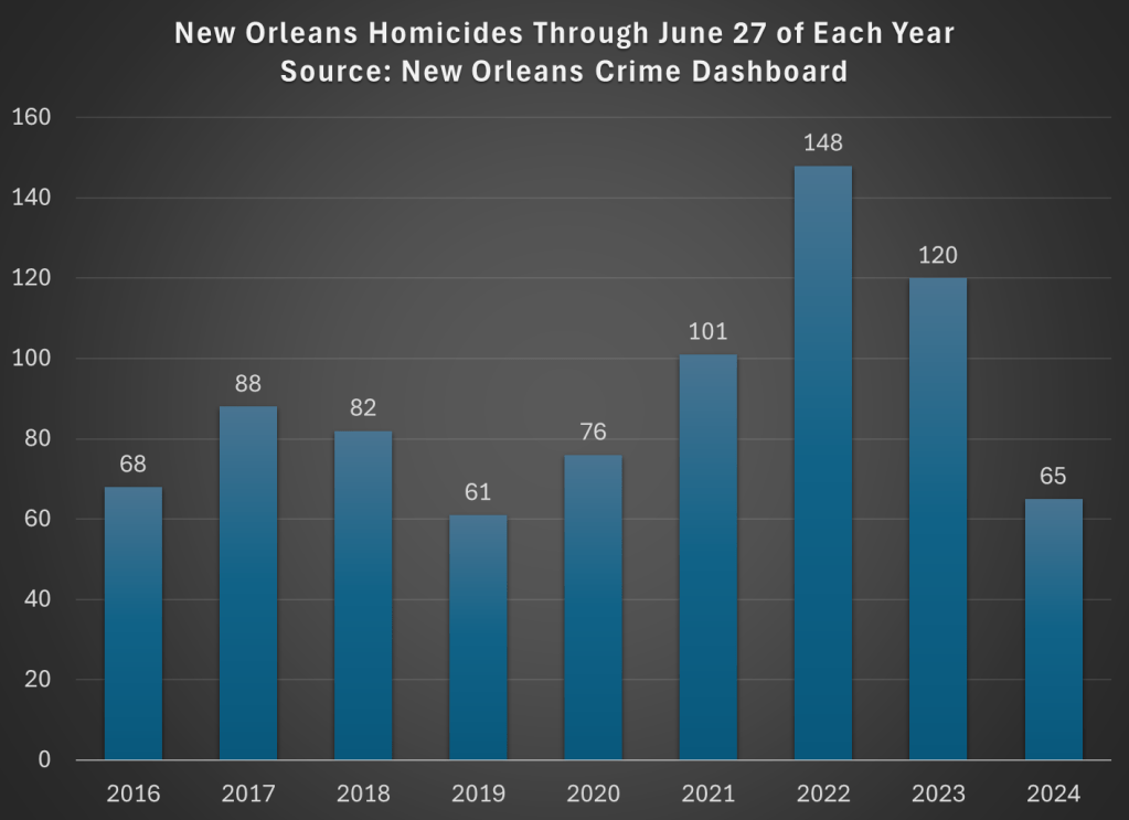
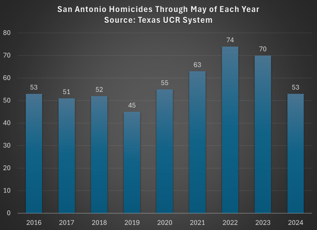
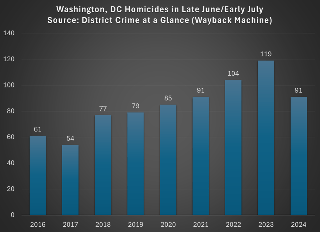
Crime of all forms certainly spiked in 2020 and 2021 in most of the US, and continued to remain high for a time after that. But recent data, especially homicide data compiled by AH Datalytics, suggest that crime is falling. When measured by homicide rates, the worst of crimes and the least likely to be underreported, homicide rates across 272 major cities in the US is down 17.6% in 2024 compared with the same period in 2023. And among the 20 cities with the most homicides in 2023, just one (Birmingham, the 20th on the list) saw an increase from 2023 to 2024.
But is this just coming down from a relative high? Are homicide rates still elevated from pre-pandemic? I went through the cities with the most homicides on the AH Datalytics list, and for those where I could find comparable data pre-pandemic, I created the following charts. As you will see, lots of these cities are down to or below pre-pandemic levels (for the period in 2024 that is comparable to prior years). Not every single city, of course, but most are close to 2019 or prior years.
From a new working paper “The Price of Housing in the United States, 1890-2006” by Ronan C. Lyons, Allison Shertzer, Rowena Gray & David N. Agorastos (emphasis added):
“Zoning was adopted by almost every city in our sample during the 1920s. We see a slightly steeper gradient over the next two periods (coefficients of .48 and .29, respectively). In these periods it is possible both that the existing zoning regimes were causing higher price growth and that home price appreciation was incentivizing cities to adopt even more restrictive measures, particularly by the 1970s (Fischel, 2015; Molloy et al., 2020). The gradient in the final period (1980-2006) is even steeper, however (coefficient of .67), suggesting a closer relationship between zoning and home price appreciation towards the end of the 20th century.”
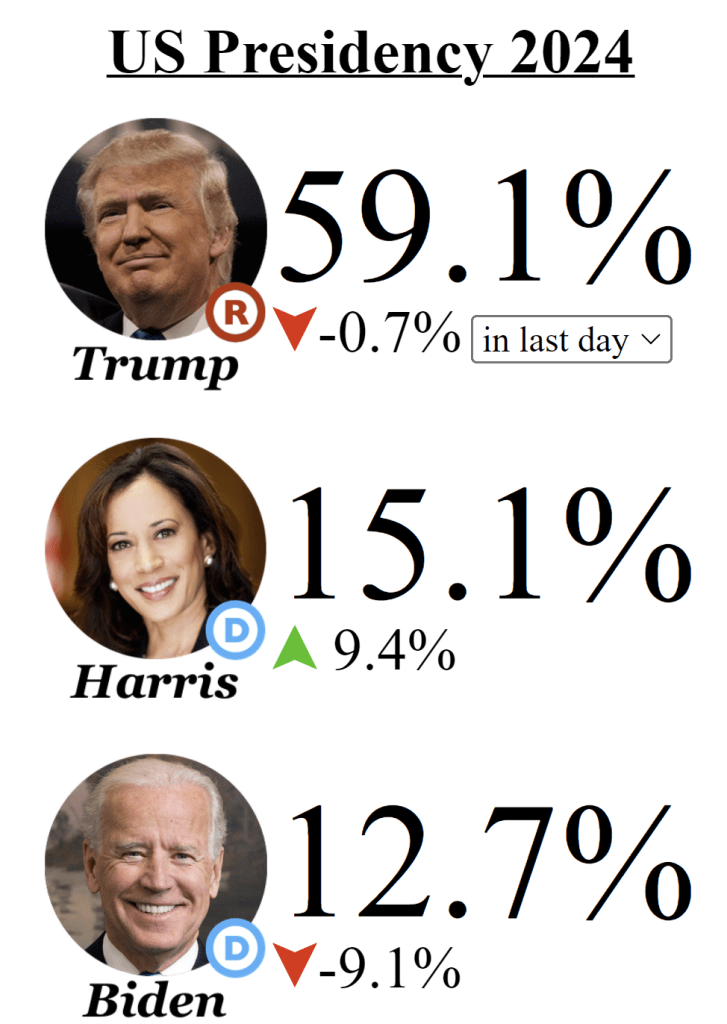
Back in January I encouraged you to follow the money in the Presidential race, by which I meant follow the betting markets. I suggested this was a good way to cut through the sometimes inaccuracy of polls, and the uncertainty of listening to any one expert or group of experts. Bettors in prediction markets can take all of these into account.
Lately of course the big question in the Presidential race is whether Biden will actually be the Democratic nominee. There is much uncertainty right now, and you will all kinds of predictions from experts, media quoting “inside sources,” and other such rumors. How are you, as a relatively uninformed outsider, supposed to know who to trust?
The answer again I will suggest is: watch the betting markets. And if you check the betting markets today (aggregated across multiple markets by EletionBettingOdds.com), you will see that Biden and Kamala Harris have roughly equal chances of becoming the next President (and Trump is about a 60% favorite):
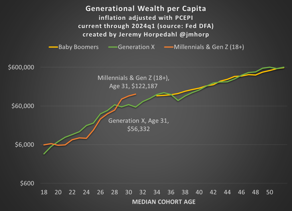
First, here is an updated chart on average wealth by generation, which gives us the first glimpse at 2024 data:
I won’t go into too much detail explaining the chart here, as I have done that in more detail in pastposts. But one brief explanatory note: I’m now labeling the most recent generation “Millennials & Gen Z (18+).” Because of the nature of the data from the Fed’s DFA, I can’t separate these two generations (it can be done with the Fed SCF data, but that is now 2 years old). This combined generation now includes everyone from ages 18 to 43 (which means that technically the median age is 30.5, not quite 31 yet), somewhere around 116 million people, which makes it a bit of a weird “generation,” but you work with the data you have. Note though that this makes the case even harder for young Americans to be doing well, as every year I am adding about 400,000 people to the denominator of the calculation, even though 18-year-olds don’t have much wealth.
What’s notable about the data is just how much the youngest “generation” in the chart has jumped up in recent years. They have now have about double the wealth that Gen X had at roughly the same age. Average wealth is about as much as Gen X and Boomers had 5-6 years later in life — and while there are no guarantees, odds are Millennial/Gen Z wealth will be much, much higher in another 5-6 years. You may notice at the tail end of the chart that Gen X and Boomers now have roughly equal amounts of average wealth at the same age (Gen X’s current age), while 2 years ago they were $100,000 ahead. I suspect this is just temporary, and Gen X will soon be ahead again, but we shall see.
Of course, the most common complaint about my data is that these are just averages, so they don’t tell us a lot about the distribution of wealth and could be impacted by outliers. That’s why I’m really excited to share this new data on wealth by decile from the 2022 Fed SCF survey. This data was put together by Rob J. Gruijters and co-authors, and it allows us to compare the wealth of Boomers, Gen X, and Millennials across the wealth distribution. You should read their analysis of the data, but in this post I’ll give my slightly different (and optimistic) interpretation of it.
For all three generations, wealth in the bottom 10% is negative when that generation is in their 30s. And for Millennials, it is the most negative: -$65,000 compared to -$30,000 for Gen X and -$17,000 for Boomers in the bottom decile (as always, the figures are adjusted for inflation). While I haven’t dug into the data, my suspicion is that student debt is driving a lot of the increase. Since this is households in their 30s, I suspect a lot of the bottom decile is composed of folks that just finished graduate and professional school, and are only now starting to acquire assets and pay down debt — they have very high earning potential, which means over their lifetime they will do great, but they are starting from behind. Again, we’ll have to wait and see, but I suspect many in the bottom will quickly climb up the wealth distribution over their working years.
That being said, in the following chart I have left off the bottom 10% for each generation, since displaying negative wealth would make the chart look a little weird. But this chart shows a very optimistic result: Millennials are doing better than Boomers across the distribution, and Millennials are ahead of almost all deciles for Gen X except a few, where they are essentially equal to Gen X (2nd, 7th, and 8th deciles).
The chart may be a little confusing (give me your suggestions to improve it!), but here’s how to read it. The blue bars show Millennial wealth relative to Gen X, at the same age, for each decile (excluding the bottom 10%). For example, the first bar shows that Millennials in the 2nd wealth decile had 100% of the wealth that Gen Xers in the 2nd wealth decile had at the same age — in other words, they were equal. The orange bars show Millennial wealth relative to Baby Boomer wealth at the same age, in the same decile (to repeat, it’s all adjusted for inflation).
Notice that other than the very first bar (Millennials vs. Gen X in the 2nd wealth decile), all of the other bars are over 100%, indicating that Millennials have more wealth than the two prior generations for almost every decile. For some of these, they are much, much greater than 100%. In the 5th decile (close to the median), Millennials have over 50% more wealth than Gen X and almost 200% (double the wealth) of the wealth of Boomers. That’s a massive increase!
A pessimistic read of the chart is that the biggest gains went to the top 10%. Though notice that’s only true relative to Baby Boomers. When compared with Gen X, the 4th and 5th deciles did better than the top 10% in terms of relative improvement. To relate this to the earlier chart in this post, it suggests that relative to Boomers, outliers at the top end might be skewing the average a bit, but that’s probably not the case relative to Gen X. And again, the broad-based gains are visible throughout the distribution from the 2nd decile on up.
Finally, on social media I’ve got several objections about the chart, such as folks not liking the log scale y-axis, and preferring the CPI-U for inflation adjustments instead of the PCEPI that I use. For those objectors, here is a different version of the chart: