The chart originates from Statista, as you can see from the label in the image. But it is very frequently shared on social media, Reddit, and elsewhere (often with the Statista label clipped), occasionally generating millions of views and lots of heated comments.
But it’s a bad graph. In so many ways. Let’s break them down.
The data comes from BLS’s Consumer Expenditures Survey. I use this data frequently, as regular readers probably know. The data in the viral chart is from 2021 (more on that in a moment), but if I create a similar chart using the most recent data in 2023 but also include spending by those older than Baby Boomers (primarily the Silent Generation), you will notice a curious thing:
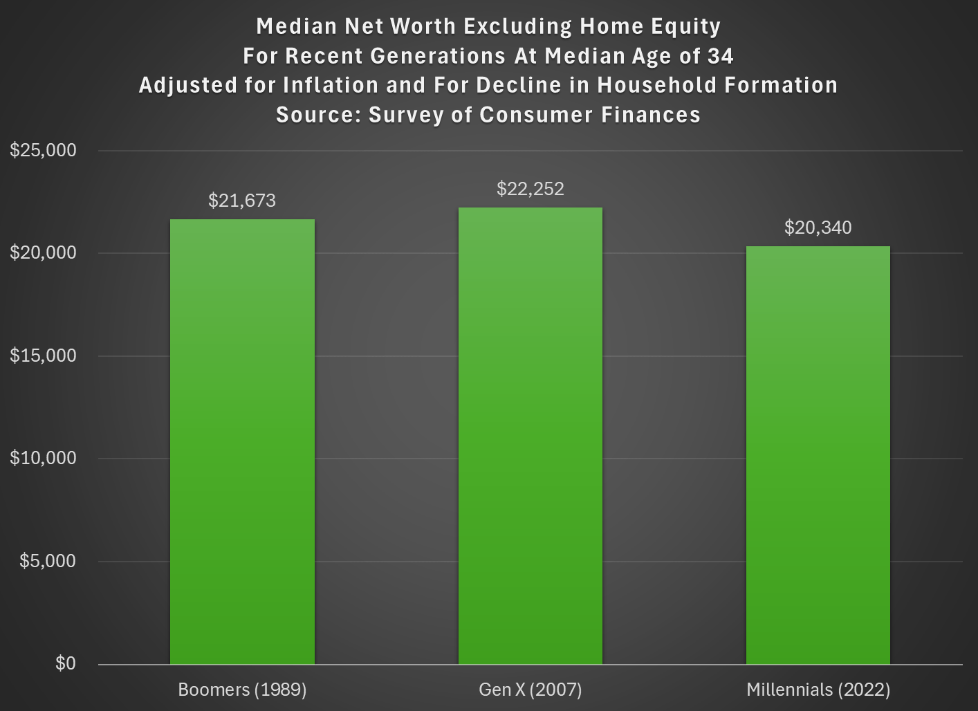
Last week I tried to address whether rising wealth for younger generations was primarily driven by rising home values. My analysis suggested that it was a cause, but not the only cause. Here’s another chart on that topic, showing median net worth excluding home equity for recent generations:
Two things are notable in the chart. For millennials, even excluding home equity they are well ahead of past generations, though of course their net worth is much smaller excluding this category of wealth (the total median net worth for millennials in 2022 was $93,800). But for Gen X in 2022 (last data in that chart), they are slightly behind Boomers, never having recovered from the decline in wealth after 2007 (primarily from the stock market decline, since we’re excluding housing).
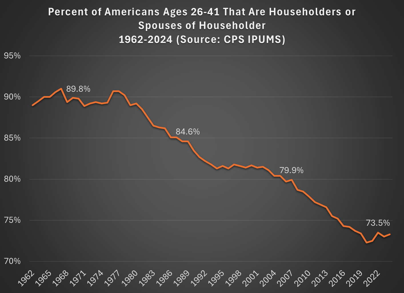
But today I want to address another general objection to the wealth data found in the Fed’s SCF and DFA programs. That objection has to do with household formation. Specifically, these surveys are calculated for households, and the age/generation indicators are for the household head (or “householder” as it is now called). And we know that household formation has been declining over time, as more young people live with parents, with roommates, etc. So the Millennial data we see in the chart above is excluding any Millennials that have not yet formed their own household.
Here’s a general picture of the decline, which has been happening gradually since about 1980. Note: I use the age group 26-41, because this is the age of Millennials in 2022 (the most recent SCF survey year). The highlighted years on the chart are when the Silent, Baby Boomer, Gen X, and Millennial generations were about the same age (26-41).
What this means is that when we are looking at households in these wealth surveys (or any survey that focuses on households) we aren’t quite comparing apples to apples. Does this mean the surveys are worthless? No! With the microdata in the SCF, we can look at not only the median value, but the entire distribution. Since the household formation rate has fallen by about 11 percentage points between Boomers in 1989 and Millennials in 2022, one solution is to look up or down the distribution for a rough comparison.
For example, if we assume all of the 11 percent of non-householders among Millennials have wealth below the median, we can make a rough correction by looking at the 39th percentile for Millennials — the 39th percentile would be the median if you included all of those 11 percent of non-householders as households. Similarly, for Gen X would move down 5 percentage points in the distribution to the 45th percentile in 2007.
The household-formation-adjusted chart does paint a more pessimistic picture than just looking at the median for each generation: the 39th percentile Millennial has about 20% less wealth than the median Boomer did at roughly the same age. Seems like generational decline! Is there any silver lining?
First, you should interpret the chart above as a worst case scenario for Millennial wealth. It assumes all non-householders have low wealth. But likely not all of them do. If instead we use the 43rd percentile of Millennials in 2022, their net worth is $61,000, slightly above Boomers at the same age. (The household formation problem isn’t going away anytime soon as generations age — even if we look at Gen Xers, with a median age of 50 in 2022, their household formation is still 6 percentage points behind Boomers at that age.)
Second, my worst case scenario almost certainly overstates the problem. If all of those 11 percent fewer Millennials not yet forming households were to get married to other millennials, it would only add half of that many households to the aggregate distribution (when two non-householders get married, it becomes one household). So instead of moving down 11 percentage points to the 39th percentile, we should only move down 5 or 6 percentiles. The 44th percentile of Millennial net worth in 2022 was $63,060 — again, compare this to Boomers in the chart above.
Finally, if we combine both of the adjustments discussed in this post, looking at wealth excluding home equity and also adjusting for the decline in household formation, we get the following chart (here I once again use the 39th percentile for Millennials and the 45th percentile for Gen X, i.e., the worst case scenario):
With this final adjustment, we get a slightly different picture. The wealth of these three generations is roughly the same at the same age. No increase in wealth, but no decline either. You could read this as pessimistic, if your assumption is that wealth should rise over time, but the general vibes out there are that young people are worse off than in the past. This wealth data suggests, once again, that the kids are doing all right.
As I have discussed in many previous blog posts, young people today have a lot more wealth than past generations at the same point in their life. But we also know that housing prices have increased dramatically in recent years, and that for most families their home is their largest source of wealth.
Does this imply that the increase in wealth young Americans have seen is primarily driven by increased housing prices? If so, this would paint a less optimistic picture of the wealth of young people today, since the value of your home that you usually can’t easily convert into other consumption.
If we look at the past 5 years (2019Q4 to 2024Q4), the total wealth US households under the age of 40 increased by $5 trillion, in nominal terms. That’s not adjusted for inflation, but we don’t need to do so because we can look at how much each asset class increased in nominal terms as well. The total value of assets for households under age 40 increased by $5.86 trillion.
Here’s how the various classes of assets have increased since 2019Q4:
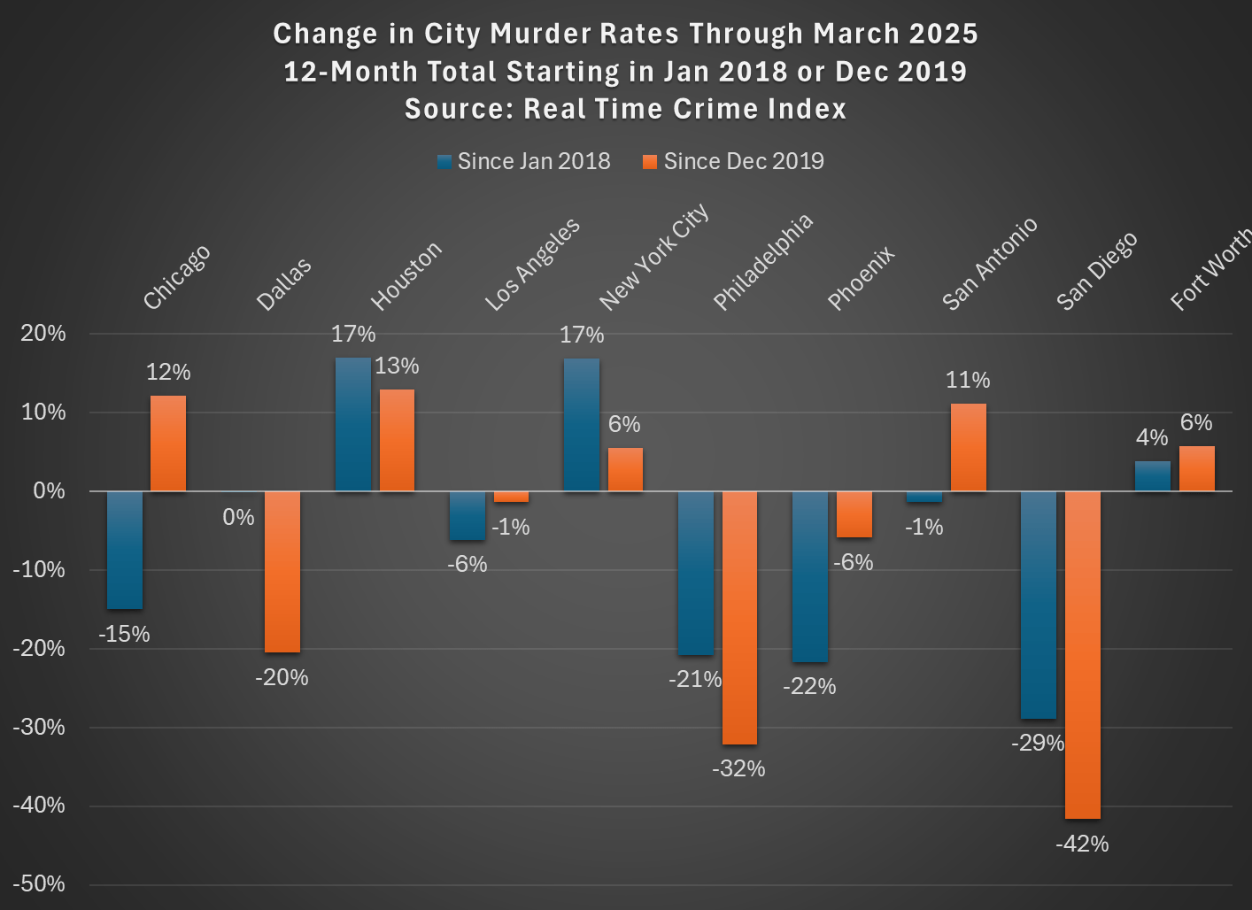
We all know that homicides spiked in the US in 2020 and we all (hopefully) know that homicides have been falling across most of the country dramatically since the end of 2021. But have homicides started to get back to, or even below, pre-pandemic levels? Or is it merely reversing the 2020 increases?
The answer depends on the city and the pre-pandemic baseline! The chart below shows the 10 largest cities (with Fort Worth instead of Jacksonville, because the Real-Time Crime Index doesn’t include the latter) in the US, using a base of either January 2018 (the first month in the RTCI) or December 2019 (just before the pandemic, and murders had fallen nationally between these two dates):
The murder data comes from the Real-Time Crime Index, and it is a 12-month total so we shouldn’t have to worry about seasonality even though the months are different. I use Census annual city population estimates to calculate the rates (and estimate 2025 based on the growth from 2023-24).
As you can see, depending on the base timeframe used, about half of the cities saw declines, a few were roughly flat, and some definitely saw increases. New York, Houston, and Fort Worth are definitely still elevated. Los Angeles, Philly, Phoenix, and San Diego are definitely down. The others are either close to even or mixed depending on your baseline.
Keep in mind these data are only through March 2025. As both Billy Binion at Reason and Jeff Asher have both recently emphasized, if we use the most recent data for many cities, it’s entirely possible that 2025 will end up having some of the lowest homicide rates ever recorded for many US cities. The declines in early 2025 have definitely been big, but mostly they are just a continuation of the post-2021 decline.
Again, for clarification, all of these cities are down from their 2020-21 peaks: using September 2021 as the base (when the national murder rate roughly peaked), these 10 cities are down between 31% and 58%. Big improvements!
SPOILER ALERT if you are watching the TV Series Yellowstone: at the start of Season 5, John Dutton (played by Kevin Costner) is sworn in as Governor of Montana. One of his first proposals in his inaugural address is that the state legislature “double property taxes for non-residents” who have been buying up vacation homes in the state, and contributing to the increase in property values in the state (a fact which drives many plotlines throughout the series). This episode aired in November 2022.
This week, the real governor of Montana signed a pair of bills which effectively did what the fictional governor John Dutton proposed: significantly increasing property taxes on non-residents. Starting in tax year 2026, the property taxes for non-primary residences (which will include non-Montana residents and Montanans who own vacation homes) will be based on 1.9% of market value, while Montana residents will pay a graduated rate structure for their primary residence: 0.76% for property up to the state median (currently about $340,000), 0.9% up to two times the state median, 1.1% for the value between 2 and 4 times the state median, and 1.9% (the same as non-residents) for the value of homes above 4 times the state median ($1.36 million currently). Currently residential property is taxed at 1.35% of market value, meaning that while the rate hasn’t fully doubled for non-residents, most non-residents will be paying twice or more in property taxes than Montana residents.
I was a non-resident member of the Montana Property Tax Task Force, and served on the “Tax Fairness” subcommittee where the plan for HB 231 originated, so I have somewhat of a unique perspective on these changes to property tax rates. I will offer a few thoughts, some of which are critical, but let me first say that it was a great honor to be asked to serve on the Task Force by Montana’s Governor. Also, everyone on the Task Force was very friendly and receptive to ideas from outsiders (I was one of three non-Montanans on the Task Force), and so my comments here are not critical of the Task Force process nor anyone on it. As I did when I served on the Task Force, my goal in this post is to try, as best as I can, to objectively analyze how this proposal (now law) will impact Montana.
Has it gotten easier or harder for Americans to afford the basic necessities of life? Part of the answer to this question depends on how you define “basic necessities,” but using the common triad of food, clothing, and housing seems like a reasonable definition since these composed over 80% of household spending in 1901 in the United States.
If we use that definition of necessities, here is what the progress has looked like in the US since 1901:
The data comes from various surveys that the Bureau Labor Statistics has collected over the years, collectively known as the Consumer Expenditure Surveys. The surveys were conducted about once every 1-2 decades from 1901 up until the 1980s, and then annually starting in 1984. Some of these are multi-year averages, but to simplify the chart I’ll just state one year (e.g., “1919” is for 1918 and 1919). The categories are fairly comprehensive: “food” includes both groceries and spending at restaurants; “housing” includes either mortgage or rent, plus things like utilities and maintenance; and “clothing” includes not only the cost of the clothes themselves, but services associated with them such as repairs or alterations (much more important in the past).
We can see in the chart that over time the share spent on these three areas of spending has declined dramatically, taken as a group. Housing is different, but it has been fairly stable over time, mostly staying between 22% and 29% of income (the Great Depression being an exception). There are two time periods when these costs rose: the Great Depression and the late 1970s/early 1980s. Both are widely recognized as bad economic times, but they are aberrations. The jump from 1973 to 1985 in spending on necessities was fully offset by 2003, and today spending on necessities is well below 1973 — even though for housing, it is a few percentage points greater.
A chart like this shows great progress over time, but it will inevitably raise many questions. Let me try to answer a few of them in advance.
Claims that the middle class or working class has been “hollowed out” in the US have been made for years, or decades really. The latest claim is an essay in the Free Press by Joe Nocera. But these claims are usually lacking in data, while strong in anecdotes. Let’s look at the data.
Notice that the latest data point is for 2024, which is the highest they have ever been in this data series, and likely higher than any point in the past. While many point to about the year 2000 as when troubles for the working class started (this is when manufacturing employment really fell off a cliff, and China joined the WTO in 2001), inflation-adjusted earnings have risen 11% for this group of workers since then. You might say that’s not a lot of growth — and you would be correct! But this group is better off economically than in the year 2000, which is a point that gets lost in so many discussions about this issue.
But that’s just a national number. Might some states that were especially hit by manufacturing job losses be worse off? Nocera mentions North Carolina and the Midwest. To answer this, we can use BLS OEWS data, which has not only median wages by state, but also the 10th percentile wage — the lowest of the working class. Here’s what median real wage growth (again inflation-adjusted with the PCEPI) since 2001 (the earliest year in this series with comparable data):
The 2025 first quarter GDP data came in slightly bad: negative 0.3%. I think the number is a bit hard to interpret right now, but it’s hard to spin away a negative number. A big factor pulling down the accounting identify that we call GDP was a massive increase in imports, specifically imports of goods. It’s likely this is businesses trying to front-run the potential tariffs (and keep in mind this was pre-“Liberation Day,” so probably even more front running in April), so the long-run effect is harder to judge.
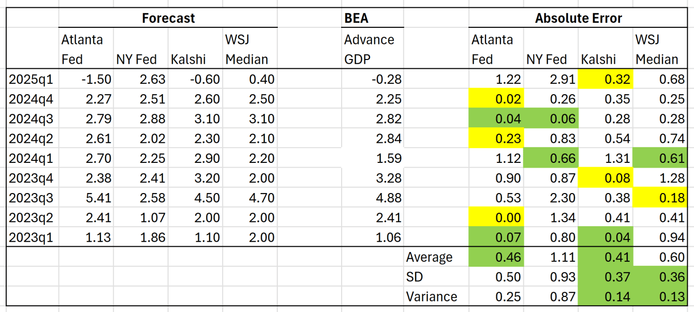
But aside from the interpretation of the GDP estimate, we can ask a related question: did anyone predict it correctly? I have written previously about two GDP forecasts from two different regional Federal Reserve banks. They were showing very different estimates for GDP!
Both the Fed estimates ending up being pretty wrong: -1.5% and +2.6%. But there are two other kinds of forecasts we can look at.
The first is from a survey of economists done by the Wall Street Journal. The median forecast in that survey was positive 0.4%. This survey got the direction wrong, but it was much closer than the Fed models.
Finally, we can look at prediction markets. There are many such markets, but I’ll use Kalshi, because it’s now legal to use in the US, and it’s pretty easy to access their historical data. The average Kalshi forecast for Q1 (a weighted average of sorts across several different predictions) was -0.6%. Pretty close! They got the direction right, and the absolute error was smaller than WSJ survey. And obviously, much better this quarter than the Fed models.
But this was just one quarter, and perhaps a particularly weird quarter to predict (Atlanta Fed even had to update their model mid-quarter, because large gold inflows were throwing of the model). You may say that weird quarters are exactly when we want these models to perform well! But it’s also useful to look at past predictions. The table below summarizes predictions for the past 9 quarters (as far back as the current NY Fed model goes):
Today the stock market does seem to move a lot on the news about Trump’s ever-evolving tariff policy. If you see the S&P 500 is up today, you can probably guess that Trump or his advisors slightly backed off some aspect of their previously announced tariff policy. And vice versa. That much is true.
But back in 2020, the implied correlation in the market was briefly over 80% in the spring of 2020, and was over 50% for almost all of the summer of 2020. Today, the correlation is closer to 40%. That’s a bit lower than 2020, but it is a significant jump from where it was 2-3 months ago.