In surveys more than two-thirds of Americans say they are are struggling with the cost of groceries. And yet, relative to average wages:
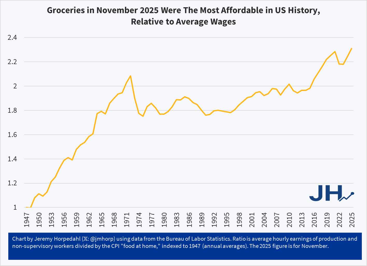
The chart shows a simple measure of relative grocery affordability. Starting with the levels of wages and grocery prices in 1947, if in any year wages increase more than prices, the line goes up (it can also go down, as it does in some years). Cumulatively, you can see that today groceries are over twice as affordable as in 1947.
You could reasonably complain that there hasn’t been much progress since the early 1970s. Fair enough. But there has been significant progress since the 1990s. Even if the progress is less than we would have liked, groceries are still, right now, the most affordable they have ever been in the US relative to average wages. And since US consumers spend by far the lowest share of their income on groceries in the world, we might be tempted to say that right now groceries in the US are the most affordable they have ever been in human history. Period.
This is not just a trick of using average wages, which can be distorted by outliers. First, we are already using an average wage series that strips out the highest earners (supervisors, managers, etc.). But we can show this more clearly by using a median-wage series, such as the CPS series (calculated by EPI) starting in 1973. Notice this affordability trend gets slightly better if we use median wages from 1973-2024:
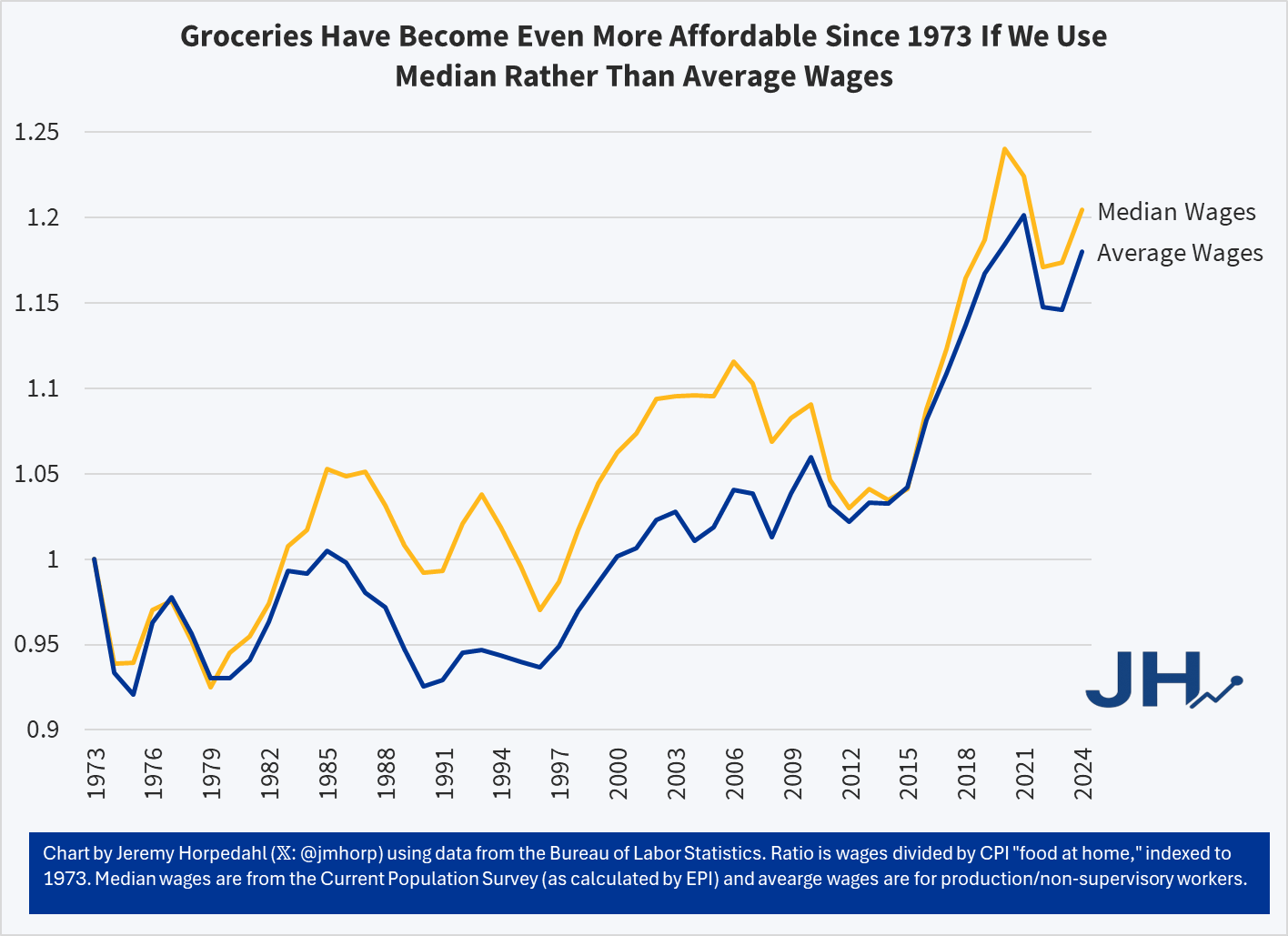
It’s true that using the median wage series, 2020 and 2021 look more affordable than 2024 — but that’s because the compositional effects of the job losses in the pandemic really throw off the median wage. But the growth rate since 1973 is slightly better for median rather than average wages — it’s not a trick! And when we have the median wage data for 2025, it will also likely be the most affordable measure on this chart.
So why are people so pessimistic if wages have been rising faster than grocery prices? One theory: availability bias. People focus on the prices where they notice goods becoming less affordable, but ignore the ones that are more affordable. Many consumers could probably tell you that a dozen eggs increased from $1.40 per dozen in November 2019 to $2.86 today, and at times was much higher, topping $6 briefly in early 2025. Likewise they could tell you that a pound of ground beef soared from $3.81 in late 2019 to $6.54 today. Both of these prices increases vastly exceed wage increases over the same timeframe (about 33 percent for wages), but most consumers probably couldn’t tell you that these were outliers and most major categories of food increased by less than average wages since late 2019:
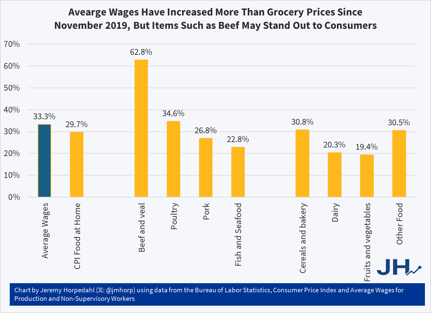
While the “beef and veal” category has clearly outpaced wages — by almost twice as much! — nearly every other category of meat and as well as other food product prices increased less than wages. Poultry is the one exception, though here it is almost equal to wage increases. But if we are talking about pork or fish, or the non-meat categories, most food is more affordable than in late 2019 relative to wages. Consumers won’t as easily identify these more affordable categories, and they probably have no idea how much average wages increased.