At Ave Maria University, we have an open economics faculty position. Indeed, it’s late in the job market and we haven’t settled a match. That’s what accounts for my late post. I interviewed someone today when I otherwise would have been grading. So, I spent my evening writing feedback on papers (pleading for greater concision).
We are a small department at a Catholic liberal arts school. When staffed, we employ 3 full time Econ faculty plus 1 or 2 adjuncts. We’re primarily a teaching university, teaching 3-class loads each semester. The students are great people. They have better moral fiber than I did at their age and the Econ majors tend to be smarter and more capable than I was at their age.
The university is located in Ave Maria, Florida which is a small town near Naples, the very wealthy destination of snowbirds and retirees. Most faculty live near the university, send their kids to the nearby private school, and attend the same masses. There is a lot of community here.
We’re happy to take economists of almost any specialization. A focus on micro or stats or data analysis would be a plus. The link to apply is below. I’d be thrilled to learn that this is how we met.
I found a new time series and panel data tool that I want to share. What does it do? It’s called xtbreak and it finds what are known as ‘structural breaks’ in the data. What does that mean? It means that the determinants of a dependent variable matter differently at different periods of time. In statistics we’d say that the regression coefficients are different during different periods of time. To elaborate, I’ll walk through the same example that the authors of the command use.
The data contains weekly US covid cases and deaths for 2020-2021. Here’s what it looks like:
So, what’s the data generating process? It stands to reason that the number of deaths is related to the number of cases one week prior. So, we can adopt the following model:
That seems reasonable. However, we suspect that δ is not the same across the entire sample period. Why not? Medical professionals learned how to better treat covid, and the public changed their behavior so that different types of people contracted covid. Further, once they contracted it, the public’s criteria for visiting the doctor changed. So, while the lagged number of cases is a reasonable determinant of deaths across the entire sample, we would expect it to predict a different number deaths at different times. In the model above, we are saying that δ changes over time and maybe at discrete points.
First, xtbreak allows us to test whether there are any structural breaks. Specifically, it can test whether there are S breaks rather than S-1 breaks. If the test statistic is greater than the critical statistics, then we can conclude that there are some number of breaks. Note that there being 5 breaks given that there are 4 depends on there also be at least 4 breaks. And since we can’t say that there are certainly 4 breaks rather than 3, it would be inappropriate to say that there are 4 or 5 breaks.
Great, so if there are three structural breaks, then when do they occur? xbtreak can answer that too (below). The three structural breaks are noted as the 20th week of 2020, the 51st week of 2020, and the 11th week of 2021. Conveniently, there is also a confidence interval. Note that the confidence intervals for 2020w11 and 2021w11 breaks are nice and precise with a 1-week confidence interval. The 2nd break, however, has a big 30-week confidence interval (nearly 7 months). So, while we suspect that there is a 3rdstructural break, we don’t know as precisely where it is.
Regardless, if there are three structural breaks, then that means that there are four time periods with different relationships between lagged covid cases and covid deaths. We can create a scatter plot of the raw data and run a regression to see the different slopes. Below we can see the different slopes that describe the impact of lagged covid cases on deaths. Sensibly, covid cases resulted in more deaths earlier during the pandemic. As time passed, the proportion of cases which resulted in death declined (as seen in the falling slope of the dots). It’s no wonder that people were freaking out at the start of the pandemic.
What’s nice about this method for finding breaks is that it is statistically determined. Of course, it’s important to have a theoretical motivation for why any breaks would occur in the first place. This method is more rigorous than eye-balling the data and provides opportunities to hypothesis test the number of breaks and their location. If you read the documentation, then there are other tests, such as breaks in the constant, that are also possible.
Subjectivism is popular at many universities. I am not talking about the economics kind in which people have a diversity of preferences. I’m talking about the subjectivism that permits different and conflicting assertions of truth to be simultaneously correct. This is where the ‘my truth’ language enters. Having a diversity of feelings is one thing – and unavoidable. Having different practical claims about the material world is another. Many universities have embraced Descartes’s unreliability of the senses writ large. The result is that people of seeming plentiful intellectual capacity dogmatize themselves into speaking such that nothing is considered a default. Nothing “is normal”, there is only “normal for someone”.
It’s a perfectly defensible model of the world. And, as we know, models are applicable only insofar as they’re useful. The subjectivist model is great at describing the diversity of preferences and priorities. The model is bad for math and achieving material ends. Further, it can serve to hinder our understanding of worldly or social phenomena.
Here’s an example.
Consider people who don’t speak the same language. They may or may not have some other compensatory skill. For Mandarin speakers, we can rightfully say that they can’t speak or communicate as effectively with the English-speaking majority of people in the US. We can also say the converse: The English-speaking majority can’t speak Mandarin or communicate as effectively with the Mandarin-speaking minority. There’s a certain symmetrical beauty to being able to interpret reality both ways. It exercises our cerebral cortex.
However, modeling the descriptive statements as intrinsically equivalent harms our ability to sensibly understand and analyze the circumstances. Specifically, we need to talk about opportunity costs.
Consider an urban storeowner in America who speaks only Mandarin. Consider also an only-English-speaking customer who has a question about an item for sale. We can perform the same symmetrical analysis as above saying that they both speak different languages. Importantly, however, they face substantially different opportunity costs in two ways.
First, the English-speaking customer has low-cost alternatives. The language barrier need not be insurmountable. If the transaction cost of more difficult communication is adequate, then the English-speaking customer can go elsewhere relatively easily and purchase from the English-speaking storeowner down the block. They have plenty of low-cost opportunities for gains from trade. Clearly, there is nothing intrinsically advantageous about speaking English. What’s advantageous is speaking the more popular language.
By having access to the larger market, the English speaker has access to greater specialization and to more buyers and sellers. If the language difference is the only difference between two people, then the one who speaks the majority language has an economic advantage. I mean ‘economic’ in both the pecuniary and non-pecuniary sense. Speaking the majority language has the consequence of greater income. But that comes from the very real differences in costs and benefits associated with trade. If the exact same person spoke only a minority language, then their income would be lower along with their lesser access to trading partners. Therefore, while it is symmetrically true that the English speaker can’t speak Mandarin and that the Mandarin speaker can’t speak English, it is not true that they face the same opportunity costs.
Second, and probably more trivially, it may be that most English speakers never have occasion to interact with any Mandarin-only speakers. Whereas Mandarin speakers in the US have constant potential interactions with English speakers. It would therefore belie the costs and benefits to simply say that they symmetrically can’t speak the same language. Indeed, many English-speakers have no motivation nor awareness of potential Mandarin-speaking trade partners. At the same time, in the US, Mandarin speakers would very much have an awareness and occasion to interact with English speakers. While it is true that they don’t speak the same language, they differ by their access to potential trade partners who speak a different language. It wouldn’t reflect the incentives to say that the English speaker is less able to communicate with Mandarin speakers when they largely lack even the awareness of the minority language.
Conclusion
An analysis of English and Mandarin speakers in the US is not a symmetrical analysis. It doesn’t matter whether we frame English speakers has having a lower opportunity cost to trading with Mandarin speakers, or whether we frame Mandarin-speakers as having a higher opportunity cost to trading with English speakers. The economic truth is that the opportunity costs differ, no matter how we might try to equivocate about what normal is. Obviously, the above analysis isn’t specific to Mandarin and English, nor to language necessarily. While framing a circumstance with a default is an arbitrary modelling decision, asserting that two alternatives means or practices have the same opportunity cost or the same productive capacity is indefensible and often doesn’t reflect the underlying economic reality.
I recently learned about an interesting statistic for social scientists. It’s called the “Dissimilarity Index”. It allows you to compare the categorical distribution of two sets.
Many of us already know how to compare two distributions that have only 2 possible values. It’s easy because if you know the proportion of a group who are in category 1, then you know that 1-p will be in category 2. We can conveniently denote these with values of zero and one, and then conduct standard t-tests or z-tests to discover whether they are statistically different. But what about distributions across more than two possible categories?
The government is unique among economic institutions insofar as it can use coercion legally. But not all activities are coercive. Clearly, taxation is overwhelmingly coercive. Some people say that they are happy to pay taxes, but the voluntary gifts to the US Treasury are itsy-bitsy (just over $1m for FY 2023). Most regulations also include the threat of fines or jail time for non-compliance.
But once the government has the money in their coffers, there is plenty that they can do consensually. Once they have the resources, they are often just another potential transactor in the markets for goods and services. While the government can transact as well as anyone else, there is a fundamental theoretical difference for how we should interpret those transactions. Specifically, there is a principal-agent problem such that we can’t quite identify the welfare that is enjoyed by consumers when the government makes purchases. We really have very little idea.
Garett Jones uses the analogy of the government confiscating potatoes. The worst use would be for the government to throw the valuable resources into the river. Those resources help no one. Improved welfare would be yielded if the government just transferred those potatoes back to people. Sure, there’s the transaction cost of administration, but people get their potatoes back. Finally, the great hope is that the government takes the potatoes and makes tasty potato fritas such that they return to the public something more valuable than they took. These might be things that fall into the public goods category or solving collective action problems generally.
The above examples illustrates that how the government spends matters a lot for the welfare implications of the newly purchased government resources. But, we need to recall that there is an entire private segment of the market that is affected by the government transactions.
Short-Run Analysis
In a competitive market, firms face increasing marginal costs and make decisions about their levels of output. When the government makes purchases, it’s simply acting as another demander. How does the entry of a larger demander affect everyone else in the market? See the below GIF.
Last time the gifs were simply about price & quantity and welfare. I’m sharing some more GIFs, this time in regard to welfare and taxes.
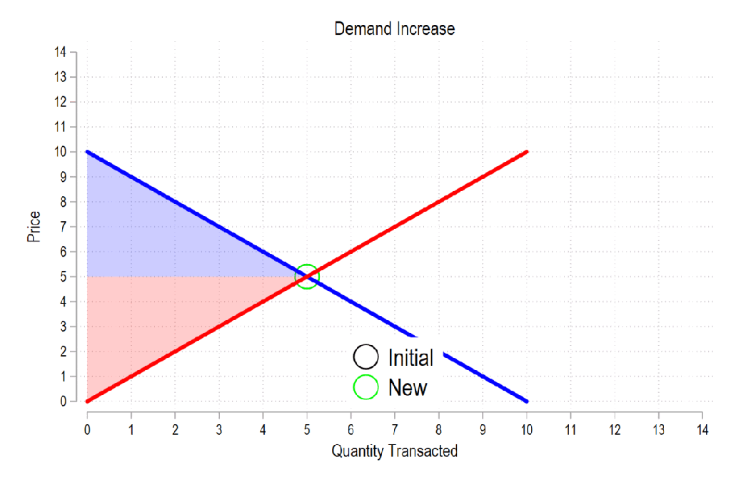
First, see the below gif. It shows us that both consumer surplus (blue area) and producer surplus (red area) always rise if there is a demand increase (assuming the law of supply and law of demand).
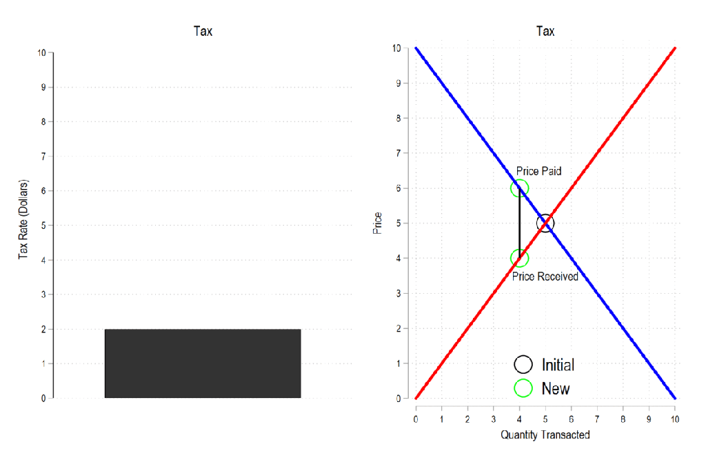
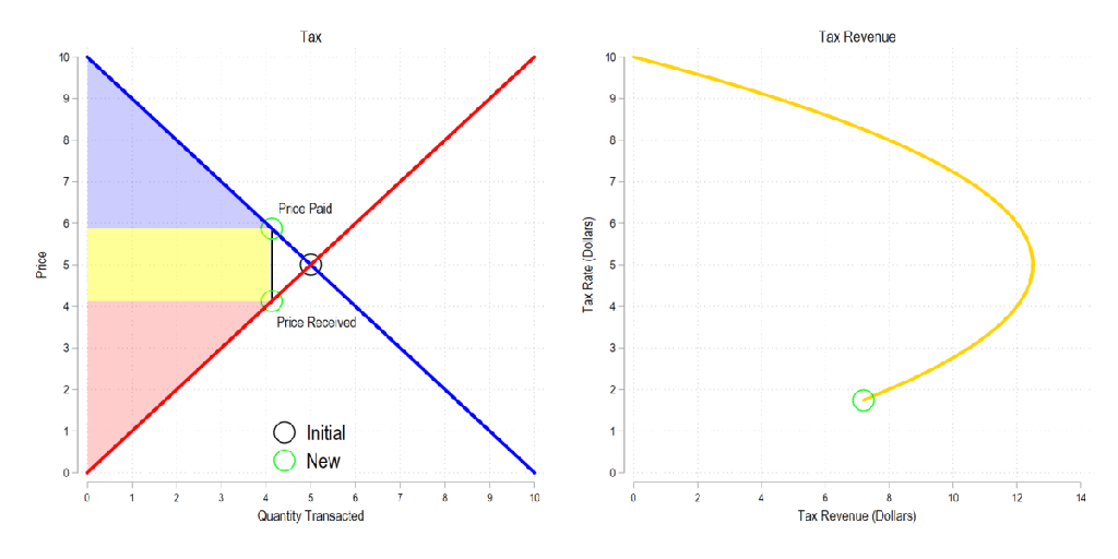
Next, let’s consider a basic tax. We can represent it as the difference between what the demander pays and what the supplier receives. The bigger the tax, the bigger the difference between the two.
Now let’s combine the tow ideas: If taxes rise, then the quantity transacted falls, price paid rises, price received falls, and both consumer and producer surplus fall. Not only that, since there is an inverse relationship between the tax rate and the quantity transacted, it may be that increasing the tax rate more *reduces* revenue. The idea that there is a tax revenue maximizing tax rate is illustrated below right and is known as the Laffer curve.
I’ve discussed the ways to teach supply and demand in the past. Regardless, almost all principles of economics classes require a book. But even digital books are often just intangible versions of the hard copy. Supply and demand are illustrated as static pictures, using arrows and labels to do the leg-work of introducing exogenous changes. There’s often a text block with further explanation, but it lacks the kind of multi-sensory explanation that one gets while in a class.
In a class, the instructor can gesticulate and vary their speech explain the model, all while drawing a graph. That’s fundamentally different from reading a book. Studying a book requires the student to repeatedly glance between the words and the graph and to identify the appropriate part of the graph that is relevant to the explanation. For new or confused students, connected the words to one of many parts of a graph is the point of failure.
This is part of why the Marginal Revolution University videos do well. They’re well produced, with context and audio-overlaid video of graphs. It’s pretty close to the in-person experience sans the ability to ask questions, but includes the additional ability to rewind, repeat, adjust the speed, display captions, and share.
We’ve all heard the stereotype. Millennials eat avocado toast (so say the older generations). The uncharitable version is that they can’t afford other things like cars, houses, etcetera due to their expensive consumption habits otherwise. And avocado on toast is the standard bearer for that spendthrift consumption.
I’m here to tell you that it’s bunch of nonsense and that the older folks are just jealous. Millennials, those born between 1981 & 1996, weren’t intrinsically destined to spend their money poorly as some generational sense of entitlement. Nor did the financial crisis imbue them with the mass desire for small but still affordable treats. The reason that millennials got the reputation for eating avocado on toast is that 1) it’s true, 2) because they could afford it, and 3) older generations didn’t even have access.
Have you ever tried to do something objectively. It’s impossible. We might try, but how do we know when we’ve failed to compensate for a bias or when we’ve over compensated. Russ Roberts taught me 1) all people have biases, 2) all analysis is by people, & 3) analysis should be interpreted conditional on the bias – not discarded because of it.
The only people who don’t have biases are persons without values – which is no one. We all have apriori beliefs that color the way that we understand the world. Recognizing that is the first step. The second step is to evaluate your own possible biases or the bias of someone’s work. They may have blind spots or points of overemphasis. And that’s OK. One of the best ways to detect and correct these is to expose your ideas and work to a variety of people. It’s great to talk to new people and to have friends who are different from you. They help you see what you can’t.
Finally, because biases are something that everyone has, they are not a good cause to dismiss a claim or evidence. Unless you’re engaged in political combat, your role is usually not to defeat an opponent. Rather, we like to believe true things about the world. Let’s get truer beliefs by peering through the veil of bias to see what’s on the other side. For example, everyone who’s ever read Robert Higgs can tell that he’s biased. He wants the government to do much less and he’s proud of it. That doesn’t mesh well with many readers. But it’d be intellectually lazy to dismiss Higgs’ claims on these grounds. Higgs’ math and statistics work no differently than his ideological opponents. It’s important for us to filter which claims are a reflection of an author’s values, and the claims that are a reflection of the author’s work. If we focus on the latter, then you’ll learn more true things.
Know Multiple Models
In economics, we love our models. A model is just a fancy word which means ‘argument’. That’s what a mathematical model is. It’s just an argument that asserts which variables matter and how. Models help us to make sense of the world. However, different models are applicable in different contexts. The reason that we have multiple models rather than just one big one is because they act as short-cuts when we encounter different circumstances. Understanding the world with these models requires recognizing context clues so that you apply the correct model.
Models often conflict with one another or imply different things for their variables. This helps us to 1) understand the world more clearly, and 2) helps us to discriminate between which model is applicable to the circumstances. David Andolfatto likes to be clear about his models and wants other people to do the same. It helps different people cut past the baggage that they bring to the table and communicate more effectively.
For example, power dynamics are a real thing and matter a lot in personal relationships. I definitely have some power over my children, my spouse, and my students. They are different kinds of power with different means and bounds, but it’s pretty clear that I have some power and that we’re not equal in deed. Another model is the competitive market model that is governed by property rights and consensual transactions. If I try to exert some power in this latter circumstance, then I may end up not trading with anyone and forgoing gains from trade. It’s not that the two models are at odds. It’s that they are theories for different circumstances. It’s our job to discriminate between the circumstances and between the models. Doing so helps us to understand both the world one another better.
The Differences-in-Differences literature has blown up in the past several years. “Differences-in-Differences” refers to a statistical method that can be used to identify causal relationships (DID hereafter). If you’re interested in using the new methods in Stata, or just interested in what the big deal is, then this post is for you.
First, there’s the basic regression model where we have variables for time, treatment, and a variable that is the product of both. It looks like this:
The idea is that that there is that we can estimate the effect of time passing separately from the effect of the treatment. That allows us to ‘take out’ the effect of time’s passage and focus only on the effect of some treatment. Below is a common way of representing what’s going on in matrix form where the estimated y, yhat, is in each cell.
Each quadrant includes the estimated value for people who exist in each category. For the moment, let’s assume a one-time wave of treatment intervention that is applied to a subsample. That means that there is no one who is treated in the initial period. If the treatment was assigned randomly, then β=0 and we can simply use the differences between the two groups at time=1. But even if β≠0, then that difference between the treated and untreated groups at time=1 includes both the estimated effect of the treatment intervention and the effect of having already been treated prior to the intervention. In order to find the effect of the intervention, we need to take the 2nd difference. δ is the effect of the intervention. That’s what we want to know. We have δ and can start enacting policy and prescribing behavioral changes.
Easy Peasy Lemon Squeezy. Except… What if the treatment timing is different and those different treatment cohorts have different treatment effects (heterogeneous effects)?* What if the treatment effects change over time the longer an individual is treated (dynamic effects)**? Further, what if the there are non-parallel pre-existing time trends between the treated and untreated groups (non-parallel trends)?*** Are there design changes that allow us to estimate effects even if there are different time trends?**** There’re more problems, but these are enough for more than one blog post.
For the moment, I’ll focus on just the problem of non-parallel time trends.
What if untreated and the to-be-treated had different pre-treatment trends? Then, using the above design, the estimated δ doesn’t just measure the effect of the treatment intervention, it also detects the effect of the different time trend. In other words, if the treated group outcomes were already on a non-parallel trajectory with the untreated group, then it’s possible that the estimated δ is not at all the causal effect of the treatment, and that it’s partially or entirely detecting the different pre-existing trajectory.
Below are 3 figures. The first two show the causal interpretation of δ in which β=0 and β≠0. The 3rd illustrates how our estimated value of δ fails to be causal if there are non-parallel time trends between the treated and untreated groups. For ease, I’ve made β=0 in the 3rd graph (though it need not be – the graph is just messier). Note that the trends are not parallel and that the true δ differs from the estimated delta. Also important is that the direction of the bias is unknown without knowing the time trend for the treated group. It’s possible for the estimated δ to be positive or negative or zero, regardless of the true delta. This makes knowing the time trends really important.
STATA Implementation
If you’re worried about the problems that I mention above the short answer is that you want to install csdid2. This is the updated version of csdid & drdid. These allow us to address the first 3 asterisked threats to research design that I noted above (and more!). You can install these by running the below code:
program fra
    syntax anything, [all replace force]
    local from "https://friosavila.github.io/stpackages"
    tokenize `anything'
    if "`1'`2'"==""  net from `from'
    else if !inlist("`1'","describe", "install", "get") {
        display as error "`1' invalid subcommand"
    }
    else {
        net `1' `2', `all' `replace' from(`from')
    }
    qui:net from http://www.stata.com/
end
fra install fra, replace
fra install csdid2
ssc install coefplot
Once you have the methods installed, let’s examine an example by using the below code for a data set. The particulars of what we’re measuring aren’t important. I just want to get you started with the an application of the method.
local mixtape https://raw.githubusercontent.com/Mixtape-Sessions
use `mixtape'/Advanced-DID/main/Exercises/Data/ehec_data.dta, clear
qui sum year, meanonly
replace yexp2 = cond(mi(yexp2), r(max) + 1, yexp2)
The csdid2 command is nice. You can use it to create an event study where stfips is the individual identifier, year is the time variable, and yexp2 denotes the times of treatment (the treatment cohorts).
The above output shows us many things, but I’ll address only a few of them. It shows us how treated individuals differ from not-yet treated individuals relative to the time just before the initial treatment. In the above table, we can see that the pre-treatment average effect is not statistically different from zero. We fail to reject the hypothesis that the treatment group pre-treatment average was identical to the not-yet treated average at the same time period. Hurrah! That’s good evidence for a significant effect of our treatment intervention. But… Those 8 preceding periods are all negative. That’s a little concerning. We can test the joint significance of those periods:
estat event, revent(-8/-1)
Uh oh. That small p-value means that the level of the 8 pretreatment periods significantly deviate from zero. Further, if you squint just a little, the coefficients appear to have a positive slope such that the post-treatment values would have been positive even without the treatment if the trend had continued. So, what now?
Wouldn’t it be cool if we knew the alternative scenario in which the treated individuals had not been treated? That’s the standard against which we’d test the observed post-treatment effects. Alas, we can’t see what didn’t happen. BUT, asserting some premises makes the job easier. Let’s say that the pre-treatment trend, whatever it is, would have continued had the treatment not been applied. That’s where the honestdid stata package comes in. Here’s the installation code:
local github https://raw.githubusercontent.com
net install honestdid, from(`github'/mcaceresb/stata-honestdid/main) replace
honestdid _plugin_check
What does this package do? It does exactly what we need. It assumes that the pre-treatment trend of the prior 8 periods continues, and then tests whether one or more post-treatment coefficients deviate from that trend. Further, as a matter of robustness, the trend that acts as the standard for comparison is allowed to deviate from the pre-treatment trend by a multiple, M, of the maximum pretreatment deviations from trend. If that’s kind of wonky – just imagine a cone that continues from the pre-treatment trend that plots the null hypotheses. Larger M’s imply larger cones. Let’s test to see whether the time-zero effect significantly differs from zero.
What does the above table tell us? It gives us several values of M and the confidence interval for the difference between the coefficient and the trend at the 95% level of confidence. The first CI is the original time-0 coefficient. When M is zero, then the null assumes the same linear trend as during the pretreatment. Again, M is the ratio by which maximum deviations from the trend during the pretreatment are used as the null hypothesis during the post-treatment period. So, above, we can see that the initial treatment effect deviates from the linear pretreatment trend. However, if our standard is the maximum deviation from trend that existed prior to the treatment, then we find that the alpha is just barely greater than 0.05 (because the CI just barely includes zero).
That’s the process. Of course, robustness checks are necessary and there are plenty of margins for kicking the tires. One can vary the pre-treatment periods which determine the pre-trend, which post-treatment coefficient(s) to test, and the value of M that should be the standard for inference. The creators of the honestdid seem to like the standard of identifying the minimum M at which the coefficient fails to be significant. I suspect that further updates to the program will come along that spits that specific number out by default.
I’ve left a lot out of the DID discussion and why it’s such a big deal. But I wanted to share some of what I’ve learned recently with an easy-to-implement example. Do you have questions, comments, or suggestions? Please let me know in the comments below.
The above code and description is heavily based on the original author’s support documentation and my own Statalist post. You can read more at the above links and the below references.
*Sun, Liyang, and Sarah Abraham. 2021. “Estimating Dynamic Treatment Effects in Event Studies with Heterogeneous Treatment Effects.” Journal of Econometrics, Themed Issue: Treatment Effect 1, 225 (2): 175–99. https://doi.org/10.1016/j.jeconom.2020.09.006.
**Sant’Anna, Pedro H. C., and Jun Zhao. 2020. “Doubly Robust Difference-in-Differences Estimators.” Journal of Econometrics 219 (1): 101–22. https://doi.org/10.1016/j.jeconom.2020.06.003.
***Callaway, Brantly, and Pedro H. C. Santa Anna. 2021. “Difference-in-Differences with Multiple Time Periods.” Journal of Econometrics, Themed Issue: Treatment Effect 1, 225 (2): 200–230. https://doi.org/10.1016/j.jeconom.2020.12.001.
****Rambachan, Ashesh, and Jonathan Roth. 2023. “A More Credible Approach to Parallel Trends.” The Review of Economic Studies 90 (5): 2555–91. https://doi.org/10.1093/restud/rdad018.