¡Hedonic Frijoles! …And Televisions!

You may have seen on your social media recently that the price of TVs has fallen 98% since 2020. That’s certainly what the data from the BLS says. This would seem to imply that a one-thousand dollar TV in the year 2000 would now be priced at $20. While we have seen amazing things in the market for TVs, we’re not seeing $20 TVs.  One take away might be that the data is just wrong. But that data is always wrong. The question is how the data is wrong and whether it’s a problem.

The reason for the disagreement between the data and the price on the shelves is due to something called ‘Hedonic Adjustment’. The idea is that some goods have quality features that change over time, even if the price doesn’t change so much. In the case of TVs, we might see higher resolution, flatter screens, larger screen sizes, smart features, etc. TVs are not a stable set of qualities. They are a bundle of characteristics, and those characteristics have some wiggle room while still satisfying some sensible criteria for being a TV. In theory, every single good is a bundle of services that we value. The reason that the some CPI categories have fallen so much is not only because the price has fallen necessarily. Rather, the amount of services that we get from a TV has increased so that each dollar that we spend can purchase more of those TV features.

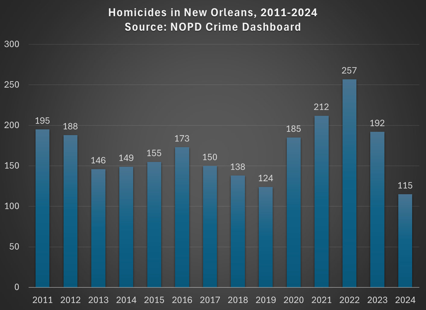
Continue reading for the gif.

Continue reading

Homicides in 2024 Were Down Significantly

The tragic act of terrorism in New Orleans early on New Year’s Day might seem like confirmation to many that crime, especially in big cities, is still at elevated levels from before the pandemic. But we have to be very careful with anecdotes, no matter how deadly and visible.

Using data from the New Orleans Police Department dashboard, which has been updated through December 31, 2024, we see that 2024 had the lowest number of homicides going back to 2011, which likely makes it one of the safest years on record in New Orleans:

New Orleans is not alone.

Using data from the Real Time Crime Index, we see that among the 10 largest cities in the US in their index, through the first 10 months of the 2024 (the most recent available for all these cities), homicides are down 16.9% compared to 2023.

Murders in these 10 largest cities are still about 5.6% above the first 10 months of 2019, but three of the 10 cities (Dallas, Philadelphia, and San Diego) are already below the first 10 months of 2019, by fairly significant margins (-13.7%, -26.2%, and -21.6%). Once we have all 12 months of data for these cities, I suspect that a few more will be back to 2019 levels.

Crime is indeed still a major social problem in much of the US, but we are getting back to 2019 levels of social problems — which is still bad, but violent crime is not high and rising, as many seem to believe based on very notable and horrific events.

(The 10 largest cities in the RT Crime Index are Chicago, Dallas, Houston, Las Vegas, Los Angeles, New York, Philadelphia, Phoenix, San Antonio, and San Diego.)

Nintendo vs Nintendo: Time Prices of Video Games in 1986 and 2024

For decades one of the most popular Christmas gifts for kids (and often adults) has been video game systems. And Nintendo has long been a dominant player in this market: the original NES arguably launched the modern gaming market in 1986 (even though it wasn’t the first, it was the first blockbuster) and Nintendo’s latest offering, the Switch, is now the best-selling console ever in the US.

As we often ask on this blog: has it become more or less affordable for an average worker to buy this iconic Christmas gift (or even buy one for yourself)?

When it comes to the consoles themselves, the Switch and NES are, perhaps surprisingly, equally affordable. The original NES cost $90 in 1986, while the Switch costs $300 today. Average wages in late 1986 were $9/hour and they are about $30/hour today. So in both years, it took about 10 hours of work to buy the console (alternatively, it’s about 25% of median weekly earnings in both years).

But as any serious gamer will tell you, the individual game cartridges can cost as much or more than the console if you want to play a lot of games. For example, the games available in the 1986 Sears catalog ranged from $25-$30. To buy just the 10 games in that catalog would cost $275 — over 30 hours of labor at the average wage, or about 3 hours of labor per game.

Today there is a wider range of prices for games, but the most expensive Switch games are around $60, or just 2 hours of labor at the average wage. There are also plenty of games around $30, or just 1 hour of labor.

The challenge with the comparison is that video games today are much higher quality, challenging, and advanced in so many ways. Is there any way to make a more direct comparison?

Yes. Nintendo offers an annual subscription for $20 to Nintendo Switch Online. Included in the subscription is access to nearly every NES game, plus Super Nintendo and Gameboy games. Not only do you get the 10 games from the 1986 Sears catalog, but many dozens more. All for less than $1 hour of labor at the average wage.

In other words, for 30 hours of labor today (the time to purchase those 10 original NES games), you could buy about 46 years worth of subscriptions to Nintendo online. That’s almost a lifetime of video game play, with many more advanced games.

Excel’s Weird (In)Convenience: COUNTIF, AVERAGEIF, & STDEVIF

Excel is an attractive tool for those who consider themselves ‘not a math person’.  In particular, it visually organizes information and has many built-in functions that can make your life easier. You can use math if you want, but there are functions that can help even the non-math folks

If you are a moderate Excel user, then you likely already know about the AVERAGE and COUNT functions. If you’re a little but statistically inclined, then you might also know about the STDEV.S function (STDEV is deprecated). All of these functions are super easy and only have one argument. You just enter the cells (array) that you want to describe, and you’re done. Below is an example with the ‘code’ for convenience.

=COUNT(A2:A21)
=AVERAGE(A2:A21)
=STDEV.S(A2:A21)

If you do some slightly more sophisticated data analysis, then you may know about the “IF” function. It’s relatively simple; if a proposition is true (such as a cell value condition), then it returns a value. If the proposition is false, then it returns another value. You can even create nested “IF”s in which a condition being satisfied results in another tested proposition. Back when excel had more limited functions, we had to think creatively because there was a limit to the number of nested “IF” functions that were permitted in a single cell. Prior to 2007, a maximum of seven “IF” functions were permitted. Now the maximum is 64 nested “IF”s. If you’re using that many “IF”s, then you might have bigger problems than the “IF” limitations.

Another improvement that Excel introduced in 2019 was easier array arguments. In prior versions of Excel, there was some mild complication in how array functions must be entered (curly brackets: {}). But now, Excel is usually smart enough to handle the arrays without special instructions.  Subsequently, Excel has introduced functions that combine the array features with the “IF” functions to save people keystrokes and brainpower.

Looking at the example data we see that there is an identifier that marks the values as “A” or “B”. Say that you want to describe these subgroups. Historically, if you weren’t already a sophisticated user, then you’d need to sort the data and then calculate the functions for each subgroup’s array. That’s no big deal for small sets of data and two possible ID values, but it’s a more time-consuming task for many possible ID values and multiple ID categories.

The early “IF” statements allowed users to analyze certain values of the data, such as those that were greater than, less than, or equal to a particular value. But, what if you want to describe the data according to criteria in another column (such as ID)? That’s where Excel has some more sophisticated functions for convenience. However, as a general matter of user interface, it will be clear why these are somewhat… awkward.

Continue reading

Economic Nostalgia: 1890s Edition

You see a lot of nostalgia for the recent past. People pining for the simpler life of the 1950s, or claims that wages have stagnated since the late 1970s or early 1980s. I’ve tried to take these arguments seriously and respond to them, such as in a paper I wrote with Scott Winship and summarized in a blog post last June. But occasionally, you find really weird economic nostalgia, like for the 1890s. Yes, the 1890s, not the 1990s.

Here’s one example: a cartoon shared on social media of workers being oppressed in the 1890s, with the caption “the problem has only gotten worse.” That post received 2 million views on Twitter, possibly because many people are criticizing it, but it also has a lot of retweets and likes.

If it was just one semi-viral social media post from an anonymous Twitter account, we could easily dismiss it. But 1890s economic nostalgia has been coming from another important place lately: President Elect Trump. Of course he is nostalgic for the policies of the 1890s. But on occasion, Trump will say things like “Go back and look at the 1890’s, 1880’s with McKinley and you take a look at tariffs, that was when we were at our richest” (emphasis added).

Really, our richest in the 1890s? Can this be true? Are the anonymous socialist Twitter accounts correct? Let’s look at the data. But the answer probably won’t surprise you: your intuition is correct, we are much better off today than the 1890s, in almost every way of looking at it economically.

Continue reading

The Mythology of Rice and Beans

I’ve written about proteins twice before. Once concerning protein content generally and then another concerning amino acid content of animal proteins. The reason that I stuck to animal proteins initially was because I held a common and false belief: Singular vegetarian foods aren’t complete proteins. The meat-eaters gotchya claim is that meats contain complete proteins. After all, we’ve heard a million times that beans and grains are often eaten together because they form a complete protein. The native North Americans? Corn and beans. Subcontinent Indians? Rice and Lentils or chickpeas. Japan? Rice and soy. Choose your poor or vegetarian population in the world, and they combine beans and grains. We’ve always been told that it’s because the combination constitutes a ‘complete protein’.

But you know what else constitutes a complete protein? Any of those foods all by themselves. What the heck. I haven’t been lied to. But I’ve certainly been misled. Let me briefly tell you my research journey. My recommended daily intake (RDI) are from the World Health Organization and the amino acid data is from the US Department of Agriculture. Prices are harder to pin down in a representative way, but I cite those too.  

Continue reading

House Prices and Quality: 1971 vs 2023

Last week I did a comparison of “time prices” for several goods and services in 1971 compared with 2024. For almost all goods and services, it took fewer hours of work in 2023 to purchase them. In some cases, huge increases in affordability; air travel is 79% cheaper and milk is 59% cheaper, in terms of how much time an average worker needs to labor to pay for them.

There was one major exception though: housing. Especially the cost of buying a new home. Just using the median sale price of a home, the cost (in terms of hours of work) roughly doubled between 1971 and 2024. That’s not good!

Many who commented on the post mentioned that houses are much bigger today, and I noted that in the post but still claimed this is a worrying trend: “since 1971 you can’t really argue the quality improvements make up for the increase. Yes, houses are much bigger (about double in size), but that’s not clearly driven by consumer demand (more so by zoning and other laws). The 1971 house also had indoor plumbing (but maybe not air conditioning).”

Furthermore, housing is the largest expense for most families, both today and in 1971. In the early 1970s it was 30.8% of consumer spending, and in 2023 it was slightly higher at 32.9%. Given all this, it is worth investigating further.

First, let’s consider the size of a typical house. For most of the 1971 data, I will use this HUD report on new single-family homes. And I will use the similar Characteristics of New Housing report for 2023 (the latest year available) to compare.

Are houses bigger today? Yes, but not nearly enough to account for the decreasing affordability I showed in the previous post. In 1971, the median new home had 1,400 square feet of floor space. In 2023, it was 2,286. That’s a big increase (over 60%), but let’s now do the time-price affordability calculation, which I show in the table below.

Continue reading

The Price of a Complete [Animal] Protein

I wrote about the protein content of different foods previously. I summarized how much beef versus pea and wheat flour one would need to eat in order to consume the recommended daily intake (RDI) of ‘complete proteins’ – foods that contain all of the essential amino acids that compose protein. These amino acids are called ‘essential’ because, unlike the conditionally essential or non-essential amino acids, your body can’t produce them from other inputs. Here, I want to expand more on complete proteins when eating on a budget.

Step 1: What We Need

To start, there are nine essential amino acids with hard to remember names for non-specialists, so I’ll just use the abbreviations (H, I, L, K, M, F, T, W, V). The presence of all nine essential amino acids is what makes a protein complete. But, having some of each protein is not the same as having enough of each protein. Here, I’ll use the World Health Organization’s (WHO) guidelines for essential amino acid RDI for a 70kg person. See the table below.

Step 2: What We Need to Eat

What foods are considered ‘complete proteins’? There are many, but I will focus on a few animal sources: Eggs, Pork Chops, Ground Beef, Chicken, & Tuna. Non-animal proteins will have to wait for another time. Below are the essential amino acid content per 100 grams expressed as a percent of the RDI for each amino acid. What does that mean? That means, for example, that eating 100 grams of egg provides 85% of the RDI for M, but only 37% of the RDI for H.

Continue reading

“Time Prices” Today Compared With 1924 and 1971

I’ve written before on this blog about “time prices”: the amount of time it takes at a particular wage to buy a specific product. Time prices are especially useful for making historical comparisons of the real price of a good or service. Rather than adjusting historical prices for inflation (which only tells you whether they have increased faster or slower than average prices), time prices give you a real comparison of whether a good has become more or less affordable.

Antony Davies recently did a 100-year comparison of time prices for an average worker in the US. He compared prices in 1924 for several common food items, gasoline, electricity, movie tickets, airline tickets, an automobile, and several measures of housing costs to the best comparable thing in 2024. This following table shows his results:

You will notice a few things here. For the median worker, most things are much more affordable in 2024. Some things are dramatically so! For many items, the median worker in 2024 is similar to someone in the top 1% in 2024. Huge improvements in the standard living.

It will probably not surprise you that one major exception is housing. For renters, things are not obviously worse, but they are not better, depending on what size of city you are in (renters also have lower incomes, but that would be true in both time periods). However compared to the average home price, things look much worse in 2024. You can reasonably reply that the home is much larger and better quality in 2024 (as late as 1940, barely half of homes had complete indoor plumbing!), and this is all true. Still, an average house today is much better, but also much less affordable.

Despite the high cost of housing, the average worker today is much better off than 1924. It’s hard to deny it.

But what about more recent times? As a recurring meme likes to date it, what about since 1971?

Continue reading

The Laboratory of the States: Regulatory Reform Edition

The US Federal government has been considering major reforms like the REINS Act, which would require Congressional approval of major regulations proposed by executive branch agencies, or bringing back the “two in one out” rule from the first Trump administration. What would these do?

Right now it’s hard to say much for sure. But similar reforms have already been implemented in the states; as usual, the states provide a laboratory for investigating how policies work and whether they deserve broader adoption. It’s especially valuable to inform the debate over reforms like the REINS act that are still being considered at the federal level. Even for federal reforms that have already happened, it can be easier to evaluate the state version, since states make better control groups for each other than other countries do for the US.

But so far we’ve mostly been ignoring our laboratory results from recent state regulatory reforms. For instance, Broughel, Baugus, and Bose (2022) released a dataset that could be used to evaluate state regulatory reforms, but it has only been cited 3 times. This is why I’m adding this to my ideas page as a good subject for future academic research.  Do state REINS or Red Tape Reduction Acts actually reduce either the stock or flow of regulation? If so, which types of regulations are affected, and does this have any effect on downstream measures like economic growth or new business formation?

Any research along these lines could help inform policy debates in the states, as well as for a new Presidential administration coming in with hopes of boosting economic growth through deregulation.

HT: Adam Millsap