Initial Jobs Reports from BLS are Very Good At Identifying Downturns in the Labor Market

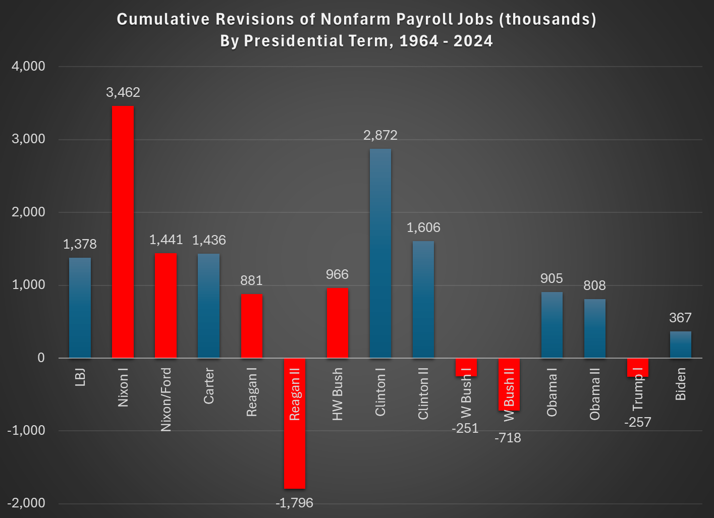
Yesterday I showed that BLS jobs reports from the CES aren’t getting worse over time, if we judge them by how much they are later revised. In fact, they are much better than decades past, with the last 20 years or so standing out as much better than the past.

Today I want to address a related but separate topic: are the initial jobs reports good at telling us when a downturn in the labor market is beginning? This is actually the strongest argument for releasing this survey data in a timely manner, even though the data often goes through significant revisions later. The report typically comes out the first Friday of a new month, so it is very current data. Given that the likely new BLS Commissioner has signaled he prefers the more accurate quarterly release, even though it is 7-9 months after the fact, it is useful to ask if these initial reports have any value in telling us when labor market declines (and recessions) are beginning.

That’s right: you are getting two posts from me this week, on essentially the same topic. Because it’s very important right now.

The short answer: the report is very good for the purpose of identifying downturns, especially the start of the downturns. Let’s walk through the past few recessions.

Continue reading →

BLS Has Been Getting Better at Estimating Jobs, and They are Not More Favorable to Democrats

You’ve probably heard a lot about BLS data recently (or at least more than usual) with Trump firing the BLS Commissioner after a bad monthly revision to the nonfarm payroll jobs figures. But this didn’t come out of the blue, as there was plenty of criticism of the jobs numbers during the Biden term as well, mostly coming from the political right.

The two main criticisms leveled at the BLS, in my reading of it are:

  1. The BLS is getting worse at estimating jobs numbers over time, leading to larger revisions
  2. The revisions are done in a way that is favorable to Democrats

I think both of those claims can be analyzed with the following chart, which also shows those claims to be incorrect:

Continue reading →

Hayek on The Volatility Pie

In the Road to Serfdom, Friedrich Hayek uses some basic quantitative logic to make an important point about employment and political economy.

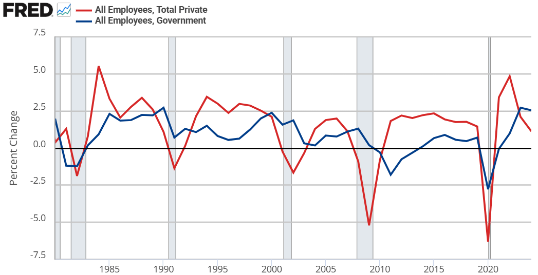
Hayek starts by assuming that government jobs are stable relative to those in the private sector. This might seem obvious, but let’s just start by checking the premises. Below are the percent change in total compensation and total employment for government employees and for the private sector. From year to year, private employment and total compensation is more volatile. So, Hayek’s initial premise is correct.

From there, he proceeds to say that if any part of income or employment is guaranteed or stabilized by the government, then the result must be that the risk and volatility is borne elsewhere in the economy. He reasons that if there is a decline in total spending, then stable government pay and employment implies that the private sector must have a deeper recession than the overall economy. Looking at the above graphs, both government employment and the total compensation are much less volatile.

But can’t governments intervene in macroeconomic stabilization policies effectively? Yes! They can and do stabilize the economy, especially with monetary policy. But Hayek is referring to individual stabilizations. For any individual to be guaranteed an income, all others must necessarily experience greater income volatility. How’s that?

Consider two individuals. Person #1 has an average income of $100. In any given year, his income might be $10 – or 10% – higher or lower than average. For the moment, person #2 is not employed and has income volatility of zero. If the government provides a job with a constant pay rate to person #2, then they still have zero income volatility. But instead of earning a consistent $0, person #2 earns a consistent $50. Nice.

Of course, person #2 gets his pay from somewhere. By one means or another, it comes from person #1. Let’s be generous and assume the tax on person #1 has no resulting behavioral effect. His new average income is $50, being $10 higher or lower in any given year. But now, that $10 deviation is over a base of $50 rather than $100. Person #1’s income varies by 20% relative to his new average!

Reasoning through this, we can consider that a person has a stable portion of their income and a volatile portion. If someone takes a part of your stable portion and leaves you with all of your volatile portion, then your remaining income is now more volatile on average. I think that this point is interesting enough all by itself.

IRL, many of our taxes are not lump sum. Rather, progressive taxation causes a negative incentive for production & earnings. The downside is that we produce less. The upside is that the government takes a higher proportion of our volatile income than of our stable income (because income changes are always on the margin and those marginal dollars are taxed at a higher rate). So, the government shares the income volatility of the private sector. By continuing to pay government employees a stable salary, the government is effectively absorbing some of that year-to-year income volatility on behalf of its employees.* The government is, in a sense, providing income insurance to a subgroup.

What does this have to do with The Road to Serfdom? Hayek argues that, as the government employs an increasing proportion of the population, the remaining private sector experiences increasing income and employment volatility. Such volatility increases private risk exposure so much that people begin to fawn over and increasingly compete for the stability found in government work. He gets anthropological and argues that the economic attraction to government jobs will introduce greater competition for those jobs and subsequently greater esteem and respect for those who are able to get them. This process makes the government jobs even more attractive.

My own two cents is that there is nothing internally unstable about this process. Total real income would fall compared to the alternative. However, such a state of affairs might be externally unstable as other governments/economies compete with the increasingly socialist one.


*An important analogue is that firms behave in a similar way. An individual may receive a relatively constant salary so long as they are employed. But the result must be that the firm bears more of the net-profit volatility. So, as more people want stable private sector jobs, the profit volatility of firms would increase and result in greater [seemingly windfall] profits and losses.
GDP Predictions: Pretty Good!

Last week I wrote about the GDP predictions from Kalshi and the GDPNow Model. They were both showing 2.4% for Q2 of 2025 last week. They both changed slightly by yesterday, up to 2.8% and 2.9%. The final result (technically, the “advanced” result, but the final one for purposes of this comparison) was 2.97%. The Atlanta Fed GDPNow model continues to be a top performer, and you can’t do much better than averaging these two estimates. And you can pretty consistently do better than the median result from the WSJ/Dow Jones survey of economists.

Here’s the updated table:

And here is the original post explaining the data.

Is A Music Major Worth It?

Our new paper concludes that the answer is a resounding “It Depends”.

It depends on your answer to the following questions:

  1. If you didn’t major in music, would you major in something else, or not finish college?
  2. How dead set are you on a career in music?
Source: Figure 1 of Bailey and Smith (2025)

We found that

  1. Music majors earn more than people who didn’t graduate from college, even if they don’t end up working as musicians
  2. Among musicians, music majors earn more than other majors
  3. But among non-musicians, other majors earn much more than music majors

So on average a music major means higher income if you would be a musician anyway, or if you wouldn’t have gone to college for another major, but lower income than if you majored in something else and worked outside of music. The exact amounts depend on what you control for; this gets complex but this table gives the basic averages before controls:

Source: Table 2 of Bailey and Smith (2025), showing wage plus business income for respondents to the 2018-2022 American Community Survey

For better or worse, a music major also means you are much more likely to be a musician- 113 times more likely, in fact (this is just the correlation, we’re not randomizing people into the major). Despite that incredible correlation, only 9.8% music majors report being professional musicians, and only 22.3% of working musicians were music majors.

Sean Smith had the idea for this paper and wrote the first draft in my Economics Senior Capstone class in 2024. After he graduated I joined the paper as a coauthor to get it ready for journals, and it was accepted at SN Social Sciences last week. We share the data and code for the paper here.

Continue reading →

Second Quarter GDP Predictions

Back in April I wrote about 4 different estimates of GDP growth and how well they have performed since 2023. With the 2nd quarter of 2025 GDP data coming out next week, what do the best performing predictors currently say?

In that last post, I showed that the Atlanta Fed GDPNow model and the Kalshi betting market were generally the best performers. And furthermore, averaging these two improves the predictive power a little more. As of today, the GDPNow model is predicting 2.4% growth and Kalshi is… also predicting 2.4%!

There will be a few more updates to GDPNow over the next week, and of course Kalshi is constantly updating as more people bet. But as of right now, 2.4% growth seems like a reasonable prediction. That may surprise some people, especially given all of the pessimism surrounding tariffs and policy uncertainty generally. But despite all of this, the US economy appears to be just continuing to chug along.

Inflation Is Stuck

Here’s a somewhat niche measure of inflation: 6-month CPI excluding food, shelter, and energy. It might seem like a weird measure, as it excludes over half of the CPI. But there is a logic to at least considering it along with other measures.

Food and energy are both volatile, so they can give us a lot of noise. That’s why “core CPI” and other core measures are followed closely by the Fed and inflation watchers. But excluding shelter might also make sense, because increasing housing prices are largely due to supply constraints, and will move independently of monetary policy to some extent. Six-month inflation is also useful for a more timely measure than 12 months, the headline number.

As you can see in the chart above, this niche measure of inflation has been stuck for two and a half years. It has oscillated between about 0.5% and 1.5% since December 2022. And right now it’s almost exactly in the middle of that range. It has come down from 6 months ago, but higher than 1 year ago.

As you can see in the pre-2020 years, it generally oscillated between 0% and 1%. So 6-month inflation is stuck about 0.5% higher than we had become used to, which translates into roughly 1% higher annually.

In the grand scheme of things, 1% higher inflation isn’t the end of the world. But we do seem to be stuck at a slightly elevated rate of inflation relative to the decade before 2020.

Writing Humanity’s Last Exam

When every frontier AI model can pass your tests, how do you figure out which model is best? You write a harder test.

That was the idea behind Humanity’s Last Exam, an effort by Scale AI and the Center for AI Safety to develop a large database of PhD-level questions that the best AI models still get wrong.

The effort has proven popular- the paper summarizing it has already been cited 91 times since its release on March 31st, and the main AI labs have been testing their new models on the exam. xAI announced today that its new Grok 4 model has the highest score yet on the exam, 44.4%.

Current leaderboard on the Humanity’s Last Exam site, not yet showing Grok 4

The process of creating the dataset is a fascinating example of a distributed academic mega-project, something that is becoming a trend that has also been important in efforts to replicate previous research. The organizers of Humanity’s Last Exam let anyone submit a question for their dataset, offering co-authorship to anyone whose question they accepted, and cash prizes to those who had the best questions accepted. In the end they wound up with just over 1000 coauthors on the paper (including yours truly as one very minor contributor), and gave out $500,000 to contributors of the very best questions (not me), which seemed incredibly generous until Scale AI sold a 49% stake in their company to Meta for $14.8 billion in June.

Source: Figure 4 of the paper

Here’s what I learned in the process of trying to stump the AIs and get questions accepted into this dataset:

  1. The AIs were harder than I expected to stump because they used frontier models rather than the free-tier models I was used to using on my own. If you think AI can’t answer your question, try a newer model
  2. It was common for me to try a question that several models would get wrong, but at least one would still get right. For me this was annoying because questions could only be accepted if every model got them wrong. But of course if you want to get a correct answer, this means trying more models is good, even if they are all in the same tier. If you can’t tell what a correct answer looks like and your question is important, make sure to try several models and see if they give different answers
  3. Top models are now quite good at interpreting regression results, even when you try to give them unusually tricky tables
  4. AI still has weird weaknesses and blind spots; it can outperform PhDs in the relevant field on one question, then do worse than 3rd graders on the next. This exam specifically wanted PhD-level questions, where a typical undergrad not only couldn’t answer the question, but probably couldn’t even understand what was being asked. But it specifically excluded “simple trick questions”, “straightforward calculation/computation questions”, and questions “easily answerable by everyday people”, even if all the AIs got them wrong. My son had the idea to ask them to calculate hyperfactorials; we found some relatively low numbers that stumped all the AI models, but the human judges ruled that our question was too simple to count. On a question I did get accepted, I included an explanation for the human judges of why I thought it wasn’t too simple.

I found this to be a great opportunity to observe the strengths and weaknesses of frontier models, and to get my name on an important paper. While the AI field is being driven primarily by the people with the chops to code frontier models, economists still have lot we can contribute here, as Joy has shown. Any economist looking for the next way to contribute here should check out Anthropic’s new Economic Futures Program.

23 MSAs Produce Half of US GDP

The 23 blue-shaded MSAs in this map produce half of US GDP:

You might be tempted to think this map, like so many maps, is just a map of US population. It kind of is, but not completely. These 23 MSAs have 133 million people (as of the 2020 Census), or about 40% of the US population. That’s a lot, but it’s much less than half, which the GDP proportion they account for. In other words, these MSAs also tend to have above-average per capita income.

The three largest MSAs by population (NY, LA, Chicago) are also the three largest by GDP. But after the first three there are some interesting discrepancies. The San Francisco MSA is the 4th largest by GDP, but only the 12th largest by population — San Fran has a population similar to the Phoenix MSA, but almost double the GDP. San Francisco MSA has a very high GDP per capita (the third highest).

The San Jose MSA is also among these 23 largest MSAs for GDP, and also sticks out — it is the 13th largest by total GDP, but only the 36th largest by population. San Jose has a population similar to Cleveland and Nashville, but well over double the GDP of these two MSAs individually. In fact, there are 12 MSAs larger in population than San Jose, but that aren’t among these 23 MSAs that produce half of US GDP: places like St. Louis, Orlando, San Antonio, Pittsburgh, and Columbus. Silicon Valley really pulls up San Jose: it has the 2nd largest GDP per capita among MSAs, only beaten by much smaller Midland, Texas and its oil income.

Here is the full list of those 23 MSAs:

  1. New York-Newark-Jersey City, NY-NJ-PA
  2. Los Angeles-Long Beach-Anaheim, CA
  3. Chicago-Naperville-Elgin, IL-IN-WI
  4. San Francisco-Oakland-Berkeley, CA
  5. Dallas-Fort Worth-Arlington, TX
  6. Washington-Arlington-Alexandria, DC-VA-MD-WV
  7. Houston-The Woodlands-Sugar Land, TX
  8. Boston-Cambridge-Newton, MA-NH
  9. Seattle-Tacoma-Bellevue, WA
  10. Atlanta-Sandy Springs-Alpharetta, GA
  11. Philadelphia-Camden-Wilmington, PA-NJ-DE-MD
  12. Miami-Fort Lauderdale-Pompano Beach, FL
  13. San Jose-Sunnyvale-Santa Clara, CA
  14. Phoenix-Mesa-Chandler, AZ
  15. Minneapolis-St. Paul-Bloomington, MN-WI
  16. Detroit-Warren-Dearborn, MI
  17. San Diego-Chula Vista-Carlsbad, CA
  18. Denver-Aurora-Lakewood, CO
  19. Baltimore-Columbia-Towson, MD
  20. Austin-Round Rock-Georgetown, TX
  21. Charlotte-Concord-Gastonia, NC-SC
  22. Riverside-San Bernardino-Ontario, CA
  23. Tampa-St. Petersburg-Clearwater, FL