This is post coauthored with Jack Cavanaugh, Ave Maria University Graduate of 2025.
Say that you want to become a successful lawyer. What does that mean? One possible meaning is that you are well-compensated. Money is not everything, but it does give people more options for how to spend their time and resources. Law degrees are a type of graduate degree. So, what bachelor’s degree major should one choose in preparation for law school? We lack rich administrative data on college majors and LSAT scores.
Luckily, the 2023 American Community Survey (ACS) comes to the rescue. It has all of the typical demographic covariates, income, occupation, and college major. So, if we make the small leap that well-prepared law school students become high-performing lawyers who are ultimately paid more, then what college major puts you on the right path? What should your major be?
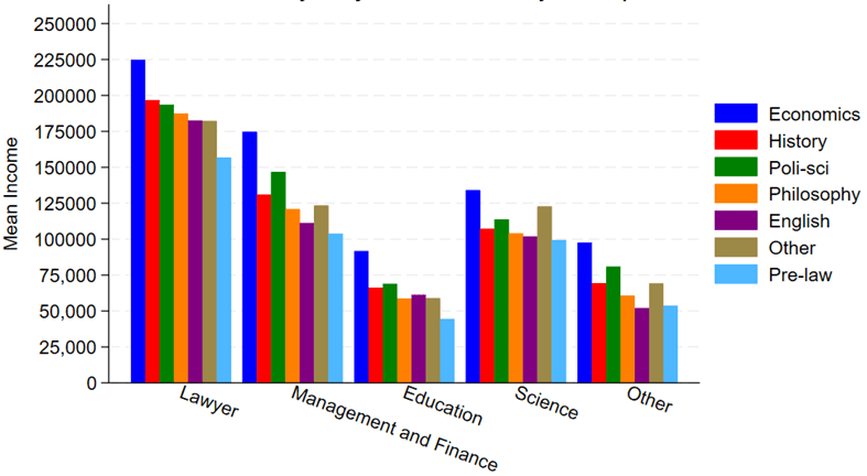
We don’t look at an exhaustive list. We place several occupations into bins and examine only a few alternative majors. Any unlisted major falls under ‘other’. Below are the raw average incomes by occupational category and college major. Note two majors in particular. First, Pre-law literally has the word ‘law’ in the name and is marketed as preparation for law school. However, it is the undergraduate major associated with the lowest paid lawyers. For that matter, Pre-law majors have the lowest pay no matter what their occupation is. Second, Economics majors are the most highly paid in all of the occupations.
This is from the latest Census release of CPS ASEC data, updated through 2024 (see Table F-23 at this link). In 1967, only 5 percent of US families earned over $150,000 (inflation adjusted).
Addendum: Several comments have asked how much of these trends can be explained by the rise of dual-income households. The answer is some, but not all of it, which I have written about before. Dual-income households were already the most common family structure by the 1980s. There hasn’t been an increase in total hours worked by married households since Boomers were in their 30s. You can explain some of the increase up until the Boomers by rising dual-income households, but this doesn’t explain the continued progress since the 1980s. And as Scott Winship and I have documented, even if you look just at male earnings, there has been progress since the 1980s.
The Federal Reserve will probably cut rates next week:
I can’t advise them on the complexpolitics of this, but based on the economics I think cutting would be a mistake. I see one good reason they want to cut: hiring is slow and apparently has been for a year. But that could be driven by falling labor supply rather than falling demand, and most other indicators suggest holding rates steady or even raising them.
Most importantly, inflation is currently well above their 2% target, 2.9% over the past year and a higher pace than that in August. Inflation expectations remain somewhat elevated. Real GDP growth was strong in Q2 and looks set to be strong in Q3 too, and NGDP growth is still well above trend.. The Conference Board’s measure of consumer confidence looks bad, but Michigan’s looks fine.
Financial conditions are loose, with stocks at all time highs and credit spreads low. Its only September and we’ve already seen more Initial Public Offerings than in any year since 2021 (when the last big bout of inflation kicked off):
Crypto prices are back near all time highs and crypto is becoming more integrated into public stocks through bitcoin treasury companies and IPOs from Gemini and Figure.
The Taylor Rule provides a way of putting all this together into a concrete suggestion for interest rates. Some versions of the rule say rates are about on target, while others including my preferred Bernanke versionsuggest they should be closer to 6%. To me this is what the debate should be- do we keep rates steady or raise them? I see good arguments each way, but the case for a cut seems very weak.
I look forward to finding out in a year or two whether I or the FOMC is the crazy one here.
* The Usual Disclaimer, hopefully extra obvious in this case: These views are mine and I’m not speaking for any part of the Federal Reserve System.
Are you tired of hearing about revisions to jobs data? Well, there was another hot one released by BLS yesterday. Known as the “preliminary estimate of the Current Employment Statistics (CES) national benchmark revision to total nonfarm employment,” this change isn’t yet incorporated into the official jobs data. But it will, possibly slightly modified, be included with the January 2026 jobs release, altering jobs data back to April 2024. It is part of the normal annual process of reconciling the monthly, survey-based jobs data with the near-universe data from unemployment insurance records. Normally, this is a quiet affair, especially the preliminary estimate which is just giving a heads up to researchers about what will be coming in a few months.
I wrote about these preliminary figures last year, when the initial estimate was a negative revision 818,000 jobs. When revised and actually incorporated into the data, it was a somewhat smaller 598,000 jobs, which I then used in a post just last month to show that BLS hasn’t been getting worse at estimating jobs. If anything, they have been getting better. Yesterday’s report showed that the revision could be negative again, this time 911,000 jobs. That’s a little bigger than last year, but maybe it will end up being smaller in the final number. So, no big deal again?
Maybe not. The 911,000 jobs revision would actually be much larger than last year’s revisions because it’s coming on top of a slower growing labor force already. The initial report for March 2024 showed 2.9 million jobs added in the past year, so the 818,000 revision was a much smaller share than this most recent data, since the March 2025 initial report showed just 1.9 million jobs added in the prior year. And the March 2025 jobs numbers have already been revised down by over 100,000 jobs since the initial report, meaning that potentially half or more of the initially reported job gains would be lost due to the revision, as opposed to about 20 percent last year.
Is losing half of the job gains large? Yes. In fact, almost unprecedented:
(note: I am trying out a new chart template. Let me know what you think!)
Bar codes have been common in retail stores since the 1970s. These give a one-dimensional read of digital data. The hardware and software to decode a bar code are relatively simple.
The QR code encodes information in a two-dimensional matrix. The QR code, short for quick-response code, was invented in 1994 by Masahiro Hara of the Japanese company Denso Wave for labelling automobile parts. It can pack far more information in the same real estate than a bar code, but it requires sophisticated image processing to decode it. Fortunately, the chip power for image processing has kept up, so smart phones can decode even intricate QR codes, provided the image is clear enough.
Like most QR codes, it has three distinctive square patterns on three corners, and a smaller one set in from the fourth corner, that give information to the image processing software on image orientation and sizing.
As time goes on, more versions of QR codes are defined, with ever finer patterns that convey more information. For instance, here is a medium-resolution QR Code (version 3), and a very high resolution QR code (Version 40):
My phone could not decode the Version 40 above; the limit may be how much detail the camera could capture.
QR codes use the Reed–Solomon error correction methodology to correct for some errors in image capture or physical damage to the QR code. For instance, this QR code with the torn-off corner still decodes properly as the URL for Wikipedia (whole image shown above):
Getting down a little deeper in the weeds, this image shows, for Version 3 (29×29) QR code, which pixels are devoted to orientation/alignment (reddish, pinkish), which define the format (blueish), and which encode the actual content (black and white):
Uses Of QR Codes
A common use of QR codes is to convey a web link (URL), so pointing your phone at the QR code is the equivalent of clicking on a link in an email. Here is an AI summary of uses:
They are used to access websites and digital content, such as restaurant menus, product information, and course details, enabling a contactless experience that reduces the need for printed materials. Smartphones can scan QR codes to connect to Wi-Fi networks by automatically entering the network name (SSID), password, and encryption type, simplifying the process for users. They facilitate digital payments by allowing users to send or receive money through payment apps by scanning a code, eliminating the need for physical cash or cards. QR codes are also used to share contact information, such as vCards, and to initiate calls, send text messages, or compose emails by pre-filling the recipient and message content. For app downloads, QR codes can directly link to the Apple App Store or Google Play, streamlining the installation process. In social media and networking, they allow users to quickly follow profiles on platforms like LinkedIn, Instagram, or Snapchat by scanning a code. They are also used for account authentication, such as logging into services like WhatsApp, Telegram, or WeChat on desktop by scanning a code with a mobile app. Additionally, QR codes are employed in marketing, event ticketing, and even on gravestones to provide digital access to obituaries or personal stories. Their versatility extends to sharing files like PDFs, enabling users to download documents by scanning a code. Overall, QR codes act as a bridge between the physical and digital worlds, enhancing efficiency and interactivity across numerous daily activities.
Note that your final statement in this world might be a QR code on your gravestone.
Security with QR Codes
On an iPhone, if “Scan QR Codes” (or something similar) has been enabled, pointing the phone at a QR code in Camera mode will display the first few characters of the URL or whatever, which gives you the opportunity to click on it right then. If you want to be a bit more cautious, you can take a photo, and then open Photos to look at the image of QR code. If you then press on the photo of the QR code, up will come a box with the entire character string encoded by the QR code. You can then decide if clicking on something ending in .ru is what you really want to do.
Accessing a rogue website can obviously hurt you. And even if you aren’t dinged by that kind of browser exploit, the reader’s permissions on your phone may allow use of your camera, read/write contact data, GPS location, read browser history, and even global system changes. The bad guys never sleep. Who would have thought that a QR code on a parking meter posing as a quick payment option could empty your bank account? Our ancestors needed to stay alert to physical dangers, for us it is now virtual threats.
ACKNOWLEDGEMENT: The bulk of the content, and all the images, in this blog post were drawn from the excellent Wikipedia article “QR code”.
Many people take a basic statistics course in college. Those course usually include an overview of standard graphs and best practices for visualizing data.
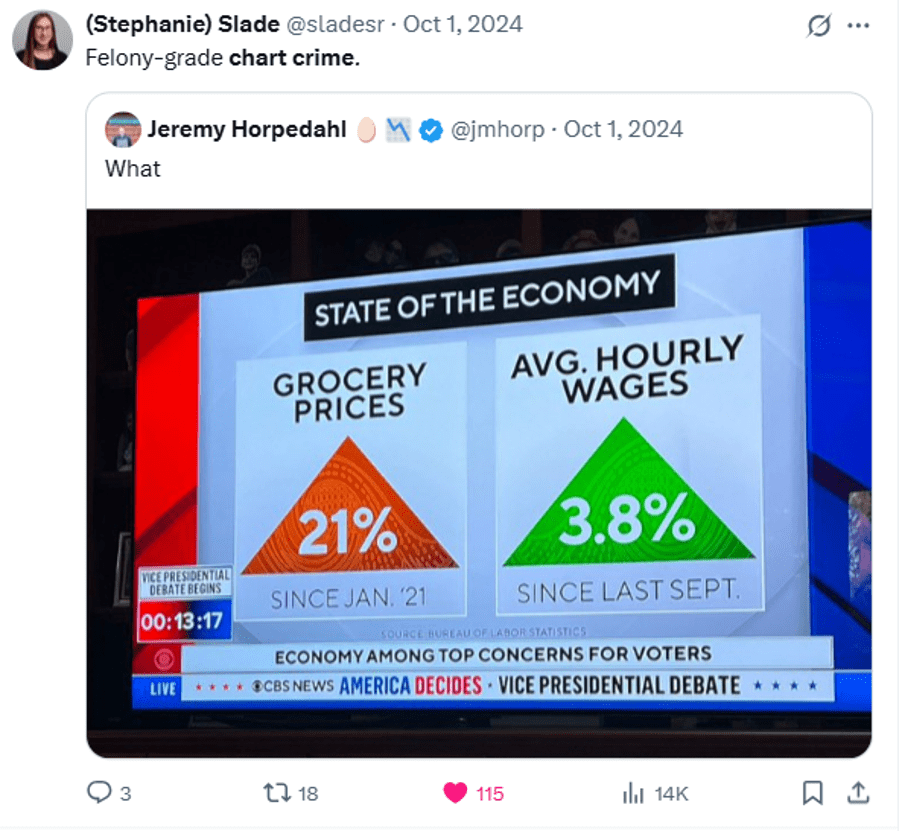
To keep that section from getting boring (“here’s a line graph… here’s a bar chart…”) you can borrow my slides on #chartcrimes Teaching people best practices is more engaging when you can show real examples of charts gone wrong.
These are pictures I dropped directly into slides and talked through:
P.S. Joke I made about this section of my textbook:
My textbook includes a slide specifically telling people not to use techniques thought to be cutting edge in 1998. "Perplexing depth" and "distracting art" 💀 pic.twitter.com/Pk5baBZvK1
“Both younger and older workers withdrew from the labor force in large numbers during the pandemic: In fact, their participation rates plummeted. Yet, within two years, the younger workers had bounced back to their pre-pandemic participation rates. But the older workers have not.”
They include a chart which seems to back up that assertion:
However, if you look closely, you will see that the older workers’ age group is open-ended. It includes 55-year-olds, as well as 95-year-olds. Given that the US population is aging, this seems like a poor choice.
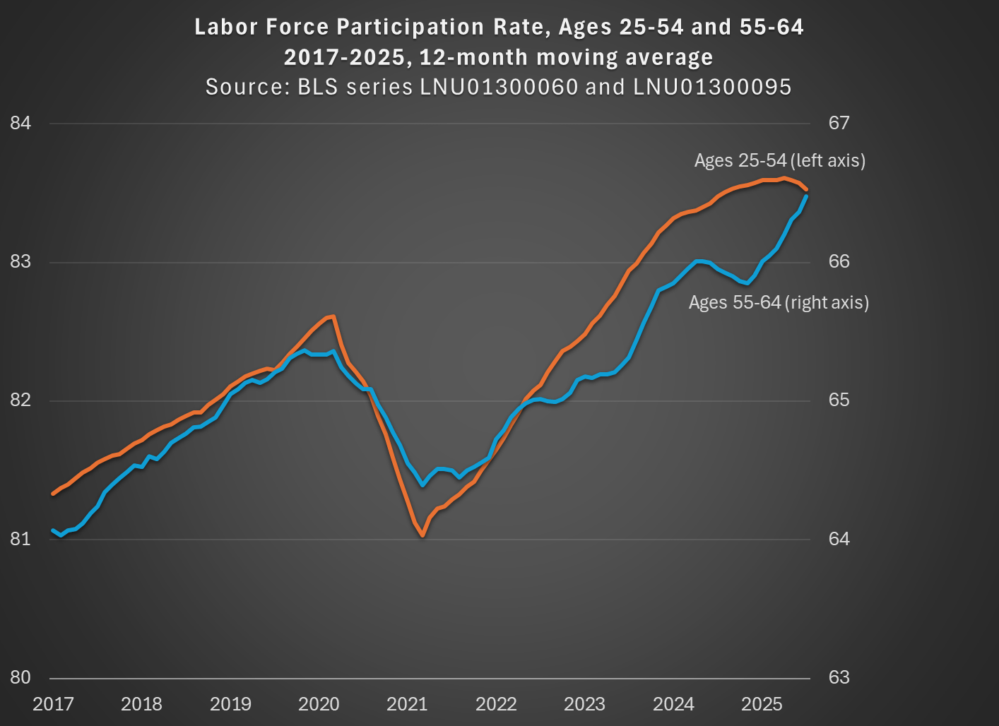
While not available currently in the FRED database, there is data from BLS available for older workers that is not open-ended. For example, we can look at workers ages 55-64, who are older but still young enough that they are mostly below traditional retirement age. I use that data and compare with the 25-54 age group (note: because the 55-64 data isn’t available seasonally adjusted, I use the non-adjusted data for both age groups, then use a 12-month average, so my chart doesn’t exactly replicate the chart above):
By using a closed-end age group for older workers, we see that labor force participation has not only recovered from the pandemic, but it exceeds the pre-pandemic peak for both prime-age and older workers, and had done so by the Spring of 2023. In fact, both are now about 1 percentage point above February 2020. If we want to go to the first decimal place, older workers have actually increased their labor force participation slightly more: 1.1 vs 0.9 percentage points. But these are close enough, given that this is survey data, to say the recovery has been roughly equal.
The St. Louis Fed blog concludes by saying that early workforce retirements “will continue to depress the labor force participation rate of workers aged 55 and older for the foreseeable future.” But it’s not true that the LFPR of older workers is depressed! Provided that we exclude those 65 and older.
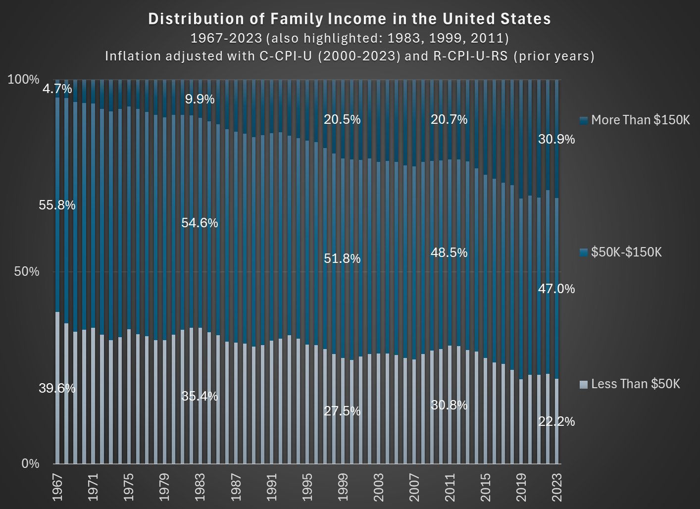
In 1967, about 56 percent of families in the US had incomes between $50,000 and $150,000, stated in 2023 inflation-adjusted dollars. In 2023, that number was down to 47 percent. So the American middle class shrunk, but why? (Note: you can do this analysis with different income thresholds for middle class, but the trends don’t change much.)
As you can see in the chart, the proportion of families that are in the high-income section, those with over $150,000 of annual income in 2023 dollars, grew from about 5 percent in 1967 to well over 30 percent in the most recent years. And the proportion that were lower income shrunk dramatically, almost being cut in half as a proportion, and perhaps surprisingly there are now more high-income families than low-income families (using these thresholds, which has been true since 2017). The number is even more striking when stated in absolute terms: in 1967 there were only about 2.4 million high-income households, while in 2023 there were 11 times as many — over 26 million.
Is this increase in family income caused by the rise of two-income households? To some extent, yes. Women have been gradually shifting their working hours from home production to market work, which will increase measured family income. However, this can’t fully explain the changes. For example, the female employment-population ratio peaked around 1999, then dropped, and now is back to about 1999 levels. Similarly, the proportion of women ages 25-54 working full-time was about 64 percent in 1999, almost exactly the same as 2023 (this chart uses the CPS ASEC, and the years are 1963-2023).
But since the late 1990s, the “moving up” trend has continued, with the proportion of high-income families rising by another 10 percentage points. Both the low-income and middle-income groups fell by about 5 percentage points. Certainly some of the trend in rising family income from the 1960s to the 1990s is due to increasing family participation in the paid workforce, but it can’t explain much since then. Instead, it is rising real incomes and wages for a large part of the workforce.
SPOILER ALERT FOR THE THIRD SEASON OF THE GILDED AGE
In Season 3 of the drama series “The Gilded Age,” one of the servants (Jack, a footman) earns a sum of $300,000 by selling a patent for a clock he invented (the total sum was $600,000, split with his partner, the son of the even wealthier neighbor to the house Jack works in). In the series, both the servants and Jack’s wealthy employers are shocked by this amount. Really shocked. They almost can’t believe it.
How can we put that $300,000 from 1883 in New York City in context so we can understand it today?
A recent WSJ article attempts to do that. They did a good job, but I think more context could help. For example, they say “Jack could buy a small regional bank outside of New York or bankroll a new newspaper.” Probably so, but I don’t think that quite conveys the shock and awe from the other characters in the show (a regional bank? Ho-hum).
First, the WSJ states that the “figure nowadays would be between $9 and $10 million.” That’s just doing a simple inflation adjustment, probably using a calculator such as Measuring Worth (it’s a good tool, and they mention it later in the story). But as the WSJ goes on to note, that probably isn’t the best way to think about that figure.
Here’s my best attempt to contextualize the $300,000 figure: as a footman, Jack probably made $7 to $10 per week. Or let’s call it $1 per day. That means Jack’s fellow servants would have had to work 300,000 days to earn that same amount of income — in other words, assuming 6 days of work per week, they would have had to work for almost 1,000 years to earn that much income. Jack appears, to his co-workers, to have earned that income almost in one fell swoop (though in reality, he spent months of his free time toiling away at the clock).
Did president Trump’s first term tariffs, enacted in 2018, increase manufacturing employment or even just manufacturing output? Let’s set the stage.
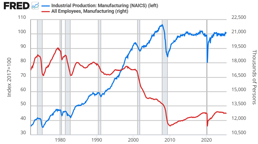
Manufacturing employment was at its peak in 1979 at 19.6 million. That number declined to 18m by the 1980s, 17.3m in the 1990s. By 2010, the statistics bottom out at 11.4m. Since then, there has been a rise and plateau to about 12.8m if we omit the pandemic.
Historically, economists weren’t too worried about the transition to services for a while. After all, despite falling employment in manufacturing, output continued to rise through 2007. But, after the financial crisis, output has been flat since 2014, again, if we omit the pandemic. Since manufacturing employment has since risen by 5% through 2025, that reflects falling productivity per worker. That’s not comforting to either economists or to people who want more things “Made in the USA”.
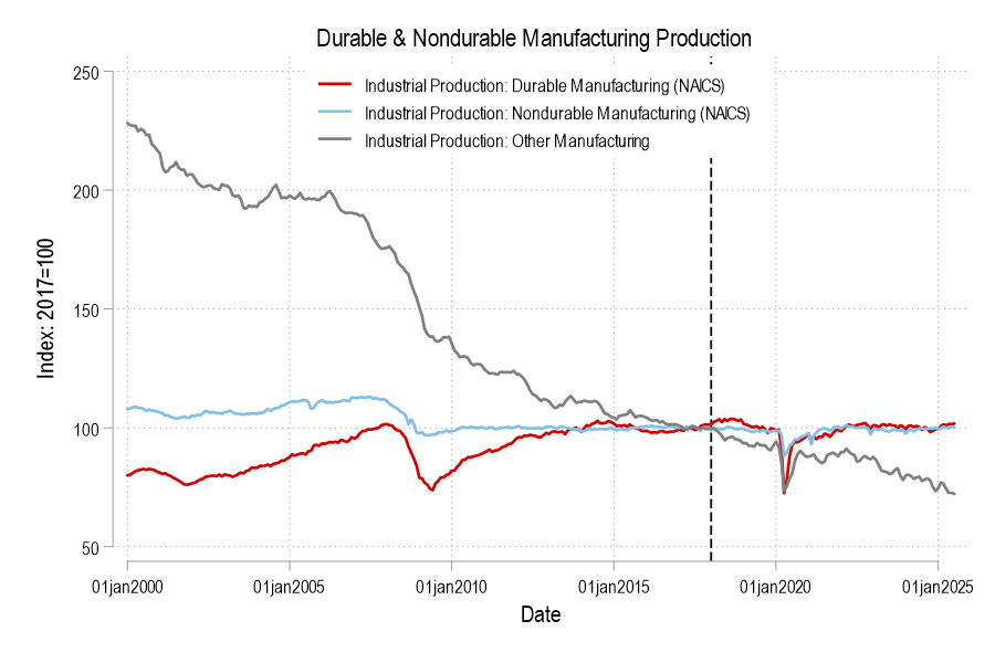
Looking at the graphs, there’s no long term bump from the 2018 tariffs in either employment or output. If you squint, then maybe you can argue that there was a year-long bump in both – but that’s really charitable. But let’s not commit the fallacy of composition. What about the categories of manufacturing? After all, the 2018 tariffs were targeted at solar panels, washing machines, and steel. Smaller or less exciting tariffs followed.
Breaking it down into the major manufacturing categories of durables, nondurables, and ‘other’ (which includes printed material and minimally processed wood products), only durable manufacturing output briefly got a bump in 2018. But we can break it down further.