This is an update to a previous post that I did on per-capita real consumption in 1990 vs 2021. As of 2021, we still weren’t sure after the pandemic what was transitory vs structural, and it was unclear whether incomes would keep up with inflation. We now have three more years of data through 2024. News flash: We’re even richer.
I like to use the BEA real quantity indices. Those track what is actually consumed in volumes rather than by deflating total spending by price indices. Divided by population, we can calculate the real quantities of goods and services that people actually consumed per capita.
Even after the pandemic policies have settled down, we are still SO MUCH RICHER – and even richer than we were with all of the pandemic-related stimulus. The worst consumption category since the pandemic has been food and beverage for off-premise consumption, and that is *up* 4.6% since 2020, increasing 31% since 1990. So, while I understand that people can’t enjoy the the low prices of yesteryear, we are still better off in that category than pre-pandemic. In the other categories, everything is awesome.
Since 1990, our consumption of communication services has risen 332%, our houses are 254% better furnished, and we have 118% greater quality-adjusted clothing consumption. All of this is already adjusted for inflation and is per-capita. Since the pandemic, these numbers are still up by 20.4%, 9.8%, and 31.1% respectively. People didn’t like the post-pandemic inflation. I get that. But these improvements in average consumption are mind boggling.
Ms. Armas Perez has written a current summary of the fast fashion landscape, including quotes from professors like me and industry executives.
Here’s one quote about me:
Joy Buchanan, an associate professor of Quantitative Analysis and Economics at Samford University, expanded on this idea: “Fast fashion is partly just a sign of a richer world. We can all have more of everything, including customized clothes.” In a world where clothing is cheaper than ever, the desire to reinvent oneself through fashion isn’t just encouraged—it’s expected. “Now that T-shirts are so cheap to make, it’s not surprising that people print them up for a single club event with little thought about the financial or environmental cost. Financially speaking, shirts are almost as disposable as plastic forks,” said Buchanan.
About the publication: The Politic is Yale’s undergraduate journal of politics and culture since 1947. The way people end up finding me to comment on this issue is my original piece for Cato from 2023.
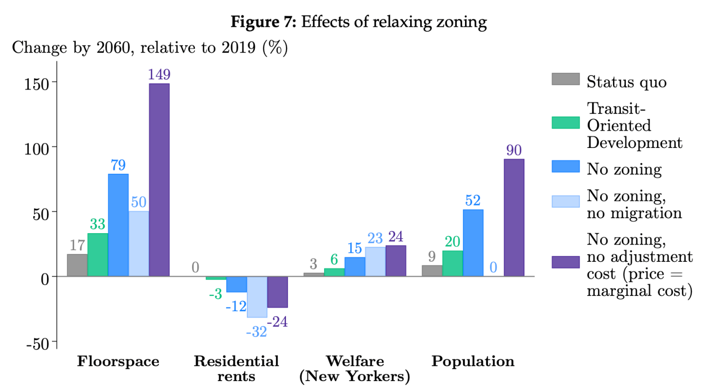
Most US cities make it hard for housing supply to meet demand because of rules that prevent large apartment buildings. Usually cities do this with zoning rules that limit the number of homes per parcel, often to as low as 1. New York City relies more on rules about Floor Area Ratio (the ratio of the floor area to the area of the parcel). But how binding are these rules? If we relaxed or repealed them, how much new construction would we see, and where would we see it?
I build a dynamic general equilibrium model of the supply and demand of floorspace in a city , which I estimate using a novel parcel-level panel dataset of land use and zoning in New York City. I validate the model using quasi-experimental variation from recent zoning reforms and use it to simulate the effects of zoning changes on construction and prices.
He finds that eliminating these rules in NYC would lead to a construction boom, with a 79% increase in the amount of floor space available by 2060. This would allow many more people to live in New York, with a 52% increase in population; but many of the benefits would go to existing NYC residents, with more floor space per person and modestly lower rents leading to higher wellbeing:
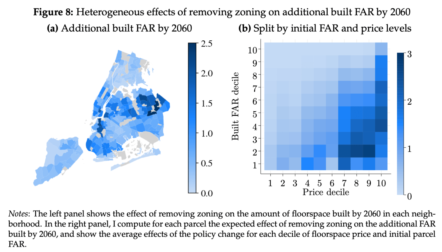
Where exactly would we see the building boom? Not Manhattan, but Brooklyn and Queens. The intuition is that zoning is most binding in places where housing prices are currently high but where the buildings are currently small; this is where there is the biggest incentive to tear down existing buildings and build taller if you are allowed to.
I have a good friend who is a professor in philosophy at another university. He was telling me about the struggle among his colleagues to determine the recipient of their annual department award. Every year the department chooses from among the graduating philosophy major students one to recognize for excellence. This year, they faced the challenge of incommensurables.
One student had a high GPA in the major, but had a severe case of senioritis and had phoned-in her senior courses. A second had a slightly worse GPA, but had face-planted the senior thesis. Still a 3rd student had merely a good GPA, but wrote an excellent publishable thesis.
The philosophy faculty could not agree. They each shared stories and arguments about the relative weights of the performance indicators and the relative value of the performances. I don’t know if you know any academics, but suffice it to say that they both A) tend not to be good administrators and B) tend not to be invited to productive meetings. I’m glad that I wasn’t in the room.
In fact, the faculty met twice! They were at an impasse. The department award winner is usually no contest. The person who excels in one area tends to also excel in the others. This year, the decision was so unclear and the faculty were so divided that they even seriously considered withholding the award entirely. None of the candidates was excellent on all counts.
Finally, trying to come to a decision – if not an agreement – they decided to adopt something that they’d heard good things about: Ranked Choice Voting. I was thrilled to hear this. What an opportunity to exhibit the nuance and beauty of this collective choice method! They agreed to adopt whatever the outcome would be. As my friend told me this, I was giddy with anticipation. What an exciting story! More good experiences with ranked choice voting may improve its popularity and make widespread its adoption.
If you don’t know, Ranked Choice Voting involves everyone ranking the candidates in order of preference. In this case 1 is most preferred and 3 is least preferred. Then, the candidate with the fewest first-ranked votes is eliminated from the running. The voters whose first preference was nixed now have their votes reallocated to their 2nd preferred candidates. Since only two candidates remain, one of them has won the majority and the election ends with an outcome that is usually considered better than the simple ‘just choose your favorite’ version that most of us use at our local polls.
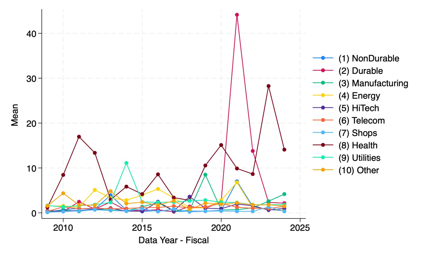
A reporter recently told me she thought there is a national trend toward hospitals issuing more bonds. I tried to verify this and found it surprising hard to do with publicly available data. But once I had to spend an hour digging through private Compustat data to find the answer, I figured I should share some results. Here’s the average debt in millions of companies by sector:
Source: My graph made from Compustat North American Fundamentals Annual data collapsed by Standard Industrial Classification code into the Fama-French 10 sectors
This shows that health care is actually the least-indebted sector, and telecommunications the most indebted, followed by utilities and “other” (a broad category that actually covers most firms in the Fama-French 10). But are health care firms really more conservative about debt, or are they just smaller? Let’s scale the debt by showing it as a share of revenue:
My graph made from Compustat North American Fundamentals Annual data collapsed by SIC code into the Fama-French 10 sectors(dltt/revt).
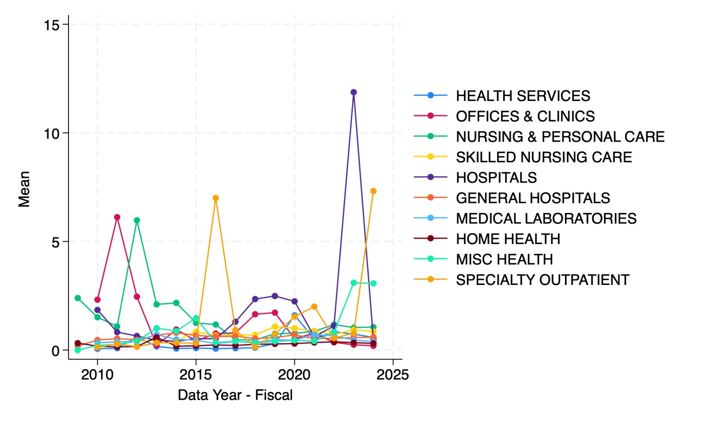
It appears that health care firms are the most indebted relative to revenue since 2023. But which parts of health care are driving this?
Hospitals in 2023 followed by specialty outpatient in 2024. However, seeing how much the numbers bounce around from year to year, I suspect they are driven by small numbers of outlier firms. This could be because Compustat North America data only covers publicly traded firms, but many sectors of health care are dominated by private corporations or non-profits.
I welcome suggestions for datasets on the bond-market side of things that are able to do industry splits including private companies, or suggestions for other breakdowns you’d like to see me do with Compustat.
SPOILER ALERT if you are watching the TV Series Yellowstone: at the start of Season 5, John Dutton (played by Kevin Costner) is sworn in as Governor of Montana. One of his first proposals in his inaugural address is that the state legislature “double property taxes for non-residents” who have been buying up vacation homes in the state, and contributing to the increase in property values in the state (a fact which drives many plotlines throughout the series). This episode aired in November 2022.
This week, the real governor of Montana signed a pair of bills which effectively did what the fictional governor John Dutton proposed: significantly increasing property taxes on non-residents. Starting in tax year 2026, the property taxes for non-primary residences (which will include non-Montana residents and Montanans who own vacation homes) will be based on 1.9% of market value, while Montana residents will pay a graduated rate structure for their primary residence: 0.76% for property up to the state median (currently about $340,000), 0.9% up to two times the state median, 1.1% for the value between 2 and 4 times the state median, and 1.9% (the same as non-residents) for the value of homes above 4 times the state median ($1.36 million currently). Currently residential property is taxed at 1.35% of market value, meaning that while the rate hasn’t fully doubled for non-residents, most non-residents will be paying twice or more in property taxes than Montana residents.
I was a non-resident member of the Montana Property Tax Task Force, and served on the “Tax Fairness” subcommittee where the plan for HB 231 originated, so I have somewhat of a unique perspective on these changes to property tax rates. I will offer a few thoughts, some of which are critical, but let me first say that it was a great honor to be asked to serve on the Task Force by Montana’s Governor. Also, everyone on the Task Force was very friendly and receptive to ideas from outsiders (I was one of three non-Montanans on the Task Force), and so my comments here are not critical of the Task Force process nor anyone on it. As I did when I served on the Task Force, my goal in this post is to try, as best as I can, to objectively analyze how this proposal (now law) will impact Montana.
Satire news shows are, in my opinion, one of the higher forms of art that my country has produced (and an example of our exports). “Meet Tariff Tilly, the perfect replacement for the 37 dolls your kid does not need” from The Daily Show
“Tariff Tilly” builds. There is even a comment on interest rates (addressed in my previous post).
This post is co-written with John Olis, History major at Ave Maria University.
There is a popular myth that manufacturing jobs of the past provided a leg-up to young people. The myth goes like this. Manufacturing jobs had low barriers to entry so anyone could join. Once there, the job paid well and provided opportunities for fostering skills and a path toward long-term economic success. There is more to the myth, but let’s stop there for the moment. Is the myth true?
One of my students, John Olis, did a case study on Connecticut in 1920-1930 using cross sectional IPUMS data of white working age individuals to evaluate the ‘Manufacturing Myth’. We are not talking causal inference here, but the weight of the evidence is non-zero. The story above has some predictions if not outright theoretical assertions.
Manufacturing jobs paid better than non-manufacturing jobs for people with less human capital.
Manufacturing jobs yielded faster income growth than non-manufacturing jobs.
Implicitly, manufacturing jobs provided faster income growth for people with less human capital.
Using only one state and two decades of data obviously makes the analysis highly specific. Expanding the breadth or the timescale could confirm or falsify the results. But historical Connecticut is a particularly useful population because 1) it had a large manufacturing sector, 2) existed prior to the post WWII boom in manufacturing that resulted from the destruction of European capacity, and 3) had large identifiable populations with different levels of human capital.
Who had less human capital on average? There are two groups who are easy to identify: 1) immigrants and 2) illiterate people. Immigrants at the time often couldn’t speak English with native proficiency or lacked the social norms that eased commercial transactions in their new country (on average, not always). Illiterate people couldn’t read or write. Therefore, having a comparative advantage in manual labor, we’d expect these two groups to be well served by manufacturing employment vs the alternative.
Being cross-sectional, the individuals are not linked over time, so we can’t say what happened to particular people. But we can say how people differed by their time and characteristics. Interaction variables help to drill-down to the relevant comparisons. There are two specifications for explaining income*, one that interacts manufacturing employment with immigrant status and one that interacts the status of illiteracy. The baseline case is a 1920 non-operative native or literate person. Let’s start with the below snapshot of 1920. The term used in the data is ‘operative’ rather than ‘manufacturer’, referring to people who operate machines of one sort or another. So, it’s often the same as manufacturing, but can also be manufacturing-adjacent. The below charts illustrate the effect of lower human capital in pink and the additional subpopulation impacts of manufacturing in blue.
In the left-hand specification, native operatives made 2.2% less than the baseline population. That is, being an operative was slightly harmful to individual earnings. Being an immigrant lowered earnings a substantial 16.8%, but being an operative recovered most of the gap so that immigrant operatives made only 6.1pp less than the baseline population and only 3.9pp less than native operatives. In the right-hand specification, unsurprisingly, being illiterate was terrible for one’s earnings to the tune of 23.4pp. And while being an operative resulted in a 1.2% earnings boost among natives, being an operative entirely eliminated the harm that illiteracy imposed on earnings.
Both graphs show that manufacturing had tiny effects for a typical native or literate individual. But manufacturing mattered hugely for people who had less human capital. So, prediction 1) above is borne out by the data: Manufacturing is great for people with less-than-average human capital.
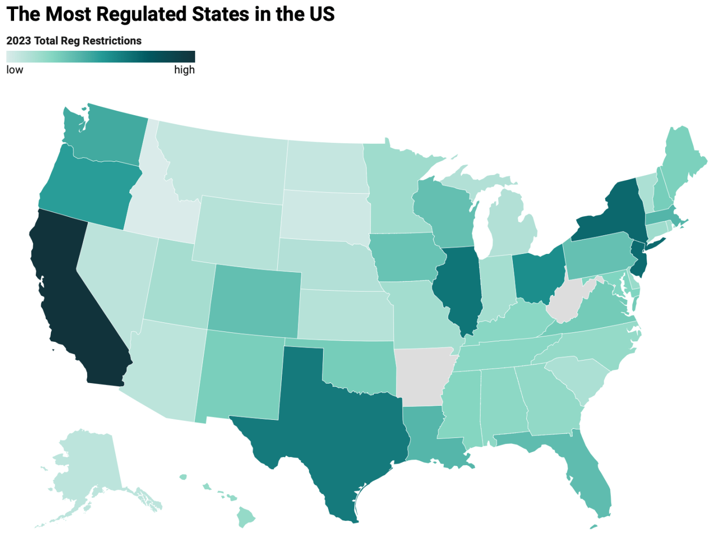
The Mercatus Center has put together a page of “Snapshots of State Regulation” using data from their State RegData project. Their latest data suggests that population is still a big predictor of state-level regulation, on top of the red/blue dynamics people expect:
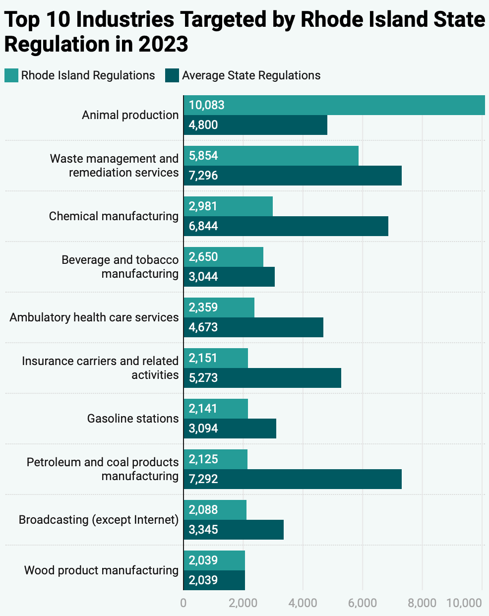
They also made pages with much more detail on each state, like what the most regulated industries in each state are and how each one compares to the national average: