Rat to Research Discourse

I made this Decreasing Marginal Utility rat picture when I was an undergraduate, and it caught on. A textbook asked me for permission to print it.

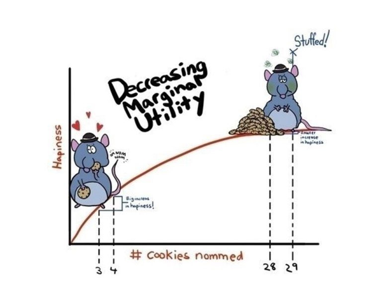
This week on Twitter (X.com), someone said it was their favorite graph. Upon replying I learned that he had used it for teaching. It’s fun when you know one of your ideas is out in the world helping people.

For real? I absolutely HOWLED when I found it on a google image search! Bravo! I taught HS Econ for many years and this was the kind of stuff that kept kids awake!

https://twitter.com/arburnside/status/1702690454884487495

Blogger privilege is to manifest a new conversation on here. If one of my research articles were to achieve the same level of influence as the stuffed rat, then people might tweet something along the following lines:

An Experiment on Protecting Intellectual Property,” (2014), with Bart Wilson. Experimental Economics, 17:4, 691-716.

This original project, both in terms of methodology and subject, is one of the first controlled experiments on intellectual property protection, which has inspired subsequent lab work on this issue. We present a color cube mechanism that provides a creative task for subjects to do in an experiment on creative output. The results indicate that IP protection alone does not cause people to become inventors, although entrepreneurs are encouraged to specialize by IP protection.

Smile, Dictator, You’re On Camera,” (2017), with Matthew McMahon, Matthew Simpson and Bart Wilson. Southern Economic Journal, 84:1, 52-65.

The dictator game (DG) is attractive because of its simplicity. Out of thousands of replications of the DG, ours is probably the controlled experiment that has reduced “social distance” to the farthest extreme possible, while maintaining the key element of anonymity between the dictator and their receiver counterpart. In our experiment the dictator knows they are being watched, which is the opposite of the famous “double-blind” manipulation that removed even the view of the experimenter. As we predicted, people are more generous when they are being watched. Anyone teaching about DGs in the classroom should show our entertaining video of dictators making decisions in public: https://www.youtube.com/watch?v=vZHN8xyp6Y0&t=22s

My Reference Point, Not Yours,” (2020) Journal of Economic Behavior and Organization, 171: 297-311.

There is a lot of talk about reference points. No matter how you feel about “behavioral” economics, I don’t think anyone would deny that reference-dependent behavior explains some choices, even very big ones like when to sell your house. Considering how important reference points are, can people conceive of the fact that different people have different reference points shaped by their different life experiences? Results of this study imply that I tend to assume that everyone else has my own reference point, which biases my beliefs about what others will do. Because this paper is short and simple, it would make a good assignment for students in either an experimental or econometrics class. I have a blog post on how to turn this paper into an assignment for students who are just learning about regression for the first time.

If Wages Fell During a Recession,” (2022) with Daniel Houser, Journal of Economic Behavior and Organization.  Vol. 200, 1141-1159.

The title comes from Truman Bewley’s book Why Wages Don’t Fall during a Recession. First, I’ll take some lines directly from his book summary:

A deep question in economics is why wages and salaries don’t fall during recessions. This is not true of other prices, which adjust relatively quickly to reflect changes in demand and supply. Although economists have posited many theories to account for wage rigidity, none is satisfactory. Eschewing “top-down” theorizing, Truman Bewley explored the puzzle by interviewing—during the recession of the early 1990s—over three hundred business executives and labor leaders as well as professional recruiters and advisors to the unemployed.

By taking this approach, gaining the confidence of his interlocutors and asking them detailed questions in a nonstructured way, he was able to uncover empirically the circumstances that give rise to wage rigidity. He found that the executives were averse to cutting wages of either current employees or new hires, even during the economic downturn when demand for their products fell sharply. They believed that cutting wages would hurt morale, which they felt was critical in gaining the cooperation of their employees and in convincing them to internalize the managers’ objectives for the company.

We are one of the first to take this important question to the laboratory. The nice thing about an experiment is that you can measure shirking precisely and you can get observations on wage cuts, which are rare in the naturally occurring American economy.

We find support for the morale theory, but a new puzzle got introduced along the way. Many of our subjects in the role of the employer cut the wages of their counterpart, which probably lowered their payment. Why didn’t they anticipate the retaliation against wage cuts? That question inspired the paper “My Reference Point, Not Yours.”

Other people’s money: preferences for equality in groups,” (2022) with Gavin Roberts, European Journal of Political Economy, Vol. 73.

Andreoni & Miller (2002) have been cited over 2500 times for their experiment that shows demand curves for altruism slope down. Economic theory is not broken by generosity. We extend their work to show that demand curves for equality slope down. Individuals don’t love inequality, but they also don’t love parting with their own money. There is a higher demand for reducing inequality with other people’s money than with own income.

Willingness to be Paid: Who Trains for Tech Jobs?” (2022), Labour Economics, Vol 79, 102267. 

This is the last paper I’ll do here. At this point, readers probably would like a funny animal picture. Here’s a meme about the difficult life of computer programmers:

For decades, tech skills have had a high return in the labor market. There is very little empirical work on why more people do not try to become computer programmers, although there are policy discussions about confidence and encouragement.

I ran an experiment to measure something that is important and underexplored. One thing I found is that attempts to increase confidence, if not carefully evaluated, might backfire.

Would you predict it’s more important to have taken a class in programming or for a potential worker to report that they enjoy programming? My results imply that we should be doing more to understand both the causes and effects of subjective preferences (enjoyment) for tech work. 

A few more decades to go here… I will try to top the stuffed rat picture.

Hand-in-Hand: Demand & Technology

In standard microeconomics, the long-run demand is unimportant for the market price of a good. Firm competition, entry, and exit causes economic profits to be zero and the price to be equal to firms’ identical minimum average cost. This unreasonably assumes that they have constant technology. That is, they have a constant mix of productive inputs and practices.

Just so we’re clear: time is passing such that firms can enter, exit, and adjust the price – but no productive innovation occurs. For the modeling, we freeze time for technology, but not for other variables. The model ceases to reflect reality on the margin of scale-induced innovation. The standard model assumes an optimal quantity of production for each firm and the only way for total output to change is for there to be more or fewer firms. The model precludes adopting any different technology because firms are already producing at the minimum average cost – if they could produce more cheaply, then they would.

Enter Scale

One of my favorite details about production was taught to me by Robin Hanson.* Namely, that the scale of production isn’t merely with the aid of more raw materials, labor, and capital. There are perfectly well-known existing technologies and methods that reduce the average cost – if the firm could produce a large enough quantity. This helps to illustrate what counts are technology. A firm can achieve lower average costs without inventing anything, and merely by adopting a superficially different production method.

Continue reading

OpenAI wants you to fool their AI

OpenAI created the popular Dall-E and ChatGPT AI models. They try to make their models “safe”, but many people make a hobby of breaking through any restrictions and getting ChatGPT to say things its not supposed to:

Source: Zack Witten

Now trying to fool OpenAI models can be more than a hobby. OpenAI just announced a call for experts to “Red Team” their models. They have already been doing all sorts of interesting adversarial tests internally:

Now they want all sorts of external experts to give it a try, including economists:

This seems like a good opportunity to me, both to work on important cutting-edge technology, and to at least arguably make AI safer for humanity. For a long time it seemed like you had to be a top-tier mathematician or machine learning programmer to have any chance of contributing to AI safety, but the field is now broadening dramatically as capable models start to be deployed widely. I plan to apply if I find any time to spare, perhaps some of you will too.

The models definitely still need work- this is what I got after prompting Dall-E 2 for “A poster saying “OpenAI wants you…. to fool their models” in the style of “Uncle Sam Wants You””

Median Family Income in US States, 2022

Last week I wrote about median income in the US, and how it had declined since 2019 and 2021 through 2022 (inflation adjusted, of course). The big story is that median income (both for households and families) has been falling in recent years. While there are some silver linings when looking at subgroups, such as Black families, the overall data isn’t good.

But while that is true for the US overall, it’s not true for every state. In fact, it’s not even true for most states! From 2019 to 2022, there were 29 states that saw their median family incomes rise! That’s adjusted for inflation (I’m using the C-CPI-U, which is Census’s preferred inflation measure for this data). The income data in this post all comes from the Census ACS 1-year estimates.

Here’s a map showing the states that had increases in median family income (green) and those that had decreases (in red). (This is my first time experimenting with Datawrapper maps, feedback appreciated!)

Some states had pretty robust growth, with New Mexico and Arizona leading the way with around 5 percent growth. There is substantial variation across US states, including with big declines like Wyoming at -5 percent, and Oklahoma and Illinois are -3 percent.

A few weeks ago I also wrote about the richest and poorest MSAs in the US. But what about the richest and poorest states in the US? The following map shows that data.

The immediate fact which will jump out at you is that the lowest income US states are almost all located in the South. This will probably not surprise most of us, although it probably is a bit surprising since the data is adjusted for differences in the cost of living (using the BEA RPP data). Even after making these adjustments, the South is still clearly the poorest region (and it definitely was the poorest without the adjustments).

Among the higher income states, they are distributed pretty well across the rest of the non-South. There are 16 states (plus DC) that have median family incomes over $100,000 (again, cost of living adjusted), and while many of these are in New England and the Mid-Atlantic, there area still a few in the Midwest, Great Plains, and the West. Utah and New Jersey have similar incomes, as do Virginia and Rhode Island.

The highest income states are Massachusetts and Connecticut, with over $112,000 in median family income, while the lowest are Mississippi and West Virginia, both under $78,000. Median family income in Massachusetts is 46 percent higher than Mississippi. And that’s after adjusting for differences in the cost of living.

Christine Lagarde on Instability in 2023

Christine Lagarde, President of the European Central Bank, gave a speech called “Policymaking in an age of shifts and breaks” at Jackson Hole in August 2023.

She mentioned multiple factors that make the near future hard to predict, from the effect of A.I. on jobs to the war in Ukraine.

In the pre-pandemic world, we typically thought of the economy as advancing along a steadily expanding path of potential output, with fluctuations mainly being driven by swings in private demand. But this may no longer be an appropriate model.

For a start, we are likely to experience more shocks emanating from the supply side itself.

A line I found interesting, because of my paper on sticky wages:

Large-scale reallocations can also lead to rising prices in growing sectors that cannot be fully offset by falling prices in shrinking ones, owing to downwardly sticky nominal wages. So the task of central banks will be to keep inflation expectations firmly anchored at our target while these relative price changes play out.

And this challenge could become more complex in the future because of two changes in price- and wage-setting behaviour that we have been seeing since the pandemic.

First, faced with major demand-supply imbalances, firms have adjusted their pricing strategies. In the recent decades of low inflation, firms that faced relative price increases often feared to raise prices and lose market share. But this changed during the pandemic as firms faced large, common shocks, which acted as an implicit coordination mechanism vis-à-vis their competitors.

Under such conditions, we saw that firms are not only more likely to adjust prices, but also to do so substantially. That is an important reason why, in some sectors, the frequency of price changes has almost doubled in the euro area in the last two years compared with the period before 2022.

Once Covid changed our lives so much, then things kept changing. Firms are raising prices because consumers got used to change.

At this Jackson Hole meeting, both J. Powell, the chair of the Federal Reserve, and Lagarde indicated that they are trying to get inflation under control and back to the 2% target. If you want to get this information via podcast, listen to “Joe Gagnon on Inflation Progress and the Path Ahead: Breaking Down Jerome Powell’s Jackson Hole Speech

After reading her interesting speech, I had to know more about C. Lagarde. On Wikipedia, I discovered:

After her baccalauréat in 1973, she went on an American Field Service scholarship to the Holton-Arms School in Bethesda, Maryland.[18][19] During her year in the United States, Lagarde worked as an intern at the U.S. Capitol as Representative William Cohen’s congressional assistant, helping him correspond with French-speaking constituents from his northern Maine district during the Watergate hearings.

Since my post about “awards for young talent” was found and shared on Twitter, I have continued thinking about it. According to Wiki, C. Lagarde has received several prestigious awards. Her progression through the “Most Powerful Woman in the World” ranking is something.

Imagine being that close to the top back in 2015 and getting beat out by American Melinda Gates.  But today, Lagarde is winning over both Melinda French Gates and Kamala Harris. Will an economist climb to #1? Lagarde is currently sitting at #2 when I checked the Forbes website.

Bond King Doesn’t Like Bonds

Bill Gross grew PIMCO into a trillion dollar company by trading bonds, earning the epithet “Bond King“. But in an interview with Odd Lots this week, he disclaims both bonds and his title. He wasn’t the king:

My reputation as a bond king was first of all made by Fortune. They printed a four page article with me standing on my head doing yoga, and I was supposedly the bond king, and that was good because it sold tickets. But I never really believed it. The minute you start believing it, you’re cooked.

Who is the real bond king? The Fed:

The bond kings and queens now are are at the Fed. They rule, they determine for the most part which way interest rates are going.

Who still isn’t the bond king? Any other trader, especially Jeff Gundlach:

To be a bond king or a queen, you need a kingdom, you need a kingdom. Okay, Pimco had two trillion dollars. Okay, DoubleLine’s got like fifty five billion. Come on, come on, that’s no kingdom. That’s like Latvia or Estonia whatever. Okay, and then then look at his record for the last five, six, seven years. How does sixtieth percentile smack of a bond king? It doesn’t.

Why he doesn’t believe in long-term bonds right now:

We have a deficit of close to two trillion. The outstanding treasury market is about 33 trillion… about thirty percent of the existing outstanding treasuries, so ten trillion have to be rolled over in the next twelve months, including the two trillion that’s new. So that’s that’s twelve trillion dollars. Where the treasuries that have to be financed over the next twelve months, and who’s going to buy them at these levels? Well, some people are buying them, but it just seems to be a lot of money. And when you when you add on to that, Powell is doing quantitative tightening, as you know, and that theoretically is a trillion dollars worth of added supply, I guess. And so it just seems like a very dangerous time based on supply, even if inflation does comedown.

By revealed preference I agree with Gross, in that I don’t own any long-term bonds. Their yields are way up from 2 years ago, making them somewhat tempting, but I can get higher yields on short-term bonds, some savings accounts, and some stocks. So I see no reason to go long term, especially given the factors Gross highlights. If he’s right, better long-term yields will be here in a year or two. If he turns out to be wrong, I think it would be because of a severe recession here or in another major economy, but I don’t expect that. So what is Gross buying instead of bonds? He likes the idea of real estate:

 All all my buddies at the country club are in real estate, and they’ve never paid a tax in their life…. I’ve paid a lot of taxes.

He landed on Master Limited Partnerships, common in the energy sector, as an easier way to avoid taxes, and has 40% of his wealth there. Those are yielding more like 9% and have the tax benefits, though they are risker than treasury bonds. The rest of his portfolio he implies is in stocks, describing some merger arbitrage opportunities. I am a bit tempted by bonds because they’ve done so badly recently (and so have gotten much cheaper), but like Gross I think we’re still not to the bottom.

Median Income Is Down Again. Are There Any Silver Linings in the Data?

This week the Census Bureau released their annual update on “Income, Poverty and Health Insurance Coverage in the United States.” This release is always exciting for researchers, because it involves as massive release of data based on a fairly large (75,000 household) sample with detailed questions about income and related matters. For non-specialists, it also generates some of the most commonly used national data on income and poverty. Have you heard of the poverty rate? It’s from this data. How about median household income? Also from this data.

I’ll focus on income data in this post, though there is a lot you could say about poverty and health insurance too. The headline result on median income is, once again, a dismal one. Whether you look at median household income (very commonly reported, even though I don’t like this measure) or median family income (which I prefer), both are down from 2021 to 2022 when adjusted for inflation. Both are still down noticeably from the pre-pandemic high in 2019 (though both are also above 2018 — we aren’t quite back to the Great Depression or Dark Ages, folks!).

These headline results are bad. There is no way to sugarcoat or “on the other hand” those results. And these results are probably more robust and representative than other measures of average or median earnings, since they aren’t subject to “composition effects” — when those with zero wages in one period don’t show up in the data. I will note that these results are for 2022, and we are highly likely to see a turnaround when we get the 2023 data in about a year (inflation has slowed to less than wage growth in 2023).

But given that obviously bad headline result, was there any good data? As I mentioned above, a ton of data, sliced many different ways, is released with this report. Some of it also gives us consistent data back decades, in some cases to the 1940s. What else can we learn from this data release?

Median Income by Race

When we look at median income by race, there are a few silver linings. The headline data from Census tells us that only the drop in household income for White, Non-Hispanics was statistically significant. For other races and ethnicities, the changes were not statistically significant from 2021 to 2022 — and some of those changes were actually positive. We shouldn’t dismiss White, Non-Hispanics — they are the largest racial/ethnic group! — but it is useful to look at others.

Black household and families are the most interesting to look at in more detail, especially because they are the poorest large racial group in the US. Black household and family income increased from 2021 to 2022, although the increase was small enough that we can’t say it is statistically significant (remember, this is a sample, not the universe of the decennial Census).

But what’s more important is that median Black household income is now at the highest level it has ever been (adjusted for inflation, as always). Median Black household income is about $1,000, or around 2 percent higher than in 2019 — the peak date for overall median income. Two percent growth over 3 years is nothing to shout from the rooftops, but it is very different from White, Non-Hispanic households, which are down over 6 percent since 2019.

Median black family income is roughly flat since 2019, but it is up about 1.5 percent in the past year — not quite as robust, but still better than the overall numbers.

Historical Income Data

The other silver lining I always like to mention is the long-run historical data. This data often gets overlooked in the obsessive focus on the most recent changes, so it’s useful to sit back and look at how far we have come. Let’s start where we just left off, with Black families. I wrote a post back in February about Black family income, which had data current through 2021, but it’s useful once again to look at the data with another year (plus they have updated the inflation adjustments for 2000 onward).

The chart shows the percent of Black families that are in three income groups, using total money income data. The data is adjusted for inflation. The progress is dramatic. In 1967, the first year available, half of Black families had incomes under $35,000. By 2022 that number had been cut in half to just one quarter of families (the 2022 number is the lowest on record, even beating 2019). Twenty-five percent is still very high, especially when compared to White, Non-Hispanics (it’s about 12 percent), but it’s still massive progress. It’s even a 10-percentage point drop from just 10 years ago. And Black families haven’t just moved up a little bit: the “middle class” group (between $35,000 and $100,000) has been pretty stable in the mid-40 percentages, while the number of rich (over $100,000) Black families has grown dramatically, from just 5 percent to over 30 percent.

We saw earlier that progress for White, Non-Hispanics has stumbled in the past 3 years, but the long run data is much more optimistic (this data starts in 1972).

The progress here should be evident too, but let me highlight one thing for emphasis: as far back as 1999, the largest of these three groups was the “rich” (over $100,000 group). And since 2017, the upper income group has been the majority, with median White Non-Hispanic family income surpassing $100,000 in 2017, up from $70,000 at the beginning of the series in the early 1970s (all inflation adjusted, of course).

The next question I often get with this historical data is: How much of this increase is due to the rise of two-income households. Well, this same data release allows us to look at that data too! This final chart shows median family income for families with either one or two earners (there are families with zero earners or more than two, but these two categories make up the bulk of families). This data is pretty cool because it goes all the way back to 1947.

This chart doesn’t look so good for one-earner families. After growing along with two-earner families in the 1950s and 1960s, it basically stagnates from the early 1970s until the late 2010s. Then you get a little growth. Not good!

I think more investigation is needed here, but the share of families that have two earners has grown dramatically, from 26 percent of families in 1947 to 42 percent in 2022. Single earner families shrunk from 59 percent to 31 percent, and dual-income families have been the most common family type since the late 1960s. There are some important compositional differences here in what types of families only have one earner. If we imagine some alternate history where, by law, only one spouse was allowed to work, certainly the single earner line would have risen more. And many of the single earner families today are single mothers, who for a variety of reasons have much lower earning potential than the fathers heading married couples in the 1950s and 1960s. So the numbers aren’t perfectly comparable.

Still, even for single earner families, real median income has more than doubled since 1947 — though most of that growth had happened by the early 1970s.

As we make our way through a challenging economic time following the pandemic and 2 years of unusually high inflation, hopefully we can look forward to a future of resuming the upward trajectory of incomes for all kinds of families.

[Not] Choosing Rationally

I’ve written previously on game theory, about the generality of Pure Strategy Nash Equilibria (PSNE), and the drawbacks of Sub-Game Perfect Nash Equilibria (SGPE). In this post I have another limitation for SGPE.


First, some definitions:
PSNE: “No player can change one of their strategies and improve their payoff, given the strategies of all other players.”
Subgame: “A subset of any extensive-form game that includes an initial node (which doesn’t share an information set with other nodes) and all its successor nodes.”
Subgame Equilibrium (SGE): “The PSNE of the Subgame”
SGPE: “The set of PSNE that are also SGE”


Clearly, there is nothing inconsistent about the above definitions. The reason that SGPE emerged was because some PSNE assert that a player would be willing to choose strategies that do not maximize conditional payoffs in subgames that are off of the equilibrium path. So, people often characterize the SGPE as a player ‘being rational each step of the way in each subgame’.

But, there is a problem. “Each step of the way” and “in each subgame” are not the same thing. Each step of the way implies that a player is rational at each decision – ie, at each information set. But, not every information set is a subgame! So, a SGPE can include rationality at each SGE while also permitting some irrationality at individual information sets. Since economists like to identify the bounds of their claims, let me emphasize the word can. In order to be correct, I need only identify one case in which the claim is true.


Here is that case:

Continue reading

Cool the Schools

Short post today because I’m busy watching my kids, who had their school canceled because of excessive heat, like many schools in Rhode Island today.

I thought this was a ridiculous decision until my son told me he heard from his teacher that his elementary school is the only one in town that has air conditioning for every classroom. Given that, the decision to cancel given the circumstances is at least reasonable, but the lack of AC is not.

It’s not just that hot classrooms are unpleasant for students and staff, or that sudden cancellations like this are a major burden for parents. Several economics papers have found that air conditioning significantly improves students’ learning as measured by test scores (though some find not). Park et al. (2020 AEJ: EP) find that:

Student fixed effects models using 10 million students who retook the PSATs show that hotter school days in the years before the test was taken reduce scores, with extreme heat being particularly damaging. Weekend and summer temperatures have little impact, suggesting heat directly disrupts learning time. New nationwide, school-level measures of air conditioning penetration suggest patterns consistent with such infrastructure largely offsetting heat’s effects. Without air conditioning, a 1°F hotter school year reduces that year’s learning by 1 percent.

This can actually be a bigger issue in somewhat Northern places like Rhode Island- we’re South enough to get some quite hot days, but North enough that AC is not ubiquitous. Data from the Park paper shows that New York and New England are actually some of the worst places for hot schools:

This is because of the lack of AC in the North:

The days are only getting hotter…. it’s time to cool the schools.

The Dodge Caravan, Quality Improvements, and Affordability

1996 was a big year for minivans. While modern minivans had been around for about a decade by that point, 1996 marked a turning point. That year Dodge introduced what is referred to as the “third generation” of its Caravan, and it won Motor Trend’s car of the year award. That’s the first, and only time, that a minivan ever won this award. If you drive a minivan today or see one on the road, you are seeing the look, style, and features that were first introduced in 1996 (interestingly, that year also seems to have marked the peak in sales for the Chrysler family of minivans).

If you wanted to buy the cheapest possible Dodge Caravan in 1996, you would have paid about $18,500. You could always pay more for more features, as with any car, but if you wanted this “car of the year,” and you wanted it new and cheap, that was what you paid.

Dodge continued to produce the Caravan for the US market until 2020, when it was discontinued in favor of other nameplates (though it still lived on in Canada). In 2020, the base model Caravan was about $29,000 (and now only available in the “Grand” version, an upgrade in 1996).

Oren Cass has used the prices of these two minivans to make a point about price indexes, quality adjustments, and affordability. If you look at the raw prices, clearly it is more expensive. But the consumer price index tells us that the price of new cars was flat between 1996 and 2020.

So what gives?

Continue reading