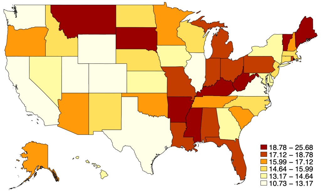
State health care spending usually gets reported in terms of dollars per capita, leading to maps like this that show Alaska as the highest-spending state and Utah as the lowest:
But states differ greatly in how rich they are and how much they have to spend. I wanted to know the states where health care takes up the largest and smallest share of the economy, so I got the data:
Health Care Spending as Share of State Gross Domestic Product in 2019:
You can see that health spending as a share of GDP looks pretty different from health spending in raw dollars. We’ve gone from a high-spending North and low-spending South to more of a mix. Health spending is now highest in West Virginia, where it makes up more than a fourth of the economy; and lowest in Washington State and Washington D.C., where it makes up less than one ninth of the economy.
The biggest change when considering things this way is in Washington D.C., which has the highest spending in $ terms but the lowest as a share of GDP because it has an enormous GDP per capita. Many other states that spend a lot in $ also fall a lot in the rankings due to high GDP per capita, including Alaska, New York, and Massachusetts. The states that rise the most in this ranking are poor states like Arkansas, Alabama, and Mississippi. Mississippi rises the most, gaining 37 spots in the rankings of highest-spending states when we go from $ per capita to share of GDP.
I share the data here so you can do your own comparisons:
The other day I was chatting on Zoom with a friend. She noted that she and a couple of girl friends go on an interesting vacation each year. They start off by each of them writing down their top three destinations, and then comparing notes. This year, it is a tour of the Danube region.
Thinking of a similar “Where do we go next year for kicks, guys?” scenario in the movie City Slickers, I jokingly suggested running with the bulls in Pamplona. That is kind of a guy thing (50-100 injuries each year, occasional fatal goring), but it triggered a comeback from her: “Well, maybe the tomato festival instead.”
So of course I started poking around the internet to see what was up with tomato festivals. They sounded less than exhilarating, on a par with a midwestern pumpkin growing contest. Now, in Lancaster County, PA (Amish country), some of the tomato festivals feature..wait for it….a bounce house! That’s nice, but maybe not worth a plane flight to get there.
Nashville goes all out with their Tomato Art Fest, with food vendors, live performances and people walking around costumed as giant tomatoes. This year’s theme was, ““THE TOMATO: A Uniter, NOT A Divider! – Bringing Together Fruits & Vegetables.” In Leamington, Ontario they get really physical by putting a layer of tomatoes in kiddie pools on the ground, so you can take off your shoes and socks and step in and squoosh those tomatoes under your bare feet. Woo hoo!
But it turns out the real action is La Tomatina in Bunol, near Valencia (Spain). Excitement builds as truckloads of ripe tomatoes are brought into town:
Then there is the greasing of a tall pole with lard; a ham is perched at the top of the pole. And then (since the pole is unclimbable), enthusiastic people pile their bodies up around the pole till someone can reach the top of the pole and cast down the ham, whereupon a signal cannon fires.
That is the signal for total mayhem to erupt – 20,000 people (you have to buy a ticket beforehand) hurling tomatoes at each other, until the whole town square is deep in squishy red pulp. Participants are asked to hand-squash each tomato before throwing it.
After an hour, a second cannon fires to signal cease firing. Local residents may hose you off, or you can go wash off in the river. (Tips include bringing a change of clothes, because you aren’t allowed on the train or bus with your gooey clothes). Afterward, the firetrucks come and hose down the town square. Reportedly, due to the annual rinsing with acidic tomato juices, the town streets appear remarkably clean. During the days leading up to the main event, there are local parades and tours and a paella cooking contest. (Paella is an amazing local rice-based dish, worth of a blog article of its own)
So if you want to do something memorable in Spain but you are too lazy to walk 500 miles on the Camino de Santiago pilgrimage, or you are too chicken to run in front of a crowd of angry bulls, put La Tomatina on your bucket list.
Wall Street analysts love to get out ahead and tout The Next Big Thing. Earlier this year it was Generative AI that was going to Change Everything. I am old enough to remember a surge of enthusiasm when fractal number sets were going to Change Everything (“How did we manage to get along without fractals?” was a question that was really asked), so I tend to underreact to these breathless hot takes.
Well, The Next Big Thing as of last week seemed to be the new generation of weight loss drugs. With names like Ozemic and Wegovy and Mounjaro (who thinks up these names, anyway?), these are mainly GLP-1 blockers which up till now have been mainly used in treating Type 2 diabetes.
These drugs mimic the action of a hormone called glucagon-like peptide 1. When blood sugar levels start to rise after someone eats, these drugs stimulate the body to produce more insulin. The extra insulin helps lower blood sugar levels.
Lower blood sugar levels are helpful for controlling type 2 diabetes. But it’s not clear how the GLP-1 drugs lead to weight loss. Doctors do know that GLP-1s appear to help curb hunger. These drugs also slow the movement of food from the stomach into the small intestine. As a result, you may feel full faster and longer, so you eat less.
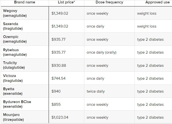
I’ll append a table at the end with a bunch of these drug names, for reference. At this point, most of them are only FDA approved for diabetes treatment, but are being prescribed off-label for weight control. It is no secret that obesity is rampant in America, and is spreading in other regions. The knock-on health problems of obesity are also well-known. So, these treatments might be very helpful, if they pan out.
What does Wall Street think of all this? Well, there is first the potential profit to accrue to the makers of these wonder drugs. You typically take them via daily or weekly skin injections, similar to insulin shots. A month’s worth of these meds may cost a cool $1000. Cha-ching right there, for makers like Novo Nordisk and Eli Lilly.
But wait, there’s more – Jonathan Block at Seeking Alpha calls out a number of possible financial angles for these drugs:
While at first glance the impact of these medications — known as GLP-1 agonists — might just impact food and beverages, the reality is that they could influence many other consumer industries.
Apparel retailers, casino/gaming names, and even airlines are just some of the industries that could see an impact from the growing popularity of weight loss drugs.
The thinking is that folks who lose 15 pounds will go out and buy a whole new wardrobe, which is good for clothing makers and retailers. On the other hand, gambling is highly correlated with obesity, so maybe casino business will fall off. There are claims that kidney health is so improved with these drugs that purveyors of dialysis equipment may be under threat.
Fuel represents some 25% of airlines’ expenses, so somebody with a sharp pencil at Jefferies sat down and calculated that for one airline (United) the cost savings would be $80 million per year if the average passenger shed 10 pounds. And who know, if people get really thinner, maybe the airlines can pack in an extra row of seats…
Analysts estimate that nearly 7% of the U.S. population could be on weight loss drugs by 2035, which could lead to a 30% cut in daily calorie intake due to the consumption changes for the targeted group. There is also some conjecture that the increased attention to dieting and weight loss in general could have a downstream impact on the consumption of snacks and sweets.
Real World Efficacy of Weight Loss Drugs May Fall Short of Clinical Trials
Throwing buckets of cold water on these scenarios of slenderized Americans is a study by RBC Capital Markets suggesting that the actual impact of these meds may be much less than indicated by clinical trials:
“Unlike clinical studies, insights from real-world use of these drugs imply weight loss can be limited or short-lived as a result, making it difficult for some users to justify the treatment’s lofty price tag,” RBC analyst Nik Modi said. “Recent insurance claims data on 4k+ patients who started taking GLP-1s in 2021 indicate only 32% remained on therapy and just 27% adhered to treatment after 1 year, citing an increase in healthcare costs.” He mentioned one study on 3.3k subjects that found after a year on the drugs, patients saw an average of just 4.4% weight loss. That is significantly less than declines cited by Novo Nordisk (NVO) and Eli Lilly (LLY) in their studies.
Also, he said IQVIA data found that the growth in GLP-1s is due mostly to new prescriptions, not refills, “making us question its sustainability.” Given this information, “we believe GLP-1s have genuine hurdles to prolonged use that have the potential to limit their long-term societal/economic impact.” To back up his argument, Modi provided several real-life examples of drugs or products where hype that it would shake up a consumer segment ended up falling flat.
The clinical trials for the GLP-1 blockers were paid for by the manufacturers, so they tend to be skewed to the positive. It is not clear whether these flattish real-world results are due to the drugs themselves not being so effective, or to other factors. These factors include side effects, unpleasantness of self-injection, and the huge out-of-pocket cost (~ $12,000/year). Weight loss drugs are often not covered by insurance, since obesity is considered a behavioral outcome, not a disease.
My guess is the final outcome will fall somewhere between mass weight loss and nothing. We hope that progress continues to be made in this area, since so many other health conditions are worsened by being overweight. For instance, fellow blogger Joy Buchanan recently linked to an article by Matt Iglesia in which he described significant and long-lasting weight loss from bariatric surgery.
And as promised, that list of diabetes/weight-loss meds:
On X.com Matt Yglesias posted a chart that sparked some conversation about child safety:
One thing about the much-lamented rise of more intensively supervised childhood activities is that kids have in fact become a lot less likely to die. pic.twitter.com/MTjR7spLM8
Of course, it was probably more his comment about the “rise of more intensively supervised childhood activities” that generated the feedback and pushback. And I assume his comment was partially tongue-in-cheek, as often happens on Twitter, and designed to generate that very discussion. Still, it is worth thinking about. Exactly why did that decline happen?
I’ve posted on this topic before. In my March 2023 post, I looked at very broad categories of child death. While all death categories have declined, about half of the decrease (depending on the age group, but half is about right) is from a decline in deaths from diseases, as opposed to external causes. And fewer disease death can largely be attributed to improvements in healthcare, broadly defined. Good news!
Of course, that means that about half of the decline is from things other than diseases. What caused those declines? Let’s look into the data. Specifically, let’s look into the data on deaths from car accidents.
We reported last month on yet another COVID surge beginning, driven by yet another new, highly transmissible variant. When I checked in on the state of affairs this week, I found two different narratives.
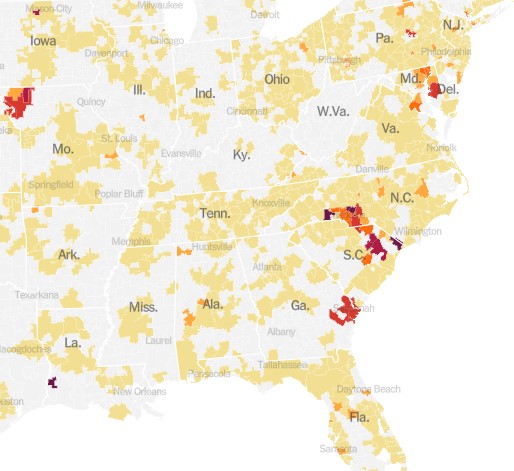
With the demise of widespread public testing, it has become more difficult to track the progress of the disease. One means to do so now is to monitor hospital admissions for COVID. The New York Times provides this service, and it shows a continued uptrend in cases, at least through September 8:
The chart above is for the whole country. It turns out that these cases are highly localized in certain hot spots, especially along the Atlantic seaboard (Delaware through South Carolina), plus the region of St. Joseph, Missouri:
An alternate means of monitoring the progress of COVID is to do ongoing testing of municipal wastewater. The virus is “shed” (to put it delicately) in sewage, and can be detected there some days before a person reports any symptoms. Most recent wastewater analyses indicate that incidence of the disease is plateauing for now, according to an NBC News article by Erika Edwards:
Biobot Analytics, a company that tracks wastewater samplesat 257 sites nationwide, said that the current average Covid levels across the United States are approximately 5% lower than they were last week.
“All fingers crossed,” Cristin Young, a Biobot epidemiologist said, “this wave is plateauing and may be declining.”
After a mid- to late-summer rise, the CDC’s Covid wastewater surveillance now shows declines in mid-Atlantic states, such as Virginia and Maryland.
The findings are backed up from surveillance in North Carolina, said Jessica Schlueter, an associate professor in the department of bioinformatics and genomics at the University of North Carolina Charlotte. Her lab is responsible for testing 12 sites across the state.
The increase in Covid wastewater samples during the last six months “seems to be peaking and starting to taper off,” she said. …Wastewater collection sites in the Midwest and the Northeast, however, show a steady uptick in Covid spread.
Hospitalizations and deaths are lagging indicators, whereas wastewater analysis provides something of a leading indicator. Putting it all together, it may be that what we are seeing now is the usual late summer COVID increase, which may come down in the next two months, to be followed by another winter surge. Do get your latest booster shots.
One of today’s best econbloggers, Matt Yglesias, just wrote “What I learned losing 70 pounds: Medical interventions work, among other things”
This is not about lemon juice or cutting out dessert. Matt wrote about getting surgery that he paid for out of pocket. No one wants to talk about medical stuff publicly. No one wants to admit that they have a hard time doing obvious correct things like eating less and exercising. Matt did this to help people. He’s inspired me to share something about health, too.
Around the time my second child was 6 months old, I decided it would be nice to get back into some kind of “shape.” So, it was time to head out the door and try to run around the block. Ouch. My knee was wrong.
To keep this short, so I’ll just say that I already knew what a doctor would tell me to do. I knew that I should do targeted exercises to strengthen the muscles around the knee. There are very boring ways to do that, such as counting reps by yourself in a quiet room.
Likewise, Matt Y knew that he could lose weight by simply eating less. It’s easier said than done. Matt took advantage of money and new technology to get results. In a less extreme way, so did I. Instead of doing “physical therapy,” I joined a friend’s Pilates studio. I paid someone to talk to me and count my reps and play music. I paid for accountability. It worked.
There is even better news. If you have Youtube access, you can get almost the full benefit of Pilates classes for free by following along with videos. Or, you can pay a little bit for even better videos with no ads. This is just one way that economic growth and technological innovation have made our lives much better.
A lot of our readers are men. You might think this only applies to women in yoga pants. Not so.
There is a certain stigma surrounding Pilates due to its vast popularity amongst women owing to its numerous health benefits and its versatility (suitable to all age groups and ability levels). However, Pilates was actually developed by a man named Joseph Pilates to help rehabilitate injured soldiers imprisoned during World War 1.
We seem to be somewhat exhausted by all the dire predictions around Covid, now that life has largely gotten back to the normal. Shops and theaters are open, and people are once more crowding aboard those floating petri dishes called cruise ships. The most vulnerable segments of the population have mainly been vaccinated, and each new strain of the disease seems less harmful. All the anti-vaxxers I know have had Covid at least once and hence have some level of immunity, or else they caved and got vaccinated after seeing a close friend or relative die back in the winter of 2021-22. One enduring benefit of Covid is much more availability to work from home.
One of the direst prognostications was that the world would suffer a more or less permanent step down in standards of living due to “long Covid.” According to this narrative, untold numbers of healthy young or middle-aged people would remain debilitated indefinitely due to the ongoing after-effects of a Covid infection: struck down in their prime, never to rise again.
A recent review of the field in Nature concluded, “The oncoming burden of long COVID faced by patients, health-care providers, governments and economies is so large as to be unfathomable”. Ouch. The federal government has provided $1.15 billion for research into the problem of long COVID and its mitigation.
Just the Facts
A couple of facts stand out: First, in many cases, scans of internal organs have shown changes in victims’ hearts and lungs and brains, following a severe Covid infection. Second, many people have reported symptoms such as weakness, fatigue and general malaise, impaired concentration and breathlessness, weeks after the primary symptoms of the disease have resolved.
How big a problem is this? I cannot, in the scope of a short blog post, adequately canvass all the data and literature. I will just cite a few numbers and charts, and let the professional data analysts dig into the fine points.
One meta-analysis found that a full “41.7% of COVID-19 survivors experienced at least one unresolved symptom and 14.1% were unable to return to work at 2-year after SARS-CoV-2 infection.” [That number seems much higher than my personal observations would suggest]. A CDC survey found that as of July 26-Aug 7, 2023, about 5.8 % of all Americans (which is 10.4% of Americans who ever had Covid) report experiencing some effects of long Covid, with 1.5% of all American adults experiencing significant activity limitations as result of long Covid. These numbers show a modest downward trend with time.
The chart below depicts the incidence of long Covid in England, again showing a modest downward trend in the latest year:
Weekly estimates of prevalence of COVID-19 and long COVID in England. Source.
Correlation versus Causation
So: we have many people experience severe symptoms from Covid, but most resolve within a few months at most. That leaves a small but nontrivial minority of Covid victims reporting problems long after that window. A significant question is whether Covid of itself caused those long-term symptoms, or just precipitated some problem that was bound to show up anyway.
I have read poignant anecdotes of perfectly healthy young people who suffer from brain fog two years later. But I have lived long enough to be wary of generalizing from poignant anecdotes. After all, the whole anti-vaccination movement has been fueled by poignant anecdotes of, say, perfectly normal two-year-olds going autistic shortly after getting their vaccine shots.
The 2023 metastudy referred to earlier found that long Covid sufferers tended to be older, and had pre-existing medical comorbidities. Similarly, we have known since 2020 that the cohorts most likely to die from Covid were older folks (such as me!), many of whom were bound to die anyway.
In this light, the data brought forth by James Baily in his recent article on this blog, Long Covid is Real in the Claims Data… But so is “Early Covid”?, is most interesting. He noted that on average people use more health care for at least 6 months post-Covid compared to their pre-Covid baseline, which is consistent with some measure of long Covid. However, those same individuals also spent significantly more on healthcare 1-2 months before their Covid diagnosis. This seems consistent with the notion that some of what gets blamed on Covid would have occurred sooner or later anyway.
A Nuanced View of Long Covid
An article in Slate by Jeff Wise has dug deeper into the data. He noted that the survey-based datasets that have been largely used to estimate the effects of long Covid tend to be biased: those who feel ongoing symptoms are more likely to complete the surveys, giving rise to some of the largish numbers I have shared above. Newer, better-controlled retrospective cohort studies tend to show much lower ongoing incidence of symptoms, especially compared to control groups who had not had Covid. The feared tidal wave of mass disabilities never arrived:
“The best available figures, then, suggest two things: first, that a significant number of patients do experience significant and potentially burdensome symptoms for several months after a SARS-CoV-2 infection, most of which resolve in less than a year; and second, that a very small percentage experience symptoms that last longer. ”
Further, “Another insight that emerges from the cohort studies into long COVID is that it is not so easy to prove causality between a particular infection and a symptom. Almost all the symptoms associated with long COVID can also be triggered by all sorts of things, from other viruses to even the basic reality of living through a pandemic.”
Finally:
It looks more as if people who complain of long COVID are suffering from a collection of different effects. “I think there’s quite a heterogeneous group of people all sailing under the one flag,” said Alan Carson, a neuropsychiatrist at the University of Edinburgh in Scotland. Some patients may be experiencing the lingering aftereffects that occur in the wake of many diseases; some patients with chronic comorbidities might be experiencing the onset of new symptoms or the continuation of old ones; others might be affected by the sorts of mood disorders and psychiatric symptoms you’d expect to find in a population undergoing the stress of a global pandemic.
Another Slate article from last month gently debunks alarmism stemming from a Nature Medicine study of U.S. veterans who showed increased susceptibility to disease even two years after contracting Covid.
There is often great difficulty in discerning the actual organic, biochemical basis for the reported symptoms. This makes it hard to come up with a pill or a shot that might adjust the body’s metabolic pathways in order to cure them. Thus, simply treating the symptoms as such may offer the best near-term relief. To that end, a team of French researchers had the audacity to propose that much of the fatigue and brain fog associated with long Covid may be largely in our heads. In an article in the Journal of Psychosomatic Research Why the hypothesis of psychological mechanisms in long COVID is worth considering , Lemogne, et al. noted strong links between a patient’s prior expectations of symptom severity and the actual reported outcomes. The intent of the researchers is not to belittle the reported distress of long Covid sufferers, but to point towards established therapeutic methods to help treat disorders with at least a partial psychosomatic basis:
Many potential psychological mechanisms of long COVID are modifiable factors that could thus be targeted by already validated therapeutic interventions. Beside the treatment of a comorbid psychiatric condition, which may be associated with fatigue, cognitive impairment or aberrant activation of the autonomous nervous system, therapeutic interventions may build on those used in the treatment of ‘functional somatic disorders’, defined as the presence of debilitating and persistent symptoms that are not fully explained by damage of the organs they point. These disorders are common after an acute medical event, particularly in women, and include psychological risk factors, such as anxiety, depression, and dysfunctional beliefs that can lead to deleterious, yet modifiable health behaviors. Addressing these factors in the management of long COVID may provide an opportunity for patient empowerment.
In sum: A significant number of those who contract COVID suffer ongoing symptoms for a number of months afterward. Over a billion dollars of research has been directed at the problem. The severity of these symptoms tends to decline with time, in the vast majority of cases resolving by twelve months. This leaves some individuals still suffering fatigue and brain fog over a year later. Studies are ongoing to discern the organic basis of these complaints, and the exact role that COVID may have played, in the light of the fact that complaints of enduring fatigue and brain fog were not uncommon before the pandemic. We hope that following the science will bring more relief here.
Circling back to our original interest in the economic impact of long COIVD, early studies indicated that a large fraction of the population might continue to be debilitated, to the point of being unable to work, with significant effects on the workforce and GDP. Actual data (e.g., on disability claims) indicate that these problems have not actually materialized.
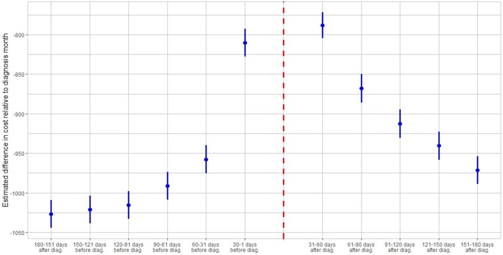
I’ve seen plenty of investigations of “Long Covid” based on surveys (ask people about their symptoms) or labs (x-ray the lungs, test the blood). But I just ran across a paper that uses insurance claims data instead, to test what happens to people’s use of medical care and their health spending in the months following a Covid diagnosis. The authors create some nice graphics showing that Long Covid is real and significant, in the sense that on average people use more health care for at least 6 months post-Covid compared to their pre-Covid baseline:
The graph is a bit odd in that its scales health spending relative to the month after people are diagnosed with Covid. Their spending that month is obviously high, so every other month winds up being negative, meaning just that they spent less than the month they had Covid. But the key is, how much less? At baseline 6 months prior it was over $1000/month less. The second month after the Covid diagnosis it was about $800 less- a big drop from the Covid month but still spending $200+/month more than baseline. Each month afterwards the “recovery” continues but even by month 6 its not quite back to baseline. I’m not posting it because it looks the same, but Figure 4 of the paper shows the same pattern for usage of health care services. By these measures, Long Covid is both statistically and economically significant and it can last at least 6 months, though worried people should know that it tends to get better each month.
I was somewhat surprised at the size of this “post Covid” effect, but much more surprised at the size of the “pre Covid” or “early Covid” effect- the run-up in spending in the months before a Covid diagnosis. For the month immediately before, the authors have a good explanation, the same one I had thought of- people are often sick with Covid a couple days before they get tested and diagnosed:
There is a lead-up of healthcare utilization to the diagnosis date as illustrated by the relatively high utilization levels 30–1 days before diagnosis. This may be attributed to healthcare visits only days prior to the lab-confirmed infection to assess symptoms before the manifestation or clinical detection of COVID-19.
But what about the second month prior to diagnosis? People are spending almost $150/month more than at the 6-month-prior baseline and it is clearly statistically significant (confidence intervals of months t-6 and t-2 don’t overlap). The authors appear not to discuss this at all in the paper, but to me ignoring this lead-up is burying the lede. What is going on here that looks like “Early Covid”?
My guess is that people were getting sick with other conditions, and something about those illnesses (weakened immune system, more time in hospitals near Covid patients) made them more likely to catch Covid. But I’d love to hear actual evidence about this or other theories. The authors, or someone else using the same data, could test whether the types of health care people are using more of 2 months pre-diagnosis are different from the ones they use more of 2 months post-diagnosis. Doctors could weigh in on the immunological plausibility of the “weakened immune system” idea. Researchers could test whether they see similar pre-trends / “Early Covid” in other claims/utilization data; probably they have but if these pre-trends hold up they seem worthy of a full paper.
Demography is cool generally, but life tables are really cool in their elegance. Don’t know what a life table is? Let me ‘splain.
A life table uses data from private or public death registers, or even genealogical records, to identify a variety of survival and death estimates. Briefly, the tables include for each age:
Probability of death in the next year
Probability of surviving to the age
The life expectancy
There is more in the tables, but these are the big items that people often want to know. All of the various table columns can be calculated from survival rates. The US government and the UN each has created many such tables for a variety of time, locations, and development details. For example, the earliest and most dependable one is from 1901 and includes separate tables by race, sex, migrant status, urbanity, and even for some specific states.
I’m looking for a new car now and would like to know what the safest reasonable option is. There are lots of ways to get some information about this, but none are very good.
The government provides safety ratings based on crash tests they perform. This is better than nothing but the crash tests only test certain things and don’t necessarily tell you how a car performs in the real world. They also have a habit of just giving their top rating (5 stars) to tons of vehicles so it doesn’t help you pick between them, and they only compare cars to other cars in the same “class”, ignoring that some classes are safer than others. On top of all the problems with the ratings themselves, they also don’t provide any lists of their ratings, instead making you search one car at a time.
Several other sites improve on the government ratings by using real-world data on how often cars actually crash (much of which comes from the government, which as usual is great at collecting data but not so great at presenting it in helpful user-friendly ways). The Auto Professor grades cars using real-world data but otherwise has the same problems as the government (NHTSA) site. Cars get letter grades rather than a rank or meaningful number, so it’s not actually clear which car is best, or how much better the good cars are than the average or bad cars. You can search the grades for one car at a time but they don’t just list the safest cars anywhere, including on their page labelled “safest cars list“.
The Insurance Institute for Highway Safety uses real world data and provides actual numbers of fatality rates for different vehicles. This is great because you don’t have the problem of “dozens of cars all have 5-star / A, which is best?” or the problem of “how much better is 5 star than 4 star, or A than B?”. But they don’t include data from the 2 most recent years, and they only post their ratings for a handful of cars. Not only do they not present a complete list, they seem to have no search function whatsoever for their real-world data (they do for their NHSTA-style crash test data). Some 3rd party sites seem to have posted more complete versions of their data, but it still doesn’t show data for most car models.
The least-terrible car safety site I have found is Real Safe Cars. The good: they use real-world safety data, they apply reasonable-sounding corrections and controls do it, they present meaningful quantitative measures like “vehicle lifetime fatality chance” and “vehicle lifetime injury chance”, and they present the data using both a search function and lists of “safest vehicles”. For 2020 you can see that the #1 car, the 2020 Audi e-tron Sportback, has a vehicle lifetime fatality chance of 0.0158%. Compare this to the #100 car, which is about average overall- the 2020 Acura TLX has a vehicle lifetime fatality chance of 0.0435% (almost 3x the safest). The site makes it hard to find the very worst car but near the bottom is the 2020 Hyundai Accent, which “has a vehicle lifetime fatality chance of 0.0744%”.
The lists could be better; the only list that includes all vehicle classes is restricted to only 2020 makes. Meanwhile when you search a car it ranks it only relative to cars in the same year, though you can make comparisons across years yourself using the quantitative “fatality chance” and “injury chance” measures. I’m not totally convinced of the ratings themselves, given how well many smaller sedans do. Their front page explains how taller cars are generally safer, but also lists the Mini Cooper as the #18 safest car of 2020 across all classes. But Real Safe Cars seems like the current best site to me (maybe I’m biased since one of its creators is an economics professor).
I hope these sites will address some of the weaknesses I identified here, though I’m not optimistic about most of them, because other than Real Safe Cars the “bad” decisions seem to be clearly driven by incentives like keeping car companies happy or SEO.
I also think there’s still room for another effort by economists or other quantitatively-skilled people to make another site. The underlying crash data is public and the statistical problems are not especially hard; I think a single economist could run the numbers in about the time it takes to write a typical economics paper (weeks to months for a 1st draft), and a decent website could be built off that quickly as well. You could probably make a decent amount of money off the site, though perhaps not if you do the right thing and publicly post all the data and code. Posting the data would make it easy for others to copy you and make their own sites. You could fight that with copyright, but given the huge public good aspect here and the lives at stake it might make more sense to get grant funding up front and then make the data and code totally public. A sane world would have done this already; NHTSA’s annual budget is over $1 billion, with $35 million of that going to research and analysis. I think any decent funder should be able to do at least as well as the sites above with under $200k, or anyone with good data chops could do it out of the goodness of their heart in a few months. I don’t have a few months right now but perhaps one of you could take this up or start applying for grants to do it.
For everyone who just wants to know about which cars are safe, for now I think Real Safe Cars is the best bet, though I’d also like to hear if you think I missed anything.


