Long Covid is Real in the Claims Data… But so is “Early Covid”?

I’ve seen plenty of investigations of “Long Covid” based on surveys (ask people about their symptoms) or labs (x-ray the lungs, test the blood). But I just ran across a paper that uses insurance claims data instead, to test what happens to people’s use of medical care and their health spending in the months following a Covid diagnosis. The authors create some nice graphics showing that Long Covid is real and significant, in the sense that on average people use more health care for at least 6 months post-Covid compared to their pre-Covid baseline:

Source: Figure 5 of “Long-haul COVID: healthcare utilization and medical expenditures 6 months post-diagnosis“, BMC Health Services Research 2022, by Antonios M. Koumpias, David Schwartzman & Owen Fleming

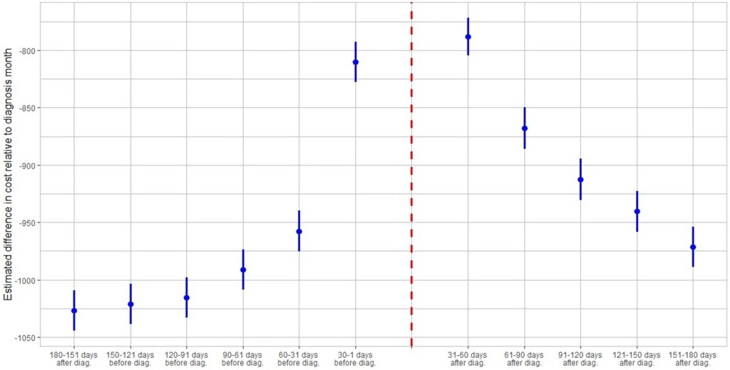
The graph is a bit odd in that its scales health spending relative to the month after people are diagnosed with Covid. Their spending that month is obviously high, so every other month winds up being negative, meaning just that they spent less than the month they had Covid. But the key is, how much less? At baseline 6 months prior it was over $1000/month less. The second month after the Covid diagnosis it was about $800 less- a big drop from the Covid month but still spending $200+/month more than baseline. Each month afterwards the “recovery” continues but even by month 6 its not quite back to baseline. I’m not posting it because it looks the same, but Figure 4 of the paper shows the same pattern for usage of health care services. By these measures, Long Covid is both statistically and economically significant and it can last at least 6 months, though worried people should know that it tends to get better each month.

I was somewhat surprised at the size of this “post Covid” effect, but much more surprised at the size of the “pre Covid” or “early Covid” effect- the run-up in spending in the months before a Covid diagnosis. For the month immediately before, the authors have a good explanation, the same one I had thought of- people are often sick with Covid a couple days before they get tested and diagnosed:

There is a lead-up of healthcare utilization to the diagnosis date as illustrated by the relatively high utilization levels 30–1 days before diagnosis. This may be attributed to healthcare visits only days prior to the lab-confirmed infection to assess symptoms before the manifestation or clinical detection of COVID-19.

But what about the second month prior to diagnosis? People are spending almost $150/month more than at the 6-month-prior baseline and it is clearly statistically significant (confidence intervals of months t-6 and t-2 don’t overlap). The authors appear not to discuss this at all in the paper, but to me ignoring this lead-up is burying the lede. What is going on here that looks like “Early Covid”?

My guess is that people were getting sick with other conditions, and something about those illnesses (weakened immune system, more time in hospitals near Covid patients) made them more likely to catch Covid. But I’d love to hear actual evidence about this or other theories. The authors, or someone else using the same data, could test whether the types of health care people are using more of 2 months pre-diagnosis are different from the ones they use more of 2 months post-diagnosis. Doctors could weigh in on the immunological plausibility of the “weakened immune system” idea. Researchers could test whether they see similar pre-trends / “Early Covid” in other claims/utilization data; probably they have but if these pre-trends hold up they seem worthy of a full paper.

Life Tables are Cool

Demography is cool generally, but life tables are really cool in their elegance. Don’t know what a life table is? Let me ‘splain.

A life table uses data from private or public death registers, or even genealogical records, to identify a variety of survival and death estimates. Briefly, the tables include for each age:

  • Probability of death in the next year
  • Probability of surviving to the age
  • The life expectancy

There is more in the tables, but these are the big items that people often want to know. All of the various table columns can be calculated from survival rates. The US government and the UN each has created many such tables for a variety of time, locations, and development details. For example, the earliest and most dependable one is from 1901 and includes separate tables by race, sex, migrant status, urbanity, and even for some specific states.

Continue reading

The Least Terrible Car Safety Sites

I’m looking for a new car now and would like to know what the safest reasonable option is. There are lots of ways to get some information about this, but none are very good.

The government provides safety ratings based on crash tests they perform. This is better than nothing but the crash tests only test certain things and don’t necessarily tell you how a car performs in the real world. They also have a habit of just giving their top rating (5 stars) to tons of vehicles so it doesn’t help you pick between them, and they only compare cars to other cars in the same “class”, ignoring that some classes are safer than others. On top of all the problems with the ratings themselves, they also don’t provide any lists of their ratings, instead making you search one car at a time.

Several other sites improve on the government ratings by using real-world data on how often cars actually crash (much of which comes from the government, which as usual is great at collecting data but not so great at presenting it in helpful user-friendly ways). The Auto Professor grades cars using real-world data but otherwise has the same problems as the government (NHTSA) site. Cars get letter grades rather than a rank or meaningful number, so it’s not actually clear which car is best, or how much better the good cars are than the average or bad cars. You can search the grades for one car at a time but they don’t just list the safest cars anywhere, including on their page labelled “safest cars list“.

The Insurance Institute for Highway Safety uses real world data and provides actual numbers of fatality rates for different vehicles. This is great because you don’t have the problem of “dozens of cars all have 5-star / A, which is best?” or the problem of “how much better is 5 star than 4 star, or A than B?”. But they don’t include data from the 2 most recent years, and they only post their ratings for a handful of cars. Not only do they not present a complete list, they seem to have no search function whatsoever for their real-world data (they do for their NHSTA-style crash test data). Some 3rd party sites seem to have posted more complete versions of their data, but it still doesn’t show data for most car models.

The least-terrible car safety site I have found is Real Safe Cars. The good: they use real-world safety data, they apply reasonable-sounding corrections and controls do it, they present meaningful quantitative measures like “vehicle lifetime fatality chance” and “vehicle lifetime injury chance”, and they present the data using both a search function and lists of “safest vehicles”. For 2020 you can see that the #1 car, the 2020 Audi e-tron Sportback, has a vehicle lifetime fatality chance of 0.0158%. Compare this to the #100 car, which is about average overall- the 2020 Acura TLX has a vehicle lifetime fatality chance of 0.0435% (almost 3x the safest). The site makes it hard to find the very worst car but near the bottom is the 2020 Hyundai Accent, which “has a vehicle lifetime fatality chance of 0.0744%”.

The lists could be better; the only list that includes all vehicle classes is restricted to only 2020 makes. Meanwhile when you search a car it ranks it only relative to cars in the same year, though you can make comparisons across years yourself using the quantitative “fatality chance” and “injury chance” measures. I’m not totally convinced of the ratings themselves, given how well many smaller sedans do. Their front page explains how taller cars are generally safer, but also lists the Mini Cooper as the #18 safest car of 2020 across all classes. But Real Safe Cars seems like the current best site to me (maybe I’m biased since one of its creators is an economics professor).

I hope these sites will address some of the weaknesses I identified here, though I’m not optimistic about most of them, because other than Real Safe Cars the “bad” decisions seem to be clearly driven by incentives like keeping car companies happy or SEO.

I also think there’s still room for another effort by economists or other quantitatively-skilled people to make another site. The underlying crash data is public and the statistical problems are not especially hard; I think a single economist could run the numbers in about the time it takes to write a typical economics paper (weeks to months for a 1st draft), and a decent website could be built off that quickly as well. You could probably make a decent amount of money off the site, though perhaps not if you do the right thing and publicly post all the data and code. Posting the data would make it easy for others to copy you and make their own sites. You could fight that with copyright, but given the huge public good aspect here and the lives at stake it might make more sense to get grant funding up front and then make the data and code totally public. A sane world would have done this already; NHTSA’s annual budget is over $1 billion, with $35 million of that going to research and analysis. I think any decent funder should be able to do at least as well as the sites above with under $200k, or anyone with good data chops could do it out of the goodness of their heart in a few months. I don’t have a few months right now but perhaps one of you could take this up or start applying for grants to do it.

For everyone who just wants to know about which cars are safe, for now I think Real Safe Cars is the best bet, though I’d also like to hear if you think I missed anything.

New EG.5  Variant Spreading: Start of New Covid Surge?

The spread of highly-contagious and sometimes fatal Covid-19, and the responses to it (lockdowns and then trillions of dollars of federal giveaway money to mitigate the effects of the lockdowns and now huge interest rate hikes to counter the inflation caused by that giveaway money) have been arguably the most economically momentous events of this decade so far. Thus, it behooves us to keep an ongoing eye on this beast, since it seems to keep coming back in waves.

We all know that Covid is spread by little “aerosol”  droplets coming out the infected people’s mouths and noses. Those aerosols are mainly generated by speaking and singing. So being in a room full of talking or singing people (e.g., a happy convention or bar, or a hymn-singing church) can be a super-spreader situation.

I have reasons to try to avoid respiratory diseases, and so I attended church on-line or outdoors for most of the past three years. The Covid numbers finally got low enough this spring that I started attending inside, and even going unmasked the past two months.

Alas, Covid cases and hospitalizations are back on the rise, it seems due to the new Eris or EG.5 subvariant. Like the infamous omicron variant of a year ago, it is very transmissible and resistant to existing vaccines, but is not as deadly as the original strain. Much of the population has some immunity due to vaccines and/or prior exposure. Also, antivirals like Paxlovid are widely available to help mitigate symptoms. Still, a case of Covid often makes for an uncomfortable and disruptive  week or two, and can still be fatal or debilitating.

So, I have done a quick amateur scan of the internet, trying to get a fix on what to expect. One thing that stands out is that actual case numbers are far higher than officially reported, for a couple of reasons. One is that the rigorous, systematic reporting of cases has fallen off, since Covid was deemed no longer an emergency. Also, with the end of free test kits and the generally more lax public attitude (we just want to be done with this), there is far less testing done than in 2022. (In communities with systematic testing, it turns out that the best way to track Covid is by analyzing wastewater).

Will the Latest Vaccines Save Us?

The vaccine story seems somewhat mixed. The latest booster vaccine, to be available around October, will target the XBB.1.5 subvariant, which is what was mainly circulating earlier this year. However, it is expected that since EB.5 is closely related to XBB.1.5 (both of these are of the general omicron family), the booster will confer some immunity to EB.5. That is the good news.

The bad news is that the public’s uptake of boosters in general is well under 50%, so we may expect EB.5 or whatever the next subvariant is to continue to circulate, and probably surge during the colder months when respiratory diseases tend to spread. Also, vaccines do not really stop you from getting Covid, they mainly act to mitigate the symptoms by helping your body’s defenses to react faster.

Starting next week, I will resume wearing an effective KN-95 or my preferred KF-94 mask at church and other venues where a lot of people are talking or singing.

Comprehensive Cancer Centers: Expensive But Fast

An article I coauthored, “Comparing hospital costs and length of stay for cancer patients in New York State Comprehensive Cancer Centers versus nondesignated academic centers and community hospitals“, was just published in Health Services Research. We find that:

Inpatient costs were 27% higher (95% CI 0.252, 0.285), but length of stay was 12% shorter (95% CI −0.131, −0.100), in Comprehensive Cancer Centers relative to community hospitals.

In other words, these cutting-edge hospitals that tend to treat complex cases are more expensive, as you would expect; but despite getting tough cases they actually manage a shorter average length of stay. We can’t nail down the mechanism for this but our guess is that they simply provide higher-quality care and make fewer errors, which lets people get well faster.

What are Comprehensive Cancer Centers? Here’s what the National Cancer Institute says:

The NCI Cancer Centers Program was created as part of the National Cancer Act of 1971 and is one of the anchors of the nation’s cancer research effort. Through this program, NCI recognizes centers around the country that meet rigorous standards for transdisciplinary, state-of-the-art research focused on developing new and better approaches to preventing, diagnosing, and treating cancer.

Our paper focuses on New York state because of their excellent data, the New York State Statewide Planning and Research Cooperative System Hospital Inpatient Discharges dataset, which lets us track essentially all hospital patients in the state:

We use data on patient demographics, total treatment costs, and lengths of stay for patients discharged from New York hospitals with cancer-related diagnoses between 2017 and 2019.

You know I’m all about sharing data; you can find our data and code for the paper on my OSF page here.

My coauthor on this paper is Ryan Fodero, who wrote the initial draft of this paper in my Economics Senior Capstone class last Fall. He is deservedly first author- he had the idea, found the data, and wrote the first draft; I just offered comments, cleaned things up for publication, and dealt with the journal. I’ve published with undergraduates several times before but this is the first time I’ve seen one of my undergrads hit anything close to a top field journal. You can find a profile of Ryan here; I suspect it won’t be the last you hear of him.

Canadian Wildfires Will Burn All Summer; Ways to Filter the Air in Your Home

This past week, smoke from wildfires in Canada once again drifted southward and gave very unhealthy air in parts of the U.S.  Several sources I checked indicated that it is unrealistic to expect human effort to extinguish these fires (see here , here, and here). The Canadian forests are just too huge in relation to the fire-fighting resources. What usually happens, even during a normal fire season, is that summer fires just keep burning until they are dampened down by winter rain, snow, and cold. Most of the fire-fighting efforts are devoted to saving communities that are in the path of the flames.

Thus, we may expect periodic episodes of unhealthy air for the next several months. The most hazardous smoke particles are those less than 2.5 microns in size. Particles this small make it past your body’s defenses and penetrate deep into your lungs, promoting a number of serious medical conditions. These smoke particles are made of toxic chemicals like polycyclic aromatic hydrocarbons.

What to do to protect yourself? A first line of defense is to don an effective mask, even indoors. We all probably have Chinese KN95 or Korean KM94 masks left over from pandemic days, and (properly fitted around the nose) these should filter out most of the smoke, including the particles that are less than 2.5 microns. (I prefer the more-comfortable KM94 masks, as discussed here.)  These masks are supposedly about as effective as the more-rigid N95 masks that are the U.S. standard.

Air Filters in Your Furnace

See here for some general tips on dealing with smoke in the home, e.g. damp-mop non carpet floors rather than vacuuming, to avoid shooting settled particles into the air. However, what is really needed is some means to filter the smoke out of the air in your home, otherwise over time the air inside may be as polluted as the air outside. All furnace/central air conditioning systems have a filter in the circuit. A simple solution would be to use an air filter which can catch the smoke particles. The problem here is that the better the filter is at catching small particles, the more restrictive of air flow it is.

Most air filters are rated according to MERV values. MERV 13 filters can remove most smoke particles in a single pass. Unfortunately, most home heating/cooling systems cannot handle that much restriction in air flow; the fan motor would get overloaded and perhaps burn out. One solution here is to install a parallel air filter, with its own booster fan, using a MERV 13 filter. Here, only part of the home air circulation goes through the MERV 13 filter on each pass, but with time most of the home air gets cleaned.

Another approach is to install a MERV 11 or (if your furnace is newer) MERV 12 filter in the furnace. A MERV 11 filter might only capture around 25% of smoke particles per pass, but in the course of a day your whole house air volume should pass through the filter several times. If you have a common size air filter, you can probably get a MERV 11 that would fit on Amazon or at a local big box store. For uncommon sizes, try here.

Make Your Own High-Capacity Filter Box

In addition to working with your furnace/air conditioning filter, you can buy a compact stand-alone air purifier for your home. This Shark HP202 model will provide a continuous read-out of air quality.

For even more air-cleaning muscle, you can make a box-style air purifier by duct-taping together four MERV 13 furnace air filters (four sides of a cube), and adding a box fan on top. Instructions (including YouTube links) for doing this are here, with further details here. These diagrams give the general picture:

An example of a finished product is below; note the red tape covering the outer part of the fan outlet. Blocking that outer area, giving a smaller diameter opening for the air to blow out, increases the net air flow significantly. (It prevents back-eddies of air around the edges).

 It turns out that the air flow through one of these home-made air filters is so high that, even though the per-pass capture efficiency is lower than a HEPA filter, the home-made filter box can remove more particulates from a room than a store-bought HEPA filter.

I have made two of these filter boxes so far, using premium and regular filters. They have worked quite well in clearing the smoke from our rooms: the benefit is well worth the cost of parts and labor. See here for more on my experiences and construction tips.

Some on-line resources:

Accuweather  seems to have straightforward reporting of air quality, including specifically the less than 2.5 micron particles. (Search on your location, then find Air Quality and click Details).

NOAA provides a real time satellite map of smoke patterns (click on “Surface Smoke”), but don’t rely on their color coding to decide whether your local condition is orange or red.

This web site from Natural Resources Canada shows locations of current wildfires in Canada. See Overlays for the meaning of the symbols; red denotes fires that are out of control. You can click Fire Perimeter Estimate to see the enormous extents of some of these fires.

Disinformation Is Real, And It Is a Concern

Two recent essays push back against the concept of “disinformation” in thoughtful but, I believe, ultimately incorrect ways.

Martin Gurri is primarily concerned with government trying to stamp out what it views as disinformation. I am concerned about that too, but there are ways for private actors to correct bad information too.

Dan Klein (my friend and professor in grad school) argues that most labeling of “disinformation” or “misinformation” is not really about information, but instead about knowledge. I agree that sometimes this is true. But sometimes it is not true. Sometimes we really are talking about information. And sometimes the information is about extremely important topics.

As I search through my own Twitter history for these terms, I see that there is overwhelmingly one period of time and one piece of information that I used them for: the total number of deaths in the United States in 2020. If you can think way back to the fall and winter of 2020/early 2021, you might recall that we were just finishing up the first year of the pandemic, and we were also going through one of the worst periods in the pandemic. Vaccines were now starting to become widely available as we got into 2021, and people were starting to make person decisions about whether to “get the jab.”

The number of total deaths in 2020 was an important number. There was still a lot of uncertainty about exactly how bad the pandemic was, or (to a small but vocal minority) whether the pandemic was even “real.” The data was crucial to this debate. Of course, once we have the data, we must interpret it. This is one of Klein’s main points, and a good one. But if we aren’t starting from a common baseline of true information, there is really no point in discussions based on interpretations of those different apparent realities. We will, by definition, be “talking past each other.”

So what were people saying about total deaths in 2020 during this moment of importance in late 2020/early 2021?

Continue reading

South Carolina Repeals Certificate of Need

Last week South Carolina Governor McMaster signed a bill repealing almost all Certificate of Need (CON) laws in the state. If you want to open or expand a health care facility in South Carolina, you can now do so faster, cheaper, and with more certainty.

This is a bigger deal than West Virginia’s reform earlier this year because it applies to almost all types of facilities, and applies to both new facilities and expansions of existing facilities. Only two parts of the CON system remain: a 3-year sunset where hospitals still need special permission to add beds, and a permanent restriction on nursing homes (why? see my recent post on why states hate nursing homes).

As is often the case, this reform took years to enact. I wrote last year about a repeal bill passing the SC Senate; it didn’t make it through the House then, but did this time. As I said then:

This seems like good news; here at EWED we’ve previously written about some of the costs of CON. I’ve written several academic papers measuring the effects of CON, finding for instance that it leads to higher health care spending. I aimed to summarize the academic literature on CON in an accessible way in this article focused on CON in North Carolina.

CON makes for strange bedfellows. Generally the main supporter of CON is the state hospital association, while the laws are opposed by economistslibertariansFederal antitrust regulatorsdoctors trying to grow their practices, and most normal people who actually know they exist. CON has persisted in most states because the hospitals are especially powerful in state politics and because CON is a bigger issue for them than for most groups that oppose it. But whenever the issue becomes salient, the widespread desire for change has a real chance to overcome one special interest group fighting for the status quo. Covid may have provided that spark, as people saw full hospitals and wondered why state governments were making it harder to add hospital beds.

Why did reform succeed this time in South Carolina? From where I sit in Rhode Island I can only guess, but here are my guesses. First, the reform side really had their stuff together. See this nice page from SC think tank Palmetto Promise on why to repeal CON, and this paper from Matt Mitchell that does a comprehensive review of the literature on CON and explains what it means for South Carolina. Legislative supporters like Senator Wes Climer just kept pushing.

Second, the biggest opponent of CON reform is usually the state hospital association, but in this case they did not formally oppose repeal. Why not? Here I’m really speculating, but in general it has been faster-growing states that repeal CON. Population growth makes it obvious that new facilities are needed, and it means that existing facilities are thinking about how to grow to take advantage of new opportunities, rather than thinking about lobbying to maintain their share of a static or shrinking pie. You can see some hospital CEOs say they don’t mind repeal in this article (where I’m also quoted). South Carolina has been growing at a decent clip, as is Florida, which also almost-entirely repealed CON in 2019. On this theory, the next big CON reform would happen in a fast-growing CON state like Montana, Delaware, North Carolina, Georgia, or Tennessee. If I had to pick one, I’d say North Carolina.

Update: Apparently Montana already repealed all non-nursing home CON in 2021 and I missed it!

“Studies Show”: Marijuana Legalization and Opioid Deaths

In his NY Times column today, Ross Douthat argues that legalizing marijuana is a big mistake. Douthat makes a number of arguments, but let me focus on one point he makes in the column: that recent research suggests legalizing marijuana increases opioid deaths. This point is made in just one sentence of the essay, so let me quote it in full:

There was hope, and some early evidence, that legal pot might substitute for opioid use, but some of the more recent data cuts the other way: A new paper published in the Journal of Health Economics finds that “legal medical marijuana, particularly when available through retail dispensaries, is associated with higher opioid mortality.”

Kudos to Mr. Douthat for actually linking to the paper. That’s what the internet is for! Yet so many writers in traditional news sources fail to do this.

Now, on to the paper itself. There is nothing untrue in what Douthat writes. First, there was plenty of “early evidence” that legalizing marijuana reduced opioid deaths. More on this in a moment. And the study he cites by Mathur and Ruhm is particularly well done. It is published in the top health economics journal. But the main point of the paper is to say “we think the rest of the literature is wrong, and we’re going to try really hard to convince you that we are right.”

What does the rest of this literature say? Here’s a brief tour (all of these are cited in Mathur and Ruhm). The variable in question is opioid deaths.

Continue reading

Save $$$, Easily Change Your Car Cabin Air Filter Yourself

I have done various maintenance and repairs on my cars over the decades. Usually, they turn out to be harder and more time-consuming than I thought. Changing the engine oil and oil filter has become genuinely harder since the oil filters have migrated deep up under the engine, where it is hard to access them without putting the car on a lift, and disposing of a milk jug of used oil has gotten more difficult.  I used to be able to easily change out a light bulb in the headlight, but the last car where that needed doing required you to take apart much of the front end of the car to get at the headlight. However, I recently found that changing the cabin air filters in my two vehicles (van and sedan) is so easy, I wish I had started doing it years ago.

Why Change the Cabin Air Filter?

The cabin air filter filters the air coming into the passenger section of the car. It knocks out road dust and pollen, and other bits of whatever that might get sucked into your air system as you are going down the road. So, it protects your and your family’s lungs as well as the components of the air handling system. Typical recommendations are to change out the filter about once a year or every 15,000-20,000 miles.

The photo below shows the cabin air filter I just pulled out of my van after maybe 2 years and 25,000 miles, next to a relatively clean filter. Obviously, I let this one go a bit too long: it is grey with dust/dirt, and partly blocked with plant debris.

I have not been quick to change out these filters because garages or dealers often charge something like $80-$100 for this. And until recently, I never considered doing it myself, because for some reason I thought it was a hard job. I had read of people having to contort in unnatural positions with heads inserted under dashboards as they disassemble layers of car to get at the filter.

It Is (Often) Super Easy to Change a Cabin Air Filter

It all depends on where the filter is located. For most models of cars, you can find guidelines on line, including YouTube videos. There are some models where you indeed may have to unscrew a cover plate somewhere below the dashboard to expose the filter. But in most cars, you remove the glove box to expose the filter. That may involve undoing come screws or a snap or strut, and squeezing the edge of the glove box inward. For my Hondas, all I had to do was empty the glovebox, (authoritatively) squeeze in the edges, and the glove box pivoted down, and behold, there was the filter in its little holder. Then slide out the holder, pull out the old filter and put in the new filter (purchased at AutoZone for $20 each), slide the holder back in place, and finally tilt the glovebox back up until it snapped in place.

Ten minutes max, easy-peasy. Obviously, this saved money, but it also felt empowering. I highly recommend trying it.