That’s exactly what he tried to do this past Monday. Trump announced on social media that Lisa Cook, appointed by Biden in 2022, is now fired. Things are about to get awkward.
First, Trump can’t simply fire Fed governors willy-nilly. Remember when DOGE was involved in all of those federal workforce lay-offs earlier in the year? I know, it seems like forever ago. The US Supreme Court ruled on the legality of those firings, including some at government corporations and ‘independent agencies’. The idea behind such entities is that they are supposed to be politically insulated and less bound by the typical red tape of the government. But Trump’s administration argued that the separation from the rest of the executive branch is a fiction and that there is no one else in charge of them if not the president. The Supreme Court agreed with the administration, with one exception.
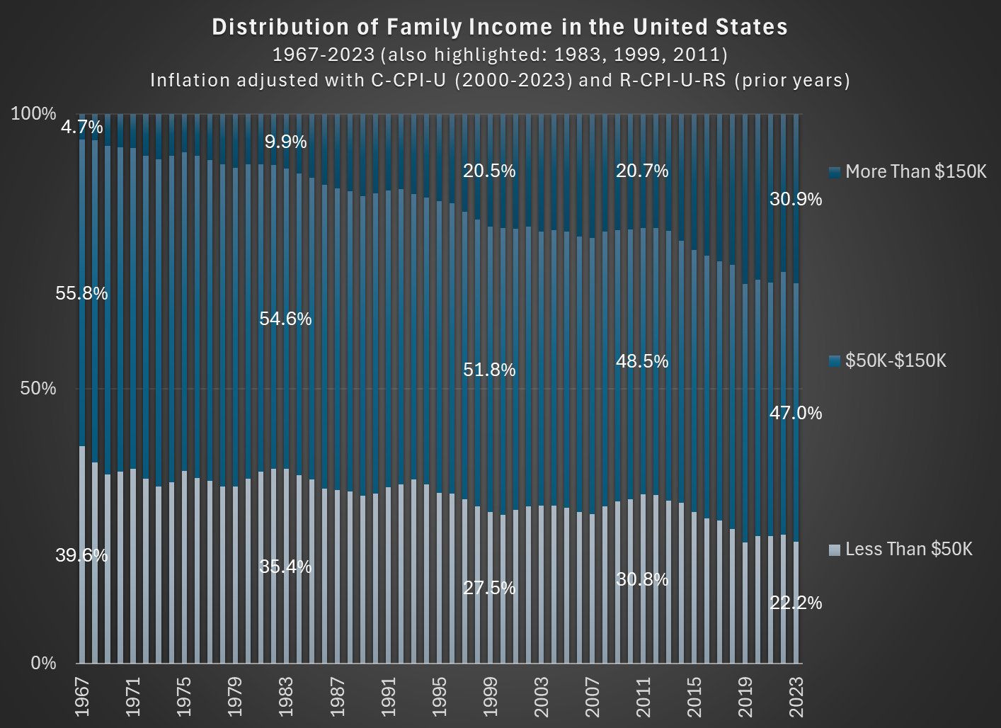
In 1967, about 56 percent of families in the US had incomes between $50,000 and $150,000, stated in 2023 inflation-adjusted dollars. In 2023, that number was down to 47 percent. So the American middle class shrunk, but why? (Note: you can do this analysis with different income thresholds for middle class, but the trends don’t change much.)
As you can see in the chart, the proportion of families that are in the high-income section, those with over $150,000 of annual income in 2023 dollars, grew from about 5 percent in 1967 to well over 30 percent in the most recent years. And the proportion that were lower income shrunk dramatically, almost being cut in half as a proportion, and perhaps surprisingly there are now more high-income families than low-income families (using these thresholds, which has been true since 2017). The number is even more striking when stated in absolute terms: in 1967 there were only about 2.4 million high-income households, while in 2023 there were 11 times as many — over 26 million.
Is this increase in family income caused by the rise of two-income households? To some extent, yes. Women have been gradually shifting their working hours from home production to market work, which will increase measured family income. However, this can’t fully explain the changes. For example, the female employment-population ratio peaked around 1999, then dropped, and now is back to about 1999 levels. Similarly, the proportion of women ages 25-54 working full-time was about 64 percent in 1999, almost exactly the same as 2023 (this chart uses the CPS ASEC, and the years are 1963-2023).
But since the late 1990s, the “moving up” trend has continued, with the proportion of high-income families rising by another 10 percentage points. Both the low-income and middle-income groups fell by about 5 percentage points. Certainly some of the trend in rising family income from the 1960s to the 1990s is due to increasing family participation in the paid workforce, but it can’t explain much since then. Instead, it is rising real incomes and wages for a large part of the workforce.
Two ideas coalesced to contribute to this post. First, for years in my Principles of Macroeconomics course I’ve taught that we no longer have mass starvation events due to A) Flexible prices & B) Access to international trade. Second, my thinking and taxonomy here has been refined by the work of Michael Munger on capitalism as a distinct concept from other pre-requisite social institutions.
Munger distinguishes between trade, markets, and capitalism. Trade could be barter or include other narrow sets of familiar trading partners, such as neighbors and bloodlines. Markets additionally include impersonal trade. That is, a set of norms and even legal institutions emerge concerning commercial transactions that permit dependably buying and selling with strangers. Finally, capitalism includes both of these prerequisites in addition to the ability to raise funds by selling partial stakes in firms – or shares.
This last feature’s importance is due to the fact that debt or bond financing can’t fund very large and innovative endeavors because the upside to lenders is too small. That is, bonds are best for capital intensive projects that have a dependable rates of return that, hopefully, exceed the cost of borrowing. Selling shares of ownership in a company lets a diverse set of smaller stakeholders enjoy the upside of a speculative project. Importantly, speculative projects are innovative. They’re not always successful, but they are innovative in a way that bond and debt financing can’t satisfy. Selling equity shares open untapped capital markets.
With this refined taxonomy, I can better specify that it’s not access to international trade that is necessary to consistently prevent mass starvation. It’s access to international markets. For clarity, below is a 2×2 matrix that identifies which features characterize the presence of either flexible prices or access to international markets.
SPOILER ALERT FOR THE THIRD SEASON OF THE GILDED AGE
In Season 3 of the drama series “The Gilded Age,” one of the servants (Jack, a footman) earns a sum of $300,000 by selling a patent for a clock he invented (the total sum was $600,000, split with his partner, the son of the even wealthier neighbor to the house Jack works in). In the series, both the servants and Jack’s wealthy employers are shocked by this amount. Really shocked. They almost can’t believe it.
How can we put that $300,000 from 1883 in New York City in context so we can understand it today?
A recent WSJ article attempts to do that. They did a good job, but I think more context could help. For example, they say “Jack could buy a small regional bank outside of New York or bankroll a new newspaper.” Probably so, but I don’t think that quite conveys the shock and awe from the other characters in the show (a regional bank? Ho-hum).
First, the WSJ states that the “figure nowadays would be between $9 and $10 million.” That’s just doing a simple inflation adjustment, probably using a calculator such as Measuring Worth (it’s a good tool, and they mention it later in the story). But as the WSJ goes on to note, that probably isn’t the best way to think about that figure.
Here’s my best attempt to contextualize the $300,000 figure: as a footman, Jack probably made $7 to $10 per week. Or let’s call it $1 per day. That means Jack’s fellow servants would have had to work 300,000 days to earn that same amount of income — in other words, assuming 6 days of work per week, they would have had to work for almost 1,000 years to earn that much income. Jack appears, to his co-workers, to have earned that income almost in one fell swoop (though in reality, he spent months of his free time toiling away at the clock).
Arrrr, me hearties! What think ye of a venture to raise a gigantic hoard of sunken treasure?
The story begins with the last voyage of RMS Republic. This was a luxurious passenger steamship of the White Star Line, which sailed between Europe and America.
Republic was a large vessel (15,000 tons displacement) for her day, and was known as the “Millionaires’ Ship” for the number of wealthy Americans who sailed back and forth on her. A number of such magnates were aboard on her last voyage. In January, 1909 Republic left New York City with passengers and crew, bound for Gibraltar and Mediterranean ports. In thick fog off the island of Nantucket, Republic was rammed amidships by the Italian liner Florida. Florida’s bow was crumpled back, but she stayed afloat. The damage to Republic was fatal. The engine rooms flooded, the ship began to list, and it was clear that the passengers needed to be evacuated.
Using the new-fangled Marconi “wireless” apparatus, a CQD distress signal was broadcast by radio operator Jack Binns. This was the first wireless transmission that resulted in a major life-saving marine rescue. (Binns had to scramble and improvise to get this done, since his apparatus had been damaged and the ship’s power was lost as a result of the collision, so he was a technology nerd turned hero, duly lauded by a ticker-tape parade). It was hard for other ships to locate Republic in the fog, but eventually nearly all the passengers and crew from Republic and from the damaged Florida were safely transferred to other ships.
As was the custom of the time, she did not carry enough lifeboats to hold all the passengers, but only enough to ferry them to some other ship; it was assumed that on the busy Atlantic route there would always be other large ships around. (That scheme played out well with the Republic, but when sister White Star liner Titanic sank four years later, the dearth of lifeboats helped doom some 1,500 people to a watery grave.) Despite efforts to save her, Republic went down stern-first on January 24. She was the largest ship ever to sink at the time. There were reports at the time that she was carrying some $3 million (1909 dollars) of gold, which went down with the ship. That would translate to hundreds of millions of dollars today for that gold.
But wait, there’s more, maybe much more. Enter a modern-day pirate, Martin Bayerle:
Bayerle looks like a pirate, sporting a genuine eyepatch covering an eye lost in an explosives accident. He killed a man who was fooling around with his wife, which seems like a piratical thing to do, and he is after a ship’s gold. His salvage enterprise is even formally described in legal court papers as “modern day pirates”.
His company, Martha’s Vineyard Scuba Headquarters, Inc. (“MVSHQ”), acquired salvage rights to the wreck of the Republic. In 2013 he published a book, The Tsar’s Treasure, detailing his thesis that Republic carried far more gold than was publicly acknowledged. He notes that there was no formal inquiry regarding the sinking of Republic, which was highly unusual and is suggestive of a cover-up. Cover-up of what?
Well, Europe at the time was a tinder box of potential conflict, which did in fact erupt five years later in World War I. Czarist Russia was a key part of the European military equation. Britain was counting on Russia to help contain the emerging militaristic Germany. Russia had incurred huge debts in its disastrous war with Japan in 1905. Russia was about to issue a new round of bonds in 1909, to roll over its debt from 1905. It was critical that that bond issuance would go forward.
Bayerle believes that a large amount of gold was stashed in the hold of the Republic, destined for European banks, to support the Russian bonds of 1909. The revelation that that gold was lost would have jeopardized this crucial financial transaction, perhaps leading to Russia’s collapse, which is something Britain could not afford. Hence, the cover-up. Bayerle estimates that the value of this trove is up to $10 billion in today’s money. Shiver me timbers!
This geopolitical speculation, together with stories of failed previous salvage attempts on Republic, all make for a rollicking yarn. Is it for real? Nobody knows, but Bayerle is offering investors a chance at a slice of the booty. If you are inclined to “Dare to dream the impossible” (per the website), you have the opportunity to invest in his Lords of Treasure enterprise as they make a dive on the site this summer.
I don’t happen to have that much risk appetite, but it should be an interesting story to follow.
UPDATE
According to the June 2025 Lords of Fortune Newletter, salvage operations originally slated for 2025 are being put off till 2026, as funding is still being developed. We note the technical challenge of picking through hundreds of tons of steel plate and girders, deep underwater, in search of a smallish volume of gold. On the other hand, Capt. Bayerle’s recent researches suggest the gold trove may be even larger than earlier estimated, up to some $30 billion. So high risk meets high reward here. It seems ironic that VC’s will throw say $300 million into dubious tech unicorns or the latest crap-coin, but eschew a pretty sure bet of at least breaking even here (if only the lowest estimates of the Republic gold pan out) with a good shot at 10X-ing their investment. We will stay tuned.
In the Road to Serfdom, Friedrich Hayek uses some basic quantitative logic to make an important point about employment and political economy.
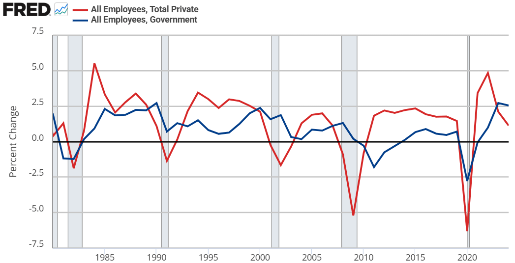
Hayek starts by assuming that government jobs are stable relative to those in the private sector. This might seem obvious, but let’s just start by checking the premises. Below are the percent change in total compensation and total employment for government employees and for the private sector. From year to year, private employment and total compensation is more volatile. So, Hayek’s initial premise is correct.
From there, he proceeds to say that if any part of income or employment is guaranteed or stabilized by the government, then the result must be that the risk and volatility is borne elsewhere in the economy. He reasons that if there is a decline in total spending, then stable government pay and employment implies that the private sector must have a deeper recession than the overall economy. Looking at the above graphs, both government employment and the total compensation are much less volatile.
But can’t governments intervene in macroeconomic stabilization policies effectively? Yes! They can and do stabilize the economy, especially with monetary policy. But Hayek is referring to individual stabilizations. For any individual to be guaranteed an income, all others must necessarily experience greater income volatility. How’s that?
Consider two individuals. Person #1 has an average income of $100. In any given year, his income might be $10 – or 10% – higher or lower than average. For the moment, person #2 is not employed and has income volatility of zero. If the government provides a job with a constant pay rate to person #2, then they still have zero income volatility. But instead of earning a consistent $0, person #2 earns a consistent $50. Nice.
Of course, person #2 gets his pay from somewhere. By one means or another, it comes from person #1. Let’s be generous and assume the tax on person #1 has no resulting behavioral effect. His new average income is $50, being $10 higher or lower in any given year. But now, that $10 deviation is over a base of $50 rather than $100. Person #1’s income varies by 20% relative to his new average!
Reasoning through this, we can consider that a person has a stable portion of their income and a volatile portion. If someone takes a part of your stable portion and leaves you with all of your volatile portion, then your remaining income is now more volatile on average. I think that this point is interesting enough all by itself.
IRL, many of our taxes are not lump sum. Rather, progressive taxation causes a negative incentive for production & earnings. The downside is that we produce less. The upside is that the government takes a higher proportion of our volatile income than of our stable income (because income changes are always on the margin and those marginal dollars are taxed at a higher rate). So, the government shares the income volatility of the private sector. By continuing to pay government employees a stable salary, the government is effectively absorbing some of that year-to-year income volatility on behalf of its employees.* The government is, in a sense, providing income insurance to a subgroup.
What does this have to do with The Road to Serfdom? Hayek argues that, as the government employs an increasing proportion of the population, the remaining private sector experiences increasing income and employment volatility. Such volatility increases private risk exposure so much that people begin to fawn over and increasingly compete for the stability found in government work. He gets anthropological and argues that the economic attraction to government jobs will introduce greater competition for those jobs and subsequently greater esteem and respect for those who are able to get them. This process makes the government jobs even more attractive.
My own two cents is that there is nothing internally unstable about this process. Total real income would fall compared to the alternative. However, such a state of affairs might be externally unstable as other governments/economies compete with the increasingly socialist one.
*An important analogue is that firms behave in a similar way. An individual may receive a relatively constant salary so long as they are employed. But the result must be that the firm bears more of the net-profit volatility. So, as more people want stable private sector jobs, the profit volatility of firms would increase and result in greater [seemingly windfall] profits and losses.
I had planned to write about the Trump-BLS fight today. But considering that two of my co-bloggers have already written about this (Mike on Monday and Scott on Tuesday) and that I have written about supposedly “fake” jobs numbers before several times (see January 2024 and August 2024), I will hold off on that topic until all of the dust settles. But this is a very important topic, and I believe Trump is clearly in the wrong (as is Kevin Hassett, see my tweets from this week), so please do continue to follow this topic and sane voices on it (see a Tweet from Ernie Tedeschi and from me for a long-run perspective on data accuracy).
But now, on to something a little more light-hearted: is everyone traveling to Europe these days?
Judging by my Facebook feed, it seems that Yes, lots of people are traveling to Europe. But this could be a result of selection bias in at least two ways: the people I am friends with on Facebook, and what people choose to post about on Facebook.
So what does the hard data say? We actually have pretty good long-run data on this question. In short: yes, lots more Americans are traveling to Europe (and overseas generally). Though don’t worry: not everyone went to Europe this summer, despite what social media might have you believe.
For starters, here’s a chart showing three decades of US overseas travel:
Unexpectedly, Chesterton on Patriotism from 2021 is one of my all-time top performing posts due to a slow but steady drip of Google Search hits.
In 1908, G.K. Chesterton published the following line in Orthodoxy,
This, as a fact, is how cities did grow great. Go back to the darkest roots of civilization and you will find them knotted round some sacred stone or encircling some sacred well.
By 1908, Chesterton had likely been exposed to Victorian early anthropological thinkers like Tylor and Frazer. Maybe I shouldn’t be impressed that he’d get it right, but I don’t think of Chesterton as having access to the best and latest evidence for how human civilization evolved.
I was browsing the book Sapiens (2011) this week and came across:
In the conventional picture, pioneers first built a village, and when it prospered, they set up a temple in the middle. But Göbekli Tepe suggests that the temple may have been built first, and that a village later grew up around it. (pg 102)
Today’s post is dedicated to congratulating Chesterton on making a conjecture that turns out to line up with the best we now know and archeological evidence that was only discovered in 1995.
Chesterton wrote,
The only way out of it seems to be for somebody to love Pimlico; to love it with a transcendental tie and without any earthly reason. If there arose a man who loved Pimlico, then Pimlico would rise into ivory towers and golden pinnacles… If men loved Pimlico as mothers love children, arbitrarily, because it is theirs, Pimlico in a year or two might be fairer than Florence.
Also this month I witnessed Americans celebrating the 4th of July. People here love this country “because it is theirs.”
I’ve heard a lot of panicking in the past 10 years about the fate of the nation, and I think we should always be in a partial state of paranoia. But, if love of country is needed in the recipe, we’ve still got it. (you might need an Instagram account to view Mark Zuckerberg Zuck wakeboarding in a bald eagle suit)
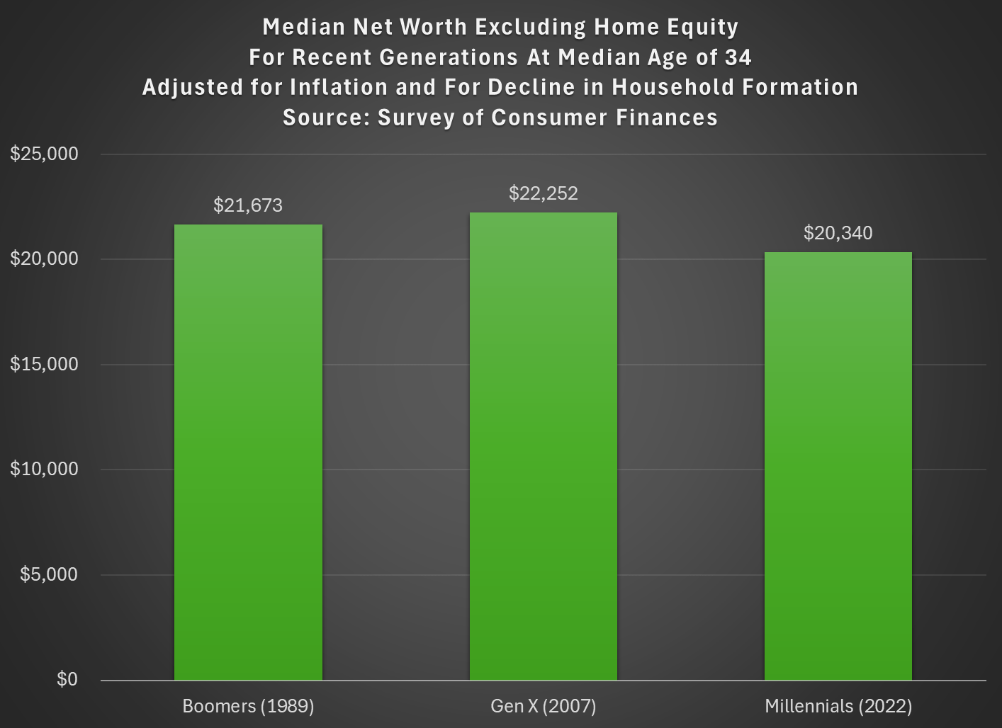
Last week I tried to address whether rising wealth for younger generations was primarily driven by rising home values. My analysis suggested that it was a cause, but not the only cause. Here’s another chart on that topic, showing median net worth excluding home equity for recent generations:
Two things are notable in the chart. For millennials, even excluding home equity they are well ahead of past generations, though of course their net worth is much smaller excluding this category of wealth (the total median net worth for millennials in 2022 was $93,800). But for Gen X in 2022 (last data in that chart), they are slightly behind Boomers, never having recovered from the decline in wealth after 2007 (primarily from the stock market decline, since we’re excluding housing).
But today I want to address another general objection to the wealth data found in the Fed’s SCF and DFA programs. That objection has to do with household formation. Specifically, these surveys are calculated for households, and the age/generation indicators are for the household head (or “householder” as it is now called). And we know that household formation has been declining over time, as more young people live with parents, with roommates, etc. So the Millennial data we see in the chart above is excluding any Millennials that have not yet formed their own household.
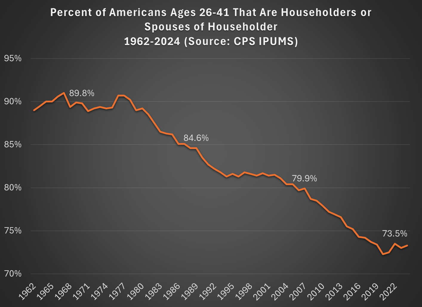
Here’s a general picture of the decline, which has been happening gradually since about 1980. Note: I use the age group 26-41, because this is the age of Millennials in 2022 (the most recent SCF survey year). The highlighted years on the chart are when the Silent, Baby Boomer, Gen X, and Millennial generations were about the same age (26-41).
What this means is that when we are looking at households in these wealth surveys (or any survey that focuses on households) we aren’t quite comparing apples to apples. Does this mean the surveys are worthless? No! With the microdata in the SCF, we can look at not only the median value, but the entire distribution. Since the household formation rate has fallen by about 11 percentage points between Boomers in 1989 and Millennials in 2022, one solution is to look up or down the distribution for a rough comparison.
For example, if we assume all of the 11 percent of non-householders among Millennials have wealth below the median, we can make a rough correction by looking at the 39th percentile for Millennials — the 39th percentile would be the median if you included all of those 11 percent of non-householders as households. Similarly, for Gen X would move down 5 percentage points in the distribution to the 45th percentile in 2007.
The household-formation-adjusted chart does paint a more pessimistic picture than just looking at the median for each generation: the 39th percentile Millennial has about 20% less wealth than the median Boomer did at roughly the same age. Seems like generational decline! Is there any silver lining?
First, you should interpret the chart above as a worst case scenario for Millennial wealth. It assumes all non-householders have low wealth. But likely not all of them do. If instead we use the 43rd percentile of Millennials in 2022, their net worth is $61,000, slightly above Boomers at the same age. (The household formation problem isn’t going away anytime soon as generations age — even if we look at Gen Xers, with a median age of 50 in 2022, their household formation is still 6 percentage points behind Boomers at that age.)
Second, my worst case scenario almost certainly overstates the problem. If all of those 11 percent fewer Millennials not yet forming households were to get married to other millennials, it would only add half of that many households to the aggregate distribution (when two non-householders get married, it becomes one household). So instead of moving down 11 percentage points to the 39th percentile, we should only move down 5 or 6 percentiles. The 44th percentile of Millennial net worth in 2022 was $63,060 — again, compare this to Boomers in the chart above.
Finally, if we combine both of the adjustments discussed in this post, looking at wealth excluding home equity and also adjusting for the decline in household formation, we get the following chart (here I once again use the 39th percentile for Millennials and the 45th percentile for Gen X, i.e., the worst case scenario):
With this final adjustment, we get a slightly different picture. The wealth of these three generations is roughly the same at the same age. No increase in wealth, but no decline either. You could read this as pessimistic, if your assumption is that wealth should rise over time, but the general vibes out there are that young people are worse off than in the past. This wealth data suggests, once again, that the kids are doing all right.
This post is co-written with John Olis, History major at Ave Maria University.
There is a popular myth that manufacturing jobs of the past provided a leg-up to young people. The myth goes like this. Manufacturing jobs had low barriers to entry so anyone could join. Once there, the job paid well and provided opportunities for fostering skills and a path toward long-term economic success. There is more to the myth, but let’s stop there for the moment. Is the myth true?
One of my students, John Olis, did a case study on Connecticut in 1920-1930 using cross sectional IPUMS data of white working age individuals to evaluate the ‘Manufacturing Myth’. We are not talking causal inference here, but the weight of the evidence is non-zero. The story above has some predictions if not outright theoretical assertions.
Manufacturing jobs paid better than non-manufacturing jobs for people with less human capital.
Manufacturing jobs yielded faster income growth than non-manufacturing jobs.
Implicitly, manufacturing jobs provided faster income growth for people with less human capital.
Using only one state and two decades of data obviously makes the analysis highly specific. Expanding the breadth or the timescale could confirm or falsify the results. But historical Connecticut is a particularly useful population because 1) it had a large manufacturing sector, 2) existed prior to the post WWII boom in manufacturing that resulted from the destruction of European capacity, and 3) had large identifiable populations with different levels of human capital.
Who had less human capital on average? There are two groups who are easy to identify: 1) immigrants and 2) illiterate people. Immigrants at the time often couldn’t speak English with native proficiency or lacked the social norms that eased commercial transactions in their new country (on average, not always). Illiterate people couldn’t read or write. Therefore, having a comparative advantage in manual labor, we’d expect these two groups to be well served by manufacturing employment vs the alternative.
Being cross-sectional, the individuals are not linked over time, so we can’t say what happened to particular people. But we can say how people differed by their time and characteristics. Interaction variables help to drill-down to the relevant comparisons. There are two specifications for explaining income*, one that interacts manufacturing employment with immigrant status and one that interacts the status of illiteracy. The baseline case is a 1920 non-operative native or literate person. Let’s start with the below snapshot of 1920. The term used in the data is ‘operative’ rather than ‘manufacturer’, referring to people who operate machines of one sort or another. So, it’s often the same as manufacturing, but can also be manufacturing-adjacent. The below charts illustrate the effect of lower human capital in pink and the additional subpopulation impacts of manufacturing in blue.
In the left-hand specification, native operatives made 2.2% less than the baseline population. That is, being an operative was slightly harmful to individual earnings. Being an immigrant lowered earnings a substantial 16.8%, but being an operative recovered most of the gap so that immigrant operatives made only 6.1pp less than the baseline population and only 3.9pp less than native operatives. In the right-hand specification, unsurprisingly, being illiterate was terrible for one’s earnings to the tune of 23.4pp. And while being an operative resulted in a 1.2% earnings boost among natives, being an operative entirely eliminated the harm that illiteracy imposed on earnings.
Both graphs show that manufacturing had tiny effects for a typical native or literate individual. But manufacturing mattered hugely for people who had less human capital. So, prediction 1) above is borne out by the data: Manufacturing is great for people with less-than-average human capital.


#/media/File:RMS_Republic.jpg)