Fellow blogger James Bailey and I have noted earlier this year that with inflation having plateaued well above the target 2% level, and with the ongoing strength in the U.S. economy, the three (initially six) rate cuts that pundits predicted for 2024 may not materialize. In fact, we may get no rate cuts at all. This has implications for many things, including housing markets and investing. Also, high interest on the federal debt, layered on top of insane peacetime budget deficits (neither party is willing to tell we the people that we cannot have big spending and low taxes), means the debt will balloon. Sorry about that, grandkids.
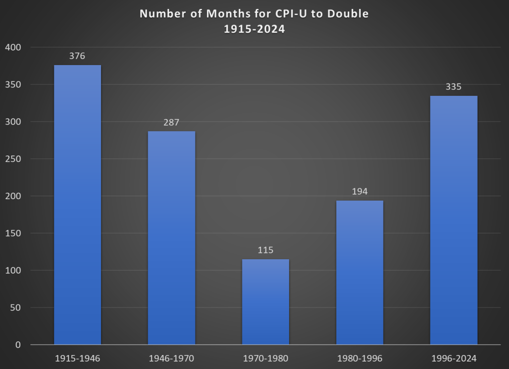
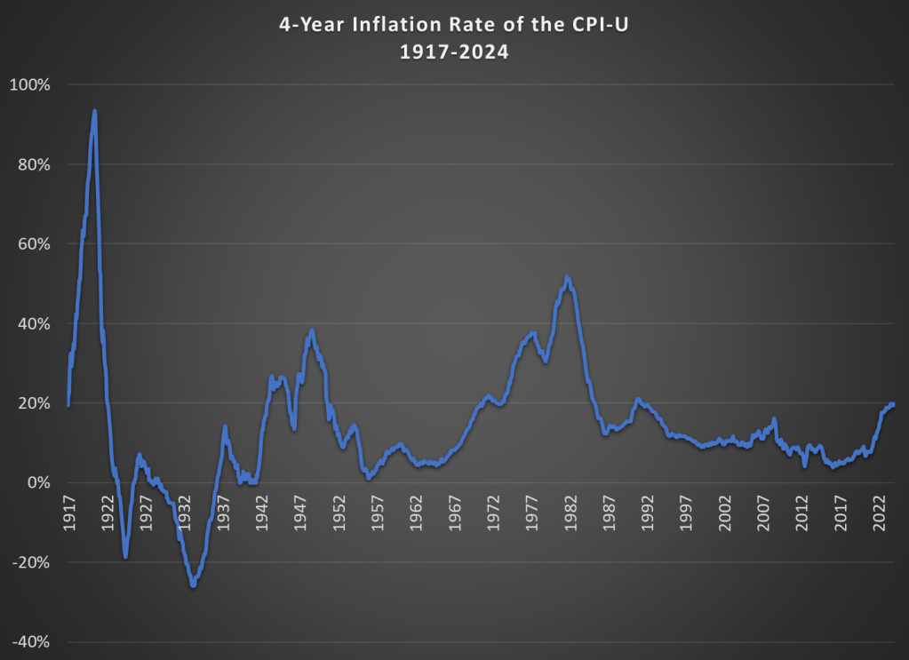
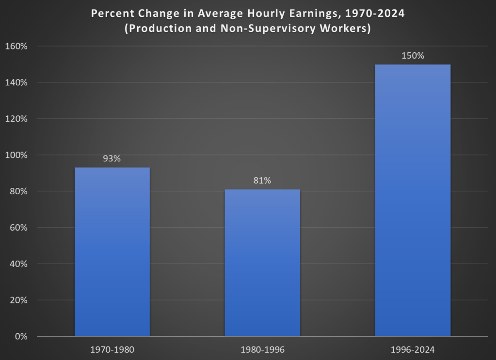
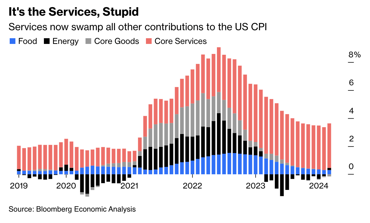
Here is a graphic which illustrates the course of inflation as measured by the Consumer Price Index:

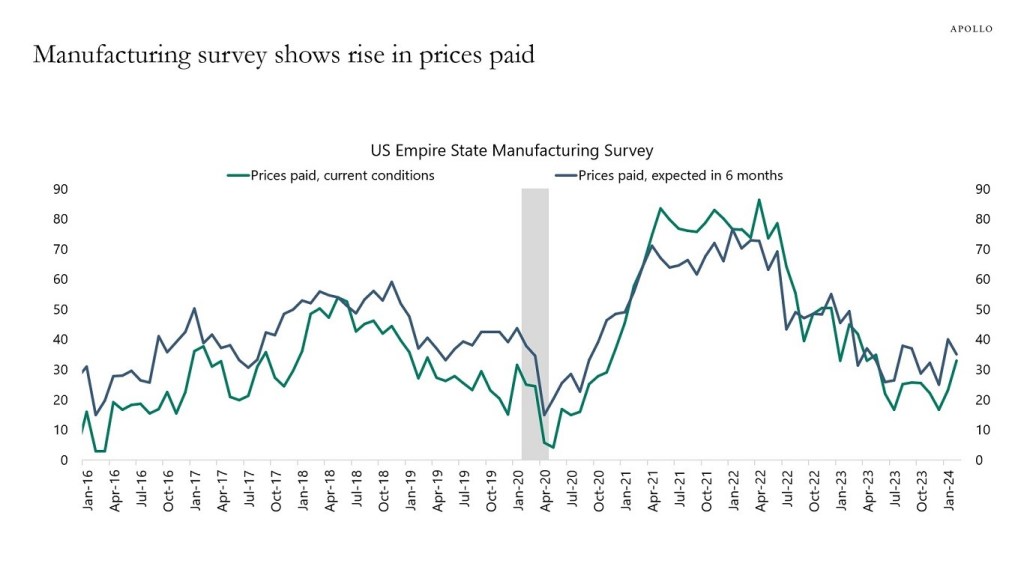
It seems that inflationary expectations are now firmly embedded into wage growth (which is the driver for the increase in Service costs). This mindset way be tough to break. Such is the fruit of the Fed’s head in the sand, inactive approach to raging inflation back in 2021. Instead of nipping it in the bud, they blandly assured us, “It’s just a transitory response to supply shocks”.
One very recent (yesterday) data point is the Census Bureau’s Advance Report on Monthly Sales for Retail & Food Services. This report provides initial data on consumer spending at U.S. retail establishments for March 2024; this is a valuable, timely indicator of current economic activity. According to the Census, Retail Sales expanded by +0.72%, surprising to the upside by +0.32%. This economy just isn’t slowing down.
Slow Landing versus No Landing
The dominant expectation among economists as 2023 drew to a close was that the economy would slow down significantly, gradually enough to justify Fed rate cuts, but it would not crater so fast as to bring on a recession. Now there is more and more talk of a “No Landing” scenario, where GDP keeps chugging along and rates stay high, as the new normal.
Yahoo Finance summarized the recent thinking of Wells Fargo:
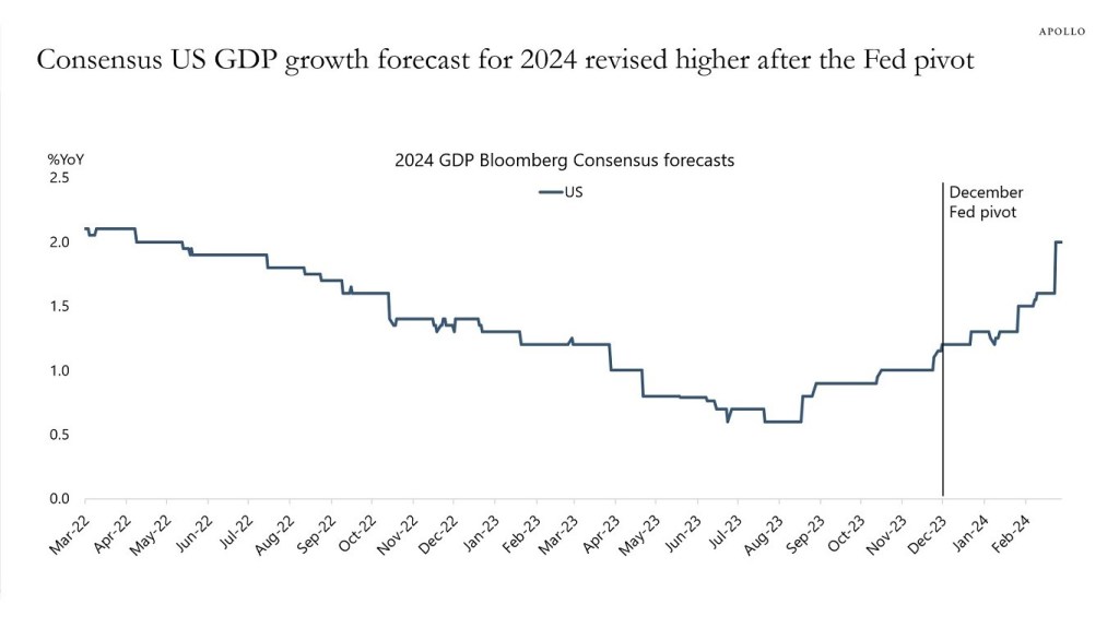
The Wells Fargo Investment Institute piled on to that narrative in a note Monday upgrading its outlook for the U.S. economy. While the bank didn’t specifically predict a “no landing” outcome, researchers lifted their gross domestic product growth forecast from just 1.3% for 2024 to 2.5%—the same as last year’s rate of 2.5%.
Wells also said the U.S. unemployment rate will sit at 4.1% instead of 4.7% by the end of 2024. The tradeoff will be slightly higher inflation. The bank now sees U.S. CPI inflation of 3%, instead of its previous 2.8% estimate.
Several factors have been named to account for the unexpected strength of the U.S. economy over the past few years, including record fiscal spending, particularly on infrastructure and semiconductors; the housing market’s resilience to higher rates owing to post–Global Financial Crisis policy changes and supply issues; and even “greedflation.”
But Wells Fargo said the economy has outperformed expectations because financial conditions—a measure of the availability and cost of borrowing, as well as risk and leverage in financial markets—are actually accommodative, despite the Fed’s rate-hiking campaign.
To that point, the Chicago Federal Reserve’s National Financial Conditions Index has been in accommodative territory throughout the Fed’s hiking cycle, and decreased to –0.53 in the week ended April 5—its lowest level since February 2022.
Unless there is a sudden change, it looks unlikely to me that the Fed can cut in May or June or July. If they do not cut by August, the thinking goes, it becomes likely that they will not cut at all this year, because of the optics around the fall election.


