A Pessimistic Take on Inflation

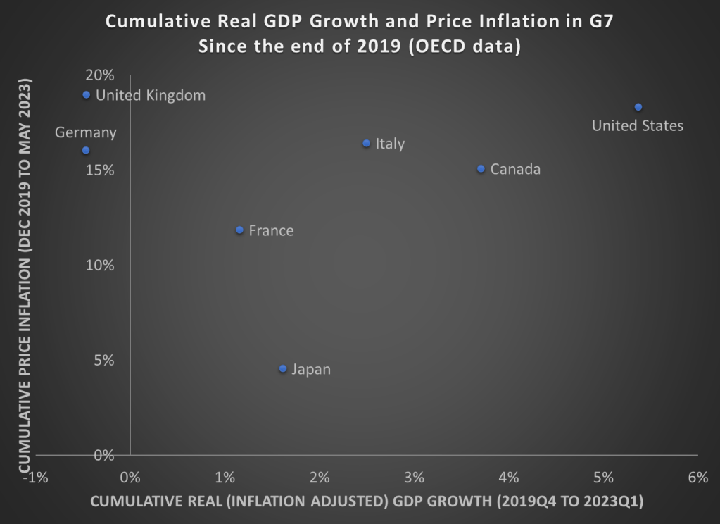
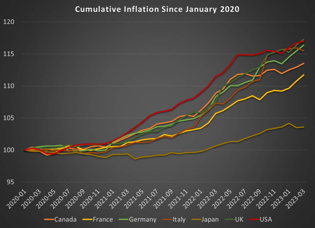
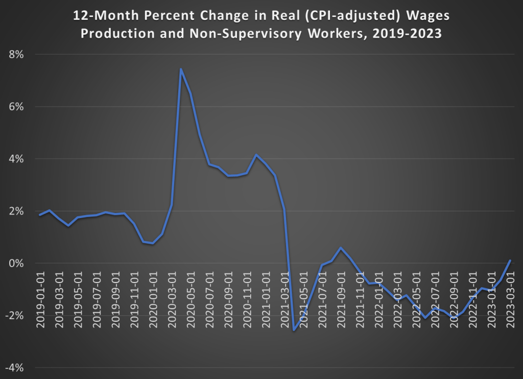
Last week I wrote an optimistic take on inflation. The rate of general price inflation has fallen a lot in recent months, and wage growth is now clearly outpacing inflation. That’s all good news.

Today, the Fed will announce their latest interest rate decision. Will the good news on inflation lead the Fed to stop raising interest rates? I’m not very good at making predictions, but today I’ll give a pessimistic take on inflation which suggests the Fed (and everyone else) should still be concerned about inflation.

The pessimistic take can be summarized in two charts. First, this chart shows the year-over-year change in the core PCE inflation index. As most readers will know, core indexes take out food and energy prices. This is not a “cheat” to mask important goods, it’s done because these are particularly volatile categories of goods. If we want to see the true underlying trend in inflation, we should ignore price fluctuations that are driven largely by weather and geopolitics.

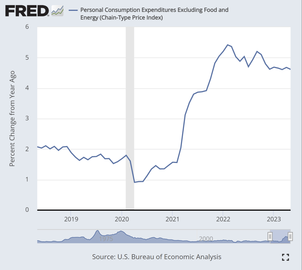
While there is some moderation in inflation in this chart, we don’t see anything like the dramatic decline in the CPI-U, which fell from about 9 to 3 percent over roughly the past year. True, there is some decline over the past year, but only about 1 percentage point, and it has been stuck at just over 4.6 percent for the past 6 months. This is not a return to normalcy, as this rate historically has stayed in the band of 1-2 percent.

The second pessimistic chart is M2, a broad measure of the money supply.

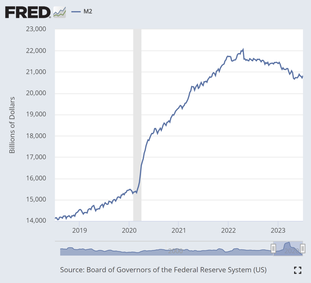
The dramatic increase in M2 during 2020 is clear. That’s a big source of the inflation issues we’ve had over the past 2 years. There is some cause for optimism in this chart: M2 has clearly shrunk from the peak in Spring 2022. In fact, using a year-over-year percentage change, M2 has been negative since last November.

But if we look very recently, there is less cause for optimism. Since late April, M2 has stopped falling. In fact, it’s up a little bit. Is this a sign that the Fed doesn’t really have inflation under control? Perhaps. The increase isn’t huge, and there’s always some seasonality and noise to this data so we shouldn’t overanalyze this small deviation from the general decline in the past year plus. But we’ll need to continue watching this data.

The Rate of Inflation is Falling, But Prices are Still Rising (And So are Wages)

The latest CPI-U price data shows that the rate of inflation in the US has slowed significantly to just 3% in the past 12 months. That’s a huge improvement from the peak last June, when the annual rate of inflation was over 9%. Still, prices as a whole aren’t falling, and they clearly aren’t anywhere near where they were before the pandemic: using the CPI-U, prices are up over 17% since January 2020.

Lately I’ve heard many people asking a good question: will prices ever get back down to where they were? Usually they mean pre-pandemic prices, though sometimes they refer to a particular point-in-time (such as the start of Biden’s presidency). The only correct answer is “we don’t know,” but I think a likely answer for many goods and services is “no.” For many reasons, the nominal prices of most goods and services rise over time. Though this is not true for everything, of course (newer technologies are one example we often see).

But what about specific goods that we buy frequently? Will we ever see gasoline consistently below $3 per gallon again? Will we ever see milk consistently below $4 per gallon again? What about eggs and bread? And indeed, these prices are well above January 2020 levels: 23% higher for milk, 43% for bread, 45% for gasoline, and a whopping 52% for eggs. For the price data, I am using this convenient data on common food and energy goods from BLS.

For some of these items, I do think you might someday see prices fall back to levels consumers were used to from the recent past, since food and energy prices tend to be volatile. For others, though maybe not. But I think we as consumers can become overly focused on staples that we buy frequently and can easily recall the price in our heads. For example, while eggs, bread, and milk are items that we buy frequently (including being the staples of stocking up before a storm), in total these constitute just 0.6% of average consumer spending.

If instead of those 3 staples, your mind naturally anchors on produce prices, the trends look different: oranges are up 23%, but bananas are only up 10%, and tomatoes are, in fact, down 14% since January 2020. But again, these items are less than 0.5% of total consumer spending. Ideally, we shouldn’t anchor on any one subset of goods when doing a good analysis, even if it is natural for us to do so in our lives as consumers.

This is where the benefit of a price index, like the CPI-U, comes in.

Continue reading

Updated GDP and Inflation Data for G7 Countries

As we prepare for the release of second quarter GDP data over the next few weeks, here is a chart showing cumulative GDP growth (inflation adjusted) and Price inflation for G7 countries. While inflation has been high everywhere (except for Japan), the US comes out looking very well relatively on GDP growth. That’s especially true compared to the UK and Germany, which have also had high price inflation, but have actually had negative economic growth since the end of 2019.

“Good Money at the Time”

On summer vacation, I recently visited Mount Rushmore. It’s amazing structure, and the story of its construction is as impressive as the monument itself. Much of the story you learn when visiting is the story of its creation. As an economist, of course seeing the following display with wage data got me very excited:

While the sign says that laborers made 30 cents per hour, searching online it appears that 50 cents was more common. More skilled workers, such as assistant sculptors, made $1.50 per hour. These were, as the sign says, “good wages” for that time. In the economy generally, production workers made around 50 cents per hour our as well around that time period, and most of the construction of Rushmore was during the Depression (some of the workers were WPA funded), so having any job, much less one that paid pre-Depression wages, was certainly a good one.

How does this compare to wages today? This is always a tricky question, as I have documented on this blog several times before, but the most straight forward approach (and good first approximation) is a simple CPI inflation adjustment. Using 1929 as the baseline year, when construction was in full swing, 30 cents an hour is roughly $5 today, 50 cents per hour is close to $9, and $1.50 would be about $26.50. That doesn’t sound too bad!

The best comparison I like to use is BLS’s average hourly earnings for private production and non-supervisory workers. Averages aren’t perfect, but this measure excludes management occupations that will be distorting the average. In May 2023, that wage was $28.75 per hour. So the average worker today earns 3-6 times as much per hour as these “good paying jobs” in the late 1920s and the Depression. And, as the Rushmore signage notes, these jobs were seasonal. Their off-season jobs probably paid even less.

The wage of the assistant sculptor does compare well with average wages today, but that pay was unusual for the time and was likely a highly skilled worker. The only record I can find of anyone making that much at Rushmore was Lincoln Borglum, the son of the main sculptor Gutzon Borglum. Lincoln oversaw the completion of the project after Gutzon’s death, and it was only in later years on the project that his pay was increased to $1.50 per hour.

For the typical laborer on Rushmore, having a good job was indeed good to have, but the wages pale in comparison to a typical worker today.

Inflation in G20 Countries

Most recent annual rates, compiled by Trading Economics. The US is right in the middle:


Argentina 109%
Turkey 43.7%
United Kingdom 8.7%
Italy 8.2%
Germany 7.2%
Australia 7%
Euro Area 7%
South Africa 6.8%
Mexico 6.3%
France 5.9%
Singapore 5.7%
Netherlands 5.2%
United States 4.9%
India 4.7%
Canada 4.4%
Indonesia 4.3%
Brazil 4.2%
Spain 4.1%
South Korea 3.7%
Japan 3.5%
Saudi Arabia 2.7%
Switzerland 2.6%
Russia 2.3%
China 0.1%

Regulation and Delayed Updates: Why Services Inflation Will Likely Stay High

Apart from some possible geopolitical upset (and theater with the debt ceiling), the Big Issue for the larger economy, and for investing decisions, remains how fast inflation will decline – since that governs how soon the Fed can relent on keeping interest rates high. Those high interest rates are having all kinds of knock-on effects, including bank failures and suppressed home sales.

The investing market seems to be pricing in expectations of significant Fed rate cuts before the end of 2023, which in turn presupposes that inflation will have ratcheted downwards far enough by then to allow the Fed to declare victory. Goods inflation (= mainly stuff made in China) has declined nicely, but services (which comprise the majority of household spending) remains high. It is coming down, but too slowly to realistically hit the Fed’s 2% target this year.

In an article in the Seeking Alpha site title Services Inflation Is Stuck, the investment firm Blackrock notes some technical factors that will likely keep services inflation high for at least the remainder of this year. I will paste in their text in italics:

Core Services ex-Shelter inflation is a bit of a hodgepodge that includes things like medical care services, video and audio services, tuition, and insurance. It comprises roughly a quarter of the CPI basket and, importantly for the Fed, is very domestically oriented.

A key insight from this article is that nearly two-thirds of this key “Core Services ex-Shelter” component consists of:

(1) Service prices that are regulated (especially insurance), and

(2) Services with infrequent price resets (such as tuition and especially medical services):

There are technical factors that make it likely that these particular items will see ongoing, sticky inflation:

Impact of Regulated Prices

Regulated prices tend to be more discrete and more lagged in their changes due to bureaucratic delays and their negotiated nature. Some types of regulated prices, like postage or water and sewage fees, are easily recognizable as subject to government regulation. Somewhat less intuitive is the degree to which insurance in the United States is a regulated price. Insurance comprises the largest share of Core Services ex-Shelter basket and state-level insurance commissioners play important roles in negotiating auto, property, and casualty insurance price changes.

The underwriting costs of insurance have been surging globally – a combination of higher reinsurance premiums, inflated asset values, and more natural disasters. These rising costs have only just begun to flow through into consumer prices; auto insurance costs were an upside surprise within March’s CPI report.

Jumps in Medical and Education Prices Will Appear Later

Though the market has been fixated on the painstaking details of the month-over-month inflation prints, many of the sub-components of the CPI do not update monthly. Two of the more important items within the core services basket – medical care services and tuition – only update their prices annually. Coincidentally, updates for both of these categories take place in the autumn, and both are set to rise strongly.

Medical care services are the largest component (28%) of Core Services ex-Shelter, but have a complex and lagged computation and update only once a year in October. Medical services inflation has been negative since last October as a consequence of excess consumer demand for post-pandemic doctors’ visits, however, we expect this mechanical effect will abate later this year and thereafter lift core services inflation.

Tuition is another example of a service with intermittent price resets, given prices are set on the basis of the academic year. We expect the broad-based upward wage pressure in education to be passed through to higher education consumer prices later this year when students return to school.

And so…I expect “higher for longer” inflation and interest rates.

Inflation and GDP Growth in the G7 Revisited

In August 2022, I wrote a post showing that among G7 nations, the US had the highest inflation during the pandemic, but also the highest rate of real economic growth. But since the economic situation is evolving rapidly, I wanted to update that data from mid-2022 (I also use core inflation, but I’ll use total inflation in this post).

Here’s how inflation has looked during the pandemic:

While the US had the most cumulative inflation for much of the pandemic, the cooling of inflation in the US and the acceleration in Europe has changed things a bit. By late 2022, the UK and Italy had caught up to the US, and Germany is closing in too. These countries have cumulative inflation of between 15 and 17 percent since January 2020.

Japan looks to be the winner here. But wait, we don’t only care about low and stable inflation. We also want economic growth. Here’s the data through the 4th quarter of 2022 (we’ll start to get 2023q1 data from countries next week):

By this measure, the US comes out as the clear winner, with real GDP being about 5 percent higher than the end of 2019. That might not sound impressive for 3 years of growth, until you realize that 5 of the 7 nations had growth below 2 percent, with Germany and the UK actually still smaller than the end of 2019! And this doesn’t take account of the cumulative losses. Notice that the US had the second smallest dip in 2020q2 as well.

It’s hard to know exactly what the right non-COVID counterfactual would be, since these countries all had different rates of growth before the pandemic. But adding up the GDP scaled to 100 before the pandemic, the US is the only G7 country where these 12 quarters of data add up to more than 1,200. The other countries haven’t even had enough growth since the 2020 recession to make up for the losses during the recession, to say nothing of what their potential growth would have been. Japan comes the closest to making up the losses, while the UK stands out as the worst.

Here’s the figures for all the G7 countries, with 100% meaning they have had enough growth to offset the losses from the 2020 recession:

US: 100.8%

Japan: 99.3%

Canada: 98.6%

Germany: 98.0%

France: 97.1%

Italy: 96.9%

UK: 94.5%

Workers Finally Get a Real Annual Raise

Back in December I pointed out that, thanks to slowing inflation, real wages had been rising since June 2022 (using either the CPI or the PCEPI for inflation adjustments).

With the latest monthly data, we can now report more good news for wage earners: CPI-adjusted wages have increased over the past 12 months. That had happened since 2021. In the past 12 months, wages of production and non-supervisory workers are up 5.1%, just a hair more than the annual increase in the CPI of 5.0%. It’s not much, and we’re not back to our pre-pandemic norm of 2% real wage growth. But it is more good news that we may finally getting past our post-COVID inflationary hangover.

Job Market Still Red-Hot; Inflation and High Rates Not Going Away Soon

As noted earlier, the main driver in inflation since 2021 has not been supply chain issues, but ongoing wage increases in (mainly) the service industry, fueled by a tight labor market. Some headlines note recent decreases in job openings, etc., suggesting that the end of inflation is near. The point of this post is that measures of labor market tightness remain at very high levels, and so it will be a while yet before the Fed can claim victory over inflation and start meaningfully reducing interest rates.

Below I will post a set of charts (courtesy of Seeking Alpha article by Wolf Richter) which make the following point: most measure of labor tightness remain at least as high as they were in late 2019, just before the pandemic hit. It is true that things have loosened up in the past few months, but that just means the labor market has gone from white-hot to merely red-hot. Let the data speak:

We hold that the current  tightness of the labor market is largely a result of pandemic policies which incentivized a whole tranche of experienced workers to take early retirement and also put lots of cash in our pockets which we are spending generously on services .  Those workers are not coming back, but at some point in the next 1-2 years the excess Covid cash will run out and we may finally get the long-expected recession. But if the government rushes in with enhanced unemployment benefits to ease the recession pain, we would expect inflation to remain well above the nominal 2% target

Whiteboard Macroeconomics

There’s nothing that economists love more than a good blackboard (or in modern times, a whiteboard) to work out some basic models of how we think the world works. Supply and demand rules in microeconomics, but macroeconomics has a few good blackboard models too.

So I was excited to see when a member of Congress was using a whiteboard to work through some basic economic logic, as Rep. Katie Porter did in this video she tweeted using the textbook macroeconomics aggregate demand and aggregate supply model:

However, while I haven’t taught macroeconomics in about a decade, it seems there are a few flaws in her analysis. Flaws enough that this probably wouldn’t get a passing grade on an oral exam. I could detail them myself, but… I will leave this to the readers as an exercise! For fun, even if you don’t think this is the best model in the world, just assume it’s a good model. What did Rep. Porter miss? Leave a comment.