Today is a big day not only for Supreme Court watchers, but for everyone following economic policy: the Court will hear oral arguments for the case Learning Resources, Inc. v. Trump. The case concerns whether Trump’s tariffs imposed under the International Emergency Economic Powers Act are legal, which includes the famous “Liberation Day” tariffs from April 2025.
You should be able to livestream the arguments from the SCOTUS website starting at 10am ET (though it may start a little later). SCOTUS blog has a liveblog which should cover most of the legal arguments, but if you want to follow the economic arguments there are several people you can follow on Twitter, such as Scott Lincicome and Phil Magness (you can follow me too).
One of the likely effects of the federal government shutdown is that recipients of SNAP benefits (what used to be officially called “food stamps,” a term still used by the general public, especially those that dislike the program) may lose their benefits next month. This would obviously be a hardship for those that depend on this program, but it has also led to bad claims being made about the program, from both supporters and opponents of the program.
Let’s start from the political right: Matt Walsh makes the claim that by subsidizing food consumption “obviously drives up the cost” of groceries.
The number one thing that artificially inflates the price of groceries is the food stamp program. The federal government is subsidizing groceries for 40 million people which obviously drives up the cost. That's why the increase in the cost of groceries tracks exactly with the…
As with all bad claims, there is a nugget of truth baked into them. If the government subsidizes anything, we would expect demand to increase, and thus unless supply is perfectly elastic, there will be some effect on prices. However, we need to think more carefully about the nature of the subsidy.
The way SNAP works is that beneficiaries receive an electronic voucher to spend at the grocery store, which is about $300 per month on average for a household. That $300 must be spent on groceries. However, if that household had already planned to spend $300 or more on groceries, it is unlikely they will spend all of the additional $300 on food. In the limit, it’s entirely possible they will spend no additional money on groceries, merely reducing their out-of-pocket spending on groceries by $300. They will then effectively have $300 more to spend on other goods. More likely is that they will spend some of the additional $300 on groceries, and some of it on other goods.
Many studies have tried to look at the extent to which SNAP benefits affect household spending, but these were mostly observational studies. There was no treatment and control group. But a 2009 paper titled “Consumption Responses to In-Kind Transfers: Evidence from the Introduction of the Food Stamp Program” has a better approach to studying the question. Since the original Food Stamp program was slowly rolled out across the country over more than a decade, you can compare counties that entered the program first to counties that entered it later. By doing so, Hilary Hoynes and Diane Schanzenbach find out some first interesting things about the causal effects of SNAP benefits.
For the claim by Walsh in his Tweet, the most relevant result from the paper is that food stamps impact household spending similarly to a cash transfer. Yes, the program increases household spending on groceries, but it also increases spending on other goods and services. And it does so almost identically to how cash transfers impact household spending. In other words, while pitching the program as assistance for buying groceries may make it more politically palatable, SNAP benefits are no different from a similarly-sized cash transfer for the average recipient. If they do cause any inflation, they do so in the same way as a cash transfer would, and thus there is no specific impact on food inflation.
A second bad claim about SNAP comes from the political left, in this case Minnesota Governor Tim Walz:
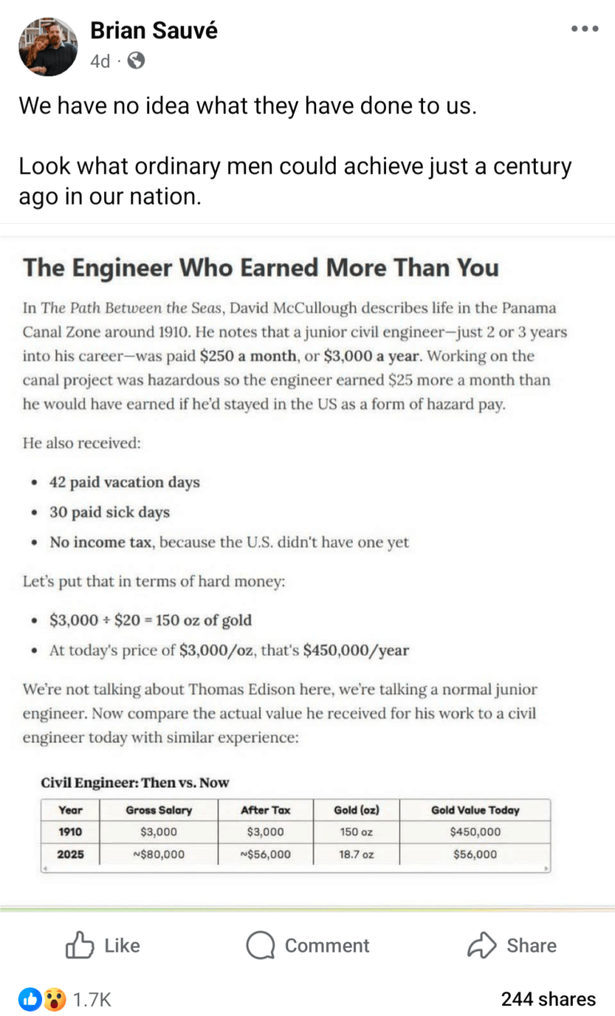
Inflation adjusting income and prices from the past is a common theme in my blog posts, including fact checking of other attempts to do these adjustments. But here is a really novel one, in a viral post from Facebook (which comes from this essay), which claims that a civil engineer earned the equivalent of $450,000 in today’s terms:
Can this be correct? If so, it would represent massive stagnation in incomes over time. Thankfully, there are two major errors, or at least misleading aspects to the calculation.
The listed salary was not one of an “ordinary man” — far from it.
Using gold prices to inflation adjust the incomes is very misleading.
First, the salary: $3,000 per year was definitely not what ordinary men earned. The average wage, for example, for a production worker in manufacturing was 18 cents per hour. You would need to work almost 17,000 hours to earn $3,000 at that wage, which of course is not possible. In reality, the average worker put in 57 hours per week — which means they earned about $500 if they were able to work 50 weeks per year (most probably didn’t). So already we see that the civil engineer working on the Panama Canal is making about 6 times as much as an “ordinary man.” Agricultural workers, the other main industry of 1910, earned about $28 per month ($22 if they also received board) — even less than manufacturing, and only about 1/10 of the engineer
Second, the gold price adjustment is misleading. Yes, in 1910, gold was how we defined currency in the US. But you can’t eat gold, and most people only keep a little gold on hand that can be described as providing services for them (such as jewelry). What people really wanted were real goods and services, and mostly goods. Around 1910, the average American household spent about 40% of their income on food, 23% on housing, and 15% on clothing. Comparing standards of living over time requires us to look at what people spend their money on, not what the currency is denominated in. And that’s what a good consumer price index does: it compares the prices of all consumer spending at different points in time, not just one thing like gold, allowing us to make rough comparisons of income over time.
Using the Measuring Worth historical CPI (which extends the BLS CPI back before 1913), we see that the index was 9.21 in 1910, and it stands at 323.364 in August 2025. So the 18-cent manufacturing wage from 1910 is roughly equivalent to $6.32 in current dollars. The average manufacturing wage today? Around $29. And of course, workers today have a whole range of fringe benefits, worth roughly another $13.58 for private sector workers. This means that an “ordinary man” today working in manufacturing can buy 5-7 times as many real goods and services as his 1910 counterpart for each hour he works. And the work is, of course, much safer today: BLS reports 23,000 industrial deaths in 1913 (61 deaths per 100,000 workers), but only 391 manufacturing deaths in 2023 (0.003 deaths per 100,000 workers).
But what about that extraordinary man in 1910, the civil engineer? How was he doing compared with today? Using the same historical CPI, we can see that $3,000 in 1910 is roughly equivalent to $105,000 today. Not bad! That’s almost exactly the median pay for civil engineers today. But keep in mind the civil engineer working in Panama was an unusually highly paid position. A 1913 report from the American Society of Civil Engineers suggests that most early career civil engineers were making closer to $1,500 per year — half of the Panama engineer. Engineers were also a highly skilled, very rare profession in 1910. And don’t forget that about 10% of the American workers on the Canal died in the construction, mostly from disease so the engineers were probably just as susceptible to death as the laborers.
Finally, we might ask a different question: what if you had held onto gold since 1910? Let’s say your great-great grandfather was a civil engineer, and managed over the course of a few years to save one year’s salary in gold. He even managed to hide it during the 1930s-1970s, when private holding of gold was generally illegal in the US.
How much would that 150 ounces of gold be worth today? That answer is simple: about $615,000 today (gold has gone up a bit just since that calculation was done in May!). But was that a good investment? Not really. A $3,000 investment in the stock market from 1910 to 2024 would be worth about… $120 million (it’s actually a bit more than that, since the market continued to rise after January 2024). Of course, that would have required a bit of active management, since index funds don’t come along until much later. But your great-great grandfather would have been much wiser to set up a trust for you and have it actively managed to approximate the entire US stock market, rather than to bury 150 ounces of gold in his backyard.
Even assuming you lost half the value to management fees, the stock portfolio today would be worth at least 100 times as much as the gold.
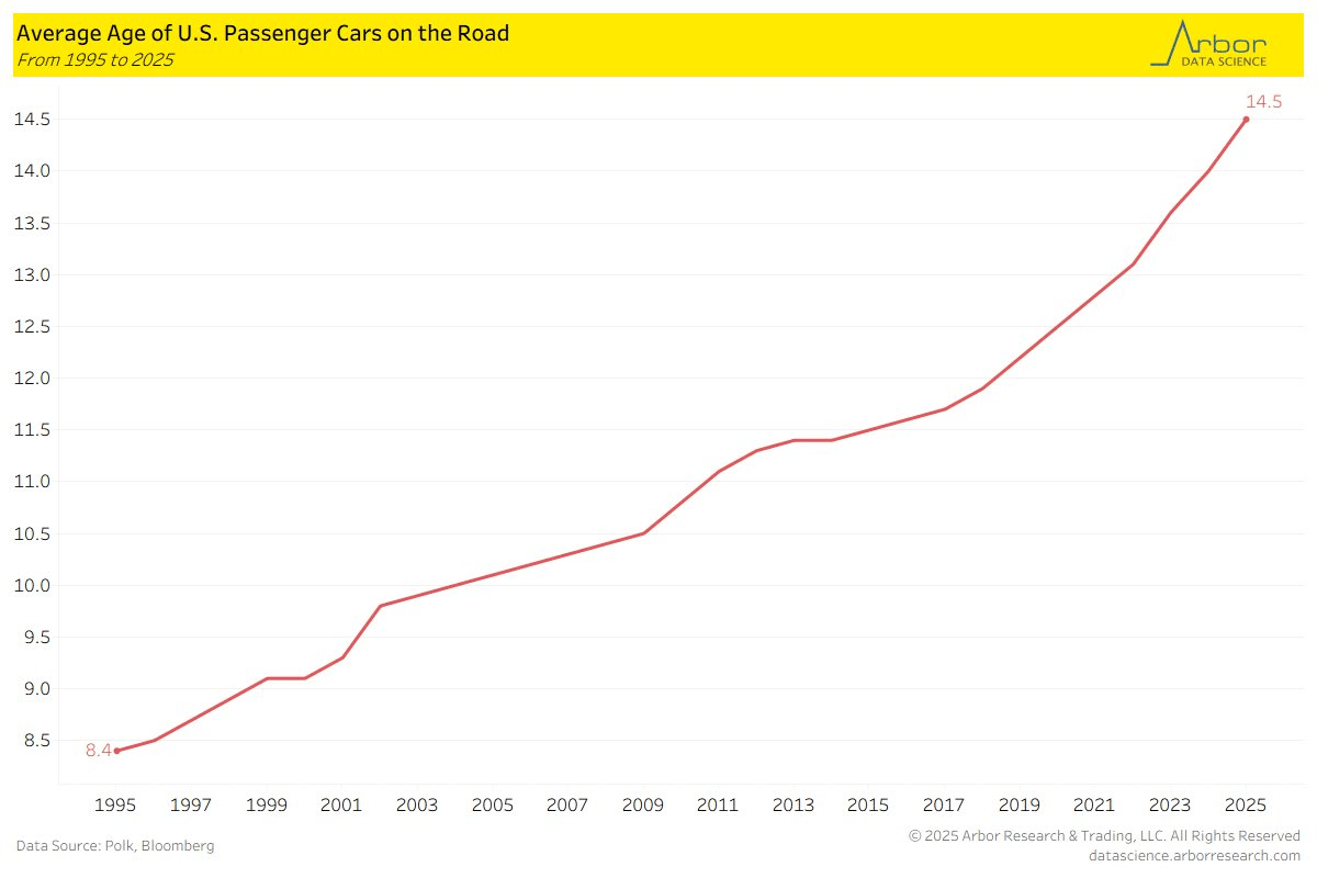
The following chart from Arbor Research shows that the average age of cars on the road in the US is 14.5 years. If we go back to 1995, it was almost half that, and the increase has been steady since over the past 30 years. Similar data from the Bureau of Transportation Statistics confirms these numbers.
Why would this be? I see two primary explanations that are possible. One is that cars are becoming more reliable (better quality), so consumers are happy to drive them longer. The other is that cars today are less affordable, so people are only hanging onto old cars because they are forced to. One of these is a happy explanation, one is consistent with a narrative of stagnation. Which is true?
On the affordability question, we do have some good data, but it points in the opposite direction: cars are much more affordable today than in 1995, or even before that.
Yesterday on Twitter I shared a chart showing the age at first marriage for white men and women in the US, with data going back to 1880. I pointed out an interesting fact: at least for men, the age was essentially the same in 1890 and 1990 (27), though for women it was a bit higher in 1990 than in 1890 (by about 1 year).
This Tweet generated quite a bit of interest (over 800,000 impressions so far), and (of course!) a lot of skeptical responses. One skeptical response is that I cut off the data in 1990, when trends since then have shown continuously rising ages at first marriage, and by 2024 the comparable figures were much higher than in 1890 (by about 4 years for men and 6.5 years for women). In one sense, guilty as charged, though I only came across this data when looking through the Historical Statistics of the US, Millennial Edition, and that was the most current data available when it was printed. Here is a more updated chart from Census:
But there is another interesting fact about that data: the massive decline age of first marriage in the first half of the 20th century. Between 1890 and 1960, the median age at first marriage fell by about 3 years for men and 2 years for women. For men, most of the decline (about 2 years) had already happened by 1940. Thus, if we start from the low-point of the 1950s and 1960s (as many charts do, such as this one), it appears marriage is continuously getting less common in US history, while the fuller picture shows a U-shaped pattern.
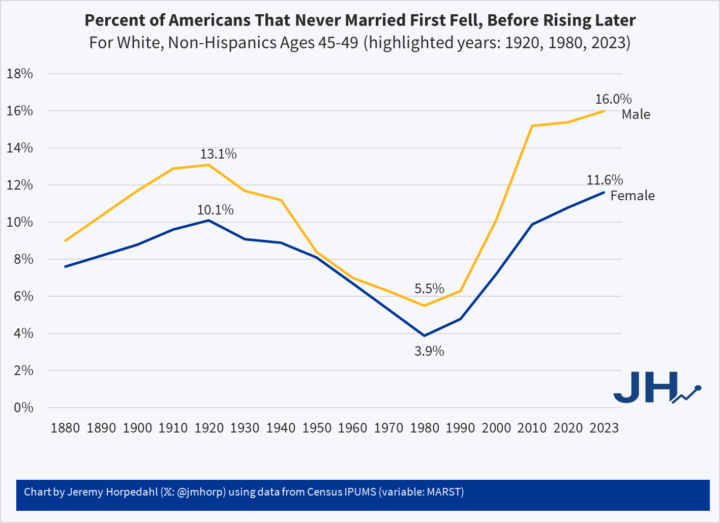
This same pattern shows up in another measure of marriage data: the percentage of people that never get married. If we look at White, Non-Hispanic Americans in their late 40s, the picture looks something like this (keen observers will note that the Hispanic distinction is a modern one dating from the 1970s, but Census IPUMS has conveniently imputed this classification back in time based on other demographic characteristics):
Looking at people in their late 40s is useful because, at least for women, they are past their childbearing years. And using, say, the late 50s age group doesn’t alter the picture much: even though some people get married for the first time in their 50s, it’s always been a small number.
Here we can see an even more dramatic pattern. 100 years ago, it was not super rare for people to never marry: over 1/10 of the population didn’t! But by 1980 (thus, for people born in the early 1930s), it was much rarer: less than 4% of women were never married (among White, Non-Hispanics). In fact, the peak in 1920 of 10% unmarried women wasn’t surpassed again until 2013! And it’s not substantially higher today than 1920 for women, especially when considering the full swing downward. Men are quite a bit higher today, though the 1920 peak of 13% wasn’t surpassed again until 2006.
For a measure that peaks in 1920, we might wonder if new immigrants are skewing the data in some way, given that this is right at the end of about 4 decades of mass immigration. But just the opposite: if we focus on native-born women, the 1920 level was even higher at 11.1%, which wasn’t surpassed until 2022, and even in the latest figures it is less than 1 percentage point higher than 1920.
Precisely why we observed this U-shaped pattern in marriage (both first age and ever married) is debated among scholars, though my sense among the general public is that it isn’t much thought about. Most people (from my casual observation) seem to assume that marriage rates and ages were always lower in the past, and that modern times are the outliers. But in reality, the middle part of the 20th century seems to be the outlier. The “Baby Boom” of roughly 1935-1965 is possibly better understood as a “Marriage Boom,” with more babies naturally following from more and younger marriages.
When reading an old novel or watching a period drama movie or TV show, it is almost inevitable that some historical currency amounts will be mentioned. This is especially true when the work is dealing with money and wealth, for example the series “The Gilded Age” is about rich people in late 19th century America. So money comes up a lot. I wrote a post a few weeks ago trying to contextualize a figure of $300,000 from 1883 for that show.
A new Netflix series “The House of Guinness” is another period piece that spends a lot of time focusing on rich people (the family that produces the famous beer), as well as their interactions with poorer folks. So of course, there are plenty of historical currency values mentioned, this time denominated in British pounds (the series is primarily set in Ireland, where the pound was in use). On this series, though, they have taken the interesting approach of giving the viewers some idea of what historical currency values are worth today, by overlaying text on the screen (the same way they translate the Gaelic language into English).
For example, in Episode 4 of the first season, one of the Guinness brothers is attempting to negotiate his annual payment from the family fortune. He asks for 4,000 pounds per year. On the screen the text flashes “Six Hundred Thousand Today.”
The creators of the show are to be commended for giving viewers some context, rather than leaving them baffled or pausing the show to Google it. But is 600,000 pounds today a good estimate? Where did they get this number? As with the “Gilded Age” estimate, it’s complicated, but it is probably more than you think.
Housing is certainly more expensive than in the past. I have written about this several times, including a post from last year showing that between about 2017 and 2022 housing started to get really expensive almost everywhere in the US, not just on the West Coast and Northeast (as had previously been the case). I don’t think the housing affordability crisis is in serious doubt anymore, and it can’t be explained over the past few years by increasing size and amenities, since those haven’t changed much since 2017 (though it is relevant when comparing housing prices to the 1970s).
But why did this happen? Knowing why is crucial, not merely to blame the causes, but because the policy solution is almost certainly related to the causes. I and many others have argued that supply-side restrictions, such as zoning laws, are the primary culprit. The policy solution is to reduce those restrictions. But a recent op-ed titled “Why your parents could afford a house on one salary – but you can’t on two,” the authors place the blame for housing prices (as well as the stagnation of living standards generally) on a different factor: Nixon’s 1971 “severing the dollar’s link to gold.” The authors have a book on this topic too, which I have not yet read, but they provide most of the relevant data in this short op-ed.
Does their explanation make sense? I am skeptical. Here’s why.
This is from the latest Census release of CPS ASEC data, updated through 2024 (see Table F-23 at this link). In 1967, only 5 percent of US families earned over $150,000 (inflation adjusted).
Addendum: Several comments have asked how much of these trends can be explained by the rise of dual-income households. The answer is some, but not all of it, which I have written about before. Dual-income households were already the most common family structure by the 1980s. There hasn’t been an increase in total hours worked by married households since Boomers were in their 30s. You can explain some of the increase up until the Boomers by rising dual-income households, but this doesn’t explain the continued progress since the 1980s. And as Scott Winship and I have documented, even if you look just at male earnings, there has been progress since the 1980s.
Are you tired of hearing about revisions to jobs data? Well, there was another hot one released by BLS yesterday. Known as the “preliminary estimate of the Current Employment Statistics (CES) national benchmark revision to total nonfarm employment,” this change isn’t yet incorporated into the official jobs data. But it will, possibly slightly modified, be included with the January 2026 jobs release, altering jobs data back to April 2024. It is part of the normal annual process of reconciling the monthly, survey-based jobs data with the near-universe data from unemployment insurance records. Normally, this is a quiet affair, especially the preliminary estimate which is just giving a heads up to researchers about what will be coming in a few months.
I wrote about these preliminary figures last year, when the initial estimate was a negative revision 818,000 jobs. When revised and actually incorporated into the data, it was a somewhat smaller 598,000 jobs, which I then used in a post just last month to show that BLS hasn’t been getting worse at estimating jobs. If anything, they have been getting better. Yesterday’s report showed that the revision could be negative again, this time 911,000 jobs. That’s a little bigger than last year, but maybe it will end up being smaller in the final number. So, no big deal again?
Maybe not. The 911,000 jobs revision would actually be much larger than last year’s revisions because it’s coming on top of a slower growing labor force already. The initial report for March 2024 showed 2.9 million jobs added in the past year, so the 818,000 revision was a much smaller share than this most recent data, since the March 2025 initial report showed just 1.9 million jobs added in the prior year. And the March 2025 jobs numbers have already been revised down by over 100,000 jobs since the initial report, meaning that potentially half or more of the initially reported job gains would be lost due to the revision, as opposed to about 20 percent last year.
Is losing half of the job gains large? Yes. In fact, almost unprecedented:
(note: I am trying out a new chart template. Let me know what you think!)
“Both younger and older workers withdrew from the labor force in large numbers during the pandemic: In fact, their participation rates plummeted. Yet, within two years, the younger workers had bounced back to their pre-pandemic participation rates. But the older workers have not.”
They include a chart which seems to back up that assertion:
However, if you look closely, you will see that the older workers’ age group is open-ended. It includes 55-year-olds, as well as 95-year-olds. Given that the US population is aging, this seems like a poor choice.
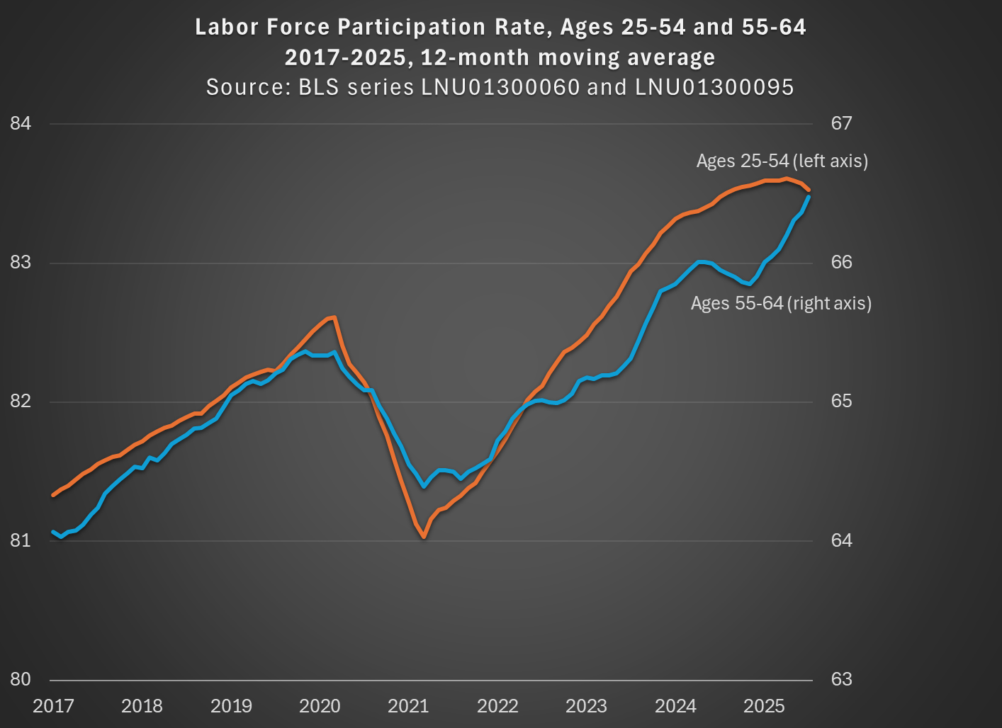
While not available currently in the FRED database, there is data from BLS available for older workers that is not open-ended. For example, we can look at workers ages 55-64, who are older but still young enough that they are mostly below traditional retirement age. I use that data and compare with the 25-54 age group (note: because the 55-64 data isn’t available seasonally adjusted, I use the non-adjusted data for both age groups, then use a 12-month average, so my chart doesn’t exactly replicate the chart above):
By using a closed-end age group for older workers, we see that labor force participation has not only recovered from the pandemic, but it exceeds the pre-pandemic peak for both prime-age and older workers, and had done so by the Spring of 2023. In fact, both are now about 1 percentage point above February 2020. If we want to go to the first decimal place, older workers have actually increased their labor force participation slightly more: 1.1 vs 0.9 percentage points. But these are close enough, given that this is survey data, to say the recovery has been roughly equal.
The St. Louis Fed blog concludes by saying that early workforce retirements “will continue to depress the labor force participation rate of workers aged 55 and older for the foreseeable future.” But it’s not true that the LFPR of older workers is depressed! Provided that we exclude those 65 and older.