Podcast Recommendation: Acquired

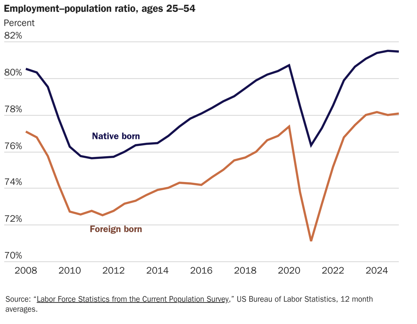
For your upcoming summer road trips, even with a family, I recommend you check out the Acquired podcast. Each episode is the history (or partial history) of one business, told in a way that is entertaining and informative on many levels.

I was first introduced to the podcast when someone recommended the episode on Costco. It’s 3 hours long. I thought to myself “Really? I’m interested in Costco, but isn’t 3 hours a bit much?” But I had a long road trip, so I gave it a try. I was floored by how much I learned about Costco, the history of retail in the US, and the connections to other businesses. For example, Sam’s Club, which I thought was just kinda doing the same thing as Costco in different geographic areas, but no — Sam Walton copied Costco, as well as many other ideas from Sol Price (what a great name for a retailer!), the man behind the companies that would eventually become Costco today.

If you are at all interested in the history of business (especially mid-to-late Twentieth century businesses, though they do have one on Standard Oil), you will love this podcast. But I have found that the podcast is also great for children — well, at least if you have a roughly eleven-year-old boy. They will have many questions, so you may stop the podcast often, but that’s OK with me.

I think the reason some of the episodes appeal to children is because many of the stories focus on a single entrepreneur that started a business, and the hosts always spend a little bit of time on the childhood of those entrepreneurs. Often, they were entrepreneurial or innovative in some way as a child. For example, Warren Buffett in the first Berkshire Hathaway episode (there are 3 episodes on BH, totaling over 9 hours!), selling sticks of gum and cans of Coke door-to-door. Or Ingvar Kamprad (founder of IKEA, told in a 3-hour episode) selling matchboxes and fountain pens. Or the young Bill Gates being privileged enough in middle school to have access to computers, but also turning this into a business in high school (told in the first of two episodes on Microsoft, totaling once again over 9 hours).

As I mentioned in the above paragraph, if you thought that 3 hours on Costco was a lot, just wait until you listen to some of the others. You probably can’t imagine yourself listening to 9 hours on the history of a single company, much less your kids following along too. But I highly recommend that you give it a shot.

The Price of Eggs: Long-Run Perspective

Everyone is talking about the price of eggs. Even the President. That’s despite the fact eggs, on average, constitute about 0.1% of consumer spending (according to the Consumer Expenditure Survey for 2023). Even so, economists always get excited when people talk about prices.

On prices at the current moment, I wrote a blog post for the Cato Institute looking at the relevant supply and demand factors, and trying to explain why wholesale egg prices are falling so quickly. When will these falling wholesale prices translate into lower retail prices? The NY Times asked this question, and I tried to answer it for them (answer: perhaps in a few weeks).

But let’s step back from the current moment and take a longer-term perspective on egg prices. This chart shows the long-run real price of eggs, measured in terms of how much time an average worker would need to work to afford 1 dozen eggs:

Continue reading

US Federal Government Spending Hasn’t Decreased (Yet)

Despite DOGE and the President partially stopping some payments for some federal agencies, the changes so far aren’t visible at all in federal payments data. The Brookings Institution has put together a new tool that tracks daily spending data from the US Treasury. (My co-blogger Zach wrote about this tool last week too.) Here’s a chart from that tool showing total federal outlays by calendar year. Notice that 2025 is right on track with the past two years, or just slightly above (dollars are in nominal terms):

Of course, given the massive amount of US federal spending and the large number of agencies, we might expect it to take more than a few months to get spending under control or significantly alter its course. But this way of tracking the data is definitely picking up any changes made so far. For example, notice the flat lining of USAID funding after Trump comes into office at the end of January:

So while we don’t see any big changes yet in the aggregate spending, the few small agencies that DOGE has frozen are showing up in this data. That tells this will be a useful tool to follow going forward.

Understanding the Projected GDP Decline

UPDATE: This thread on Twitter from the Atlanta Fed provides some clarification on how this model is behaving (it is probably overstating the decline due to gold inflow).

You may have seen the following chart recently:

The chart comes from the Atlanta Fed’s GDPNow model, which tries to estimate GDP growth each quarter as data becomes available. The sharp drops in their Q1 forecast for 2025, based on the last two data updates, look pretty shocking. Should we be worried?

First, it’s useful to ask: has this model been accurate recently? Yes, it has. For Q4 of 2025, the model forecast 2.27% growth — it was 2.25%. For Q3 of 2024, the model forecast 2.79% growth — it was 2.82%. Those are very accurate estimates. Of course, it’s not always right. It overestimated growth by 1 percentage point in Q1 of 2024, and it underestimated growth by 1 percentage point the quarter before that. So pretty good, but not perfect. Notable: during the massive decline in Q2 2020 at the start of the pandemic, it got pretty close even given the strange, uncertain data and times, predicting -32.08% when it was -32.90% (that’s off by almost 1 percentage point again, but given the highly unusual times, I would say “pretty good”).

OK, so what can we say about the current forecast of -2.8% for Q1 of 2025? First, almost all of the data in the model right now are for January 2025 only. We still have 2 full months in the quarter to go (in terms of data collection). Second, the biggest contributor to the negative reading is a massive increase in imports in January 2025.

To understand that part of the equation, you have to think about what GDP is measuring. It is trying to measure the total amount of production (or income) in the United States. One method of calculation is to add up total consumption in the US, including by final consumers, business investments, and government purchases and investments. But this method of calculation undercounts some US production (because exports don’t show up — they are consumed elsewhere) and overcounts some US production (because imports are consumed here, but not produced here). So to make GDP an accurate measure of domestic production, you need to add in exports, and subtract imports.

Keep in mind what we’re doing in this calculation: we aren’t saying “exports good, imports bad.” We are trying to accurately measure production, but in a roundabout way: by adding up consumption. So we need to take out the goods imported — not because they are bad, but because they aren’t produced in the US.

The Atlanta Fed GDPNow model is doing exactly that, subtracting imports. However, it’s likely they are doing it incorrectly. Those imports have to show up elsewhere in the GDP equation. They will either be current consumption, or added to business inventories (to be consumed in the future). My guess, without knowing the details of their model, is that it’s not picking up the change in either inventories or consumption that must result from the increased imports. It’s also just one month of data on imports.

As always, we’ll have to wait for more data and then, of course, the actual data from BEA (which won’t come until April 30th). More worrying in the current data, to me, is not the massive surge in imports — instead, it’s that real personal consumption expenditures and real private fixed investment are currently projected to be flat in Q1. If consumption growth is 0% in Q1, it will be a bad GDP report, regardless of everything else in the data.

Women Have Always Worked More Than Men: Hours of Work Since 1900

This chart shows the average number of hours worked in the US, by gender, for those in their prime working ages (25-54), from 1900 to 2023. It includes both paid market work and household production (which includes activities like cooking, cleaning, shopping, and taking care of children):

Most of the data (from 1900-2005) comes from a 2009 paper by Valerie Ramy and Neville Francis, which looks at lots of trends in work and leisure in the twentieth century. I extend the data past 2005 using an update from Ramey through 2012, and then attempting to replicate their methods using the CPS (for market work) and the BLS ATUS (for home production).

A few things to notice. First, there is no data for 2020, as the ATUS didn’t publish any tables due to incomplete data from the pandemic. And even if we had data, it would have been a huge outlier year.

More importantly, there is an obvious long-term trend of declining market work and rising household production for men, and the opposite for women. In 1900 women worked over 6 times as many hours in the household as they did in the market, but by 2023 they worked almost the exact same number of hours in each sector.

Male hours in market work declined by about 16 hours per week (using 10-year averages, as there is a slight business-cycle effect on hours), but the total number of hours they worked declined much more modestly, by about 3 hours per week (note: these numbers include all men, whether they are working or not). Women saw similar changes, but in the opposite direction, with total hours worked only falling by about 4 hours per week, even though hours working at home fell by almost 22 hours.

Americans do have more leisure time than in 1900, but not dramatically so: perhaps 3-4 hours per week. This is an improvement, but less of an improvement than you might suspect by looking at hours of market work alone.

Ramey and Francis do try to carefully distinguish between household production and leisure. For example, yardwork and changing diapers are household production, while gardening and playing with your children are leisure. For some respondents to surveys, they may feel differently about whether gardening is “really” work or not, and some may enjoy changing baby’s diapers, but in general their distinctions seem reasonable to me.

Finally, we can say pretty confidently with this data that women have almost always worked more hours than men — the one exception in the 20th century being WW2 — and the gender gap was about 4 hours per week in both the early 1900s and the most recent decade (though it did fluctuate in between).

Foreigners Aren’t Taking Our Jobs

Are foreigners taking the jobs of native-born Americans? The fear that foreigners are displacing domestic workers has long been feared, and remains one of the major economic objections to immigration. And recently there seems to be some evidence this is happening in the US, with almost all net job creation in the US in the past 5 years going to foreigners, while native-born employment has been flat.

But this is not evidence that foreigners are taking our jobs, as I explain in my latest piece for the Cato Institute. The reason is simple: the native-born, working-age population hasn’t been growing. If we looking at the employment-rate of native-born Americans, it is higher than it has ever been, and higher than for the foreign-born population:

2024 Labor Market: Not the Greatest Ever, But Pretty, Pretty Good

At the end of 2023 I asked: was 2023 the greatest labor market in US history? I presented some data to suggest that, yes, maybe, probably, it was the greatest labor market in US history.

That post was partly inspired by critics of the unemployment rate as a broad measure of labor market utilization. Yes, the UR isn’t perfect, and it misses some things. But other measures of labor force performance tend to move with the UR, and so it’s still a useful measure. 2023 saw not only some of the lowest unemployment rates in US history (rivaling the late 1960s), but also some of the highest employment rates (only beat by the late 1990s). Wage growth was also robust. And other measures of unemployment, such as the much broader U-6 rate and the Insured Unemployment Rate, were also at record low levels (though the data doesn’t go back as far).

Today I learned about a very interesting, though I think probably confusing, measure called the “true unemployment rate.” Produced by the Ludwig Institute, it uses the same underlying data source (the CPS) that the BLS uses to calculate the unemployment rate and other measures mentioned above. This “true” rate is definitely intended to shock you: it suggests that 25 percent of the workforce is “unemployed.”

But they aren’t actually measuring unemployment. What they are doing, in a sense, is combining a very broad measure of labor underutilization (like the U-6 rate mentioned above) with a measure that is similar to the poverty rate (but not exactly). They count people as unemployed if they are part-time workers, but would like to work full-time (U-6 does this). But they also count you as unemployed if you earn under $25,000 per year. Or if you don’t work at all, you are counted as unemployed — even if you aren’t trying to find a job (such as being a student, a homemaker, disabled, etc.). The entire working age population (ages 16+, though they don’t tell us the upper limit, we can probably assume 64) is the denominator in this calculation.

So again, this is attempting to combine a broad measure of employment with a poverty measure (though here poverty is defined by your own wage, rather than your household income). So of course you will get a bigger number than the official unemployment rate (or even the U-6 rate).

But here’s the thing: even with this much broader definition, the US labor market was still at record lows in 2023! Given this new information I learned, and that we are now through 2024, I decided to update the table from my previous post:

From this updated table, we see that by almost every measure, 2023 was an excellent year for the US labor market. The only measure where it slightly lags is the prime-age employment rate, which was a bit higher in the late 1990s/2000. Real wage growth was also quite strong in 2023, despite still having some lingering high inflation from the 2021-22 surge.

How about 2024? By almost all of these measures, 2024 was slightly worse than 2023. And still, 2024 was a good year. A pretty, pretty good year for the labor market. And while the UR ticked up in the middle of the year, it has since come back down a bit and is now right at 4%. As for the “true” unemployment rate, it followed a similar pattern, ticking up a bit in mid-2024, but by December it was back slightly below the level from December 2023.

Alternative “true” measures of the economy rarely give us any additional information than the standard measures — other than a shocking, but confusing, headline number.

Was the US at Our Richest in the 1890s?

Donald Trump has repeatedly said that the US was at our “richest” or “wealthiest” in the high-tariff period from 1870-1913, and sometimes he says more specifically in the 1890s. Is this true?

First, in terms of personal income or wealth, this is nowhere near true. I’ve looked at the purchasing power of wages in the 1890s in a prior post, and Ernie Tedeschi recently put together data on average wealth back to the 1880s. As you can probably guess, by these measures Trump is quite clearly wrong.

So what might he mean?

One possibility is tax revenue, since he often says this in the context of tariffs versus an income tax. Broadly this also can’t be true, as federal revenue was just about 3% of GDP in the 1890s, but is around 16% in recent years.

But perhaps it is true in a narrower sense, if we look at taxes collected relative to the country’s spending needs. Trump has referenced the “Great Tariff Debate of 1888” which he summarized as “the debate was: We didn’t know what to do with all of the money we were making. We were so rich.” Indeed, this characterization is not completely wrong. As economic historian and trade expert Doug Irwin has summarized the debate: “The two main political parties agreed that a significant reduction of the budget surplus was an urgent priority. The Republicans and the Democrats also agreed that a large expansion in government expenditures was undesirable.” The difference was just over how to reduce surpluses: do we lower or raise tariffs?

It does seem that in Trump’s mind being “rich” in this period was about budget surpluses. Let’s look at the data (I have truncated the y-axis so you can actually read it without the WW1 deficits distorting the picture, but they were huge: over 200% of revenues!):

It is certainly true that under parts of the high-tariff period, we did collect a lot of revenue from tariffs! In some years, federal surpluses were over 1% of GDP and 30% of revenues collected. But notice that this is not true during Trump’s favored decade, the 1890s. Following the McKinley Tariff of 1890, tariff revenue fell sharply (though probably not likely due to the tariff rates, but due to moving items like sugar to the duty-free list, as Irwin points out). The 1890s were not a decade of being “rich” with tariff revenue and surpluses.

Finally, also notice that during the 1920s the US once again had large budget surpluses. The income tax was still fairly new in the 1920s, but it raised around 40-50% of federal revenue during that decade. By the Trump standard, we (the US federal government) were once again “rich” in the 1920s — this is true even after the tax cuts of the 1920s, which eventually reduced the top rate to 25% from the high of 73% during WW1.

If we define a country as being “rich” when it runs large budget surpluses, the US was indeed rich by this standard in the 1870s and 1880s (though not the 1890s). But it was rich again by this standard in the 1920s. This is just a function of government revenue growing faster than government spending. And the growth of revenue during the 1870s and 1880s was largely driven by a rise in internal revenue — specifically, excise taxes on alcohol and tobacco (these taxes largely didn’t exist before the Civil War).

1890 was the last year of big surpluses in the nineteenth century, and in that year the federal government spent $318 million. Tariff revenue (customs) was just $230 million. There was only a surplus in that year because the federal government also collected $108 million of alcohol excise taxes and $34 million of tobacco excise taxes. In fact, throughout the period 1870-1899, tariff revenues are never enough to cover all of federal spending, though they do hit 80% in a few years (source: Historical Statistics of the US, Tables Ea584-587, Ea588-593, and Ea594-608):

One more thing: in some of these speeches, Trump blames the Great Depression on the switch from tariffs to income taxes. In addition to there really being no theory for why this would be the case, it just doesn’t line up with the facts. The 1890s were plagued by financial crises and recessions. The 1920s (the first decade of experience with the income tax) was a period of growth (a few short downturns) and as we saw above, large budget surpluses. The Great Depression had other causes.

One Hundred Years of U.S. State Taxation

From a paper recently published in the Journal of Public Economics by Sarah Robinson & Alisa Tazhitdinova, here is the history of federal and state taxation in the past century in the US in one picture:

The paper primarily focuses on US state taxes, thus mostly ignoring local taxes, but in the Appendix the authors do show us similar charts for local taxes:

In broad terms, the history of taxation in the US in the 20th century is a history of the decline of the property tax, and the rise of the income and sales taxes. In 1900, there were barely any federal taxes (other than those on alcohol and tobacco), 50% of state taxes were property tax, and almost 90% of local taxes were property taxes. Property taxes were essentially the only form of taxation most Americans would directly recognize (excise taxes and tariffs were baked into the price of the goods).

John Wallis (2000) provided a similar, and simpler picture of these changes: considering all taxes in the US, property taxes were over 40% of the total in 1900, but today are under 10%. Income taxes come out of nowhere and are now about half of all government revenues in the US: