After the Crash: Silver Clawing Back Up After Epic Bust Last Week

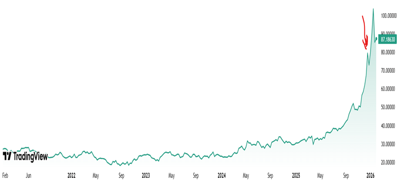
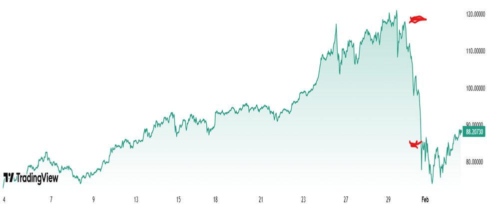
A month ago (red arrow in 5-year chart below), I noticed that the price of silver was starting into a parabolic rise pattern. That is typical of speculative bubbles. Those bubbles usually end in a bust. Also, the rise in silver price seemed to be mainly driven by retail speculators, fueled by half-baked narratives rather than physical reality.

Five-year chart of silver prices $/oz, per Trading View

So I wrote a blog post here last month warning of a bubble, and sold about a quarter of my silver holdings. (I also initiated some protective options but that’s another story for another time.) I then felt pretty foolish for the next four weeks, as silver prices went up and up and up, a good 40% percent over the point I initially thought it was a bubble. Maybe I was wrong, or maybe the market can stay irrational longer than you can stay solvent, per J. M. Keynes.

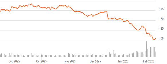
When the crash finally came, it was truly epic. Below is a one-month chart of silver price. The two red lines show silver price at the close of regular trading on Thursday, January 29 (115.5 $/oz), and at the close of trading on Friday, January 30 (84.6 $/oz):

This is a drop of nearly 30% in one day, which is a mind-boggling move for a major commodity. Gold got dragged down, too:

These aren’t normal moves. Over roughly the past 25+ years (through 2025), gold’s price has changed by about 0.8% per day on average (in absolute percentage terms). Silver, being more volatile, has averaged around 1.4–1.5% per day. If you’re scoring at home, that’s about a 13 Sigma move for Gold and 22 Sigma move for Silver! You’re witnessing something that shouldn’t happen more than once in several lifetimes…statistically speaking. Yet here we are.

After the fact, a number of causes for the crash were proposed:

  • The nomination of Kevin Warsh as the next Federal Reserve Chair.  Warsh is perceived as a hawkish policymaker, leading investors to expect tighter monetary policy, higher interest rates, and a stronger U.S. dollar—all of which reduce the appeal of non-yielding assets like silver. 
  • Aggressive profit-taking after silver surged over 40% year-to-date and hit record highs near $121 per ounce. 
  • Leveraged positions in silver futures were rapidly unwound as prices broke key technical levels, triggering stop-loss orders and margin calls. 
  • CME margin hikes (up to 36% for silver futures) increased trading costs, forcing traders to cut exposure and accelerating the sell-off. 
  • Extreme speculation among Chinese investors, leading the Chinese government to clamp down on speculative trading. (And presumably Chinese solar panel manufacturers have been complaining to the government about high costs for silver components).

What happens next?

Silver kept falling to a low of 72.9 $/oz in the wee hours of February 2, a drop of 40% percent from the high of 120.8 on Jan 26. However, it looks to my amateur eyes like the silver bubble is not really tamed yet. For all the drama of a 22-sigma crash one day crash, about all that did was erase one months’ worth of speculative gains. The charts above are showing that silver is clawing its way right back up again.  It is very roughly on the trend line of the past six months, if one excludes the monster surge in the month of January.

There is a saying among commodities traders, that the cure for high prices is high prices. This means that over time, there will be adjustments that will bring down prices. In the case of silver, that will include figuring out ways to use less of it, including recycling and substitution of other metals like copper and aluminum. However, my guess is that the silver bulls feel vindicated by the price action so far, and will keep on buying at least for now.

Disclaimer: As usual, nothing here should be regarded as advice to buy or sell any security.

Economic Impacts of Weather Apps Exaggerating Storm Dangers

Snowmageddon!! Over 20 inches of snow!!! That is what we in the mid-Atlantic should expect on Sat-Sun Jan 24-25 according to most weather apps, as of 9-10 days ahead of time.  Of course, that kept us all busy checking those apps for the next week. As of Wednesday, I was still seeing numbers in the high teens in most cases, using Washington, D.C. as a representative location. But my Brave browser AI search proved its intelligence on Wednesday by telling me, with a big yellow triangle warning sign:

 Note: Apps and social media often display extreme snow totals (e.g., 23 inches) that are not yet supported by consensus models. Experts recommend preparing for 6–12 inches as a realistic baseline, with the potential for more.

“Huh,” thought I. Well, duh, the more scared they make us, the more eyeballs they get and the more ad revenue they generate. Follow the money…

Unfortunately, I did not log exactly who said what when last week. My recollection is that weather.com was still predicting high teens snowfall as of Thursday, and the Apple weather app was still saying that as of Friday. The final total for D.C. was about 7.5 inches for winter storm Fern. In fairness, some very nearby areas got 9-10 inches, and it ended up being dense sleet rather than light fluffy snow. But there was still a pretty big mismatch.

Among the best forecasters I found was AccuWeather. They showed a short table of probabilities that centered on (as I recall) 6-10”, with some chances for higher and for lower, that let you decide whether to prepare for a low probability/high impact scenario. It seems that the Apple weather app is notoriously bad: instead of integrating several different forecast models like some other apps (and like your local talking head meteorologist), it apparently just spits out the results of one model:

The core issue is that many weather apps, including Apple Weather, display raw data from individual forecast models without the context and analysis that professional meteorologists provide. While meteorologists at the National Weather Service balance multiple computer models, dozens of simulations and their own expertise to create forecasts, apps often pull from a single source and deliver it directly to users.

“Everything that catches attention is mostly nonsense,” said Eric Fisher, chief meteorologist for WBZ-TV in Boston. He points to the viral snowfall maps that spread on social media, noting that extreme forecasts generate the most attention even when they may not be the most accurate.

Anyway, I tried to poke around and find out in dollar terms how much it benefits the weather apps to exaggerate storm dangers. I was unsuccessful there, but by playing with query wording, I was able to coax out of ChatGPT some numbers on how much these exaggerations may cost the rest of us. (A more qualitative search noted, among other things, that the “crying wolf” cost of people becoming jaded to alarmist forecasts may lead them to discount genuine warnings; and I will add it is inconvenient to find the stores out of things because of panic buying).

Everything below the line of asterisks is just a straight dump from the AI, since I could not readily improve on its presentation:

****************************************************************

The economic impact of weather apps exaggerating storm dangers isn’t easy to quantify precisely because most formal studies focus on weather warnings overall (from official sources like the National Weather Service), not specifically on private weather apps exaggerating risk. However, economics research on false alarms, over-warning, and exaggerated alerts offers concrete dollar figures that we can use to approximate the kinds of costs involved. Below are the key economic impacts with as many dollar figures as available:


💸 1. Opportunity Costs of False or Overbroad Storm Warnings

Time cost of false warnings:

  • Traditional county-wide tornado warnings (over-broad alerts) have historically forced many people to shelter unnecessarily, resulting in ≈234 million person-hours per year spent under warnings (1996–2004) — valued at roughly $2.7 billion annually in lost time/productivity in the U.S. alone.
  • Improved storm-based warnings that reduce false warning area could save up to $750 million–$1.9 billion/year in avoided lost time.

This demonstrates that exaggerated alerts — such as those sometimes amplified or presented without clear context by weather apps — can force unnecessary economic shutdowns of work and business activity.


🏙️ 2. Evacuation and Preparedness Costs from False Alarms

Evacuation costs:

  • A NOAA analysis estimates that evacuation costs for hurricanes, when done broadly for storm-warnings, can reach about $1.4 billion annually in the U.S., with roughly $1 billion being unnecessary cost due to false alarms (people evacuating where no damaging winds ultimately occur).

Evacuations are one of the most expensive forms of response — from lost wages to lodging and fuel costs — and exaggerated risk messaging can trigger them prematurely or more frequently.


🏭 3. Business Productivity Losses from False Alerts

Example from private sector:

  • A building management firm reported that by reducing false storm alerts (better targeted data rather than broad app warnings), it saved ~$10 million in lost production time in one year alone.

This is a real dollar example showing how over-warning impacts businesses directly when they preemptively shut down operations.


💼 4. Broader Firm-Level Economic Avoidance

Cost avoidance from better warning info:

  • A study of nearly 500 firms found that switching from deterministic (binary “storm/no storm”) warnings to probabilistic information could produce $2.3 billion to $7.6 billion per year in avoided costs for businesses, thanks to better decision-making.

While this doesn’t measure exaggeration specifically, it underscores the economic penalty of imprecise or alarmist warnings, which many weather apps unintentionally echo.


📉 5. Insurance & Property Impacts

Although not directly about exaggerated warnings, inaccurate perceptions of storm danger influence behavior and pricing:

  • Insurance premiums rising: In storm-prone states (e.g., Florida), homeowners’ premiums have risen by ~57% or more because of risk perceptions and loss patterns tied to severe weather.
  • Losses from storms: Billion-dollar disasters are common; for example, Hurricane Milton in 2024 had estimated total costs of $21–$85 billion (depending on source).

While not directly caused by exaggeration, inflated perceptions of danger (from apps or media) can affect insurance markets and property values, contributing indirectly to economic impacts.


📈 6. Net Benefits vs. Exaggeration

It’s important to balance:

  • Early warnings overall clearly save money and lives. Improved forecasts and early alert systems have been estimated to avoid $300 million to $2 billion per year in asset losses and provide up to $32 billion/year in broader economic benefits (through optimized activities and prep).

This highlights that the problem isn’t warnings per se, but inaccurate or exaggerated warnings that cause over-response.

Restraining Sleep Position Can Help Heal Tennis Elbow

Tennis elbow (or these days, pickleball elbow) is a painful, debilitating condition that affects around 2% of adults at any given time. Active tennis players have about a 50% chance of being stricken at some point. If you give it a chance to heal, it usually goes away within a year, but that is a long time to be in pain or disabled.

The traditional technical name for this condition is “lateral epicondylitis.” That suffix “…itis” implies inflammation, but it is now known that typical inflammation markers are generally absent. So, the new jargon is the deliberately ambiguous “tendinosis” or even “tendinopathy.” It seems to be caused by accumulated damage to the very end of the tendon that anchors the muscles which are attached to the back of your hand. Those muscles that let you tilt your hand up; if you grip something hard and try to hold something steady, those muscles contract in a big way. The micro tears seem to occur right about where that tendon attaches to a little knob of bone at the very outside of your elbow joint:

From Wikipedia

This condition is somewhat frustrating for doctors and for patients, since there’s not a single clear effective treatment. Although injecting Cortisone type anti-inflammatories gives short-term pain relief, it seems to adversely affect longer term outcomes, so those shots are less common than 20 years ago. Therapists throw all sorts of techniques at it, including NSAIDs, heat, cold, exercises, braces, shock waves, acupuncture, injections of blood extracts, and so on. All these may help, though for every study that shows positive results for a given treatment there seems to be one that doesn’t.

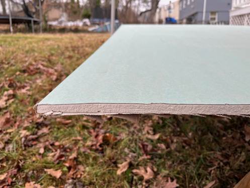
I have a personal interest in this subject, since I have a long-standing for propensity towards tennis elbow. I had to stop playing tennis many years ago because of it. More recently, I spent the day helping on a work project, installing sheet rock to repair flood damage in a someone’s home. After a day gripping a powered drill driver, the old tennis elbow flared up significantly.

In the course of my internet search, I ran across a very promising study that seems to have been largely neglected. It is also a sweet piece of science.

An orthopedist named Jerrold Gorski started reflecting on the common observation that tennis elbow often feels worst upon waking up in the morning. That made him wonder whether something was going on in the night that caused the condition to worsen. Which led him to hypothesize that tennis elbow might be helped by changing a patient’s sleep posture. Prior studies showed that X people spend some 55% of the night sleeping with their arm crooked up overhead, something like this:

That position could keep stress on the tendon all night, and inhibit it from healing. Dr. Gorski also noted that in the literature there are other examples of sleep posture or waking postures making a difference in treating various orthopedic conditions.

And so, like a good scientist, he devised an experiment to test his hypothesis. He came up with a very simple technique of using a bathrobe belt, which is soft and wide, to restrain the arm during sleep. You simply tie a large loop at one end that goes around the thigh, and a smaller loop at the other that fits snuggly around the wrist. If all goes well, this rigging well prevent will keep the arm down close to the side all night, so it cannot get crunched under the head:

Dr. Gorski tried tried this out with 39 tennis elbow patients. Six of them apparently could not tolerate being roped for the night, so they were designated as “treatment failures”, or effectively a control group. The other 33 patients stuck with the protocol, although most of them, like the 6 “treatment failures”, complained about interference with going to sleep or staying asleep.

There was a fairly dramatic difference in outcomes. The six treatment failures had ongoing tennis elbow symptoms that persisted unchanged over the initial 3-month study period. Of the thirty-three patients who stuck with the protocol, 66% reported improvement within 1 month, and 100% of them improved within 3 months. Those are really good results.

Obviously, it’s not a perfect study. It only claims to be a prospective study. Nevertheless, the results were so promising, and the treatment was so inexpensive and harmless and noninvasive, I would’ve thought that it would get a lot of attention. But looking in Google Scholar for citations, I only saw seven articles that cited it. Two of those articles were letters to the editor by the author, Dr. Gorksi himself, seemingly trying to draw due attention to his promising study, and one citation was in an article that got retracted. This leaves only 4 independent citations in the medical literature all of which, as best I could tell, were about touting some other treatment, and just nodded in passing to Dr. Gorski’s work. So, essentially crickets. One can only speculate on why the medical profession has not paid more attention to a treatment which requires nothing more than an office visit and demo with a strip of cloth.

I want to give a shout-out to the UK-based “Sports Injury Physio” website, which, in a very helpful and comprehensive article on tennis elbow care, noted:

Sleeping with your elbow straight is usually a gamechanger. There is something about keeping the elbow bent for long periods that irritates tennis elbow and makes the pain worse. It can be a bit challenging to figure out how to keep your elbow straight while tossing and turning in bed, but my patients who manage this report big improvements in their pain.

That endorsement piqued my interest. The Wikipedia article on tennis elbow also mentions this treatment clearly. With my nascent tennis elbow, I decided to try it for myself. Using a bowline knot (which does not slip), I tied a loop at one end of a bathrobe belt just big enough to wriggle my hand through, and a larger loop at the bottom to go around my thigh:

It is somewhat awkward to sleep with this on, but it is entirely bearable if you set your mind to it and plan ahead, e.g., where to position your nighttime tissue box. After only two nights on this protocol, I am now waking up with no pain in my elbow. Thanks, doc.

Steps To Grow Lettuce and Herbs in AeroGarden-Type Countertop Hydroponics Unit

This will be a longer-than-usual post, since I will try to include all the steps I used to grow salad ingredients in a compact (AeroGarden-type) hydroponics system. I hope this encourages readers to try this for themselves. See my previous post for an introduction to the hardware, including small modifications I made to it. I used a less-expensive ($45), reliable 18-hole MUGFA model here, but all the AeroGardens and its many knockoffs should work similarly.   Most plant roots need access to oxygen as well as to water; these hydroponic units allow the upper few inches of the root to sit in a (moist) “grow sponge” up out of the water to help with aerobic metabolism.

Step 1. Unbox the hydroponics unit, set up per instructions near a power outlet. Fill tank close to upper volume marking.

Step 2. Add nutrients to the water in the tank: usually there are two small plastic bottles, one with nutrient mix “A” and the other with nutrient mix “B”, initially as dry granules. Add water to the fill lines of each of these bottles with the granules, shake till dissolved. (You can’t mix the A and B solutions directly together without dilution, because some components would precipitate out as solids. So, you must add first one solution, then the other, to the large amount of water in the tank.)

There is more than one way to do this. I pulled the deck off the tank, used a large measuring cup to get water from my sink into the tank, a little below the full line. For say 5 liters of water, I add about 25 ml of nutrient Solution A, stir well, then add 25 ml of Solution B and stir. You could also keep the deck on, have the circulation pump running, and slowly pour the nutrient solutions in through the fill hole (frontmost center hole in the deck). You don’t have to be precise on amounts.

Step 3. Put the plastic baskets (sponge supports) in their holes in the deck, and put the conical porous planting sponges/plugs in the baskets. Let the sponges soak up water and swell. (This pre-wetting may not be necessary; it just worked for me).

Step 4. Plant the seeds: Each sponge has a narrow hole in its top. You need to get your seed down to the bottom of the hole. I pulled one moist sponge out at a time and propped it upright in a little holder on a table where I could work on it. I used the end of plastic bread tie to pick up seeds from a little plate and poke them down to the bottom of the hole. You have to make a judgment call how many seeds to plant in each hole. Lettuce seeds are large and pretty reliable, so I used two lettuce seeds for each lettuce sponge. Same for arugula (turns out that it was better to NOT pre-soak the arugula seeds, contrary to popular wisdom). If both seeds sprout, it’s OK to have two lettuce plants per hole, though you may not get much more production than from one plant per hole. For parsley*, where I wanted 2-3 plants per hole, I used three seeds each. For the tiny thyme seeds, I used about 5 seeds, figuring I could thin if they all came up. For cilantro, I used two pre-soaked seeds. I really wanted chives, but they are hard to sprout in these hydroponics units. I used five chive seeds each in two holes, but they never really sprouted, so I ended up planting something else in their holes.  

I chose all fairly low-growing plants, no basil or tomatoes. Larger plants such as micro-dwarf tomatoes can be grown in these hydroponics units; also basil, though need to aggressively keep cutting it back. It may be best to choose all low or all high plants for a given grow campaign. See this Reddit thread for more discussion of growing things in a MUGFA unit.

Once all the plugs are back in their holders, you stick a light-blocking sticker on top of each basket. Each sticker has a hole in the middle where the plants can grow up through, but they block most of the light from hitting the grow sponge, to prevent algae growth. Then pop a clear plastic seeding cover dome on top of each hole, and you are done. The cover domes keep the seeds extra moist for sprouting; remove the domes after sprouting.  Make sure the circulation pump is running and the grow lights are on (typically cycling on 16 hours/off 8 hours). This seems like a lot of work describing it here, but it goes fast once you have the rhythm. Once this setup stage is done, you can just sit back and let everything unfold, no muss, no fuss. Here is the seeded, covered state of affairs:

Picture: Seeds placed in grow sponges on Jan 14. Note green light-blocking stickers, and clear cover domes to keep seeds moist for germination. The overhead sunlamp has a lot of blue and red LEDs (which the plants use for photosynthesis), which gives all these photos a purple cast.

Jan 28 (Two weeks after planting): seedlings. Note some unused holes are covered, to keep light out of the nutrient solution in the tank. The center hole in front is used for refilling the tank.

Feb 6.  Showing roots of an arugula plant, 23 days after planting.

Step 5. Maintenance during 2-4 month grow cycle. Monitor water level via viewing port in front. Top up as needed. Add nutrients as you add water (approx. 5 ml of Solution A and 5 ml Solution B, per liter of added water). The water will not go down very fast during the first month, but once plants get established, water will likely be needed every 5-10 days. If you keep trimming outside leaves every several days, you can get away with having densely planted greens, whereas if you only harvest say every two weeks, the plants get so big they would crowd each other if you plant in every hole on the deck.

Optional: Supposedly it helps to keep the acidity (pH) of the nutrient solution in the range of 5.5-6.5. I think most users don’t bother checking this, since the nutrient solutions are buffered to try to keep pH in balance. Being a retired chemical engineer, I got this General Hydroponics kit for measuring and adjusting pH. On several occasions, the pH in the tank was about 6.5. That was probably perfectly fine, but I went ahead and added about 1/8 teaspoon of the pH lowering solution, to bring it down to about 6.0.   I also got a meter for measuring Electrical Conductivity/Total Dissolved Solids to monitor that parameter, but it was not necessary.

Feb 16: After a month, some greens are ready to snip the outer leaves. Lettuces (buttercrunch, red oak, romaine) on the right, herbs on the left.

~~~~~~~~~~~~~~~~~~~~~~~~~~~~~~~~~~~~~~~~~~~

Feb 17: Harvesting a small salad or sandwich filler every 2-3 days now.

March 6: Full sized, regular small harvests. All the lettuces worked great, buttercrunch is especially soft and sweet. Arugula (from the mustard plant family) gave a spicy edge. Italian parsley and thyme added flavor. The cilantro was slower growing, and only gave a few sprigs total.

Closeup March 16 (three months), just before closing out the grow cycle. Arugula foreground, lettuce top and right, thyme on left, Italian parsley upper left corner.

Step 6. Close out grow cycle. At some point, typically 2-4 months, it is time to bring a grow cycle to a close. I suppose with something like dwarf tomatoes, you could keep going longer, though you might need to pull the deck up and trim the roots periodically.  In my case, after three months, the arugula and cilantro were starting to bolt, though the lettuce, thyme, and parsley were still going strong. As of mid-March, my focus turned to outside planting, so I harvested all the remaining crops on the MUGFA, turned off the power, and gently pulled the deck off the tank. The whole space under the deck was a tangled mass of roots. I used kitchen shears to cut roots loose, enough to pull all the grow sponges and baskets out. The sponges got discarded, and the baskets saved for next time. I peeled off and saved the round green light-blocking stickers for re-use. I cleared all the rootlets from the filter sponge on the pump inlet. Then I washed out the tank per instructions. It took maybe 45 minutes for all this clean-out, to leave the unit ready for a next round of growing.

Stay tuned for a future blog post on growing watercress, which went really well this past fall. Looking to the future: In Jan 2026 I plan to do a replant of this 18-hole (blocked down to 14-holes) MUGFA device, sowing less lettuce (since we buy that anyway) but more arugula/Italian parsley/thyme for nutritious flavorings. For replacement nutrients and grow sponges, I got a Haligo hydroponics kit like this (about $12).

Growing these salad/sandwich ingredients in the kitchen under a built-in sunlamp provided good cheer and a bit of healthy food during the dark winter months. The clean hydroponic setup removed concerns about insect pests or under/overwatering.  It was a hobby; at this toy scale it did not “save money”, though from these learnings I could probably rig a larger homemade hydroponics setup which might reduce grocery costs. This exercise led to fun conversations with visitors and children, and was a reminder that nearly everything we eat comes from water, nutrients, and light, directly or indirectly.  

*Pro tips on germinating parsley seeds – – Parsley seeds have a tough coating, and can take weeks to germinate. Some techniques to speed things up:

( 1 ) Lightly abrade the seeds by gently rubbing between sheets of sandpaper.

( 2 ) Soak in warmish water for 24-48 hours.

( 3 ) For older seeds, cold stratification (1–2 weeks in a damp paper towel in the fridge) may help break dormancy.

Is the Silver Bubble Bursting?

This is a five-year chart of the silver ETF SLV:

By most standards, this pattern looks like we entered a bubble a few months ago: speculative froth, unjustified by fundamentals. Economic history is replete with such madness of crowds. It is accepted wisdom on The Street that these parabolic price rises seldom end well. I lost a few pesos buying into the great gold bubble of 2011. All sorts of justifications were given at the time by the gold bugs on why gold prices ought to just keep on rising, or at least reach a “permanently high plateau” (in the famous words of Irving Fisher, just before the 1929 crash). Well, gold then proceeded to go down and down and down, losing some 60% of its value, until the price in 2015 matched the price in 2009, before the great bubble of 2010-2011.

Today, similar justifications are proffered as to why silver is going to the moon. There is a long-standing deficit in supply vs. demand; it takes ten years for a new silver mine to get productive; China has started restricting exports; Samsung announced a breakthrough lithium battery that can charge in six minutes, but requires a kilogram of silver; AI infrastructure is eating all the silver. These narratives seem to feed on each other. As the silver price moved higher in the past month, out came yet wilder stories that ricochet around the internet at high speeds: the commodities exchanges have run out of physical silver to back the paper trades; and the persistent claim that “they” (shadowy paper traders, central banks, commodity exchanges, the deep state, etc.) are “suppressing” silver and gold prices by means of shorting (which makes no sense). Given this popular shorting myth, it was with great glee that the blogosphere breathlessly spread the bogus story that some “systematically important bank” was in the process of being liquidated because it got squeezed on its silver short position.

The extreme price action at the very end of December (discussed below) was like rocket fuel for these rumors. Having bought a little SLV myself so as to not feel like a fool if the silver rally did have legs, I spent a number of hours as 2025 turned to 2026 trying to sort all this out. Here are some findings.

First, as to  the medium term supply/demand issues, I refer the reader to a recent article on Seeking Alpha by James Foord. He shows a chart showing that silver demand is increasing, but slowly:

He also notes that as silver price increases, there is motivation for more recycling and substitution, to compensate. He concludes that the current price surge is not driven by fundamentals, but by paper speculation.

The last ten days or so have been a wild ride, which merits some explanation. Here is the last 30 days of SLV price action:

Silver prices were rising rapidly throughout the month, but then really popped during Christmas week, reaching a crescendo on Friday, Dec 26 (blue arrow), amid rumors of physical shortages on the Shanghai exchange. To cool the speculative mania, the COMEX abruptly raised the margin requirements on silver contracts by some 30%,  from $25,000 to $32,500, effective Monday, Dec 29. I think the exchange was trying to ensure that speculators could make good on their commitment, and the raise in margin requirement would help do that. (Note, the exchange is liable if some market participant fails to deliver as promised and goes BK).

Anyway, this move forced long speculators to either post more collatoral or to liquidate their positions, on short notice. Blam, the price of silver dropped a near record amount in one day (red arrow). For me, a little minnow caught in the middle of all this shark tank action, the key part is what came after this forced decline. Was the bubble punctured for good? Should I hold or fold?

As shown above, the price has traded in a range for the past week, with violent daily moves. Zooming out to the a one-year view, it looks like the upward momentum has been halted for the moment, but it is unclear to me whether the bubble will deflate or continue for a while:

I sold about a quarter of my (small) SLV holding, hoping to buy back cheaper sometime in the coming year. Time will tell if that was a good move.

Usual disclaimer: Nothing here is advice to buy or sell any security.

P.S. Tuesday, Jan 6, 2025, after market close: I wrote this last night (Monday, Jan. 5) when silver was still rangebound. SLV was about $69, and spot silver about $76/oz. But silver ripped higher overnight, and kept going during the day, up nearly 7% at the close to new all time high. It looks like the bubble is alive and well, for now. Congrats to silver longs…

Review of MUGFA (Aerogarden type) Countertop Hydroponic Units

Last year about this time, as the outside world got darker and colder, and the greenery in my outdoor planters shriveled to brown – – I resolved to fight back against seasonal affect disorder, by growing some lettuce and herbs indoors under a sun lamp.

After doing some reading and thinking, I settled on getting a countertop hydroponics unit, instead of rigging a lamp over pots filled with dirt indoors. With a compact hydroponics unit there is no dirt, no bugs, it has built-in well-designed sun lamp on a timer, and is more or less self-watering.

These systems have a water tank that you fill with water and some soluble nutrients. There is a pump in the tank that circulates the water. There is a deck over the tank with typically 8 to 12 holes that are around 1 inch diameter. Into each hole you put a conical plug or sponge made of compressed peat moss, supported by a plastic basket. On the top of each sponge is a little hole, into which you place the seeds you want to grow.

A support basket with a dry (unwetted, unswollen) peat moss grow sponge/plug in it.

As long as you keep the unit plugged in, so the lights go on when they should, and you keep the nutrients solution topped up, you have a tidy automatic garden on a table or countertop or shelf.

The premier countertop hydroponics brand, which has defined this genre over the past twenty years, is Aerogarden. This brand is expensive. Historically its larger models were $200-$300, though with competition its larger models are now just under $200.  Aerogarden tries to justify the high cost by sleek styling and customizable automation of the lighting cycles, linked into your cell phone.

I decided to go with a cheaper brand, for two reasons. First, why spend $200 when I could get similar function for $50 (especially if I wasn’t sure I would like hydroponics)? Second, I don’t want the bother and possible malfunction associated with having to link an app on my cell phone to the growing device and program it. I wanted something simple and stupid that just turns on and goes.

So I went with a MUGFA brand 18-hole hydroponics unit last winter. It is simple and robust. The LED growing lights are distributed along the underside of a wide top lamp piece. The lamp has a lot of vertical travel (14“), so you could accommodate relatively tall plants. The lights have a simple cycle of 16 hours on, 8 hours off. You can reset by turning the power off and on again; I do this once, early on some morning, so from then on the lights are on during the day and the evening, and off at night.  The water pump pumps the nutrient solution through channels on the underside of the deck, so each grow sponge has a little dribble of solution dribbling onto it when the pump cycle is on. I snagged a second MUGFA unit, a 12 hole model, when it was on sale last spring. The MUGFA units come complete with grow sponges/plugs, support baskets/baskets for the sponges, nutrients (that you add to the water), clear plastic domes you put over the deck holes while the seeds are germinating, and little support sticks for taller plants. You have to buy seeds separately.

Images above from Amazon , for 12-hole model

I have made a couple small modifications to my MUGFA units. The pump is not really sized for reaching 18 holes, and with plants of any size you’re likely not going be stuffing 18 plants on that grow deck. Also, the power of the lamp for the 18-hole unit (24 W) is the same as the 12-hole unit; the LEDs are just spread over a wider lamp area. That 24W is OK for greens that don’t need so much light, but may only be enough to grow a few (mini) tomato plants. For all these reasons, I don’t use the four corner holes on the 18-hole unit. Those corner holes get the least light and the least water flow. To increase the water flow to the other 14 holes, I plugged up the outlets of the channels on the underside of the deck leading to those four holes. I cut little pieces of rubber sheeting, and stuffed them in channel outlets for those holes.

The 12-hole unit has a slightly more pleasing compact form factor, but it has a minor design defect [1]. The flow out of the outlet of each of the 12 channels under the deck is regular, but not very strong. Consequently, the water that comes out of each outlet drops almost straight down and splashes directly into the water tank, without contacting the grow sponge at that hole. The waterfall noise was annoying. The fix was easy, but a little tedious to implement. I cut little pieces of black strong duct tape and stuck them under the outlet of each hole, to make the water travel another quarter inch further horizontally. Those little tabs got the water in contact with the grow sponge basket. The picture below shows the deck upside down, showing the water channels under the deck going to each hole. There is a white sponge basket sticking through the nearest hole, and my custom piece of black duct tape is on the end of the water channel there, touching the basket. (In order to cover the exposed sticky side of the duct tape tab that would be left exposed and touching the basket, I cut another, smaller piece of duct tape to cover that portion of the tab, sticky side to sticky side.). This sounds complicated, but it is straightforward if you ever do it. Also, many cheap knock-off hydroponics units don’t have these under-deck flow channels at all. With MUGFA you are getting nearly Aerogarden type hardware for a third the price, so it is worth a bit of duct tape to bring it up to optimal performance.

12-hole MUGFA deck, upside down with one basket;  showing my bit of black duct tape to convey water from the channer over to the basket.

Some light escapes out sideways from under the horizontal lamps on these units. As an efficiency freak, I taped little aluminum foil reflectors hanging down from the back and sides of the lamp piece, but that is not necessary.

To keep this post short, I have just talked about the hardware here. I will describe actual plant growing in my next post. But here is one picture of my kitchen garden last winter, with the plants about 2/3 of their final sizes:

The bottom line is, I’ve been quite satisfied with both of these MUGFA units, and would recommend them to others. They provided good cheer in the dark of winter, as well as good conversations with visitors and good fresh lettuce and herbs. An alternate use of these types of hydroponics units is to start seedlings for an outside garden.

ENDNOTE

[1] For the hopelessly detail-obsessed technical nerds among us – – the specific design mistake in the 12-hole model is subtle. I’ll explain a little more here.        Here is a picture of the deck for the 18-hole model upside down, with three empty baskets inserted. The network of flow channels for the water circulation is visible on the underside. When the deck is in place on the tank, water is pumped into the short whitish tube at the left of this picture, flows into the channels, then out the ends of all the channels. (Note on the corner holes here, upper and lower right, I stuck little pieces of rubber into the ends of the flow channels to block them off since I don’t use the corner holes on this model; that blocking was not really necessary, it was just an engineering optimization by a technical nerd).

 Anyway, the key point is this: the way the baskets are oriented in the 18-hole model here, a rib of the basket faces the outlet of each flow channel. The result is that as soon as the water exits the flow channel, it immediately contacts a rib of the basket and flows down the basket and wets the grow sponge/plug within the basket. All good.

The design mistake with the 12-hole model is that the baskets are oriented such that the flow channels terminate between the ribs. The water does not squirt far enough horizontally to contact the non-rib part of basket or the sponge, so the water just drips down and splashes into the tank without wetting the sponge. This is not catastrophic, since the sponges are normally wetted just by sitting in the water in the tank, but it is not optimal. All because of a 15-degree error in radial orientation of the little rib notches in the deck. Who knows, maybe Mugfa will send me a free beta test improved 12-hole model if I point this out to them.

A Visual Summary of the 2025 Economics Nobel Lectures

Fellow EWED blogger Jeremy Horpedahl generally gives good advice. Therefore, when the other week he provided a link and recommended that we watch Joel Mokyr’s 2025 Nobel lecture*, I did so.

There were three speakers on that linked YouTube, who were the economics laureates for this year. They received the prize for their work on innovation-driven economic growth. The whole video is nearly two hours long, which is longer than most folks want to listen to, unless they are on a long car trip. Joel’s talk was the first, and it was truly engaging.

For time-pressed readers here, I have snipped many of the speakers’ slides, and pasted them below, with minimal commentary.

First, here are the great men themselves:

Talk # 1.  Joel Mokyr: Can Progress in Innovation Be Sustained?

And indeed, one can find pieces of evidence that point in this direction, such as the slower pace of pharm discoveries.

But Joel is optimistic:

Joel provides various examples of advances in theoretical knowledge and in practical technology (especially in making instruments) feeding each other. E.g., nineteenth century advances in high resolution microscopy led to study of micro-organisms which led to germ theory of disease, which was one of the all-time key discoveries that helped mankind:

So, on the technical and intellectual side, Joel feels that the drivers are still in place for continued strong progress. What may block progress are unhelpful human attitudes and fragmentation, including outright wars.

Or, as Friedrich Schiller wrote, “Against stupidity, the gods themselves contend in vain”.

~ ~ ~ ~ ~ ~ ~ ~ ~ ~ ~ ~ ~ ~ ~ ~ ~ ~ ~ ~ ~ ~ ~ ~ ~ ~ ~ ~ ~

Talk # 2: Philippe Aghion, The Economics of Creative Destruction

He commented that on the personal level, what seems to be a failure in your life can prove to be “a revival, your savior” (English is not his first language; but the point is a good one).

Much of his talk discussed some inherent contradictions in the innovation process, especially how once a new firm achieves dominance through innovation, it tends to block out newer entrants:

KEY SLIDE:

Outline of the rest of his talk:

[ There were more charts on fine points of his competition/innovation model(s)]

Slide on companies’ failure rate, grouped by age of the firm:

His comment..if you are a young , small firm, it only takes one act of (competitors’) creative destruction to oust you, whereas for older, larger, more diverse firms, it might take two or three creative destructions to wipe you out.

He then uses some of these concepts to address “Historical enigmas”

First, secular stagnation:

[My comment: Total factor productivity (TFP) growth rate in economics measures the portion of output growth not explained by increases in traditional inputs like labor and capital. It is often considered the primary contributor to GDP growth, reflecting gains from technological progress, efficiency improvements, and other factors that enhance production]

I think this chart was for the US. Productivity, which grew fast in the 1996-2005 timeframe, then slowed back down.

In the time of growth soaring, there was increased concentration in services. The boost in ~1993-2003 was a composition effect, as big techs like Microsoft, Amazon, bought out small firms, and grew the most. But then this discouraged new entries.

Gap is increasing between leaders and laggers, likely due to quasi-monopoly of big tech firms.

Another historical enigma – why do some countries stop growing? “Middle Income Trap”

s

Made a case for Korea, Japan growing fastest when they were catching up with Western technology, then slowed down.

China for past 30 years has been growing by catching up, absorbing outside technology. But the policies for pioneering new technologies are different than those for catching up.

Europe: During WWII lot of capital was destroyed, but they quickly started to catch up with US (Europe had good education, and Marshall plan rebuilt capital)…but then stagnated, because not as strong in innovation.

Europeans are doing mid-tech incremental innovation, whereas US is doing high tech breakthrough.

[my comment: I don’t know if innovation is the whole story, it is tough to compete with a large, unified nation sitting on so much premium farmland and oil fields]

Patents:

Red =US,  blue=China, yellow=Japan, green=Europe. His point: Europe is lagging.

Europe needs true unified market, policies to foster innovation (and creative destruction, rather than preservation).

Finally: Rethinking Capitalism

GINI index is a measure of inequality.

Death of unskilled middle-aged men in U.S.…due in part to distress over of losing good jobs [I’m not sure that is the whole story]. Key point of two slides above is that US has more innovation, but some bad social outcomes.

So, you’d like to have best of both…flexibility (like US) AND inclusivity (like Europe).

Example: with Danish welfare policies, there is little stress if you lose your job (slide above).

Found that innovation (in Europe? Finland?) correlated with parents’ income and education level:

…but that is considered suboptimal, since you want every young person, no matter parents’ status, to have the chance to contribute to innovation. Pointed to reforms of education in Finland, that gave universal access to good education..claimed positive effects on innovation.

Final subtopic: competition. Again, the mega tech firms discourage competition. It used to be that small firms were the main engine of job growth, now not so much:

Makes the case that entrant competition enhances social mobility.

Conclusions:

~ ~ ~ ~ ~ ~ ~ ~ ~ ~ ~ ~ ~ ~ ~ ~ ~ ~ ~ ~ ~ ~ ~ ~ ~ ~ ~ ~ ~

Talk # 3. Peter Howitt

The third speaker, Peter Howitt showed only a very few slides, all of which were pretty unengaging, such as:

So, I don’t have much to show from him. He has been a close collaborator of Philippe Aghion, and he seemed to be saying similar things. I can report that he is basically optimistic about the future.

* The economics prize is not a classic “Nobel prize” like the ones established by the Swedish dynamite inventor himself, but was established in 1968 by the Swedish national bank “In Memory of Alfred Nobel.”

Here is an AI summary of the 2025 economics prize:  

The 2025 Sveriges Riksbank Prize in Economic Sciences in Memory of Alfred Nobel was awarded to Joel Mokyr, Philippe Aghion, and Peter Howitt for their groundbreaking work on innovation-driven economic growth. Mokyr received half of the prize for identifying the prerequisites for sustained growth through technological progress, emphasizing the importance of “useful knowledge,” mechanical competence, and institutions conducive to innovation. The other half was jointly awarded to Aghion and Howitt for developing a mathematical model of sustained growth through “creative destruction,” a concept that explains how new technologies and products replace older ones, driving economic advancement. Their research highlights that economic growth is not guaranteed and requires supportive policies, open markets, and mechanisms to manage the disruptive effects of innovation, such as job displacement and firm failures. The award comes at a critical time, as concerns grow over threats to scientific research funding and the potential for de-globalization to hinder innovation.

The Fed Resumes Buying Treasuries: Is This the Start of, Ahem, QE?

In some quarters there is a sense that quantitative easing (QE), the massive purchase of Treasury and other bonds by the Fed, is something embarrassing or disreputable – – an admission of failure, or an enabling of profligate financial behaviors. For months, pundits have been smacking their lips in anticipation of QE-like Fed actions, so they could say, “I told you so”. In particular, folks have predicted that the Fed would try to disguise the QE-ness of their action by giving some other, more innocuous name.

Here is how liquidity analyst Michael Howell humorously put it on Dec 7:

All leave has been cancelled in the Fed’s Acronym Department. They are hurriedly working over-time, desperately trying to think up an anodyne name to dub (inevitable) future liquidity interventions in time for the upcoming FOMC meeting. They plainly cannot use the politically-charged ‘QE’. We favor the term ‘Not-QE, QE’, but odds are it will be dubbed something like ‘Bank Reverse Management Operations’ (BRMO) or ‘Treasury Market Liquidity Operations’ (TMLO). The Fed could take a leaf from China’s playbook, since her Central Bank the PBoC, now uses a long list of monetary acronyms, such as MTL, RRRs, RRPs and now ORRPs, probably to hide what policy makers are really doing.

And indeed, the Fed announced on Dec 10 that it would purchase $40 billion in T-bills in the very near term, with more purchases to follow.

But is this really (the unseemly) QE of years past? Cooler heads argue that no, it is not. Traditional QE has focused on longer-term securities (e.g. T-bonds or mortgage securities with maturities perhaps 5-10 years), in an effort to lower longer-term rates. Classically, QE was undertaken when the broader economy was in crisis, and short-term rates had already been lowered to near zero, so they could not be lowered much further.

But the current purchases are all very short-term (3 months or less). So, this is a swap of cash for almost-cash. Thus, I am on the side of those saying this is not quite QE. Almost, but not quite.

The reason given for undertaking these purchases is pretty straightforward, though it would take more time to explicate it that I want to take right now. I hope to return to this topic of system liquidity in a future post.Briefly, the whole financial system runs on constant refinancing/rolling over of debt. A key mechanism for this is the “repo” market for collateralized lending, and a key parameter for the health of that market is the level of “reserves” in the banking system. Those reserves, for various reasons, have been getting so low that the system is getting in danger of seizing up, like a machine with insufficient lubrication. These recent Fed purchases directly ease that situation. This management of short-term liquidity does differ from classic purchases of long-term securities.

The reason I am not comfortable saying robustly, “No, this is not all QE” is that the government has taken to funding its ginormous ongoing peacetime deficit with mainly short-term debt. It is that ginormous short-term debt issuance which has contributed to the liquidity squeeze. And so, these ultra-short term T-bill purchases are to some extent monetizing the deficit. Deficit monetization in theory differs from QE, at least in stated goals, but in practice the boundaries are blurry.

Google’s TPU Chips Threaten Nvidia’s Dominance in AI Computing

Here is a three-year chart of stock prices for Nvidia (NVDA), Alphabet/Google (GOOG), and the generic QQQ tech stock composite:

NVDA has been spectacular. If you had $20k in NVDA three years ago, it would have turned into nearly $200k. Sweet. Meanwhile, GOOG poked along at the general pace of QQQ.  Until…around Sept 1 (yellow line), GOOG started to pull away from QQQ, and has not looked back.

And in the past two months, GOOG stock has stomped all over NVDA, as shown in the six-month chart below. The two stocks were neck and neck in early October, then GOOG has surged way ahead. In the past month, GOOG is up sharply (red arrow), while NVDA is down significantly:

What is going on? It seems that the market is buying the narrative that Google’s Tensor Processing Unit (TPU) chips are a competitive threat to Nvidia’s GPUs. Last week, we published a tutorial on the technical details here. Briefly, Google’s TPUs are hardwired to perform key AI calculations, whereas Nvidia’s GPUs are more general-purpose. For a range of AI processing, the TPUs are faster and much more energy-efficient than the GPUs.

The greater flexibility of the Nvidia GPUs, and the programming community’s familiarity with Nvidia’s CUDA programming language, still gives Nvidia a bit of an edge in the AI training phase. But much of that edge fades for the inference (application) usages for AI. For the past few years, the big AI wannabes have focused madly on model training. But there must be a shift to inference (practical implementation) soon, for AI models to actually make money.

All this is a big potential headache for Nvidia. Because of their quasi-monopoly on AI compute, they have been able to charge a huge 75% gross profit margin on their chips. Their customers are naturally not thrilled with this, and have been making some efforts to devise alternatives. But it seems like Google, thanks to a big head start in this area, and very deep pockets, has actually equaled or even beaten Nvidia at its own game.

This explains much of the recent disparity in stock movements. It should be noted, however, that for a quirky business reason, Google is unlikely in the near term to displace Nvidia as the main go-to for AI compute power. The reason is this: most AI compute power is implemented in huge data/cloud centers. And Google is one of the three main cloud vendors, along with Microsoft and Amazon, with IBM and Oracle trailing behind. So, for Google to supply Microsoft and Amazon with its chips and accompanying know-how would be to enable its competitors to compete more strongly.

Also, AI users like say OpenAI would be reluctant to commit to usage in a Google-owned facility using Google chips, since then the user would be somewhat locked in and held hostage, since it would be expensive to switch to a different data center if Google tried to raise prices. On contrast, a user can readily move to a different data center for a better deal, if all the centers are using Nvidia chips.

For the present, then, Google is using its TPU technology primarily in-house. The company has a huge suite of AI-adjacent business lines, so its TPU capability does give it genuine advantages there. Reportedly, soul-searching continues in the Google C-suite about how to more broadly monetize its TPUs. It seems likely that they will find a way. 

As usual, nothing here constitutes advice to buy or sell any security.

AI Computing Tutorial: Training vs. Inference Compute Needs, and GPU vs. TPU Processors

A tsunami of sentiment shift is washing over Wall Street, away from Nvidia and towards Google/Alphabet. In the past month, GOOG stock is up a sizzling 12%, while NVDA plunged 13%, despite producing its usual earnings beat.  Today I will discuss some of the technical backdrop to this sentiment shift, which involves the differences between training AI models versus actually applying them to specific problems (“inference”), and significantly different processing chips. Next week I will cover the company-specific implications.

As most readers here probably know, the popular Large Language Models (LLM) that underpin the popular new AI products work by sucking in nearly all the text (and now other data) that humans have ever produced, reducing each word or form of a word to a numerical token, and grinding and grinding to discover consistent patterns among those tokens. Layers of (virtual) neural nets are used. The training process involves an insane amount of trying to predict, say, the next word in a sentence scraped from the web, evaluating why the model missed it, and feeding that information back to adjust the matrix of weights on the neural layers, until the model can predict that next word correctly. Then on to the next sentence found on the internet, to work and work until it can be predicted properly. At the end of the day, a well-trained AI chatbot can respond to Bob’s complaint about his boss with an appropriately sympathetic pseudo-human reply like, “It sounds like your boss is not treating you fairly, Bob. Tell me more about…” It bears repeating that LLMs do not actually “know” anything. All they can do is produce a statistically probably word salad in response to prompts. But they can now do that so well that they are very useful.*

This is an oversimplification, but gives the flavor of the endless forward and backward propagation and iteration that is required for model training. This training typically requires running vast banks of very high-end processors, typically housed in large, power-hungry data centers, for months at a time.

Once a model is trained (e.g., the neural net weights have been determined), to then run it (i.e., to generate responses based on human prompts) takes considerably less compute power. This is the “inference” phase of generative AI. It still takes a lot of compute to run a big program quickly, but a simpler LLM like DeepSeek can be run, with only modest time lags, on a high end PC.

GPUs Versus ASIC TPUs

Nvidia has made its fortune by taking graphical processing units (GPU) that were developed for massively parallel calculations needed for driving video displays, and adapting them to more general problem solving that could make use of rapid matrix calculations. Nvidia chips and its CUDA language have been employed for physical simulations such as seismology and molecular dynamics, and then for Bitcoin calculations. When generative AI came along, Nvidia chips and programming tools were the obvious choice for LLM computing needs. The world’s lust for AI compute is so insatiable, and Nvidia has had such a stranglehold, that the company has been able to charge an eye-watering gross profit margin of around 75% on its chips.

AI users of course are trying desperately to get compute capability without have to pay such high fees to Nvidia. It has been hard to mount a serious competitive challenge, though. Nvidia has a commanding lead in hardware and supporting software, and (unlike the Intel of years gone by) keeps forging ahead, not resting on its laurels. 

So far, no one seems to be able to compete strongly with Nvidia in GPUs. However, there is a different chip architecture, which by some measures can beat GPUs at their own game.

NVIDIA GPUs are general-purpose parallel processors with high flexibility, capable of handling a wide range of tasks from gaming to AI training, supported by a mature software ecosystem like CUDA. GPUs beat out the original computer central processing units (CPUs) for these tasks by sacrificing flexibility for the power to do parallel processing of many simple, repetitive operations. The newer “application-specific integrated circuits” (ASICs) take this specialization a step further. They can be custom hard-wired to do specific calculations, such as those required for bitcoin and now for AI. By cutting out steps used by GPUs, especially fetching data in and out of memory, ASICs can do many AI computing tasks faster and cheaper than Nvidia GPUs, and using much less electric power. That is a big plus, since AI data centers are driving up electricity prices in many parts of the country. The particular type of ASIC that is used by Google for AI is called a Tensor Processing Unit (TPU).

I found this explanation by UncoverAlpha to be enlightening:

A GPU is a “general-purpose” parallel processor, while a TPU is a “domain-specific” architecture.

The GPUs were designed for graphics. They excel at parallel processing (doing many things at once), which is great for AI. However, because they are designed to handle everything from video game textures to scientific simulations, they carry “architectural baggage.” They spend significant energy and chip area on complex tasks like caching, branch prediction, and managing independent threads.

A TPU, on the other hand, strips away all that baggage. It has no hardware for rasterization or texture mapping. Instead, it uses a unique architecture called a Systolic Array.

The “Systolic Array” is the key differentiator. In a standard CPU or GPU, the chip moves data back and forth between the memory and the computing units for every calculation. This constant shuffling creates a bottleneck (the Von Neumann bottleneck).

In a TPU’s systolic array, data flows through the chip like blood through a heart (hence “systolic”).

  1. It loads data (weights) once.
  2. It passes inputs through a massive grid of multipliers.
  3. The data is passed directly to the next unit in the array without writing back to memory.

What this means, in essence, is that a TPU, because of its systolic array, drastically reduces the number of memory reads and writes required from HBM. As a result, the TPU can spend its cycles computing rather than waiting for data.

Google has developed the most advanced ASICs for doing AI, which are now on some levels a competitive threat to Nvidia.   Some implications of this will be explored in a post next week.

*Next generation AI seeks to step beyond the LLM world of statistical word salads, and try to model cause and effect at the level of objects and agents in the real world – – see Meta AI Chief Yann LeCun Notes Limits of Large Language Models and Path Towards Artificial General Intelligence .

Standard disclaimer: Nothing here should be considered advice to buy or sell any security.