If you want an economist to support a government intervention, then there are two major sets of logic that they generally find attractive.
The first concerns rate of return and attracts narrower support. If the government can invest in a project in a way that the private sector couldn’t/wouldn’t and the payoff is bigger than the investment by enough, then the project should be built.
The second set of logic is more accepted more broadly. If there is an externality, and the administration costs are small relative to the change in the externality, then the project should be pursued in order to increase total welfare.
I’m going to criticize and refine the second argument. I was inspired by a student who wrote about education creating positive externalities for “all”. They kept using the word “all”. And I notated each time “not *all*”. While we might refer to something called ‘social’ cost and value, the existence of externalities does not imply that everyone is affected by the them identically. That’s a representative agent fallacy. The externalized costs and benefits are often irregularly distributed among 3rd parties. This is important because government intervention can impose its own externalities depending on how the administrative costs funded.
I’ll elaborate with two examples that illustrate when an irregular distribution of externalities is a problem and when it isn’t a problem.
Electric Plant Pollution
The first example illustrates how resolving an irregular distribution of externalities can be resolved without issue. Consider a coal-powered electric plant that serves a metropolitan area and creates pollution. That pollution drifts east and passively harms residents in the form of asthma exacerbation and long-term ill health. The residents to the west are unaffected by the pollution, thanks to favorable weather patterns. Obviously, one would rather live on the west side, all else constant (importantly, all else it not always constant and there is a case to be made that there is no externality here).
To resolve the externality, the government imposes a tax per particle on the power plant at a low administrative cost. That’s nice and efficient – we won’t waste our time with means-oriented regulations. In turn, the cost of electricity increases for all metropolitan residents, both those in the east and in the west. Why is this appropriate? Prior to the intervention, the electricity users in the west were enjoying electricity at a low price, failing to pay for the harm done by their consumption. For that matter, the residents to the east are also paying the higher rates, but now they enjoy better health.
In the end, the externality is resolved by imposing a cost on all consumers of the good – which happens to be everyone. This circumstance is not pareto efficient, but it is Kaldor-Hicks efficient. Everyone now considers the costs that they were previously able to impose on others and ignore.
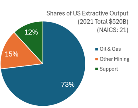
What with all the talk about semi-conductor production and rare-earth mineral extraction, I think that it’s worth examining what the USA produces in terms of what we get out of the ground. This includes mining, quarrying, oil and natural gas extraction, and some support activities (I’ll jump more into the weeds in the future). I’ll broadly call them the ‘extractive’ sectors. How important are these industries? In 2021 extractive production was worth $520 billion. That was roughly 2% of all GDP. Below is the break down by type of extraction.
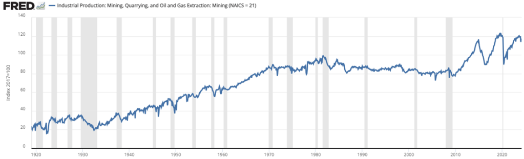
Examining the graph of total extraction output below tells a story. The US increased production of extracted material substantially between the Great Depression and 1970. That’s near the time that the clean water and clean air acts were passed. But the change in the output growth rate is so stark, that I suspect that those were not the only causes of change (reasonable people can differ). For the next 40 years, there was a malaise in output. This was the period during which it was popular to talk about our natural resource insecurity. As in, if we were to be engaged in a large war, then would we be able to access the necessary materials for wartime production?
But for the past 15 years we’ve experienced a boom with extracted output rising by 50%, an average growth rate of 2.7% per year. That’s practically break-neck speeds for an old industry at a time when the phrase ‘great stagnation’ was being thrown about more generally. By 2023, we were near all-time-high output levels (pre-pandemic was higher by a smidge).
For people concerned about resource security, the recent boom is good news. For people who associate digging with environmental degradation, greater extraction is viewed with less enthusiasm. Those emotions are especially high when it comes to fossil fuel production. Below is a graph that identifies the three major components of extraction indexed to the 2021 constant prices. By indexing to the relative outputs of a particular year, the below graph is a close-ish proxy to real output that is comparable in levels.
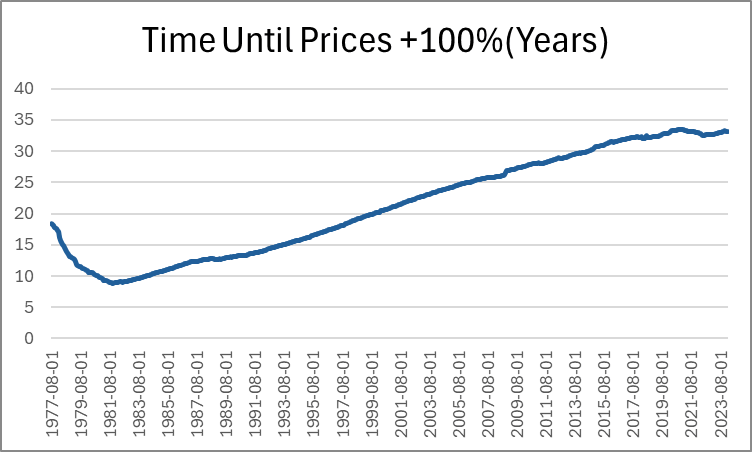
Last month, Jeremy wrote about how long it takes for prices to double. He identified a few intervals of time that are sensible. But I want to pick up the ball and move it further down the field. Not only can we identify how long it took for prices to double in particular eras, we can also do it for *every month*. Below, is a graph that shows us how many years had passed since prices were half as high (PCE Chained Prices).
Expectedly, the minimum time to double consumer prices was in the early 80s, taking just under 9 years for price to double. The prior decade included the highest inflation rates in the past 70 years. Since that time, the number of years needed in order for prices to double steadily rose as the average inflation rate fell. That is, until after the pandemic stimuli which caused the time to plateau. But to be clear, that must mean that prices aren’t doubling any fast that they used to, despite what we’ve heard on the news.
Except… prices are in fact rising faster by 21st century standards. Indeed, measuring the time that it took prices to double covers up a lot of variation. After all, The PCEPI was 15.19 in 1959 and is 122.3 now. That’s only enough difference for three doublings. But as we lower the threshold for price changes, we can see more of the price level patterns. Below-left is the time that was necessary for prices to increase by 50% and below-right is the time that was necessary for prices to rise by 25%.
In these graphs we can see more of the action that happened post-Covid. The time needed for prices to rise by 50% has fallen by about five years since 2020. That’s a 20% shorter time necessary for a 50% increase in prices. The time needed for a 25% increase in prices is even more drastic. As of 2020, people were accustomed to experiencing upwards of 14 years before overall prices rose by 25%. That number fell below 8 years by 2024.
And finally, the most unnerving graph of all is below: the time that was needed for prices to rise by 10%.
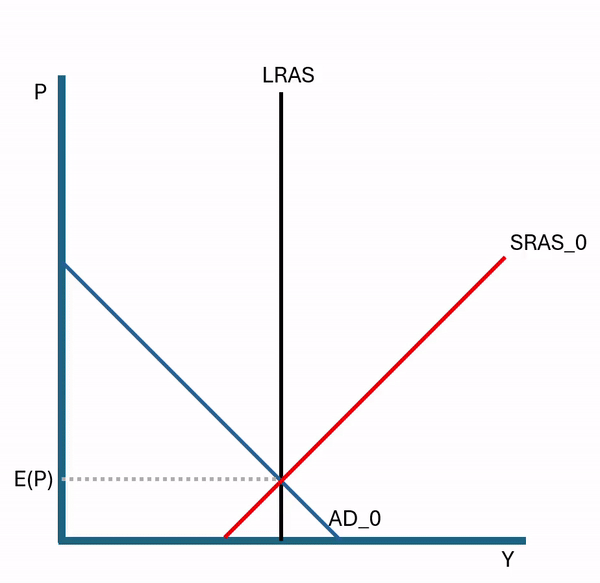
Say that the Federal Reserve Prints a boatload of money. We can use the AS-AD model (aggregate supply & aggregate demand) to evaluate the effect on prices and output.
Printing money results in more total spending in the economy. How much of that initial greater total spending is composed of higher prices versus higher output depends on business marginal costs and whether firms know or expected the greater demand to be due to a broad inflationary event (rather than just greater demand for their particular products).
If there is broad inflation, then the price level that is observed in the economy, including inputs, will deviate from what firms expected. Naturally, firms update their expectations. In so doing, they increase the price that they would require in order to produce every quantity of output. The vertically rising SRAS reflects both of these. The rising itself reflects the higher required prices, and the intersection with the LRAS reflects the expected price level. Notice that updating the expectations places upward pressure on prices, resulting in still higher than anticipated prices. This occurs repeatedly and each time that expectations are updated, the difference between the actual and the expected inflation gets smaller.
This is what macroeconomists call the “self-correcting property’. The economy will adjust to an AD shock ‘automatically’. Of course, automatic isn’t quite the right word. It’s automatic from the perspective of a policy maker. But the self-correction is the result of an economy’s worth of people bidding for scarce goods and changing their price expectations. It’s automatic in the sense that people don’t need to be told to make the effort. The same results won’t occur if buyers and sellers do nothing, which sounds less automatic.
Since the fundamental productivity of the economy hasn’t changed, we eventually return to the original level of output. If monetary policy doesn’t change in the meantime, then prices will simply rise until the long-run price change composes 100% of the change in total spending. Indeed, given the AS-AD model above, half of the price difference between the current price and the long run price is eliminated each period. Similarly, half of the output gap is eliminated each period. This is why monetary and fiscal stimulus that just focuses on total spending only has short-run output and employment effects. The self-correcting property asserts itself and prices rise in the long run.
*In the figures above, I’ve illustrated an initial sharp price change, though sticky prices and very surprising inflationary stimulus can cause a delay in the initial price adjustment.
**Of course, all of this can be expressed in percent change rather than levels.
I’ve written about coffee consumption during US alcohol prohibition in the past. I’ve also written about visualizing supply and demand. Many. Times. Today, I want to illustrate how to use supply and demand to reveal clues about the cause of a market’s volume and price changes. I’ll illustrate with an example of coffee consumption during prohibition.
The hypothesis is that alcohol prohibition would have caused consumers to substitute toward more easily accessible goods that were somewhat similar, such as coffee. To help analyze the problem, we have the competitive market model in our theoretical toolkit, which is often used for commodities. Together, the hypothesis and theory tell a story.
Substitution toward coffee would be modeled as greater demand, placing upward pressure on both US coffee imports and coffee prices. However, we know that the price in the long-run competitive market is driven back down to the minimum average cost by firm entry and exit. So, we should observe any changes in demand to be followed by a return to the baseline price. In the current case, increased demand and subsequent expansions of supply should also result in increasing trade volumes rather than decreasing.
Now that we have our hypothesis, theory, and model predictions sorted, we can look at the graph below which compares the price and volume data to the 1918 values. While prohibition’s enforcement by the Volstead act didn’t begin until 1920, “wartime prohibition” and eager congressmen effectively banned most alcohol in 1919. Consequently, the increase in both price and quantity reflects the increased demand for coffee. Suppliers responded by expanding production and bringing more supplies to market such that there were greater volumes by 1921 and the price was almost back down to its 1918 level. Demand again leaps in 1924-1926, increasing the price, until additional supplies put downward pressure on the price and further expanded the quantity transacted.
We see exactly what the hypothesis and theory predicted. There are punctuated jumps in demand, followed by supply-side adjustments that lower the price. Any volume declines are minor, and the overall trend is toward greater output. The supply & demand framework allows us to image the superimposed supply and demand curves that intersect and move along the observed price & quantity data. Increases toward the upper-right reflect demand increases. Changes plotted to the lower-right reflect supply increases. Of course, inflation and deflation account for some of the observed changes, but similar demand patterns aren’t present in the other commodity markets, such as for sugar or wheat. Therefore, we have good reason to believe that the coffee market dynamics were unique in the time period illustrated above.
*BTW, if you’re thinking that the interpretation is thrown off by WWI, then think again. Unlike most industries, US regulation of coffee transport and consumption was relatively light during the war, and US-Brazilian trade routes remained largely intact.
When discussing the median voter theorem with my public policy class, I went on an informative and educational tangent about ranked choice voting.
We gave an example in which we would go out to eat, each pay our own way, but we must all go to the same restaurant in town. We went through the multiple rounds of voting, eliminating least popular alternatives, and came to a conclusion. The winning restaurant was Tropical Smoothie. If you are not familiar, it is nothing to write home about. However, it is also inoffensive and they provide what they say that they will.
The students quite enjoyed the exercise and the process drove the point home that there are perfectly reasonable alternatives to the typical one – man – one – vote status quo.
Entirely separate
Last weekend, my family purchased a new beta fish. There are six people in our family with four children, ages ranging from one to six years old. Thanks to an offhand comment by my wife, I realized that it was such a beautiful opportunity to teach the kids about ranked choice voting. Everybody in the family suggested a name for the fish. The options were: Hibiscus, Jack Sparrow, Bubbles the 2nd <3, sparkels, camouflage, and ‘no’. Which do you prefer?
I teach one hour-forty minute classes on Tuesdays and Thursdays. And I allot only sixty minutes for exams. While student enjoy having the unexpected spare time after an exam, that’s a lot of learning time to miss. Therefore, after my midterms, we do an in-class activity that is a low-stakes, competitive game (and, entirely voluntary).
I call this game “The Extent of the Market” and it has three lessons. Here’s how the game works:
I have a paper handout, a big bag of variety candy, and a URL. The handout is pictured below-left and lists the types of candy. Each student rates their preference with zero being the least preferred candy. Whether they keep their preferences a secret is up to them. Next, I distribute two pieces of candy to each of them. Importantly, their candy endowment is random and they don’t get to choose or trade (yet). Finally, the URL takes them to a Google sheet pictured below-right where they can choose an id and enter there ‘value score’ under Round 0 by summing the candy ratings of their endowment.
Round 1 is where they get to make choices. I tell students that their goal is to maximize their score and that there is a prize at the end. They are now permitted to trade with anyone at their table or in their row. It doesn’t take long since their candy preferences compose of only the short list, their endowments are small, and the group of potential trade partners is small. When trading is finished, they enter there new scores under round 1.
Lesson #1: Voluntary trade makes people better off.
For each transaction that occurred, someone’s score increased. And in most cases two people’s scores increased. Not everyone will have traded and not everyone will have a higher score. But no one will have a lower score, given the rules and objective of the game. Importantly, the total amount and variety of candy in the little classroom economy hasn’t changed. But the sum of the values in Round 1 increased from Round 0. Trade helps allocate resources where they provide the most value, even if the total amount of physical stuff remains fixed. If it’s a microeconomics class, then this is where you mention Pareto improvements.
Round 2 follows the same process, but this time they may trade with anyone in their quadrant or section of the room. After trading concludes, they enter their scores at the URL under round 2.
Lesson #2: More potential trade partners increases the potential gains from trade.
Again, the variety and total amount of candy in the room remains constant. The only thing that increased was the size of the group of people with whom students could trade. And, they again earn higher scores or, at least, scores that are no lower. People have diverse resources and diverse preferences, and the more of them that you can trade with, the more opportunities to find complementary gains. Clearly, this means that increasing the size of the pool of trading partners is beneficial. One among the many reasons that the USA has had great economic success is that we are a large country geographically with diverse resources and a population of diverse preferences. This means that we have a large common market with many opportunities for mutually beneficial trade. The bigger that we make that common market, the better. Clearly, the implications run afoul of buy-local and protectionist inclinations.
Round 3 proceeds identically with students able to trade with anyone in the room and they enter their scores. At this time the game is finished. It’s important to identify the cumulative class scores across time and to reemphasize lessons #1 & #2. Often, the cumulative value-score will have doubled from Round 0, despite the fixed recourses, making no one worse off. If trading with a row, and then a section, and then the whole class results in gains, then there is an analogy to be drawn to a state, country, and the globe.
Lesson #3: Trade changes the distribution of resources.
Despite an initial distribution of resources, voluntary trade changed that distribution. While no one is worse off and plenty of students are better off, measured inequality may have been affected. Regardless, once a voluntary trade occurs, the distribution of candy and of scores changes. This has implications for redistributive policies. If income or wealth is redistributed in order to achieve some ideal distribution, then the ability to freely trade alters that distribution. The only way to achieve it again would be for another intervention to change the candy distribution by force or threat thereof. Consider that sports superstar Lebron James became rich by playing basketball for people who like to watch him. If we redistribute his income, and then permit him the freedom to voluntarily play basketball again, then the income distribution will change as he again trades and increases his income. Similarly, giving money to a low marginal product worker can provide some short-term relief. But, if the worker resumes their prior behavior and productivity, then the same determinants and resulting income persist.
It’s a fund game and students enjoy it. There are some important limitations. #1: There is no production in this game nor incentives for production. This is a feature for the fixed resources aspect of the game. But this is a bug insofar as students think about US jobs vs international jobs. I can assert that the supply side works similarly to the demand side, but students see it less clearly (it helps to draw these parallels throughout the semester). #2: While there is a maximum possible score in the game, the value created in reality is unbounded. There is no highest possible score IRL. #3: There are no feedback dynamics. Taxes associated with income redistribution cause workers to require higher pay, worsening pre-tax inequality. People respond to incentives, and the tax/subsidy component that determined the initial distribution of candy is absent.
It’s a fun game. If you try it, then please let me know how it goes or leave suggestions in the comments.
*By default, Google Sheets anonymizes users. You could have them sign in or use an institutional cloud drive to remove problems that might be associated anonymity.
**If your student can’t handle choosing their own id, then you can just list your students.
***Ideally, each increased trade-group is a superset of the prior round’s potential trading partners.
****You can do more than 3 rounds, but the principle doesn’t change
*****More trade will occur with more students, a greater variety of possible candies, and with more candies endowed per person. You can alter these as needed depending on the classroom limitations.
Interest rates communicate the value of resources over time. For example, if you take out a loan, then the interest rate tells you how much you must to pay in order to keep that money over the life of the loan. The interest rate also reflects how much the lender will be compensated in exchange for parting with their funds. On the consumer side, the interest rate reflects the price that the borrower is willing to pay in order to avoid delaying a purchase.
When a business borrows, the interest rate reflects the minimal amount of value that they would need to create in order to make an accounting profit. For example, if a business borrows $100 for one year at an interest rate of 5%, then they need to earn $105 by the time that they repay the loan in order to break even with zero profit. The business would need to earn more than 5% in order to earn a profit on their borrowing and investment venture.
The longer the business takes to repay their loan, the more interest that accrues. And, the higher the interest rate, the more they need to earn in order to repay their loan.
This logic applies to all production because all production takes time. If production takes very little time, then the impact of the interest cost is miniscule. But, if production takes longer, then interest rates become increasingly relevant. These kinds of products include trees, cheese, wine, livestock, etc. Anything that ages, ferments, or has a lengthy production process will be more sensitive to the cost of borrowing.
How?
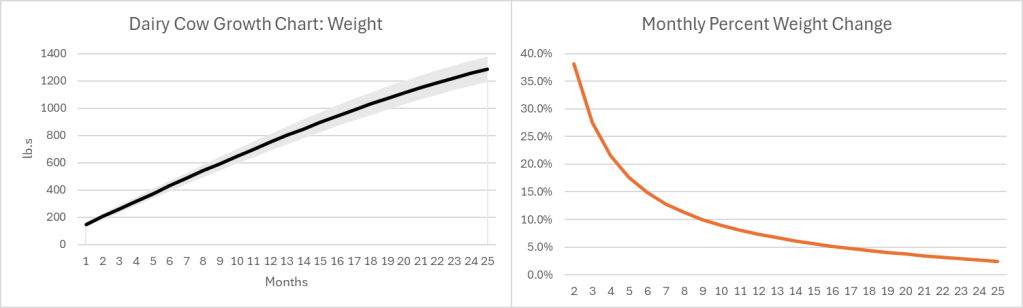
The growth pattern for most (all?) goods looks similar. Below-left is a growth chart for dairy cows . Notice that calves grow quickly at first, and their growth slows over time. For the sake of argument, let’s say that the change in value of a cow mimics the change in weight (Yes, I know that dairy and beef cows are different, but the principle is the same). Below-right is the monthly percent change. Even at an age of 25 months a cow is still growing in value at 2.4% per month or 33% per year.
Of course, there is a risk that some cows don’t survive to slaughter, lowering the expected growth rate. Since most cattle are slaughtered between 18 and 24 months of age, their growth rate at the time of slaughter is 4.4%-2.7% per month. As the interest rate at which farmers borrow rises, the optimal age at slaughter falls. Otherwise, the spread between the growth rate and the interest rate could go negative. Even so, what an investment! If you can borrow at, say, 8% per year, then you’ll make money hand-over-fist on the spread.
Except… Cows cost money to raise, and most of that cost is feed. According to the production indicators and estimated returns published by the USDA, the cost of feed in February of 2023 was $158.11 per hundred pounds of beef. The selling price of beef was $161.07. That leaves $2.96 or a profit of 1.87% earned over the course of 1.5-1.75 years. That investment is starting to look a lot less good, especially since it doesn’t include the cost of maintaining facilities, insurance, etc. It’s no wonder that farmers and ranchers are serious about their subsidies. Clearly, with such tight margins, farmers and ranchers are going to look good and hard at the interest rates that they pay on their debt. And, they do have debt.
However, the recent increase in beef prices is not caused by higher interest rates.
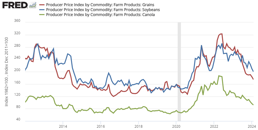
That 1.87% profit margin is at prices and costs from February 2023. Since 2020, the price of cattle feed ingredients (grain, bean, and oil) peaked in the summer of 2022 and are still substantially more expensive than pre-Covid (see below). That means that cows getting slaughtered right now were raised on more expensive feed. This February 2024, the cost of feed per 100lb. of cattle was $191.80. But the cattle selling price was only $180.75. That’s a $11.05 loss for cattle raising. Wholesale prices of cattle might be up recently, but the cost of feed is up by more. It’s not the cattle farmers who are benefiting from the high beef prices. In fact, they’re getting squeezed hard.
There is good news. The cost of feed ingredients has been falling recently, which means that beef farmers should begin to see some relief if the recent trend continues. For Consumers, the price of beef is already down from its 2023 peak.
Economists rightly make a big deal out of specialization and trade. They proceed to go one step further and say that it’s better to pay someone else to perform some service, even if you can perform it yourself. One the assumptions underlying this advice is that time and money are both fungible and convertible.
How are economists right and wrong about the convertibility of time and money? In one sense, we can change how much we work and change how much income we have. That seems plain. But it also requires some start-up costs to have an easy go-to means of earning more income. For example, Uber drivers are registered with Uber already. Joe from the street can’t start driving tomorrow without substantial preparation.
If economists are wrong about the convertibility of earned time and earned money, then they still have standing. We all have an endowment of time, if not money. But there are plenty of goods that have a money price and a time price that have an inverse relationship. The advantage of having a time budget is that you can offset some of the money price of goods with time such that more of the money budget can be spent otherwise.
For example, I had to buy a new golf cart battery. One option was to spend $2,400 for a guy to come replace my old battery for me. The other option was for me to spend $1,500 and one evening to do it myself. Given that I typically do chores in the evening anyway, the time-cost to me didn’t feel all that imposing.
Further, if I free up some time, then what happens to it? I can leisure. That’s what economists call any time spent that isn’t working. But after that leisure, it’s gone. There some saving your time for later in the form of bringing other chores earlier in time. But there’s certainly no allowing your time to earn compound interest. That’s where the advantage of self-service really shines IMO. I can give up $900 and enjoy one evening of leisure. Or, I can given up an evening of leisure, put the savings into an investment account, and then reap double the evening’s worth seven years later. Then I’ll have two nights of leisure rather than one. To me, that’s the biggest difference between time and money. I can earn interest on my money in a way that I can’t earn interest on my time.
I have four children, and all them were or are babies. As an economist, I know that becoming more productive includes contributions to labor, capital, and technology. Caring for and pacifying babies is no different. Here are some of my methods for pacifying and employing babies who are 4-18 months old.
Own a pacifier. You don’t need to use it or even force it into your baby’s mouth. But just have it around. Paul Romer said that we learn and innovate by interacting with capital. So, let’s get the capital.
Employ your baby’s labor. Children as small as 2 or 3 can go get the eggs from the hen house. But what about a smaller baby? Of course we need to stimulate, feed, water, change, and rest the baby. But sometimes, you just need them to be quiet. What to do? Babies respond to Pavlovian stimulus at a very early age. If they’re crying or even just somewhat bored, then place the pacifier in their hand and say, in a very low but normal voice, ‘pacifier’. Babies will instinctively put the pacifier in their mouth. If you have it clipped on, then eventually, they’ll be able to find it when they need it. Developing physical human capital takes work experience and time. I always insist that my older children place the pacifier in the baby’s hand rather than the baby’s mouth. Greater human capital will yield productivity gains.
There came a point when my baby would awaken at night. I wouldn’t even get out of bed. I’d just calmly, and dispassionately say ‘pacifier’. And our baby would pop the pacifier in their own mouth. Employ your baby’s labor. Innovation happens when you interact with capital.
In the same vein, I’d balance the baby bottle on my child’s front side, and place their hands on it. Next thing I knew, my baby was holding their own bottle earlier than the internet said that I should expect them to. Those little hands aren’t useless. They’re low marginal product labor just waiting to be employed. Given that home production is a team effort and labors have interaction effects, that small marginal product for the baby frees your labor to have a larger marginal product for the household. Take advantage of interaction effects, specialization, and comparative advantage.
How do you produce sleep in a baby? Let’s examine the production function. It typically includes: warmth, a clean diaper, darkness, a full belly, maybe some motion, and a lack of disruptive noise. Once the baby is asleep, you really only need the warmth, darkness, and peaceful noise. Leverage your capital to make yourself more productive. Capital may not be able to replace you in helping your baby fall asleep. But it can replace you to help keep them asleep. Repurpose your current stock of capital. If only there was a warm, dark, white noise chamber in your house already. There is. It’s called a bathroom. Get your infant to fall asleep, then put them in the dark bathroom with the fan on. Now you can grade your papers, clean the house, or write your articles.
Addendum on diaper changing:
When it comes to changing a diaper, you should act like you have a low discount rate. That is, you should bear the cost of preparing a changing space so that your future self is thankful. This means preparing the changing pad, opening the new diaper, unfolding the wipes, preparing for diaper disposal, and preparing any new clothes. This makes the diaper changing process much easier and mitigates stochastic costs like leaks, mid-change accidents, etc. Further, your MPL is lower when you have to mind a baby who’s on an elevated surface. Employ your labor when it’s more productive – before you lay them down.
Do you have a baby who fights or cries during diaper changes? Take a hint from the Fed and engage in forward guidance. Did you know that if you blow in a baby’s face, that they instinctively close their eyes and mouth and stop flailing? Early on this can act as a reset and interrupt crying. As a baby gets older, they’ll learn to anticipate the blown air. But only if you build your reputation.
When my 12 month old would start to fight, I’d audibly inhale. My baby would immediately stop fighting and clothes her eyes and mouth, and stop flailing in preparation of me blowing in her face. That’s called forward guidance. Building a reputation of action means that signaling action is often just as good as the act itself. But be careful, if you always blow in their face, they grow accustomed to it due to expectations augmented responses. So, I introduce stochastic bluffs wherein I audibly inhale, but then neglect to blow in their face. Stimulus only works repeatedly if you can violate their expectations.