I’ve written about coffee consumption during US alcohol prohibition in the past. I’ve also written about visualizing supply and demand. Many. Times. Today, I want to illustrate how to use supply and demand to reveal clues about the cause of a market’s volume and price changes. I’ll illustrate with an example of coffee consumption during prohibition.
The hypothesis is that alcohol prohibition would have caused consumers to substitute toward more easily accessible goods that were somewhat similar, such as coffee. To help analyze the problem, we have the competitive market model in our theoretical toolkit, which is often used for commodities. Together, the hypothesis and theory tell a story.
Substitution toward coffee would be modeled as greater demand, placing upward pressure on both US coffee imports and coffee prices. However, we know that the price in the long-run competitive market is driven back down to the minimum average cost by firm entry and exit. So, we should observe any changes in demand to be followed by a return to the baseline price. In the current case, increased demand and subsequent expansions of supply should also result in increasing trade volumes rather than decreasing.
Now that we have our hypothesis, theory, and model predictions sorted, we can look at the graph below which compares the price and volume data to the 1918 values. While prohibition’s enforcement by the Volstead act didn’t begin until 1920, “wartime prohibition” and eager congressmen effectively banned most alcohol in 1919. Consequently, the increase in both price and quantity reflects the increased demand for coffee. Suppliers responded by expanding production and bringing more supplies to market such that there were greater volumes by 1921 and the price was almost back down to its 1918 level. Demand again leaps in 1924-1926, increasing the price, until additional supplies put downward pressure on the price and further expanded the quantity transacted.
We see exactly what the hypothesis and theory predicted. There are punctuated jumps in demand, followed by supply-side adjustments that lower the price. Any volume declines are minor, and the overall trend is toward greater output. The supply & demand framework allows us to image the superimposed supply and demand curves that intersect and move along the observed price & quantity data. Increases toward the upper-right reflect demand increases. Changes plotted to the lower-right reflect supply increases. Of course, inflation and deflation account for some of the observed changes, but similar demand patterns aren’t present in the other commodity markets, such as for sugar or wheat. Therefore, we have good reason to believe that the coffee market dynamics were unique in the time period illustrated above.
*BTW, if you’re thinking that the interpretation is thrown off by WWI, then think again. Unlike most industries, US regulation of coffee transport and consumption was relatively light during the war, and US-Brazilian trade routes remained largely intact.
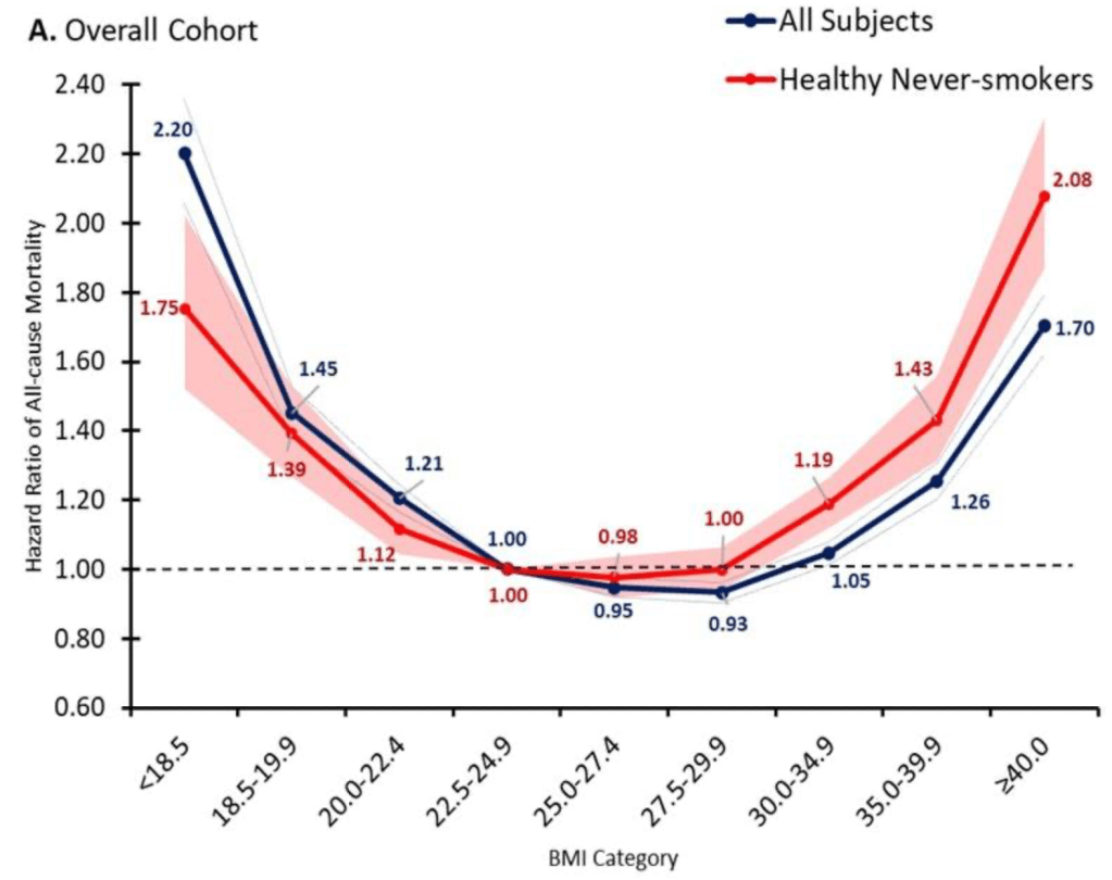
It seems like we finally have anti-obesity drugs that are effective and come without deal-breaking side effects: GLP-1 inhibitors like semaglutide (Wegovy). But they are currently priced over $10,000 per year for Americans. Should insurance cover them?
So far Medicare has decided to cover these drugs only to the extent that they treat diseases like diabetes (which these drugs were originally developed to treat) and heart disease (Wegovy reduces adverse cardiac events by 20% in overweight patients with heart disease). Just based on the diabetes coverage, Medicare was already spending $5 billion per year on these drugs in 2022, making semaglutide the 6th most expensive drug for Medicare with prescriptions still growing rapidly. The addition of other indications for specific diseases, like heart disease coverage added last month, is sure to expand this dramatically, especially if trials confirm other benefits.
But with almost 3/4 of Americans now officially overweight, weight loss makes for a bigger potential market than any specific disease. Medicare currently spends about 15k per beneficiary for all medical care; if they actually paid for an 11k/yr drug for 3/4 of their beneficiaries, their spending could rise to 23k per beneficiary per year. The effect on Medicare Part D, which covers prescription drugs and currently spends about 2.5k per beneficiary per year, would be even more dramatic, with spending quadrupling. This would blow a huge hole in the federal budget, where health insurance already accounts for about 1/4 of all spending (and Medicare 1/2 of that 1/4).
Of course, the reality would not be nearly that bad. Not all overweight people would want to take a weight loss drug, even if it were covered by insurance; the side effects are real. To the extent people do take the drugs, the reduction in obesity could lead to lower spending on treatments for things like heart attacks. Rebates can already reduce the cost of these drugs to be less than half of their list price, and Medicare may be able to negotiate even lower prices starting in 2027. Key patents will expire by 2033, after which generic competition should dramatically lower prices. Competition from other brand-name GLP-1 drugs could lower prices much sooner.
Patents always come with a tradeoff: they encourage innovation in the future, but mean high prices and under-use of patented goods today. The government does have one option for how to lower the marginal price of a drug without discouraging future innovation: just buy out the patent. This would likely cost hundreds of billions of dollars up front, but this could be recouped over time through lower spending, while bringing large health benefits because the drug would be much more widely used if it were sold at a price near its marginal cost of production.
Of course, for now supply of these medications is the bigger problem than the cost. Even with the current high prices and insurers tending not to cover drugs of weight loss alone, demand exceeds supply and shortages abound. The manufacturers are trying to ramp up production quickly to meet the large and growing demand, but this takes time. Insurers like Medicare covering weight loss drugs wouldn’t actually mean more people get the drugs in the short run, it would simply change who gets to use them.
But once production ramps up, I do expect that it will make sense for Medicare to cover weight loss drugs. The health benefits appear to be so large that the drugs are cost effective even at current prices, and prices are likely to fall substantially over time. The big restriction I suspect will still make sense is to require that patients be obese, rather than merely overweight, since being “merely” overweight (BMI 25-29) probably isn’t that bad for you:
Update 4/18/24: I started thinking about this question because of an interview request from Janet Nguyen at Marketplace. She has now published an excellent article on the subject that also includes quotes from John Cawley of Cornell, who knows a lot more than I do on the subject.
I’m not using all of it, but it’s very helpful to see what other instructors have come up with to make teaching monetary policy more fun and more effective. You have to sign up to access it, using your official instructor email address.
It can feel relatively easy to talk to students about their role in the economy as consumers. It is relatively hard to lecture about central banking, because it is less relatable to everyday life. These exercises help us get into the “mind” of a bank.
Thank you to Econiful and Marginal Revolution University for making these resources available. There will probably be an equivalent for fiscal policy produced in the future.
Daniel Kahneman, the psychologist who won a Nobel prize in economics and wrote the best-selling book “Thinking Fast and Slow“, died yesterday at age 90. Others will summarize his biography and the substance of his work, but I wanted to highlight two aspects of his style that I think fueled his unusual success among both the public and economists.
Daniel Kahneman’s new book amazes me. Not so much due to the content, though I’m sure that will blow your mind if you haven’t previously heard about it through studying behavioral economics or psychology or reading Less Wrong. It is the writing style: Kahneman is able to convey his message succinctly while making it seem intuitive and fascinating. Some academics can write tolerably well, but Kahneman seems to be on a level with those who write popularly for a living- the style of a Jonah Lehrer or Malcolm Gladwell, but no one can accuse the Nobel-prize-winning Kahneman of lacking substance.
This made me wonder if it is simply an unfair coincidence that Kahneman is great at both writing and research, or causation is at work here. True, in more abstract and mathematical fields great researchers do not seem especially likely to be great writers (Feynman aside). But to design and carry out great psychology experiments may require understanding the subject intuitively and through introspection. This kind of understanding- an intuitive understanding of everyday decision-making- may be naturally easier to share than other kinds of scientific knowledge, which use processes (say, math) or examine territories (say, subatomic particles) which are unfamiliar to most people. Kahneman says that he developed the ideas for most of his papers by talking with Amos Tversky on long walks. I suspect that this strategy leads to both good idea generation and a good, conversational writing style.
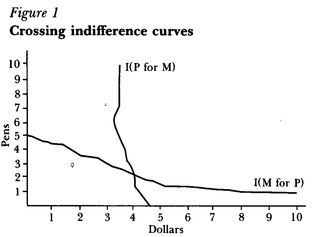
But how did a psychologist get economists to not just take his work seriously, but award him the top prize in our field? One key step was learning to speak the language of our field, or coauthor with people who do. For instance, summarizing the results of an experiment as showing indifference curves crossing where rationally they should not:
Finally, something that helped Kahneman appeal to all parties was that he avoided the potential trap of being the arrogant behavioral economist. Most economists have a natural tendency toward arrogance, kept somewhat in check by our belief that most people are fundamentally rational. Behavioral economists who think most people are irrational can be the most arrogant if they think they are the only sane one, and should therefore tell everyone else how to behave. But Kahneman avoided this by seeming to honestly believe he is just as subject to behavioral biases as everyone else.
Christians across the world are observing the season of Lent right now, concluding this week. This important period of religious observance involves personal sacrifice of some sort, and for Western Christians a common form of sacrifice is abstaining from consuming meat on Fridays during Lent. But there is one exception: most Christians allow consumption of fish on Fridays, in lieu of other kinds of meat.
But abstaining from meat on Fridays was not always a practice reserved for Lent. Catholics used to abstain from meat for the entire year prior to a 1966 decree by Pope Paul VI. This decree relaxed the rules on fasting and decentralized them. In the US, Catholic Bishops chose to eliminate meatless Fridays, except during Lent.
No doubt this was an important religious change, but it was also an important economic change. And the first question an economist would ask is: how did this impact the price of fish? In our simple supply and demand framework, this should result in a decrease in demand, which would lower the price of fish. Did that happen?
In 1968, economist Frederick Bell asked just that question in an article published in the American Economic Review titled “The Pope and the Price of Fish.” The short answer is that yes, the price of fish did indeed decline!
I teach one hour-forty minute classes on Tuesdays and Thursdays. And I allot only sixty minutes for exams. While student enjoy having the unexpected spare time after an exam, that’s a lot of learning time to miss. Therefore, after my midterms, we do an in-class activity that is a low-stakes, competitive game (and, entirely voluntary).
I call this game “The Extent of the Market” and it has three lessons. Here’s how the game works:
I have a paper handout, a big bag of variety candy, and a URL. The handout is pictured below-left and lists the types of candy. Each student rates their preference with zero being the least preferred candy. Whether they keep their preferences a secret is up to them. Next, I distribute two pieces of candy to each of them. Importantly, their candy endowment is random and they don’t get to choose or trade (yet). Finally, the URL takes them to a Google sheet pictured below-right where they can choose an id and enter there ‘value score’ under Round 0 by summing the candy ratings of their endowment.
Round 1 is where they get to make choices. I tell students that their goal is to maximize their score and that there is a prize at the end. They are now permitted to trade with anyone at their table or in their row. It doesn’t take long since their candy preferences compose of only the short list, their endowments are small, and the group of potential trade partners is small. When trading is finished, they enter there new scores under round 1.
Lesson #1: Voluntary trade makes people better off.
For each transaction that occurred, someone’s score increased. And in most cases two people’s scores increased. Not everyone will have traded and not everyone will have a higher score. But no one will have a lower score, given the rules and objective of the game. Importantly, the total amount and variety of candy in the little classroom economy hasn’t changed. But the sum of the values in Round 1 increased from Round 0. Trade helps allocate resources where they provide the most value, even if the total amount of physical stuff remains fixed. If it’s a microeconomics class, then this is where you mention Pareto improvements.
Round 2 follows the same process, but this time they may trade with anyone in their quadrant or section of the room. After trading concludes, they enter their scores at the URL under round 2.
Lesson #2: More potential trade partners increases the potential gains from trade.
Again, the variety and total amount of candy in the room remains constant. The only thing that increased was the size of the group of people with whom students could trade. And, they again earn higher scores or, at least, scores that are no lower. People have diverse resources and diverse preferences, and the more of them that you can trade with, the more opportunities to find complementary gains. Clearly, this means that increasing the size of the pool of trading partners is beneficial. One among the many reasons that the USA has had great economic success is that we are a large country geographically with diverse resources and a population of diverse preferences. This means that we have a large common market with many opportunities for mutually beneficial trade. The bigger that we make that common market, the better. Clearly, the implications run afoul of buy-local and protectionist inclinations.
Round 3 proceeds identically with students able to trade with anyone in the room and they enter their scores. At this time the game is finished. It’s important to identify the cumulative class scores across time and to reemphasize lessons #1 & #2. Often, the cumulative value-score will have doubled from Round 0, despite the fixed recourses, making no one worse off. If trading with a row, and then a section, and then the whole class results in gains, then there is an analogy to be drawn to a state, country, and the globe.
Lesson #3: Trade changes the distribution of resources.
Despite an initial distribution of resources, voluntary trade changed that distribution. While no one is worse off and plenty of students are better off, measured inequality may have been affected. Regardless, once a voluntary trade occurs, the distribution of candy and of scores changes. This has implications for redistributive policies. If income or wealth is redistributed in order to achieve some ideal distribution, then the ability to freely trade alters that distribution. The only way to achieve it again would be for another intervention to change the candy distribution by force or threat thereof. Consider that sports superstar Lebron James became rich by playing basketball for people who like to watch him. If we redistribute his income, and then permit him the freedom to voluntarily play basketball again, then the income distribution will change as he again trades and increases his income. Similarly, giving money to a low marginal product worker can provide some short-term relief. But, if the worker resumes their prior behavior and productivity, then the same determinants and resulting income persist.
It’s a fund game and students enjoy it. There are some important limitations. #1: There is no production in this game nor incentives for production. This is a feature for the fixed resources aspect of the game. But this is a bug insofar as students think about US jobs vs international jobs. I can assert that the supply side works similarly to the demand side, but students see it less clearly (it helps to draw these parallels throughout the semester). #2: While there is a maximum possible score in the game, the value created in reality is unbounded. There is no highest possible score IRL. #3: There are no feedback dynamics. Taxes associated with income redistribution cause workers to require higher pay, worsening pre-tax inequality. People respond to incentives, and the tax/subsidy component that determined the initial distribution of candy is absent.
It’s a fun game. If you try it, then please let me know how it goes or leave suggestions in the comments.
*By default, Google Sheets anonymizes users. You could have them sign in or use an institutional cloud drive to remove problems that might be associated anonymity.
**If your student can’t handle choosing their own id, then you can just list your students.
***Ideally, each increased trade-group is a superset of the prior round’s potential trading partners.
****You can do more than 3 rounds, but the principle doesn’t change
*****More trade will occur with more students, a greater variety of possible candies, and with more candies endowed per person. You can alter these as needed depending on the classroom limitations.
I’ve always told my health economics students that Medicaid is both better and worse than all other insurance in the US for its enrollees.
Better, because its cost sharing is dramatically lower than typical private or Medicare plans. For instance, the maximum deductible for a Medicaid plan is $2.65. Not $2650 like you might see in a typical private plan, but two dollars and sixty five cents; and that is the maximum, many states simply set the deductible and copays to zero. Medicaid premiums are also typically set to zero. Medicaid is primarily taxpayer-financed insurance for those with low incomes, so it makes sense that it doesn’t charge its enrollees much.
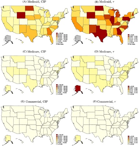
But Medicaid is the worst insurance for finding care, because many providers don’t accept it. One recent survey of physicians found that 74% accept Medicaid, compared to 88% accepting Medicare and 96% accepting private insurance. I always thought these low acceptance rates were due to the low prices that Medicaid pays to providers. These low reimbursement rates are indeed part of the problem, but a new paper in the Quarterly Journal of Economics, “A Denial a Day Keeps the Doctor Away”, shows that Medicaid is also just hard to work with:
24% of Medicaid claims have payment denied for at least one service on doctors’ initial claim submission. Denials are much less frequent for Medicare (6.7%) and commercial insurance (4.1%)
Identifying off of physician movers and practices that span state boundaries, we find that physicians respond to billing problems by refusing to accept Medicaid patients in states with more severe billing hurdles. These hurdles are quantitatively just as important as payment rates for explaining variation in physicians’ willingness to treat Medicaid patients.
Of course, Medicaid is probably doing this for a reason- trying to save money (they are also trying to prevent fraud, but I have no reason to expect fraud attempts are any more common in Medicaid than other insurance, so I don’t think this can explain the 4-6x higher denial rate). This certainly wouldn’t be the only case where states tried to save money on Medicaid by introducing crazy rules hassling providers. You can of course argue that the state should simply spend more to benefit patients and providers, or spend less to benefit taxpayers. But the honest way to spend less is to officially cut provider payment rates or patient eligibility, rather than refusing to pay providers as advertised. In addition to being less honest, these administrative hassles also appear to be less efficient as a way to save money, probably because they cost providers time and annoyance as well as money:
We find that decreasing prices by 10%, while simultaneously reducing the denial probability by 20%, could hold Medicaid acceptance constant while saving an average of 10 per visit.
Medicaid is a joint state-federal program with enormous differences across states, and administrative hassle is no exception. For administrative hassle of providers, the worst states include Texas, Illinois, Pennsylvania, Georgia, North Dakota, and Wyoming:
Source: Figure 5 of A Denial a Day Keeps the Doctor Away, which notes: “The left column shows the mean estimated costs of incomplete payments (CIP) by state and payer. The right column shows the mean CIP as a share of visit value by state and payer. “
Interest rates communicate the value of resources over time. For example, if you take out a loan, then the interest rate tells you how much you must to pay in order to keep that money over the life of the loan. The interest rate also reflects how much the lender will be compensated in exchange for parting with their funds. On the consumer side, the interest rate reflects the price that the borrower is willing to pay in order to avoid delaying a purchase.
When a business borrows, the interest rate reflects the minimal amount of value that they would need to create in order to make an accounting profit. For example, if a business borrows $100 for one year at an interest rate of 5%, then they need to earn $105 by the time that they repay the loan in order to break even with zero profit. The business would need to earn more than 5% in order to earn a profit on their borrowing and investment venture.
The longer the business takes to repay their loan, the more interest that accrues. And, the higher the interest rate, the more they need to earn in order to repay their loan.
This logic applies to all production because all production takes time. If production takes very little time, then the impact of the interest cost is miniscule. But, if production takes longer, then interest rates become increasingly relevant. These kinds of products include trees, cheese, wine, livestock, etc. Anything that ages, ferments, or has a lengthy production process will be more sensitive to the cost of borrowing.
How?
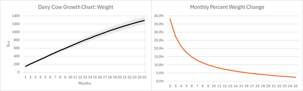
The growth pattern for most (all?) goods looks similar. Below-left is a growth chart for dairy cows . Notice that calves grow quickly at first, and their growth slows over time. For the sake of argument, let’s say that the change in value of a cow mimics the change in weight (Yes, I know that dairy and beef cows are different, but the principle is the same). Below-right is the monthly percent change. Even at an age of 25 months a cow is still growing in value at 2.4% per month or 33% per year.
Of course, there is a risk that some cows don’t survive to slaughter, lowering the expected growth rate. Since most cattle are slaughtered between 18 and 24 months of age, their growth rate at the time of slaughter is 4.4%-2.7% per month. As the interest rate at which farmers borrow rises, the optimal age at slaughter falls. Otherwise, the spread between the growth rate and the interest rate could go negative. Even so, what an investment! If you can borrow at, say, 8% per year, then you’ll make money hand-over-fist on the spread.
Except… Cows cost money to raise, and most of that cost is feed. According to the production indicators and estimated returns published by the USDA, the cost of feed in February of 2023 was $158.11 per hundred pounds of beef. The selling price of beef was $161.07. That leaves $2.96 or a profit of 1.87% earned over the course of 1.5-1.75 years. That investment is starting to look a lot less good, especially since it doesn’t include the cost of maintaining facilities, insurance, etc. It’s no wonder that farmers and ranchers are serious about their subsidies. Clearly, with such tight margins, farmers and ranchers are going to look good and hard at the interest rates that they pay on their debt. And, they do have debt.
However, the recent increase in beef prices is not caused by higher interest rates.
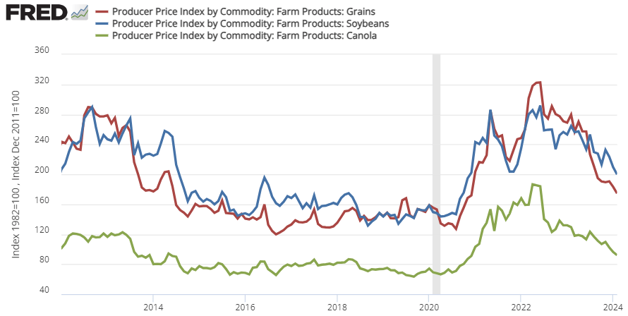
That 1.87% profit margin is at prices and costs from February 2023. Since 2020, the price of cattle feed ingredients (grain, bean, and oil) peaked in the summer of 2022 and are still substantially more expensive than pre-Covid (see below). That means that cows getting slaughtered right now were raised on more expensive feed. This February 2024, the cost of feed per 100lb. of cattle was $191.80. But the cattle selling price was only $180.75. That’s a $11.05 loss for cattle raising. Wholesale prices of cattle might be up recently, but the cost of feed is up by more. It’s not the cattle farmers who are benefiting from the high beef prices. In fact, they’re getting squeezed hard.
There is good news. The cost of feed ingredients has been falling recently, which means that beef farmers should begin to see some relief if the recent trend continues. For Consumers, the price of beef is already down from its 2023 peak.
The Fed made two mistakes during the Great Recession of 2007-2009: being too slow and weak in their initial reaction to the financial crisis, and being too hurried in their attempts to return to a ‘normal’ policy stance. The first mistake turned what could have been a minor road bump into the worst recession in decades, and the second mistake meant it took a full decade from the start of the crisis in 2007 for unemployment to return to pre-crisis levels.
The rapid recovery from the Covid recession shows that the Fed learned from its first mistake in 2007. In 2020, the Fed acted quickly and decisively, so that despite the worst pandemic in a century the US experienced a recession that lasted only months, and it took unemployment barely 2 years to return to pre-Covid levels. But the Fed’s talk about cutting rates this year makes me worry they did not learn the second lesson. Despite all their talk of being “data driven”, I don’t see how a dispassionate look at current inflation, labor market, or financial data could lead them to be considering rate cuts; if anything it currently suggests rate hikes.
Why then is the Fed talking rate cuts? Of course you can dig and find a few data points to support cuts, but I think the driving factor is simply a feeling that interest rates are currently above “normal”. They are digging to find data points to support cuts because they want to return rates to “normal”, just as in the early to mid 2010’s they were digging for reasons to raise rates to “normal”. Rather than being consistently too hawkish or too dovish, they are consistently too eager to return rates to “normal” when circumstances are still abnormal.
This is not simply out of a social and political desire to avoid appearing “weird”, though that is definitely a factor. There is also a long academic tradition of measuring the stance of monetary policy by comparing current interest rates to a neutral, “natural” rate of interest, r*. But this tradition has problems. The “natural” rate of interest is always changing, and at any given time we can’t really know for sure what it is. The current Fed Funds rate may be higher than it has been in recent years, but that doesn’t necessarily mean it is above the current natural rate of interest; the natural rate itself could have risen too. This is why interest rates aren’t a great way to measure the stance of monetary policy. At times Chair Powell himself has made the same point, saying that trying to set policy by comparing to the “natural” rate of interest r* is like “navigating by the stars under cloudy skies”.
Lacking such celestial guidance, I can only hope the Fed will make good on their promise to be data-driven and navigate by the guideposts they can see around them: measures like current inflation and unemployment, or market-based forecasts of such measures.
Let me start by saying high rates of inflation, especially unexpected inflation, is bad. Still, it is useful to have some historical context. We’ve experienced the highest inflation rates in a generation lately, especially in 2022, but past generations experienced inflation too. How to compare?
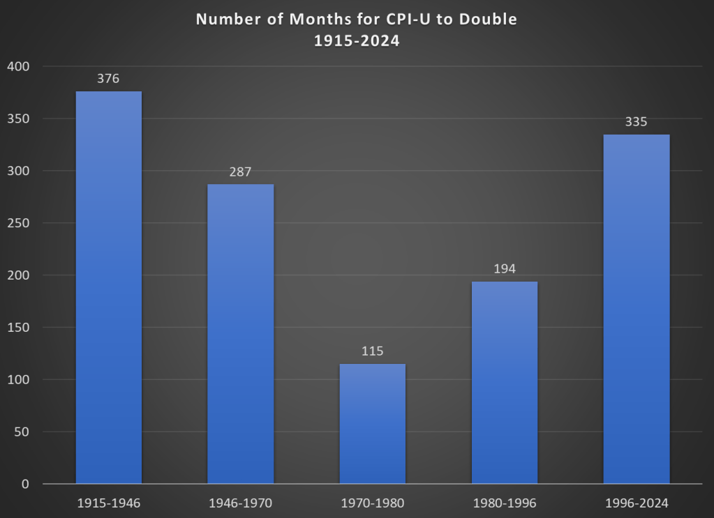
Here’s one approach. Using the latest CPI-U data, we can see that prices on average approximately doubled between March 1996 and February 2024. That’s 335 months to double, or just shy of 28 years. How long did it take prices to double if we keep moving backward in time from March 1996?
It only took 194 months for prices to double from January 1980 until March 1996, just a little over 16 years. Prior to January 1980, prices doubled even quicker, this time taking less than 10 years! Prior to that, it took 24 years for prices to double between WW2 and 1970, and before that you have to go back 31 years to 1915 for another doubling. Judged by this, our recent history doesn’t look so bad.
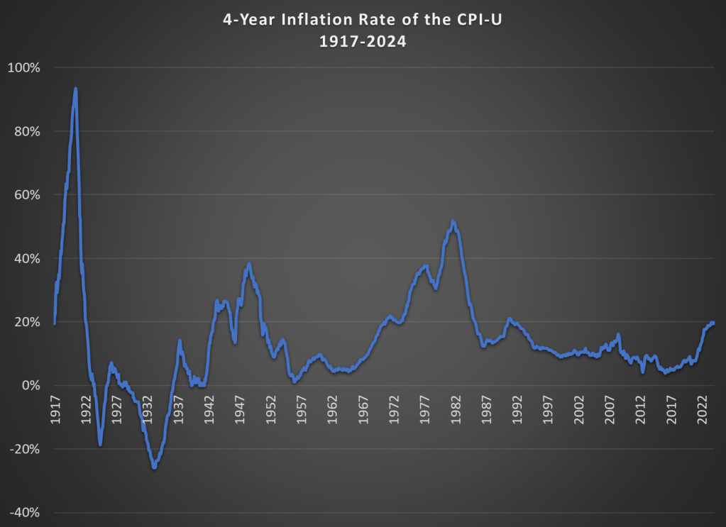
That doesn’t mean everything is OK. As I said above, unexpected inflation is the worst kind, since individuals and businesses aren’t planning for it. And we’ve had 20% inflation in the past 4 years — something not seen since 1991 over a 4-year time period. A 20%+ inflation rate is unusual to us today, but it certainly wasn’t in the past: basically all of the 1970s and 1980s had 20%+ inflation every 4 years, sometimes more than 40% or even 50%.
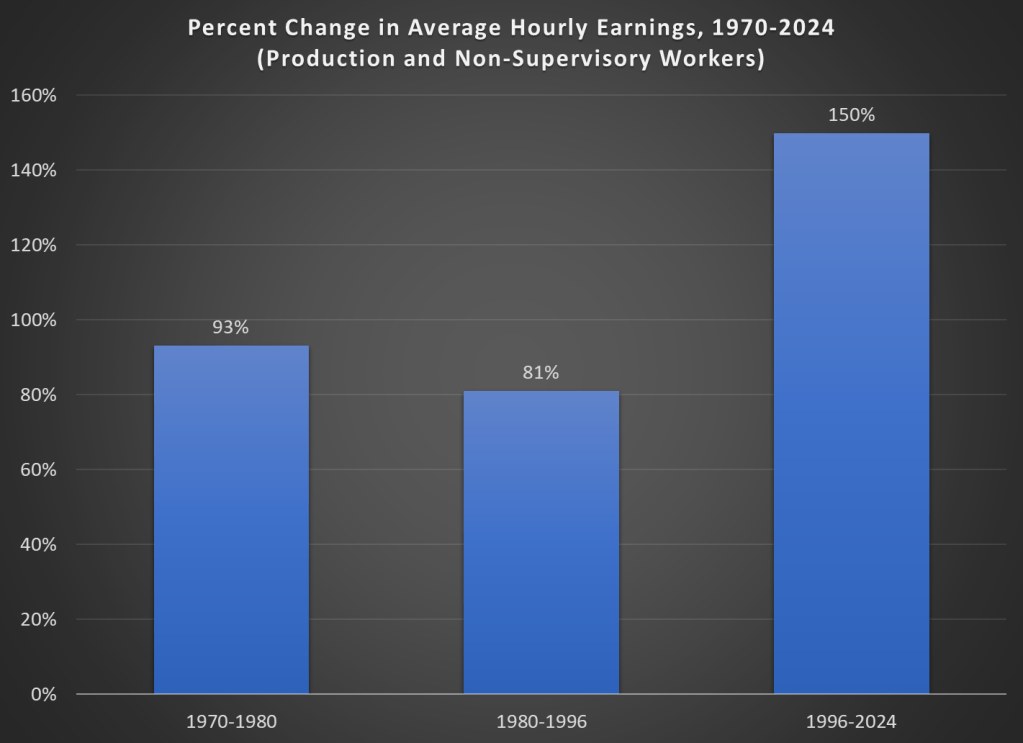
Finally, while unexpected inflation is bad, we also care about the relationship between wage increases and price increases. We can rightfully bemoan rapid, unexpected price inflation, but if wages are increasing faster than inflation, we are still better off (on average). The BLS average hourly wage series for production and non-supervisory workers only goes back to 1964, so we can’t do a full comparison with the CPI-U, but we can compare the three most recent doublings of prices.
Keep in mind with the chart above that prices (as measured by the CPI-U) increased by 100% for each of these time periods. So, for the 1970s and 1980-1996 periods, wages actually rose by less than rate of inflation — wage stagnation! If we used the PCE price index instead, those time periods still don’t look good: PCE prices increased by 88% for 1970-1980, 85% from 1980-1996, and 78% since 1996. With either price index, the 1996-2024 period is clearly the best of these three, and it’s not even really close.
Let me finish where I started: the recent inflation is bad. I don’t want to downplay that. But some historical perspective is also useful.