I like to take existing datasets, clean them up, and share them in easier to use formats. When I started doing this back in 2022, my strategy was to host the datasets with the Open Science Foundation and share the links here and on my personal website.
OSF is great for allowing large uploads and complex projects, but not great for discovery. I saw several of my students struggle to navigate their pages to find the appropriate data files, and they seem to have poor SEO. Their analytics show that my data files there get few views, and most of the ones they get come from people who were already on the OSF site.
This year I decided to upload my new projects like County Demographics data to Kaggle.com in addition to OSF, and so far Kaggle is the clear winner. My datasets are getting more downloads on Kaggle than views on OSF. I’ve noticed that Kaggle pages tend to rank highly on Google and especially on Google Dataset Search. I think Kaggle also gets more internal referrals, since they host popular machine learning competitions.
Kaggle has its own problems of course, like one of its prominent download buttons only downloading the first 10 columns for CSV or XLSX files by default. But it is the best tool I have found so far for getting datasets in the hands of people who will find them useful. Let me know if you’ve found a better one.
The 2025 first quarter GDP data came in slightly bad: negative 0.3%. I think the number is a bit hard to interpret right now, but it’s hard to spin away a negative number. A big factor pulling down the accounting identify that we call GDP was a massive increase in imports, specifically imports of goods. It’s likely this is businesses trying to front-run the potential tariffs (and keep in mind this was pre-“Liberation Day,” so probably even more front running in April), so the long-run effect is harder to judge.
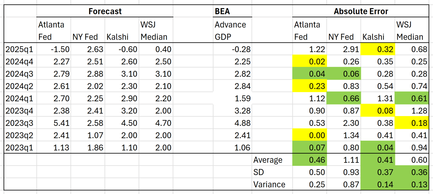
But aside from the interpretation of the GDP estimate, we can ask a related question: did anyone predict it correctly? I have written previously about two GDP forecasts from two different regional Federal Reserve banks. They were showing very different estimates for GDP!
Both the Fed estimates ending up being pretty wrong: -1.5% and +2.6%. But there are two other kinds of forecasts we can look at.
The first is from a survey of economists done by the Wall Street Journal. The median forecast in that survey was positive 0.4%. This survey got the direction wrong, but it was much closer than the Fed models.
Finally, we can look at prediction markets. There are many such markets, but I’ll use Kalshi, because it’s now legal to use in the US, and it’s pretty easy to access their historical data. The average Kalshi forecast for Q1 (a weighted average of sorts across several different predictions) was -0.6%. Pretty close! They got the direction right, and the absolute error was smaller than WSJ survey. And obviously, much better this quarter than the Fed models.
But this was just one quarter, and perhaps a particularly weird quarter to predict (Atlanta Fed even had to update their model mid-quarter, because large gold inflows were throwing of the model). You may say that weird quarters are exactly when we want these models to perform well! But it’s also useful to look at past predictions. The table below summarizes predictions for the past 9 quarters (as far back as the current NY Fed model goes):
Chickens were apparently domesticated from the red jungle fowl (Gallus gallus), a native of southeast Asia, thousands of years ago. Humans have been selectively breeding them ever since. Traditionally, chickens were valued mainly for their eggs. Surplus roosters would get eaten, of course, and tough overage laying hens would end up in the stewpot. But your typical chicken was a stringy, hardy bird whose job was to stay alive and to lay eggs.
Raising chickens en masse just for eating started in 1923 with Celia Steele of southern Delaware, somewhat by accident. She wanted to set up a small flock of egg-laying chickens to supplement her husband Wilmer’s Coast Guard salary. She placed an order for 50 chicks, but it was mistakenly heard as 500. When she got this huge shipment, she thought fast and decided to raise them to eating size (“broilers”) and then immediately sell them. She built a coop designed for grow-out, rather than for egg-laying. This enterprise was profitable, so she expanded operations. She doubled production the next year, and by 1926 she had 10,000 chickens. Her neighbors saw her success, and also went into the broiler biz. Thus was spawned the modern broiler industry. All this was aided by the general prosperity in the 1920s, together with technical progress in refrigeration and transportation. Her first broiler house is now on the U.S. Registry of Historic Places.
However, chickens themselves were still scrawny by today’s standards. As of 1948, chicken meat was still an expensive luxury. With the broiler (meat chicken) market established, breeders naturally tried to develop strains that would grow big and fast. That not only allows more meat to be grown in a given flock, but fast growth means less feed is consumed to get to market weight.
For several years around 1950, A&P Supermarkets sponsored a “Chicken of Tomorrow” program, overseen by the USDA, to promote improved broiler breeding. As examples of chickendom as of 1948, here are plucked carcasses of contestants for the Chicken of Tomorrow contest of that year. Note how stringy they are, compared to the plump, meaty bird you buy at the grocery store today:
Without going into much detail, the ultimate product was a cross (hybrid) between the Cornish chicken and other breeds. Cornish cross chickens were initially bred for size and growth rate. By say the 1990s, that led to birds that were so heavy that they sometimes could not support their own weight. More recent breeding programs promote leg strength and other health factors, as well as sheer growth.
To produce today’s optimized broiler is a complex process. Breeders must maintain something like four purebred strains, and then carefully cross-breed them, and then cross-breed some more, to get the final hybrid chick to send out for farmers to raise. Only these hybrids have the optimized characteristics; you can’t just take a bunch of these crossed chickens and breed a good flock from them:
Only a few large outfits can afford to do this, so most hatcheries are supplied by a handful of big breeders. However, there seems to be enough competition to keep the prices down for the consumer. Some folks will always find something to complain about (reduced genetic diversity or hardiness, etc.), but they are welcome to breed and grow less efficient chickens, if it pleases them.
In terms of dollars: “The inflation-adjusted cost of producing a pound of live chicken dropped from US$2.32 in 1934 to US$1.08 in 1960. In 2004, the per-pound cost had dropped to 45 cents, according to the USDA Poultry Yearbook (2006).”
According to the National Chicken Council, in 1925 it took a broiler chicken an average of 112 days to reach a market weight of 2.5 pounds. As of 2024, the market weight has soared to 6.5 pounds, and chickens reach that weight much faster, in 47 days (about the time it takes leafy green vegetables). The net result is that now it only takes about 1.7 pounds of feed to grow one pound of chicken, compared to 4.7 lb/lb in 1925. This nearly three-fold reduction in resource consumption translates into lower consumer costs, lower load on the environment and agricultural resources, and even lower CO2 generation. The largest jump feed conversion efficiency (from 4 to 2.5 lb/lb) occurred between 1945 and 1960, thanks to the development of the Cornish cross.
In economics, commitment devices are often seen as clever solutions to self-control problems—ways people can tie their future hands to avoid giving in to temptation. A smoker throws away their cigarettes, a dieter pays in advance for healthy meals, a student announces a deadline publicly so they can’t back out. The idea is that by limiting future choices, a person can force themselves to stick with a preferred long-term strategy. But commitment devices also show up in places far removed from personal productivity—and in some cases, they carry bad unintended consequences when the strategic landscape shifts.
Consider the case of gang tattoos, especially those associated with MS-13. For years, highly visible tattoos served as a powerful way to demonstrate loyalty to the group. These tattoos—sometimes covering the face, neck, or arms—weren’t just aesthetic. They signaled that the individual was fully committed to the gang. In economic terms, they functioned as a high-cost, hard-to-fake commitment device. By making oneself easily identifiable as a gang member, a person burned bridges to legitimate employment or life outside the gang. That might seem irrational at first glance, but it was often a rational decision in context. Within certain neighborhoods or prisons, that signal provided protection, status, and trust among peers. The visible commitment reduced the gang’s uncertainty about who was loyal and who might defect.
But the rules of the game changed. In March 2022, El Salvador launched an aggressive crackdown on gangs following a sharp spike in homicides. Under a sweeping “state of exception,” authorities suspended constitutional rights, arrested tens of thousands of people, and expanded prison capacity dramatically. Tattoos quickly became one of the easiest ways for police to identify and detain suspected gang members. News reports describe men being pulled from buses or homes not for current criminal activity, but simply because of the ink on their skin. In many cases, the tattoos were from years earlier—when the wearer had been young and immersed in a world where signaling loyalty felt necessary for survival. Now, those same signals serve as evidence in court or grounds for indefinite detention.
Generally, decisions to spend federal funds come is the authority of congress. But the Trump administration has very publicly made clear that it will try to cut the things that are within its authority (or that it thinks should be within that authority). Truly, the fiscal year with the new Republican unified government won’t begin until October of 2025. So, the last quarter is when we’ll see what the Republicans actually want – for better or for worse. In the meantime, we can look past the hyperbole and see what the accounting records say. The most recent data includes 95 days after inauguration. First, for context, total spending is up $134 billion or 5.8% from this time last year to $2.45 trillion.
The Trump administration has been making news about their desire and success in cutting. Which programs have been cut the most? As a proportion of their budgets, below is a graph of were the five biggest cuts have happened by percent. The Cuts to the FCC and CPB reflect long partisan stances by Republicans. The cuts to the Federal Financing Bank reflect fewer loans administered by the US government and reflect the current bouts to cut spending. Cuts in the RRB- Misc refer to some types of railroad payments to employees. In the spirit of whiplash, the cuts to the US International Development Finance Corporation reverse the course set by the first Trump administration. This government corporation exists to facilitate US investment in strategically important foreign countries.
But some programs have *increased* spending since 2024. The five largest increases include the USDA, the US contributions to multilateral assistance, claims and judgments against the US, the federal railroad administration, and the international monetary fund. Funding for farmers and railroads reflect the old agricultural and new union Republican constituencies. The multilateral assistance and IMF spending reflects greater international involvement of the administration, despite its autarkic lip service.
The Smoot-Hawley Tariff of 1930 was opposed by a thousand economists, but passed anyway, exacerbating the Great Depression. Now that the biggest tariff increase since 1930 is on the table, the economists are trying again. I hope we will find a more receptive audience this time.
The Independent Institute organized an “Anti-Tariff Declaration” last week that now has more signatures than the anti-Smoot-Hawley declaration, including many from top economists. One core argument is the sort you’d get in an intro econ class:
Overwhelming economic evidence shows that freedom to trade is associated with higher per-capita incomes, faster rates of economic growth, and enhanced economic efficiency.
But I thought the Declaration made several other good points. Intro econ textbooks say that tariffs at least benefit domestic producers (at the expense of consumers and efficiency), but in practice these tariffs have been mainly hurting domestic producers, because:
The American economy is a global economy that uses nearly two thirds of its imports as inputs for domestic production.
I get asked to sign a petition of economists like this every year or so, but this is the first one I have ever agreed to sign onto. Most petitions are on issues where there are good arguments on each side, like whether to extend a particular tax cut, or which Presidential candidate is better for the economy. But the argument against these tariffs is as solid as any real-world economic argument gets.
The full Declaration is quite short, you can read the whole thing and consider signing yourself here.
Today the stock market does seem to move a lot on the news about Trump’s ever-evolving tariff policy. If you see the S&P 500 is up today, you can probably guess that Trump or his advisors slightly backed off some aspect of their previously announced tariff policy. And vice versa. That much is true.
But back in 2020, the implied correlation in the market was briefly over 80% in the spring of 2020, and was over 50% for almost all of the summer of 2020. Today, the correlation is closer to 40%. That’s a bit lower than 2020, but it is a significant jump from where it was 2-3 months ago.
Despite the nearly universal outcry, President Trump was standing firm on his massive tariffs. “No backing down”, etc., despite the evaporation of trillions of dollars in stock values. On Tuesday, April 8, White House spokesperson Karoline Leavitt affirmed: “The President was asked and answered this yesterday. He said he’s not considering an extension or delay. I spoke to him before this briefing. That was not his mindset. He expects that these tariffs are going to go into effect.” However, the next day, Wednesday, April 9, Trump announced on his social media platform, Truth Social, that for all countries but China, there would be a 90-day pause in reciprocal tariffs.
What happened here? The common explanations are that (1) the chaos and losses in the markets had finally grown intolerable, or that (2) the president had planned all along to pause the tariff hikes on April 9. I suspect there is some merit to both of these factors – -despite all the prior warnings, I think (1) Trump did not expect such market devastation (he sincerely believes that he is making the American economy great, so why should markets crash?), and also (2) that he had indeed planned to play around with tariff implementations in pursuit of deals.
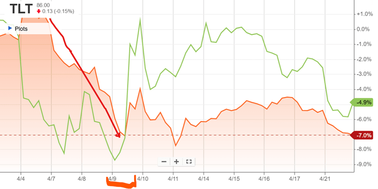
But what some analysts pointed out as a further factor was the drop in the market value of U.S. Treasury bonds, which correlates directly to a rise in interest rates. The actions of the Administration have seemingly caused market participants, especially abroad, to question the risk-free status of U.S. debt. If the government has to pay higher interest on its debt, it is game over, as interest payments will spiral up and consume an ever-higher share of the federal budget. The chart below shows in orange the price movement of the TLT fund, which holds long-term T-bonds, plummeting on April 7, 8, and 9 (red arrow), as an indicator of rising rates. TLT price then shot upwards, along with stocks (the green line is S&P 500 fund SPY) late on April 9, in the relief following the tariff announcement:
As Treasury Secretary, Scott Bessent would be particularly sensitized to the interest rate issue, and able to communicate that to the boss. He has been a successful hedge fund trader and manager, so he understands the plumbing of the system, unlike some other presidential advisors. Up till then, however, economist Peter Navarro, who is ultra-hawkish on tariffs, had had the ear of the president.
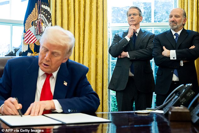
So, what did Bessent do? (This is the part that only came to my attention a few days ago, even though technically this is old news). It seems he enlisted the support of Commerce Secretary Lutnick, and adroitly chose a time when Navarro was tied up in a meeting, and barged in on the president in an unscheduled meeting so they could get him alone. And it worked! Evidently, they persuaded him that now was the time to do the clever deal-making thing and issue a pause. It’s a mark of how readily the president can change his mind that his own press spokespeople were unaware of this volte-face, and had to scramble to make sense of it. It is also interesting that cabinet members are resorting to cloak-and-dagger tactics to get policy done.
Bessent naturally gave all the credit to the president for the decision, but he and Lutnick had photos taken to show who saved the financial world – for now:
Scott Bessent (standing, left) and Howard Lutnick (right) with President Trump as he signs 90-day pause in reciprocal tariffs. Source: Daily Mail.
The president’s recent musings about trying to fire the supposedly independent Fed chairman have since contributed to interest rates going back up again, but that is another story.
“From 2005 to 2019, forty US states raised the dollar value threshold delineating misdemeanor and felony theft, reducing the expected punishment for a subset of property crimes. Using an event study framework, we observe significant and growing increases in theft after a state reform is passed. We then show that reduced sanctions for theft have broader effects in the market for illegal activity. Consistent with a mechanism of substitution across income-generating crimes, we find decreases in both drug distribution crimes and the probability that a released offender previously convicted of drug distribution is reincarcerated for a new drug conviction.”
For those interested in a bit more of the nitty-gritty, we analyze both arrest and recidivism data within a stacked event study because we are dealing with staggered (diffent years) and fully-absorbing treatments (i.e. once they raise it they never lower it back). States raise their felony theft thresholds for a portfolio of stated and unstated reasons, but the reality is that the value of the marginal stolen good is often deteriorated by decades of inflation only to be doubled or tripled by a single act of legislation. This makes for an excellent before/after experimental setting to test the effect on crime.
We’re going to look at two things broadly: arrests and recidivism. The importance of arrests is straightforward: they give us a sense of the rates of crime across populations. Recidvism is more subtle. More on that in a bit.
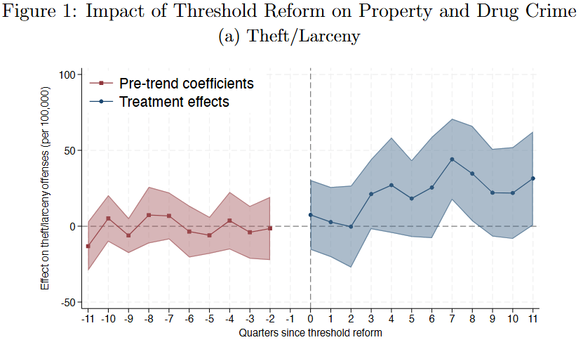
In the quarters leading up to a threshold change (above) we see flat pre-trend with a coefficient of zero i.e. nothing happening. Nothing happening is good, it means that neither law enforcement nor criminals exhibit any sign of anticipating the change. Once a given state makes the change, we see an uptick in rates of theft within 6 months that persists for three years. Speculating beyond that is dangerous – too many other things happening in the world. But criminals seem to be responding.
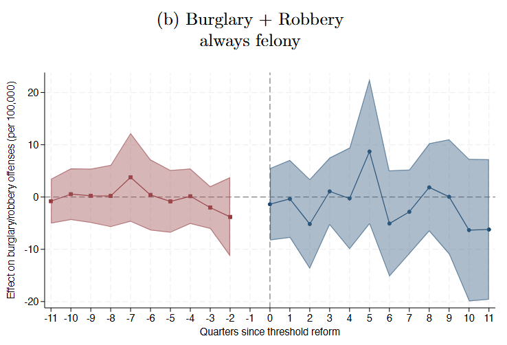
We don’t see any effect on Burglary or Robbery, however (below). This is also a sign of rational criminals since these thresholds don’t apply (i.e. they are always a felony, regardless of property value). In other words, we don’t see an effect on all property crime, just on those crimes for which expected punishment is reduced.
We do, however, see an interested effect on drug distribution (below). In the quarters after a theft threshold reduction, we see a significant and persisting reduction in drug arrests. Yes, we include controlling covariates for medical and recreational marijuana legalization. There’s something else going on here. Are people exiting one income-generating crime for another?
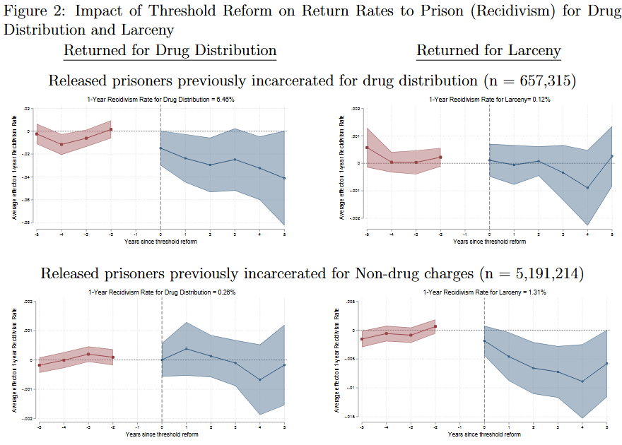
This is where recidivism comes in. Using detailed, restricted-access, prisoner records, we track when prisoners are released and if/when they are returned to prison. By stratifying the analysis by the crime types they were previously incarcerated for, we can separately estimate the effects of felony threshold changes on individuals with human and social capital in the drug distribution business from those who do not. What we observed is both striking and subtle.
For indidividuals previously incarcerated for drug distribution (top left), their rate of return for future drug convictions is immediately lower with a reduction in the felony threshold. For those who were never in the drug trade, there is no effect (bottom left). Reducing the expected punishment for theft is pulling individuals out of the drug business.
Now let’s look at the return rate for felony larceny. For most prisoners (bottom right), there is a massive reduction in the rate of return for larceny. This makes complete sense – if more theft is classified as a misdemeanor, you are much less likely to be re-incarcerated with a new sentence for it. When we look at prisoners previously incarcerated for drug distribution, however, there is no observed effect (apologies for the changing y axis scales, there’s no good way to keep them constant). What does this mean? We interpret this as evidence that the reduction in punishment for theft is canceled out by the shift into theft as a preferred way of earning income. The labor substitution effect cancels out the effect of reduced punishment.
There’s obviously a lot more in the paper. No, there is not an effect on violent crime (Table 2). No, there is not an observed effect on officer enforcement intensity (Appendix Table A3). No, we can’t do a regression discontinuity at the threshold values (too much bunching, see Appendix Figure A7). The conclusions are both obvious and subtle, but the most important may simply be the reminder that all policies have tradeoffs and spillovers, no matter how narrow they might seem.
TLDR; When states increase the property value threshold delineating misdemeanor from felony theft, prospective criminals respond by a) committing more theft and b) substituting out of drug distribution and into theft. This pattern of substitution in the criminal labor market is more evidence that criminals are not only rational and respond to deterrence incentives, but are also selecting across criminal options, which means we should expect spillovers across crimes when policies create differential changes in expected punishments, enforcement, and returns.