Messy Disability Records in the Historical Censuses

The historical US Census roles of disability among free persons are a mess. Specifically for the 1850-1870 censuses, the census bureau was not professionalized and the pay was low (a permanent office wasn’t founded until 1902). So, the enumerators were temporary employees and weren’t experts of their art. To boot, their handwriting wasn’t always crystal clear. Second, training for disability enumeration was even less complete and enumerators did their best with whom they encountered and how they understood the instructions. Finally, the digitized data in IPUMS doesn’t perfectly match the census reports. What a mess.

Guilty by Association

Disabled people and their families often misreported their status out of embarrassment or shame. Given that enumerators had quotas to fill, they were generally not inclined to investigate claimed statuses strenuously. Furthermore, disabled people were humans and not angels. Sometimes they themselves didn’t want to be associated with other types of disabled people. In particular, the disability designation in question (13) on the 1850 census questionnaire asked  “Whether deaf and dumb, blind, insane, idiotic, pauper or convict”. Saying “yes” may put you in company that you don’t prefer to keep.

Summer censuses also sometimes missed deaf students who were traveling to or from a residential school.

Enumerator Discretion

The enumerator’s job was to write the disability that applied. What counts as deaf and dumb? That’s largely at the enumerator’s discretion. Some enumerators wrote ‘deaf’ even though that wasn’t an option. Was that shorthand for ‘Deaf and Dumb’? Or were they specifying that the person was deaf only and not dumb? We don’t know. But we do know that they didn’t follow the instructions. What if a person was both insane and blind? Then what should be written? “Blind/Insane” or “Blind and Insane” or “In-B” and any number of combinations were written. Some of them are easier to read than others.

Data Reading Errors

IPUMS is the major resource for using census data. The historical data was entered by foreign data-entry workers who didn’t always speak English. So, the records aren’t perfect. Some of the records are corroborated with Optical Character Recognition (OCR), but the historical script is sometimes hard to read. Finally, the fine folks at familysearch.org and Brigham Young University have used Church of Latter Day Saints (LDS) volunteers to proof data entries. Regardless, we know that the IPUMS data isn’t perfect and that the disability data is far from perfect. Usually, reports don’t dwell on it. They simply say that the data is incomplete.

The disability data is incomplete for a lot of reasons related to the respondent, the enumerator, the instructions, and the digital data creation. What a mess.

Optimal Protein Consumption in the 21st Century: A Model

I’ve discussed complete proteins before. I’ve talked about the ubiquity of protein, animal protein prices, vegetable protein prices, and a little but about protein hedonics. My coblogger Jeremy also recently posted about egg prices over the past century. Charting the cost of eggs is great for identifying egg affordability. But a major attraction of eggs is that they are a ‘complete protein’. So how much of that can we afford?

Here I’ll outline a model of the optimal protein consumption bundle. What does this mean? This means consuming the quantities of protein sources that satisfy the recommended daily intake (RDI) of the essential amino acids and doing so at the lowest possible expenditure. Clearly, this post includes a mix of both nutrition and economics.  Since a comprehensive evaluation that includes all possible foods would be a heavy lift, here I’ll just outline the method with a small application.

Consider a list of prices for 100 grams of Beef, Eggs, and Pork.* We can also consider a list that identifies the quantity that we purchase in terms of hundreds of grams. Therefore, the product of the two yields the total that we spend on our proteins.

Of course, not all proteins are identical. We need some characteristics by which to compare beef, eggs, and pork. Here, I’ll use the grams of essential amino acids in 100 grams of each protein source. Because there are different RDIs for each amino acid, I express each amino acid content as a proportion of the RDI (represented by the standard molecular letter).

Then, we can describe how much of the RDI of each amino acid that a person consumes by multiplying the amino acid contents by the quantities of proteins consumed.

Our goal is to find the minimum expenditure, B, by varying the quantities consumed, Q, such that the minimum of C is equal to one. If the minimum element of C is greater than one, then a person could consume less and spend less while still satisfying their essential amino acid RDI. If the minimum element is less than one, then they aren’t getting the minimum RDI.

How do we find such a thing? Well, not algebraically, that’s for sure. I’ll use some linear programming (which is kind of like magic, there’s no process to show here).

The solution results in consuming only 116.28 grams of Pork and spending $1.093 per day. The optimal amino acid consumption is also below. Clearly, prices change. So, if eggs or beef became cheaper relative to pork, then we’d get different answers.

In fact, we have the price of these protein sources going back almost every month to 1998. While pork is exceptionally nutritious, it hasn’t always been most cost effective. Below are the prices for 1998-2025. See how the optimal consumption bundle has changed over time – after the jump.

Continue reading

A Forgotten Data Goldmine: Foreign Commerce and Navigation Reports

Economists rely on trade data. The historical Foreign Commerce and Navigation of the United States reports detailed monthly figures on imports, exports, and re-exports. This dataset spans decades, providing a crucial resource for researchers studying price movements, consumption patterns, and the effects of war on global trade.

The U.S. Department of Commerce compiled these reports to track the nation’s commercial activity. The data cover a vast range of commodities, including coffee, sugar, wheat, cotton, wool, and petroleum. Officials recorded trade flows at a granular level, enabling economists to analyze seasonal fluctuations, wartime distortions, and postwar recoveries. Their inclusion of re-export figures allows for precise estimates of domestic consumption. Researchers who ignore re-exports risk overstating demand by treating imports as goods consumed rather than goods in transit.

Continue reading

Excel’s Weird (In)Convenience: COUNTIF, AVERAGEIF, & STDEVIF

Excel is an attractive tool for those who consider themselves ‘not a math person’.  In particular, it visually organizes information and has many built-in functions that can make your life easier. You can use math if you want, but there are functions that can help even the non-math folks

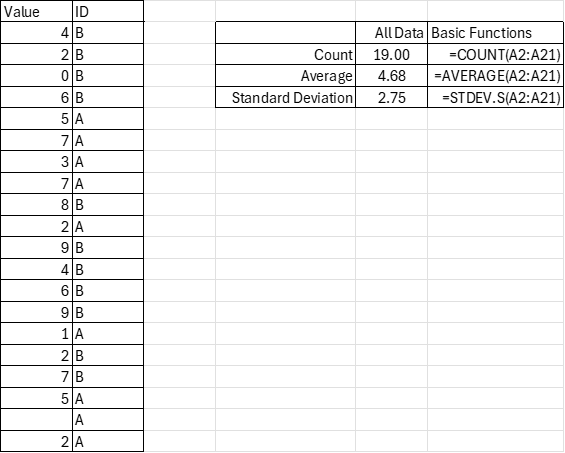
If you are a moderate Excel user, then you likely already know about the AVERAGE and COUNT functions. If you’re a little but statistically inclined, then you might also know about the STDEV.S function (STDEV is deprecated). All of these functions are super easy and only have one argument. You just enter the cells (array) that you want to describe, and you’re done. Below is an example with the ‘code’ for convenience.

=COUNT(A2:A21)
=AVERAGE(A2:A21)
=STDEV.S(A2:A21)

If you do some slightly more sophisticated data analysis, then you may know about the “IF” function. It’s relatively simple; if a proposition is true (such as a cell value condition), then it returns a value. If the proposition is false, then it returns another value. You can even create nested “IF”s in which a condition being satisfied results in another tested proposition. Back when excel had more limited functions, we had to think creatively because there was a limit to the number of nested “IF” functions that were permitted in a single cell. Prior to 2007, a maximum of seven “IF” functions were permitted. Now the maximum is 64 nested “IF”s. If you’re using that many “IF”s, then you might have bigger problems than the “IF” limitations.

Another improvement that Excel introduced in 2019 was easier array arguments. In prior versions of Excel, there was some mild complication in how array functions must be entered (curly brackets: {}). But now, Excel is usually smart enough to handle the arrays without special instructions.  Subsequently, Excel has introduced functions that combine the array features with the “IF” functions to save people keystrokes and brainpower.

Looking at the example data we see that there is an identifier that marks the values as “A” or “B”. Say that you want to describe these subgroups. Historically, if you weren’t already a sophisticated user, then you’d need to sort the data and then calculate the functions for each subgroup’s array. That’s no big deal for small sets of data and two possible ID values, but it’s a more time-consuming task for many possible ID values and multiple ID categories.

The early “IF” statements allowed users to analyze certain values of the data, such as those that were greater than, less than, or equal to a particular value. But, what if you want to describe the data according to criteria in another column (such as ID)? That’s where Excel has some more sophisticated functions for convenience. However, as a general matter of user interface, it will be clear why these are somewhat… awkward.

Continue reading

Services, and Goods, and Software (Oh My!)

When I was in high school I remember talking about video game consumption. Yes, an Xbox was more than two hundred dollars, but one could enjoy the next hour of that video game play at a cost of almost zero. Video games lowered the marginal cost and increased the marginal utility of what is measured as leisure. Similarly, the 20th century was the time of mass production. Labor-saving devices and a deluge of goods pervaded. Remember servants? That’s a pre-20th century technology. Domestic work in another person’s house was very popular in the 1800s. Less so as the 20th century progressed. Now we devices that save on both labor and physical resources. Software helps us surpass the historical limits of moving physical objects in the real world.


There’s something that I think about a lot and I’ve been thinking about it for 20 years. It’s simple and not comprehensive, but I still think that it makes sense.

  • Labor is highly regulated and costly.
  • Physical capital is less regulated than labor.
  • Software and writing more generally is less regulated than physical capital.


I think that just about anyone would agree with the above. Labor is regulated by health and safety standards, “human resource” concerns, legal compliance and preemption, environmental impact, and transportation infrastructure, etc. It’s expensive to employ someone, and it’s especially expensive to have them employ their physical labor.

Continue reading

IPUMS Data Intensive Workshop & Conference

I just returned from the Full Count IPUMS data workshop at the Data-Intensive Research Conference that was hosted by the Network on Data Intensive Research on Aging and IPUMS. The theme of this conference was “Linking Records”.

It was the best workshop and conference that I’ve ever attended. I’d attended the conference remotely in the past. But attending the workshop was exceptional. Myself and about 20 other people were flown to the Minneapolis Population Center and put up in a hotel during our stay (that made the conference a low-stress affair). The whole workshop was well organized, the speakers built on one another’s content, and there was a hands-on lab for us to complete. I felt my human capital growing by the hour.  

Continue reading

Fossil Fuel Frenzy: The Driving Force Behind US Extractive Growth

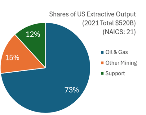
What with all the talk about semi-conductor production and rare-earth mineral extraction, I think that it’s worth examining what the USA produces in terms of what we get out of the ground. This includes mining, quarrying, oil and natural gas extraction, and some support activities (I’ll jump more into the weeds in the future). I’ll broadly call them the ‘extractive’ sectors. How important are these industries? In 2021 extractive production was worth $520 billion. That was roughly 2% of all GDP. Below is the break down by type of extraction.

Examining the graph of total extraction output below tells a story. The US increased production of extracted material substantially between the Great Depression and 1970.  That’s near the time that the clean water and clean air acts were passed. But the change in the output growth rate is so stark, that I suspect that those were not the only causes of change (reasonable people can differ). For the next 40 years, there was a malaise in output. This was the period during which it was popular to talk about our natural resource insecurity. As in, if we were to be engaged in a large war, then would we be able to access the necessary materials for wartime production?  

https://fred.stlouisfed.org/graph/?g=1kWNU

But for the past 15 years we’ve experienced a boom with extracted output rising by 50%, an average growth rate of 2.7% per year. That’s practically break-neck speeds for an old industry at a time when the phrase ‘great stagnation’ was being thrown about more generally. By 2023, we were near all-time-high output levels (pre-pandemic was higher by a smidge).

For people concerned about resource security, the recent boom is good news. For people who associate digging with environmental degradation, greater extraction is viewed with less enthusiasm. Those emotions are especially high when it comes to fossil fuel production. Below is a graph that identifies the three major components of extraction indexed to the 2021 constant prices. By indexing to the relative outputs of a particular year, the below graph is a close-ish proxy to real output that is comparable in levels.

Continue reading

Counting Jobs (Revisited)

In January 2023 I had a post looking at the different ways that the Bureau of Labor Statistics measures employment. Those who follow the data closely probably know about the difference between the household and establishment surveys, which the monthly jobs report data is based on. But these are just surveys.

The more comprehensive data (close to the universe of workers, roughly 95%) is the Quarterly Census of Employment and Wages. While more comprehensive, this data comes out with a much longer lag, and is only released once per quarter. The QCEW is just the raw count of workers, which is useful in some ways, but we also know that there are normal seasonal fluctuations, which the QCEW doesn’t adjust for. Therefore, year-over-year changes in jobs are the best way to look at trends in this data. In September 2023 (latest month available), the US had 2.25 million more workers than in the previous September. For comparison, the establishment survey showed an increase of 3.13 million jobs that month, and the household survey showed a change of 2.66 million — suggesting they both might be overstating job growth.

Still with me? Here’s one more set of jobs data: the Business Employment Dynamics data. This dataset is built on the QCEW data, but allows more fine detailed insights into what types and sizes of firms are gaining or losing jobs. Like the QCEW, the most recent data is for the 3rd quarter of 2023 (just released today), but when looking at the aggregate data, it has one advantage over the QCEW: it is seasonally adjusted, so we can look at the most recent quarterly change (not really useful for not-seasonally-adjusted data). The BED data also looks only at private sector jobs, so it is looking at the health of the private labor market (and ignoring changes in government employment).

The latest BED data do show a possibly worrying trend: the 3rd quarter of 2023 showed a net loss of 192,000 private-sector jobs. That’s the first loss since the height of the pandemic, and ignoring the first half of 2020, the only quarterly decline since 2017. Here’s the chart (note: y-axis is truncated because the 2020q2 job loss is so large it makes the chart unreadable):

I should note that this data is subject to revisions, even though the QCEW is mostly complete. The second quarter of 2022 originally showed a decline, but that was later revised upwards as QCEW is updated and seasonal adjustment factors are updated. Still as, this data stands, it is a worrying jobs number that differs from the monthly surveys. For the change from 2023q2 to 2023q3, the establishment survey shows a gain of 640,000 jobs and the household survey also shows a gain of 546,000. Like the QCEW raw data, the BED seasonally adjusted data suggests that the monthly surveys may be overstating job growth.

Coffee’s Supply & Demand Dance during Prohibition

I’ve written about coffee consumption during US alcohol prohibition in the past. I’ve also written about visualizing supply and demand. Many. Times. Today, I want to illustrate how to use supply and demand to reveal clues about the cause of a market’s volume and price changes. I’ll illustrate with an example of coffee consumption during prohibition.

The hypothesis is that alcohol prohibition would have caused consumers to substitute toward more easily accessible goods that were somewhat similar, such as coffee. To help analyze the problem, we have the competitive market model in our theoretical toolkit, which is often used for commodities. Together, the hypothesis and theory tell a story.

Substitution toward coffee would be modeled as greater demand, placing upward pressure on both US coffee imports and coffee prices. However, we know that the price in the long-run competitive market is driven back down to the minimum average cost by firm entry and exit. So, we should observe any changes in demand to be followed by a return to the baseline price. In the current case, increased demand and subsequent expansions of supply should also result in increasing trade volumes rather than decreasing.

Now that we have our hypothesis, theory, and model predictions sorted, we can look at the graph below which compares the price and volume data to the 1918 values. While prohibition’s enforcement by the Volstead act didn’t begin until 1920, “wartime prohibition” and eager congressmen effectively banned most alcohol in 1919. Consequently, the increase in both price and quantity reflects the increased demand for coffee. Suppliers responded by expanding production and bringing more supplies to market such that there were greater volumes by 1921 and the price was almost back down to its 1918 level. Demand again leaps in 1924-1926, increasing the price, until additional supplies put downward pressure on the price and further expanded the quantity transacted.

We see exactly what the hypothesis and theory predicted. There are punctuated jumps in demand, followed by supply-side adjustments that lower the price. Any volume declines are minor, and the overall trend is toward greater output. The supply & demand framework allows us to image the superimposed supply and demand curves that intersect and move along the observed price & quantity data. Increases toward the upper-right reflect demand increases. Changes plotted to the lower-right reflect supply increases. Of course, inflation and deflation account for some of the observed changes, but similar demand patterns aren’t present in the other commodity markets, such as for sugar or wheat. Therefore, we have good reason to believe that the coffee market dynamics were unique in the time period illustrated above.


*BTW, if you’re thinking that the interpretation is thrown off by WWI, then think again. Unlike most industries, US regulation of coffee transport and consumption was relatively light during the war, and US-Brazilian trade routes remained largely intact.

Interpolation Vs Transition

Sometimes you read an academic article and the author fills in the data gaps with interpolation. That is, they assume some functional form of the data and then replace the missing values with the estimated ones. Often, lacking an informed opinion about functional form, authors will just linearly interpolate between the closest known values. Sometimes this method is OK. But sometimes we can do better.

Historical census data provides a good example because the frequency was only every ten years. Say that we want to know more about child migration patterns between 1850 and 1860. What happened in the intervening years? Who knows. Let’s look at the data.

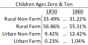
Using data on individuals who have been linked across censuses allows us to fill in the gaps a little bit. For simplicity, let’s just look at whether a child migrant lived in an urban location and whether they lived on a farm. That means that there are 4 possible ways to describe their residence. Below is a summary of where children migrants lived at the age of zero in 1850 and where the same children lived a decade later at the age of ten in 1860 given that they moved counties.

When I’m the mean time did these children move from one place and to the other? We don’t know exactly. The popular answer is to say that they moved uniformly throughout the decade. That’s ‘fine’. But it assumes that the rate at which people departed places was rising and the rate at which they arrived places was falling. Maybe that’s true, but we don’t really know. Below-left is a graph that shows the linear interpolation.

The nice thing about linear interpolation is that everyone is accounted for at each point in time. The total number of people don’t rise or fall in the intervening interpolation period. But if we were to assume that children departed/arrived at each type of place at a constant rate (maybe a more reasonable assumption), then suddenly we lose track of people. That is, the sum of people dips below 100% as people depart faster than they arrive.

What’s the alternative to linear interpolation?

Continue reading