State tax revenue is down a lot since last year. The latest comparable data from Census’s QTAX survey is for the 2nd quarter of 2023, and it shows a massive hit: state tax revenue was down 14% from the same quarter in 2022, which is about $66 billion. Almost all of that decline is from income tax revenue, specifically individual income tax revenue which is down over 30% (almost $60 billion). General sales taxes, the other workhorse of state budgets, is essentially flat over the year.
That’s a huge revenue decline! So, what’s going on? In some states, there has been an attempt to blame recent tax cuts. It’s not a bad place to start, since half of US states have reduced income taxes in the past 3 years, mostly reducing top marginal tax rates. But that can’t be the full explanation, since almost every state saw a reduction in revenue: just 3 states had individual income tax revenue increases (Louisiana, Mississippi, and New Hampshire) from 2022q2 to 2023q2, and they were among the half of states that reduced rates!
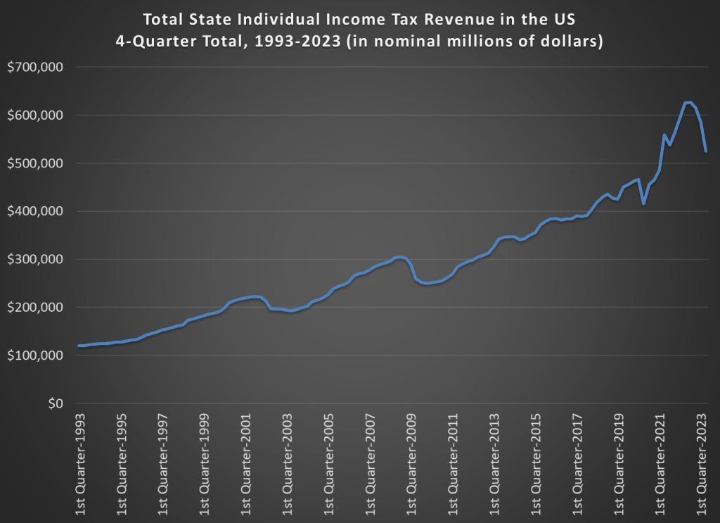
To get some perspective let’s look at long-run trends. This chart shows total state individual income tax revenue for all 50 states (sorry, DC) going back to 1993. I use a 4-quarter total, since tax receipts are seasonal (and because states sometimes move tax deadlines due to things like disasters, a specific quarter can sometimes look weird). And importantly, this data is notinflation adjusted. Don’t worry, I will do an adjustment further below in this post, but for starters let’s just look at the nominal dollars, because nominal dollars are how states receive money!
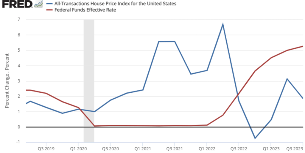
The third quarter ‘All Transaction’ housing price data was just released this week. These numbers are interesting for a few of reasons. One reason is that home prices are a big component of our cost of living. Higher home prices are relevant to housing affordability. This week’s release is especially interesting because it’s starting to look like the Fed might be pausing its year 18-month streak of interest rates hikes. In case you don’t know, higher interest rates increase the cost of borrowing and decrease the price that buyers are willing to pay for a home. Nationally, we only had one quarter of falling home prices in late 2022, but the recent national growth rate in home prices is much slower than it was in 2021 through mid-2022.
Do you remember when there were a bunch of stories about remote workers and early retirees fleeing urban centers in the wake of Covid? We stopped hearing that story so much once interest rates started rising. The inflection point in the data was in Q2 of 2022. After that, price growth started slowing with the national average home price up 6.5%. But the national average masks some geographic diversity.
In the October 1980 Presidential debate, Ronald Reagan famously asked that question to the American voters. His next sentence made it clear he was talking about the relationship between prices and wages, or what economists call real wages: “is it easier for you to go and buy things in the stores than it was four years ago?”
Reagan was a master of political rhetoric, so it’s not surprising that many have tried to copy his question in the years since 1980. For example, Romney and Ryan tried to use this phrase in their 2012 campaign against Obama. But it’s a good question to ask! While the President may have less control over the economy than some observers think, the economy does seem to be a key factor in how voters decide (for example, Ray Fair has done a pretty good job of predicting election outcomes with a few major economic variables).
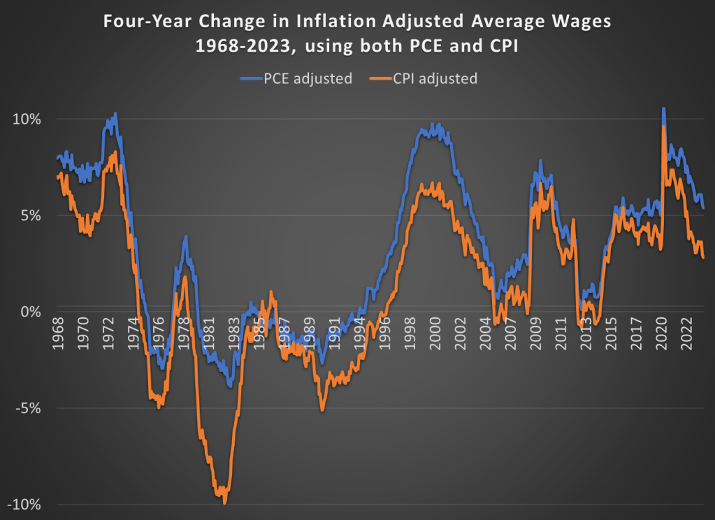
Voters in 2024 will probably be asking themselves a similar question, and both parties (at least for now) seem to be actively encouraging voters to make such a comparison. We still have 12 months of economic data to see before we can really ask the “4 years” question, but how would we answer that question right now? Here’s probably the best approach to see if people are “better off” in terms of being able to “go and buy things at the stores”: inflation-adjusted wages. This chart presents average wages for nonsupervisory workers, with two different inflation adjustments, showing the change over a 4-year time period.
Last week I gave some advice on how to save money on food. Food prices are up a lot in the past 4 years, but especially since the beginning of 2021. Over the 32 months since January 2021, grocery prices (according to the CPI) are up 20 percent (keep that number in mind). To give you an idea of how unusual that is, in the 32 months before the pandemic (up to January 2020), grocery prices only rose 2 percent. Perhaps even more astonishingly, if we look at October 2019 grocery prices, they were slightly lower on average than 4 years earlier in October 2015. From a flat 4 years to a 25 percent increase over the next 4 years. That’s a huge change for consumers.
But we also shouldn’t overstate the price increases. As you might guess, the best place for overstatements is social media. You can find plenty of them. For example, this very viral video claims that her family’s grocery prices doubled (in fact, almost exactly doubled, to the penny, which is suspicious) in just one single year, from August 2021 to August 2022. According to the CPI data, grocery prices were up 13.5 percent over that period — which, don’t get me wrong, is a lot! But it’s not 100 percent. I’ll focus on this one example, but I’m sure you will believe me that you can find dozens of examples like this on social media every single day (for example, yesterday someone claimed bread prices had tripled since 2019).
Let’s leave aside for a moment that in that viral video she claims to spend $1,500 per month on groceries. This would be a massive outlier for 2022. A family in the middle income quintile spent $460 per month on groceries in 2022, and $713 on all food including restaurants. So even if this family eats every single meal at home, they are still spending twice as much as a middle income family. Even a family with 5 or more people (the largest bucket BLS uses in that report) spent $755 per month on groceries ($1,232 on all food). According to the Consumer Expenditure survey, the middle quintile grocery spending went up 16%, and the five-person household went up 19% from 2021 to 2022. Big increases, no doubt! But not 100%.
So who are we to believe? Have prices roughly doubled since 2021? Or are they up about 20 percent? People are sometimes skeptical of the consumer price index, so let’s look at the actual price data that goes into the index. BLS has data on hundreds of individual food items, but here’s a summary chart with eight common food items. Here’s the change in the prices of those items since January 2021:
It’s the time of the year when we share ideas for things to buy, possibly as Christmas or other holiday gifts. But I’m going to share with you not a specific thing to buy, but instead a method for buying things. And probably not the kind of thing you might think of sticking in a wrapped present: food.
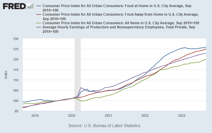
We’ve all heard about and felt inflation lately. But food prices have been especially noticeable to consumer, and not just because it’s a product you frequently buy and probably know the price of many food items. Food prices, both at home and restaurants, have increased much more than the average price levels.
On average, prices are up about 20 percent in the US over the past 4 years. But food prices are up about 25 percent, on average.
Wages (the purple line) actually have increase faster than the general price level over the past 4 years — that may shock you given what we constantly hear in the traditional and social media about “price increases outpacing wage gains” — but it is true when we are talking about food. Your dollar doesn’t go quite as far as it used to for food.
In some sense these costs are hard to avoid: food is a necessity. But there are ways to reduce your costs, and you probably know the general tips. Eat less at restaurants. Buy generic. Buy in bulk. Etc. These are good tips, but they all involve some sacrifice or annoyance. Is there anything else a consumer can do?
Yes. Here’s a few tips that can save you money, without the sacrifice. There is some thought involved, and perhaps a slight annoyance, but I’ve found that once you get in these habits, the mental and time cost is pretty low.
1. RESTAURANT APPS
You should always be ordering your food through restaurant apps when possible, especially for fast food. I try to track limited good deals on Twitter, but most restaurants offer on-going good deals. For example, McDonalds usually has a 20% off coupon, just for using the app. Taco Bell has a $6 box you can build, which would cost around $10 to order as a combo or à la carte at the restaurant. That’s a 40% discount for using the app.
Using apps also means you are using the restaurant’s rewards programs. Valuations vary, but McDonald’s rewards are roughly worth 10% cash back.
2. CHASE THE SALES AT GROCERY STORES
Clipping coupons is the classic way of saving money at the grocery store (we even have reality shows about it), but in the modern world grocery stores have expanded the ways to effectively save the same amount of money. The clearest example is, once again, the rise of apps. Stores will often have “digital only” coupons that you need to access through their app (which is also tied to your rewards account, just like restaurants).
While I’m a strong advocate of coupon clipping (and the virtual equivalent), it can be time consuming. Another strategy that can save you is thinking ahead about seasonal and other cyclical prices. For example, my kids like M&M’s. We usually buy a bulk 62-ounce container at Sam’s Club (already a savings), but today I took the additional saving step of buying the Halloween-themed bulk container. It was 36 percent less than the identical Christmas-themed M&M’s container right next to it. And I was replacing the Easter-themed bulk container that we purchased back in April, and they just finished.
Of course, I had to be planning ahead and know that November 1st was a great day to buy M&M’s. That takes some mental effort, sure. And you might think these kinds of deals are fairly limited in nature. But holidays aren’t the only kind of seasonal deals. For example, even though most fruit is generally available year-round now, there are still predictable price cycles of when things are “in season” and when they have to be imported from expensive locations. Even if you are only able to find these cyclical deals for 10 percent of your purchases, saving 30-50% on cyclical goods will shave another 3-5% off your grocery bill — bringing it closer in line to the average increase in prices (and wages).
3. CASH BACK CREDIT CARDS
I could write an entire post about credit card rewards. But let me focus here on credit cards that are especially good for buying food. At a minimum you should be getting 2 percent back on all of your purchases, as there are several no-annual-fee cards that give you 2 percent: the Citi Double Cash and Wells Fargo Active Cash are good examples.
But on food purchases, you should be able to beat 2 percent. For example, the Citi Custom Cash card gives you 5 percent back on your top spending category each month, up to $500 of spending. This can be on either groceries or restaurants. And since a family in the median quintile spends $250 at restaurants and $460 on groceries per month, you should be getting 5 percent back on basically all of your purchases in one of these two categories. (Personally I stick to restaurants for this card, because I buy most of my groceries at Walmart and Sams Club, which don’t count towards the grocery cash back.) Or if you want a simple card that gives you 3 percent back on both groceries and restaurants, check out the Capital One SavorOne card (again, no annual fee).
There are also several cards that have rotating 5 percent cash back categories each quarter, and they often include either restaurants or groceries. How do I keep track of which card to use for what kind of purchase? Simple: put a strip of masking tape on the card with a label. This will get some chuckles from your friends or the server at the restaurant, but that’s just an opportunity to tell them how to save money too!
Is There Really a Free Lunch?
Some of my economist friends are probably skeptical at this point. Aren’t I say there is a free lunch here? Isn’t the extra hassle of the steps I suggested going to outweigh any discount you get?
The answer is No. And while economists are quick to bring up the concept of opportunity cost, I find that most people tend to overestimate their opportunity cost. But even if you don’t overestimate your opportunity cost, you can bring in another useful economic concept: price discrimination.
Restaurants are very much in the business of price discrimination, and always have been. Tuesday Night specials, happy hours, etc. Every consumer has a different willingness to pay, and since it’s hard to resell a restaurant meal, restaurants can potentially use this technique to their advantage (and yours, if you are willing to look for discrimination). Grocery stores don’t have as much of an opportunity to discriminate, but they still find ways.
Don’t be afraid of price discrimination: use it to your advantage!
Inflation has been constantly in the news over the past 2 years, but it has especially been in the news lately with regards to one country: Argentina. That country has been experiencing triple-digit annual inflation lately, and it has become one of the key issues in the current presidential race.
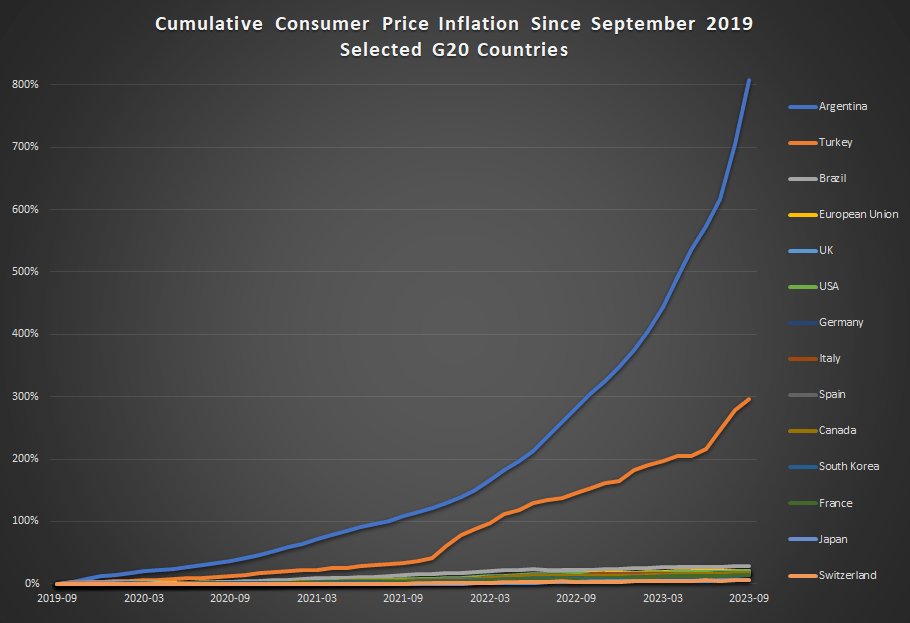
How bad is inflation in Argentina? Here’s a comparison to some other G20 countries from September 2019 through September 2023 (data from the OECD).
Cumulative consumer price inflation in Argentina over the past 4 years is over 800 percent. That means goods which cost 100 pesos in September 2019 now costs 900 pesos, on average. Well, they did in September. It’s almost November now, so if the recent inflation rates persisted, those goods are around 1,000 pesos now.
Turkey also stands out as a country with very rapid inflation the past 4 years — without Argentina on the chart, Turkey would clearly stand out from the rest. But other than Turkey, all the other countries are bunched at the bottom. Has there not been much difference among them? Not quite.
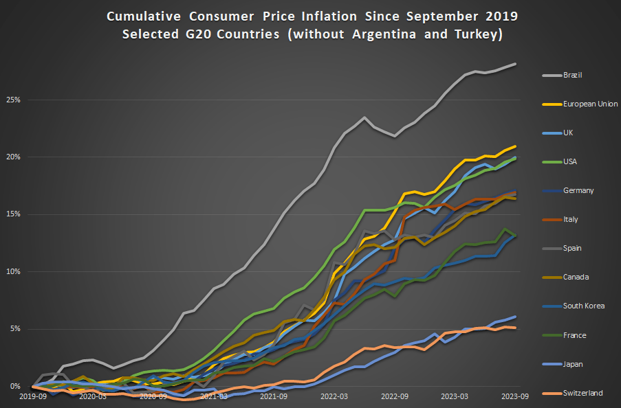
This next chart removes Argentina and Turkey:
In this second chart we see two standouts on the opposite end of the spectrum: Japan and Switzerland have had extremely low inflation, just 6 and 5 percent cumulatively since late 2019 (and this is not unusual for these two countries in recent history).
For us here in the USA, things don’t look so good. Only Brazil and the EU are higher (and the EU is mostly due to energy price inflation in Eastern Europe), so other than that we are basically tied with the UK for the worst inflation performance among very high income countries during the pandemic. That’s bad news! But perhaps one silver lining is that average wages in the US have outpaced inflation slightly: 23 percent vs 20 percent growth over this time period. That’s not much to celebrate — except relative to most of the rest of the world.
The last post where I attempted a macro prescription was in April 2022, when I said the Fed was still under-reacting to inflation. That turned out right; since then the Fed has raised rates a full 500 basis points (5 percentage points) to fight inflation. So I’ll try my luck again here.
Headline annual CPI inflation has fallen from its high of 9% at the peak last year to 3.7% today. Core PCE, the measure more closely watched by the Fed, is at a similar 3.9%. Way better than last year, but still well above the Fed’s target of 2%. Are these set to fall to 2% on the current policy path, or does the Fed still need to do more?
The Fed’s own projections suggest one more rate hike this year, followed by cuts next year. They expect inflation to remain a bit elevated next year (2.5%), and that it will take until 2026 to get all the way back to 2.0%. They expect steady GDP growth with no recession.
What do market-based indicators say? The yield curve is still inverted (usually a signal of recession), though long rates are rising rapidly. The TIPS spread suggests an average inflation rate of 2.18% of the next 5 years, indicating a belief the Fed will get inflation under control fairly quickly. Markets suggest the Fed might not raise rates any more this year, and that if they do it will only be once. All this suggests that the Fed is doing fine, and that a potential recession is a bigger worry than inflation.
Some of my other favorite indicators muddy this picture. The NGDP gap suggests things are running way too hot:
M2 shrank in the last month of data, but has mostly leveled off since May, whereas a year ago it seemed like it could be in for a major drop. I wonder if the Fed’s intervention to stop a banking crisis in the Spring caused this. Judging by the Fed’s balance sheet, their buying in March undid 6 months of tightening, and I think that underestimates its impact (banks will behave more aggressively knowing they could bring their long term Treasuries to the Fed at par, but for the most part they won’t have to actually take the Fed up on the offer).
The level of M2 is still well above its pre-Covid trend:
Before I started looking at all this data, I was getting worried about a recession. Financial markets are down, high rates might start causing more things to break, the UAW strike drags on, student loan repayments are starting, one government shutdown was averted but another one in November seems likely. After looking at the data though, I think inflation is still the bigger worry. People think that monetary policy is tight because interest rates have risen rapidly, but interest rates alone don’t tell you the stance of policy.
I’ll repeat the exercise with the Bernanke version of the Taylor Rule I did in April 2022. Back then, the Fed Funds rate was under 0.5% when the Taylor Rule suggested it should be at 9%- so policy was way too loose. Today, the Taylor Rule (using core PCE and the Fed’s estimate of the output gap) suggests:
3.9% + 0.5*(2.1%-1.8%) + 0.5%*(3.9%-2%) + 2% = 7%
This suggests the Fed is still over 1.5% below where they need to be. Much better than being 9% below like last April, but not good. The Taylor rule isn’t perfect- among other issues it is backward-looking- but it tends to be at least directionally right and I think that’s the case here. Monetary policy is still too easy. Fiscal policy is still way too easy. If current policy continues and we don’t get huge supply shocks, I think a mild “inflationary boom” is more likely than either stagflation or a deflationary recession.
She mentioned multiple factors that make the near future hard to predict, from the effect of A.I. on jobs to the war in Ukraine.
In the pre-pandemic world, we typically thought of the economy as advancing along a steadily expanding path of potential output, with fluctuations mainly being driven by swings in private demand. But this may no longer be an appropriate model.
For a start, we are likely to experience more shocks emanating from the supply side itself.
Large-scale reallocations can also lead to rising prices in growing sectors that cannot be fully offset by falling prices in shrinking ones, owing to downwardly sticky nominal wages. So the task of central banks will be to keep inflation expectations firmly anchored at our target while these relative price changes play out.
And this challenge could become more complex in the future because of two changes in price- and wage-setting behaviour that we have been seeing since the pandemic.
First, faced with major demand-supply imbalances, firms have adjusted their pricing strategies. In the recent decades of low inflation, firms that faced relative price increases often feared to raise prices and lose market share. But this changed during the pandemic as firms faced large, common shocks, which acted as an implicit coordination mechanism vis-à-vis their competitors.
Under such conditions, we saw that firms are not only more likely to adjust prices, but also to do so substantially. That is an important reason why, in some sectors, the frequency of price changes has almost doubled in the euro area in the last two years compared with the period before 2022.
Once Covid changed our lives so much, then things kept changing. Firms are raising prices because consumers got used to change.
After reading her interesting speech, I had to know more about C. Lagarde. On Wikipedia, I discovered:
After her baccalauréat in 1973, she went on an American Field Service scholarship to the Holton-Arms School in Bethesda, Maryland.[18][19] During her year in the United States, Lagarde worked as an intern at the U.S. Capitol as Representative William Cohen’s congressional assistant, helping him correspond with French-speaking constituents from his northern Maine district during the Watergate hearings.
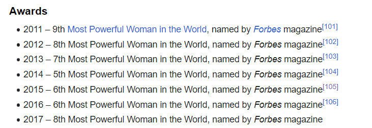
Since my post about “awards for young talent” was found and shared on Twitter, I have continued thinking about it. According to Wiki, C. Lagarde has received several prestigious awards. Her progression through the “Most Powerful Woman in the World” ranking is something.
Imagine being that close to the top back in 2015 and getting beat out by American Melinda Gates. But today, Lagarde is winning over both Melinda French Gates and Kamala Harris. Will an economist climb to #1? Lagarde is currently sitting at #2 when I checked the Forbes website.
You may have heard that there is a new viral song which deals with a few economic issues. Noah Smith has a good analysis of “Rich Men North of Richmond,” which he mostly finds to be incorrect in its analysis (for example, of welfare policy). But Smith does say that the song has a point: manufacturing wages haven’t performed well in recent years. Not only has pay for factory workers “[lagged] the national average in recent years,” for those workers in Virginia, it’s lower in real terms than in 2010.
Well that all doesn’t sound good! Smith is only going back to about 2000 with the data he shows. What if we took a longer run perspective? What if we took a really long-run perspecitive?
Here’s wages for blue-collar factor workers that goes back to 1939 in the US:
The wage data (for manufacturing production workers) is from BLS and the PCE price index is from the BEA. What do you notice as you look at the data?
First, it is true that the last 20 years or so hasn’t been great. Only about 8% cumulative growth since 2002. That’s not great!
But as you look back further, you’ll notice that gains are substantial. Compared to what some might consider the “golden age” of manufacturing wages, the early 1950s, real wages have roughly doubled. It’s true, the growth rate from 1939-1973 is much, much better than the following 50 years. Wouldn’t it be nice if that growth rate had continued! But no doubt you’ve seen many memes saying something like “in the 1950s you could support a family on one high-school graduate income, but not today!” This data suggests that view of the 1950s is a little distorted by nostalgia.
One final thing to note: we might think that one big change in recent decades is that a lot more compensation goes to benefits, rather than wages. There’s actually a total compensation series for blue-collar workers going all the way back to 1790:
The total compensation data, as well as the CPI data that I used to inflation-adjust the figures (to 2022 dollars), comes from the fantastic resource Measuring Worth. This is a total compensation measurement, so it includes benefits, but the source data tells us that up until the late 1930s, it’s really just a wage measure. So potentially we could splice this together with the above chart, to get a “wage only” series covering the entire history of the US.
However, when we look at total compensation, we still see the post-1970s stagnation. Real compensation is roughly the same as about 1977. Yikes! Note here that we’re using the CPI, since the PCE index only goes back to 1929, and the CPI tends to overstate inflation (yes, that’s right, sorry CPI truthers). Still, it’s not the most optimistic picture.
Or isn’t it? With all of the automation and global competition in manufacturing coming on board in the past 50 years, perhaps our baseline is that things could have been much worse. In any case, if we look at total compensation, it’s currently about double what it was in the post-WW2 era. That’s even with the dip in 2022 due to high CPI inflation.
Wages and compensation of blue-collar productions workers have indeed been growing slowly for the past few decades. That much is true. On the other hand, they are still among the highest they have ever been in history, over 50 times (not 50%, 50 times!) higher than at the birth of this nation. This ranks them as probably the highest wages anywhere in world history for an occupation that doesn’t require an advanced degree. That history is worth knowing.
I was reading “The Ultimate Guide to Barbie” the other day, and I noticed an interesting piece of data towards the end of the magazine: the original Barbie doll in 1959 retailed for $3. Today, according to the magazine, a Barbie costs around $14-19. And they further told us that adjusted for inflation, that $3 original Barbie is about $24 today.
I’m not sure exactly where they got that number. Using the BLS CPI tool, it’s more like $31.50. And while I appreciate the attempt to give us historical context, I think for the typical reader will still be a bit perplexed. What does it mean to say $3 in 1959 is equal to $24 (or $31.50) today? Well, it means that the price of Barbie dolls has risen more slowly than other goods and services (quality adjusted). But I think we can do better on the context.
Here’s my best attempt to give context:
The chart shows the number of minutes of work that the median woman would need to work to purchase a Barbie doll for her daughter. In 1959, it took almost 2 hours of work. Today, it takes only about a half hour (I’m using the lower range from the magazine, $14 for a Barbie today, although there are plenty of $10-11 Barbies on Amazon).
Another way of thinking about it: with the same amount of work, a working mother today could buy her daughter 3-4 times as many Barbies as her counterpart in 1959.
I deliberately used median female wages here to make another historical comparison. Women’s earnings have increased much more than men’s since 1959. Back then, median female earnings for full-time, year round workers was only 61% of male earnings. Today, it is close to 85%. True, that’s still not parity. And for those that know the history, you will also know that the closing of that gap has stagnated in recent years. But this is still some major progress during the Barbie Era.
Finally, as I have emphasized before, looking too much at the cost of one product over time has limits. What about other goods and services? A toy, even a well-known brand like Barbie, is a tradable good that can be manufactured anywhere in the world (it looks like Indonesia is where many Barbies are made today). So it wouldn’t be surprising that it has got cheaper over time. But what about all goods and services?
Here’s where inflation adjustments are most useful. Not for individual goods and services, but for looking at incomes over time. How much stuff can a given income purchase compared to the past? That’s what inflation adjustments are for. And this chart shows male and female median earnings in 1959 and 2023, with the 1959 figures adjusted to 2023 dollars using the PCE price index.
When we adjust for changes in all prices, not just Barbies, we can see that median female earnings have roughly doubled between 1959 and 2023. That’s not quite as robust as the “Barbie standard of living,” which allows you to purchase 3-4 times as many dolls. But 2 times as much stuff is pretty good. It’s especially good when compared with male earnings growth, which grew about 44 percent.
It should be obvious here that these are just the raw medians, not controlling for anything like education, experience, or occupational choice. Controlling for those will shrink the gap a bit more. But the gains for women in the labor market since the introduction of Barbie are large and worth celebrating.