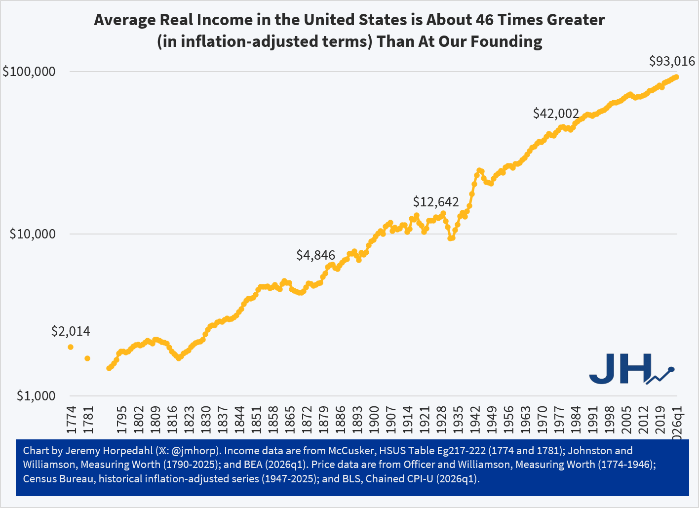
For America’s 250th birthday, my present to all of you is this chart showing our economic history. Average income in the US has increased dramatically since the country was founded. This chart attempts to provide one, continuous series, using the best available income data and inflation adjustments (well, mostly continuous — before 1790 there are just a few estimates). Sources are listed at the bottom of the chart. The y-axis is a log scale.

this is very nice, and very encouraging. Just anticipating what deniers will say, I’m wondering if you can show this by income quartiles or quintiles?
LikeLike
Thanks. It’s a fair question, but I don’t think it’s really possible to do any detailed distributional analysis before the mid-20th century.
The best we can probably do is look at manufacturing wages. This is still just an average, but useful because it will exclude management and capital owners. Using the same inflation adjustment as my chart, production wages increased from about 60 cents in 1790 (in 2026q1 dollars) to about $30 today. That’s roughly the same as the GDP per capita increase.
LikeLike
Thanks! Yeah, I think that captures the essence. It seems likely that the rise would be spread across all income levels and that’s a good piece of evidence that it’s true.
LikeLike