Last week I wrote about median income in the US, and how it had declined since 2019 and 2021 through 2022 (inflation adjusted, of course). The big story is that median income (both for households and families) has been falling in recent years. While there are some silver linings when looking at subgroups, such as Black families, the overall data isn’t good.
But while that is true for the US overall, it’s not true for every state. In fact, it’s not even true for most states! From 2019 to 2022, there were 29 states that saw their median family incomes rise! That’s adjusted for inflation (I’m using the C-CPI-U, which is Census’s preferred inflation measure for this data). The income data in this post all comes from the Census ACS 1-year estimates.
Here’s a map showing the states that had increases in median family income (green) and those that had decreases (in red). (This is my first time experimenting with Datawrapper maps, feedback appreciated!)
Some states had pretty robust growth, with New Mexico and Arizona leading the way with around 5 percent growth. There is substantial variation across US states, including with big declines like Wyoming at -5 percent, and Oklahoma and Illinois are -3 percent.
A few weeks ago I also wrote about the richest and poorest MSAs in the US. But what about the richest and poorest states in the US? The following map shows that data.
The immediate fact which will jump out at you is that the lowest income US states are almost all located in the South. This will probably not surprise most of us, although it probably is a bit surprising since the data is adjusted for differences in the cost of living (using the BEA RPP data). Even after making these adjustments, the South is still clearly the poorest region (and it definitely was the poorest without the adjustments).
Among the higher income states, they are distributed pretty well across the rest of the non-South. There are 16 states (plus DC) that have median family incomes over $100,000 (again, cost of living adjusted), and while many of these are in New England and the Mid-Atlantic, there area still a few in the Midwest, Great Plains, and the West. Utah and New Jersey have similar incomes, as do Virginia and Rhode Island.
The highest income states are Massachusetts and Connecticut, with over $112,000 in median family income, while the lowest are Mississippi and West Virginia, both under $78,000. Median family income in Massachusetts is 46 percent higher than Mississippi. And that’s after adjusting for differences in the cost of living.
This week the Census Bureau released their annual update on “Income, Poverty and Health Insurance Coverage in the United States.” This release is always exciting for researchers, because it involves as massive release of data based on a fairly large (75,000 household) sample with detailed questions about income and related matters. For non-specialists, it also generates some of the most commonly used national data on income and poverty. Have you heard of the poverty rate? It’s from this data. How about median household income? Also from this data.
I’ll focus on income data in this post, though there is a lot you could say about poverty and health insurance too. The headline result on median income is, once again, a dismal one. Whether you look at median household income (very commonly reported, even though I don’t like this measure) or median family income (which I prefer), both are down from 2021 to 2022 when adjusted for inflation. Both are still down noticeably from the pre-pandemic high in 2019 (though both are also above 2018 — we aren’t quite back to the Great Depression or Dark Ages, folks!).
These headline results are bad. There is no way to sugarcoat or “on the other hand” those results. And these results are probably more robust and representative than other measures of average or median earnings, since they aren’t subject to “composition effects” — when those with zero wages in one period don’t show up in the data. I will note that these results are for 2022, and we are highly likely to see a turnaround when we get the 2023 data in about a year (inflation has slowed to less than wage growth in 2023).
But given that obviously bad headline result, was there any good data? As I mentioned above, a ton of data, sliced many different ways, is released with this report. Some of it also gives us consistent data back decades, in some cases to the 1940s. What else can we learn from this data release?
Median Income by Race
When we look at median income by race, there are a few silver linings. The headline data from Census tells us that only the drop in household income for White, Non-Hispanics was statistically significant. For other races and ethnicities, the changes were not statistically significant from 2021 to 2022 — and some of those changes were actually positive. We shouldn’t dismiss White, Non-Hispanics — they are the largest racial/ethnic group! — but it is useful to look at others.
Black household and families are the most interesting to look at in more detail, especially because they are the poorest large racial group in the US. Black household and family income increased from 2021 to 2022, although the increase was small enough that we can’t say it is statistically significant (remember, this is a sample, not the universe of the decennial Census).
But what’s more important is that median Black household income is now at the highest level it has ever been (adjusted for inflation, as always). Median Black household income is about $1,000, or around 2 percent higher than in 2019 — the peak date for overall median income. Two percent growth over 3 years is nothing to shout from the rooftops, but it is very different from White, Non-Hispanic households, which are down over 6 percent since 2019.
Median black family income is roughly flat since 2019, but it is up about 1.5 percent in the past year — not quite as robust, but still better than the overall numbers.
Historical Income Data
The other silver lining I always like to mention is the long-run historical data. This data often gets overlooked in the obsessive focus on the most recent changes, so it’s useful to sit back and look at how far we have come. Let’s start where we just left off, with Black families. I wrote a post back in February about Black family income, which had data current through 2021, but it’s useful once again to look at the data with another year (plus they have updated the inflation adjustments for 2000 onward).
The chart shows the percent of Black families that are in three income groups, using total money income data. The data is adjusted for inflation. The progress is dramatic. In 1967, the first year available, half of Black families had incomes under $35,000. By 2022 that number had been cut in half to just one quarter of families (the 2022 number is the lowest on record, even beating 2019). Twenty-five percent is still very high, especially when compared to White, Non-Hispanics (it’s about 12 percent), but it’s still massive progress. It’s even a 10-percentage point drop from just 10 years ago. And Black families haven’t just moved up a little bit: the “middle class” group (between $35,000 and $100,000) has been pretty stable in the mid-40 percentages, while the number of rich (over $100,000) Black families has grown dramatically, from just 5 percent to over 30 percent.
We saw earlier that progress for White, Non-Hispanics has stumbled in the past 3 years, but the long run data is much more optimistic (this data starts in 1972).
The progress here should be evident too, but let me highlight one thing for emphasis: as far back as 1999, the largest of these three groups was the “rich” (over $100,000 group). And since 2017, the upper income group has been the majority, with median White Non-Hispanic family income surpassing $100,000 in 2017, up from $70,000 at the beginning of the series in the early 1970s (all inflation adjusted, of course).
The next question I often get with this historical data is: How much of this increase is due to the rise of two-income households. Well, this same data release allows us to look at that data too! This final chart shows median family income for families with either one or two earners (there are families with zero earners or more than two, but these two categories make up the bulk of families). This data is pretty cool because it goes all the way back to 1947.
This chart doesn’t look so good for one-earner families. After growing along with two-earner families in the 1950s and 1960s, it basically stagnates from the early 1970s until the late 2010s. Then you get a little growth. Not good!
I think more investigation is needed here, but the share of families that have two earners has grown dramatically, from 26 percent of families in 1947 to 42 percent in 2022. Single earner families shrunk from 59 percent to 31 percent, and dual-income families have been the most common family type since the late 1960s. There are some important compositional differences here in what types of families only have one earner. If we imagine some alternate history where, by law, only one spouse was allowed to work, certainly the single earner line would have risen more. And many of the single earner families today are single mothers, who for a variety of reasons have much lower earning potential than the fathers heading married couples in the 1950s and 1960s. So the numbers aren’t perfectly comparable.
Still, even for single earner families, real median income has more than doubled since 1947 — though most of that growth had happened by the early 1970s.
As we make our way through a challenging economic time following the pandemic and 2 years of unusually high inflation, hopefully we can look forward to a future of resuming the upward trajectory of incomes for all kinds of families.
1996 was a big year for minivans. While modern minivans had been around for about a decade by that point, 1996 marked a turning point. That year Dodge introduced what is referred to as the “third generation” of its Caravan, and it won Motor Trend’s car of the year award. That’s the first, and only time, that a minivan ever won this award. If you drive a minivan today or see one on the road, you are seeing the look, style, and features that were first introduced in 1996 (interestingly, that year also seems to have marked the peak in sales for the Chrysler family of minivans).
If you wanted to buy the cheapest possible Dodge Caravan in 1996, you would have paid about $18,500. You could always pay more for more features, as with any car, but if you wanted this “car of the year,” and you wanted it new and cheap, that was what you paid.
Dodge continued to produce the Caravan for the US market until 2020, when it was discontinued in favor of other nameplates (though it still lived on in Canada). In 2020, the base model Caravan was about $29,000 (and now only available in the “Grand” version, an upgrade in 1996).
Income varies a lot across the US. So does the cost of living. Does it mostly wash out when you adjust incomes for the costs of living? No, not even close. Apples-to-apples comparisons are always hard, but it’s still worth making comparisons.
Let’s use some data that Ryan Radia put together that I really like, for several reasons. He uses the 100 largest MSAs — these comprise about 2/3 of the US population. He uses median income, so outliers shouldn’t effect the income data. He uses median family income, since the more common median household income is, in my opinion, very difficult to interpret (5 college students living together are a household, and so is one elderly person living alone). And Ryan also limits it to non-elderly, married couples, and then separates the data by the employment status of each member of the couple.
As an illustration, let’s use the data for married couples with only one spouse working full-time (I have played around with the data for other working statuses, and the results are similar). Before adjusting for the cost of living, here are the top MSAs with the highest median incomes:
The answer to that question is, of course, “no.” No one number can alone tell us the whole story, whether we are talking about the economy, health, education, population, or any other social statistic. But when you look at other measures of the health of the labor market, you usually find that they tell a similar story to the unemployment rate.
My goal in this post is to dive a little deeper into the data on the labor market, but really the goal is broader: to give you a little insight about how to interpret data. Some rules of thumb, perhaps. But really there is One Big Rule: numbers need context. A number on its own doesn’t tell us much of anything. How does it compare to the past? How does it compare to other places?
With the unemployment rate at historic lows for both the US and many states, I’ve started to see many people saying that, not only doesn’t the unemployment rate give us the full story, but many other indicators point in the opposite direction. Is this true? Let’s dig into the data. Here’s one example of someone saying this for Arkansas. I’ll focus on Arkansas, since that’s where I live and I pay attention to the economic data here pretty closely, but I’ll also refer to national data where appropriate.
You may have heard that there is a new viral song which deals with a few economic issues. Noah Smith has a good analysis of “Rich Men North of Richmond,” which he mostly finds to be incorrect in its analysis (for example, of welfare policy). But Smith does say that the song has a point: manufacturing wages haven’t performed well in recent years. Not only has pay for factory workers “[lagged] the national average in recent years,” for those workers in Virginia, it’s lower in real terms than in 2010.
Well that all doesn’t sound good! Smith is only going back to about 2000 with the data he shows. What if we took a longer run perspective? What if we took a really long-run perspecitive?
Here’s wages for blue-collar factor workers that goes back to 1939 in the US:
The wage data (for manufacturing production workers) is from BLS and the PCE price index is from the BEA. What do you notice as you look at the data?
First, it is true that the last 20 years or so hasn’t been great. Only about 8% cumulative growth since 2002. That’s not great!
But as you look back further, you’ll notice that gains are substantial. Compared to what some might consider the “golden age” of manufacturing wages, the early 1950s, real wages have roughly doubled. It’s true, the growth rate from 1939-1973 is much, much better than the following 50 years. Wouldn’t it be nice if that growth rate had continued! But no doubt you’ve seen many memes saying something like “in the 1950s you could support a family on one high-school graduate income, but not today!” This data suggests that view of the 1950s is a little distorted by nostalgia.
One final thing to note: we might think that one big change in recent decades is that a lot more compensation goes to benefits, rather than wages. There’s actually a total compensation series for blue-collar workers going all the way back to 1790:
The total compensation data, as well as the CPI data that I used to inflation-adjust the figures (to 2022 dollars), comes from the fantastic resource Measuring Worth. This is a total compensation measurement, so it includes benefits, but the source data tells us that up until the late 1930s, it’s really just a wage measure. So potentially we could splice this together with the above chart, to get a “wage only” series covering the entire history of the US.
However, when we look at total compensation, we still see the post-1970s stagnation. Real compensation is roughly the same as about 1977. Yikes! Note here that we’re using the CPI, since the PCE index only goes back to 1929, and the CPI tends to overstate inflation (yes, that’s right, sorry CPI truthers). Still, it’s not the most optimistic picture.
Or isn’t it? With all of the automation and global competition in manufacturing coming on board in the past 50 years, perhaps our baseline is that things could have been much worse. In any case, if we look at total compensation, it’s currently about double what it was in the post-WW2 era. That’s even with the dip in 2022 due to high CPI inflation.
Wages and compensation of blue-collar productions workers have indeed been growing slowly for the past few decades. That much is true. On the other hand, they are still among the highest they have ever been in history, over 50 times (not 50%, 50 times!) higher than at the birth of this nation. This ranks them as probably the highest wages anywhere in world history for an occupation that doesn’t require an advanced degree. That history is worth knowing.
I was reading “The Ultimate Guide to Barbie” the other day, and I noticed an interesting piece of data towards the end of the magazine: the original Barbie doll in 1959 retailed for $3. Today, according to the magazine, a Barbie costs around $14-19. And they further told us that adjusted for inflation, that $3 original Barbie is about $24 today.
I’m not sure exactly where they got that number. Using the BLS CPI tool, it’s more like $31.50. And while I appreciate the attempt to give us historical context, I think for the typical reader will still be a bit perplexed. What does it mean to say $3 in 1959 is equal to $24 (or $31.50) today? Well, it means that the price of Barbie dolls has risen more slowly than other goods and services (quality adjusted). But I think we can do better on the context.
Here’s my best attempt to give context:
The chart shows the number of minutes of work that the median woman would need to work to purchase a Barbie doll for her daughter. In 1959, it took almost 2 hours of work. Today, it takes only about a half hour (I’m using the lower range from the magazine, $14 for a Barbie today, although there are plenty of $10-11 Barbies on Amazon).
Another way of thinking about it: with the same amount of work, a working mother today could buy her daughter 3-4 times as many Barbies as her counterpart in 1959.
I deliberately used median female wages here to make another historical comparison. Women’s earnings have increased much more than men’s since 1959. Back then, median female earnings for full-time, year round workers was only 61% of male earnings. Today, it is close to 85%. True, that’s still not parity. And for those that know the history, you will also know that the closing of that gap has stagnated in recent years. But this is still some major progress during the Barbie Era.
Finally, as I have emphasized before, looking too much at the cost of one product over time has limits. What about other goods and services? A toy, even a well-known brand like Barbie, is a tradable good that can be manufactured anywhere in the world (it looks like Indonesia is where many Barbies are made today). So it wouldn’t be surprising that it has got cheaper over time. But what about all goods and services?
Here’s where inflation adjustments are most useful. Not for individual goods and services, but for looking at incomes over time. How much stuff can a given income purchase compared to the past? That’s what inflation adjustments are for. And this chart shows male and female median earnings in 1959 and 2023, with the 1959 figures adjusted to 2023 dollars using the PCE price index.
When we adjust for changes in all prices, not just Barbies, we can see that median female earnings have roughly doubled between 1959 and 2023. That’s not quite as robust as the “Barbie standard of living,” which allows you to purchase 3-4 times as many dolls. But 2 times as much stuff is pretty good. It’s especially good when compared with male earnings growth, which grew about 44 percent.
It should be obvious here that these are just the raw medians, not controlling for anything like education, experience, or occupational choice. Controlling for those will shrink the gap a bit more. But the gains for women in the labor market since the introduction of Barbie are large and worth celebrating.
About one year ago, I wrote a post with the title “Are We in A Recession?” At the time there was much talk, both in the popular media and among economists, about whether we were in a recession or not, and what “technically” counts as a recession. Now with hindsight, I think we can pretty clearly say that we were not in a recession last summer, nor at any point in 2022.
One thing is true: GDP did decline for two quarters in the first half of 2022. In fact, even the more nuanced “real average of GDP and GDI” declined for two quarters. But as I explained in that July 2022 post, that’s not how the NBER defines a recession. It often coincides with their defined recession, but they used a separate set of indicators. And while some economics textbooks do use the two quarters of declining GDP definition, as I explained in a follow-up post, that’s not the most common textbook definition.
The first half of 2022 is a good candidate for a possible recession, but when we look at the NBER’s preferred 6 measures of economic activity, it seems pretty clear that this was not a recession. If you start the data in the last few months of 2021, you do have small declines in two measures through July 2022 (real personal income and real manufacturing sales), but this looks nothing like past recessions, which have large declines in all or most of the 6 measures.
OK, but that was then, this is now. Are we in a recession now or headed into one? You can find lots of models and surveys or different groups of economists out there. I’m not sure that any particular one is the best, so I won’t dive into those. But if we look at the average of GDP and GDI again, we do notice that 2022q4 was negative and 2023q1 was very weak. Maybe that was a recession?
Again, we can start the NBER indicators around that time to see. Starting from September 2022, we can indeed see that there is some weakness in a lot of the measures for the next 2-3 months. But when we look out 6 months or so from then, we once again only have 2 of the 6 indicators that are below the September 2022 level, and the declines are mild (less than 1 percent). You can play around with the start date a bit, but I think September is the best candidate for a peak, and it’s still pretty weak.
OK, OK, you say, but that’s still all the past. What about the future? Sorry dear reader, I don’t have a crystal ball or the economic equivalent (a model). All I can say is what the data shows right now (which is always backward looking), and as of right now most broad measures of the economy aren’t declining. Yet!
This doesn’t mean everything is great in the economy. Inflation is bad. Poverty is bad. Inequality is, often, bad. We always have these things. But are they getting better? Or are they getting worse? A recession is a particularly bad thing, and something that is often hard to precisely define and measure (for good reason: the economy is complex and hard to measure!). All indication of the available data is that, whatever other bad things are happening right now, a recession is probably not one of those things.
Last week I wrote an optimistic take on inflation. The rate of general price inflation has fallen a lot in recent months, and wage growth is now clearly outpacing inflation. That’s all good news.
Today, the Fed will announce their latest interest rate decision. Will the good news on inflation lead the Fed to stop raising interest rates? I’m not very good at making predictions, but today I’ll give a pessimistic take on inflation which suggests the Fed (and everyone else) should still be concerned about inflation.
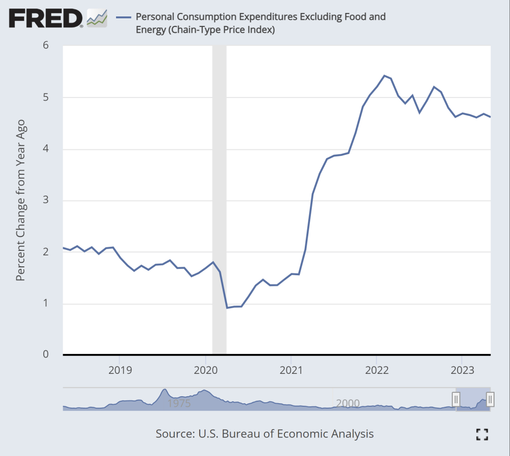
The pessimistic take can be summarized in two charts. First, this chart shows the year-over-year change in the core PCE inflation index. As most readers will know, core indexes take out food and energy prices. This is not a “cheat” to mask important goods, it’s done because these are particularly volatile categories of goods. If we want to see the true underlying trend in inflation, we should ignore price fluctuations that are driven largely by weather and geopolitics.
While there is some moderation in inflation in this chart, we don’t see anything like the dramatic decline in the CPI-U, which fell from about 9 to 3 percent over roughly the past year. True, there is some decline over the past year, but only about 1 percentage point, and it has been stuck at just over 4.6 percent for the past 6 months. This is not a return to normalcy, as this rate historically has stayed in the band of 1-2 percent.
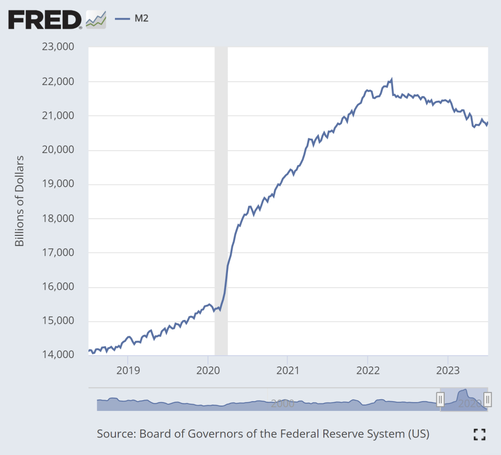
The second pessimistic chart is M2, a broad measure of the money supply.
The dramatic increase in M2 during 2020 is clear. That’s a big source of the inflation issues we’ve had over the past 2 years. There is some cause for optimism in this chart: M2 has clearly shrunk from the peak in Spring 2022. In fact, using a year-over-year percentage change, M2 has been negative since last November.
But if we look very recently, there is less cause for optimism. Since late April, M2 has stopped falling. In fact, it’s up a little bit. Is this a sign that the Fed doesn’t really have inflation under control? Perhaps. The increase isn’t huge, and there’s always some seasonality and noise to this data so we shouldn’t overanalyze this small deviation from the general decline in the past year plus. But we’ll need to continue watching this data.
The latest CPI-U price data shows that the rate of inflation in the US has slowed significantly to just 3% in the past 12 months. That’s a huge improvement from the peak last June, when the annual rate of inflation was over 9%. Still, prices as a whole aren’t falling, and they clearly aren’t anywhere near where they were before the pandemic: using the CPI-U, prices are up over 17% since January 2020.
Lately I’ve heard many people asking a good question: will prices ever get back down to where they were? Usually they mean pre-pandemic prices, though sometimes they refer to a particular point-in-time (such as the start of Biden’s presidency). The only correct answer is “we don’t know,” but I think a likely answer for many goods and services is “no.” For many reasons, the nominal prices of most goods and services rise over time. Though this is not true for everything, of course (newer technologies are one example we often see).
But what about specific goods that we buy frequently? Will we ever see gasoline consistently below $3 per gallon again? Will we ever see milk consistently below $4 per gallon again? What about eggs and bread? And indeed, these prices are well above January 2020 levels: 23% higher for milk, 43% for bread, 45% for gasoline, and a whopping 52% for eggs. For the price data, I am using this convenient data on common food and energy goods from BLS.
For some of these items, I do think you might someday see prices fall back to levels consumers were used to from the recent past, since food and energy prices tend to be volatile. For others, though maybe not. But I think we as consumers can become overly focused on staples that we buy frequently and can easily recall the price in our heads. For example, while eggs, bread, and milk are items that we buy frequently (including being the staples of stocking up before a storm), in total these constitute just 0.6% of average consumer spending.
If instead of those 3 staples, your mind naturally anchors on produce prices, the trends look different: oranges are up 23%, but bananas are only up 10%, and tomatoes are, in fact, down 14% since January 2020. But again, these items are less than 0.5% of total consumer spending. Ideally, we shouldn’t anchor on any one subset of goods when doing a good analysis, even if it is natural for us to do so in our lives as consumers.
This is where the benefit of a price index, like the CPI-U, comes in.