Americans like their food. Holidays are often known by the dishes that we serve. Thanksgiving is a bit unique in that most of us converge on turkey, though diversity obviously exists. What about Easter? There’s not really the same focus on a single food like there is for Thanksgiving. My impression is that people eat daytime or lunch foods that include ham, lamb, or just about anything. My family tends to make tacos.
What am I saying?! We eat candy! Solid or hollow chocolate bunnies, jellybeans, peeps, and on and on. We fill Easter eggs and keep candy around the office. We literally have baskets full of candy.
A Chocolate Bunny? In this economy?
Have you seen the price of chocolate? Yeesh! The latest figures are from February and the prices for chocolate and cocoa bean products are down 11.7% year-over-year. That’s nice, you may think, our budgets can fit a bit more chocolate into our consumer – I mean Easter – baskets. Great news. The news seems a little less great when you realize that February’s price of chocolate was 90% higher than it was four years earlier in 2022. 90% higher is a lot like 100%, and 100% is double! In fact, the price had peaked at 142% higher by September of 2025, and now prices are quickly falling. See the chocolate-colored line in the graph below.
This post solves for the equilibrium quantity of production with quadratic total cost under Cournot and Stackelberg competition.
Say that there are two firms. They produce the exact same quality and type of goods and sell them at the same price. Let’s also assume that the market clears at one price. Finally, let’s assume increasing marginal costs.
Let’s say that they face the following demand curve:
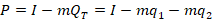
The firms have a total cost of:
The marginal cost is the derivative with respect to the choice variable for each firm, or their respective quantities produced:
The total revenue is just the price times the quantity sold.
This is all standard fare for economic modeling. You’re free to make different assumptions. You can even adopt different slopes in the demand curve to reflect goods with different characteristics.
Cournot Competition
If you imagine a lengthy production process, or otherwise that they physically attend the same market, then it’s reasonable to assume that they don’t know one another’s choice of quantity produced.
We know how firms maximize profit: They produce the quantity at which the marginal revenue equals the marginal cost. But, what is marginal revenue? The derivative of total revenue with respect to the choice variable:
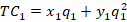
Now we can set the marginal revenue equal to marginal cost and solve for the optimal level of output:
Notice that the optimal level of output depends on the production decision of the other firm. These are called response functions. If we solve for the quantities at which they intersect, then we are solving for where both firms are producing the best response to one another. This is known as a Pure Strategy Nash Equilibrium (PSNE).
Luckily, in many applications, one or more of the above terms are zeros, which makes things much simpler.
The general process for solving for the Cournot equilibrium is:
If you’ve been on LinkedIn recently, then you may have seen the chatter about teaching your artificial intelligence to have various skills. I saw one post by a guy who claimed to have created several skills, each representing a tech billionaire.
At first, I thought “I am behind the 8-ball. What is this new thing?”. Obviously I know what the word “skill” is and how people use it, but I had not encountered its use in the context of AI having it. What does it mean for an AI to have a skill? I somewhat dreaded the the work of learning the new skill of teaching my AI skills.
Then I had lunch with a computer scientist and I learned that skills are nothing new.
Mike Mulligan and His Steam Shovel, by Virginia Lee Burton, is a classic 1939 children’s book about a man, Mike Mulligan, and his beloved steam shovel, Mary Anne, who are replaced by modern machinery. They get one last chance to demonstrate their worth by digging the cellar for a new town hall in a single day.
This book is more than just a nostalgic children’s story with a happy ending. This is a tale about economic history, comparative advantage, non-pecuniary benefits, labor and capital heterogeneity, and, of course, transaction costs.
Here’s some background. Historically, excavating or earth-moving equipment was powered by steam. Much like a steam engine locomotive (train), a steam shovel burns coal to heat water in a boiler, creating steam that can drive pistons that operate the mechanics. The result is machinery that can move a greater volume of soil at a faster speed than humans with simple hand shovels. Advancements in oil extraction and refining and internal combustion made the steam methods obsolete. Diesel or gasoline made earth movers safer, faster, and larger all because there was no need to build high pressures from boiling water. Steam pressure in the field takes a lot of time and is dangerous.
Here is how the story goes. Mike enjoys his earth-moving work with his steam-shovel and is proud to be more productive than hand-shovels. One day, diesel, electric, and gasoline-powered shovels arrive. They’re bigger and better than Mary Anne. She is now obsolete. It’s unclear whether Mike’s skills are transferable to the newer equipment, but he implicitly prefers working with Mary Anne. Together, they can’t compete in the urban areas where the value placed on quick excavation is high. So, they flee to the countryside.
The text doesn’t say why the newer shovels aren’t in the countryside. Let’s address that first. The new shovels haven’t spread to the rural areas because the opportunity cost is too high. Diesel Shovels are expensive and the owners/operators need revenue from many jobs in order to pay for their equipment in a reasonable amount of time and earn a positive return. Rural areas don’t have the same willingness to pay for as many projects, so less specialized capital is limited by the smaller extent of the market. Clearly, a higher cost of capital – the cost of the loan that pays for the diesel shovels or the alternative uses of the resources – accentuate the necessity for project volume.
Individuals or their families act as infinitely lived agents.
All governments and agents can borrow and lend at a single rate.
The path of government expenditures is independent of financing choices
Assumption 2) appears patently absurd on its face. I certainly cannot borrow at the same interest rate that the US Treasury can. QED. Do not pass go, do not collect $200. The yield on 1-year US treasuries is 3.58%. I can’t borrow at that rate… Or can I?
Let’s do some casuistry.
What is a loan?
It’s a contract that:
Provides the borrower with access to spending
with or without collateral
with a promise to repay the lender at defined times, usually with interest.
So, when you borrow $5 from a friend and pay it back on the same day, it’s a loan. The contract is verbal, there is no collateral, the repayment time is ‘soon’ with flexibility, and the interest rate is zero.
A mortgage is a collateralized loan. You borrow from a bank, make monthly payments for the term of the loan, and accrue interest on the principal. The contract is written, the house or a portion of its value is the collateral, and the interest rate is positive.
What about a Pawnshop loan? Most of us are probably unfamiliar with these. In this circumstance, a person has valuable non-assets that and the pawnshop has money. They engage in a contractual asset swap. The borrower lends the non-money asset to the pawnshop as collateral and borrows money from the pawnshop. The pawnshop borrows the non-money asset and lends the money to the borrower. The borrower can use the money as they please, but the pawnshop can not use the non-money asset – they can simply hold it. They collect interest in order to cover their opportunity costs.
One outcome is that the borrower repays the loan and interest by the maturity date and reclaims their non-money asset. Another outcome is that the borrower retains the option to default without any further obligation. But they lose the right to reclaim their property according to the repayment terms. If the borrower exercises the option to default, then the pawnshop acquires full rights to the non-money asset. The pawnshop often resells the asset at a profit. The profit is relatively reliable because the illiquidity of the non-money asset allows the pawnshop to lend much less than its retail value. That illiquidity is also why the borrower is willing to accept the terms.
If we accept that the pawnshop contract is a loan, which is just a collateralized loan with a mostly standard default option, then get ready for this.
During president Trump’s first term in office, he made a bunch of waves (as he’s wont to do). His more educated supporters said that he engaged in substantial deregulation of telecommunications, which got a lot of press. There was a quiet contingent of educated voters who were relatively silently supportive on Trump’s regulatory policy, even if his character was indefensible or his other policy was less desirable.
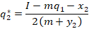
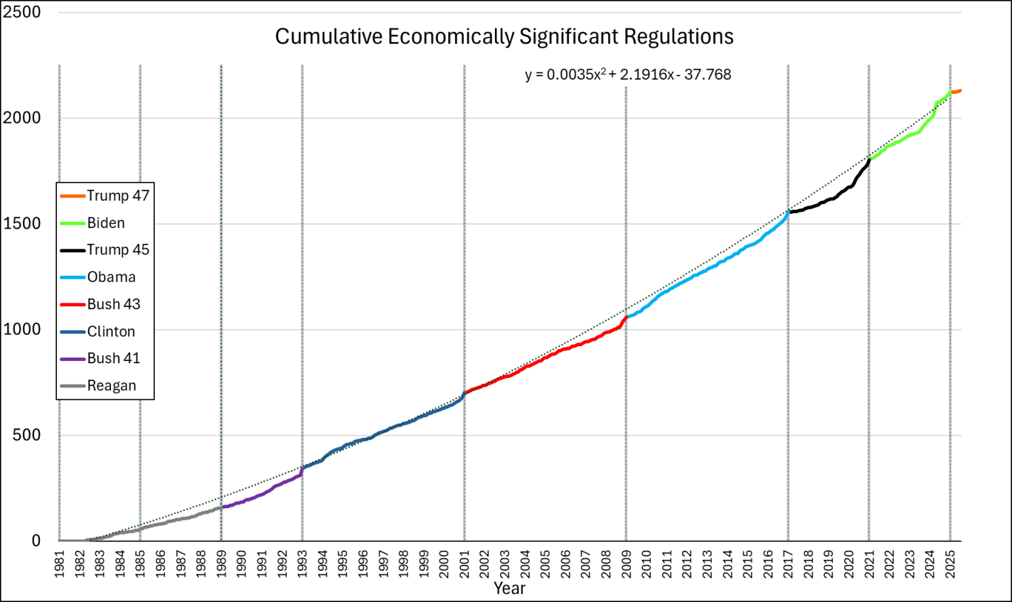
But was Trump a great deregulator? Or was it one of those cases when we say that he regulated *less* than his fellow executives? The George Washington University Regulatory Studies Center can help shed some light with their data. Specifically, they have calculated the number of ‘economically significant’ regulations passed during each month of each president going back through Ronald Reagan’s term. What counts as ‘economically significant’? The definition has changed over time. But, generally, ‘economically significant’ regulations:
“Have an annual [adverse] effect on the economy of $100 million or more
Or, adversely affect in a material way the economy, a sector of the economy, productivity, competition, jobs, the environment, public health or safety, or State, local, or tribal governments or communities.”
The only exception to this is between April 6, 2023 and January 20, 2025 when the threshold was raised to $200 million.
The Data
The graph below-left shows the number of economically significant regulations for each president since the start of his term, through July of 2025. It’s reproduced from the link above except that I appended Trump’s second term onto his first term. What does the graph tell us? There doesn’t seem to be much of a difference between republicans and democrats. Rather, it seems that, generally, the number of economically significant regulations increases over time. Importantly, the below lines are cumulative by president. So each year’s regulations each cost $100m annually and that’s on top of the existing ones already in place. So, regulatory costs generally rise, with the caveat that we don’t see the relief provided by small or rescinded regulations (for that matter, we don’t see small regulatory burdens here either). Something else that the below graph tells us is that presidents tend to accelerate their economically significant regulations prior to leaving office. Reagan was the only exception to this pattern and he *slowed* the number of regulations as the end of his term approached.
Below-right is the same data, but the x-axis is months until leaving office. Every president since Bush-41 has accelerated their burdensome regulations during their final months in office. The timing of the acceleration corresponds to how close the preceding election was and whether the incumbent president lost. Whereas all presidents regulate more in their last 2-3 months in office, the presidents who were less likely to win re-election started regulating more starting around eight months prior to leaving office. Of course, they wouldn’t say that they expected to lose, but they sure regulated like there was no tomorrow.
What about Trump? Trump’s fewer regulations is caused by his single term. He definitely still added to the regulatory burden (among economically significant regulations, anyway). While Trump started with the fewest additional regulations since Reagan, and Biden started with the most ever initial regulations, together they earn the top prizes for most regulations added in their first term.
What if we append these regulations from end-to-end? That’s what the below chart does. We do have to be careful because the series is a measure of gross economically significant regulations and not net economically significant regulations. So, it’s possible that some rescissions dampened the below values, but this is the data that I have for the moment. While each presidential administrations increases regulation more than the prior, the good news is that the rate of change is not exponential. The line of best fit is quadratic. We’re experiencing growing regulations, but at least it’s not compound growth.
The Cost
We can estimate the costs of these economically significant regulations. It’s a rough cut, and definitely a lower bound since rescission is rare and $100 million is itself a lower bound, but we can multiply the number of regulations by $100m to get minimum annual cost. Like I said, the Biden criterion from April 2023 through January 20, 2025 changed, so those regulations get counted as $200 million instead. The change in definition means that the regulation counts underestimate the late-term Biden regulations relative to the other presidencies.
The flu and covid-19 vaccines don’t work super well. Both vaccines permit infection and transmission at quite high rates. The benefit from these vaccines come largely from reductions in mortality or severe symptoms conditional on infection. The covid-19 vaccine is itself especially risky or ineffective depending on the age and health of the individual. Plenty of people eschew vaccines.
I live in Collier County, Florida where there have been 61 confirmed cases of measles so far this year. I have since learned that Measles is EXTREMELY contagious. It floats around the air and on items and just sort of hangs out and waits for a place to replicate. I’ve also learned that symptoms include a fever, eye irritation, possible brain swelling, severe dehydration, and a characteristic rash. The severe dehydration easily puts people in the hospital, the eye irritation can lead to permanent vision loss, and the brain swelling can be acute, or a symptom delayed by 5-6 years, which can also be fatal. I’ve also learned that having the vaccine, which is usually administered in two doses, provides about 97% immunity. The vaccine works so well, that the department of health recommends no behavioral change among the vaccinated population when there is a measles outbreak. Barring unique circumstances, measles immunity can persist for a lifetime.
Unfortunately, a large segment of the anti-vaccine mood affiliation retains the salience of the covid-19 vaccine characteristics. Other vaccines and diseases in the typical pediatric schedule are not similar. Most of these prevent infection >90% of the time (TDAP is low at 73%), prevent transmission, reduce mortality when there are breakthrough infections, are effective for years or decades, and are extremely safe for all age groups.
The risks of disease versus the corresponding vaccine are orders of magnitude away from each other. The tables below summarize the data (with sources). I did not double check the source on every single figure. If you glance below, then you’ll see why: Even if the numbers are closer by 10 or 100 times, vaccines still look really good.
First, mortality: The data is divided by disease and age group, and provides mortality rates for both the disease and for the vaccine. The numbers are proportions, conditional on infection or vaccination. There are a lot of zeros in the vaccine mortality rates and certainly more than for the diseases. For example, a measles infection is 10,000 more lethal than the MMR vaccine which prevents it. In fact, all of those zeros in the vaccine rates reflect mortality that is so uncommon, that the estimated one out of every 10 million is just rounded up because researchers don’t think that the risk is zero.
There was a seismic shift in the AI world recently. In case you didn’t know, a Claude Code update was released just before the Christmas break. It could code awesomely and had a bigger context window, which is sort of like memory and attention span. Scott Cunningham wrote a series of posts demonstrating the power of Claude Code in ways that made economists take notice. Then, ChatGPT Codex was updated and released in January as if to say ‘we are still on the frontier’. The battle between Claude Code and Codex is active as we speak.
The differentiation is becoming clearer, depending on who you talk to. Claude Code feels architectural. It designs a project or system and thrives when you hand it the blueprint and say “Design this properly.” It’s your amazingly productive partner. Codex feels like it’s for the specialist. You tell it exactly what you want. No fluff. No ornamental abstraction unless you request it.
Codex flourishes with prompts like “Refactor this function to eliminate recursion”, or “Take this response data and apply the Bayesian Dawid-Skene method”. It does exactly that. It assumes competence on your part and does not attempt to decorate the output. It assumes that you know what you’re doing. It’s like your RA that can do amazing things if you tell it what task you want completed. Having said all of this, I’ve heard the inverse evaluations too. It probably matters a lot what the programmer brings to the table.
Both Claude Code and Codex are remarkably adept at catching code and syntax errors. That is not mysterious. Code is valid or invalid. The AI writes something, and the environment immediately reveals whether it conforms to the rules. Truth is embedded in the logical structure. When a single error appears, correction is often trivial.
When multiple errors appear, the problem becomes combinatorial. Fix A? Fix B? Change the type? Modify the loop? There are potentially infinite branching possibilities. Even then, the space is constrained. The code must run, or time out. That constraint disciplines the search. The reason these models code so well is that the code itself is the truth. So long as the logic isn’t violated, the axioms lead to the result. The AI anchors on the code to be internally consistent. The model can triangulate because the target is stable and verifiable.
Once upon a time, eugenics was all the rage. It was nascent during the reconstruction era and persisted into the 20th century. It grew out of biological evolutionary theory and emphasized reproductive fitness. In brief, the theory asserted that there are differences in individual fitness and that the more fit living things will survive better and reproduce, eventually becoming a greater part of the population. The ability to compile and evaluate statistics about various human measurements made inferences hard to resist. Of course, researchers were plagued by small sample size, omitted variable bias, and social biases of the day (for example, phrenology inferred fitness characteristics from skull shape).
People employing eugenic thinking, overwhelmingly, supported theories that their own type of person was among the more fit. Eugenicists didn’t promote theories of their own un-fitness. In the progressive era of the early 20th century, eugenics met the prevailing attitude that government could be employed to resolve social and economic ills. This era is when the income tax emerged, prohibition was enacted, the Federal Reserve was formed, and various labor regulations were enacted.
The result was that policy sometimes pursued greater ‘fitness’ among its populations. Rather than systematically encouraging the supposedly more fit with economic incentives, most policy was geared toward reducing the reproductive success of supposedly less fit people. These included forced sterilization, institutionalization, and economic exclusion. Besides rejecting basics individual human dignity, the harm was all the more tragic given that fitness was often poorly specified. That is, policy criteria weren’t dependably related to fitness. Fatal conceit, indeed!
One of my favorite ways to argue is to grant premises and then change details on the margin to see whether the conclusion changes. Let’s do that. Let’s grant that there are innate differences between people that are related to biological success. Since survivability is related to resource acquisition, let’s grant also that economic success overlaps at least somewhat. Taking that as granted, does pursuit of the historical eugenic policy still follow?
It does not.
There are two mistakes that eugenicists and various sorts of racists and xenophobes made. They assert or imply 1) that fitness characteristics are stable and systematically identifiable, and 2) that policy needed to intentionally select for the fitness characteristics.
This post is just some thoughts about perspective. I apologize for any lack of organization.
My academic influences include North, Weingast, Coase, Hayek, the field of Public Choice, and others. I’m not an ‘adherent’ to any school of thought. Those guys just provided some insights that I find myself often using.
What lessons did they teach? Plenty. When I see the world of firms, governments, and other institutions, I maintain a sharp distinction between intention and outcome. Any given policy that’s enacted is probably not the welfare maximizing one, but rather must keep special interests relatively happy. So, the presence of special interests is a given and doesn’t get me riled up. When I see an imperfect policy outcome, I think about who had to be enticed to vote for it. We live in a world where ‘first bests’ aren’t usually on the table.
Historically, or in lower income countries, I think about violence. Their rules and laws are not operating in a vacuum of peaceful consent. There is always the threat of violence. Laws are enforced (or not) conditional on whether and what type of violence that may result. All of the ideal legislation is irrelevant if theft and fraud are the lay of the land.
I think about institutional evolution with both internal and external pressures. I’m a bit worried about the persistence of the US republic, or at least worried for its pro-growth policies. I’m not worried about China in the long run. I don’t think they have the institutions that get them to ‘high income’ status. I do think that they are a tactical concern in the short run and that the government does/will have access to great volumes of resources in the medium run. That’s a bit of a concern. But like I said, I’m not super worried in the long run.