Where would you expect Federalism to occur? In other words, where would expect a government to devolve authority to a lower government. Importantly, this is different from freedom vs authoritarianism. The lower government might choose to be more or less free. For example, right now in Florida there is a state-wide constitutional amendment on the ballot that would enshrine each individual’s right to hunt and fish. Ignoring the particulars of what that means, it’s clearly a step toward centralizing policy rather than decentralizing it. Central governments can be strong and protect citizens, or they can strip us of rights. Either way, being small players and far-removed, it’s difficult for us to affect the policy decisions.
That concern is philosophical, however. Maybe my opinion shouldn’t matter (one could easily argue). Even as a matter of prudence, one-size-fits all sets a standard, but the standard may not be a good fit for every locality and circumstance. There is a trade-off between ease of navigating a uniform policy across the land and customized policies that are particular to local priorities. Given that Americans can vote, is there a way for us to think about when a policy will be (should be?) centralized vs decentralized?
There is a great case study by Strumpf & Oberholzer-Gee* on the matter of alcohol policy after the end of national prohibition. The US has a dizzying array of liquor laws across the country and even across states. Some states have a central policy of dry or wet, while others devolve the authority to lower governments. How should we think about that policy? What determines the policy of central versus devolved authority?
Today BLS released the annual update to the Consumer Expenditure Survey, which is exactly what it sounds like: a survey of US consumers about what their spending. The sample size is “20,000 independent interview surveys and 11,000 independent diary surveys” so it’s a pretty big sample. And this is a really great data source, because versions of it go back over 100 years (though the current, annual survey with a lot of detail starts in 1984).
What does this new data tell us? One area that has received a lot of attention lately is food spending (including a lot of attention on this blog), especially the cost of groceries. According to the CPI food at home index, grocery prices are up almost 26 percent since the beginning over 2020. That’s a lot! But incomes are up too, so how does this affect spending patterns?
Here’s what food and grocery spending for middle-quintile households looks like:
Compared to the pre-pandemic 2019 levels, consumers are spending slightly less of their income on food (12.7% vs. 13.2%), though a slightly larger share of their income is being spent on groceries (8.1% vs. 7.8%). Those changes are noticeable, though this isn’t the radical realignment of spending patterns you might expect from such a big change in food prices. The reason is clear: while grocery prices are up about 26%, middle-quintile incomes are up a similar 25% since 2019. That’s falling behind a little bit, but incomes have roughly kept pace with rising food prices. And from 2022 to 2023, both of these percentages decreased slightly, by about 0.3 percentage points.
If you didn’t know already, the past five years has been a whirl-wind of new methods in the staggered Differences-in-differences (DID) literature – a popular method to try to tease out causal effects statistically. This post restates practical advice from Jonathan Roth.
The prior standard was to use Two-Way-Fixed-Effects (TWFE). This controlled for a lot of unobserved variation over individuals or groups and time. The fancier TWFE methods were interacted with the time relative to treatment. That allowed event studies and dynamic effects.
The Federal Reserve cut interest rates yesterday for the first time since 2019. They raised rates dramatically in 2022 to fight off high inflation, and kept them high since. This cut signals that they are now less worried about inflation, which is now nearing (but not at) their 2% target, and more worried about the slowing (?) labor market. To me their action was reasonable, but doing a smaller cut or waiting longer would also have been reasonable, because the labor market is giving such mixed signals at the moment.
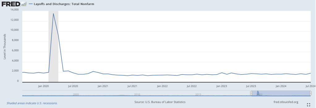
Most concerning is that unemployment increased from 3.5% last July to 4.3% this July. On previous occasions that unemployment in the US increased that rapidly, we then saw recessions and much more growth in unemployment. But unemployment ticked down to 4.2% last month, and layoffs have been flat:
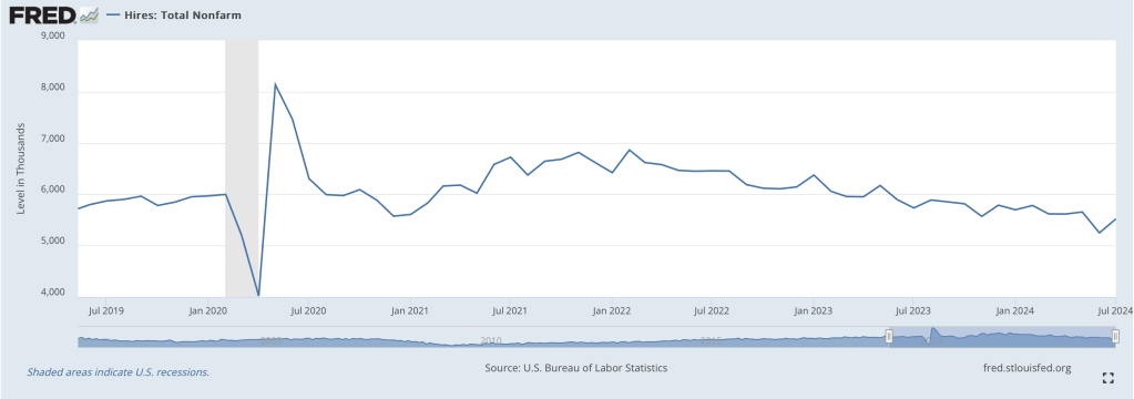
How do you get a big increase in unemployment without a big increase in layoffs? There are two main ways, one good and one bad, and we have both. The bad news, especially for new graduates, is that hiring has slowed:
But the better news is that there are simply more people wanting to work. This is generally a good sign for the economy; in bad economic times many people don’t count as “unemployed” because they are so discouraged that they don’t bother actively looking for work. In July though, prime-age labor force participation hit 84%, the highest level since 2001:
The prime-age employment-to-population ratio just hit 80.9%, also the highest level since 2001:
Labor force participation and employment-to-population among all adults are not so high, though it could be a positive that many people under 25 are in school and many people over 54 are able to retire. Finally, total payrolls got a big downward revision, but one that still implies positive growth every month.
Looking beyond the labor market though, GDP grew at a strong 3.0% in Q2, and is projected to be similar in Q3. Inflation breakevens are exactly on target. Overall it looks like some recession indicators that worked historically, like the Sahm Rule and Yield Curve Inversion, are about to break down- especially now that the Fed cutting is rates.
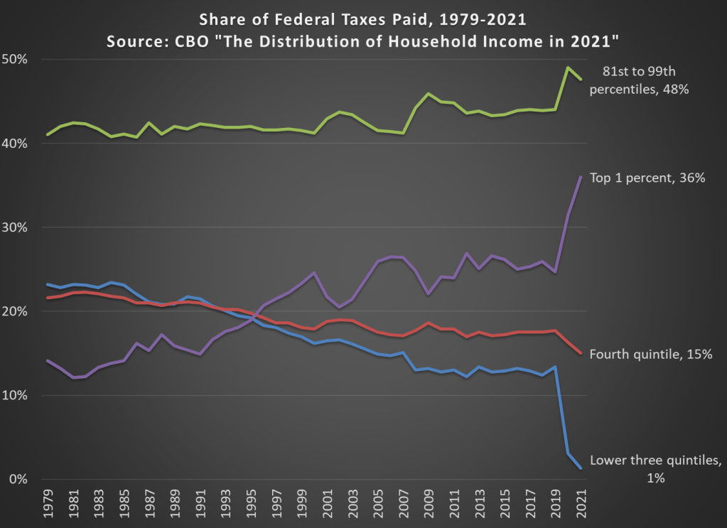
In 2021 the top 1 percent of taxpayers in the United States paid 36 percent of all federal taxes (they have 21.1 percent of income). This figure had been below 20 percent until the mid-1990s, and as recently as 2019 it was just 24.7 percent (they had 15.9 percent of the income that year).
The increase is primarily due to a large number of high-income households realizing capital gains in 2021. With all the talk lately of potentially taxing unrealized capital gains, it’s important to note that we do tax realized gains, and these change a lot from year to year. Another contributing factor is that the share of the bottom 60 percent of households only paid 1 percent of federal taxes in 2021, a big drop from 2019 due to a big increase in temporary refundable tax credits.
Are you better off than you were four years ago? That question was asked at the Presidential debate last night. But more importantly, we also got a massive amount of new data on income and poverty from Census yesterday. That data allows us to make that just that comparison, although somewhat imperfectly.
The Census data is excellent and detailed, but it’s annual data, meaning that the release yesterday only goes through 2023. We won’t have 2024 data for another year. Such is the nature of good data. (Note: I’ve tried to address this same question with more real-time data, such as average wages). Still, it’s a useful comparison to make. It’s especially useful right now because the new 2023 data on income are (for most categories) the highest ever with one exception: 4 years ago, in 2019.
A reasonable read of the data on income (whether we use households, families, or persons) is that in 2023 the median American was no better off than in 2019, after adjusting for inflation. In fact, they were probably slightly worse off. I fully expect this will no longer be true when we have 2024 data: it will certainly be above 4 years prior (2020) and likely above 2019 too (more on this below). But we can’t say that for sure right now.
So let’s do a comparison of “are you better off than 4 years ago” for recent Presidents that were up for reelection (treating 2024 as a reelection year for Biden-Harris too), using the 4-year comparison that would have been available at the time using real median family income. Notice that this data would be off by one year, but it’s what would have been known at the time of the election.
This post is quick and simple. We all know that states have different land areas and different populations. We also know that different states produce different amounts of output. We have a pretty good sense for which are the ‘big’ states since these things often go hand-in-hand. But what about household spending on consumption? It’s easy to imagine that some states produce plenty but then invest the proceeds. So, which states consume the most relative to their income?
The map above illustrates which states consume more of their income. There’s not much correlation geographically. But, among the ‘big’ states (Texas, California, New York, Illinois), the consumption per GDP is below the average of 67%. Can we make sense of this? As it turns, out more productive states also tend to have a higher per capita output. So, those higher GDP states also have richer populations on average. And, sensibly, those richer populations have lower marginal propensities to consume. They save more. But this is just spit-balling.
A recent post from the blogger (Substacker?) Cremieux called Rich Country, Poor Country showed how small differences in economic growth add up over time. Because he used nominal GDP growth rates, I don’t think that post is exactly the right way to analyze the question, but I still think it’s a very important one. So in this post I will offer, not necessarily a critique of that post, but perhaps a better way of looking at the data.
For the data, I will use the Maddison Project Database, which attempts to create comparable GDP per capita estimates for countries going back as far as possible… for some, back thousands of years, but for most countries at least the last 100 years. And the estimates are stated in modern, purchasing power adjusted dollars, so they should be roughly comparable over time (if you think these estimates are a bit ambitious, please note that they are scaled back significantly from Angus Maddison’s original data, which had an estimate for every country going back to the year 1 AD). The most recent year in the data is currently 2022, so if I slip up in this post and say “today,” I mean 2022, or roughly today in the long sweep of history.
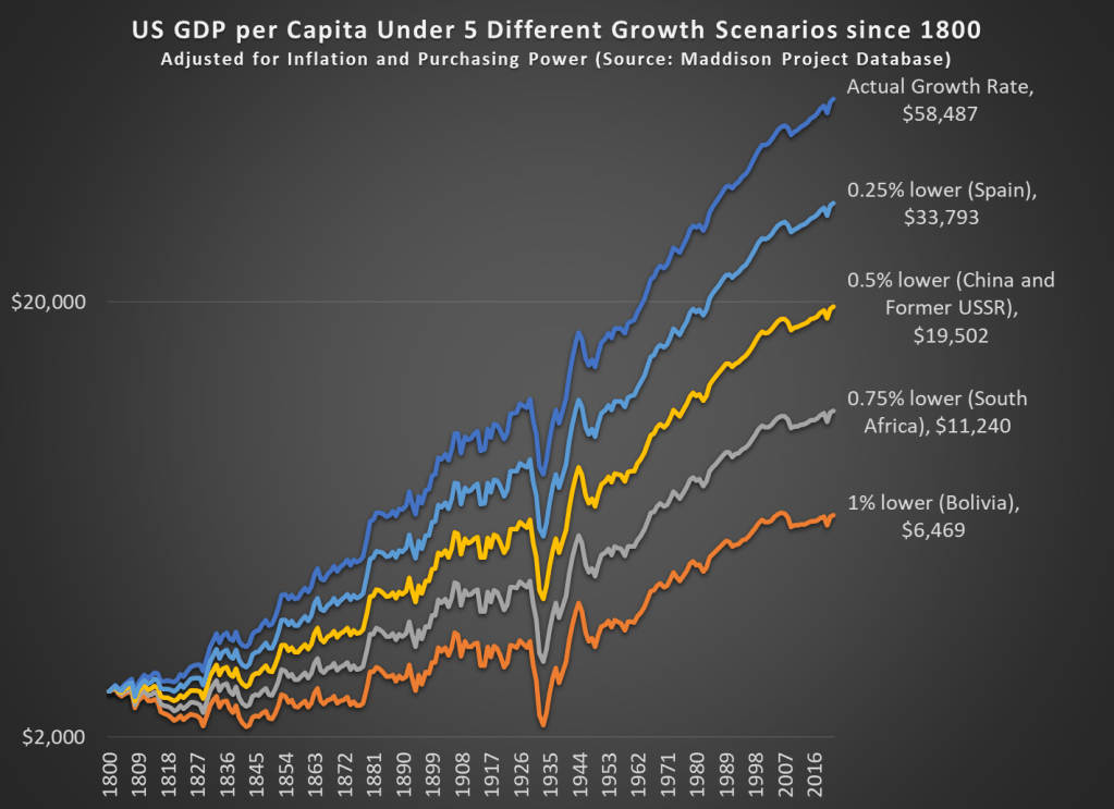
Like Cremieux’s post, I am interested in how much slightly lower economic growth rates can add up over time. Or even not so slightly lower growth rates, like 1 percentage point less per year — this is a huge number, because the compound annual average growth rate for the US from 1800 to 2022 is 1.42%. So let’s look at the data way back to 1800 (the first year the MPD gives us continuous annual estimates for the US) to see how changes in growth rates affect long-term growth.
It probably won’t surprise you that if our 1.42% growth rate had been 1 percentage point lower, the US would be much poorer today, but to put a precise number on it, we would be about where Bolivia is today (that is, ranked 116th out of the 169 countries in the MP Database). Note: I’m using a logarithmic scale, both so it’s easier to see the differences and because this is standard for showing long-run growth rates.
What is very interesting, I think, is that if our growth rate had been just 0.25 percentage points lower per year since 1800, we would be about where Spain is. Now, Spain is certainly a fine, modern developed country (they rank 34th of the 169 MPD countries). But Spain’s growth has not been spectacular lately. Average income in Spain is almost half of the US today (purchasing power adjusted!), which is another way to say that just 0.25 percentage points lower over 222 years reduces your growth rate by half.
That’s the power of economic growth.
And if our growth rate had been 0.5 percentage points lower, we’d be about where the big former Communist countries are today (both China and the former countries of the USSR are about equal today — about 1/3 of the income of the US).
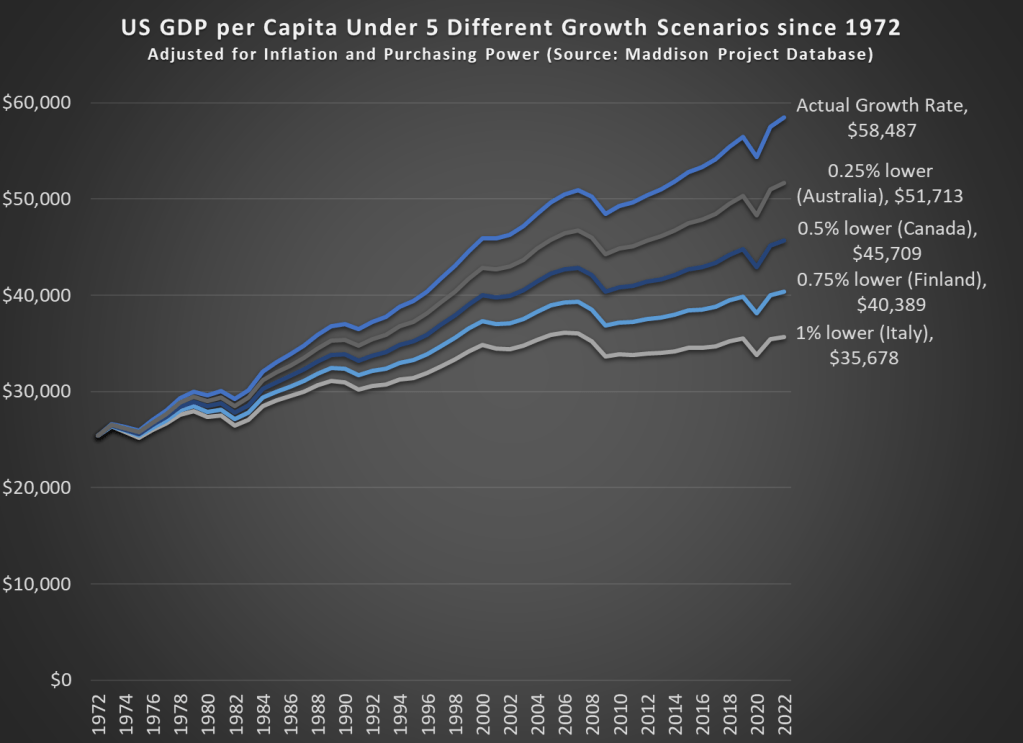
What if we perform the same analysis for a shorter time horizon? If we go back 50 years to 1972, the effects are not quite as dramatic, but still visible.
Our cumulative annual growth rate since 1972 has been a bit higher than the long-run average, around 1.68%. Under these four alternative growth scenarios since 1972, the comparable countries don’t sound so bad. It probably wouldn’t be a huge deal if we were only at Australia’s level, losing just about a decade of economic growth. But it would be a huge failure if we were only at Italy’s current level of development. Under that 1 percentage point lower growth scenario, we would have had no net growth since about year 2000, which has roughly been the case for Italy.
All of these alternative scenarios show the power of economic growth to add up over time, but they do so in pessimistic way: what if growth had been slower. What if we look at the opposite: what if growth had been faster over some time horizon. Sticking with the 1972 medium-run example, if real growth rates had been 1 percentage point higher, our income today would be almost double what it actually is, about $95,000 compared with the current $58,000 (the MPD data is stated in 2011 dollars, so that sounds lower than it actually is now: over $80,000).
What if we went back even further? If our economic growth rate since 1800 had been 1 percentage point higher every year, our average income in 2022 would be an astonishing $517,000 — almost 10 times what it actually was in 2022. That’s a dizzying number to think about, and maybe that’s not a realistic alternative scenario.
But what if it had only been 0.25 percentage points higher since 1800 — that probably is a world that was possible. In that case, GDP per capita would be about double what it actually was in 2022, at over $100,000 (again, stated in 2011 dollars).
Grocery prices are definitely up a lot in the past few years. I’ve wrote about thisseveral times before. But lately there has been a trend on social media to “post your receipts” and show how much your grocery prices have gone up. Unfortunately, very few people actually post the full receipts, often just showing the total, which leads to wild claims like prices being up 250% in just the past 2 years! That’s a huge contrast to BLS “food at home” category of the CPI, which shows an increase of 4.7% from July 2022 to July 2024 (it’s also unclear in the video what the exact date of the receipt is, he just says “2 years”). Depending on the exact base month, you’re going to be in the 20-25% compared with pre-pandemic or early pandemic using BLS data.
What if we actually looked at receipts? I tried such an exercise in November 2023, when there was another round of social media videos claiming prices had doubled in just a single year. My own personal receipt matched the corresponding BLS data pretty closely, but that was just one receipt with only eight items from Sam’s Club (which might not match grocery stores, for various reasons). At the time, I couldn’t find any good receipts from 2019 or 2020 (Kroger and Walmart drop old receipts in your account after about 2 years), but after scouring an old email account, I discovered two more receipts to compare. These are both from Walmart, in 2019 and 2020, and they contain a larger number of items than my Sam’s Club receipt (each with about a dozen and half items that are fairly typical grocery purchases, and I was able to find matching products today).
Recorded music sales peaked in 1999- then came Napster and other ways to listen to the exact music you want for free. Recorded music sales still haven’t fully recovered, but with the rapid growth of paid streaming since 2014, they have been increasing again:
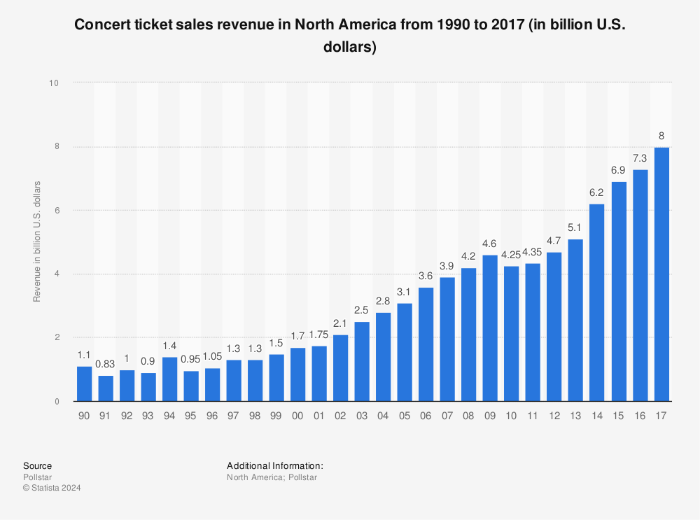
Meanwhile, live music sales have exploded since the ’90s:
The latest report from Pollstar on the top live tours is positively glowing:
2023 was a colossus, the likes of which the live industry has never before seen. If 2022 was a historic record-setting year, which it was, then this year completely blew it out of the water— by double digits. Total grosses for the 2023 Worldwide Top 100 Tours were up 46% to $9.17 billion
When you combine live and recorded sales, total spending on music has now passed the 1999 peak; this is the biggest the market for music has ever been. Of course, this doesn’t mean its an easy time to be a musician; touring is hard work and, as always, record labels and others are taking a big share of the money before it gets to artists. And opinions differ about whether today’s environment is good for creating good new music.
There are dozens of songs about how the road is hard, and the more time you spend on the road, the less they sound like cliches than like a simple and sometimes stark description of your life. Sooner or later everybody spots the exit that has their name on it –John Darnielle
The BLS data is noisy but suggests that the number of musicians in the US has been fairly flat and is projected to stay that way. A lot will depend on whether live music continues to grow, how much of that is captured by a few superstars, and whether the current streaming paradigm continues, or goes in a more or less artist-friendly direction. But now that consumers are willing to pay for music again, artists at least have a fighting chance.