Historical State GDP Data

Data on Gross State Product prior to 2017 has disappeared from the main page of the Bureau of Economic Analysis. It is also gone from some third party hosts like FRED. It turns out BEA is in the middle of revising how they calculate state GDP; they have the new version done back to 2017, and took down the older inconsistent estimates until they can recalculate them. After that, they tell me they will repost pre-2017 state Gross Domestic Product:

In the mean time, they offer some messy and seemingly incomplete versions of pre-2017 GDP here, and you can find 1980-2021 state GDP (along with many other nice variables) in a nice panel from the University of Kentucky Center for Poverty Research’s National Welfare Data.

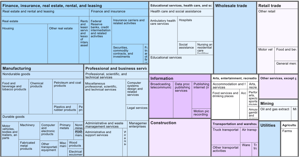
You can find more details on the actual changes BEA is making to how they calculate GDP here. Most changes seem relatively minor for states, but might have more impact on the measured relative size of industries. For instance, “equity REITs will be reclassified from the funds, trusts, and other financial vehicles industry to the real estate industry, while mortgage REITs will remain classified as funds, trusts, and other financial vehicles”.

Why Was Federal Tax Revenue Down in 2023?

The year 2023 was a pretty good one for the economy, whether judged by the labor market or economic growth. Despite this good economic growth, total receipts of the federal government were down about 7 percent from 2022 (note: I’m using calendar years, rather than fiscal years). Here’s a chart (note: in NOMINAL dollars) of total federal revenue since 2009:

I want to stress that these are nominal dollars (there, I’ve said it three times, hopefully there is no confusion). Nominal dollars are usually not the best way to look at historical data, but for purposes of looking at recent government budgets, sometimes it is. Especially when revenue is declining: if I adjusted this for inflation, the decline in 2023 would be even larger!

You’ll notice also that the decline in 2023 is even larger than the decline in 2020, the height of the pandemic when many people were out of work due to government regulations and changes in consumer behavior. The 2023 decline is big!

So, what the heck in going on with federal revenue in 2023?

Continue reading

Does More Health Spending Buy Better Outcomes for States?

When you look across countries, it appears that the first $1000 per person per year spent on health buys a lot; spending beyond that buys a little, and eventually nothing. The US spends the most in the world on health care, but doesn’t appear to get much for it. A classic story of diminishing returns:

Source: https://twitter.com/MaxCRoser/status/810077744075866112/photo/1

This might tempt you to go full Robin Hanson and say the US should spend dramatically less on health care. But when you look at the same measures across US states, it seems like health care spending helps after all:

Source: My calculations from 2019 IHME Life Expectancy and 2019 KFF Health Spending Per Capita

Last week though, I showed how health spending across states looks a lot different if we measure it as a share of GDP instead of in dollars per capita. When measured this way, the correlation of health spending and life expectancy turns sharply negative:

Source: My calculations from 2019 IHME life expectancy, Gross State Product, and NHEA provider spending

Does this mean states should be drastically cutting health care spending? Not necessarily; as we saw before, states spending more dollars per person on health is associated with longer lives. States having a high share of health spending does seem to be bad, but this is more because it means the rest of their economy is too small, rather than health care being too big. Having a larger GDP per capita doesn’t just mean people are materially better off, it also predicts longer life expectancy:

Source: My calculations from 2019 IHME life expectancy and 2019 Gross State Product

As you can see, higher GDP per capita predicts longer lives even more strongly than higher health spending per capita. Here’s what happens when we put them into a horse race in the same regression:

The effect of health spending goes negative and insignificant, while GDP per capita remains positive and strongly significant. The coefficient looks small because it is measured in dollars, but what it means is that a $10,000 increase in GDP per capita in a state is associated with 1.13 years more life expectancy.

My guess is that the correlation of GDP and life expectancy across states is real but mostly not caused by GDP itself; rather, various 3rd factors cause both. I think the lack of effect of health spending across states is real, between diminishing returns to spending and the fact that health is mostly not about health care. Perhaps Robin Hanson is right after all to suggest cutting medicine in half.

Young People Have a Lot More Wealth Than We Thought

I’ve written numerous times about generational wealth on this blog. My biggest post was one comparing different generations using the Fed’s Distributional Financial Accounts back in September 2021. I’ve posted several updates to that post as new the quarterly data was released, but this post contains a major update. I’ll explain in great detail below about the updates, but first let me present the latest version of the chart (through 2023q3):

Regular readers will notice a few differences compared with past charts. The big one is that young people have a lot more wealth than it appeared in past versions of this chart! You’ll also notice that I have relabeled this line “Millennials & Gen Z (18+)” and shifted that line over to the left a few years to account for the fact that this isn’t just the wealth of Millennials, and therefore the median age of this group is lower than in my past charts. The two dollar figures I highlighted are at the median age of 30 for these age cohorts (unfortunately we don’t have data for Boomers at that age).

Continue reading

Where is Health Care The Biggest Part of the Economy?

State health care spending usually gets reported in terms of dollars per capita, leading to maps like this that show Alaska as the highest-spending state and Utah as the lowest:

Source: https://www.kff.org/other/state-indicator/health-spending-per-capita/

But states differ greatly in how rich they are and how much they have to spend. I wanted to know the states where health care takes up the largest and smallest share of the economy, so I got the data:

Health Care Spending as Share of State Gross Domestic Product in 2019:

Source: I divided 2019 National Health Expenditure Provider data on total health spending by 2019 Gross State Product data.

You can see that health spending as a share of GDP looks pretty different from health spending in raw dollars. We’ve gone from a high-spending North and low-spending South to more of a mix. Health spending is now highest in West Virginia, where it makes up more than a fourth of the economy; and lowest in Washington State and Washington D.C., where it makes up less than one ninth of the economy.

The biggest change when considering things this way is in Washington D.C., which has the highest spending in $ terms but the lowest as a share of GDP because it has an enormous GDP per capita. Many other states that spend a lot in $ also fall a lot in the rankings due to high GDP per capita, including Alaska, New York, and Massachusetts. The states that rise the most in this ranking are poor states like Arkansas, Alabama, and Mississippi. Mississippi rises the most, gaining 37 spots in the rankings of highest-spending states when we go from $ per capita to share of GDP.

I share the data here so you can do your own comparisons:

Continue reading

Follow the Money in Politics

As we enter election season, I can sympathize with those that want to ignore it as much as possible. But if you do want to follow it closely, here is my advice: talk is cheap, so follow the money.

And by money, I am not referring to campaign contributions. I mean prediction markets, where people are putting their money where their mouth is, rather than just making predictions based on their own intuition (or their own “model,” which is just a fancy intuition).

There are a number of betting markets online today, but a good aggregator of them is Election Betting Odds.

For example, here is their current prediction for which party will win the Presidency:

Continue reading

Industries Without Investors

Venture-capital backed startups almost all cluster in the same handful of industries, mostly various types of software. This leaves a variety of large and economically important sectors with almost no venture-capital backed startups. That means those industries see fewer new companies and new ideas; they must rely on either growth from existing firms, which are unlikely to embrace disruptive innovation, or on startups that bootstrap and/or finance with debt, which tend to grow slowly.

Venture capital firm Fifty Years has done a nice job cataloging exactly which industries see the most, and least, investment relative to their size. Here is their picture of the US economy by industry market size:

Now their picture of which industries get the investment (though unfortunately, they aren’t very clear about their data source for it):

They use this to create an “Opportunity Ratio”- current market size divided by current startup funding:

They call the industries with the largest Opportunity Ratios the “Top Underfunded Opportunities”:

I don’t necessarily agree; some industries face shrinking demand, prohibitive regulation, or other fundamental issues making them bad candidates for investment. Conversely, investors haven’t just focused on software randomly or through imitation; they see that it is where the growth is.

Still, herding by investors is real, and I always like the strategy of finding a new game instead of trying to win at the most competitive games, so I do think there is something to the idea of investing in an unsexy industry like paper. Growing up in Maine and watching one paper mill after another close, I always wondered how they managed to lose money in a state that is 90% trees, and whether anyone could find a way to reverse the trend. Perhaps related technology like mass timber or biochar will be the way to take advantage of cheap lumber.

Thanks again to Fifty Years for releasing the data.

Are The Jobs Numbers Fake?

Every month we get new data on the labor market in the US from the Bureau of Labor Statistics. As I pointed out last month, the labor market data from 2023 was very good!

But lately on social media, some have been to ask whether this data is credible. Specifically, several people have pointed out that the initial numbers we receive each month almost always seem to be revised downward. Since the initial reports are based on incomplete data (for the jobs data, this would be reports from employers), it is normal that there would be some revisions with more complete data.

But for 9 of the first 10 months in 2023, the revisions were downward (and even July was first revised down, only to be revised up later). And November has already been revised down once. This pattern seems a bit suspicious, as we would normally expect these errors to be somewhat random, and indeed the last time the revisions have mostly been downward was in 2008 (which was a very different year, since it was a year of job losses, not gains as in 2023).

So what’s going on?

Continue reading

Why Avocado on Toast?

We’ve all heard the stereotype. Millennials eat avocado toast (so say the older generations). The uncharitable version is that they can’t afford other things like cars, houses, etcetera due to their expensive consumption habits otherwise. And avocado on toast is the standard bearer for that spendthrift consumption.

I’m here to tell you that it’s bunch of nonsense and that the older folks are just jealous. Millennials, those born between 1981 & 1996, weren’t intrinsically destined to spend their money poorly as some generational sense of entitlement. Nor did the financial crisis imbue them with the mass desire for small but still affordable treats. The reason that millennials got the reputation for eating avocado on toast is that 1) it’s true, 2) because they could afford it, and 3) older generations didn’t even have access.

Continue reading

Economic Growth in 2024 and Beyond

To kick off 2024, I’m just going to give you a chart to think about:

Notice that in 1990, Poland had about half the average income of Portugal, as did South Korea compared to the UK. By about 2021, those gaps had been completely closed. And while the 2021 data is a bit uncertain given the pandemic, IMF estimates for 2024 suggest that both Poland and South Korea have now pulled slightly ahead of Portugal and the UK.

You can find many other examples like this. Why have some countries grown rapidly while others have slowed or stagnated? In some sense, this is an age-old question in economics, and at least as far back as Adam Smith economists have been trying to answer that question.

But it’s actually a bit different now. In Smith’s day, the big question was why some countries had started on their path of economic growth, while others hadn’t started at all. Today, nearly all countries have started economic growth, but some of the early leaders in growth seem to have slowed down. But there isn’t some global reason for this that affects all countries: Poland and South Korea will likely keep growing for a while, and eventually there will be a big gap between them and Portugal and the UK.

The answer to this question is not, of course, just One Big Thing. But for countries like Portugal and the UK (and Japan and Spain and Italy and etc. etc.), the key to their economic future is figuring out what Many Little Things these economic miracles are doing right so that they can return to a path of high economic growth. And this isn’t just a race to see who wins: all countries can be winners! But without continued growth, solving economic, political, and social problems will be a huge challenge.

Maybe 2024 is when they will start to figure it out.