In the Road to Serfdom, Friedrich Hayek uses some basic quantitative logic to make an important point about employment and political economy.
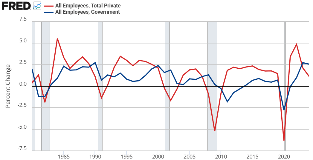
Hayek starts by assuming that government jobs are stable relative to those in the private sector. This might seem obvious, but let’s just start by checking the premises. Below are the percent change in total compensation and total employment for government employees and for the private sector. From year to year, private employment and total compensation is more volatile. So, Hayek’s initial premise is correct.
From there, he proceeds to say that if any part of income or employment is guaranteed or stabilized by the government, then the result must be that the risk and volatility is borne elsewhere in the economy. He reasons that if there is a decline in total spending, then stable government pay and employment implies that the private sector must have a deeper recession than the overall economy. Looking at the above graphs, both government employment and the total compensation are much less volatile.
But can’t governments intervene in macroeconomic stabilization policies effectively? Yes! They can and do stabilize the economy, especially with monetary policy. But Hayek is referring to individual stabilizations. For any individual to be guaranteed an income, all others must necessarily experience greater income volatility. How’s that?
Consider two individuals. Person #1 has an average income of $100. In any given year, his income might be $10 – or 10% – higher or lower than average. For the moment, person #2 is not employed and has income volatility of zero. If the government provides a job with a constant pay rate to person #2, then they still have zero income volatility. But instead of earning a consistent $0, person #2 earns a consistent $50. Nice.
Of course, person #2 gets his pay from somewhere. By one means or another, it comes from person #1. Let’s be generous and assume the tax on person #1 has no resulting behavioral effect. His new average income is $50, being $10 higher or lower in any given year. But now, that $10 deviation is over a base of $50 rather than $100. Person #1’s income varies by 20% relative to his new average!
Reasoning through this, we can consider that a person has a stable portion of their income and a volatile portion. If someone takes a part of your stable portion and leaves you with all of your volatile portion, then your remaining income is now more volatile on average. I think that this point is interesting enough all by itself.
IRL, many of our taxes are not lump sum. Rather, progressive taxation causes a negative incentive for production & earnings. The downside is that we produce less. The upside is that the government takes a higher proportion of our volatile income than of our stable income (because income changes are always on the margin and those marginal dollars are taxed at a higher rate). So, the government shares the income volatility of the private sector. By continuing to pay government employees a stable salary, the government is effectively absorbing some of that year-to-year income volatility on behalf of its employees.* The government is, in a sense, providing income insurance to a subgroup.
What does this have to do with The Road to Serfdom? Hayek argues that, as the government employs an increasing proportion of the population, the remaining private sector experiences increasing income and employment volatility. Such volatility increases private risk exposure so much that people begin to fawn over and increasingly compete for the stability found in government work. He gets anthropological and argues that the economic attraction to government jobs will introduce greater competition for those jobs and subsequently greater esteem and respect for those who are able to get them. This process makes the government jobs even more attractive.
My own two cents is that there is nothing internally unstable about this process. Total real income would fall compared to the alternative. However, such a state of affairs might be externally unstable as other governments/economies compete with the increasingly socialist one.
*An important analogue is that firms behave in a similar way. An individual may receive a relatively constant salary so long as they are employed. But the result must be that the firm bears more of the net-profit volatility. So, as more people want stable private sector jobs, the profit volatility of firms would increase and result in greater [seemingly windfall] profits and losses.