Here’s a somewhat niche measure of inflation: 6-month CPI excluding food, shelter, and energy. It might seem like a weird measure, as it excludes over half of the CPI. But there is a logic to at least considering it along with other measures.
Food and energy are both volatile, so they can give us a lot of noise. That’s why “core CPI” and other core measures are followed closely by the Fed and inflation watchers. But excluding shelter might also make sense, because increasing housing prices are largely due to supply constraints, and will move independently of monetary policy to some extent. Six-month inflation is also useful for a more timely measure than 12 months, the headline number.
As you can see in the chart above, this niche measure of inflation has been stuck for two and a half years. It has oscillated between about 0.5% and 1.5% since December 2022. And right now it’s almost exactly in the middle of that range. It has come down from 6 months ago, but higher than 1 year ago.
As you can see in the pre-2020 years, it generally oscillated between 0% and 1%. So 6-month inflation is stuck about 0.5% higher than we had become used to, which translates into roughly 1% higher annually.
In the grand scheme of things, 1% higher inflation isn’t the end of the world. But we do seem to be stuck at a slightly elevated rate of inflation relative to the decade before 2020.
When every frontier AI model can pass your tests, how do you figure out which model is best? You write a harder test.
That was the idea behind Humanity’s Last Exam, an effort by Scale AI and the Center for AI Safety to develop a large database of PhD-level questions that the best AI models still get wrong.
The effort has proven popular- the paper summarizing it has already been cited 91 times since its release on March 31st, and the main AI labs have been testing their new models on the exam. xAI announced today that its new Grok 4 model has the highest score yet on the exam, 44.4%.
Current leaderboard on the Humanity’s Last Exam site, not yet showing Grok 4
The process of creating the dataset is a fascinating example of a distributed academic mega-project, something that is becoming a trend that has also been important in efforts to replicate previous research. The organizers of Humanity’s Last Exam let anyone submit a question for their dataset, offering co-authorship to anyone whose question they accepted, and cash prizes to those who had the best questions accepted. In the end they wound up with just over 1000 coauthors on the paper (including yours truly as one very minor contributor), and gave out $500,000 to contributors of the very best questions (not me), which seemed incredibly generous until Scale AI sold a 49% stake in their company to Meta for $14.8 billion in June.
Here’s what I learned in the process of trying to stump the AIs and get questions accepted into this dataset:
The AIs were harder than I expected to stump because they used frontier models rather than the free-tier models I was used to using on my own. If you think AI can’t answer your question, try a newer model
It was common for me to try a question that several models would get wrong, but at least one would still get right. For me this was annoying because questions could only be accepted if every model got them wrong. But of course if you want to get a correct answer, this means trying more models is good, even if they are all in the same tier. If you can’t tell what a correct answer looks like and your question is important, make sure to try several models and see if they give different answers
Top models are now quite good at interpreting regression results, even when you try to give them unusually tricky tables
AI still has weird weaknesses and blind spots; it can outperform PhDs in the relevant field on one question, then do worse than 3rd graders on the next. This exam specifically wanted PhD-level questions, where a typical undergrad not only couldn’t answer the question, but probably couldn’t even understand what was being asked. But it specifically excluded “simple trick questions”, “straightforward calculation/computation questions”, and questions “easily answerable by everyday people”, even if all the AIs got them wrong. My son had the idea to ask them to calculate hyperfactorials; we found some relatively low numbers that stumped all the AI models, but the human judges ruled that our question was too simple to count. On a question I did get accepted, I included an explanation for the human judges of why I thought it wasn’t too simple.
I found this to be a great opportunity to observe the strengths and weaknesses of frontier models, and to get my name on an important paper. While the AI field is being driven primarily by the people with the chops to code frontier models, economists still have lot we can contribute here, as Joy has shown. Any economist looking for the next way to contribute here should check out Anthropic’s new Economic Futures Program.
The 23 blue-shaded MSAs in this map produce half of US GDP:
You might be tempted to think this map, like so many maps, is just a map of US population. It kind of is, but not completely. These 23 MSAs have 133 million people (as of the 2020 Census), or about 40% of the US population. That’s a lot, but it’s much less than half, which the GDP proportion they account for. In other words, these MSAs also tend to have above-average per capita income.
The three largest MSAs by population (NY, LA, Chicago) are also the three largest by GDP. But after the first three there are some interesting discrepancies. The San Francisco MSA is the 4th largest by GDP, but only the 12th largest by population — San Fran has a population similar to the Phoenix MSA, but almost double the GDP. San Francisco MSA has a very high GDP per capita (the third highest).
The San Jose MSA is also among these 23 largest MSAs for GDP, and also sticks out — it is the 13th largest by total GDP, but only the 36th largest by population. San Jose has a population similar to Cleveland and Nashville, but well over double the GDP of these two MSAs individually. In fact, there are 12 MSAs larger in population than San Jose, but that aren’t among these 23 MSAs that produce half of US GDP: places like St. Louis, Orlando, San Antonio, Pittsburgh, and Columbus. Silicon Valley really pulls up San Jose: it has the 2nd largest GDP per capita among MSAs, only beaten by much smaller Midland, Texas and its oil income.
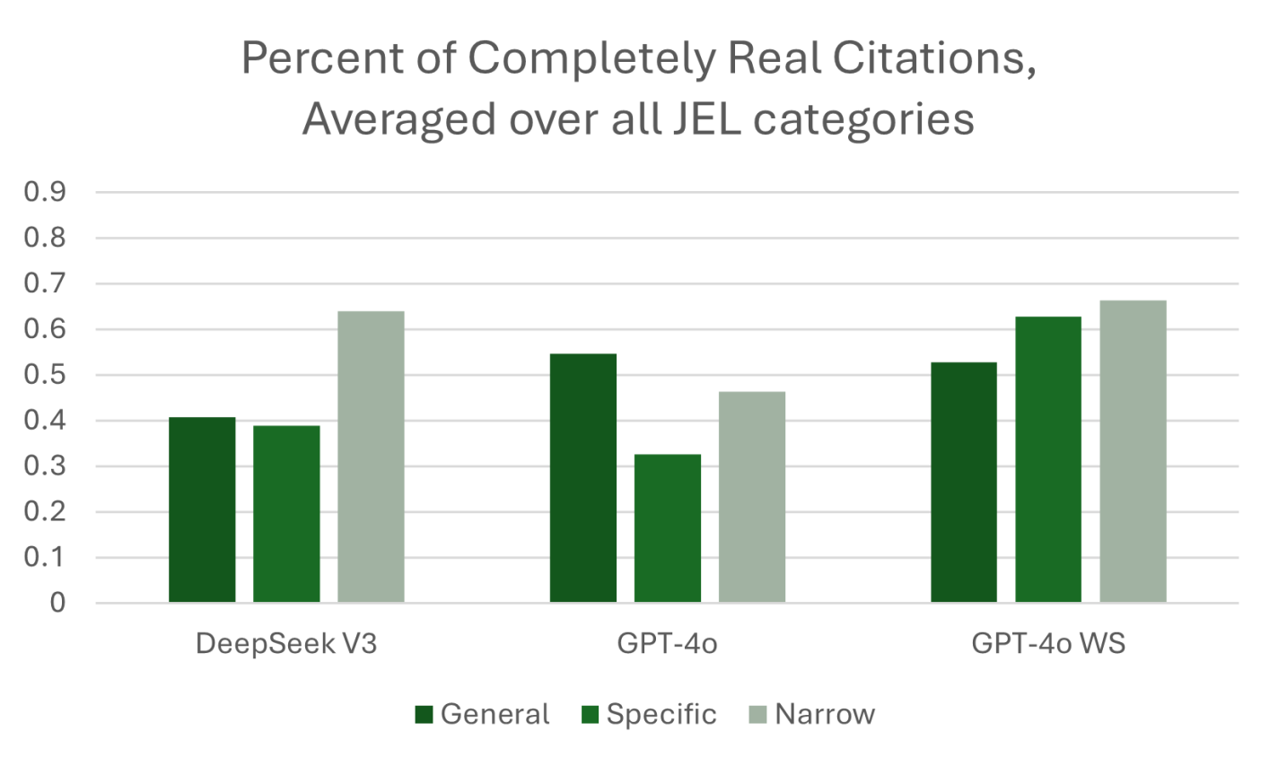
In 2023, we gathered the data for what became “ChatGPT Hallucinates Nonexistent Citations: Evidence from Economics.” Since then, LLM use has increased. A 2025 survey from Elon University estimates that half of Americans now use LLMs. In the Spring of 2025, we used the same prompts, based on the JEL categories, to obtain a comprehensive set of responses from LLMs about topics in economics.
What did we find? Would you expect the models to have improved since 2023? LLMs have gotten better and are passing ever more of what used to be considered difficult tests. (Remember the Turing Test? Anyone?) ChatGPT can pass the bar exam for new lawyers. And yet, if you ask ChatGPT to write a document in the capacity of a lawyer, it will keep making the mistake of hallucinating fake references. Hence, we keep seeing headlines like, “A Utah lawyer was punished for filing a brief with ‘fake precedent’ made up by artificial intelligence”
What we call GPT-4o WS (Web Search) in the figure below was queried in April 2025. This “web-enabled” language model is enhanced with real-time internet access, allowing it to retrieve up-to-date information rather than relying solely on static training data. This means it can answer questions about current events, verify facts, and provide live data—something traditional models, which are limited to their last training cutoff, cannot do. While standard models generate responses based on patterns learned from past data, web-enabled models can supplement that with fresh, sourced content from the web, improving accuracy for time-sensitive or niche topics.
At least one third of the references provided by GPT-4o WS were not real! Performance has not significantly improved to the point where AI can write our papers with properly incorporated attribution of ideas. We also found that the web-enabled model would pull from lower quality sources like Investopedia even when we explicitly stated in the prompt, “include citations from published papers. Provide the citations in a separate list, with author, year in parentheses, and journal for each citation.” Even some of the sources that were not journal articles were cited incorrectly. We provide specific examples in our paper.
The best they had was a 60 percent success rate. If I have my baby, and I give her a robot butler that has a 60 percent accuracy rate at holding things, including the baby, I’m not buying the butler.
In macroeconomics we have basic tools to help us talk about economic growth, which is simply the percent change in RGDP per capita. What causes growth? Lot’s of things. All else constant, if more people are employed, then more will be produced. But the productivity of those workers matters too. That’s why we calculate average labor productivity (ALP), which is the GDP per worker. This tells us how much each worker produces. All else constant, more ALP means more GDP.*
What affects ALP? Nearly everything: Technology, demographics, health, culture, and public policy. Most of these have long-term effects. So, it’s better to think in terms of regimes. After all, incurring debt now can result in a lot of investment and production, but there’s no guarantee that it can be sustained year after year. This is why I don’t get terribly excited about individual good or bad policies at any moment. There’s a lot of ruin in a nation. I care more about the long-run policy regime that is fostered over time.
Given the variety of inputs to economic growth, there’s always plenty of room for complaint about policy – even if the economy is doing well. In this post, I’m inspired by a Youtube video that a student shared with me. The OP laments poor policy in Massachusetts. But compared to some other nearby states, MA is doing just fine economically. This is not the same as saying that the OP is wrong about poor policies. Rather, a regime of policy, technology, interests, etc. is built over time and there can be a lot wrong in growing economies.
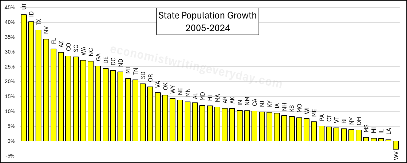
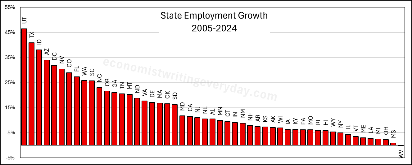
In the interest of being comprehensive, this post includes basic growth stats for all states from 2005 through 2024 (the years of FRED-state GDP).** First, let’s start with the basic building blocks of population, employment, and RGDP. Institutions matter. Policy affects whether people migrate to/from the state, fertility, how many people are employed, and what they can produce.
People like to talk about migration and the flocking to Texas & Florida. But that fails to catch the people who choose to stay in their state. Utah is 43% more populous than it was 20 years ago. But you don’t hear much clamoring for their state policies. Idaho and Nevada also beat Florida in terms of percent change. Where are the calls to be like Idaho? Employment largely tracks population, though not perfectly. The RGDP numbers can change quickly with commodity prices, reflected in the performance of North Dakota. But remember, these numbers cover a 20 year span. So, any one blockbuster or dower year won’t move the rankings much.
Of course, these figures just set the stage. What about the employment-population ratio, ALP, and RGDP per capita? Read on.
The chart originates from Statista, as you can see from the label in the image. But it is very frequently shared on social media, Reddit, and elsewhere (often with the Statista label clipped), occasionally generating millions of views and lots of heated comments.
But it’s a bad graph. In so many ways. Let’s break them down.
The data comes from BLS’s Consumer Expenditures Survey. I use this data frequently, as regular readers probably know. The data in the viral chart is from 2021 (more on that in a moment), but if I create a similar chart using the most recent data in 2023 but also include spending by those older than Baby Boomers (primarily the Silent Generation), you will notice a curious thing:
The Republicans hold a majority in both chambers of congress and they are the party of the president. They want to use that opportunity to pass substantial legislation that addresses their priorities. Hence, the One, Big, Beautiful Bill (OBBB). But, just like the Democratic party, Republican congressmen are a coalition with various and sometimes divergent policy agendas. There are ‘Trump’ Republicans, who want tariffs, executive orders, and deportations. There are more liberal members who want more free markets. You can also find the odd ‘crypto bro’, blue-state representatives, and deficit hawks. Given the slim majority in the House of Representatives, they all have to get something out of the legislation. Put them together, and what have you got?* You get a signature piece of legislation that no one is happy about but everyone touts.
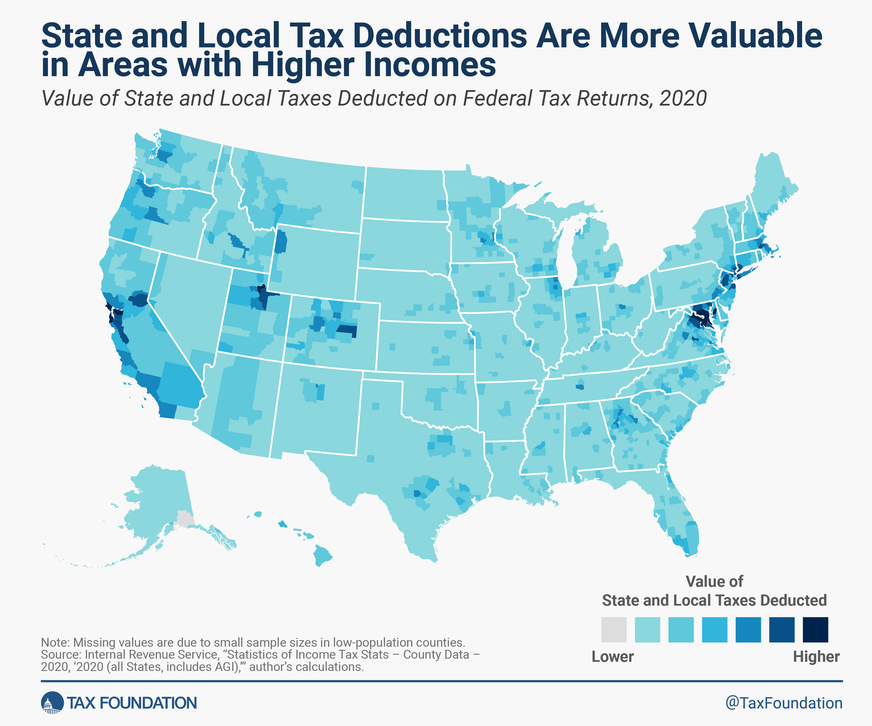
One example of such compromise is the State and Local Tax federal income tax deduction, or SALT deduction. The idea behind it is that income shouldn’t be taxed twice. If you pay a part of your income to your state government in the form of taxes, then the argument goes that you shouldn’t be taxed on that part of your income because you never actually saw it in your bank account. The state took it and effectively lowered your income. The state and local taxes get deducted from the taxable income that you report to the federal government. The reasoning is that you shouldn’t need to pay taxes on your taxes.
Paying taxes on your taxes sounds bad. And plenty of people don’t like one tax, much less two. The Tax Foundation has done a lot of good work to cut through the chaff and has published many pieces on the SALT deduction over the years.**
Cut and Dry SALT Deduction Facts:
It’s a tax cut
It reduces federal tax revenue
It adds tax code complication
It is used by people who itemize rather than take the standard income tax deduction
Prior to the 2017 Tax & Jobs Act, there was no limit on the SALT deduction. After, the limit was $10k.
The current OBBB increases the SALT deduction.
Those are the basics. Everything else is analysis. The Grover Norquist Republicans never see a tax cut that looks bad, so they’d like to see the SALT limit raised or disappear. Tax think tanks that like simplicity don’t like the SALT deduction because it adds complication. Plenty of others say they don’t like complication, but often change their mind when it comes to the details (much like cutting government waste). Think tanks tend to be a bit lonely on this point.
People mostly care about the SALT deduction due to the distributional effects. Who ends up benefiting from the deduction? The short answer is people who 1) itemize & 2) have heavy state and local tax bills. Who is that? Rich people of course! They have high incomes and lots of wealth and real estate – on which they pay taxes. But not all rich people pay loads of state taxes. So the SALT deduction is a tax cut that primarily benefits rich people who live in high tax districts. Where’s that? See the below.
It will be interesting to see if this ends up taking a place in the set of Fed surveys that are always driving economic discussions, like the Survey of Consumer Finances and the Survey of Professional Forecasters. If they keep it up and start putting out some graphics to summarize it, I think it will. My quick impression (not yet having spoken to Fed people about it) is that it will be the “quick hit” version of the Survey of Consumer Finances. It asks a smaller set of questions on somewhat similar topics, but is released quickly after each quarter instead of slowly after each year. If they stick with the survey it will get more useful over time, as there is more of a baseline to compare to.
But a year later the survey now has what I hoped for: a solid baseline for comparisons, and pre-made graphics to summarize the results. It continues to show complex and mixed economic performance in the US. People think the economy is getting worse:
They are cutting discretionary (but not necessity) spending at record levels:
They are worried about losing their jobs at record levels:
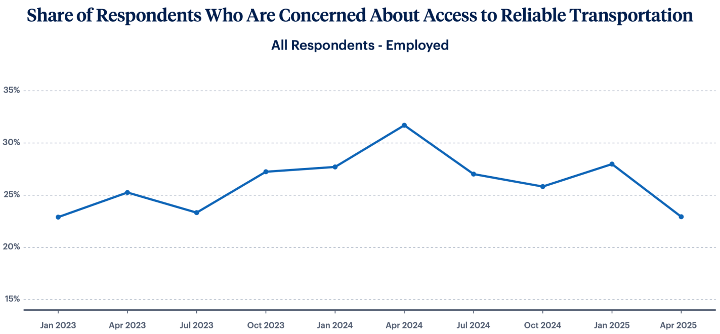
But key areas like housing, childcare, and transportation are stabilizing:
Overall I think we can synthesize these seemingly contradictory pictures by saying that Americans’ finances are fine now, but they are quite worried that things are about to get worse, perhaps due to the tariffs taking effect. You can find the rest of the LIFE survey results (including all the non-record-setting ones) here.
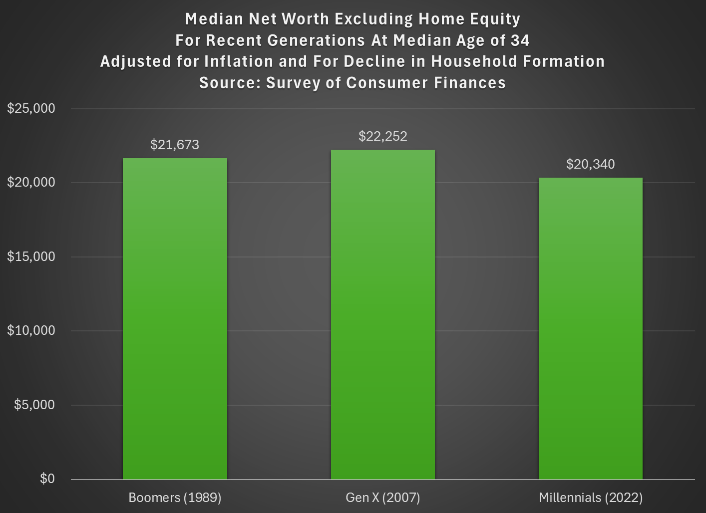
Last week I tried to address whether rising wealth for younger generations was primarily driven by rising home values. My analysis suggested that it was a cause, but not the only cause. Here’s another chart on that topic, showing median net worth excluding home equity for recent generations:
Two things are notable in the chart. For millennials, even excluding home equity they are well ahead of past generations, though of course their net worth is much smaller excluding this category of wealth (the total median net worth for millennials in 2022 was $93,800). But for Gen X in 2022 (last data in that chart), they are slightly behind Boomers, never having recovered from the decline in wealth after 2007 (primarily from the stock market decline, since we’re excluding housing).
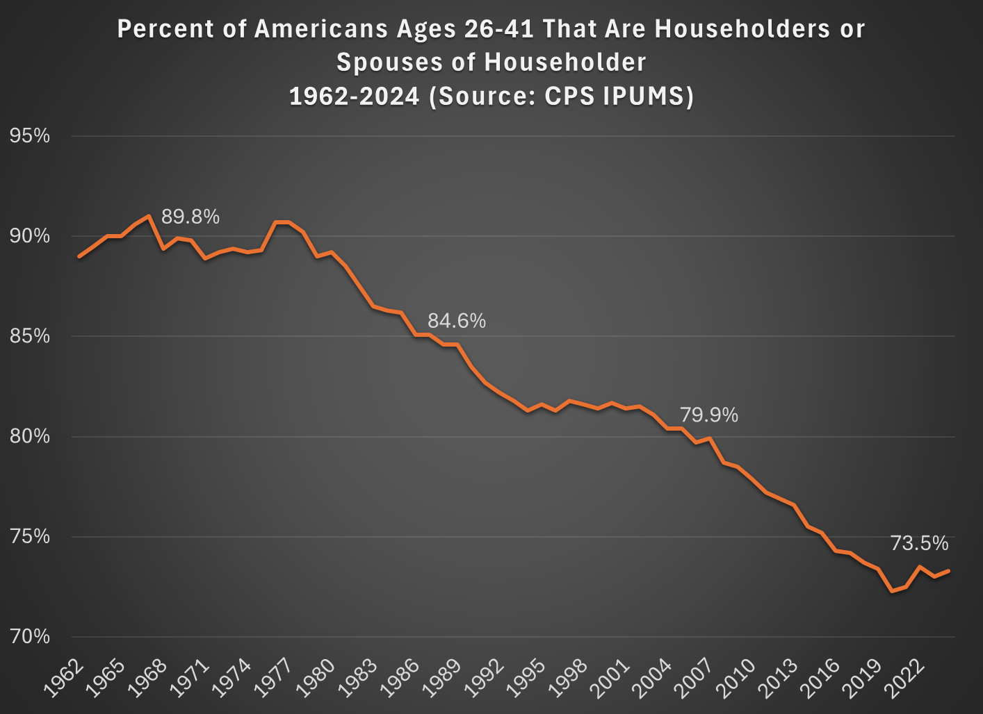
But today I want to address another general objection to the wealth data found in the Fed’s SCF and DFA programs. That objection has to do with household formation. Specifically, these surveys are calculated for households, and the age/generation indicators are for the household head (or “householder” as it is now called). And we know that household formation has been declining over time, as more young people live with parents, with roommates, etc. So the Millennial data we see in the chart above is excluding any Millennials that have not yet formed their own household.
Here’s a general picture of the decline, which has been happening gradually since about 1980. Note: I use the age group 26-41, because this is the age of Millennials in 2022 (the most recent SCF survey year). The highlighted years on the chart are when the Silent, Baby Boomer, Gen X, and Millennial generations were about the same age (26-41).
What this means is that when we are looking at households in these wealth surveys (or any survey that focuses on households) we aren’t quite comparing apples to apples. Does this mean the surveys are worthless? No! With the microdata in the SCF, we can look at not only the median value, but the entire distribution. Since the household formation rate has fallen by about 11 percentage points between Boomers in 1989 and Millennials in 2022, one solution is to look up or down the distribution for a rough comparison.
For example, if we assume all of the 11 percent of non-householders among Millennials have wealth below the median, we can make a rough correction by looking at the 39th percentile for Millennials — the 39th percentile would be the median if you included all of those 11 percent of non-householders as households. Similarly, for Gen X would move down 5 percentage points in the distribution to the 45th percentile in 2007.
The household-formation-adjusted chart does paint a more pessimistic picture than just looking at the median for each generation: the 39th percentile Millennial has about 20% less wealth than the median Boomer did at roughly the same age. Seems like generational decline! Is there any silver lining?
First, you should interpret the chart above as a worst case scenario for Millennial wealth. It assumes all non-householders have low wealth. But likely not all of them do. If instead we use the 43rd percentile of Millennials in 2022, their net worth is $61,000, slightly above Boomers at the same age. (The household formation problem isn’t going away anytime soon as generations age — even if we look at Gen Xers, with a median age of 50 in 2022, their household formation is still 6 percentage points behind Boomers at that age.)
Second, my worst case scenario almost certainly overstates the problem. If all of those 11 percent fewer Millennials not yet forming households were to get married to other millennials, it would only add half of that many households to the aggregate distribution (when two non-householders get married, it becomes one household). So instead of moving down 11 percentage points to the 39th percentile, we should only move down 5 or 6 percentiles. The 44th percentile of Millennial net worth in 2022 was $63,060 — again, compare this to Boomers in the chart above.
Finally, if we combine both of the adjustments discussed in this post, looking at wealth excluding home equity and also adjusting for the decline in household formation, we get the following chart (here I once again use the 39th percentile for Millennials and the 45th percentile for Gen X, i.e., the worst case scenario):
With this final adjustment, we get a slightly different picture. The wealth of these three generations is roughly the same at the same age. No increase in wealth, but no decline either. You could read this as pessimistic, if your assumption is that wealth should rise over time, but the general vibes out there are that young people are worse off than in the past. This wealth data suggests, once again, that the kids are doing all right.
The Senate Health, Education, Labor and Pensions Committee is proposing to cut off student loans for programs whose graduates earn less than the median high school graduate. The House proposed a risk-sharing model where colleges would partly pay back the federal government when their students fail to pay back loans themselves. Both the House and Senate propose to cap how much students can borrow for graduate loans. Both would reduce federal spending on higher ed by about $30-$35 billion per year, cutting the size of the $700 billion higher ed sector by 4-5%. I expected that something like this would happen eventually, especially after the student loan forgiveness proposals of 2022:
While we aren’t getting real reform now, I do think forgiveness makes it more likely that we’ll see reform in the next few years. What could that look like?
Colleges should also share responsibility when they consistently saddle students with debt but don’t actually improve students’ prospects enough to be able to pay it back. Economists have put a lot of thought into how to do this in a manner that doesn’t penalize colleges simply for trying to teach less-prepared students.
I’d bet that some reform along these lines happens in the 2020’s, just like the bank bailouts of 2008 led to the Dodd-Frank reform of 2010 to try to prevent future bailouts. The big question is, will this be a pragmatic bipartisan reform to curb the worst offenders, or a Republican effort to substantially reduce the amount of money flowing to a higher ed sector they increasingly dislike?
Of course, there is a lot riding on the details. How exactly do you calculate the income of graduates of a program compared to high school grads? The Senate proposal explains their approach starting on page 58. They want to compare the median income of working students 4 years after leaving their program (whether they graduated or dropped out, but exempting those in grad school) to the median income of those with only a high school diploma who are age 25-34, working, and not in school.
Nationally I calculate that this would make for a floor of $31,000. That is, the median student who is 4 years out from your program and is working should be earning at least $31k. In practice the bill would implement a different number for each state. This seems like a low bar in general, though you could certainly quibble with it. For instance, those 4 years out from a program may be closer to age 25 than age 34, but income typically rises with age during those years. If you compare them to 26 year old high school grads, the national bar would be just $28k.
What sorts of programs have graduates making less than $31k per year?