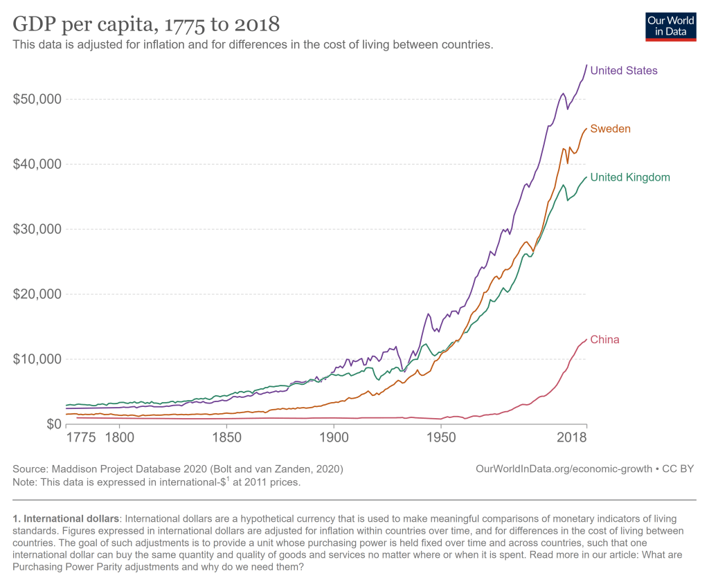
The United States has problems and always had. But the historical record of the United States as an economic powerhouse is unrivaled. The US had a bit of a head start on economic growth, being a direct descendant of the country that really kicked of the Industrial Revolution. But we took that head start and really ran with it, now being by far the highest income large country, and the highest income country that does not derive a significant part of its GDP from fossil fuels or being a tax haven.
The average American has, as best as we are able to measure it, a standard of living that is at least 20 times greater than Americans when this country began.
This past week, smoke from wildfires in Canada once again drifted southward and gave very unhealthy air in parts of the U.S. Several sources I checked indicated that it is unrealistic to expect human effort to extinguish these fires (see here , here, and here). The Canadian forests are just too huge in relation to the fire-fighting resources. What usually happens, even during a normal fire season, is that summer fires just keep burning until they are dampened down by winter rain, snow, and cold. Most of the fire-fighting efforts are devoted to saving communities that are in the path of the flames.
Thus, we may expect periodic episodes of unhealthy air for the next several months. The most hazardous smoke particles are those less than 2.5 microns in size. Particles this small make it past your body’s defenses and penetrate deep into your lungs, promoting a number of serious medical conditions. These smoke particles are made of toxic chemicals like polycyclic aromatic hydrocarbons.
What to do to protect yourself? A first line of defense is to don an effective mask, even indoors. We all probably have Chinese KN95 or Korean KM94 masks left over from pandemic days, and (properly fitted around the nose) these should filter out most of the smoke, including the particles that are less than 2.5 microns. (I prefer the more-comfortable KM94 masks, as discussed here.) These masks are supposedly about as effective as the more-rigid N95 masks that are the U.S. standard.
Air Filters in Your Furnace
See here for some general tips on dealing with smoke in the home, e.g. damp-mop non carpet floors rather than vacuuming, to avoid shooting settled particles into the air. However, what is really needed is some means to filter the smoke out of the air in your home, otherwise over time the air inside may be as polluted as the air outside. All furnace/central air conditioning systems have a filter in the circuit. A simple solution would be to use an air filter which can catch the smoke particles. The problem here is that the better the filter is at catching small particles, the more restrictive of air flow it is.
Most air filters are rated according to MERV values. MERV 13 filters can remove most smoke particles in a single pass. Unfortunately, most home heating/cooling systems cannot handle that much restriction in air flow; the fan motor would get overloaded and perhaps burn out. One solution here is to install a parallel air filter, with its own booster fan, using a MERV 13 filter. Here, only part of the home air circulation goes through the MERV 13 filter on each pass, but with time most of the home air gets cleaned.
Another approach is to install a MERV 11 or (if your furnace is newer) MERV 12 filter in the furnace. A MERV 11 filter might only capture around 25% of smoke particles per pass, but in the course of a day your whole house air volume should pass through the filter several times. If you have a common size air filter, you can probably get a MERV 11 that would fit on Amazon or at a local big box store. For uncommon sizes, try here.
Make Your Own High-Capacity Filter Box
In addition to working with your furnace/air conditioning filter, you can buy a compact stand-alone air purifier for your home. This Shark HP202 model will provide a continuous read-out of air quality.
For even more air-cleaning muscle, you can make a box-style air purifier by duct-taping together four MERV 13 furnace air filters (four sides of a cube), and adding a box fan on top. Instructions (including YouTube links) for doing this are here, with further details here. These diagrams give the general picture:
An example of a finished product is below; note the red tape covering the outer part of the fan outlet. Blocking that outer area, giving a smaller diameter opening for the air to blow out, increases the net air flow significantly. (It prevents back-eddies of air around the edges).
It turns out that the air flow through one of these home-made air filters is so high that, even though the per-pass capture efficiency is lower than a HEPA filter, the home-made filter box can remove more particulates from a room than a store-bought HEPA filter.
I have made two of these filter boxes so far, using premium and regular filters. They have worked quite well in clearing the smoke from our rooms: the benefit is well worth the cost of parts and labor. See here for more on my experiences and construction tips.
Some on-line resources:
Accuweather seems to have straightforward reporting of air quality, including specifically the less than 2.5 micron particles. (Search on your location, then find Air Quality and click Details).
NOAA provides a real time satellite map of smoke patterns (click on “Surface Smoke”), but don’t rely on their color coding to decide whether your local condition is orange or red.
This web site from Natural Resources Canada shows locations of current wildfires in Canada. See Overlays for the meaning of the symbols; red denotes fires that are out of control. You can click Fire Perimeter Estimate to see the enormous extents of some of these fires.
There is a narrative about US history that goes like this: “Historical racism was really bad and limited opportunities for blacks. Blacks were not allowed to participate in a set of occupations and other civic life. The absence of blacks from typically higher income occupations reduced the number of competitors in those sectors. Not only did blacks have fewereconomic opportunities, the whites who were insulated from competition earned monopoly rents. Therefore, if blacks were excluded, the whites who were in exclusive sectors earned profits at the expense of blacks.”
The logic is neat. Are there any holes in it?Let’s see.
If a scientific finding is really true and important, we should be able to reproduce it- different researchers can investigate and confirm it, rather than just taking one researcher at their word.
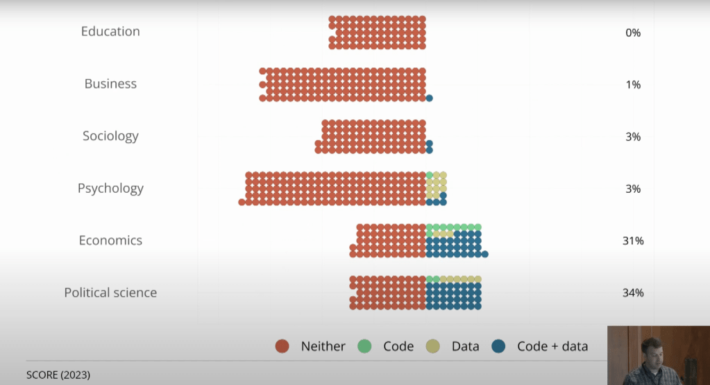
Economics has not traditionally been very good at this, but we’re moving in the right direction. It is becoming increasingly common for researchers to voluntarily post their data and code, as well as for journals (like the AEA journals) to require them to:
This has certainly been the trend with my own research; if you look at my first 10 papers (all published prior to 2018) I don’t currently share data for any of them, though I hope to go back and add it some day. But of my most recent 10 empirical papers, half share data.
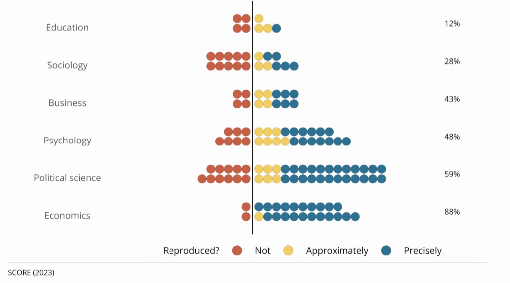
This sharing allows other researchers to easily go back and check that the work is accurate. This could mean simply checking that it is “reproducable”, i.e., that running the original code on the original data produces the results that the authors said. Or it could mean the more ambitious “replicability”, i.e., you could tackle the same question with different data and still find basically the same answer. Economics does generally does well at reproducability when code is shared, but just ok at replication.
Of course, even when data and code are shared, you still need people to actually do the double-checking research; this is still relatively rare because it is harder to publish replications than original research. But more replication journals are opening, and there are now several projects funding replications. The trends are all in the right direction to establish real, robust findings, with one exception- the rise of restricted data.
Traditionally most economics research has been done using publicly available datasets like the Current Population Survey. But an increasing proportion, perhaps a majority of research at top journals, is now done using restricted datasets (there’s a great graph on this I can’t find but see section 3.3 here). These datasets legally can’t be shared publicly, either due to privacy concerns,licensing agreements, or both. But journals almost always still publish these articles and give them an exemption to the data sharing requirement. One the one hand it makes sense not to ignore this potentially valuable research when there are solid legal reasons the data can’t be shared. But it does mean we can’t be as confident that the data has been analyzed correctly, or that it even really exists.
One potential solution is to find people who have access to the same restricted dataset and have them do a replication study. This is what the Institute for Replication just started doing. They posted a list of 100+ papers that use restricted data that they would like to replicate. They are offering $5000 for replications of most of the papers, so I think it is worthwhile for academics to look and see if you already have access to relevant datasets, or if you study similar enough things that it is worth jumping through the hoops to get data access.
For everyone else, this is just one more reason not put too much trust in any one paper you read now, but to recognize that the field as a whole is getting better and more trustworthy over time. We will be more likely to catch the mistakes, purge the frauds, and put forward more robust results that at least bear a passing resemblance to what science can and should be.
I watched the Chapman Economic Forecast Update for 2023 live on June 22 (you can watch the whole thing free here). Go to their website for free videos and links. They have an excellent track record for being correct.
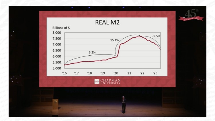
This time, Dr. Jim Doti believes we are headed for a recession by the third quarter of 2023 or at least what he conservatively calls a “slowdown”. He hates to make dramatic predictions or deliver bad news, but he saw the inflation brewing back in 2021, and I remember him correctly predicting what was to come.
For one thing, the dramatic growth in the money supply at the beginning of the pandemic has been corrected into a sharp contraction of the money supply.
People have been joking about how the recession isn’t happening.
The middle segment of the forecast, which I recommend watching, is about investing. Fadel Lawandy cautions that stocks are not a good bet right now, with a likely recession looming.
The third segment is focused on the economy of California. I didn’t finish that part, since I don’t live there anymore.
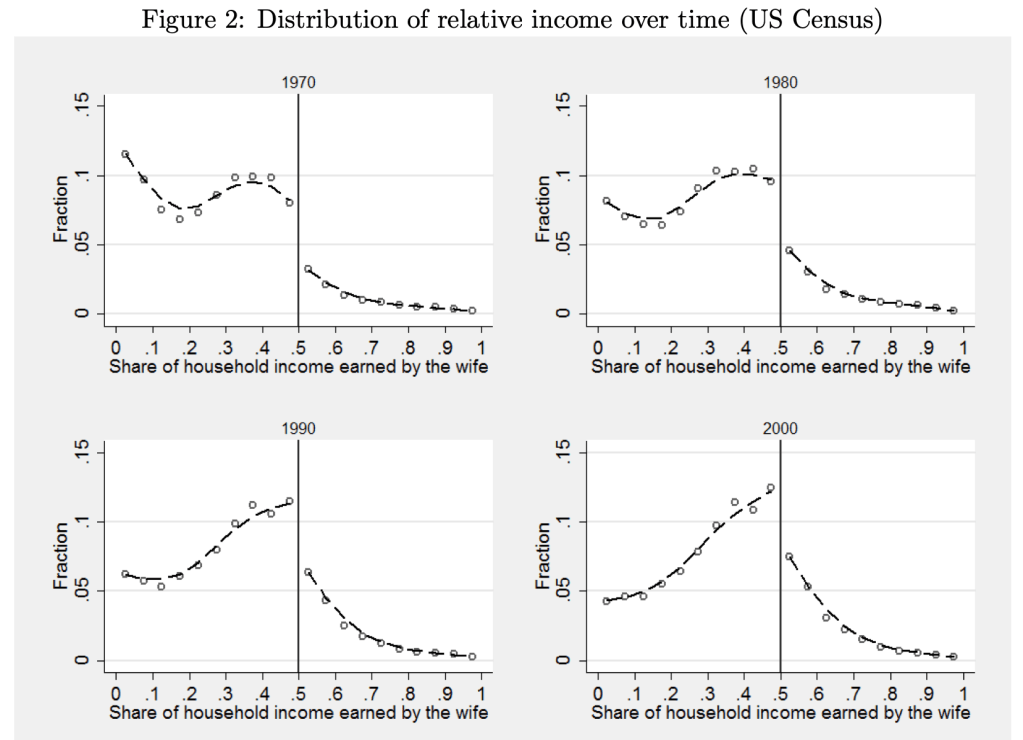
As we have gone through our education and training and changed jobs, my wife and I have been in every sort of relative income situation, with each one sometimes vastly or slightly out-earning the other. Currently she slightly out-earns me, which I thought was unusual, as I remembered this graph from Bertrand, Kamenica and Pan in the QJE 2015:
The paper argues that the big jump down at 50% is driven by gender norms:
this pattern is best explained by gender identity norms, which induce an aversion to a situation where the wife earns more than her husband. We present evidence that this aversion also impacts marriage formation, the wife’s labor force participation, the wife’s income conditional on working, marriage satisfaction, likelihood of divorce, and the division of home production. Within marriage markets, when a randomly chosen woman becomes more likely to earn more than a randomly chosen man, marriage rates decline. In couples where the wife’s potential income is likely to exceed the husband’s, the wife is less likely to be in the labor force and earns less than her potential if she does work. In couples where the wife earns more than the husband, the wife spends more time on household chores; moreover, those couples are less satisfied with their marriage and are more likely to divorce.
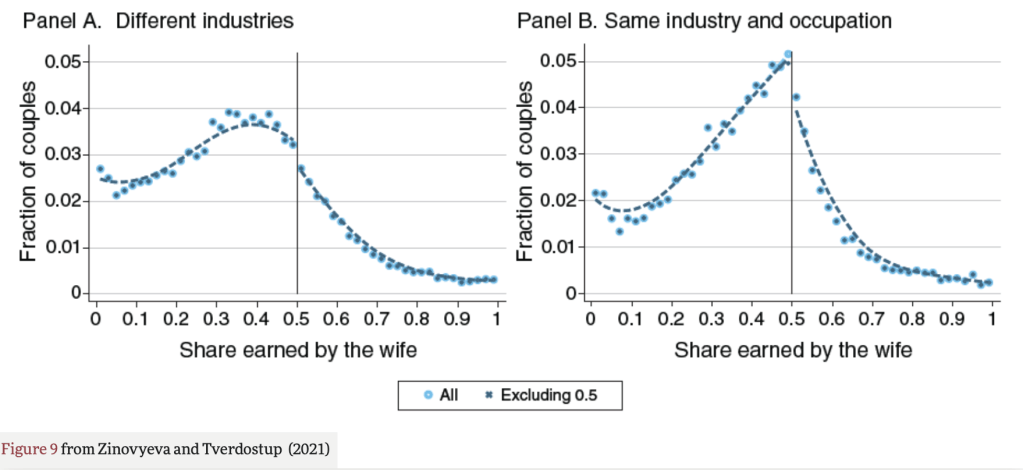
But when I went to look up the paper to show my wife the figures, I found that the effect it highlights may no longer be so large. Natalia Zinovyeva and Maryna Tverdostup show in their 2021 AEJ paper that the jump down in wives’ income at 50% is quite small, and is largely driven by couples who have the same industry and occupation:
They created the figure above using SIPP/SSA/IRS Completed Gold Standard Files, 1990–2004. I’d be interested in an analysis with more recent data. Much of their paper uses more detailed Finnish data to test the mechanism for the remaining jump down at 50%. They conclude that gender norms are not a major driver of the discontinuity:
We argue that the discontinuity to the right of 0.5 can emerge if some couples tend toward earnings equalization or convergence. To test this hypothesis, we exploit the rich employer-employee–linked data from Finland. We find overwhelming support in favor of the idea that the discontinuity is caused by earnings equalization in self-employed couples and earnings convergence among spouses working together. We show that the discontinuity is not generated by selective couple formation or separation and it arises only among self-employed and coworking couples, who account for 15 percent of the population.
Self-employed couples are responsible for most observations with spouses reporting identical earnings. When couples start being self-employed, both sides of the distribution tend to equalize earnings, perhaps because earnings equalization helps couples to reduce income tax payments, facilitate accounting, or avoid unnecessary within-family negotiations. Large spikes emerge not only at 0.5 but also at other round shares signaling the prevalence of ad hoc rules for entrepreneurial income sharing in couples. Self-employment is associated with a fall of household earnings below the level predicted by individuals’ predetermined characteristics, but this drop is mainly due to a decrease in male earnings, with women being relatively better off.
In the case of couples who work together in the same firm, there is a compression of the earnings distribution toward 0.5 both on the right and on the left of 0.5. As a result, there is an increase both in the share of couples where men slightly outearn their wives and in the share of couples where women slightly outearn their husbands. Since the former group is larger, earnings compression leads to a detection of a discontinuity.
So, concerns about relative earnings aren’t causing trouble for women in the labor market. But do they cause trouble at home? Perhaps yes, but if so its not in a gendered way and not driven by the 50% threshold:
Separation rates do not exhibit any discontinuity around the 0.5 threshold of relative earnings. Instead, the relationship between the probability of separation and the relative earnings distribution exhibits a U-shape, with higher separation rates among couples with large earnings differentials either in favor of the husband or in favor of the wife.
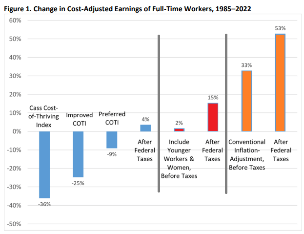
62 weeks. That’s how long the median male worker would need to work in a year to support a family in 2022, according to the calculations of Oren Cass for the American Compass Cost-of-Thriving Index released this year. Not only is 62 weeks longer than the baseline year of 1985 (when it took about 40 weeks, according to COTI), but there is a big problem: there aren’t 62 weeks in year. It is, by this calculation, impossible for a single male earner to support a family.
Is this true? In our new AEI paper, Scott Winship and I strongly disagree. First, we challenge the 62-week figure. With a few reasonable corrections to Cass’ COTI, we show that it is indeed possible for a median male earner to support a family. It takes 42 weeks, not 62 as reported in COTI.
But wait, there’s more. Much more. In our paper, we provide a range of reasonable estimates for how the cost of thriving has changed since 1985. In the COTI calculation, the standard of living for a single-earner family has fallen by 36 percent since 1985. In our most optimistic estimate, the standard of living has risen by 53 percent. The chart below summarizes our various alternative versions of COTI. How do we get such radically different results? Is this all a numbers game?
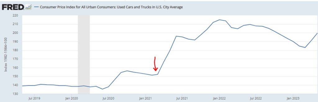
I write about various topics, usually with at least some loose connection to economics. Sometimes these are fairly macro issues, other times there are specific, actionable observations. For instance, back in March of 2021, we inferred from the critical shortages of semiconductors that car manufacturing would be severely crimped, likely leading to big price increases in cars. Our post “Chip Shortages Shutting Down Auto Assembly Lines; Buy Your Car Now Or Else” came out just in time (red arrow below) to alert the readership here:
But now, a price increase of more ubiquitous import looms. Most of us were not in the market for cars in March of 2021, but some 81% of us eat chocolate, with the average American consuming about 9.5 pounds a year. Indeed, 50% “cannot live without it every day.”
And so, it is with a heavy heart that I bring warning of a rise in the price of chocolate. Back in pandemic lockdown, I was bored and speculated a few bucks in cocoa futures, as tracked by the NIB exchange traded fund. My shares went up, and then down, and I sold out to limit losses (which was a good move at the time), and moved onto other investments.
Imagine my surprise when I randomly checked on NIB this week and saw the price ramp-up in the past few months:
A quick internet search led to a CNBC article which confirmed my worst fears:
“The cocoa market has experienced a remarkable surge in prices … This season marks the second consecutive deficit, with cocoa ending stocks expected to dwindle to unusually low levels,” S&P Global Commodity Insights’ Principal Research Analyst Sergey Chetvertakov told CNBC in an email.
The price of cocoa will feed into the price of consumer chocolate products, especially dark chocolate which has more actual cocoa content. And the price of sweets generally will rise on the back of sugar prices, which stand at 11-year highs, driven again largely by weather.
There is still time to stock up ahead of the hoarders…
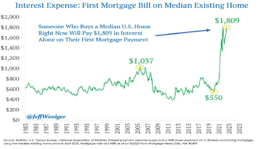
The Federal Reserve has been increasing interest rates at the fastest pace since the 1980’s, from near-zero rates in March of last year to over 5% today. This has led to rapid slowdowns in interest-rate sensitive sectors like housing, cars, and startups. Because most people finance their home buying, higher interest rates mean higher monthly payments for a house at a given price. Since many people were already buying houses near the highest monthly payment banks would allow them to, higher interest rates mean they need to buy cheaper houses or just stay out of the market and rent. This is especially true as the interest expense on mortgages has tripled in two years:
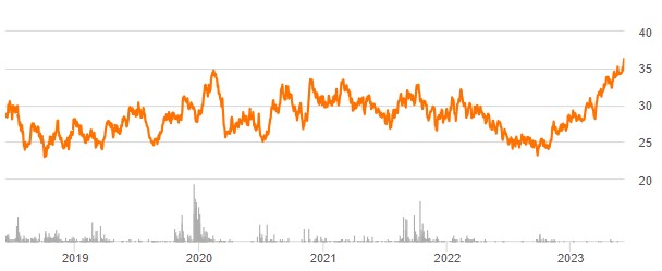
You’d think this would be bad news for homebuilders, and for most of 2022 markets agreed: homebuilder stocks fell 36% from the beginning of 2022 to September 2022 after the Fed started raising rates in March. But homebuilder stocks have recovered since September, with some major names like D.R. Horton and Lennar hitting all time highs. Why?
I bought homebuilder stocks in January but I have to say even I wasn’t expecting such a fast recovery (if I had, I would have bought a lot more). I was buying because they were cheap on a price to earnings basis and temporarily out of fashion; I love stocks that are priced like they’re in a secular decline to bankruptcy when its clear they are actually just having a bad cycle and will recover when it turns. But I thought I’d have to wait years for falling interest rates and a recovering housing market for this to happen. Instead these are up 20-100% in 6 months. Why?
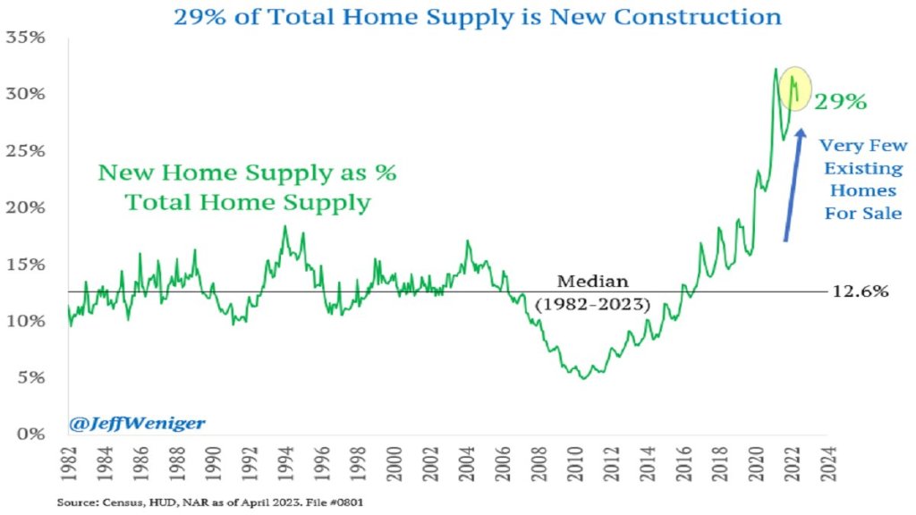
The big thing I missed was that high interest rates have hit their competition harder, reducing supply as well as demand. Who is the competition for homebuilders? Existing homeowners. Homeowners with the “golden handcuffs” of a 3% mortgage who don’t want to move if it means switching to a 7% mortgage. I’m seeing this personally in Rhode Island- I’d kind of like a house with a bigger yard on a quieter street, but there are only 5 houses for sale in my whole school district. Between that and interest rates, we’re staying put. But for people who really need to move, new homes are making up a record proportion of the available inventory:
This situation seems likely to persist for at least months, and possibly years. The Fed paused its rate hikes yesterday for the first time since last March, but indicated that more hikes may lie ahead. I’m tempted to take the win and sell homebuilder stocks, but they still have price to earnings ratios under 10, and the “golden handcuffs” on their competition seem likely to stay on for at least another year.
On summer vacation, I recently visited Mount Rushmore. It’s amazing structure, and the story of its construction is as impressive as the monument itself. Much of the story you learn when visiting is the story of its creation. As an economist, of course seeing the following display with wage data got me very excited:
While the sign says that laborers made 30 cents per hour, searching online it appears that 50 cents was more common. More skilled workers, such as assistant sculptors, made $1.50 per hour. These were, as the sign says, “good wages” for that time. In the economy generally, production workers made around 50 cents per hour our as well around that time period, and most of the construction of Rushmore was during the Depression (some of the workers were WPA funded), so having any job, much less one that paid pre-Depression wages, was certainly a good one.
How does this compare to wages today? This is always a tricky question, as I have documented on this blog several times before, but the most straight forward approach (and good first approximation) is a simple CPI inflation adjustment. Using 1929 as the baseline year, when construction was in full swing, 30 cents an hour is roughly $5 today, 50 cents per hour is close to $9, and $1.50 would be about $26.50. That doesn’t sound too bad!
The best comparison I like to use is BLS’s average hourly earnings for private production and non-supervisory workers. Averages aren’t perfect, but this measure excludes management occupations that will be distorting the average. In May 2023, that wage was $28.75 per hour. So the average worker today earns 3-6 times as much per hour as these “good paying jobs” in the late 1920s and the Depression. And, as the Rushmore signage notes, these jobs were seasonal. Their off-season jobs probably paid even less.
The wage of the assistant sculptor does compare well with average wages today, but that pay was unusual for the time and was likely a highly skilled worker. The only record I can find of anyone making that much at Rushmore was Lincoln Borglum, the son of the main sculptor Gutzon Borglum. Lincoln oversaw the completion of the project after Gutzon’s death, and it was only in later years on the project that his pay was increased to $1.50 per hour.
For the typical laborer on Rushmore, having a good job was indeed good to have, but the wages pale in comparison to a typical worker today.


