The latest Global Valuation update this week shows that Poland (along with Colombia) has some of the world’s cheapest stocks. Their overall Price to Earnings ratio is 8, compared to 28 for the US:
Does this mean Polish stocks are a good deal, or that investors are rationally discounting them as being risky or slow-growing? After all, they had a low P/E ratio last time I wrote about them too.
Stocks can rise either based on higher investor expectations (higher P/Es) or improved fundamentals (earnings rise, investors see this and bid up the price, but only enough to keep the P/E ratio roughly constant). Over the past year Polish stocks have done the latter; I bought EPOL (the only ETF I know of that focuses Poland) a year ago because its P/E was about 6. Since then its up 70% and the P/E is still… about 6.
Why haven’t investors been excited enough about this earnings growth to bid up the valuation? I think the biggest concern has been political risk, given that the ruling Law and Justice party has been alienating the EU and arguably undermining the rule of law and finding pretexts to arrest businessmen critical of the government.
The recent Polish election promises to change all this. A coalition of ‘centrist’ opposition parties won enough votes to oust the current government, and Washington, the EU, and business seem relieved:
As Europe’s sixth-largest economy, a revitalised pro-EU attitude in Poland would be particularly welcome.
“It will be a positive development for sure because it will unlock the (EU) money that has been withheld and reduce a lot of the tension that has been created with Brussels,” said Daniel Moreno, head of emerging markets debt at investment firm Mirabaud.
Some 110 billion euros ($116 billion) earmarked for Poland from the EU’s long-term budget and the post-pandemic Recovery and Resilience Facility (RRF) remain frozen due to PiS’ record of undercutting liberal democratic rules.
The case for optimism is an influx of EU funds, less risk for business, and an appetite for higher valuations among Western investors who no longer dislike the government.
Being an economist I also have to give you the “other hand”, the case for pessimism: the new government hasn’t actually formed yet, meaning the current one still has the chance for shenanigans; population growth has been strong recently with the influx of Ukrainian refugees, but it is likely to go negative again soon; and EPOL is almost half financial services, which have relatively low P/E even in the US right now.
Nothing is guaranteed but this is my favorite bet right now. I find it amusing that this “risky” emerging market has had a great year while “safe” US Treasury bonds are having a record drawdown (easy to be amused when I don’t own any long bonds and they have done surprisingly little damage in terms of blowing up financial institutions so far). I emphasize the investing angle here but hopefully this signals a bright future for the Polish people.
Disclaimers: Not investment advice, I’m talking my book (long EPOL), I’ve never been to Polandand I’m judging their politics based on Western media reports
Every sentence in this article is fascinating, since I have been writing about fast fashion.* Anything I put in quote form comes from The Guardian.
The word “revolution” in the title of this article is minor clickbait. Perhaps it would be more accurate to say: “Clothes repaired in workshop, 19 people employed” That wouldn’t get any clicks. However, I am an idealist, and I am going to stay a bit on board with the revolution. I, too, have pondered and grieved over the amount of waste heading into landfills. There could be some kind of revolution ahead, whether it is of the repair type or not.
The communal garden and bespoke textile art lend a creative startup feel, and the slogan “repair is the new cool” appears everywhere. But what’s happening here is far from ordinary startup stuff. At United Repair Centre (URC), newcomers to the Netherlands from across the world, many of them former refugees, are using their tailoring skills to mend clothes on behalf of some of the world’s biggest brands.
Immigrants are sewing, but no Dickensian horrors here. This place “has a laid-back Dutch vibe.”
Ambrose, who greets me, mans the front desk. He’s a 20-year-old Palestinian fashion fan, who was born in Syria and lived in Abu Dhabi before moving to the Netherlands in May; he is working in parallel with studying for a fashion and design diploma. Ambrose started at URC in May and loves it: the way he gets to work in collaboration with the tailors, giving advice and learning from their years of experience. “It’s really easy, fun, chill … “
Repair might be cool, but is it new? Consider Jo March from “Little Women” who was an American bouncing around between rich and poor status in the 1860s. American GPD per capita in 1860s was less than $3,000. That would be considered very poor today. Since manufactured goods were expensive and Jo March had a low opportunity cost of time, she spent lots of time mending clothes. Her passion was writing but she had no choice – that was how she contributed to her household production. Very few families at that time, even in the upper class, could afford to regularly buy new clothes from a shop.
Don Boudreaux explained that even modern rich people “recycle” clothes when it’s in one’s selfish interest. Washing and “re-use” of clothes, typically, is beneficial enough to outweigh the cost of maintaining and storing them. Sometimes we go above and beyond by donating them or maintaining them specifically because we are trying not to “waste” something, but that comes at an individual cost to us.
The author of the article writes:
I take a taxi from the station to URC because I’m running late, but I’m taken aback when en route the driver points out the many conveniently located stations and tram stops I could use for my return journey.
This is a perfect encapsulation of why rich people do not repair clothes. They are zipping around to high-productivity work meetings. The opportunity cost of time has gone up. Taking the bus is costly in terms of time, the scarcest resource of the rich.
Where I see hope for the repair “revolution” is in artificial intelligence (AI). AI can make up for our scarce time and attention. If AI can make repairs less costly in terms of time, then rich people might do it. If it doesn’t make economic sense, then it won’t scale the way the author is hoping.
Currently, the “revolution” is employing 19 people full-time. By the year 2027, all they are hoping for is to expand to 140 tailors. Hardly a revolution on the jobs front. But that’s the hopeful scenario. If it’s labor-intensive, then it won’t work. (See my ADAMSMITHWORKS post on cloth production and labor.)
Is repair reaching a tipping point?
There’s one unlikely scenario in which expensive repairs will get paid for. What rich people resoundingly want is kitchen renovations and new clothes, partly because it confers status. Could it become cool to live with those outdated cabinets and wear that repaired Patagonia vest for the next two decades? … could it? Vision: “Wow. I see that you guys have outdated ugly countertops. Nice. You resisted the desire to renovate your kitchen even though it’s within your budget.”
Even changing status markers are unlikely to tip the scale in the case of broken equipment or torn clothes. AI might allow us to repair a refrigerator instead of trash it.
URC tracks repairs using software initially developed by Patagonia, which it has built on and uses for the other brands involved.
There it is. Software makes the dream work.
Shein and the like are out there, churning out, in dizzying volumes, fast fashion that can’t be repaired.
In my conversations with Americans, many do not know what “fast fashion” is. That’s fast fashion. The 19-140 tailors are currently no match for Shein.
There isn’t always much common language – operational manager Hans says they resort to Google Translate quite a bit – but there’s plenty of laughter.
The AI, again! We are living in the globalized AI-powered future.
Lastly, the article was brought to my attention on Twitter (X) by Bronwyn Williams and Anna Gat.
This week the Nobel Foundation recognized Claudia Goldin “for having advanced our understanding of women’s labour market outcomes”. If you follow our blog you probably already know that each year Marginal Revolution quickly puts up a great explanation of the work that won the economics Prize. This year they kept things brief with a sort of victory lap pointing to their previous posts on Goldin and the videos and podcast they had recorded with her, along with a pointer to her latest paper. You might also remember our own review of her latest book, Career and Family.
But you may not know that Kevin Bryan at A Fine Theorem does a more thorough, and typically more theory-based explanation of the Nobel work most years; here is his main take from this year’s post on Goldin:
Goldin’s work helps us understand whose wages will rise, will fall, will equalize going forward. Not entirely unfairly, she will be described in much of today’s coverage as an economist who studies the gender gap. This description misses two critical pieces. The question of female wages is a direct implication of her earlier work on the return to different skills as the structure of the economy changes, and that structure is the subject of her earliest work on the development of the American economy. Further, her diagnosis of the gender gap is much more optimistic, and more subtle, than the majority of popular discourse on the topic.
He described my favorite Goldin paper, which calculates gender wage gaps by industry and shows that pharmacists moved from having one of the highest gaps to one of the lowest as one key feature of the job changed:
Alongside Larry Katz, Goldin gives the canonical example of the pharmacist, whose gender gap is smaller than almost every other high-wage profession. Why? Wages are largely “linear in hours”. Today, though not historically, pharmacists generally work in teams at offices where they can substitute for each other. No one is always “on call”. Hence a pharmacist who wants to work late nights while young, then shorter hours with a young kid at home, then a longer worker day when older can do so. If pharmacies were structured as independent contractors working for themselves, as they were historically, the marginal productivity of a worker who wanted this type of flexibility would be lower. The structure of the profession affects marginal productivity, hence wages and the gender gap, particularly given the different demand for steady and shorter hours among women. Now, not all jobs can be turned from ones with convex wages for long and unsteady hours to ones with linear wages, but as Goldin points out, it’s not at all obvious that academia or law or other high-wage professions can’t make this shift. Where these changes can be made, we all benefit from high-skilled women remaining in high-productivity jobs: Goldin calls this “the last chapter” of gender convergence.
There is much more to the post, particularly on economic history; it concludes:
When evaluating her work, I can think of no stronger commendation than that I have no idea what Goldin will show me when I begin reading a paper; rather, she is always thoughtful, follows the data, rectifies what she finds with theory, and feels no compunction about sacrificing some golden goose – again, the legacy of 1970s Chicago rears its head. Especially on a topic as politically loaded as gender, this intellectual honesty is the source of her influence and a delight to the reader trying to understand such an important topic.
This year also saw a great summary from Alice Evans, who to my eyes (admittedly as someone who doesn’t work in the subfield) seems like the next Claudia Goldin, the one taking her work worldwide:
Claudia Goldin has now done it all. With empirical rigor, she has theorised every major change in American women’s lives over the twentieth century. These dynamics are not necessarily true worldwide, but Goldin has provided the foundations.
I’ve seen two lines of criticism for this prize. One is the usual critique, generally from the left, that the Econ Nobel shouldn’t exist (or doesn’t exist), to which I say:
The critique from the right is that Goldin studied unimportant subjects and only got the prize because they were politically fashionable. But labor markets make up most of GDP, and women now make up almost half the labor force; this seems obviously important to me. Goldin has clearly been the dominant researcher on the topic, being recognized as a citation laureate in 2020 (i.e. someone likely to win a Nobel because of their citations). At most politics could explain why this was a solo prize (the first in Econ since Thaler in 2017), but even here this seems about as reasonable as the last few solo prizes. David Henderson writes a longer argument in the Wall Street Journal for why Claudia Goldin Deserves that Nobel Prize.
Best of all, Goldin maintains a page to share datasets she helped create here.
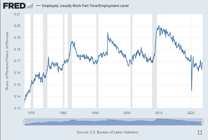
A few weeks ago I wrote about several measures of the labor market, and whether the labor market was actually doing well. It’s a good idea to look beyond the headline unemployment rate, but even looking at alternative unemployment rates, labor force participation, employment rates, and unemployment insurance claims, I concluded in that post that the labor market is still looking healthy.
Lately I have heard another objection to the job growth numbers: part-time employment. I’ve seen this pop-up a few times on Twitter lately and just yesterday my co-blogger Scott Buchanan (in a post primarily about excess savings) stated that “much of the jobs creation this year has been in the part-time category.”
So is the jobs recovery mostly about part-time jobs? What is going on?
First things first: most of the data on part-time employment is from the household survey. There’s already a lot of noise in the household survey, due to the sample size, and part-time workers are a small share of the workforce, so expect it to be even noisier. In short, don’t trust one-month fluctuations too much. Furthermore, most of the data folks look at is seasonally adjusted. That’s generally good practice! But again, for a small number in a small sample, the seasonal adjustment factors won’t be perfect. Don’t read too much into one or a few months of data.
Let’s get the big picture first. How much of the labor force in the US is usually working part-time (defined in most data as less than 35 hours per week)? As usual FRED is the best place to go for graphing BLS data:
Well, the great “Recession Starting Next Quarter” that has been predicted for nearly two years is nowhere in sight. In fact, the Bureau of Labor Statistics just last week posted an absolute blowout jobs number:
The U.S. economy churned out a blockbuster 336,000 jobs in September, smashing economists’ expectations and heightening the risk that policymakers will have to push even harder to slow down the economy. The data released Friday by the Bureau of Labor Statistics offered yet another snapshot of the job market’s remarkable strength, with the unemployment rate holding at 3.8 percent and wage growth outpacing inflation in a boost to workers. But it was also the latest example of an economy that simply refuses to slow down, despite the Federal Reserve’s aggressive attempts to get prices and hiring closer to normal levels…The September report, which showed the largest number of gains since January, had been expected to indicate continued moderation in the labor market, with forecasts of around 170,000 jobs created. Instead, it came in at nearly twice that amount. (Lauren Kaori Gurley and Rachel Siegel , Washington Post)
Before we get too excited, let’s note that the BLS numbers have a strong component of BS: nearly every jobs number they put out is quickly, quietly revised downward by 20% or so. Also, much of the jobs creation this year has been in the part-time category (so employers don’t have to pay health benefits). That said, it is indisputable that despite ferocious interest rate hikes, the economy continues to hum along, much more robustly that nearly anyone predicted six or twelve months ago. Why?
I suggest that we follow the time-tested approach of investigative reporters, which is to follow the money. We have noted earlier that since 2020 a key factor in consumer spending, which constitutes about 70% of the economy, has been the ginormous windfall of free money, over $4 trillion, that was put into the economy via various pandemic-related programs (enhanced unemployment benefits, direct stimmie payments, etc.). The story of the recent strong jobs market is largely the story of spending down that windfall.
When we were locked down in late 2020-early 2021, we consoled ourselves with ordering tons of goods on Amazon. While this generated some jobs for longshoremen and UPS and Amazon drivers, it was mainly Chinese workers who benefited from this phase. But for the past year and a half, we are out there in planes, trains, automobiles, and cruise ships, spending for services and restaurant food at a brisk pace. This has buoyed up the domestic economy, which in turn is keeping inflation far above the Fed’s 2% target.
Part of the incoming-recession story has been that the COVID windfall money is about to run out. For instance, here is a June, 2023 chart from Fed authors de Soyres, et al. showing that in the U.S. (black curve below) this money has already been exhausted:
A different set of Fed authors (Abdelrahman and Oliveira of the San Francisco Fed) wrote, also in June, that there remained a smidge of excess savings, but that “would likely be depleted in the third quarter of 2023.”
However, the Bureau of Economic Analysis (BEA) recently completed an update of national economic data that lowered the savings rate prior to the pandemic and increased it in 2020 and 2021. This basically reflected a change in the way the BEA accounts for income from mutual funds and REITS. The bottom line is that it has forced Wall Street economists to increase their excess savings projections to date by as much as $600 billion to $1 trillion, depending on the economics team. This in turn leads them to delay forecasts of recession by yet another 6-12 months.
For instance, James Knightley of ING Global Markets Research writes that there are still plenty of excess savings around; recent revisions in their numbers show the remaining hoard is even larger than they originally thought:
They did not break down this excess saving by income group, so it is possible that much of it remains with the upper 10-20% who may hoard/invest it, versus the bottom quartiles who have been spending it all into economy and now may be tapped out. We shall see how this continues to play out.
The last post where I attempted a macro prescription was in April 2022, when I said the Fed was still under-reacting to inflation. That turned out right; since then the Fed has raised rates a full 500 basis points (5 percentage points) to fight inflation. So I’ll try my luck again here.
Headline annual CPI inflation has fallen from its high of 9% at the peak last year to 3.7% today. Core PCE, the measure more closely watched by the Fed, is at a similar 3.9%. Way better than last year, but still well above the Fed’s target of 2%. Are these set to fall to 2% on the current policy path, or does the Fed still need to do more?
The Fed’s own projections suggest one more rate hike this year, followed by cuts next year. They expect inflation to remain a bit elevated next year (2.5%), and that it will take until 2026 to get all the way back to 2.0%. They expect steady GDP growth with no recession.
What do market-based indicators say? The yield curve is still inverted (usually a signal of recession), though long rates are rising rapidly. The TIPS spread suggests an average inflation rate of 2.18% of the next 5 years, indicating a belief the Fed will get inflation under control fairly quickly. Markets suggest the Fed might not raise rates any more this year, and that if they do it will only be once. All this suggests that the Fed is doing fine, and that a potential recession is a bigger worry than inflation.
Some of my other favorite indicators muddy this picture. The NGDP gap suggests things are running way too hot:
M2 shrank in the last month of data, but has mostly leveled off since May, whereas a year ago it seemed like it could be in for a major drop. I wonder if the Fed’s intervention to stop a banking crisis in the Spring caused this. Judging by the Fed’s balance sheet, their buying in March undid 6 months of tightening, and I think that underestimates its impact (banks will behave more aggressively knowing they could bring their long term Treasuries to the Fed at par, but for the most part they won’t have to actually take the Fed up on the offer).
The level of M2 is still well above its pre-Covid trend:
Before I started looking at all this data, I was getting worried about a recession. Financial markets are down, high rates might start causing more things to break, the UAW strike drags on, student loan repayments are starting, one government shutdown was averted but another one in November seems likely. After looking at the data though, I think inflation is still the bigger worry. People think that monetary policy is tight because interest rates have risen rapidly, but interest rates alone don’t tell you the stance of policy.
I’ll repeat the exercise with the Bernanke version of the Taylor Rule I did in April 2022. Back then, the Fed Funds rate was under 0.5% when the Taylor Rule suggested it should be at 9%- so policy was way too loose. Today, the Taylor Rule (using core PCE and the Fed’s estimate of the output gap) suggests:
3.9% + 0.5*(2.1%-1.8%) + 0.5%*(3.9%-2%) + 2% = 7%
This suggests the Fed is still over 1.5% below where they need to be. Much better than being 9% below like last April, but not good. The Taylor rule isn’t perfect- among other issues it is backward-looking- but it tends to be at least directionally right and I think that’s the case here. Monetary policy is still too easy. Fiscal policy is still way too easy. If current policy continues and we don’t get huge supply shocks, I think a mild “inflationary boom” is more likely than either stagflation or a deflationary recession.
Last weekend I had the opportunity to visit an arcade, but not one of those modern fancy arcades with virtual reality, laser tag, etc. This arcade specializes in having old-school games, primarily pinball, but also early video arcade games. You pay a cover charge ($5 for kids, $10 for adults), and then you use quarters to play the games. But here’s the cool part: the price of the games is the same as it was when the games were first released.
As an economist, of course, I was very interested in the prices.
They had pinball machines that dated back the 1960s, and video games from the late 1970s. Most video arcade games were around 50 cents for the early games (late 1970s and early 1980s). But the pinball machines started out at 25 cents, with the earliest game they had being a Bally Blue Ribbon machine, manufactured in 1965 (interestingly, some of the earlier machines had slots for both dimes and quarters — I assume the price was adjustable mechanically). Notably, you also got to play 5 balls for this price (3 balls seems to be standard later on).
How should we think about that 25 cents? A standard reaction is to adjust the number for inflation. Using the CPI-U as the inflation index, that means the 25 cents from 1965 is “worth” about $2.40 now. That’s interesting, but I don’t think it really provides the relevance that we want today.
An alternative is to calculate the “time price” of playing the game. Using the average hourly wage of $2.67 in December 1965, we can calculate that it would take about 5.5 minutes of work to pay for that game — a game which probably only lasts about 5.5 minutes, unless you are really good at it!
Another comparison we could do is with the cost of video games today compared with wages today. But that’s not really a fair comparison — video games are much more advanced today. We would need to do some sort of quality adjustment, which is overly complicated.
But, at least in my case, there is no need to do the quality adjustment — I can play the exact same game as 1965. In fact, I did (several times). There was also that $10 cover charge that I mentioned, and if I spread that fixed cost over 40 games, it cost me about 50 cents per play (including the 25 cents to start the machine) to play the 1965 Bally’s Blue Ribbon Pinball machine. At the average wage today of $29 per hour, it takes about 1 minute to afford a play of that same game. In other words, my Blue-Ribbon-Pinball standard of living is about 5.5 times greater than in 1965.
Now this isn’t to say we are 5.5 times better off overall than 1965. Prices don’t stay constant for most goods! But hopefully it is a useful way to think about that 25 cent price tag from the past, and how to compare it to today.
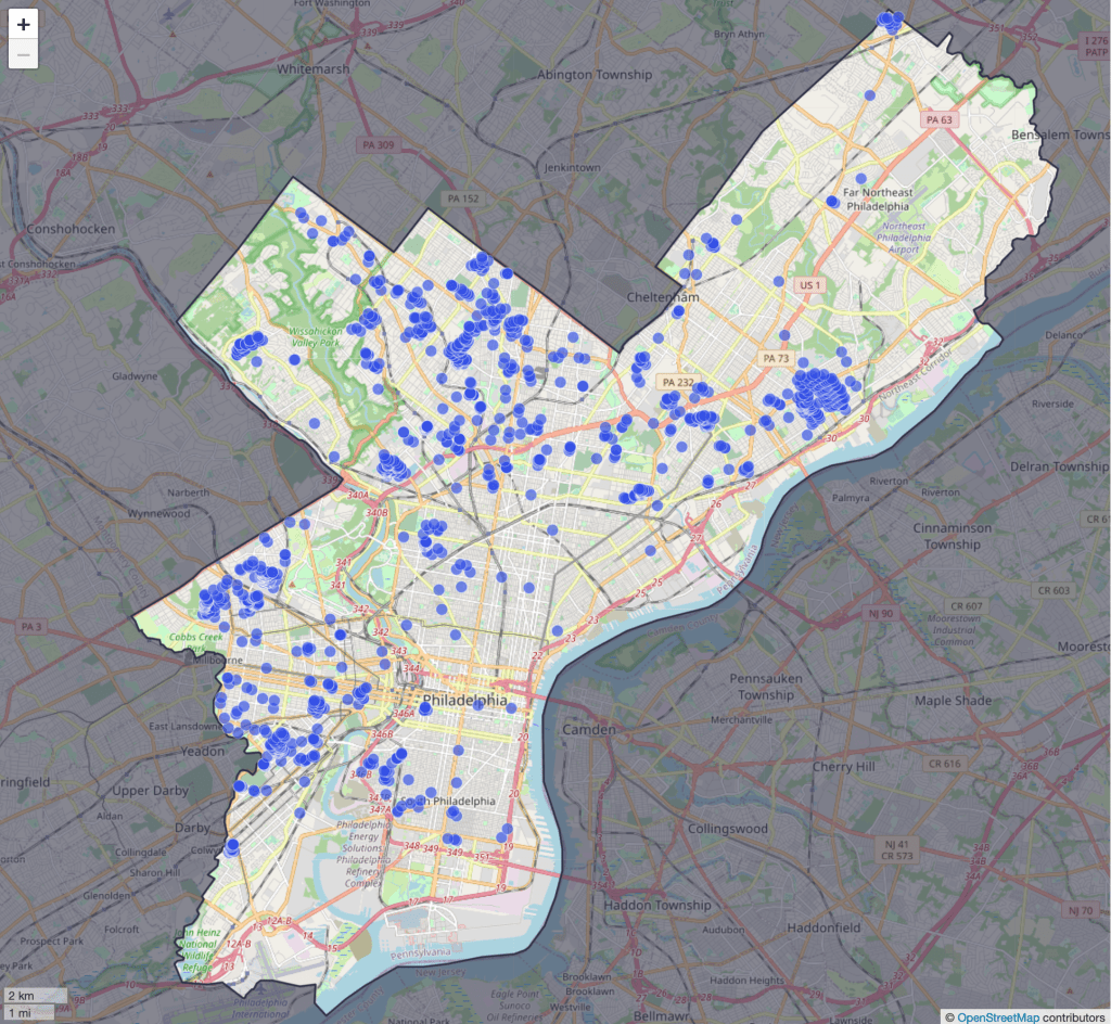
Regular readers will know that we love not only economics, but also history and data. We especially love it when “data heroes” take data that was difficult or impossible to access and make it easily available to everyone. The Federal Reserve Bank of Philadelphia just announced a project that brings together all of these things we love, their new Center for the Restoration of Economic Data:
Our mission is to advance research in topics related to regional economics and consumer finance by making economic data available in readily accessible, digital form. CREED combines state-of-the-art machine learning technology with deep subject matter expertise to convert natively unstructured data (information in books, images, and other undigitized formats) into readily accessible digital data.
The CREED research team shares the original analog or unstructured data as well as the code used to recover and clean these data, which are aggregated for use in novel economic research. Our collection features volumes of old, often overlooked, and frequently inaccessible data, which have been mined, restored, and converted into unstructured digital and analytically usable formats.
Their first project is to map all of the racially restrictive covenants in the city of Philadelphia. Until the U.S. Supreme Court declared such covenants to be unenforceable in 1948, they often barred properties from being sold to non-whites or non-citizens. After 1948 redlining took different forms, some of which may still persist today.
CREED shares the underlying data used to build the map here, and they say much more is one the way. I love it when economic historians (and regular historians) digitize old paper records and share the resulting data, and hope to see more examples like this to share in the coming years.
Disclaimer: I am a visiting scholar at the Federal Reserve Bank of Philadelphia but I was not involved with this project
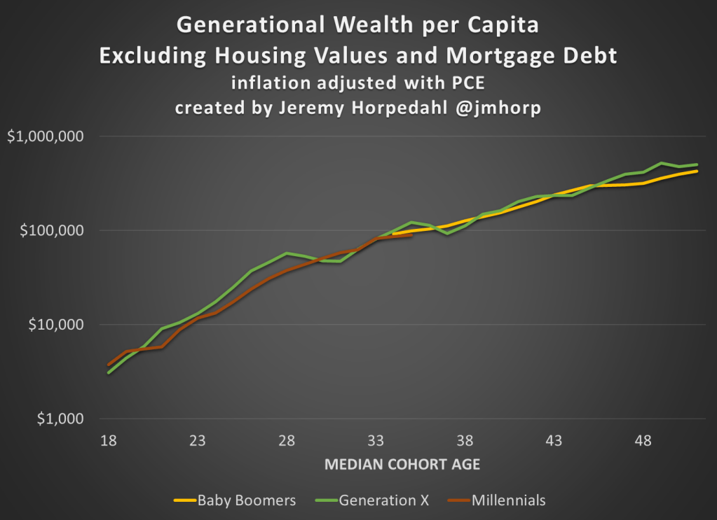
The Federal Reserve has released the latest update to their Distributional Financial Accounts data, which the data underlying several of my past posts on generational wealth. With that recent data, I have updated the chart of wealth for Baby Boomers, Generation X, and Millennials.
The data is shown on a log scale to better show growth rates and allow for easier visual comparisons. But if you are interested in the more precise numbers, in the most recent quarter (2023q2) Generation X has, on average about $620,000 in net wealth, which compares favorably with Baby Boomers at about the same age (in 2006) with about $539,000 in net wealth per person. That’s about 20 percent more.
Millennials have about $115,000 in net wealth on average, which also compares favorably with Baby Boomers, who had slightly more at about the same age (in 1990) with $121,000 in net wealth on average. Given the uncertainties of all the data that goes into this, I’d say those are roughly equal. Gen X had a bit more around the same age (in 2007) with $149,000, but that fell significantly the next two years during the Great Recession.
(For more detail on my approach to creating the chart, see the linked post above, but in short I’m using the Fed DFA data for wealth, Census Bureau data by single year of age for population, and the Personal Consumption Expenditures price index for inflation adjustments (I also have a chart with the CPI-U — it’s not much different). Wealth data is for the 2nd quarter in each year (to match 2023), except for 1989 since the 3rd quarter is the first available.)
Given how much wealth can fluctuate based on housing values (see above for Gen X from 2007-2009), it might be useful to look at the data with housing. Housing is also a weird kind of wealth — for the most part, you can’t access it without selling (other than certain home equity loans), and when you do sell, unless your home appreciated more than average, you just have to move to another home that also appreciated.
Here’s the chart excluding housing value and mortgage debt:
The chart… doesn’t change much. The values are all lower, of course, but the comparisons across generations look pretty similar. Gen X right now is 17 percent wealthier than Boomers at the same age. And if we look at all three generations around the median age of 35, they are pretty close: Gen X with $123,000 (but slipping over the next few years), Boomers with $99,000, and Millennials with $90,000.
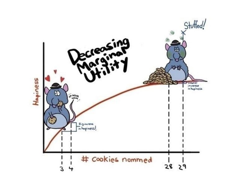
This week on Twitter (X.com), someone said it was their favorite graph. Upon replying I learned that he had used it for teaching. It’s fun when you know one of your ideas is out in the world helping people.
For real? I absolutely HOWLED when I found it on a google image search! Bravo! I taught HS Econ for many years and this was the kind of stuff that kept kids awake!
Blogger privilege is to manifest a new conversation on here. If one of my research articles were to achieve the same level of influence as the stuffed rat, then people might tweet something along the following lines:
This original project, both in terms of methodology and subject, is one of the first controlled experiments on intellectual property protection, which has inspired subsequent lab work on this issue. We present a color cube mechanism that provides a creative task for subjects to do in an experiment on creative output. The results indicate that IP protection alone does not cause people to become inventors, although entrepreneurs are encouraged to specialize by IP protection.
“Smile, Dictator, You’re On Camera,” (2017), with Matthew McMahon, Matthew Simpson and Bart Wilson. Southern Economic Journal, 84:1, 52-65.
The dictator game (DG) is attractive because of its simplicity. Out of thousands of replications of the DG, ours is probably the controlled experiment that has reduced “social distance” to the farthest extreme possible, while maintaining the key element of anonymity between the dictator and their receiver counterpart. In our experiment the dictator knows they are being watched, which is the opposite of the famous “double-blind” manipulation that removed even the view of the experimenter. As we predicted, people are more generous when they are being watched. Anyone teaching about DGs in the classroom should show our entertaining video of dictators making decisions in public: https://www.youtube.com/watch?v=vZHN8xyp6Y0&t=22s
There is a lot of talk about reference points. No matter how you feel about “behavioral” economics, I don’t think anyone would deny that reference-dependent behavior explains some choices, even very big ones like when to sell your house. Considering how important reference points are, can people conceive of the fact that different people have different reference points shaped by their different life experiences? Results of this study imply that I tend to assume that everyone else has my own reference point, which biases my beliefs about what others will do. Because this paper is short and simple, it would make a good assignment for students in either an experimental or econometrics class. I have a blog post on how to turn this paper into an assignment for students who are just learning about regression for the first time.
“If Wages Fell During a Recession,” (2022) with Daniel Houser, Journal of Economic Behavior and Organization. Vol. 200, 1141-1159.
The title comes from Truman Bewley’s book Why Wages Don’t Fall during a Recession. First, I’ll take some lines directly from his book summary:
A deep question in economics is why wages and salaries don’t fall during recessions. This is not true of other prices, which adjust relatively quickly to reflect changes in demand and supply. Although economists have posited many theories to account for wage rigidity, none is satisfactory. Eschewing “top-down” theorizing, Truman Bewley explored the puzzle by interviewing—during the recession of the early 1990s—over three hundred business executives and labor leaders as well as professional recruiters and advisors to the unemployed.
By taking this approach, gaining the confidence of his interlocutors and asking them detailed questions in a nonstructured way, he was able to uncover empirically the circumstances that give rise to wage rigidity. He found that the executives were averse to cutting wages of either current employees or new hires, even during the economic downturn when demand for their products fell sharply. They believed that cutting wages would hurt morale, which they felt was critical in gaining the cooperation of their employees and in convincing them to internalize the managers’ objectives for the company.
We are one of the first to take this important question to the laboratory. The nice thing about an experiment is that you can measure shirking precisely and you can get observations on wage cuts, which are rare in the naturally occurring American economy.
We find support for the morale theory, but a new puzzle got introduced along the way. Many of our subjects in the role of the employer cut the wages of their counterpart, which probably lowered their payment. Why didn’t they anticipate the retaliation against wage cuts? That question inspired the paper “My Reference Point, Not Yours.”
Andreoni & Miller (2002) have been cited over 2500 times for their experiment that shows demand curves for altruism slope down. Economic theory is not broken by generosity. We extend their work to show that demand curves for equality slope down. Individuals don’t love inequality, but they also don’t love parting with their own money. There is a higher demand for reducing inequality with other people’s money than with own income.
This is the last paper I’ll do here. At this point, readers probably would like a funny animal picture. Here’s a meme about the difficult life of computer programmers:
For decades, tech skills have had a high return in the labor market. There is very little empirical work on why more people do not try to become computer programmers, although there are policy discussions about confidence and encouragement.
I ran an experiment to measure something that is important and underexplored. One thing I found is that attempts to increase confidence, if not carefully evaluated, might backfire.
Would you predict it’s more important to have taken a class in programming or for a potential worker to report that they enjoy programming? My results imply that we should be doing more to understand both the causes and effects of subjective preferences (enjoyment) for tech work.
A few more decades to go here… I will try to top the stuffed rat picture.