A new online pharmacy funded by Mark Cuban promises to sell prescription drugs at a fixed markup, 15% over cost plus a $3 flat fee. What’s the catch?
As far as I can tell, there are two- they only sell generics, and they don’t take insurance. But I think this will still save many people a lot of money.
The most expensive drugs get that way because they are sold by monopolies, almost always because they were invented less than 20 years ago and are still on-patent. But it’s still possible for older drugs to be sold at huge markups, as Martin Shkreli could tell you now that he’s out of prison (Shkreli’s case is supposedly what inspired Dr. Alex Oshmyansky to start this pharmacy). Sometimes you can still blame these markups on monopolies, just induced by the FDA instead of patents. But even for generic drugs with competitive manufacturing, you still sometimes see large and variable markups at the pharmacy level. So I think there’s still huge value in a pharmacy offering a low and stable markup on generics.
What about not taking insurance? First of all, lower cash prices obviously still benefit the 28 million Americans who don’t have health insurance. But even for those with insurance, it’s surprisingly common throughout health care to find cash prices lower than their copay. I have relatively good insurance but when I checked Cost Plus Drugs for the last two prescriptions my family got, I found that one was 80% cheaper than our copay (the other was about the same as our copay, so we’d only come out even, though we’d presumably save our insurer a lot).
Cost Plus Drugs originally wanted to also work through insurance as a Pharmacy Benefit Manager, but seems to have pivoted to being an “unPBM” that just offers generics to employers to supplement their existing plans. They also want to manufacture some of their own drugs, which seems on track to happen. They were started as a Public Benefit Corporation, so while they are for-profit this lends credibility to the idea that they really do want to keep prices down, not just start with low prices to make a name for themselves. Anyway, this seems like a worthy experiment and I encourage anyone with an expensive prescription to see if you can get it cheaper here.
Sick of high drug prices? Try some low-price anti-nausea mediation
“How Dictators Use Information about Recipients” is my new project with Laura Razzolini. A working paper is up at SSRN. We use the Dictator Game to measure if people are generous toward others who made a similar choice.
In the first stage of the experiment, every player gets to make their own choice about whether or not to invest in a risky option (called Option B). Players can pick Option A if they do not want to invest.
In the second stage, participants get to decide if they will send any money to another anonymous player. If a “dictator” (the person who determines the final allocation of money) decided to take the risk on Option B in stage 1, would they be more generous toward a counterpart if they know that person also picked Option B?
We explain in our paper why the literature indicates such a form of favoritism could be expected.
Social identity theory is the psychological basis for intergroup discrimination. Economic experiments have created feelings of group identity in various ways, leading to significant effects on behavior. Chen & Li (2009) demonstrate that group identity formation can affect social preferences.
Chen and Li (2009) started by having subjects review paintings by two different modern artists. The subjects were divided into two groups, based on their reported painting preferences. Subjects were informed about their group membership by the experimenter.
The Chen and Li paper has been cited almost 2000 times. Group identity is a topic of interest. Several experimental papers demonstrate that strangers can have team feelings induced quickly with the right procedures. Those team loyalties affect behavior in incentivized tasks.
Group feelings artificially induced in the lab by Eckel & Grossman (2005) influence levels of cooperation and contributions to public goods. Pan & Houser (2013) induce group identities by asking subjects to complete tasks in groups. Pan & Houser (2019) found that investors trust in-group members more. The in-group has been induced in several different ways in lab experiments. In this paper, we investigate whether in-group effects arise from making a common financial decision in the first stage of the experiment.
Do you think our manipulation in the beginning affected giving?
Nope. There was no effect. Dictators who chose Option B did not give more to recipients who also chose Option B.
Not every result in the paper is a null result. One piece of information caused a large increase in giving. If we inform the dictator that their counterpart started with less money in the first stage (due to bad luck) then the dictator would give more. Sympathy was inspired, as we predicted, by knowing if a recipient was “poor” in the experiment. Conversely, if dictators are informed that their counterpart is “rich” then they excused themselves from having to give up money to help.
Information about financial choices, at least in our sterile simple environment, neither polarized nor united the participants. The giving with only choice information was higher than giving to “rich” but lower than giving to “poor”. Lastly, we provided all of the information at once. With full information, dictators were still heavily influenced by the starting endowments and choices information had no effect.
Understanding polarization is important. Humans exhibit tribal instincts to not help those who are perceived as different. In our experiment we seem to have found one difference that that people are willing to tolerate or overlook.
Chen, Yan, and Sherry Xin Li. “Group Identity and Social Preferences.” American Economic Review 99, no. 1 (March 2009): 431–57.
Eckel, Catherine C., and Philip J. Grossman. “Managing Diversity by Creating Team Identity.” Journal of Economic Behavior & Organization 58, no. 3 (2005): 371–92.
Pan, Xiaofei, and Daniel Houser. “Why Trust Out-Groups? The Role of Punishment under Uncertainty.” Journal of Economic Behavior & Organization 158 (2019): 236–54.
Pan, Xiaofei Sophia, and Daniel Houser. “Cooperation during Cultural Group Formation Promotes Trust towards Members of Out-Groups.” Proceedings of the Royal Society B: Biological Sciences 280, no. 1762 (July 7, 2013): 20130606.
My wife traveled to Ireland with a friend after she graduated with her bachelor’s degree. She had lived in Europe as a child and had travelled for mission trips. But travelling to the Irish Republic as a young adult, for the singular purpose of celebration and leisure, made a big impact on my eventual wife and she recounted it for years.
Remember pre-Covid when life was so easy? Many of us had planned trips, for business and leisure, that were interrupted. By now, the vast majority of people are back to ‘normal’ (I think?). Classes are in-person, masks are largely optional, and there is no more line stretching out down the sidewalk near the Trader Joe’s. With all this normalcy, one might ask:
Investors such as mutual funds, index funds, and hedge funds tend to pick a particular strategy or asset type and stick with it. It’s what they know, it’s what they’re known for, and making major changes would often create legal difficulties; something marketed as a bond fund can’t suddenly switch to stocks even if they think stocks would do much better. Other types of investors like pension funds, endowments and individuals have more flexibility to change their strategies. These investors tend to chase performance, allocating to types of investments that have performed well recently. This can create fashions, types of investment strategies that become more popular for a few years.
These strategies might involve focus on a certain asset class (stocks / bonds / commodities / private equity / real estate / et c), a certain sector or region within an asset class, a certain factor (value, growth, momentum), et c. It seems like institutional incentives, trend chasing, and FOMO lead people and institutions to over-allocate to strategies that have been successful the last 1-5 years and under-allocate to those that haven’t. Everyone sees something has recently been successful, so they pile into it, which drives up prices and makes it look even more successful for a while; but eventually this drives things to be so clearly over-valued that there’s a crash, and the crash scares people away for years until it becomes clearly undervalued. Most recently 2020-2021 saw people pile into growth/tech stocks and alternatives like SPACs/crypto, but the beginning of Fed rate hikes was the signal that the party is over and people (over?)react by pulling out.
Given this, the ideal strategy is to show up right before the party starts, then leave right at the peak; but no one can time it that well. The possibly realistic alternative is to show up early when no one’s there, then leave right when the party’s getting good (Punchbowl Capital?). Timing and identifying which strategies are too hot and which cold enough (Glacier Capital? Cryo Capital?) is the biggest practical question in how to pull this off. The simplest/dumbest way to do it is to avoid timing decisions entirely and just invest fixed proportions into all strategies; when they’re over-valued your fixed investment doesn’t buy many shares, when they’re under-valued it buys lots. This actually sounds like a decent way to go, but its more buying into the Efficient Market Hypothesis than beating it, can we do better? Here are the types of meta-strategies I’m planning to look into:
How variable is the timing of strategy boom/busts? Could you possibly just use fixed numbers of months/years- if a strategy’s been hot this long get out, if its been cold this long get in?
Use market share numbers, get in when something gets below a certain % of the market and out when it gets above
Use valuation numbers like P/E ratios (seems to work well for the overall stock market, may be harder to measure for some strategies/classes)
Flow of funds- is there a rate of change that works as a trigger?
Proportion of major institutions allocating to each strategy
What looks promising right now along these lines (May 2022)? Without looking at the numbers, the perennial strategies that have been out-of-favor a few years seem like value, emerging markets, and commodities (though commodities might be too hot again just now). These (along with real estate; right now homes seem expensive but homebuilders are cheap and I think commercial is too) all did well after the 2000 tech crash
I’m obviously not the first person to think along theselines; the concepts of the commodity cycle and Shiller’s CAPE are related, and Global Macro and Multistrategy funds do some of this. In the latest AER: Insights, Xiao Yan and Zhang echo Robert Shiller and Paul Samuelson that predicting big things like this is actually easier than predicting little things like the valuation of a specific stock:
Samuelson’s Dictum refers to the conjecture that there is more informational inefficiency at the aggregate stock market level than at the individual stock level. Our paper recasts it in a global setup: there should be more informational inefficiency at the global level than at the country level. We find that sovereign CDS spreads can predict future stock market index returns, GDP, and PMI of their underlying countries. Consistent with the global version of Samuelson’s Dictum, the predictive power for both stock returns and macro variables is almost entirely from the global, rather than country-specific, information from the sovereign CDS market
But I haven’t actually heard of any fund focused on “unfashionable investing” that considers all asset classes and strategies like this. What institution out there would be capable of saying in 2021 “growth stocks are at bubbly levels, we’re switching to commodities”, or saying in 2022 “commodities are high and growth stocks crashed, we’re switching back”? Please let me know if such an institution does exist, or what else to read along these lines.
In July of 1992, the Barenaked Ladies released their debut studio album Gordon, which included one of their most popular songs: “If I Had $1000000.” Considering all the inflation we’ve had recently, you know that $1 million doesn’t buy as much as it did in 1992, but how much less? As measured by the Consumer Price Index in the US, prices have roughly doubled since 1992, meaning you would need about $2 million to buy the same amount of stuff as in 1992.
(Note: the Barenaked Ladies are Canadian, and prices in Canada haven’t quite doubled since 1992, but this song was included on early demo tapes in 1988 and 1989 released in Canada, and prices have roughly doubled there since then.)
So the value of a dollar that you held since 1992 has lost roughly half of its purchasing power. That’s bad. But how bad is it? What’s the normal US experience for how long it takes for prices to double?
It turns out that even with the recent huge run-up in inflation, we just lived through the lowest period of inflation for anyone alive today.
Ah, Davos – – that yearly gathering of billionaires (some fresh from combusting unfathomable amounts of rocket fuel launching themselves into space for fun), flying in on their private jets and lecturing the rest of us about burning fossil fuels. That Swiss resort watering hole for elites who seemingly prefer to have the world run by unaccountable international corporations and NGO institutions rather than national governments elected by those pesky little people (“populism” is a dirty word). Here is the Wikipedia blurb on these meetings:
The World Economic Forum (WEF) is an international non-governmental and lobbying organisation based in Cologny, canton of Geneva, Switzerland. It was founded on 24 January 1971 by German engineer and economist Klaus Schwab. The foundation, which is mostly funded by its 1,000 member companies – typically global enterprises with more than five billion US dollars in turnover – as well as public subsidies, views its own mission as “improving the state of the world by engaging business, political, academic, and other leaders of society to shape global, regional, and industry agendas”.
The WEF is mostly known for its annual meeting at the end of January in Davos, a mountain resort in the eastern Alps region of Switzerland. The meeting brings together some 3,000 paying members and selected participants – among which are investors, business leaders, political leaders, economists, celebrities and journalists – for up to five days to discuss global issues across 500 sessions.
… The Forum suggests that a globalised world is best managed by a self-selected coalition of multinational corporations, governments and civil society organizations (CSOs), which it expresses through initiatives like the “Great Reset” and the “Global Redesign”. It sees periods of global instability – such as the financial crisis of 2007–2008 and the COVID-19 pandemic – as windows of opportunity to intensify its programmatic efforts.
The Davos meeting is usually held at the end of January, but this year was pushed back to May 22-72 because of the COVID surge last winter. How did last week’s globalization-fest fare?
From what I have read, the mood was less upbeat than usual. Douglas Sieg, managing partner of fund manager Lord, Abbett & Co., said: “It’s amazing that six months ago the world didn’t feel all that complicated and all of a sudden the last three months have been nothing but major issues.” Obviously, the war in Ukraine is casting a pall over the world community and economy. Soldiers and civilians are being slaughtered on a scale not seen in Europe since WWII, and Europeans are realizing too late the folly of becoming so dependent on Russia for their energy supply. China’s saber-rattling over Taiwan is making other nations nervous about their heavy reliance on semiconductor chips fabricated in that island nation.
The wild orgy of 2020-2021 COVID-related deficit spending (especially in the U.S.) has predictably led to inflation; in response, the U.S. central bank is threatening to raise rates high enough to dampen demand, which means dampened (maybe negative) economic growth. A number of the non-business speakers worried aloud about these dark clouds gathering on the horizon:
We have at least four crises, which are interwoven. We have high inflation … we have an energy crisis… we have food poverty, and we have a climate crisis. And we can’t solve the problems if we concentrate on only one of the crises…But if none of the problems are solved, I’m really afraid we’re running into a global recession with tremendous effect .. on global stability.
– German Vice Chancellor Robert Habeck
Climate change got less attention than in previous years. Europe is starving for fossil fuels at the moment, so there is more focus on keeping factories running than on pushing costly new green agendas. Trends toward re-shoring vital production and away from hyper-globalization are expected to make supply chains less efficient and thus create more persistent cost pressures.
On the other hand, corporate CEOs, perhaps taking a shorter-term view, were more chipper, saying their businesses are doing just great:
George Oliver, chairman and CEO of heating and air-conditioning manufacturer Johnson Controls, is typical of the positive current business. “We’ve been doing very well,” he said. “We see robust demand…we’re obviously watching that closely.”
“Here [in Davos] everybody’s pessimistic,” says Standard Chartered Chairman José Viñals. “But when I ask them how their business is doing, the picture is wonderful. It may be that the business reality catches up with the [very negative] macro-political reality.”
Time will tell how the global economic scenario actually plays out.
This post was co-authored with a recent AMU Economics Graduate, Michael Maynard (Linkedin here). It is based on his senior thesis entitled “The Highest Virtue: Re-examining gift Giving and Deadweight Loss”
When my older sister was in middle school, she received a book of baby animal stories. She loved that book and read it every day. A couple of years later my mother accidentally donated it, and my sister was heartbroken. We went to the thrift store repeatedly that week hoping to encounter it before it sold, but we never found it. Years later, our father scoured the internet trying to find the lost book – to no avail.
Years after that, I stumbled onto the exact same copy of the book in the for-sale corner of a nearby library. For a single dollar and negligible effort, I purchased the book that had long frustrated my family’s searching. Shortly before the birth of her first child, I gave the book to my sister for Christmas. It was one of the best Christmas gifts she had ever received.
Economic theory typically assumes that individuals have perfect information. Therefore, they are best suited to purchase their own gifts. That’s what motivates the not-so-romantic economist prescription to give a gift card or cash for birthdays, Christmas, graduations, etc. The theory states that, if we do not intimately know the receiver’s preferences, then we have incomplete information and it’s better to give a money-gift rather than to give a gift from which the receiver would enjoy less additional utility.
When finance professors publish papers claiming to find inefficiencies in asset markets, my initial reaction is skepticism. The odds are stacked against them to start since asset markets are mostly efficient. Then even if the inefficiency they found is real, shouldn’t they keep that fact to themselves and get rich trading on it?
But listening to a recent interview with Edward Thorp, I realized I shouldn’t entirely discount the possibility that someone would publish a real inefficiency, even a tradeable one. After all, Myron Scholes and Fischer Black did just that when they published the Black-Scholes model in the Journal of Political Economy. This made them famous on Wall Street and in econ/finance academia, and won Scholes the 1997 Nobel Memorial Prize in Economics.
Thorp explained that he had come up with a similar model years earlier, but instead of publishing it, he started a hedge fund and got rich. He says it makes sense that he didn’t share the Nobel Prize, partly because the Black-Scholes model was better than his, but mostly because you should need to publish and share your ideas with the world to get scientific credit for them; his prize was 20% annual returns at his hedge fund.
Why do some opt to get rich, and others to get famous? I’d say academics’ first instinct is to publish everything rather than put it into practice. But Thorp was also an academic, a math professor. Thorp was already famous for publishing a book about how to beat the house at blackjack by counting cards (which is what I knew him for before this interview), so perhaps he valued additional fame less. But he was also already rich from winning at blackjack and from book sales.
Putting ideas into practice can also bring up unanticipated difficulties. When Myron Scholes finally did start working at a hedge fund in 1994 he saw initial success, but by 1998 it had become an embarrassing blunder that inspired the book “When Genius Failed: The Rise and Fall of Long-Term Capital Management”. Scholes may have been better off sticking to academic fame.
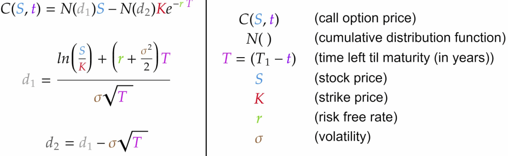
Black-Scholes formula for options pricing. The Efficient Markets Hypothesis says that markets instantly incorporate all public information, but original research like this isn’t public until you publish it, and even then it can take years for market participants to fully incorporate it
In previous blog posts, I’ve used the Simpsons as an example of a typical family to use for historical comparisons. In a post on mortgage payments, I found that it’s slightly easier to make a mortgage payment on Homer’s salary than in the early 1990s. In a post on taxes, I showed that the Simpsons now pay a much lower average tax rate than they did in the 1990s (guess all those tax cuts didn’t just go to the rich!).
Now, the Simpsons and economics are back at the front of the discourse about standards of living. The 33rd season finale of the show is all about whether the middle class can get by economically these days. And Planet Money’s “The Indicator” podcast (great program!) has a podcast about the show, which is a follow-up to a similar podcast last year called “Are The Simpsons Still Middle Class?” (apparently part of the influence for the recent Simpsons episode).
In that podcast from last year, they say “Tuition has more than doubled. Health care costs have more than doubled. I believe housing costs have more than doubled.” And they follow-up, for good measure with “Even after adjusting for inflation, college tuition has more than doubled since ‘The Simpsons’ started.”
Since we’ve already looked at housing costs for Homer, let’s look at the potential college costs for Bart. I’m going to assume Lisa will be fine, probably getting a free-ride (and a hot plate!) to one of the Seven Sisters or maybe even Harvard. But if Bart wants to go to college, the Simpsons will probably be paying out of pocket.
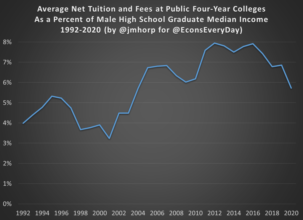
An important factor to consider when looking at college prices is not just the “sticker price,” or the published price, but to also look at what is known as the “net price.” The net price takes into account the average amount of aid that a student receives. This is important to consider at any time, but especially for data in more recent years since discounting has become a major part of the college pricing landscape. For example, at private colleges the average discount is now over 50%, with some colleges essentially giving some discount to 100% of students (in other words, at some colleges no one actually pays the sticker price). Discounting at public colleges isn’t quite as out-of-control as private colleges, but it’s still a major part of college pricing.
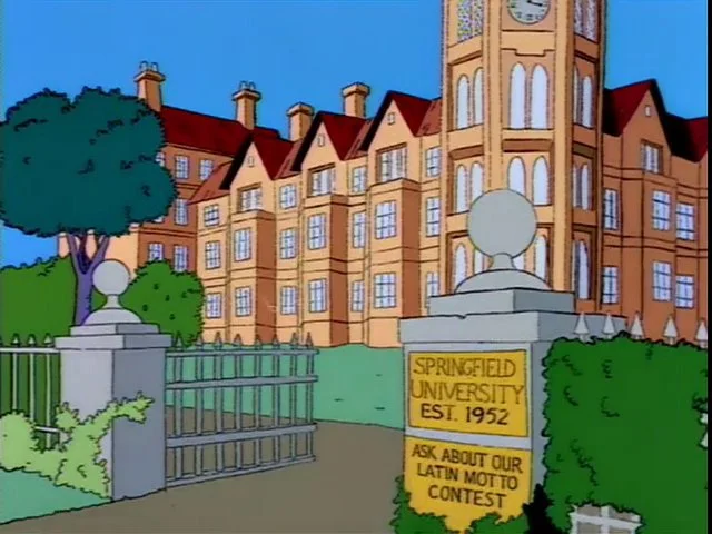
And no doubt Bart Simpson would be going to a traditional public, four-year college. Probably Springfield University, just like his old man (though Homer attended as an adult), located right in their town of Springfield. So what has happened to tuition prices since the early 1990s.
One of the best publications on college prices is the College Board’s annual report “Trends in College Pricing.” The report is broken down by type of college, it shows what factors (tuition, housing, etc.) make up the typical cost of college, and even shows differences across US states. Importantly, they include that “net tuition and fees” number, and they’ve been doing so since their 2003 report. That 2003 report even calculated the net figures back to the 1992-93 school year, perfect for an example of the early Simpsons (“Homer Goes to College” aired in 1993).
In the 1992-93 academic year, the average net tuition and fees, plus room and board for public four-year colleges in the US was $4,620 (from Figure 7, adjusted back to nominal dollars). In the 2020-21 academic year, the same figure was $15,050 (from Figure CP-9). Adjusted for inflation, that’s roughly a doubling (slightly less, but in the ballpark) since the early 1990s, just as Planet Money stated.
But let’s compare the cost of college to Homer’s income. In 1992, the median male with a high school education, working full-time earned $26,699, meaning that the cost of college would be 17.3% of his income that year. In 2020, the median male with a high school education, working full-time earned $49,661, meaning that the cost of college would be 30.3% of his income.
By this measure, college clearly has become much more expensive when compared to a Homer Simpson-type salary, and 30% of your income is a very hard pill to swallow (though the 17% in 1992 wasn’t a picnic either). But here’s one other factor to consider. The College Board data also allows us to look only at net tuition and fees, rather than also including the cost of room and board. Remember, Springfield University is located in Springfield, and Bart has a perfectly fine room at the house on Evergreen Terrace. While living on campus is certainly a big part of the college experience, and no one would probably love that experience more than Bart Simpson, many students today do choose to live with their parents while attending college (or at least live off-campus, where housing is often cheaper).
If we just look at net tuition and fees (not room and board), in 1992-93 the average cost at public four-year colleges was about $1,065 (in nominal dollars). That’s about 4% of Homer’s annual income. Much more reasonable! In 2020-21, that same figure was $2,880 (once again, in nominal dollars), or just under 6% of annual income. That’s certainly more than 4%, but not exactly the kind of expense that would break the budget if planned for.
I want to repeat that number again: $2,880. That was the average cost of tuition and fees at an in-state, four-year, public college in the US in 2020-21, after accounting for grants and aid. I suspect this number is much, much lower than most would guess.
The chart below does the same calculation for all the years I could find (1992-2020) using archived versions of the College Board’s report. I’ll admit the data isn’t perfect, as later reports sometimes have different numbers than earlier reports, but it’s probably the best we can do if we want a consistent time series. There does seem to be a break happening in the early 2000s, when college suddenly did get more expensive relative to a high school graduate’s income, though in the past 15 years it’s been pretty flat.
We should keep in mind that if Bart were to take out the maximum federal student loan amount of $9,000 as a dependent student in his first year at Springfield University, he is primarily borrowing money to pay for his housing and food, not his education.
In 1993, the premium for getting a college degree was about 54%, with the median male college grad earning about $41,400 and the equivalent high school grad earning about $26,800 (data from Table P-24). In 2021, that premium had risen to about 64%, with the median male college grad earning $81,300 compared with his high school counterpart earning about $49,700.
I’m ignoring all sorts of important questions here about what is causing the difference in pay. Is it signaling, human capital, something else, or some combination of all these? Yes. But regardless of your preferred explanation for the college wage premium, there’s pretty solid evidence of a sheepskin effect.
Putting It All Together
I’ve now explored taxes, housing, and college education prices using a family like the Simpsons. But what if we put it all together? How are high school graduates doing?
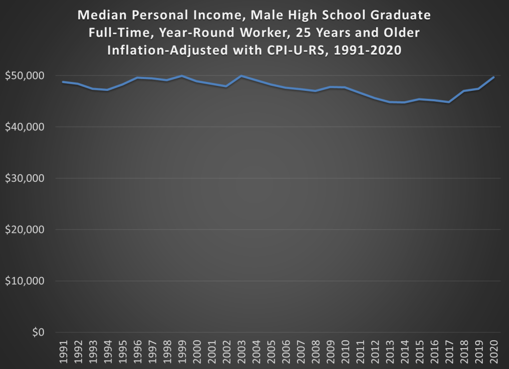
The best way to do this is probably the simple chart you’ve been thinking of all along: median income adjusted for inflation. Some things have gotten cheaper (housing, TVs), some more expensive (college, probably healthcare), but to get a sense of the total effect, we need to adjust for all prices. The chart below is that calculation, using Census data on median earnings for full-time, year-round workers, male high school graduates aged 25 and older. The data starts in 1991. You can get some earlier estimates from different data series, but if we want a consistent series 1991 is the best we can do.
And from the chart we see that real incomes of male high school graduates are… pretty flat. That’s not good, but let’s contextualize. First, claims that it’s harder for these workers to make ends meet aren’t true. It’s roughly no easier, but also no harder. Definitely wage stagnation, but also not “falling behind.”
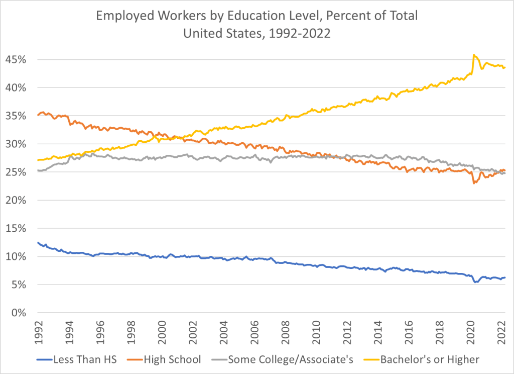
And also, high school graduates are a shrinking part of the workforce in the United States. You probably already knew this. But it wasn’t until after the year 2000 that college grads became the largest category of workers in the US. In the early 1990s, high school graduates (folks like Homer) were by far the largest single category of workers. Now, it’s by far college graduates, and those with some college or a 2-year degree are roughly equal in size to high school graudates. So, while the income stagnation we see for high school grads is not good, it’s affecting a shrinking portion of workers in the US.
Shell Oil scientist M. King Hubbert made a remarkable prediction in 1956. He had analyzed the depletion patterns of various natural resources, and proposed that the production rates of a given resource from a given region would tend to follow a roughly bell-shaped curve. More specifically, he used what is now called the “Hubbert curve”, which is a probability density function of a logistic distribution curve. This curve is like a gaussian function (which is used to plot normal distributions), but is somewhat “wider”:
Hubbert used various reasonable assumptions (which we will not canvass here) in formulating this model curve. Notably, it predicts that the peak production rate will occur when the total resource from that region is 50% depleted, and that the fall in production on the back side of the curve will be as fast as the rise in production on the front (left) side of the curve.
In 1956, while U.S. oil production was still rising briskly, he fit his curve to the data to that point in time, and predicted that U.S. production would peak in 1970 and thereafter enter a rapid and permanent decline. His prediction was somewhat ridiculed at the time, but it proved to be uncannily accurate over the following 25 years; oil production peaked right when King said it would, and then declined per his curve until about 1990:
Lower 48 U.S. Oil Production: Actual (Green curve) vs. 1956 Hubbert Prediction (Red Curve). Blue Arrow marks deviation ~ 1990-2008, and green arrow marks acceleration of shale oil production. Source: Wikipedia, with arrows added.
I drew in a red arrow at 1956 to show when King made his prediction, and also a blue arrow showing a significant deviation that starting to show after about 1990. Once production had declined maybe halfway down from its peak, the production started to flatten out and decline much more slowly. More on this “fat tail” feature below.
Another feature I called attention to with a green arrow is the remarkable resurgence in production after 2008, which is mainly due to “fracking” of tight shale formation. That new-to-the-world technology has unlocked a new set of oil fields which had previously been inaccessible for production. This illustrated a well-recognized feature of Hubbert curves, which is that a given curve can (at best) apply only to a given region and for a “normal” pace of technological improvement. Fracking production should sit on its own up-and-then-down production curve.
The plot above is for lower 48 states only; a big find in Alaska gave a bump in production 1980-2000 (not shown here) which distorted the whole-U.S. production curve. That Alaska oil peaked by about 2000 and is now in its own terminal decline pattern.
The shape of production curve on the back (declining) side is of particular interest in trying to do economic modeling of future oil production. If the declines really follow a Hubbert curve, the prognosis is pretty scary – – oil production is slated to crash to practically nothing in the near future. However, it seems that in reality, after an initially rapid decline, production can often be sustained much longer than predicted by a simple symmetrical curve. We saw that pattern in the lower 48 curve above, starting around 1990, even before the fracking revolution. Below I show two other examples showing the same feature. The first example, from Hubbert’s original paper, is Ohio oil production 1885-1956:
I am not prepared to make quantitative generalizations, but there does seem to be a pattern of sustained production at reduced levels, following the initial rapid decline from the peak. Others also have noted that asymmetric curves may give better fits to real-world production. These “fat tails” on production from various oil-producing regions should help us keep our cars running longer than predicted by simple peak-oil models. How this pertains to future U.S. shale oil production, and to global oil production, are (since oil and gas are the main energy sources for the world economy) key questions, which we may address in future articles.