Say that there is a labor market and that there is no income tax. If an income tax is introduced, then what should we expect to happen? Specifically, what will happen to employment, the size of the labor force, and the number of people unemployed? Will each rise? Fall? Remain unchanged? Change ambiguously? Take a moment and jot down a note to test yourself.
As it turns out, what your answer is depends on what your model of the labor market is. Graphically, they are all quantities of labor. The size of the labor force is the quantity of labor supplied contingent on some wage that workers receive. It’s the number of people who are willing to work. Employment is the quantity of laborers demanded by firms contingent on to wage that they pay. Finally, the quantity of people unemployed is the difference between the size of the labor force and the quantity of workers employed (Assuming that the labor force is greater than or equal to employment).
In January 2023 I had a post looking at the different ways that the Bureau of Labor Statistics measures employment. Those who follow the data closely probably know about the difference between the household and establishment surveys, which the monthly jobs report data is based on. But these are just surveys.
The more comprehensive data (close to the universe of workers, roughly 95%) is the Quarterly Census of Employment and Wages. While more comprehensive, this data comes out with a much longer lag, and is only released once per quarter. The QCEW is just the raw count of workers, which is useful in some ways, but we also know that there are normal seasonal fluctuations, which the QCEW doesn’t adjust for. Therefore, year-over-year changes in jobs are the best way to look at trends in this data. In September 2023 (latest month available), the US had 2.25 million more workers than in the previous September. For comparison, the establishment survey showed an increase of 3.13 million jobs that month, and the household survey showed a change of 2.66 million — suggesting they both might be overstating job growth.
Still with me? Here’s one more set of jobs data: the Business Employment Dynamics data. This dataset is built on the QCEW data, but allows more fine detailed insights into what types and sizes of firms are gaining or losing jobs. Like the QCEW, the most recent data is for the 3rd quarter of 2023 (just released today), but when looking at the aggregate data, it has one advantage over the QCEW: it is seasonally adjusted, so we can look at the most recent quarterly change (not really useful for not-seasonally-adjusted data). The BED data also looks only at private sector jobs, so it is looking at the health of the private labor market (and ignoring changes in government employment).
The latest BED data do show a possibly worrying trend: the 3rd quarter of 2023 showed a net loss of 192,000 private-sector jobs. That’s the first loss since the height of the pandemic, and ignoring the first half of 2020, the only quarterly decline since 2017. Here’s the chart (note: y-axis is truncated because the 2020q2 job loss is so large it makes the chart unreadable):
I should note that this data is subject to revisions, even though the QCEW is mostly complete. The second quarter of 2022 originally showed a decline, but that was later revised upwards as QCEW is updated and seasonal adjustment factors are updated. Still as, this data stands, it is a worrying jobs number that differs from the monthly surveys. For the change from 2023q2 to 2023q3, the establishment survey shows a gain of 640,000 jobs and the household survey also shows a gain of 546,000. Like the QCEW raw data, the BED seasonally adjusted data suggests that the monthly surveys may be overstating job growth.
Every month we get new data on the labor market in the US from the Bureau of Labor Statistics. As I pointed out last month, the labor market data from 2023 was very good!
But lately on social media, some have been to ask whether this data is credible. Specifically, several people have pointed out that the initial numbers we receive each month almost always seem to be revised downward. Since the initial reports are based on incomplete data (for the jobs data, this would be reports from employers), it is normal that there would be some revisions with more complete data.
A few weeks ago I wrote about several measures of the labor market, and whether the labor market was actually doing well. It’s a good idea to look beyond the headline unemployment rate, but even looking at alternative unemployment rates, labor force participation, employment rates, and unemployment insurance claims, I concluded in that post that the labor market is still looking healthy.
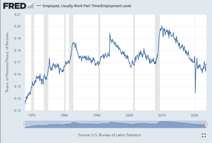
Lately I have heard another objection to the job growth numbers: part-time employment. I’ve seen this pop-up a few times on Twitter lately and just yesterday my co-blogger Scott Buchanan (in a post primarily about excess savings) stated that “much of the jobs creation this year has been in the part-time category.”
So is the jobs recovery mostly about part-time jobs? What is going on?
First things first: most of the data on part-time employment is from the household survey. There’s already a lot of noise in the household survey, due to the sample size, and part-time workers are a small share of the workforce, so expect it to be even noisier. In short, don’t trust one-month fluctuations too much. Furthermore, most of the data folks look at is seasonally adjusted. That’s generally good practice! But again, for a small number in a small sample, the seasonal adjustment factors won’t be perfect. Don’t read too much into one or a few months of data.
Let’s get the big picture first. How much of the labor force in the US is usually working part-time (defined in most data as less than 35 hours per week)? As usual FRED is the best place to go for graphing BLS data:
A stopped clock is occasionally right. And so are perma-bears, those commentators or analysts who continually predict that GDP and stocks will plunge – perhaps in the next quarter, but more often say six months from now. (And that deadline keeps getting pushed back every six months).
When I was first getting started investing, I was overly influenced by these seemingly cautious and sober souls, and I consequently lost out considerably compared to my colleagues who blithely stayed fully invested. So I hold my native pessimism in check when investing, and stay mainly in the market, but with a little cash in reserve just in case The Big One hits.
All that said, I do try to sample various points of view. If I have been mainly seeing positive chatter, I turn to my favorite perma-bear, an analyst named Jeffrey Snider. His YouTube channel is called Eurodollar University, and he runs a subscription service as well.
Jeff seems like a genuinely nice guy, who believes that his dire readings of the macroeconomic tea leaves are helping folks avoid disaster. His demeanor is more like an earnest teacher, not a huckster trying to sell something. I should add that he offers meaningful insights on the Eurodollar scene, which is globally significant and which most analysts do not understand or even recognize.
But Jeff’s bias is nearly always toward the negative, and it is something of a good-natured joke among his viewers. Typical comments: “ The market can remain irrational longer than Jeff can stay pessimistic” and “Jeff is the best on Youtube. I watch his videos every night right before I go to bed. In less than 5 minutes, I’m in a semi-conscious coma. Its better than any sleeping pill. That smooth soothing voice extoling the virtues of a collapsing economy works wonders. A++”.
Well, what is the bear-meister saying now? He claims that the seemingly red-hot employment numbers that have been reported in recent months are less hot than they appear. I will paste in a few snips from his recent YouTube, It Just Happened…The JOB MARKET JUST BROKE!! .
One point he makes is that there has been a persistent, inaccurate bias to the upside in the payroll numbers reported by the BLS. These big numbers are what gets reported; what does not get reported so much is, month after month, these monster payroll increases are quietly revised downwards, often by substantial amounts:
Even with the adjustments, these still seem like large increases in employment. Undaunted, Jeff pokes holes in the hot labor market scenario by claiming that full time employment is actually stagnant; it is the rise in part-time workers that creates the seemingly large army of the newly employed. The fact that total hours worked has plateaued seems to support his case here:
Another factor is worker hoarding. Employers were so burned trying to scramble for workers during the 2022 reopening-from-Covid that they are keeping their workers on payroll (even part-time), just in case the economy picks up and they need to pull them in full-time. A case in point is manufacturing. New orders are down considerably this year, and headed even lower, yet manufacturers have not cut their workforces appreciably:
If orders stay low for a long enough time, however, the manufacturers will have no choice but to start massive layoffs.
As another indicator of labor market softness, temporary workers may be a leading indicator of employment trends. They are not such a core part of a company, so there is less hoarding of them. And temporary help services have been in a steady decline this year, which is consistent with a cooler economy:
Sell Everything??
As I said, it is worth considering all sides. I think the specific points mentioned above are all valid ones. I would add that if students actually start payments on all those loans which taxpayers and the Fed have subsidized for the past three years, that will finally put a crimp in the spending. Also, the surprise downgrade of U.S. federal debt by the Fitch rating agency , and resulting jump in interest rates, has finally gotten people talking about out-of-control government spending, for one week anyway. Also, the great China-reopening that was supposed to jump-start the global economy seems to be pretty flat.
However, a couple of counter-points to the bearish narrative:
First, even if manufacturing is rolling over, in the U.S. it is fairly small relative to services. At least in some geographical areas, my anecdotal reports say that it is still a challenge to get good workers to do services.
Second, the tidal wave of cash from pandemic giveaways that washed into our collective bank accounts is still not depleted. Consumer confidence is high, and we are spending freely. This economy is a big, big ship, and it is still steaming full ahead, brushing aside high interest rates and yield curve inversions. The recession seems to continually recede. There will inevitably be a downturn someday, of course, but absent some geopolitical event, I think it may take some time for it to arrive.
And finally, even if the long-awaited recession does arrive, it may not necessarily be so bad for stocks. Since the 2008-2009 Great Financial Crisis, the Fed has taken a very active role in supporting the markets. Wall Street has been conditioned to expect the Fed to flood the system with money if a serious downturn occurs. Also, the Street is betting that there will be enough howls of pain over the high interest being paid on the federal debt that unbearable pressure will be brought on the Fed to loosen up; the vaunted independence of that institution will be put to the test, with Congressional threats to alter their charter if they don’t cave to pressure. And so, “[economic] bad news is [investing] good news”, in contrast to the pre-2008 world. Furthermore, federal deficit spending ramps up during recessions, and as noted in The Kalecki Profit Equation: Why Government Deficit Spending (Typically) MUST Boost Corporate Earnings , this deficit spending tends to boost earnings.
And so even if Jeff Snider is correct that the economy is rolling over and will soon slide downward, this may not give investors a very useful signal. As another one of his YouTube viewers has commented, “This channel is a masterclass in learning that knowledge about the macro environment does not provide an edge in markets.”
Last week I wrote about the challenges of counting deaths. But surely in economics, we can count better, especially when it comes to something concrete like the number of people working. Right?
Maybe not. If you follow the economic data regularly, you’ll know that once per month, the Bureau of Labor Statistics releases data on the employment situation of the nation’s economy. And if you are familiar with this report, you will probably know that it is based on two separate surveys, one of businesses and one of households. And furthermore, it gives us two separate measures of employment, the number of people working for pay.
Joseph Politano has been tracking the employment situation reports, and he writes that the two measures of employment have “completely diverged since March of [2022], with the establishment survey showing payroll growth of nearly 2.7 million and the household survey showing employment growth of 12,000.” The surveys are tracking the labor market differently, so it’s not surprising that they won’t be exactly the same (they rarely are), but this sort of discrepancy is huge. Even accounting for most of the differences between the surveys, there is still a gap of about 2 million jobs.
Today, the BLS released yet another measure of employment, this one comes from the Business Employment Dynamics series. The BED is not released as quickly as the data in the employment situation report — the BED data released today is for the 2nd quarter of last year. But that’s because this data is much more comprehensive, and it’s actually the same data underlying the employment measure from businesses in the monthly employment report (it comes from unemployment insurance records, which covers most of the workforce).
What did the BED find for the 2nd quarter of 2022? A net loss of 287,000 jobs. The BED is only looking at private-sector jobs, and it is also seasonally adjusted to smooth out normal quarterly fluctuations. If we look back at the monthly data on employment, what did it look like in the 2nd quarter of 2022? Using the seasonally adjusted, private-sector jobs number to match the BED, it showed a gain of 1,045,000 jobs. In other words, we have a discrepancy of 1.3 million jobs in a single quarter. This is huge.
Perhaps some of this could be attributed to different seasonal adjustment factors, but even using the unadjusted data there is still a gap: 3,089,000 jobs added in the monthly payroll survey (private sector only), but only a net gain of 2,432,000 private-sector jobs in the BED data. That discrepancy is smaller, but it is still a difference of over 600,000 jobs. Note here that there was job growth in the second quarter in the BED measure, just not enough job growth that on a seasonally adjusted basis that it showed net growth. Another way to think of this: there is almost always growth in the 2nd quarter, but we expected it to be a bit stronger than this data shows.
If you aren’t confused enough yet, BLS produces yet another measure of employment, called the Quarterly Census of Employment and Wages. Really this is the broadest measure of jobs and is using the same underlying data as the BED and monthly nonfarm jobs in the business survey. But like the BED, it is also released with a significant lag. What does it show? A gain of 2,338,000 jobs in the 2nd quarter of last year (this includes public sector employment too). That number isn’t seasonally adjusted and compares with the CES (monthly nonfarm employment) number of 2,702,000, a discrepancy of 364,000 jobs (note: the CES will later be revised and benchmarked with the QCEW data).
What can we learn from all these different estimates of jobs? And which is right? The short answer to the second question is: they are all right, but measuring different things. The big takeaway is that there was indeed job growth in the 2nd quarter of 2022 (even the household survey shows job growth), but based on more complete data the monthly business survey probably overstated job growth, and it may have actually been pretty weak job growth compared to what we would normally expect in that quarter in the private sector (but of course, we aren’t in normal times).
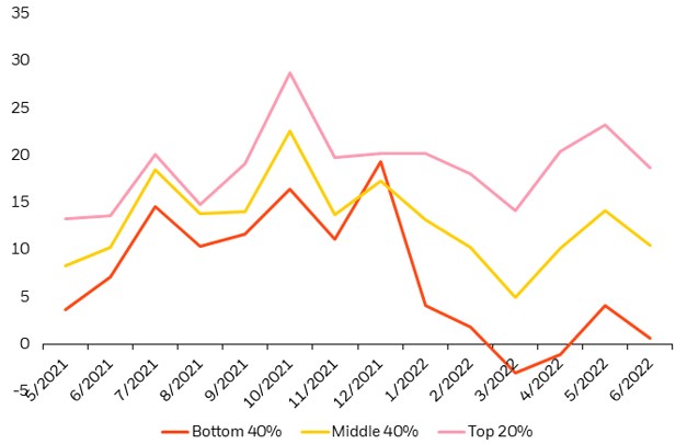
I heard on a radio interview that spending by the bottom quartile is way down in 2022, while it is holding up merrily for the upper two quartiles. My mind jumped to the thesis:
“Hmm, the bottom quartile probably (proportionately) felt the benefit of the three COVID stimulus packages more, plus they would have benefited more, proportionately, from the enhanced 2020-2021 unemployment benefits, which (I gathered from anecdotal observations) often paid them more for staying home than they used to receive for working. But…by 2022, all that extra money may be running out.”
I spent some time poking around the internet, trying to find some pre-made figures or tables to support or disprove this thesis. What I found tended to support it, but this is not rigorous data-mining. So, for what it is worth, here are some charts.
First, about the spending in 2022. This chart indicates that discretionary service spending by the bottom 40% income cohort is indeed down sharply in 2022, and now sits a little lower than a year ago, while the upper 20% cohort is spending actually more than a year ago. Spending by the middle 40% trended up in 2H 2021, then back down in 1H 2022, to end about even over the past 12 months:
Discretionary service consumption by income cohort. (I don’t what the units are for the y-axis, but presumably they show the trends). Source: Earnest Research, as of June 30, 2022, as reproduced by Blackrock.
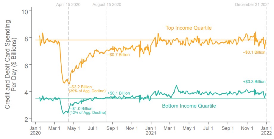
And what about 2020-2021? The next two charts indicate (a) that consumer spending was HIGHER in 2021 that it was pre-COVID for the bottom income quartile, even though (b) their employment in 2021 remained some 20% LOWER than pre-COVID. Looks to me like a lot of spending of stimmie checks was going on in 2021, but (see above) that money has run out in 2022.
Some reader here may have access to a more consistent data set, so I am happy to see this thesis tested further.
Last month I asked if travel was back. Air travel has recovered a lot from the depths of the pandemic, but it was still only about 80-85% of pre-pandemic levels.
Labor markets also plummeted during the worst of the pandemic, and have slowly (and sometimes quickly) clawing their way back. But are we back to pre-pandemic levels?
The national unemployment rate is now under 4%, a level which is rarely reached even in the best of times. But there is considerable variation across states.
The latest BLS release of state unemployment data shows that some states are at their historic lows, with one state standing out: Nebraska currently has the lowest unemployment rate a state has ever recorded at 1.7% in December 2021 (the data go back to 1976). Utah is also just below 2% in December — at 1.9% it’s the 2nd lowest in history (after Nebraska, of course).
Of course, all is not well everywhere. California and Nevada have the highest unemployment rates, at around 6.5%. This is well above their pre-pandemic levels of about 4%, and also well above what you would expect during normal times, other than during and immediately following at recession.
So is the labor market back in Nebraska, Utah, and other similar states? Not so fast.
Lately there has been lots of both good and bad news about the pandemic and its impact on the economy. But here’s once piece of good news you might have missed: the recession which began in February 2020 ended in April. And not April 2021… it ended in April 2020. At least, that’s according to the NBER Business Cycle Dating Committee, which made the announcement last week.
The 2020 recession of just 2 months is by far the shortest on record. NBER maintains a list of recessions with monthly dates going back to 1854 (there are annual business cycles dates before that, including important modern revisions of the original estimates, but the monthly series starts in 1854). In that timeframe, there have been 7 recessions in the 6-8 month range, but nothing this short. Still, it was mostly definitely a recession, as unemployment briefly spiked to levels not seen since the Great Depression. But only for 2 months. Keep in mind that the first part of the Great Depression last 43 months.
Unemployment Rate, 1948-present
But how can this be? Is the recession really over? There are still about 6-7 million fewer people working than before the pandemic began. Lots of businesses are still hurting. The unemployment rate is still 2 full percentage points above pre-pandemic levels. How in the world can we say the recession ended 15 months ago?
To answer that question, it helps to know what NBER and most macroeconomists mean by a “recession” — essentially, it is used interchangeably with “contraction.” It means the economy, by a broad array of measures (NBER uses about 10 measures), is shrinking — or we might say, going in the wrong direction. The only other option, at least in the NBER chronology, is an expansion — when the economy is going in the right direction.
Does an economic expansion mean that everything is fine the economy?