Last month I wrote about the projected decline in GDP from the Atlanta Fed’s GDPNow model. Since then, they have released an alternative version of the model, which includes a “gold adjustment” to account for non-monetary gold inflows, which may be impacting the model to overstate the negative impact of imports (and it looks like this may be a permanent change to the model).
With those changes, and some more recent data, the GDPNow model is still pointing to a negative reading for Q1 of 2025, though only very slightly now: -0.1%.
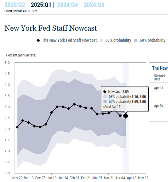
It’s also worth noting that the New York Fed has a similar model, but one with very different estimates right now: about 2.6% for Q1.
We’ll still have to wait until April 30th to get the preliminary estimates from BEA.
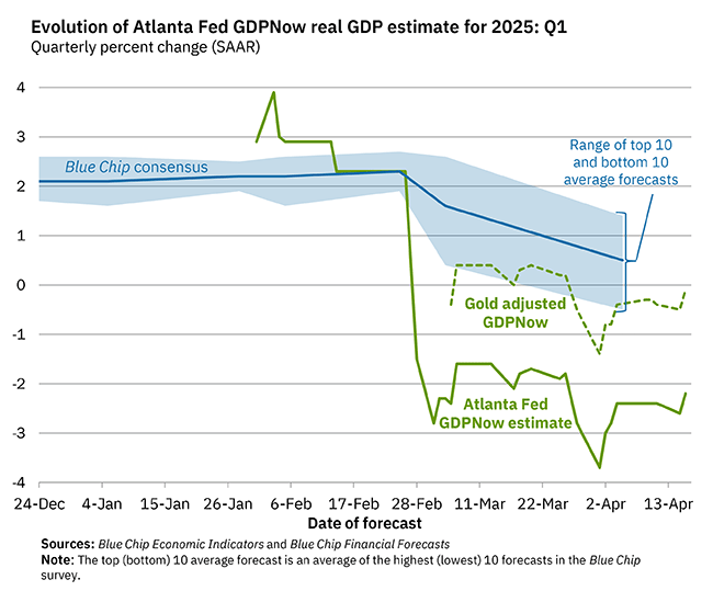
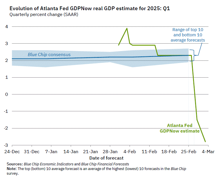
The chart comes from the Atlanta Fed’s GDPNow model, which tries to estimate GDP growth each quarter as data becomes available. The sharp drops in their Q1 forecast for 2025, based on the last two data updates, look pretty shocking. Should we be worried?
First, it’s useful to ask: has this model been accurate recently? Yes, it has. For Q4 of 2025, the model forecast 2.27% growth — it was 2.25%. For Q3 of 2024, the model forecast 2.79% growth — it was 2.82%. Those are very accurate estimates. Of course, it’s not always right. It overestimated growth by 1 percentage point in Q1 of 2024, and it underestimated growth by 1 percentage point the quarter before that. So pretty good, but not perfect. Notable: during the massive decline in Q2 2020 at the start of the pandemic, it got pretty close even given the strange, uncertain data and times, predicting -32.08% when it was -32.90% (that’s off by almost 1 percentage point again, but given the highly unusual times, I would say “pretty good”).
OK, so what can we say about the current forecast of -2.8% for Q1 of 2025? First, almost all of the data in the model right now are for January 2025 only. We still have 2 full months in the quarter to go (in terms of data collection). Second, the biggest contributor to the negative reading is a massive increase in imports in January 2025.
To understand that part of the equation, you have to think about what GDP is measuring. It is trying to measure the total amount of production (or income) in the United States. One method of calculation is to add up total consumption in the US, including by final consumers, business investments, and government purchases and investments. But this method of calculation undercounts some US production (because exports don’t show up — they are consumed elsewhere) and overcounts some US production (because imports are consumed here, but not produced here). So to make GDP an accurate measure of domestic production, you need to add in exports, and subtract imports.
Keep in mind what we’re doing in this calculation: we aren’t saying “exports good, imports bad.” We are trying to accurately measure production, but in a roundabout way: by adding up consumption. So we need to take out the goods imported — not because they are bad, but because they aren’t produced in the US.
The Atlanta Fed GDPNow model is doing exactly that, subtracting imports. However, it’s likely they are doing it incorrectly. Those imports have to show up elsewhere in the GDP equation. They will either be current consumption, or added to business inventories (to be consumed in the future). My guess, without knowing the details of their model, is that it’s not picking up the change in either inventories or consumption that must result from the increased imports. It’s also just one month of data on imports.
As always, we’ll have to wait for more data and then, of course, the actual data from BEA (which won’t come until April 30th). More worrying in the current data, to me, is not the massive surge in imports — instead, it’s that real personal consumption expenditures and real private fixed investment are currently projected to be flat in Q1. If consumption growth is 0% in Q1, it will be a bad GDP report, regardless of everything else in the data.
This post is quick and simple. We all know that states have different land areas and different populations. We also know that different states produce different amounts of output. We have a pretty good sense for which are the ‘big’ states since these things often go hand-in-hand. But what about household spending on consumption? It’s easy to imagine that some states produce plenty but then invest the proceeds. So, which states consume the most relative to their income?
The map above illustrates which states consume more of their income. There’s not much correlation geographically. But, among the ‘big’ states (Texas, California, New York, Illinois), the consumption per GDP is below the average of 67%. Can we make sense of this? As it turns, out more productive states also tend to have a higher per capita output. So, those higher GDP states also have richer populations on average. And, sensibly, those richer populations have lower marginal propensities to consume. They save more. But this is just spit-balling.
When I was in high school I remember talking about video game consumption. Yes, an Xbox was more than two hundred dollars, but one could enjoy the next hour of that video game play at a cost of almost zero. Video games lowered the marginal cost and increased the marginal utility of what is measured as leisure. Similarly, the 20th century was the time of mass production. Labor-saving devices and a deluge of goods pervaded. Remember servants? That’s a pre-20th century technology. Domestic work in another person’s house was very popular in the 1800s. Less so as the 20th century progressed. Now we devices that save on both labor and physical resources. Software helps us surpass the historical limits of moving physical objects in the real world.
There’s something that I think about a lot and I’ve been thinking about it for 20 years. It’s simple and not comprehensive, but I still think that it makes sense.
Labor is highly regulated and costly.
Physical capital is less regulated than labor.
Software and writing more generally is less regulated than physical capital.
I think that just about anyone would agree with the above. Labor is regulated by health and safety standards, “human resource” concerns, legal compliance and preemption, environmental impact, and transportation infrastructure, etc. It’s expensive to employ someone, and it’s especially expensive to have them employ their physical labor.
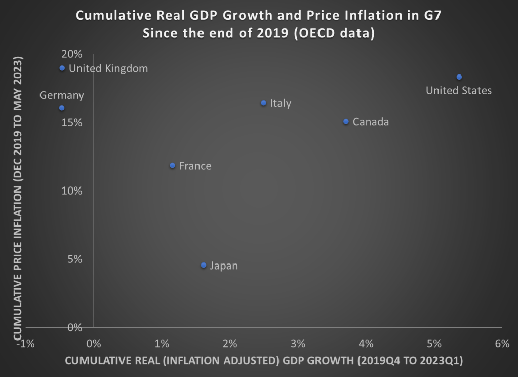
As we prepare for the release of second quarter GDP data over the next few weeks, here is a chart showing cumulative GDP growth (inflation adjusted) and Price inflation for G7 countries. While inflation has been high everywhere (except for Japan), the US comes out looking very well relatively on GDP growth. That’s especially true compared to the UK and Germany, which have also had high price inflation, but have actually had negative economic growth since the end of 2019.
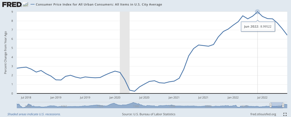
Last June I wondered if we were seeing the peak of inflation, and by at least one major measure I called the peak exactly:
At the moment, though, I’m feeling more confused than prophetic. The big question a year ago was how long it would take the Fed to get inflation down to reasonable levels, and how much collateral damage they would do to the real economy in that effort. Today most current indicators make it look like they pulled off the miraculous “soft landing”. Inflation over the last 12 months is still high, but over the last 6 months we’re nailing the Fed’s 2% annualized target. This has hit a few sectors of the real economy hard, with housing slowing dramatically and tech doing mass layoffs, but the overall picture is great: GDP growth was around 3% the last 2 quarters, and the 3.4% unemployment is the lowest since 1969.
What’s confusing about this is that we have a hard time believing we really got this lucky. Its like your plane lost power, you diverted course for an emergency crash landing, and once you touch down and find yourself seemingly unharmed you look around and wonder if the plane is about to explode. Consumer sentiment is worse than it was in the depths of Covid; business sentiment has been falling for over a year and is almost down to March 2020 levels. Betting markets forecast a 50% chance of a recession in 2023, and the yield curve is strongly inverted (one of the best predictors of a recession, though the guy who first noticed this says it might not work this time):
Finally, M2 money supply is shrinking for the first time since at least 1960, and I believe the first time since the Great Depression. This bodes well for inflation continuing to moderate, but its also one more indicator of a potential recession.
To sum up, most of the indicators of the current state of the economy look great, while most indicators of its near-term future look awful. So which do we trust?
My guess is that we avoid recession in 2023, but honestly this is mostly the gut feeling of an optimist. There’s no one knock-down piece of data I’d point to in support; its more that things are currently going well, and usually the best prediction is that tomorrow will be like today unless you have a good reason to think otherwise. The main reason people expect a slowdown is because of the Fed’s actions to fight inflation. The Fed itself predicts that they will cause a slowdown, but not a recession. Their most recent summary of economic projections from December predicts GDP growth slowing to 0.5% in 2023 and unemployment rising to 4.6%.
I think the “so what” outlook is also murky. Stocks have already fallen a lot from their highs and a recession already seems somewhat ‘priced in’, so even if I thought one was coming I wouldn’t necessarily sell stocks. On the flip side US stocks are still quite expensive by historical standards, so I don’t want to buy more on the assumption that they’ll rise more on good economic news this year. You might want to lock in decent rates on long-term bonds if you think the Fed will cut rates in response to a recession, but the inverted yield curve shows this is already somewhat priced in. 1-year bonds yielding almost 5% seems decent in either scenario, I have some and I’ll probably buy more, but 5% returns are nothing to get excited about. I’d like to hear suggestions but to me the small direct betting market on a potential recession is the clearest “so what” for anyone who does have a confident view about this year’s macro picture.
How well have countries recovered from the declines in the pandemic? It’s actually a bit difficult to answer that question, because it depends on how you measure it. Even if we agree that GDP is the best measure, how do we measure recovery? One possibility is to simply ask whether the country has exceeded its pre-pandemic GDP level. Exactly which quarter to use as the baseline is debatable, but here is a chart that Joseph Politano made for G7 countries using the 3rd quarter of 2019 as the baseline.
But we know that absent the pandemic, most countries would have continued growing (absent a recession for some other reason), so just getting back to pre-pandemic levels isn’t necessarily a full recovery. But how much growth should we have expected? It’s a hard question, but here’s a chart along those lines from the Washington Post, using the CBO’s measure of “potential GDP” as what growth might have looked like.
Using either of these approaches, it appears that the US has recovered pretty well, although it would be nice to have a comparison across countries using the same approach as the Washington Post chart does. While there is no consistent measure similar to CBO’s potential GDP figure for all countries, a simple approach is to project growth forward using the average pre-pandemic growth rate. I have done so for a number of countries, using the average growth rate from 2017-2019. In the following charts, the blue line is actual GDP levels, and the orange line is projecting the 2017-2019 growth rate forward. Sorry that I can’t easily fit all these into one chart, so here come the charts!
I have previously wrote about living standards in Ireland, and how GDP per capita overstates typical incomes because of a lot of foreign investment.
This is not to say that foreign investment is bad — to the contrary! But standard income statistics, such as GDP, aren’t particularly useful for a country like Ireland.
Norway has a similar challenge with national income statistics, but a different reason: Oil. Norway has a very large supply of oil revenues relative to the size of the rest of its economy, and oil revenues are counted in GDP. But those oil revenues don’t necessarily translate into higher household income or consumption.
Using World Bank data, Norway appears to be very rich: GDP per capita in nominal terms was about $90,000 in 2021. Compare that with $70,000 in the US, which is a very rich country itself. Sounds extremely wealthy!
Of course, by that same statistic, average income in Ireland is $100,000. But after making all the proper adjustments, as we saw in my prior post, Ireland is right around the EU average in terms of what individuals and households actually consume.
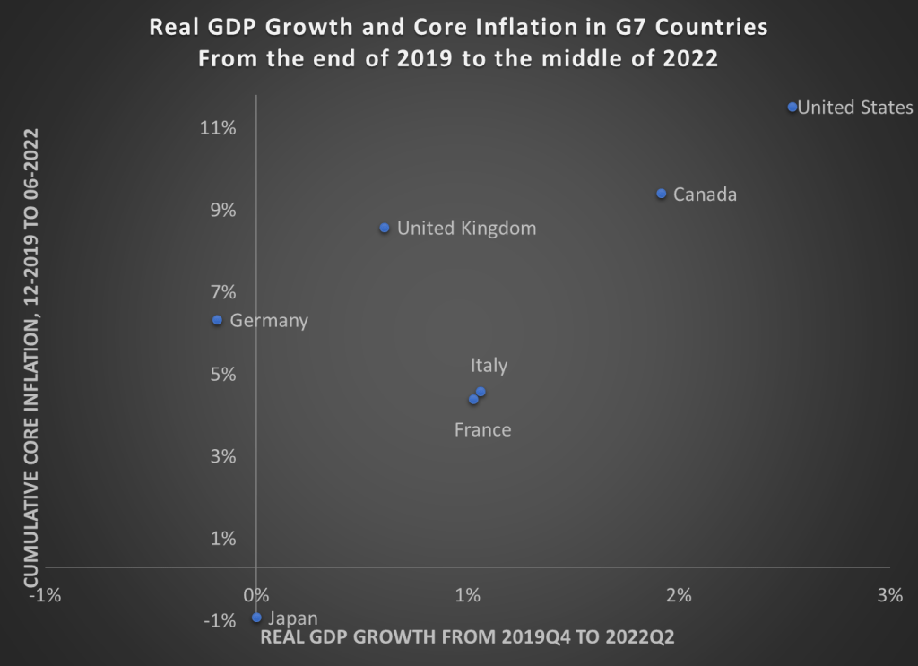
Back in April I wrote about GDP growth rates and inflation rates in G7 countries and the OECD broadly. James also wrote about a broader set of countries (182!) using these two measures. Since the economic scene is evolving so quickly, and we now have 6 more months of data, I wanted to provide an update on the US and our other large peer nations.
Here’s the data, showing cumulative real GDP growth and cumulative core inflation since the right before the pandemic (please note that I flipped the x- and y-axis from the previous post — sorry for the confusion, but this way makes more sense).
The picture looks roughly the same, but here are a few notable changes:
Despite the slight slowdown in GDP growth in the first half of 2022, the US still clearly has the highest rate of economic growth
UK, Italy, and Canada have now moved into positive territory for cumulative economic growth (yes, it’s all inflation adjusted)
But Japan and Germany still have had no net economic growth during the pandemic — and even worse for Germany, they have had a healthy dose of inflation too
The US once again stands out as having both the best economic performance and the worst inflation performance in the G7. Are these two things connected? That’s a question that is unanswerable from a simple scatterplot, and may be unanswerable completely. But I think it’s fair to say that the US hasn’t taken an obviously inferior economic path relative to other countries, even if our path has been inferior compared to some ideal policy. But don’t commit the Nirvana Fallacy!
Finally, we should recognize that the GDP is not the only important measure of how an economic is performing. For example, the US labor market has not recovered as well as some other peer nations have. Still, GDP is one of the important broad measures to look at, even if it is not ideal for diagnosing recessions.
US GDP fell for the second straight quarter according to statistics released this week by the Bureau of Economic Analysis. This means that by one common definition we’re now in a recession, which has ignited a debate about whether “two consecutive quarters of negative GDP growth” is the best definition (as opposed to ‘when the NBER says there’s one’, like I generally teach and Jeremy argued for here, or something else).
Naturally this debate has political overtones, since the party in power would be blamed for a recession, so we’ve seen the White House CEA argue that we’re not in a recession, many on the other side argue that we are, and plentiful hypocrisy from people who should know better.
But in political terms, the fight over the binary “are we in a recession” call won’t be the big economic factor in November’s elections- that will be inflation and GDP, especially 3rd quarter GDP. One of the oldest and best predictors of US elections is the Fair Model, which uses inflation and the number of recent “strong growth quarters”. Fair’s update following the recent Q2 GDP announcement states:
the predicted vote share for the Democrats is 46.70, which compares to 48.99 in October. The smaller predicted vote share for the Democrats is due to two fewer strong growth quarters and slightly higher inflation
By Election Day we’ll have 3 more months of economic data making it clear whether inflation is getting under control and whether economic activity is picking back up or continuing to decline. Monthly data releases on inflation and unemployment will be closely watched, but the most discussed release will likely be third quarter GDP. It will summarize 3 months instead of just one, it will be of huge relevance to the debate over how severe the recession is or whether we’re even in one, and it will likely be released less than two weeks before election day. The NBER almost certainly won’t weigh in by then; they tend to take over a year to date recessions, not adjudicate debates in real time.
So when BEA does release their Q3 GDP estimate in late October, what will it say? Markets currently estimate at least a 75% chance it will be positive (they had estimated a 36% chance of positive Q2 GDP just before the latest announcement). That sounds high to me, the yield curve is still inverted and I bet investment will continue to drag, but forecasting exact GDP numbers is hard. Its a much easier bet that whatever the number turns out to be will loom large in political debates just before the elections. Perhaps we’ll get the Q3 GDP growth number that would make for the most chaotic debate: 0.0%.