The Center for Modern Health and the Knee Regulatory Research Center just released an index of how free residents in each state are to provide and pursue health care as they see fit. Their summary map looks like this:
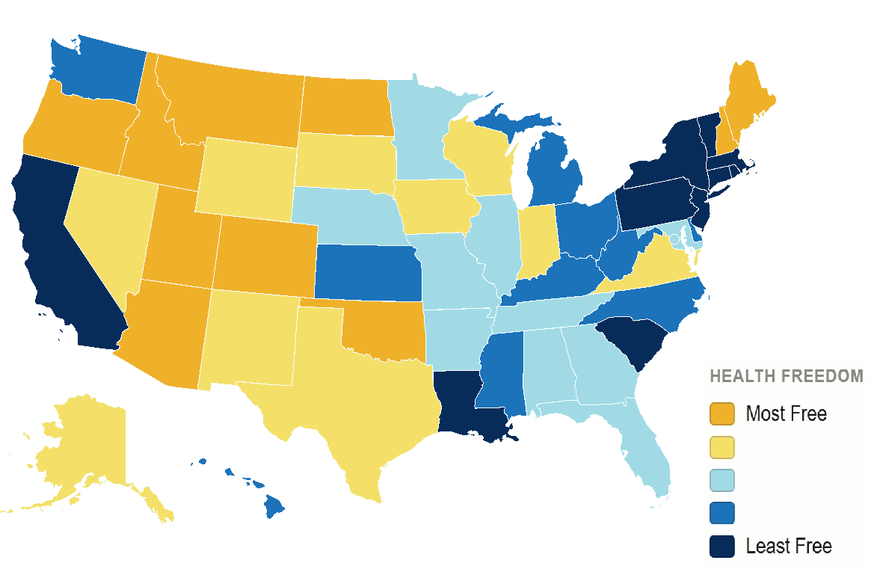
The index was created by averaging measures of freedom in 54 separate categories, summarized into the 5 broad areas of Professional, Institutional, Patient, Payment, and Delivery Freedom. A report with maps for each of the 54 underlying measures is here, and a spreadsheet with all the data is here.
This project represents a major effort on an important issue, but I have to say my favorite part is just how unusual the final map of the overall ranking looks. I’ve created many maps of the states based on data and seen many more, but almost all of them (no matter the underlying variable they represent) end up falling into a handful of looks. They are either secretly maps of population density, or North vs South, or East vs West, or the South + Appalachia (high poverty, low health and education, et c). But the Health Freedom Index groups states in a way I’ve never seen before, putting Maine and New Hampshire with Mountain West states as the most free, while South Carolina and Louisiana join California and much of the Northeast among the least free.
Some of the Index’s creators will be presenting it online on September 18th.
Note: I’m affiliated with the Knee Regulatory Research Center at WVU, but I wasn’t directly involved with this project. I’m working on a different data project with Knee I hope to discuss here soon.

