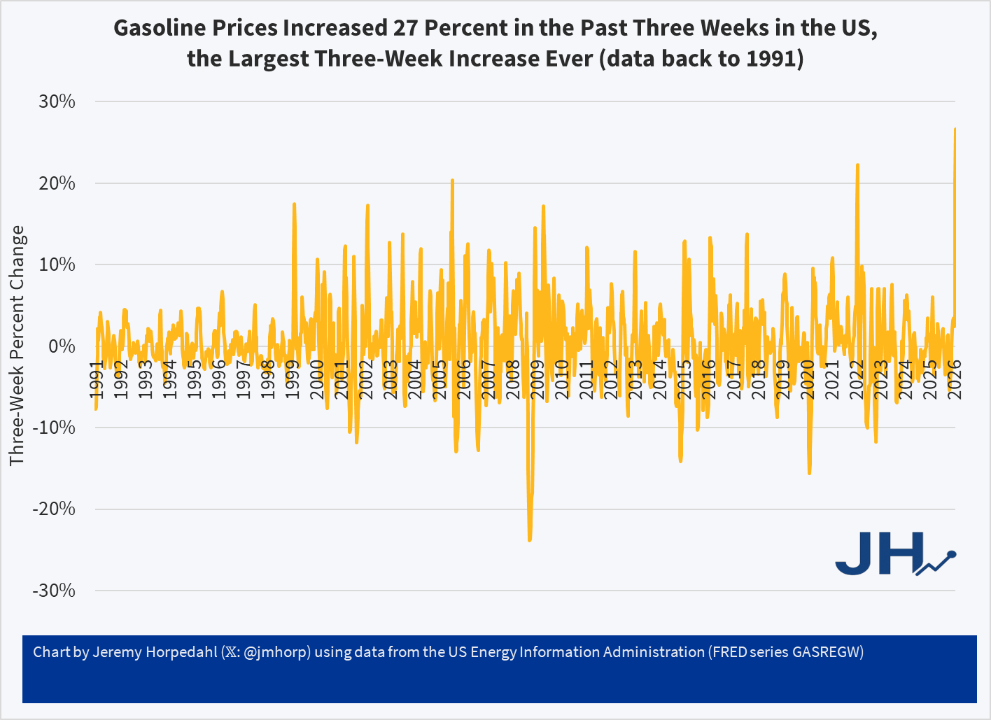
In the (so far) short military engagement with Iran, crude oil and gasoline prices have jumped significantly. The three-week change in gasoline prices at the pump for US consumers was 27 percent, the largest three-week increase consumers in the US have ever seen (with data back through the 1990s). The four-week increase is also a record.
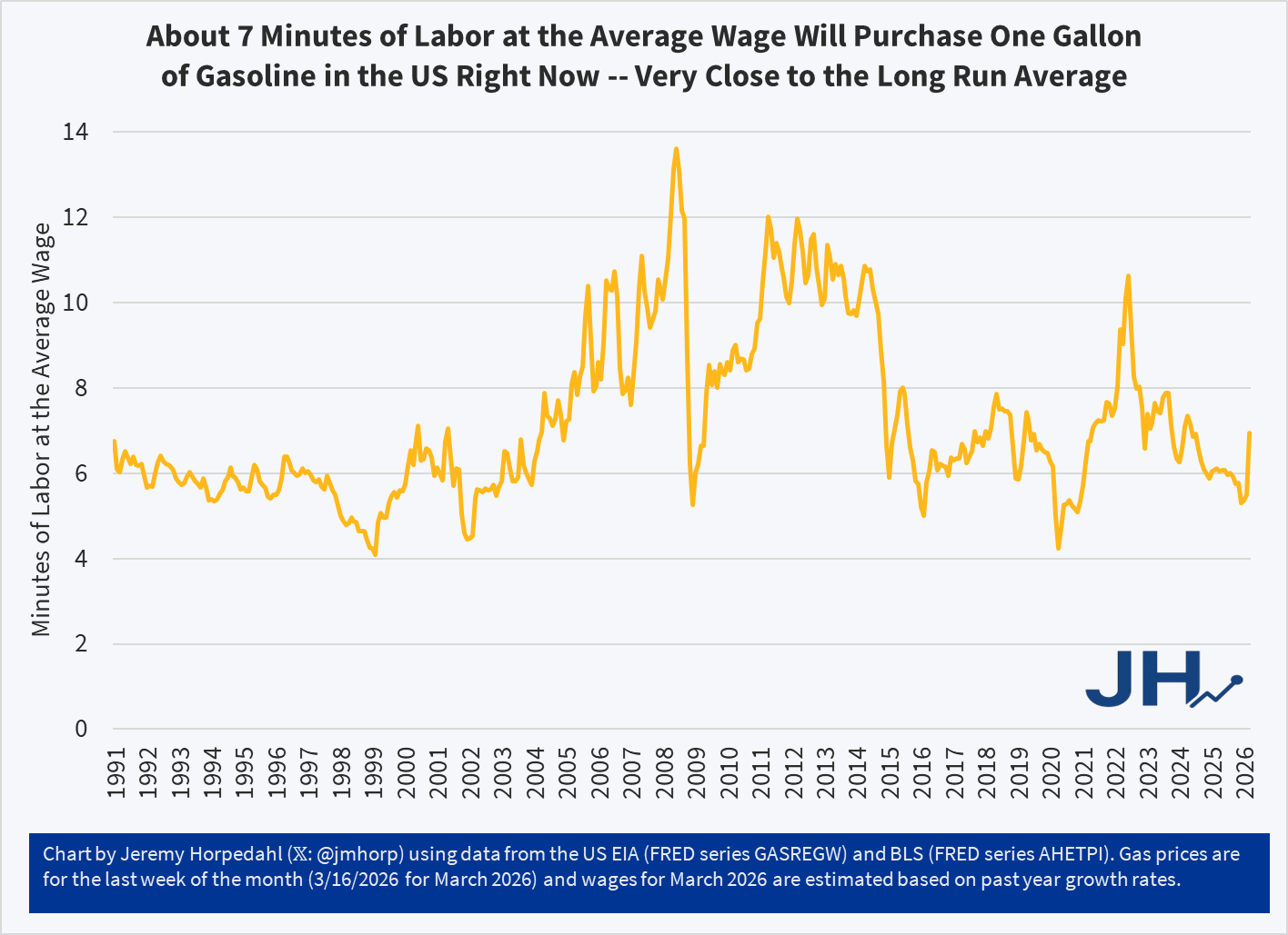
Despite this sharp increase, gasoline prices remain near the long-run average in terms of affordability: it takes about 7 minutes of work at the average wage to purchase a gallon of gasoline. To be sure, this is a big jump of where it had been earlier in 2026, at about 5 minutes of labor. Nonetheless, gasoline is still (for now!) more affordable than it was, relative to wages, for almost all of 2022 and 2023.
Last week I had the opportunity to see (and touch!) some first edition copies of Adam Smith’s books, including The Wealth of Nations and The Theory of Moral Sentiments.
For an economist, of course this was a very cool experience. The books from the Remnant Trust were still in great condition, despite people like me handling these copies from time-to-time. The books were also beautiful editions, which got me thinking: how much did these cost to purchase when originally published?
According to John Rae’s Life of Adam Smith, the original price for The Wealth of Nations was 1 pound, 16 shillings. Average wages per day in England were somewhere around 15 pence per day (1 pence is 1/12 of a shilling), it would take close to 30 days of labor to purchase the book. But that’s assuming you spent all of your wage on books, which of course would have been impossible: a common laborer would have been spending 80-90% of their wages on food, beer, and rent. And that’s assuming no unexpected expenses or sickness. In reality, it might take a common laborer months, years, or maybe his entire life to save up for that book.
Today, of course we can read this book online for free, but what if you want a nice hardcover version? Amazon has several nice hardback versions available for just under $30. These are not quite as beautiful as the 1776 edition, but they would look nice in any library. Given that the average wage in the US today is close to $32, it would take less than one hour of labor to purchase the book. And thankfully the cost of necessities today is much lower than 1776, indeed much lower than 1900, so it would be much easier to set aside that one hour of wages relative to the past, and purchase yourself a little treat like a book written 250 years ago.
By almost any measure, 2025 was a great year for the United States.
Despite inflation remaining elevated and the damage from new tariffs, the economy did well. Inflation-adjusted median earnings are higher than a year ago, though only by about 1.3%. While most prices are still rising, one bright spot for affordability is that home prices are falling in much of the country (according to Zillow estimates).
The unemployment rate did tick up slightly, from 4.2% last November to 4.6% currently. This is definitely an indicator to watch over the next few months, but it is still well below average.
But even outside of the economy, there is plenty of good news in the data. Crime rates are plummeting. The murder rate fell something like 20%, as well as every major category of crime (violent crime overall is down 10%). This are some of the largest one-year drops in crime the US has ever seen.
Homicides aren’t the only category of deaths that are falling in 2025. For most categories of death as tracked by the CDC, there is a long lag (6 months or more) before all of the deaths are categorized. So we can’t look at complete 2025 data yet. For example, drug overdoses have increased massively in recent years, especially during the pandemic. But after plateauing in 2021-23, drug ODs started falling in 2024 and have continued to fall in early 2025. For the 12 months ending in April 2025, drug OD deaths were 26% lower than the prior 12 months. If we look at just the first 5 months of the year, 2024 was 20% lower than 2023, and 2025 was another 20% lower than 2024. For the first five months of 2025, ODs are basically back down to the same level as 2018 and 2019. Motor vehicle deaths also increased during the pandemic, but they are down 8% in the first half of 2025, essentially back down to 2018-19 levels.
Was it all good news? No, you can certainly find some data to be pessimistic about. For example, despite the efforts of DOGE and other attempts to cut federal government spending, over $2 trillion was added to the national debt in 2025, up 6 percent from the end of 2024 and surpassing $38 trillion. And as I mentioned above with the unemployment rate, there is some evidence the labor market may be weakening.
Not all is rosy as we head into 2026, but 2025 was a year filled with many positive trends on the economic front and in society more generally. May your new year be prosperous and healthy!
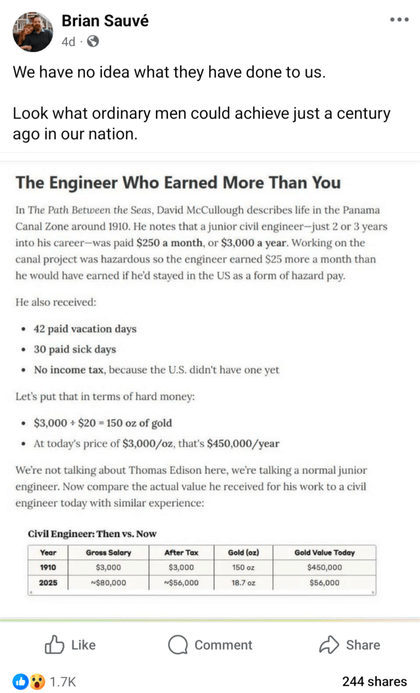
Inflation adjusting income and prices from the past is a common theme in my blog posts, including fact checking of other attempts to do these adjustments. But here is a really novel one, in a viral post from Facebook (which comes from this essay), which claims that a civil engineer earned the equivalent of $450,000 in today’s terms:
Can this be correct? If so, it would represent massive stagnation in incomes over time. Thankfully, there are two major errors, or at least misleading aspects to the calculation.
The listed salary was not one of an “ordinary man” — far from it.
Using gold prices to inflation adjust the incomes is very misleading.
First, the salary: $3,000 per year was definitely not what ordinary men earned. The average wage, for example, for a production worker in manufacturing was 18 cents per hour. You would need to work almost 17,000 hours to earn $3,000 at that wage, which of course is not possible. In reality, the average worker put in 57 hours per week — which means they earned about $500 if they were able to work 50 weeks per year (most probably didn’t). So already we see that the civil engineer working on the Panama Canal is making about 6 times as much as an “ordinary man.” Agricultural workers, the other main industry of 1910, earned about $28 per month ($22 if they also received board) — even less than manufacturing, and only about 1/10 of the engineer
Second, the gold price adjustment is misleading. Yes, in 1910, gold was how we defined currency in the US. But you can’t eat gold, and most people only keep a little gold on hand that can be described as providing services for them (such as jewelry). What people really wanted were real goods and services, and mostly goods. Around 1910, the average American household spent about 40% of their income on food, 23% on housing, and 15% on clothing. Comparing standards of living over time requires us to look at what people spend their money on, not what the currency is denominated in. And that’s what a good consumer price index does: it compares the prices of all consumer spending at different points in time, not just one thing like gold, allowing us to make rough comparisons of income over time.
Using the Measuring Worth historical CPI (which extends the BLS CPI back before 1913), we see that the index was 9.21 in 1910, and it stands at 323.364 in August 2025. So the 18-cent manufacturing wage from 1910 is roughly equivalent to $6.32 in current dollars. The average manufacturing wage today? Around $29. And of course, workers today have a whole range of fringe benefits, worth roughly another $13.58 for private sector workers. This means that an “ordinary man” today working in manufacturing can buy 5-7 times as many real goods and services as his 1910 counterpart for each hour he works. And the work is, of course, much safer today: BLS reports 23,000 industrial deaths in 1913 (61 deaths per 100,000 workers), but only 391 manufacturing deaths in 2023 (0.003 deaths per 100,000 workers).
But what about that extraordinary man in 1910, the civil engineer? How was he doing compared with today? Using the same historical CPI, we can see that $3,000 in 1910 is roughly equivalent to $105,000 today. Not bad! That’s almost exactly the median pay for civil engineers today. But keep in mind the civil engineer working in Panama was an unusually highly paid position. A 1913 report from the American Society of Civil Engineers suggests that most early career civil engineers were making closer to $1,500 per year — half of the Panama engineer. Engineers were also a highly skilled, very rare profession in 1910. And don’t forget that about 10% of the American workers on the Canal died in the construction, mostly from disease so the engineers were probably just as susceptible to death as the laborers.
Finally, we might ask a different question: what if you had held onto gold since 1910? Let’s say your great-great grandfather was a civil engineer, and managed over the course of a few years to save one year’s salary in gold. He even managed to hide it during the 1930s-1970s, when private holding of gold was generally illegal in the US.
How much would that 150 ounces of gold be worth today? That answer is simple: about $615,000 today (gold has gone up a bit just since that calculation was done in May!). But was that a good investment? Not really. A $3,000 investment in the stock market from 1910 to 2024 would be worth about… $120 million (it’s actually a bit more than that, since the market continued to rise after January 2024). Of course, that would have required a bit of active management, since index funds don’t come along until much later. But your great-great grandfather would have been much wiser to set up a trust for you and have it actively managed to approximate the entire US stock market, rather than to bury 150 ounces of gold in his backyard.
Even assuming you lost half the value to management fees, the stock portfolio today would be worth at least 100 times as much as the gold.
SPOILER ALERT FOR THE THIRD SEASON OF THE GILDED AGE
In Season 3 of the drama series “The Gilded Age,” one of the servants (Jack, a footman) earns a sum of $300,000 by selling a patent for a clock he invented (the total sum was $600,000, split with his partner, the son of the even wealthier neighbor to the house Jack works in). In the series, both the servants and Jack’s wealthy employers are shocked by this amount. Really shocked. They almost can’t believe it.
How can we put that $300,000 from 1883 in New York City in context so we can understand it today?
A recent WSJ article attempts to do that. They did a good job, but I think more context could help. For example, they say “Jack could buy a small regional bank outside of New York or bankroll a new newspaper.” Probably so, but I don’t think that quite conveys the shock and awe from the other characters in the show (a regional bank? Ho-hum).
First, the WSJ states that the “figure nowadays would be between $9 and $10 million.” That’s just doing a simple inflation adjustment, probably using a calculator such as Measuring Worth (it’s a good tool, and they mention it later in the story). But as the WSJ goes on to note, that probably isn’t the best way to think about that figure.
Here’s my best attempt to contextualize the $300,000 figure: as a footman, Jack probably made $7 to $10 per week. Or let’s call it $1 per day. That means Jack’s fellow servants would have had to work 300,000 days to earn that same amount of income — in other words, assuming 6 days of work per week, they would have had to work for almost 1,000 years to earn that much income. Jack appears, to his co-workers, to have earned that income almost in one fell swoop (though in reality, he spent months of his free time toiling away at the clock).
Claims that the middle class or working class has been “hollowed out” in the US have been made for years, or decades really. The latest claim is an essay in the Free Press by Joe Nocera. But these claims are usually lacking in data, while strong in anecdotes. Let’s look at the data.
Notice that the latest data point is for 2024, which is the highest they have ever been in this data series, and likely higher than any point in the past. While many point to about the year 2000 as when troubles for the working class started (this is when manufacturing employment really fell off a cliff, and China joined the WTO in 2001), inflation-adjusted earnings have risen 11% for this group of workers since then. You might say that’s not a lot of growth — and you would be correct! But this group is better off economically than in the year 2000, which is a point that gets lost in so many discussions about this issue.
But that’s just a national number. Might some states that were especially hit by manufacturing job losses be worse off? Nocera mentions North Carolina and the Midwest. To answer this, we can use BLS OEWS data, which has not only median wages by state, but also the 10th percentile wage — the lowest of the working class. Here’s what median real wage growth (again inflation-adjusted with the PCEPI) since 2001 (the earliest year in this series with comparable data):
Everyone is talking about the price of eggs. Even the President. That’s despite the fact eggs, on average, constitute about 0.1% of consumer spending (according to the Consumer Expenditure Survey for 2023). Even so, economists always get excited when people talk about prices.
On prices at the current moment, I wrote a blog post for the Cato Institute looking at the relevant supply and demand factors, and trying to explain why wholesale egg prices are falling so quickly. When will these falling wholesale prices translate into lower retail prices? The NY Times asked this question, and I tried to answer it for them (answer: perhaps in a few weeks).
But let’s step back from the current moment and take a longer-term perspective on egg prices. This chart shows the long-run real price of eggs, measured in terms of how much time an average worker would need to work to afford 1 dozen eggs:
For decades one of the most popular Christmas gifts for kids (and often adults) has been video game systems. And Nintendo has long been a dominant player in this market: the original NES arguably launched the modern gaming market in 1986 (even though it wasn’t the first, it was the first blockbuster) and Nintendo’s latest offering, the Switch, is now the best-selling console ever in the US.
As we often ask on this blog: has it become more or less affordable for an average worker to buy this iconic Christmas gift (or even buy one for yourself)?
When it comes to the consoles themselves, the Switch and NES are, perhaps surprisingly, equally affordable. The original NES cost $90 in 1986, while the Switch costs $300 today. Average wages in late 1986 were $9/hour and they are about $30/hour today. So in both years, it took about 10 hours of work to buy the console (alternatively, it’s about 25% of median weekly earnings in both years).
But as any serious gamer will tell you, the individual game cartridges can cost as much or more than the console if you want to play a lot of games. For example, the games available in the 1986 Sears catalog ranged from $25-$30. To buy just the 10 games in that catalog would cost $275 — over 30 hours of labor at the average wage, or about 3 hours of labor per game.
Today there is a wider range of prices for games, but the most expensive Switch games are around $60, or just 2 hours of labor at the average wage. There are also plenty of games around $30, or just 1 hour of labor.
The challenge with the comparison is that video games today are much higher quality, challenging, and advanced in so many ways. Is there any way to make a more direct comparison?
Yes. Nintendo offers an annual subscription for $20 to Nintendo Switch Online. Included in the subscription is access to nearly every NES game, plus Super Nintendo and Gameboy games. Not only do you get the 10 games from the 1986 Sears catalog, but many dozens more. All for less than $1 hour of labor at the average wage.
In other words, for 30 hours of labor today (the time to purchase those 10 original NES games), you could buy about 46 years worth of subscriptions to Nintendo online. That’s almost a lifetime of video game play, with many more advanced games.
Really, our richest in the 1890s? Can this be true? Are the anonymous socialist Twitter accounts correct? Let’s look at the data. But the answer probably won’t surprise you: your intuition is correct, we are much better off today than the 1890s, in almost every way of looking at it economically.
Last week I did a comparison of “time prices” for several goods and services in 1971 compared with 2024. For almost all goods and services, it took fewer hours of work in 2023 to purchase them. In some cases, huge increases in affordability; air travel is 79% cheaper and milk is 59% cheaper, in terms of how much time an average worker needs to labor to pay for them.
There was one major exception though: housing. Especially the cost of buying a new home. Just using the median sale price of a home, the cost (in terms of hours of work) roughly doubled between 1971 and 2024. That’s not good!
Many who commented on the post mentioned that houses are much bigger today, and I noted that in the post but still claimed this is a worrying trend: “since 1971 you can’t really argue the quality improvements make up for the increase. Yes, houses are much bigger (about double in size), but that’s not clearly driven by consumer demand (more so by zoning and other laws). The 1971 house also had indoor plumbing (but maybe not air conditioning).”
Are houses bigger today? Yes, but not nearly enough to account for the decreasing affordability I showed in the previous post. In 1971, the median new home had 1,400 square feet of floor space. In 2023, it was 2,286. That’s a big increase (over 60%), but let’s now do the time-price affordability calculation, which I show in the table below.