Everyone is talking about the price of eggs. Even the President. That’s despite the fact eggs, on average, constitute about 0.1% of consumer spending (according to the Consumer Expenditure Survey for 2023). Even so, economists always get excited when people talk about prices.
On prices at the current moment, I wrote a blog post for the Cato Institute looking at the relevant supply and demand factors, and trying to explain why wholesale egg prices are falling so quickly. When will these falling wholesale prices translate into lower retail prices? The NY Times asked this question, and I tried to answer it for them (answer: perhaps in a few weeks).
But let’s step back from the current moment and take a longer-term perspective on egg prices. This chart shows the long-run real price of eggs, measured in terms of how much time an average worker would need to work to afford 1 dozen eggs:
For decades one of the most popular Christmas gifts for kids (and often adults) has been video game systems. And Nintendo has long been a dominant player in this market: the original NES arguably launched the modern gaming market in 1986 (even though it wasn’t the first, it was the first blockbuster) and Nintendo’s latest offering, the Switch, is now the best-selling console ever in the US.
As we often ask on this blog: has it become more or less affordable for an average worker to buy this iconic Christmas gift (or even buy one for yourself)?
When it comes to the consoles themselves, the Switch and NES are, perhaps surprisingly, equally affordable. The original NES cost $90 in 1986, while the Switch costs $300 today. Average wages in late 1986 were $9/hour and they are about $30/hour today. So in both years, it took about 10 hours of work to buy the console (alternatively, it’s about 25% of median weekly earnings in both years).
But as any serious gamer will tell you, the individual game cartridges can cost as much or more than the console if you want to play a lot of games. For example, the games available in the 1986 Sears catalog ranged from $25-$30. To buy just the 10 games in that catalog would cost $275 — over 30 hours of labor at the average wage, or about 3 hours of labor per game.
Today there is a wider range of prices for games, but the most expensive Switch games are around $60, or just 2 hours of labor at the average wage. There are also plenty of games around $30, or just 1 hour of labor.
The challenge with the comparison is that video games today are much higher quality, challenging, and advanced in so many ways. Is there any way to make a more direct comparison?
Yes. Nintendo offers an annual subscription for $20 to Nintendo Switch Online. Included in the subscription is access to nearly every NES game, plus Super Nintendo and Gameboy games. Not only do you get the 10 games from the 1986 Sears catalog, but many dozens more. All for less than $1 hour of labor at the average wage.
In other words, for 30 hours of labor today (the time to purchase those 10 original NES games), you could buy about 46 years worth of subscriptions to Nintendo online. That’s almost a lifetime of video game play, with many more advanced games.
Really, our richest in the 1890s? Can this be true? Are the anonymous socialist Twitter accounts correct? Let’s look at the data. But the answer probably won’t surprise you: your intuition is correct, we are much better off today than the 1890s, in almost every way of looking at it economically.
Last week I did a comparison of “time prices” for several goods and services in 1971 compared with 2024. For almost all goods and services, it took fewer hours of work in 2023 to purchase them. In some cases, huge increases in affordability; air travel is 79% cheaper and milk is 59% cheaper, in terms of how much time an average worker needs to labor to pay for them.
There was one major exception though: housing. Especially the cost of buying a new home. Just using the median sale price of a home, the cost (in terms of hours of work) roughly doubled between 1971 and 2024. That’s not good!
Many who commented on the post mentioned that houses are much bigger today, and I noted that in the post but still claimed this is a worrying trend: “since 1971 you can’t really argue the quality improvements make up for the increase. Yes, houses are much bigger (about double in size), but that’s not clearly driven by consumer demand (more so by zoning and other laws). The 1971 house also had indoor plumbing (but maybe not air conditioning).”
Are houses bigger today? Yes, but not nearly enough to account for the decreasing affordability I showed in the previous post. In 1971, the median new home had 1,400 square feet of floor space. In 2023, it was 2,286. That’s a big increase (over 60%), but let’s now do the time-price affordability calculation, which I show in the table below.
I’ve written before on this blog about “time prices”: the amount of time it takes at a particular wage to buy a specific product. Time prices are especially useful for making historical comparisons of the real price of a good or service. Rather than adjusting historical prices for inflation (which only tells you whether they have increased faster or slower than average prices), time prices give you a real comparison of whether a good has become more or less affordable.
You will notice a few things here. For the median worker, most things are much more affordable in 2024. Some things are dramatically so! For many items, the median worker in 2024 is similar to someone in the top 1% in 2024. Huge improvements in the standard living.
It will probably not surprise you that one major exception is housing. For renters, things are not obviously worse, but they are not better, depending on what size of city you are in (renters also have lower incomes, but that would be true in both time periods). However compared to the average home price, things look much worse in 2024. You can reasonably reply that the home is much larger and better quality in 2024 (as late as 1940, barely half of homes had complete indoor plumbing!), and this is all true. Still, an average house today is much better, but also much less affordable.
Despite the high cost of housing, the average worker today is much better off than 1924. It’s hard to deny it.
But what about more recent times? As a recurring meme likes to date it, what about since 1971?
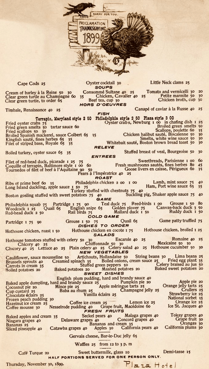
When you see prices from the past, especially the distant past, your normal reaction is perhaps one of envy or nostalgia. Take for example the Thanksgiving menu from the Plaza Hotel in New York in 1899. As you browse the menu, note that the prices are in cents, not dollars.
The most expensive items on the menu are only a few dollars, while many items can be had for around 50 cents. But hopefully your nostalgia will soon fade when you recall that wages were probably lower back then.
But how much lower?
According to data from MeasuringWorth.com (an excellent resource affiliated with the Economic History Association), the average wage for production workers in manufacturing was 13 cents per hour in 1899. From this we can immediately see that a dish such as Ribs of Prime Beef (60 cents) would take about 4.5 hours of work for a production worker to purchase.
How can we compare these prices and wages from 1899 to today?
A new essay by J. Zachary Mazlish answers the title question in the affirmative: yes, inflation made the median voter poorer. The post is data-heavy, with lots of charts and different ways of slicing the data, which is great! But since I am called out by name (or rather, my evil twin, Jeremy Horpendahl), I want to respond specifically to the claim about my data, but also I’ll make a few broader points.
Regular readers will recognize the chart in that Tweet comes from an EWED post from April 2024. Mazlich says that my chart and others like it are “misleading for understanding the election because a) they compare wages now versus January 2020, rather than January 2021.”
Fair enough, but if you read my Tweet you will see that I am specifically responding to an NPR story which said, “if you look at the difference between what… groceries cost in 2019 and what it costs today, and what wages looked like in 2019 and today, the gap is really gigantic.” So, they are specifically using 2019 as a baseline in that story, and my chart specifically used that as the baseline too! That’s why I thought that chart was relevant.
It’s true, of course, that if you want to understand median voter sentiment about the Biden administration, you should probably start the data at the beginning of the Biden administration. But I was responding to the more general claim people make, that they are worse off than in 2019.
With that clarification out of the way, what does Mazlich’s broader post say?
As I wrote last November, the question “are you better off than you were four years ago?” is a common benchmark for evaluating Presidential reelection prospects. And even though Biden is no longer running for reelection, voters will no doubt be considering the economic performance of his first term when thinking about their vote in November.
The good news for American wage earners (and possibly Harris’ election prospects) is that average wages have now outpaced average price inflation since January 2021. Despite some of that time period containing the worst price inflation in a generation, wages have continued to grow even as price growth has moderated. Key chart:
For most of Biden’s term, it was true that prices had outpaced wages. But no longer.
The real growth in wages, admittedly, is not very robust, despite being slightly positive. How does this compare to past performance under recent Presidents? Surprisingly, pretty well! (Lots of caveats here, but this is what the raw data shows.)
We all know about inflation. One popular measure is the Consumer Price Index (CPI), which measures the change in price of a fixed basket of goods. The other popular measure used for inflation is the Personal Consumption Expenditures (PCE) price index. This index measures the price of what consumers actually purchase and captures the effects of consumers changing their consumption bundles over time. While the latter is a better measure for the prices at which consumers make purchases, it takes longer to calculate. In practice, the earlier CPI release gives a pretty accurate preview to the PCE price index.
While consumption is a substantial two-thirds of total expenditures in the US economy, other prices definitely matter. On average, a third of our income is spent on other things. Below is a stacked bar chart of quarterly GDP components – the classic Y=C+I+G+NX.* Investment spending composes a relatively stable 16.7% and Government spending composes about 16.5% of GDP. We almost never hear much about the price of these other things.
Many people have nostalgia for nominal prices of the past. I’ve written about this topic in various contexts before, but the primary error in doing this is that you must also look at nominal wages from the past. Prices in isolation give us little context of how affordable they were.
One area with a lot of nostalgia is food prices of the past, specifically grocery prices (I’ve also written about fast food prices). While I have addressed grocery price inflation since 2021 in another post (it’s bad, but probably not as bad as social media leads you to believe), there is another version of grocery price nostalgia that goes back even further. For example, this image shows up on social media frequently with nostalgia for 1980 prices:
(Note that the image also mentions housing prices, but the clear focus of the image is on groceries. I won’t dig into housing in this post, but it’s something I have written a lot about before, and I would recommend you start with this post on housing prices from February 2024. But she sure looks happy! As models often do in promotional photos.)
Could you buy all those groceries for $20 in 1980? And how should we think about comparing that to grocery prices today?
One approach to grocery affordability is to look at how much a family spends as a share of their budget on food and other items. In the past I’ve used this approach to show that food spending has fallen dramatically over time as a share of a household’s budget, including since the early 1980s. But perhaps that approach is flawed. Maybe housing has got more expensive, so families are cutting back on food spending to accommodate for that fact, but they are getting less or lower quality food.
For another approach, I will use Average Price Data for grocery items from the BLS CPI series. Note that I am using actual average retail price data, not prices series data, which means there are not adjustments for quality changes or substitutions. No funny stuff, just the raw price data (the only adjustment is if product sizes changes, which of course we want them to do, so we aren’t fooled by shrinkflation — so BLS uses a constant package size, such as 1 pound for many items or a dozen eggs, etc.).
The items I have chosen out of the 150-plus price series are the 24 items which are available in both 1980 and 2024. There may be some biases by doing this, but in general BLS is continuing to collect data on things that people continue buying. So it’s the best apples-to-apples comparison we can do (note that there are no apples in this list! Apples are tracked in the CPI, but there is no continuous price series from 1980 to 2024 for one apple variety).
How best to compare prices over time? Rather than “adjusting for inflation,” as is common in the popular press and by some economists, a better approach that I and other economists use is called “time prices.” Time prices show the number of hours or minutes it would take to purchase the good in two different years, using some measure of wages or income (I will use both average and median wages in this post). By looking at prices compared with wages for individual items, we can see whether each items as well as the entire basket has become more or less affordable.
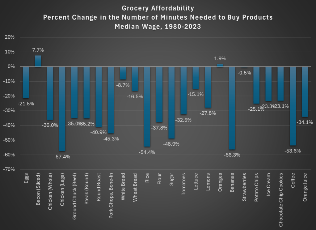
Here is what time prices for these 24 items look like if we use average wages (I use a series that covers about 80% of the workforce, but excludes supervisors and managers). For this chart, I use prices in April 1980 and April 2024, since there is some seasonality to some prices (and April 2024 is the most recent price and wage data available, so it’s as current as I can get).
The chart shows that for 23 out of the 24 items, it takes fewer minutes of work to buy the items in April 2024 than it did in April 1980. For many items, it is a huge decrease: 13 items decrease by 30 percent or more (30 percent is also the average decrease). And while we once again might be concerned by selection bias of the goods, we have a nice variety here of proteins, grains, baking items, vegetables, fruits, snacks, and drinks. Unfortunately for the bacon lovers out there it is the one product going in the other direction, but there are still a variety of other proteins that have become much more affordable (pork chops are much cheaper!).
Here’s one way in which the image of the lady shopping wasn’t wrong: you could get a basket of groceries for about $20 in 1980. The basket I’ve put together (which is obviously different from the woman’s basket, but you work with the data you have) would cost $27 if you bought the package sizes BLS tracks (e.g., one pound for most of the meats and produce). In 2024, that same basket would cost $84. That’s 3 times as much! But since wages are over 4 times higher, the family is better off and groceries are, in a real sense, more affordable.
Speaking of wages though, is my chart perhaps biased because I’m using the average wage? What if we used another measure, such as the median wage? For that, I can use the EPI’s median wage series (which comes from the CPS), and I also converted it to a nominal wage for 2023. This wage data is only available annually, with the most recent being 2023, so I will also use 2023 price data for this chart (note: for oranges and strawberries, I use the second quarter average price, since they weren’t available year round in 1980 — another subtle example of growing abundance and prosperity today).
The immediate thing you will notice is that there isn’t much difference between the average wage chart. Bacon is still less affordable. We know have oranges being slightly less affordable and strawberries being basically the same, though keep in mind as I mentioned above the chart that these weren’t available year-round in 1980.
But other than bacon and those seasonal fruits, everything is more affordable in 2023 than 1980. The average decrease is the same as the prior chart: 30 percent fewer minutes of work at the median wage to purchase this basket of goods, with 13 of the 24 items decreasing by more than that 30 percent average. The reason for this similarity is that both the average and median wages as measured by these series are more than 4 times higher than 1980.
But are these 24 items representative of other grocery items that we don’t have complete price data in the public BLS series? They are probably pretty close. The unweighted percent change in the items from April 1980 to April 2024 was 201%. If we use the CPI Food at Home component, which includes many more items but also changes in composition as buying habits change, we see a slightly larger 255% increase. But that is still less than wages have increased since 1980 (by over 300% for both average and median wages). As our incomes rise, we will naturally switch to better and more expensive foods, which can explain the 255% vs 201% difference in price increases, but it also shows the BLS isn’t engaging in any funny business with the indexes: if they kept the basket of goods constant, price increases would be smaller.
While the rise in prices since 2021 might rightly make us nostalgic for the pre-pandemic era of prices, let’s not be nostalgic for 1980 grocery prices.